


A banking app can contain hundreds of useful features and still fail at the very first screen. When everything competes for attention, nothing feels important. The real challenge of banking home screen UX is not deciding how much information can fit on a dashboard, but determining what customers need to understand, what deserves their attention, and what should happen next. Because the first screen of a banking app doesn't just display financial information. It defines the relationship between the customer and the bank.
What is the most valuable space in digital banking?
For years, banks have competed over who can offer more features, more services, more personalization, and more ways to manage money. Every new product, business unit, and campaign wants a place in the mobile app. And sooner or later, most of them want to appear on the home screen.
The result is familiar.
An account balance at the top. Several payment shortcuts. A credit card carousel. An investment widget. A savings goal. A loan offer. A cashback promotion. A financial health score. A chatbot. And somewhere between all these elements, a notification that actually requires the customer's attention.
Every feature may be useful. Every business unit may have a reasonable argument for being there. Every element may have passed its individual usability test. Yet together, they can create an experience that makes customers work harder to understand their own financial situation.
This is one of the most overlooked contradictions in digital banking: the more a bank tries to demonstrate its capabilities, the harder it can become for customers to recognize its value.
According to McKinsey's 2025 research on world-class mobile banking apps, leading mobile banks resolve more than 80% of routine interactions entirely within the app. These institutions generate 51% more annual customer touchpoints and approximately twice the mobile-driven sales and new customer acquisitions compared with the global average.
The research points to an important distinction. Digital banking leadership is not simply about adding functionality. It depends on making increasingly complex services easy to access, understand, and use. And that challenge begins the moment a customer opens the app.
At UXDA, we believe the banking home screen should be treated not as a collection of widgets, but as a strategic experience system. It should connect the bank's capabilities with the customer's immediate context and long-term financial wellbeing.
Because the most important question is no longer:
What can we show customers on the first screen?
It is:
What should customers understand, feel, and be able to do within the first few seconds of entering their bank?
Why Banking App Home Screens Are Becoming a Strategic UX Challenge
The mobile banking home screen has evolved significantly. Initially, its purpose was relatively straightforward: provide access to accounts, display balances, and help customers complete basic transactions.
Today, the same screen is expected to support everyday payments, savings, investments, borrowing, financial planning, loyalty, personalization, customer support, and increasingly AI-powered assistance.
It is not only a digital alternative to the branch anymore. It is the primary interface through which customers understand and manage their financial lives. But the underlying design logic has not always evolved at the same pace. Many banking apps still organize their home screens around the institution's internal product structure rather than the customer's financial reality.
Accounts belong to one department. Cards belong to another. Lending, investments, insurance, and loyalty each have their own business objectives, roadmaps, and performance indicators. When these priorities reach the interface without a coherent experience strategy, the home screen becomes a negotiation between departments.
The customer sees the result, but not the organizational reasons behind it. This is closely related to what we describe in our article on the Digital Banking Experience Disconnect: the gap between how a financial institution believes its digital service works and how customers actually understand and experience it.
A banking app can be logically organized from the institution's perspective while remaining confusing from the customer's perspective. The home screen is where this disconnect becomes immediately visible.
Feature richness is not the same as experience quality.
The problem is not that banks offer too many useful services. The problem emerges when the interface gives too many options with equal importance.
Deloitte's Digital Banking Maturity 2024 study evaluated 349 banks across 44 countries and analyzed 1,005 digital banking functionalities. The research provides a broad view of how digital banking capabilities have expanded. Refinement of interfaces, simplification of processes and making digital banking more intuitive may significantly improve customer satisfaction and involvement.
Digital maturity cannot be understood through feature availability alone. A bank may provide highly sophisticated capabilities without making their value obvious, accessible, or relevant to customers. The strategic challenge is therefore to move from feature availability to experience relevance.
A mature banking app should not constantly remind customers how many things the bank can do. It should make the right things available at the right moment, with minimal cognitive and emotional effort.
That requires a different starting point for home screen design.
The Fundamental Mistake: Designing a Banking Dashboard Instead of a Financial Experience
A dashboard is usually defined by the information it displays. A financial experience should be defined by what that information helps people understand and accomplish. This distinction may sound subtle, but it changes almost every design decision.
Consider two possible approaches to a mobile banking home screen.
A product-centered home screen asks:
- Which accounts and products should we display?
- Which features should be promoted?
- How many shortcuts can we fit above the fold?
- Where can we place cross-selling opportunities?
- How do we give each business unit sufficient visibility?
A customer-centered financial experience asks:
- What does the customer need to know right now?
- What is their financial situation?
- Is anything important changing or requiring attention?
- What action are they most likely trying to complete?
- How can we help them make a better financial decision?
The first approach organizes banking capabilities. The second organizes customer understanding. One is an interface architecture problem. The other is a strategic UX problem. And this is where banking app design begins to influence business outcomes.
When customers can understand their financial situation and act confidently, they have fewer reasons to hesitate, search, abandon journeys, or contact support for clarification. When the experience becomes relevant, the bank also creates more meaningful opportunities to introduce services that genuinely fit the customer's needs. The objective is to maximize the value of interactions, not just numbers.
A successful banking home screen should reduce the distance between financial information and confident action.
What Should a Banking App Show Customers First? Five Essential Layers
There is no universally perfect banking home screen. The right information depends on the customer segment, product portfolio, market, financial behavior, and the bank's strategic positioning.
However, a strong retail banking home screen should generally answer five fundamental questions.
1. Where Do I Stand? — Financial Clarity
The first responsibility of a banking app is to help customers understand their current financial position. This begins with clear visibility of their available money, but it should not necessarily end there.
Depending on the customer's situation, relevant information may include:
- Available account balance;
- Total balances across selected accounts;
- Upcoming payments and commitments;
- Outstanding credit card obligations;
- Savings progress;
- Recent financial activity.
The challenge is deciding which information creates understanding rather than simply adding data.
For example, displaying a current account balance of €2,400 may appear sufficient. But if €1,800 is already committed to upcoming rent, loan payments, and other essential expenses, that number alone does not communicate the customer's practical financial position.
A more meaningful experience could help the customer distinguish between money they have, money already committed, and money potentially available for discretionary spending.
Such calculations must be transparent and based on reliable data. If the bank does not know about an external obligation, the interface should not pretend that its estimate represents the customer's complete financial situation.
The purpose of financial clarity is not to display the maximum amount of data. It is to help customers understand what the data means.
This is particularly important because financial information has emotional consequences. A balance can create reassurance, concern, uncertainty, or confidence depending on how it is presented and what context accompanies it. The bank should not leave customers to interpret complex financial information without guidance.
2. What Needs My Attention? — Relevant Financial Awareness
Not every banking interaction starts with a transaction. Sometimes the most valuable thing a bank can do is help a customer notice something important.
A payment is due tomorrow. A card has been temporarily blocked. An unusual transaction needs verification. A savings goal is approaching completion. A subscription charge has increased. These events may be more important than the next item in a long list of available banking services.
Yet many interfaces treat urgent financial information, general announcements, product promotions, and routine notifications as visually similar content. This makes it harder for customers to distinguish what requires action from what merely invites attention.
A well-designed banking home screen should establish a clear hierarchy of relevance.
- Critical events require timely attention, such as security issues or actions necessary to restore access.
- Actionable events help customers prevent a problem or complete an important task, such as an upcoming payment requiring sufficient funds.
- Informational events improve understanding without demanding immediate action.
- Commercial messages should be shown when they genuinely relate to the customer's needs, rather than competing with more important financial information.
The principle is simple:
The bank should not compete with itself for the customer's attention.
A customer's financial wellbeing must take priority over the institution's desire to promote another product. This does not eliminate commercial opportunities. It makes them more credible by connecting them to the moments when they may create real value.
3. What Can I Do Now? — Effortless Everyday Banking
For many customers, opening a banking app is driven by a specific intention. They want to send money, pay a bill, check a transaction, freeze a card, or transfer funds between accounts. A home screen should make these everyday tasks immediately accessible.
But accessibility is not the same as showing every possible action. A row of four well-chosen actions can be more useful than an elaborate grid of twelve.
The most appropriate actions should be informed by customer research, recurring task patterns, frequency, urgency, and the consequences of errors.
For a typical retail banking customer, these may include:
- Transfer money;
- Pay a bill;
- View transactions;
- Manage cards.
But a small business owner may prioritize approvals and cash flow. A wealth management customer may need portfolio visibility and advisor access. A young customer may focus on spending, saving, and understanding their money.
A fixed universal menu cannot adequately represent every financial relationship. At the same time, excessive personalization can undermine predictability. If buttons constantly move based on an algorithm's assumptions, customers may need to relearn the interface each time they open it.
The right balance is a stable interaction foundation with contextually relevant assistance.
Core navigation and essential actions should remain predictable. Personalization can enhance what customers see without compromising their ability to find familiar functions. This distinction is essential to banking UX because customers are not merely browsing content. They are making decisions and moving money.
4. What Is Changing? — Context and Financial Progress
Traditional banking interfaces are excellent at presenting financial snapshots. They are often less effective at explaining financial change.
Customers can see today's balance but may struggle to understand why their financial situation is improving or deteriorating. They may see transaction histories without recognizing spending patterns, savings progress, or upcoming pressures on cash flow. This creates an opportunity to move beyond static banking information toward meaningful financial insight.
For example:
- Your essential expenses are higher than usual this month.
- Your savings goal is progressing faster than planned.
- Your upcoming payments may leave less available money than last month.
These messages should not become another collection of decorative widgets. They must be understandable, accurate, actionable, and relevant.
An insight that creates anxiety without offering a meaningful next step can damage the experience. An insight based on incomplete data can damage trust. An insight that explains an important change and helps the customer decide what to do next can strengthen the relationship.
This is where financial UX begins to shift from transactional functionality toward ongoing financial guidance. The home screen becomes more than a place to observe the present. It becomes a place to understand financial direction.
5. What Should I Do Next? — Confidence and Guidance
Perhaps the most important evolution in banking home screen design is the move from showing available actions to helping customers determine the right next action.
Traditional digital banking largely assumes that customers already know what they want to do. They must identify their need, find the relevant function, understand the process, and complete it independently. But many financial situations are not that straightforward.
A customer may know that their expenses are increasing without knowing what to change. They may have money available without knowing whether it should remain in a current account, move to savings, or be used to reduce debt. They may receive an unfamiliar transaction notification without understanding its implications.
The opportunity is to design a home screen that supports both execution and understanding.
Sometimes that means a clearly visible action. Sometimes it means explaining a situation. Sometimes it means suggesting a next step while keeping the decision with the customer.
And sometimes the best experience is to show nothing additional because the customer already has everything they need. This is the difference between designing a banking interface that demands activity and designing one that creates confidence.
10 Banking App Home Screen UX Principles for Better Customer Experience
Once the purpose of the home screen is clear, banks can translate it into concrete design principles.
These principles should not be treated as a collection of visual trends. They are strategic rules for prioritizing information, reducing friction, and protecting customer trust.
1. Prioritize Financial Understanding Over Feature Visibility
The first screen should communicate the customer's financial situation before trying to demonstrate the bank's product portfolio. When every service competes for the same space, the bank transfers the burden of prioritization to the customer.
A coherent financial overview reduces that burden. The most important information should be immediately recognizable without requiring customers to search through multiple cards, tabs, or carousels.
2. Design for Customer Intent, Not Internal Departments
Customers rarely open a banking app thinking about the bank's organizational structure. They think about what they need to accomplish. A payment, a concern, a financial decision, or an everyday task.
The home screen should reflect those intentions rather than mirror the institution's internal product categories. As we explore in Bank-as-a-Product: Why a Mobile Banking App Redesign Is Not Enough, customers experience one bank, even when its services are owned by different departments and delivered through different systems.
The home screen should express that unity.
3. Establish a Clear Hierarchy of Financial Importance
A €5 cashback promotion should not compete visually with a payment that requires immediate attention. A generic product offer should not look more important than a security notification.
Visual hierarchy must reflect financial relevance and consequence, not simply marketing priorities. This requires shared prioritization principles across product, business, risk, and customer experience teams.
4. Make the Most Common Actions Effortless
Frequently used actions should be easy to find, understand, and complete. But optimizing only for speed can be dangerous in financial services.
A faster transfer is not a better experience if it increases mistakes. A simplified investment journey is not better if it conceals important risks.
Financial UX should eliminate unnecessary friction while preserving the moments that help customers make informed decisions.
Good banking UX removes obstacles, not responsibility.
5. Personalize Meaning, Not Just Content
Personalization is often implemented by changing which offers, widgets, or products appear on the screen. But the deeper opportunity is to change how relevant financial information is explained.
A customer approaching a savings goal needs different guidance from one facing an unexpected expense. A first-time investor needs different information from an experienced wealth management client.
Personalization should make the bank more understanding, not merely more effective at targeting customers. It should also remain controllable, accessible, and transparent.
6. Turn Financial Data Into Useful Context
A banking app should not require customers to become financial analysts to understand their own money. Instead of relying entirely on numbers, charts, and transaction categories, banks can explain changes, identify meaningful patterns, and highlight relevant implications.
However, explanation must not be confused with unsolicited financial advice. The interface should distinguish confirmed facts, estimates, and recommendations, especially when those recommendations involve financial risk.
7. Make Trust Visible Through Every Interaction
Trust is not created by adding a security badge or reassuring message. It emerges from consistent, understandable behavior.
Customers should know when their information was updated, whether an operation succeeded, what remains pending, and how to resolve a problem. Balances, available funds, pending transactions, and credit obligations should be clearly distinguished.
Privacy controls should also be accessible, including the ability to conceal sensitive balances when using the app in public. Trust grows when the interface behaves predictably and communicates without ambiguity.
8. Create a Distinctive Digital Brand Experience
Most banking home screens contain similar elements. Balances. Accounts. Cards. Payments. Notifications.
Functional similarity is unavoidable because customers have similar fundamental financial needs. But experiential similarity is not.
A bank can distinguish itself through the clarity of its information, its approach to financial guidance, the personality of its communication, the quality of its interaction design, and how consistently its brand promise becomes visible in everyday behavior.
This is the deeper challenge behind the Digital Banking Clone Wars. Differentiation should not come at the expense of usability. It should emerge from a distinctive way of making banking useful, understandable, and trustworthy.
A recognizable Digital Brand Identity is not simply what makes the home screen look different. It is what makes the experience feel unmistakably connected to the institution.
9. Design for Accessibility, Stress, and Different Levels of Financial Literacy
A banking home screen is used in very different circumstances. One customer may be checking their salary during a relaxed morning. Another may be trying to understand why a card payment failed while standing at a checkout. A third may be worried about an unfamiliar transaction or an upcoming loan repayment.
The interface must remain understandable under stress. That requires legible typography, sufficient contrast, predictable navigation, accessible controls, understandable financial terminology, and effective screen-reader support. Important information should not depend on color alone, and essential actions should not be hidden behind gestures or decorative interactions.
Financial accessibility also means explaining complex concepts without assuming that every customer understands banking terminology. The objective is not to make customers feel sophisticated enough to use the bank. It is to make the bank sophisticated enough to serve its customers.
10. Govern the Experience Beyond the Initial Redesign
A beautifully designed home screen can gradually lose coherence as new products, promotions, and regulatory requirements are introduced.
A new feature receives a shortcut. A department requests a banner. Another product needs additional visibility. A new business priority adds another widget. Each change may seem reasonable individually. Together, they can destroy the original experience strategy.
This is why banking home screen UX cannot be protected by design guidelines alone. It requires experience governance: shared principles, ownership, evidence-based decisions, and clear criteria for introducing new elements.
Our approach to Digital Banking UX as Strategic Infrastructure explains why UX must evolve beyond individual screens and become an institutional capability. The strategic question is not simply who can add something to the home screen. It is who is responsible for protecting the value of the entire experience.
From Banking Dashboard to Financial Decision Interface
The next evolution of mobile banking is not necessarily a more complex dashboard. It is a more intelligent relationship between financial information, customer context, and action. We see this as a shift through three levels of experience maturity.
Level 1: Informational Banking — Show Me My Money
The home screen focuses on account balances, transactions, and product access. Its primary value is visibility.
Customers can see financial information and navigate to the required service. This remains fundamental. Without accurate information and reliable access, more advanced experiences have little value.
Level 2: Contextual Banking — Help Me Understand My Money
The home screen begins connecting financial information with the customer's circumstances. It helps explain spending changes, upcoming obligations, savings progress, and relevant financial events.
Its primary value is understanding. The bank moves beyond displaying what happened toward explaining what it may mean.
Level 3: Intelligent Banking — Help Me Make Better Decisions
The home screen becomes capable of anticipating relevant needs, supporting decisions, and assisting with actions. It can bring together multiple financial signals and help customers evaluate options.
Its primary value is informed action. AI may accelerate this transition, but intelligence should not be measured by how many recommendations a banking app can generate.
It should be measured by whether customers understand their options, retain control, and achieve better outcomes. A bank should not introduce AI simply to make the home screen appear technologically advanced. It should introduce intelligence where it reduces uncertainty, simplifies meaningful decisions, or removes genuine customer effort.
The evolution is not from fewer widgets to more intelligent widgets. It is from banking that displays information to banking that helps people understand and act.
How AI Will Change the Banking App Home Screen
AI introduces a fundamental change to the traditional interaction model of mobile banking. Instead of requiring every customer to navigate the same hierarchy of functions, intelligent systems can increasingly interpret intent, understand context, and guide people toward relevant services.
This creates the potential for a more adaptive banking home screen. A customer preparing for an upcoming mortgage payment might receive a relevant cash-flow explanation. A customer traveling abroad might see useful card controls or currency information. A customer who repeatedly struggles with a particular process could receive more direct guidance.
But this opportunity also creates new risks. An AI-driven home screen can become unpredictable if its structure changes too frequently. Personalization can become intrusive if the bank uses sensitive information in unexpected ways. Proactive recommendations can become manipulative if commercial interests override customer wellbeing. And autonomous AI interactions can become dangerous if customers cannot understand or control what the system is doing.
Therefore, the strategic question is where intelligent assistance meaningfully improves the experience without reducing transparency, predictability, or human agency. This aligns with our broader perspective on AI implementation in banking and the risk of scaling bad UX.
AI should not automate a poorly understood experience. It should help transform that experience based on a clear understanding of customer needs, financial behavior, and institutional responsibilities.
What Real Banking UX Transformations Reveal About Home Screen Design
The value of strategic home screen design becomes clearer when examining actual banking transformations.
BKT: Making Everyday Banking Easier to Understand
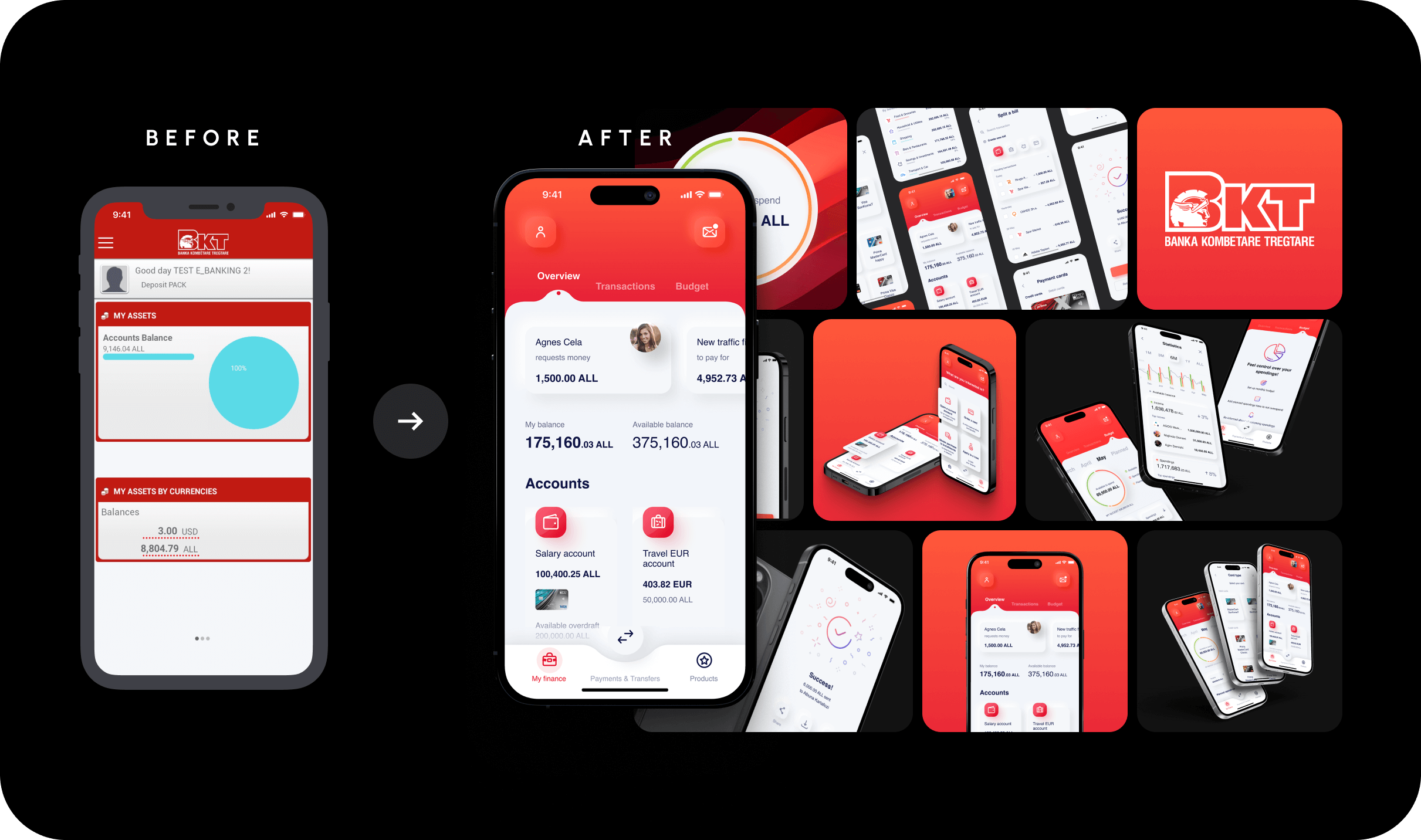
In UXDA's BKT banking UX transformation case study, one of the challenges was improving how customers understood their financial information and navigated the banking experience.
The redesigned dashboard prioritized the customer's primary scenarios while progressively revealing secondary information through tabs and menus. Customers were given clearer visibility of total and available money, alongside notifications requiring their attention.
The experience used stronger visual hierarchy, clearer communication, and more deliberate information organization. The lesson extends beyond this particular bank.
Financial clarity is not achieved by removing useful information. It is achieved by giving information the right place, priority, and context.
A banking home screen should help customers understand what matters before asking them to explore everything else.
NMB Bank: The Home Screen Must Support the Reality of the Market
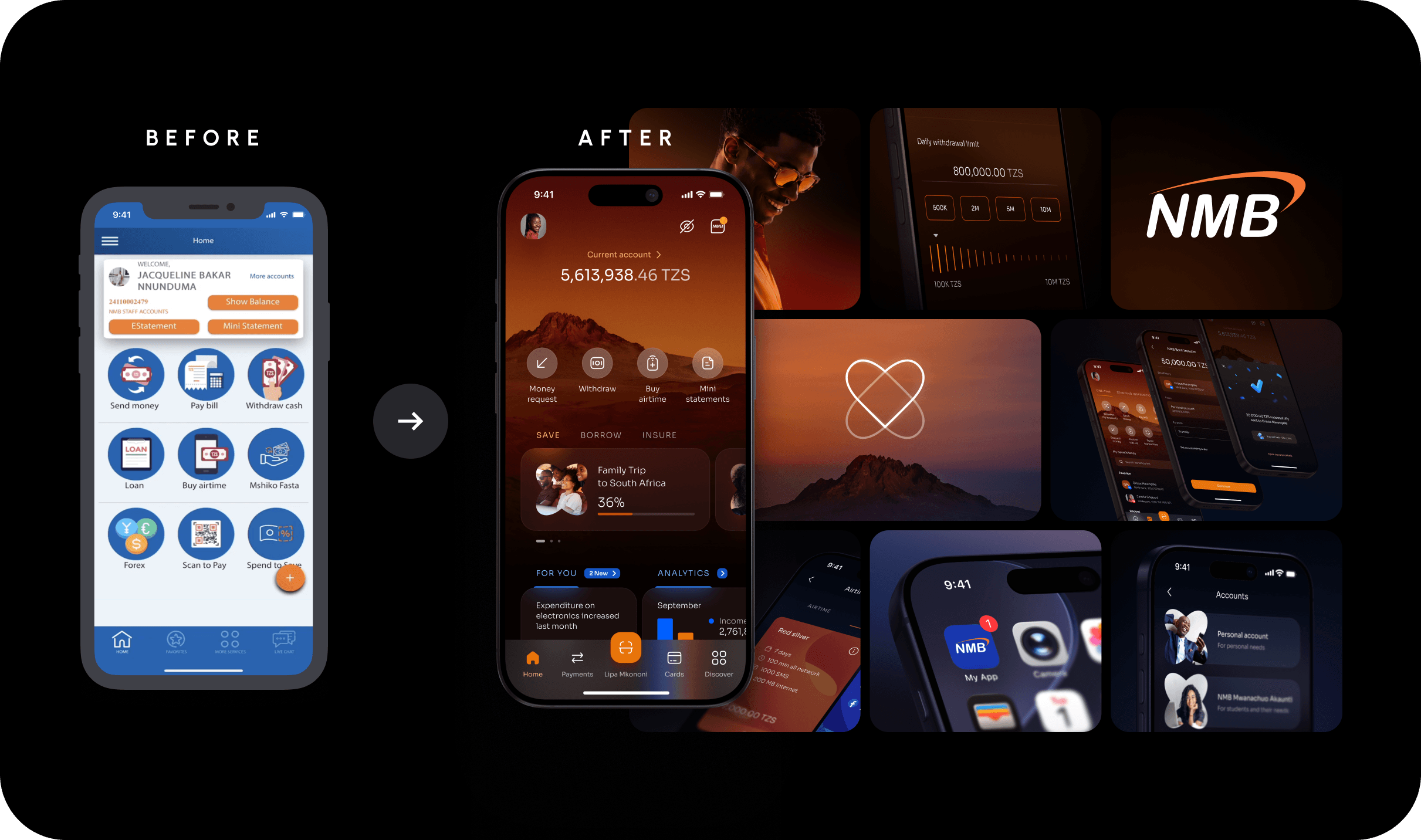
The challenge becomes different when designing banking experiences for markets where customer familiarity with formal banking varies significantly.
In Tanzania, NMB's Mkononi Super App transformation had to connect the accessibility of familiar mobile-money experiences with the broader capabilities of digital banking.
For such products, the home screen cannot assume that every customer thinks in terms of conventional banking categories. Everyday financial tasks need to remain recognizable and approachable, even as the service ecosystem expands.
A successful super-app experience must establish confidence in essential tasks before expecting customers to adopt more sophisticated financial services. The broader principle is that banking UX must be designed around the customer's financial reality, not borrowed wholesale from another market's leading application.
Why Copying the Best Banking Home Screen Interface Fails
There is a persistent assumption in banking transformation: if a competitor has a highly rated mobile app, adopting similar dashboard patterns should lead to similar results. But even an excellent interface is the visible consequence of a particular strategy, customer base, business model, and operating environment.
Copying that interface does not reproduce the system behind it. A digital-first challenger bank, a universal retail bank, a private bank, and a mobile-money-driven super app may all need account balances and payment actions. But their customers have different expectations, financial behaviors, trust requirements, and service priorities.
A distinctive banking home screen must emerge from those differences. This is why UXDA approaches financial product design through research, experience strategy, and the definition of a clear North Star before translating that direction into interfaces.
The goal is not to make a bank look like the strongest competitor. It is to help the bank become the strongest expression of its own strategic identity.
Best Banking Home Screen Cannot Be Crafted by the Design Department Alone
The home screen may be created in Figma, but the decisions determining its quality originate much earlier.
- Which customer needs matter most?
- What should the bank prioritize?
- How should financial health be defined?
- When does personalization create value, and when does it become intrusive?
- Which commercial opportunities deserve visibility?
- How should risk, compliance, marketing, product, and technology priorities be balanced?
These are not purely interface-design decisions. They are business decisions expressed through an interface. If they remain unresolved, design teams are forced to negotiate them visually. The result is often a series of compromises rather than a coherent experience.
This is why we believe banks need an experience North Star—a shared strategic reference point that defines what the institution wants its digital experience to achieve and how that ambition should guide everyday decisions.
A well-defined North Star establishes principles that remain consistent as features, products, teams, and technologies evolve.
For the home screen, that might mean establishing rules such as:
- Customer financial clarity takes priority over product promotion.
- Critical financial events must remain recognizable.
- Essential navigation should be predictable.
- Personalization must increase relevance without compromising control.
- New content must demonstrate customer value before receiving prominent placement.
- AI-generated insights must remain explainable and actionable.
- Every interaction should reinforce the bank's distinctive Digital Brand Identity.
These principles become more powerful when they are supported by clear governance and measurable outcomes.
Without governance, the home screen becomes an accumulation of competing business requirements. With governance, it can become a controlled strategic asset.
How Should Banks Measure Banking Home Screen UX Success
A successful home screen is not necessarily the one that generates the most taps, the longest sessions, or the greatest number of product impressions. In many banking scenarios, fewer interactions may indicate a better experience.
A customer who opens the app, immediately understands their financial situation, and leaves without needing further action may have achieved exactly what they intended. A customer who completes a transfer without searching through multiple menus has received value. A customer who understands a potentially worrying financial event without contacting support has benefited from clear communication.
This requires banks to move beyond superficial engagement metrics.
- Task success and completion: Can customers complete their primary banking tasks successfully? How often do they abandon processes or encounter avoidable errors?
- Time to meaningful action: How quickly can customers identify what they need and begin the appropriate journey?
- Financial comprehension: Do customers correctly understand available balances, upcoming obligations, transaction status, and financial insights?
- Customer confidence and trust: Do customers understand what the bank is communicating and feel in control of their next actions?
- Self-service resolution: How effectively does the experience help customers resolve routine needs without unnecessary assistance?
- Relevant product engagement: Do customers discover and adopt services that genuinely match their needs rather than simply respond to prominent promotions?
- Operational impact: Does better home screen UX reduce avoidable inquiries, repeated attempts, transaction errors, and other sources of service friction?
Each metric should be connected to the bank's broader customer and business objectives.
For example, reducing time to payment initiation is useful, but it is insufficient if payment errors increase.
Increasing product engagement may be commercially attractive, but it is not a positive result if customers misunderstand what they are purchasing.
As Accenture's Banking Consumer Study 2025 demonstrates, the challenge extends beyond digital convenience. Based on research involving 49,300 banking customers across 39 countries, Accenture found that 73% engage with banks beyond their primary institution.
The study also reported that banks in the highest 20% for customer advocacy achieved 1.7 times faster revenue growth than their peers.
These findings do not establish that changing a home screen will directly produce such results. They reinforce why meaningful customer relationships, trust, relevance, and service quality deserve attention alongside functionality.
The business value of banking UX lies not only in completing an interaction but in strengthening the relationship that makes future interactions possible.
The Banking Home Screen Is the First Expression of Digital Brand Identity
A bank may invest millions in brand strategy, advertising, technology, and product development. But when a customer opens its mobile app, all that investment is reduced to a single experience.
- Does the bank feel clear or confusing?
- Relevant or generic?
- Helpful or demanding?
- Confident or overwhelming?
- Human or transactional?
These impressions are not created primarily by a logo, color palette, or illustration style. They emerge from the choices the bank makes about what to show, what to explain, what to prioritize, and how to behave.
That is why the home screen is one of the most visible expressions of Digital Brand Identity.
A premium financial institution should not rely on premium aesthetics while offering an impersonal and fragmented experience. A bank promising simplicity should not confront customers with a maze of financial categories. A bank promising financial empowerment should not require customers to interpret important financial information without guidance.
The experience must deliver what the brand promises.
This is also why the future of banking home screen design cannot be reduced to a collection of best practices. Best practices establish a necessary foundation.
Distinctiveness emerges when a bank translates its own purpose, strategic priorities, and understanding of customers into a coherent digital experience. A bank does not become distinctive by adding more features than its competitors. It becomes distinctive by creating a financial experience that customers recognize as meaningfully more valuable.
The Future of Banking UX Starts With a Different First Question
For too long, the banking home screen has been treated as valuable digital real estate. Every business unit wants visibility. Every feature wants adoption. Every campaign wants attention. But customers do not open their banking apps to appreciate the institution's product portfolio. They open them to understand their money, complete a task, resolve a concern, or make a decision.
The bank that understands this distinction will make fundamentally different design choices. It will prioritize clarity over density. Relevance over promotion. Understanding over information overload. Confidence over unnecessary interaction. Distinctive value over competitive imitation. And governance over endless accumulation.
This is not about making banking apps minimalist. It is about making every element justify its place in the customer's financial life.
At UXDA, our view is that digital experience must evolve from a collection of screens into a strategic capability that shapes customer behavior, strengthens trust, and creates lasting business value.
The banking home screen is an ideal place to demonstrate that ambition. But it should never be the limit of it. Because a great home screen only creates lasting value when the entire bank delivers on the expectations it establishes.
The best banking home screen is not just the one that shows what a bank can do, it is primarily the one that makes customers feel the bank understands what they need to do next.
And that is where a banking interface begins to become a distinctive financial experience.
Banking App Home Screen UX: Frequently Asked Questions
What is banking app home screen UX?
Banking app home screen UX is the design of the first main interface customers see after entering a mobile banking application. It determines how financial information, account balances, everyday actions, notifications, and personalized guidance are organized to support customer understanding, task completion, and trust. Effective home screen UX prioritizes relevant financial needs rather than simply displaying the bank's products and features.
What should a banking app home screen include?
A banking app home screen should generally provide a clear financial overview, accessible everyday banking actions, important account notifications, relevant upcoming obligations, and contextual financial insights. The exact content depends on the customer segment, banking product, and individual circumstances. The goal is not to display everything but to help customers understand their financial position and act confidently.
What are the most important banking app home screen design principles?
The most important principles include clear information hierarchy, customer-centered navigation, immediate access to essential tasks, financial transparency, contextual relevance, accessibility, predictable interactions, privacy, and consistent visual communication. Banks should also establish experience governance to prevent feature overload and maintain consistency as their products evolve.
How can banks improve mobile banking home screen UX?
Banks should begin by researching customer needs, analyzing common tasks, identifying confusion points, and evaluating how customers understand financial information. They can then simplify the information architecture, prioritize high-value actions, improve financial clarity, test personalization, and measure task success and comprehension. Improvements should be governed by a consistent experience strategy rather than isolated design decisions.
What is the difference between a banking home screen and a banking dashboard?
A banking home screen is the main entry point to the mobile banking experience, combining financial information, navigation, actions, notifications, and relevant guidance. A banking dashboard usually refers more specifically to the presentation and visualization of financial data, such as balances, cash flow, spending, and portfolio performance. A dashboard can be part of a banking home screen, but the home screen has a broader role in organizing the customer experience.
Should banking apps show account balances first?
For many retail banking customers, account balances are among the most important pieces of information on the home screen. However, the correct priority depends on customer research, context, and urgency. A critical security notification, pending approval, or other time-sensitive event may sometimes deserve greater prominence. Banks should also provide privacy controls for hiding sensitive financial information.
How many shortcuts should a banking app home screen have?
There is no universal ideal number of shortcuts. Banks should prioritize the actions customers perform most frequently or need to access most urgently. A small, clearly organized group of primary actions is generally easier to understand than a dense collection of equally emphasized functions. The final structure should be validated through usability research and task-completion testing.
How should AI personalize a banking app home screen?
AI can personalize the home screen by identifying relevant financial events, explaining spending patterns, highlighting upcoming obligations, and guiding customers toward appropriate actions. However, personalization should remain transparent, controllable, and predictable. AI should support financial understanding and informed decision-making rather than constantly rearranging the interface or promoting products based only on commercial objectives.
How can banks make their mobile banking home screens stand out?
Banks can differentiate their home screens by developing a distinctive Digital Brand Identity expressed through information architecture, communication, interaction patterns, financial guidance, visual design, and customer care. Meaningful differentiation should reflect the institution's strategic positioning and customer needs rather than relying only on unusual layouts or decorative features.
How do banks measure the success of a home screen redesign?
Banks can measure home screen UX through task completion, time to meaningful action, financial comprehension, self-service resolution, customer confidence, error rates, relevant product engagement, and operational efficiency. These metrics should be connected to broader outcomes such as customer satisfaction, retention, trust, cost-to-serve, and sustainable business growth.
Why is banking UX governance important for home screen design?
Banking UX governance establishes the principles, responsibilities, and decision-making processes needed to maintain a coherent experience over time. Without governance, additional features, marketing campaigns, and departmental priorities can gradually overload the home screen. Governance helps financial institutions protect information hierarchy, usability, customer relevance, and Digital Brand Identity as their digital services evolve.
Get UXDA Research-Based White Paper "How to Win the Hearts of Digital Customers":

Is Your Digital Banking Experience Ready for What’s Next?
Building a future-ready financial experience takes more than great design. It requires a clear strategy that connects customer trust, distinctive Digital Brand Identity and scalable digital ecosystems with long-term business growth.
At UXDA, we partner with ambitious financial institutions to turn complex digital challenges into strategic opportunities — creating experiences that customers trust, brands can own and businesses can confidently scale.
Request a Private Briefing:
- E-mail us at info@theuxda.com
- Chat with us in Whatsapp
- Send a direct message to UXDA's CEO Alex Kreger on Linkedin