When banking executives face the challenges of costly digital transformation, a common frustration arises: “Why are our customers complaining about our digital services?” It's rarely discussed, but some bank employees don't understand why users have difficulty with their “intuitive and super-convenient” digital services and think their customers are stupid. In reality, the problem lies not with the customers but with the interfaces they are forced to navigate. Unintuitive and complex interfaces are the real culprits behind the confusion and dissatisfaction many digital banking users experience.
The Most Frequent Customer Complaints About a Digital Banking App
Seventy-five percent of people use one or more banking apps, and 68% of banking app users prefer not to interact with a bank employee when conducting their banking interactions, according to the American Experiences Survey. Seventy-seven percent of those who use a banking app do so at least once a week, and 32% use it every day or almost every day. But despite technological advancements, many digital banking apps remain overly complex and user-unfriendly. Seventy-eight percent of Gen Y and 83% of Gen Z experience frustration with the digital banking experience.
Product teams create tons of tutorials and hundreds of training videos to solve the problem. But in reality, this isn't due to a lack of digital intelligence on the user’s part but rather the result of poor UX design in banking. Financial institutions often overlook the importance of a seamless user experience, leading to cluttered, non-intuitive interfaces filled with jargon that the average user cannot easily comprehend.
The UXDA team has reviewed complaints and customer feedback from various digital forums and sources. Addressing these common complaints could significantly improve customer satisfaction and trust in digital banking platforms. Here are the top issues customers have with digital banking apps:
- Fraud and Security Issues. Users reported unauthorized transactions and difficulties securing their accounts, often attributing these issues to inadequate security measures, like weak authentication processes and the ease of PIN resets. They also report issues related to unclear fraud alerts, phishing attempts and trouble with two-factor authentication or biometric logins.
- Navigation and Usability. Numerous complaints focused on the app's user interface being unintuitive or cumbersome to navigate; difficulty finding specific features or services within the app or website; and confusion over how to perform basic functions, such as transfers, payments or account management. The overwhelming amount of information on screens makes it hard to focus on important tasks.
- Technical Bugs and App Stability. Users commonly experienced the mobile app crashing or freezing, slow performance and other bugs that hindered their ability to complete transactions or access account information. The app also does not work on certain devices or operating systems, and they reported problems after updating the app to a new version. They also had Issues with the app working on specific devices or operating systems.
- Login and Authentication Issues. Many users had trouble logging into their accounts due to faulty authentication methods. They had difficulty resetting passwords or PINs, with accounts getting locked due to multiple incorrect login attempts and problems receiving or entering authentication codes.
- Customer Service Problems. Numerous complaints centered around poor customer service experiences. Customers frequently cited long wait times and difficulty reaching customer support through the app or website, delayed responses from customer service representatives and support staff unable to resolve issues effectively. Additionally, staying in the loop with the AI chatbot is a struggle, as it can neither solve the situation nor provide access to human support.
- Account Access and Management. Customers frequently reported problems with account access, including frozen accounts, without clear reasons or timely resolution, leading to significant inconveniences. They also reported problems updating personal information, managing accounts, accessing account details and submitting or tracking service requests (e.g., new card issuance, account closure).
- Transactions and Billing. Users reported issues processing transactions, such as delays in transfers, declined transactions, duplicate charges and problems with international transactions; difficulty in setting up or managing bill payments; problems with setting up or canceling direct debits or standing orders; and issues with reversing erroneous or duplicate payments.
- Card Issues. Users often lack in-app solutions for their debit or credit cards in case they are declined, do not work internationally or freeze when lost or stolen. There is also a lack of instantly available ready-to-use virtual cards.
- Features and Functionality. Customers expressed dissatisfaction with the removal of certain app features, such as budgeting tools and transaction categorizations, which reduced the app's overall utility. They also complained about missing features or functionalities that are available on the website but not on the app, issues with applying for loans or credit cards online and confusion over interest rates, fees or account terms. Many complaints focused on unexpected overdraft charges and fees, particularly after changes to overdraft policies without adequate or timely customer notification.
- Communication and Notifications. A frequent source of frustration was poor communication regarding changes to account policies, transaction alerts and app updates. Users felt they were not adequately informed about important changes affecting their accounts and had difficulty customizing notification preferences. Users reported delays in receiving notifications, which often resulted in customers being unaware of important account activities until much later.
- Lack of Customization Options. Customers expressed frustration over the inability to customize app settings to better suit their personal preferences, such as setting transaction limits, customizing alert preferences or organizing the dashboard to prioritize frequently used features.
- Integration Issues with Other Services. Many users experienced problems integrating the banking app with other financial services or third-party applications. This included difficulties linking the app to budgeting tools, payment services or other banking institutions.
The Misconception of User Intelligence Deficit
The stereotype that older generations or less tech-savvy individuals struggle with digital banking because of their lack of digital intelligence is unfair and incorrect. In reality, even digital natives can find themselves baffled by poorly designed financial app interfaces. The issue is not the customers' inability to understand digital solutions but the designer's failure to create an intuitive and user-centered experience.
Effective user-centered design begins with empathy. Understanding the user’s context, behaviors and needs is crucial to creating a seamless experience. However, many banks design their digital interfaces with a "copycat mentality," failing to match the actual needs of their customer base.
There are several reasons why bank employees might perceive customers as "stupid" rather than recognizing the shortcomings in digital banking interfaces:
Lack of UX Design Expertise
Effective UX design requires specialized skills and knowledge that traditional bank employees do not possess. Designing intuitive interfaces involves a deep understanding of user behavior, cognitive psychology and design principles, which typically falls outside the expertise of most banking staff.
Bank employees often receive training focused on product features, security protocols and regulatory compliance rather than on UX principles and user empathy. This training gap means they might not fully appreciate the complexities of creating user-friendly digital experiences.
Disconnect Between Frontline Staff and Digital Teams
In many banks, the digital product development teams are separate from customer service and frontline staff. This organizational silo strategy can lead to a disconnect, with employees who interact with customers daily not being involved in the design and development of digital products.
Without effective feedback loops between customer service representatives and digital teams, the insights and frustrations shared by customers may not reach those who can make meaningful changes to the digital service interface.
Stress and Performance Metrics
Bank employees are often under intense pressure to meet performance metrics, such as handling a high volume of transactions or resolving issues quickly. This stress can lead to frustration and impatience when customers struggle with digital tools, especially if employees feel their performance is negatively impacted.
In high-pressure environments, employees might not have the time or resources to delve deeply into each customer’s difficulties with digital services. This can result in a surface-level understanding of the problems and a tendency to blame the user rather than improve the system.
Cultural and Mindset Barriers
There can be inherent biases by which employees, influenced by their own technological expertise, fail to empathize with users who find digital banking challenging. This lack of empathy can result in a dismissive attitude toward customers’ struggles.
Employees accustomed to traditional banking may struggle with digital tools and project their frustrations onto customers. This resistance to change can hinder a more supportive and understanding approach to customer difficulties.
Business Priorities
Banks often prioritize the rollout of new features and technological innovations over the usability and refinement of existing services. This focus can lead to sophisticated but overly complex and fragmented digital products.
Each feature builds upon the previous one, resulting in an infrastructure that requires significant time and money to improve as it becomes increasingly cumbersome. These heavy systems complicate user experiences, burden internal teams and increase the risk of data collection errors.
To address these challenges, internal teams should incorporate user feedback when setting business priorities for the roadmap, ensuring that some of the team’s tasks are driven by the goal of improving user (or internal team) experience, rather than solely focusing on innovations, revenue or other metrics.
Limited UX research and design resources mean that user experience improvements may not be prioritized. Without dedicated resources, the necessary changes to make digital interfaces more intuitive may be delayed or overlooked.
Expert's Blind Spot
The curse of knowledge is a cognitive bias in which someone who is highly knowledgeable about a subject or system struggles to understand how it appears to those who are less familiar.
For instance, a banking team that has spent a long time working on certain features might find it difficult to step back and view the system with fresh eyes. Their extensive experience with the system makes it seem straightforward and intuitive to them, but they may not realize why others find it confusing or challenging to use.
Use UX Design to Take Frustration Out of Financial Apps
In the digital era, where Fintech startups rapidly gain ground by offering user-friendly alternatives, traditional banks cannot afford to lag behind in digital services UX design. Banks can differentiate themselves and retain their competitive edge by prioritizing intuitive and emotionally engaging interfaces.
UX design provides a wide range of tools to address customers' struggles with digital banking. By focusing on user-centered design principles, banks can create digital experiences that are intuitive, accessible and enjoyable.
First and foremost, it is important to agree that a banking app is no longer just a digital channel for a bank's services. It is a valuable asset that implements a digital strategy, builds a digital brand and ensures digital loyalty. So, here’s how UX design can tackle a financial brands’ digital challenges more effectively:
1. Empathy-Driven UX Research
Create detailed personas and customer journey maps to understand different user segments' diverse needs and pain points. This helps in designing truly user-centric solutions. Conduct research in the context of users’ daily lives to gain deeper insights into their interactions with digital banking services.
2. Simplification of Interfaces
Adopt a minimalist approach to design, focusing on essential features and removing unnecessary elements that can overwhelm users. Present information gradually, showing only what is necessary at each user journey stage. This reduces cognitive load and makes navigation easier.
3. Usability Testing
Regularly test the interface with real users throughout design and development to identify and fix usability issues before they become widespread problems. Conduct user testing to determine which designs are most effective in improving user experience and achieving business goals.
4. Clear and Consistent Navigation
Design clear, logical navigation paths that guide users effortlessly through tasks. Use familiar icons and consistent labeling to reduce confusion. Help users understand their current position within the app and how to complete tasks.
5. Accessible Design
Ensure the digital platform is accessible to all users, including those with disabilities. This involves using high-contrast colors, readable fonts and screen reader compatibility according to WCAG guidelines. Design for mobile-first, ensuring the interface is fully functional and easy to use on smartphones and tablets.
6. Personalized Experiences
Allow users to customize their dashboards and interfaces to suit their preferences and frequently used features. Use AI to offer personalized financial advice and recommendations based on the user’s transaction history and behavior.
7. Effective Onboarding
Implement interactive tutorials and walkthroughs to help new users get acquainted with the platform quickly and effectively. Use tooltips and contextual hints to provide immediate help and guidance without overwhelming the user.
8. Emotional Design
Incorporate engaging visuals and micro-interactions that make the user experience more enjoyable and emotionally satisfying in line with the financial brand’s identity. Provide positive reinforcement through animations and messages when users complete tasks successfully, building confidence and satisfaction.
9. Real-Time Support
Integrate live chat and support directly within the app to provide immediate assistance when users encounter difficulties. Use AI-powered chatbots to offer 24/7 support for common queries and issues, ensuring help is always available when needed.
10. Continuous Improvement
Implement mechanisms for users to provide feedback directly within the app. Use this feedback to make ongoing improvements to the interface. Continuously monitor user behavior and interaction patterns to identify areas of friction and optimize the user experience accordingly.
Digital Banking Apps’ UX Improvement Results
Investing in user-centered design for digital banking interfaces can yield significant benefits. Improved usability leads to higher customer satisfaction, fostering loyalty and trust. A study by McKinsey & Company found that constantly improving the customer journey can reduce customer churn rates by 75 percent and double the company's revenue over a three-year period.
Based on the UXDA financial UX design team's extensive experience in transforming over 150 digital financial products throughout 37 countries, the following key results have been observed, which demonstrate the opportunities and improvements that can significantly enhance the end-user experience:
- Improved Customer Feedback. Enhanced user interfaces and user experiences have led to significantly improved customer feedback. Our clients report higher satisfaction and positive reviews from users who appreciate their financial products' intuitive and user-friendly design.
- Reduced Strain on Customer Service. By designing more intuitive and self-explanatory user interfaces, the strain on customer service has been greatly reduced. Customers can easily navigate the intuitive products without additional support, leading to fewer inquiries and faster resolution times.
- Higher App Store and Google Play Ratings. The improved user experience has translated into higher ratings on the App Store and Google Play. UXDA-designed financial products with optimized UX receive better reviews and higher ratings, which in turn attract more users.
- Increased Acquisition Through Word-of-Mouth Marketing. Satisfied customers are more likely to recommend financial products to others, leading to increased customer base growth through word-of-mouth marketing. Positive user experiences generate organic growth and expand the number of loyal customers.
- Enhanced Profits. The combination of higher user engagement, improved customer satisfaction and increased customer growth has enhanced client profits. Financial institutions benefit from higher conversion rates and greater customer retention, positively impacting their bottom line.
- Industry Accolades and Awards. Our exceptional UX design work has earned multiple accolades and awards for clients. These recognitions validate the quality and effectiveness of the design transformations, further boosting the brand's reputation and credibility.
- Improved Accessibility. UXDA’s focus on inclusive design has made financial products more accessible to users with disabilities, expanding the user base and ensuring compliance with accessibility standards and regulations.
- Faster Time to Market. Our clients' use of streamlined and user-centered design processes has enabled them to bring their financial products to market more quickly. Efficient design iterations and prototyping have reduced development cycles and sped up launch times.
- Higher User Retention Rates. Our clients have seen higher user retention rates by creating engaging and easy-to-use interfaces. Customers are more likely to continue using a financial product that meets their needs and provides a seamless experience.
- Enhanced Security Perception. Improved UX design has also enhanced users' perception of security. Clear communication and intuitive design elements make users feel more confident in the safety of their transactions and personal information, fostering trust in the financial product.
These results highlight the significant impact that user-centered service design can have on financial institutions' user experiences and overall business performance.
Below are six before-and-after financial app examples designed by UXDA that illustrate how our UX design improves overall success rates and strengthens each bank's digital advantage and brand identity. Through emotive and thoughtful design, we elevate the bank's brand to the next-gen level and remove customer frustration from the user experience:
Emirates NBD
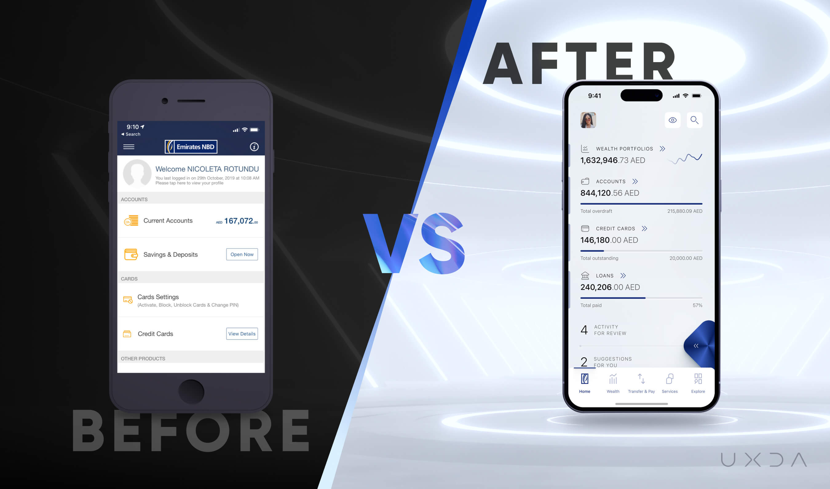
UXDA enhanced Emirates NBD's user experience by applying human-centered design principles, emphasizing intuitive navigation and personalized banking interactions. Since launching this design vision, we have spent over two years continuously improving digital products based on user feedback and evolving trends. By tailoring the banking experience to fit Dubai’s lifestyle, we integrated features that meet the needs of various user personas, enhancing usability across multiple channels and devices.
Garanti BBVA Securities
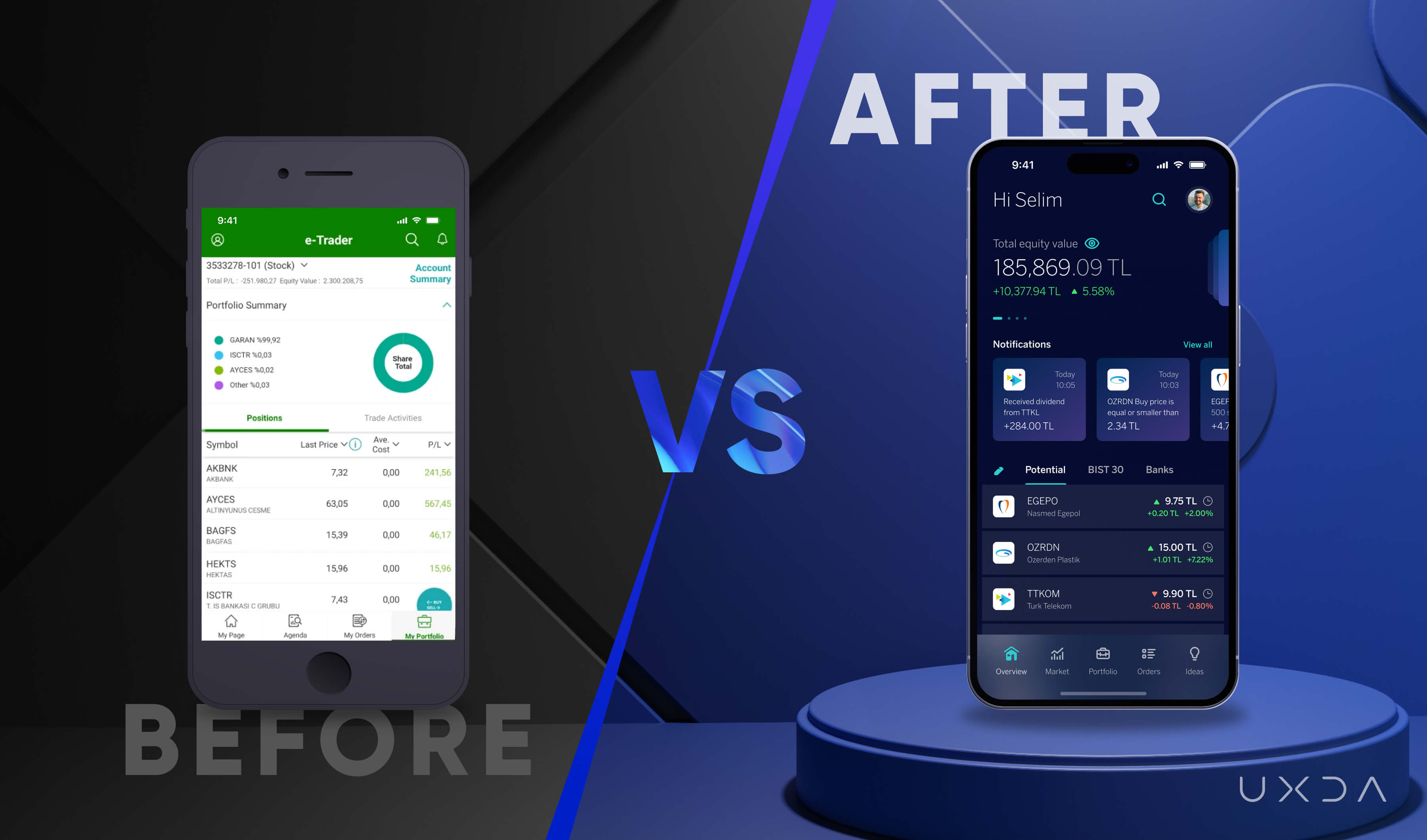
For Garanti BBVA Securities, UXDA created a digital investing experience for both novice and experienced investors. The app helps users capture investment opportunities while easily managing their investments, researching and analyzing potential investments and performing transactions. It supports a personalized, user-centered experience through a customizable home screen and color theme. The platform empowers investors to expand their knowledge, make informed decisions and enhance their financial well-being.
United Arab Bank
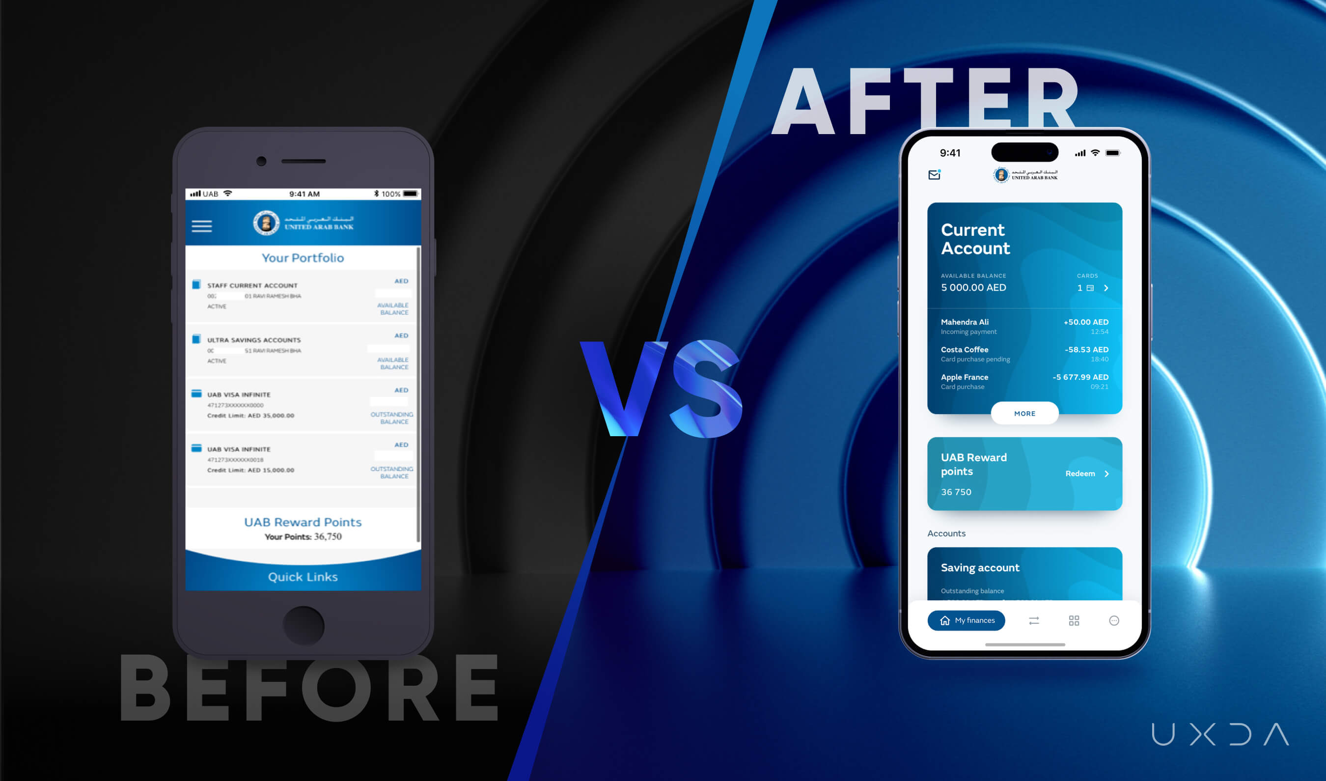
UXDA's transformation for United Arab Bank focused on creating a seamless digital onboarding process and enhancing payment flows, the most performed activity by its clients. We redesigned the customer service interface to be more responsive and intuitive, aligned with UAB's digital brand strategy, and provided users the ability to personalize the information they see on the first screen. These improvements reduced the need for physical branch visits, modernized the brand's look and feel and significantly improved overall customer satisfaction.
BKT Bank
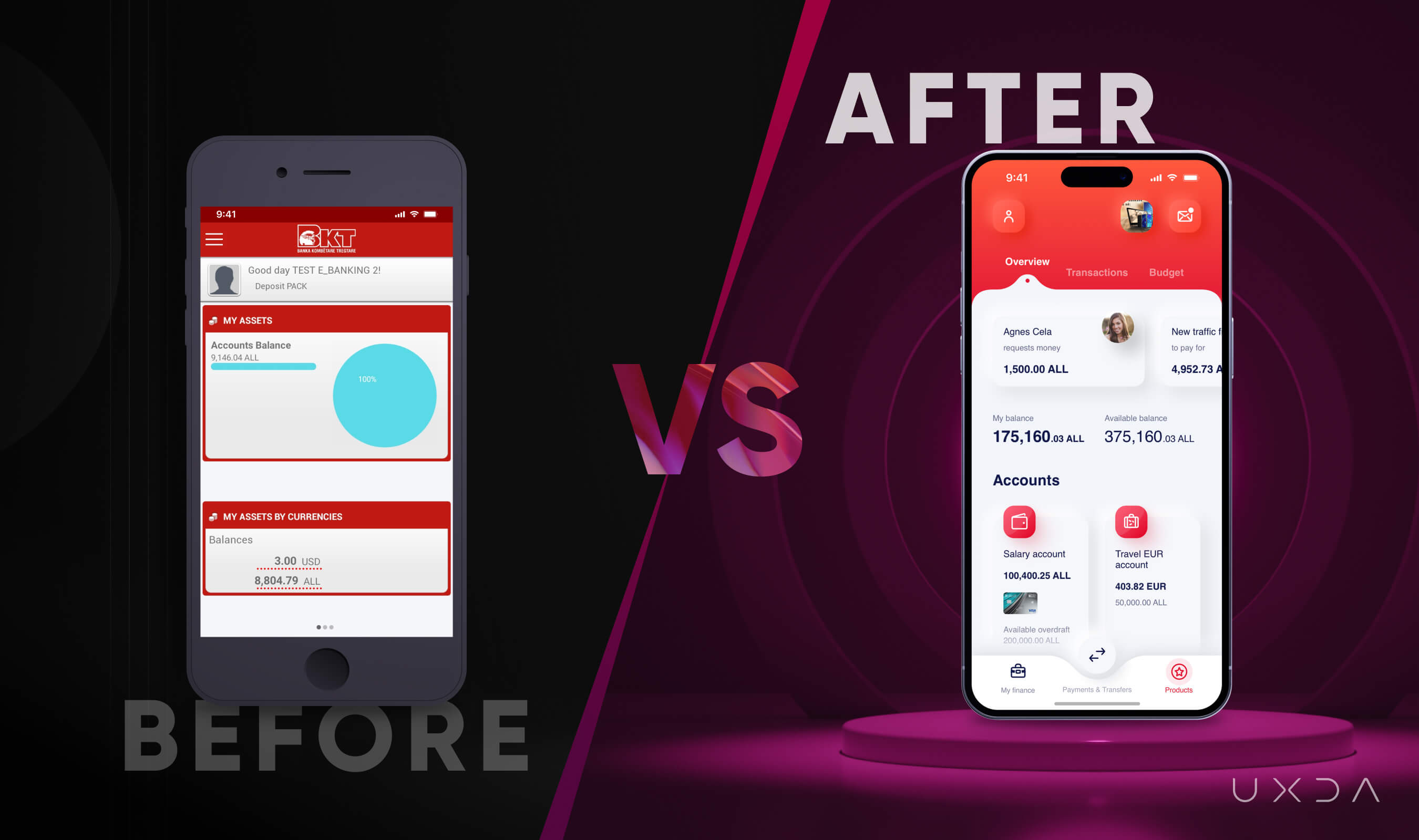
At BKT Bank, UXDA tackled legacy system challenges for the legendary century-old institution by redesigning the mobile app to enhance customer service. We introduced features that enable smarter financial decisions, such as personalized financial insights and improved navigation, resulting in a more engaging and innovative digital experience. The redesign has significantly elevated the bank's digital presence, meeting modern customer expectations and streamlining their banking interactions.
Bank of Jordan
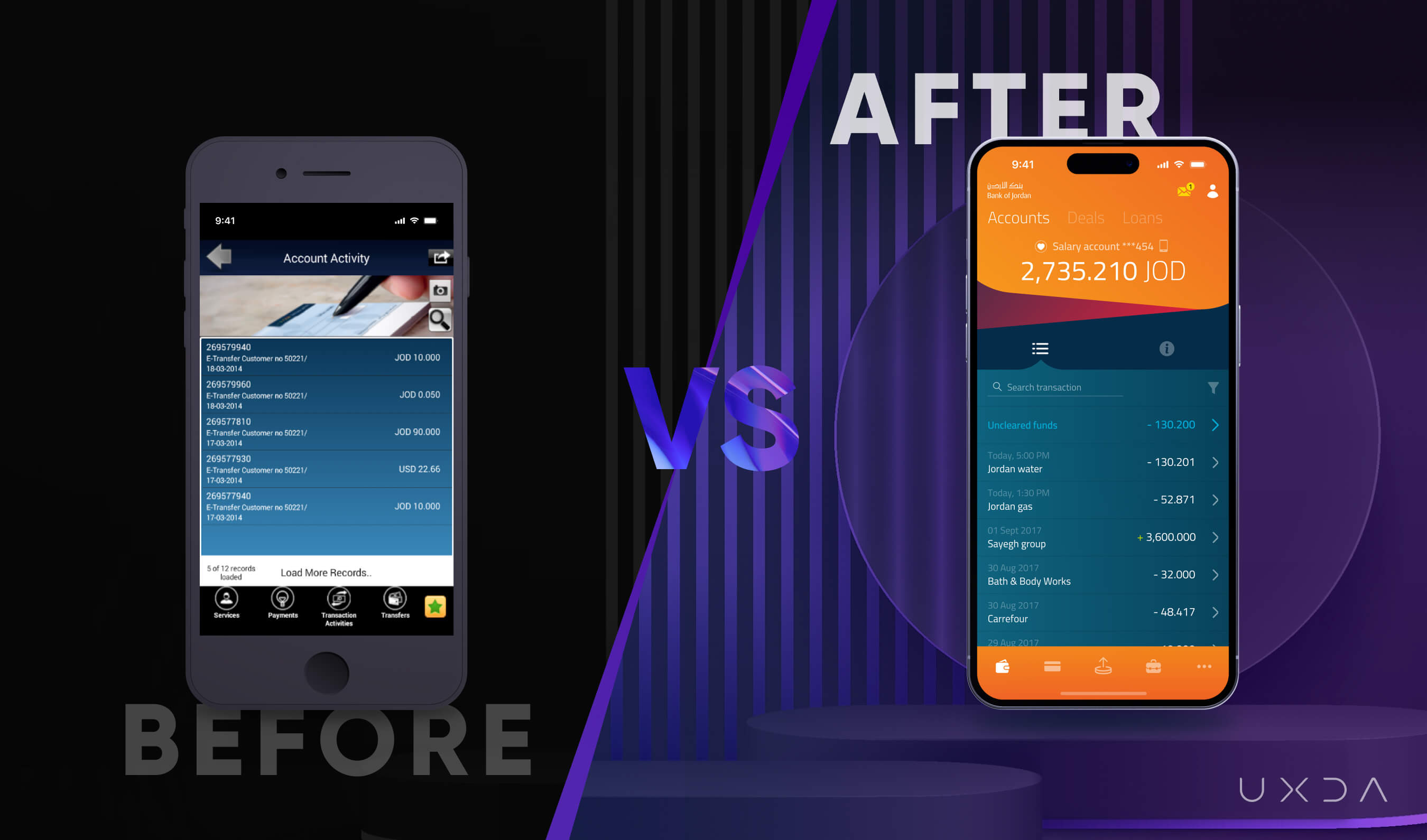
For the Bank of Jordan, UXDA focused on modernizing the digital banking experience by integrating a bold brand identity with a cohesive dashboard that provided users with a comprehensive view of their financial health. The platform also introduced digital flows for tasks previously requiring a branch visit, such as opening an account. Users were very impressed and happy with these improvements, praising the enhanced convenience and the modernized look and feel of the banking experience.
CRDB Bank
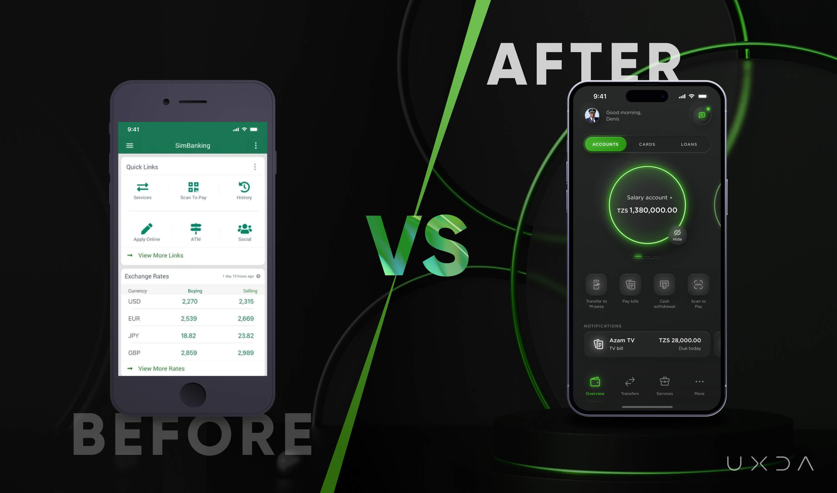
UXDA helped CRDB Bank transform its retail banking system into a next-gen user-centric platform. We conducted extensive user research to understand the needs of bank customers and designed a solution that reduced the learning curve, enhanced usability and increased overall efficiency in banking operations. Following the success of the app’s design, the entire CRDB Bank brand was updated to reflect the modern, user-focused approach, further solidifying the bank's commitment to providing exceptional customer experiences.
Conclusion
The challenges banking customers face when using digital banking services do not stem from a lack of digital intelligence but rather from poorly designed interfaces that fail to prioritize the user experience. The hidden industry myth that customers are "stupid" is damaging and unfounded. Instead, financial institutions must recognize the importance of intuitive, user-centered design in their digital services.
The real issue lies in the complex and frustrating interfaces customers are forced to use. Banks can significantly improve customer satisfaction and trust by addressing common complaints such as navigation difficulties, security issues, technical bugs and poor customer service.
Financial institutions can adopt a user-centered approach to solve this issue, focusing on simplicity and intuitiveness when designing their digital solutions. This can be achieved by:
- Conducting thorough user research to understand different users' pain points and needs. Observe how users interact with current systems and gather feedback through interviews and usability testing.
- Streamlining digital processes to reduce the steps required to complete a task can significantly improve user satisfaction. Clear, jargon-free language and intuitive navigation are critical. Making tasks easier to understand and complete is the hallmark of good design.
- Incorporating emotional design elements to create a more engaging and pleasant user experience. This involves designing interfaces that function well and delight users by addressing their emotional needs. For example, incorporating friendly and reassuring feedback when an action is successfully completed can reduce user anxiety.
Remember, UX design is not a sprint but a marathon; it’s an ongoing process rather than a quick one-time effort. Continuous testing with real users and iterating based on their feedback ensures that the interface evolves to meet changing needs and expectations.
Ultimately, banks prioritizing intuitive and emotionally engaging interfaces will be better positioned to compete with Fintech startups and retain their competitive edge in the digital era. By shifting the focus from blaming customers to improving digital interfaces, financial institutions can create a more inclusive and supportive banking environment for all users.
Get UXDA Research-Based White Paper "How to Win the Hearts of Digital Customers":
 If you want to create next-gen financial products to receive an exceptional competitive advantage in the digital age, contact us! With the power of financial UX design, we can help you turn your business into a beloved financial brand with a strong emotional connection with your clients, resulting in success, demand, and long-term customer loyalty.
- E-mail us at info@theuxda.com
- Chat with us in Whatsapp
- Send a direct message to UXDA's CEO Alex Kreger on Linkedin


