Banka Kombëtare Tregtare (BKT), the largest and oldest operating commercial bank in Albania, recognized that their digital offerings have lagged behind and needed a revamp to adapt to present-day service requirements. They challenged UXDA to update the bank's legacy operations by designing an app that would enhance customer service and empower clients to make smarter financial decisions. The goal was to change the perception of the brand from complex and formal to friendly and pleasant.
Client: Leader In the Albanian Banking Industry with Almost 100 Years of Legacy
BKT has a long history in Albania, with its roots dating back to 1925. Today, BKT’s overall assets are reaching around 5 billion USD, with 85 branches in Albania and Kosovo. As a customer-focused bank, BKT is committed to understanding and meeting the needs of its customers through digital transformation and innovative solutions.
BKT's mission is to provide its customers with peace of mind, convenience and opportunities in banking. To achieve this, they have established company values of integrity, fairness, people first, confidentiality, transparency and responsibility. BKT's vision statement is: "We know what you want and we make sure you get it. That simply makes us the first and the best bank." This reflects their dedication to excellence and customer satisfaction.
In order to maintain their position as a top bank in Albania, BKT recognized the need to update their legacy. In 2020, they partnered with UXDA to create a digital product that represents their values and vision and adapted their digital customer service in banking to present-day needs.
Challenge: Digital Customer Service Lagged Behind Brand Mission
The need to update the BKT banking app was obvious after observing competitors and user feedback. The demand for the mobile channel is constantly growing among client requests, so it is extremely important for the future development of the bank. But, unfortunately, the existing level of mobile customer service did not meet the high standards and mission of the brand, so a redesign was urgently needed.
The existing app had functionality problems, with users finding it difficult to perform certain tasks, such as easily accessing transactions, resulting in confusion about their financial situation. The outdated design also strengthened their perception of BKT as an old-fashioned and complex bank, which was not reflective of the bank's brand identity and value proposition.
UXDA’s challenge was to improve customer service in mobile banking by completely revising and rebuilding mobile user journey flows according to BKT user needs. We aimed to make the bank an approachable and reliable companion in digital banking. The BKT team's intention was to empower users to make smarter financial decisions and track their money flow, ultimately improving customers' quality of life.
Solution: Incumbent Bank Transformation into a Digital Innovator
Mobile banking upgrades and customer service improvements helped BKT change the perception of its brand from a digital perspective, strengthening their position as a market leader. It broke stereotypes about incumbent banking in the digital space by providing a light, fresh, enjoyable and user-friendly experience.
To achieve this, BKT's banking underwent a significant transformation, providing users with a convenient, easy and innovative mobile customer service to complete their daily financial tasks independently. The bank's team was determined to redefine their approach and legacy. This allowed the entire design process to be focused on making mobile banking intuitive, user-friendly and an enjoyable banking experience.
As all functionality is now available at the user's fingertips, the app has reduced the workload on bank employees and customer support. With the app's Personal Financial Management tools, users are able to take control of their finances and achieve their goals.
Approach: Digitizing Key Banking Functions and Revitalizing Perception of the Brand
After the initial research at the start of the project, we were able to set four main goals for a UX engineering and design approach:
- Update the app design and tone of voice;
- Improve user engagement and feature accessibility;
- Integrate budgeting into banking;
- Digitize key banking functions.
Revitalizing Design and Tone of Voice to Become More Approachable
According to user research, BKT was perceived as a large and unwieldy institution with an outdated app and poor digital customer service in mobile banking. Technical issues and a lack of user-friendly features made users feel as though they were working with an Excel worksheet rather than a modern digital banking solution. For example, users were experiencing long and complicated onboarding flow, the keyboard was covering some screens, and, to fully access the menu, users needed to scroll the screen.
To change this, BKT, through their transformed app, aimed to become more approachable and user-friendly, rather than appearing intimidating and impersonal. To build an app that could be a companion in users' daily lives and always there to help, we used a more friendly tone of voice and carefully selected the right design elements.
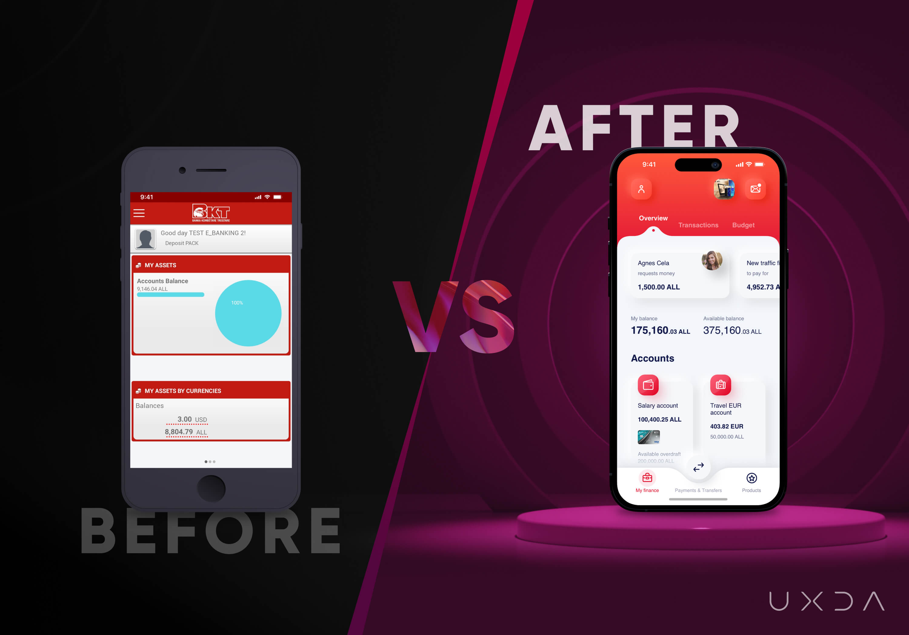
After our initial research, we discovered that many banking interfaces in Albania use harsh lines and sharp edges in their designs. The use of soft design elements can help differentiate BKT bank's interface from its competitors, making it more memorable and creating a unique identity for the brand.
On the one hand, red offers a powerful accent that distinguishes the brand from competitors, but, on the other hand, it is an archetypal aggressive color. At the same time, it was necessary to maintain BKT’s brand recognition by using their signature color palette - the red color is used in the logo and branding - so it ensures consistency between the app's interface and the overall brand of the bank.
So, it was important to properly balance its use in the interface. This was achieved through the use of softening gradients, discrete functional accents and appropriate use of white space.
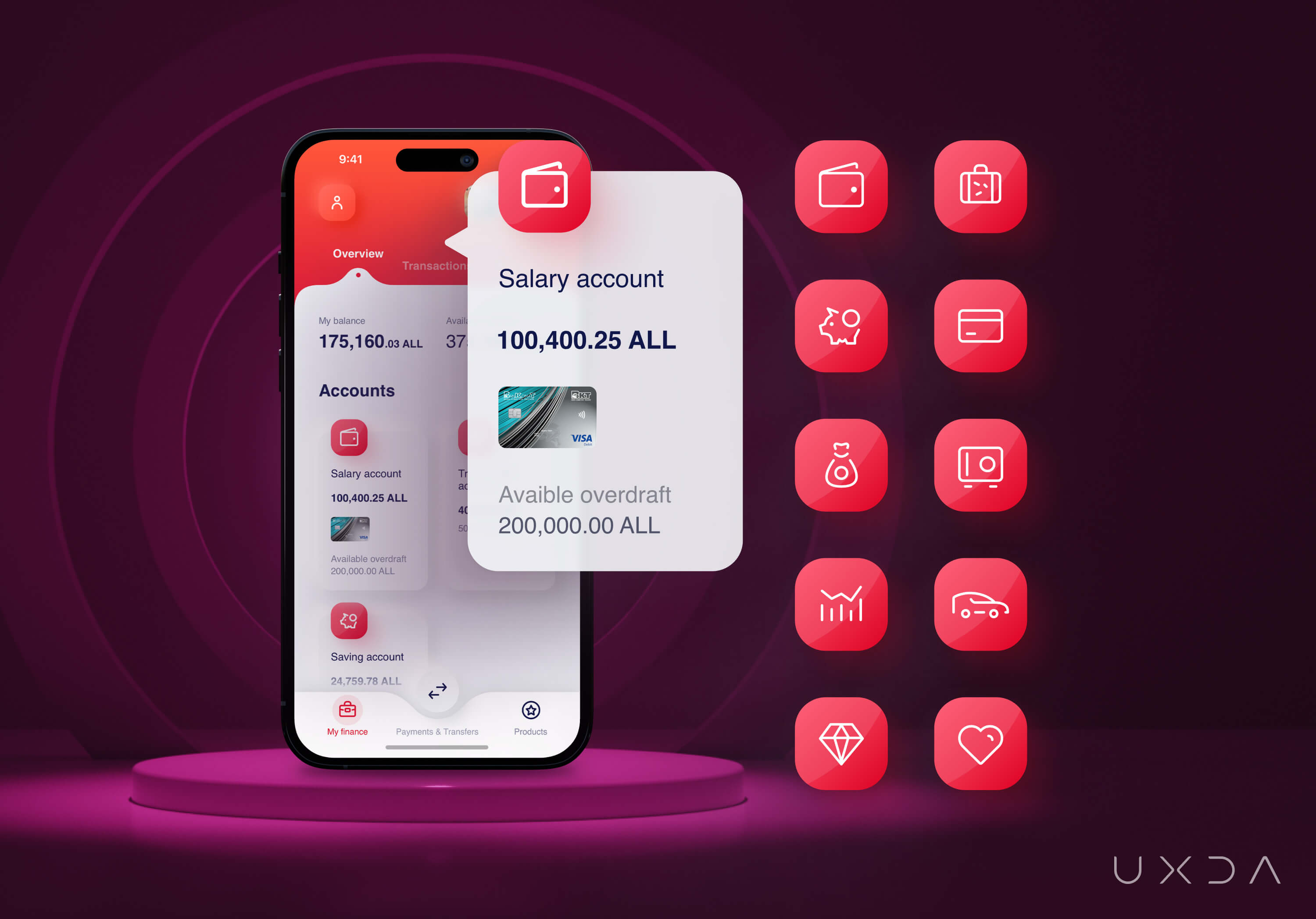
All the design elements combined created a light and positive feeling, with contrasting colors and a light gloss adding a sense of energy and movement while, at the same time, maintaining safety, approachability and friendliness. Additionally, the interface's smooth transitions improved the user experience when switching between tabs or menu items.
The app's interface was created with a focus on the use of simple, bold and clear design, meaningful and understandable iconography, depth and shadow to create an intuitive sense of hierarchy and order and responsive design to ensure that the interface looks and functions well on different devices and screen sizes.
Rounded corners, subtle gradients, easily readable fonts and soft elements make the interface design more user-friendly and less intimidating. This creates a welcoming environment that encourages users to explore the features of the interface.
Rounded corners and easy-to-read fonts also help reduce eye strain and make the interface easier to navigate. This can help build trust and loyalty among customers, who are more likely to return to an interface that they find pleasant to use.
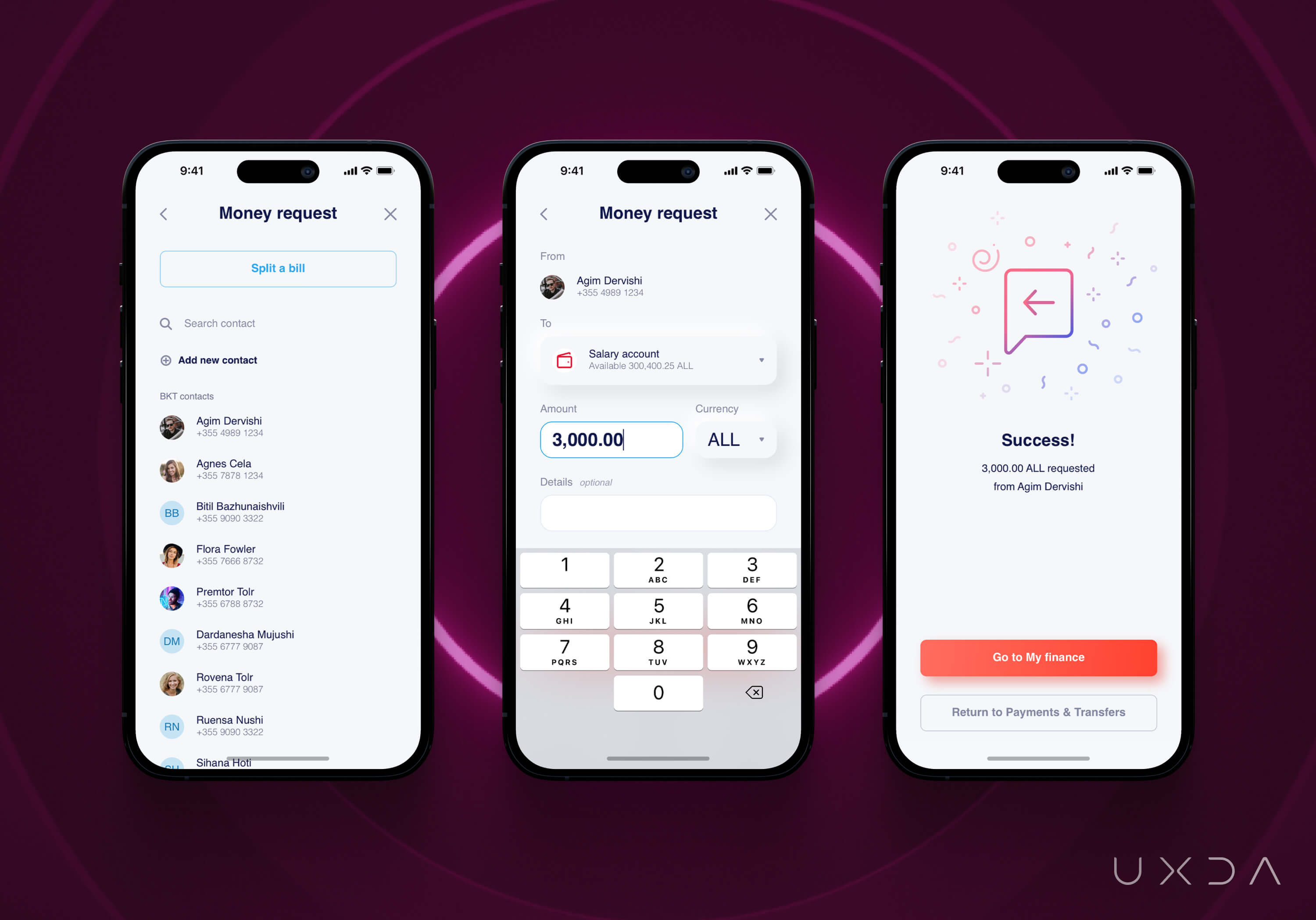
The tone of voice guidelines were updated, conveying friendliness and guidance and providing short and easy-to-understand information, rather than long and formal text.
Improving User Engagement and Accessibility to Deals
To improve the user's understanding of their finances, the dashboard was designed with a focus on the user's primary scenarios, gradually revealing secondary information on tabs and menus. Users can easily view the total and available money and quickly identify any notifications that require their attention or action. To enhance usability and improve the user experience, we incorporated large headers and ample white space to help users visually structure data and improve clarity.
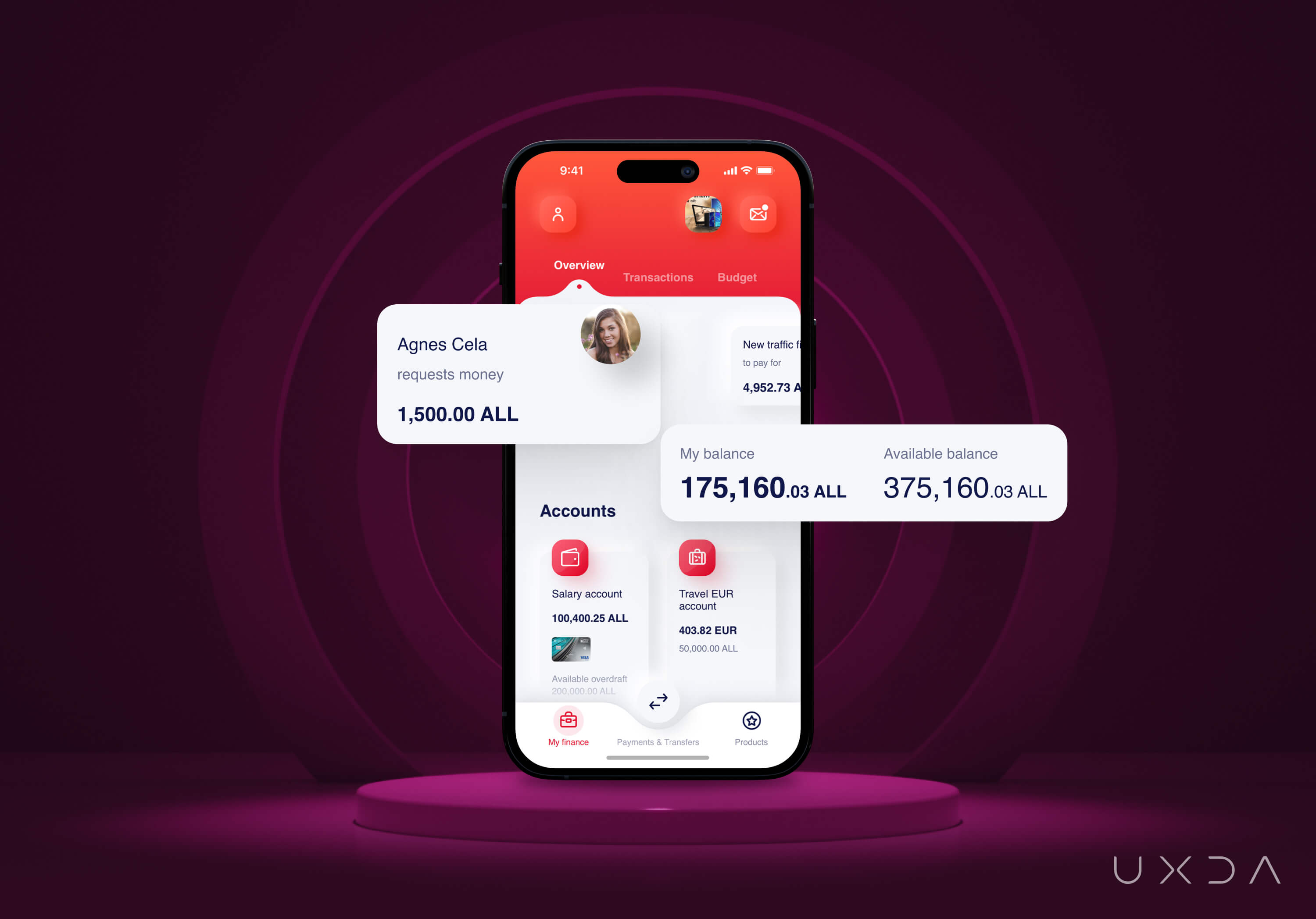
To build stronger relationships with their clients and increase loyalty, BKT is offering personalized benefits and bonuses, for example receiving cash back on their credit card purchases. We included an offer section in the dashboard as an interactive button that captures users' attention to make these deals more accessible and increase user engagement. This feature also helps users feel more in control of their finances and encourages them to take full advantage of the bank's offerings.
Revamping the Transaction List
Previously, the user had access to a transaction list, but the information was limited only to date, transfer type and amount, making it difficult to understand the purpose of the transaction and track money movement. Users needed to navigate through the app to find the information they were looking for, resulting in poor money management. Additionally, quickly switching between accounts was not possible. However, after user research, the transaction list received a significant upgrade.
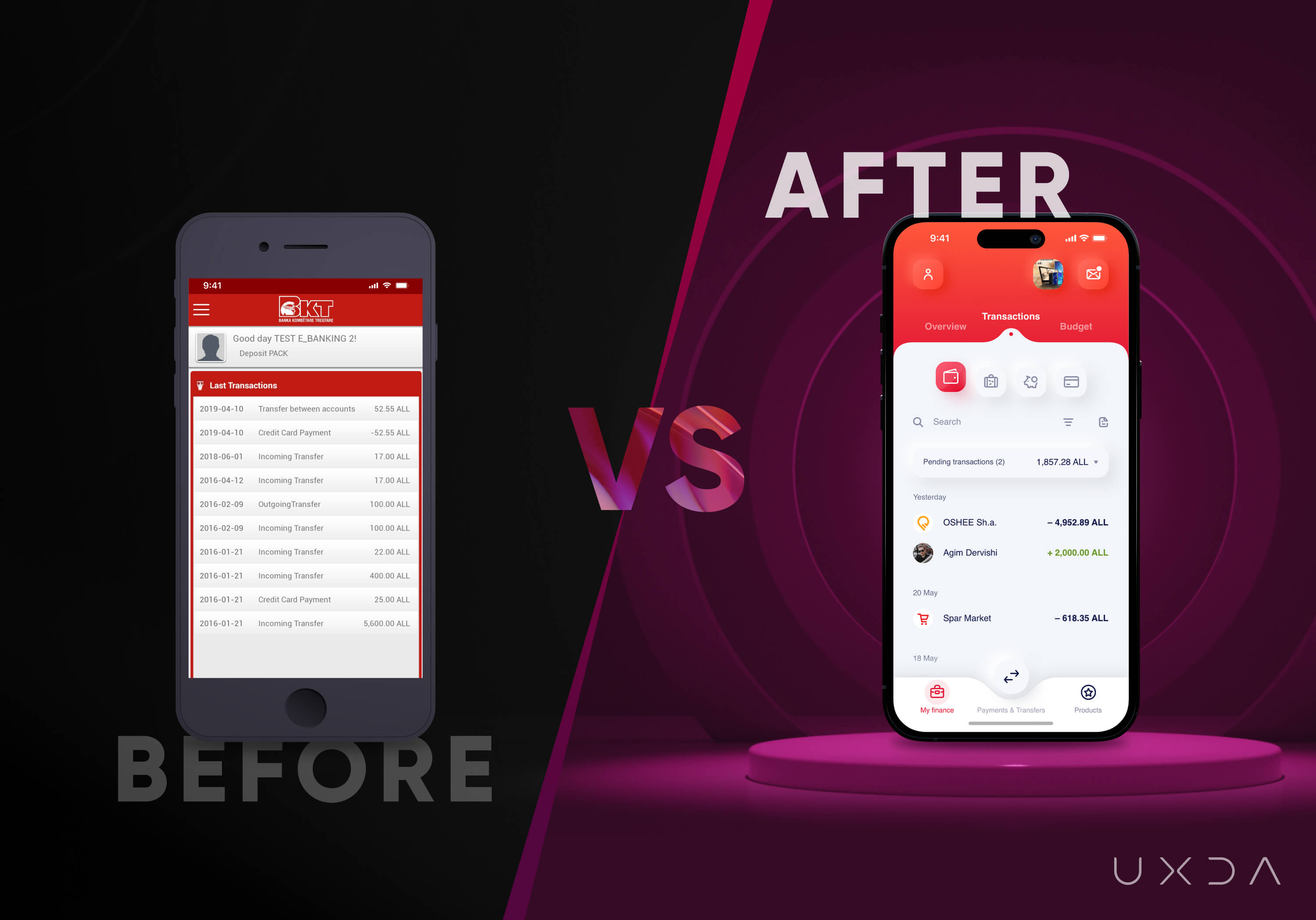
The new design highlights essential information, such as the recipient or sender of the payment, the amount and a visual representation of the account. Transactions are now grouped by completion date, and pending transactions are visually separated.
The emphasis is on providing a quick overview of the money movement by focusing on the amount and using bright colors and icons to facilitate transaction recognition and account navigation. The list features logos and photos to make it more engaging. Categories in transaction details were also introduced to aid users in budgeting.
Integrating Budgeting into Banking
During user interviews, we used the Jobs-to-be-Done framework to discover that, while performing typical banking tasks like checking account balance or viewing recent transactions, users had a goal in mind - to understand their spending habits. They wanted to know how much money they had spent and how much they had available to spend until their next paycheck.
This insight revealed an opportunity for BKT to solve an untackled user need by incorporating budgeting into the banking service. Previously, users had to manually calculate their available funds after paying their bills, making it challenging to improve their money management skills. To improve customer service in banking, we added a new section to the app called Budget.
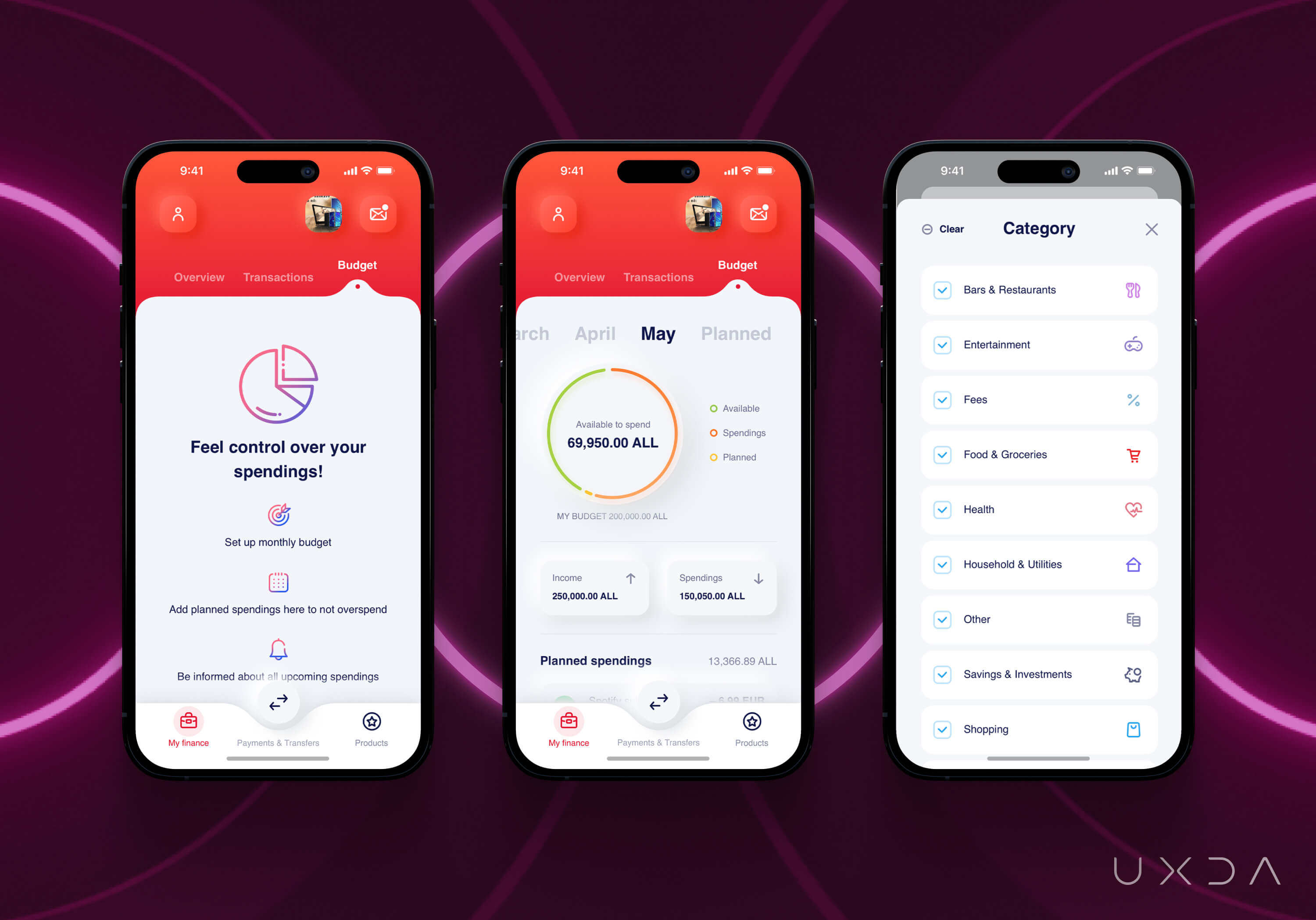
Using the transaction list as a foundation, we updated it based on user needs and incorporated additional insights and contextual information. The app now serves as a financial management companion, assisting users in managing and monitoring their monthly budget. A chart with color accents and depth effects is provided for quick updates on total income and spending, making it more visually appealing and interactive. By combining the chart with the transaction list and planned spending, users have a sense of control, clarity and security.
Digitizing Key Banking Functions for User Independence
In order to increase user engagement and encourage regular use of the app to strengthen the perception of the app as a financial companion, it was essential to shift user behavior. Previously, many functions could only be accessed by visiting a physical branch, resulting in long wait times and a heavy workload for bank tellers.
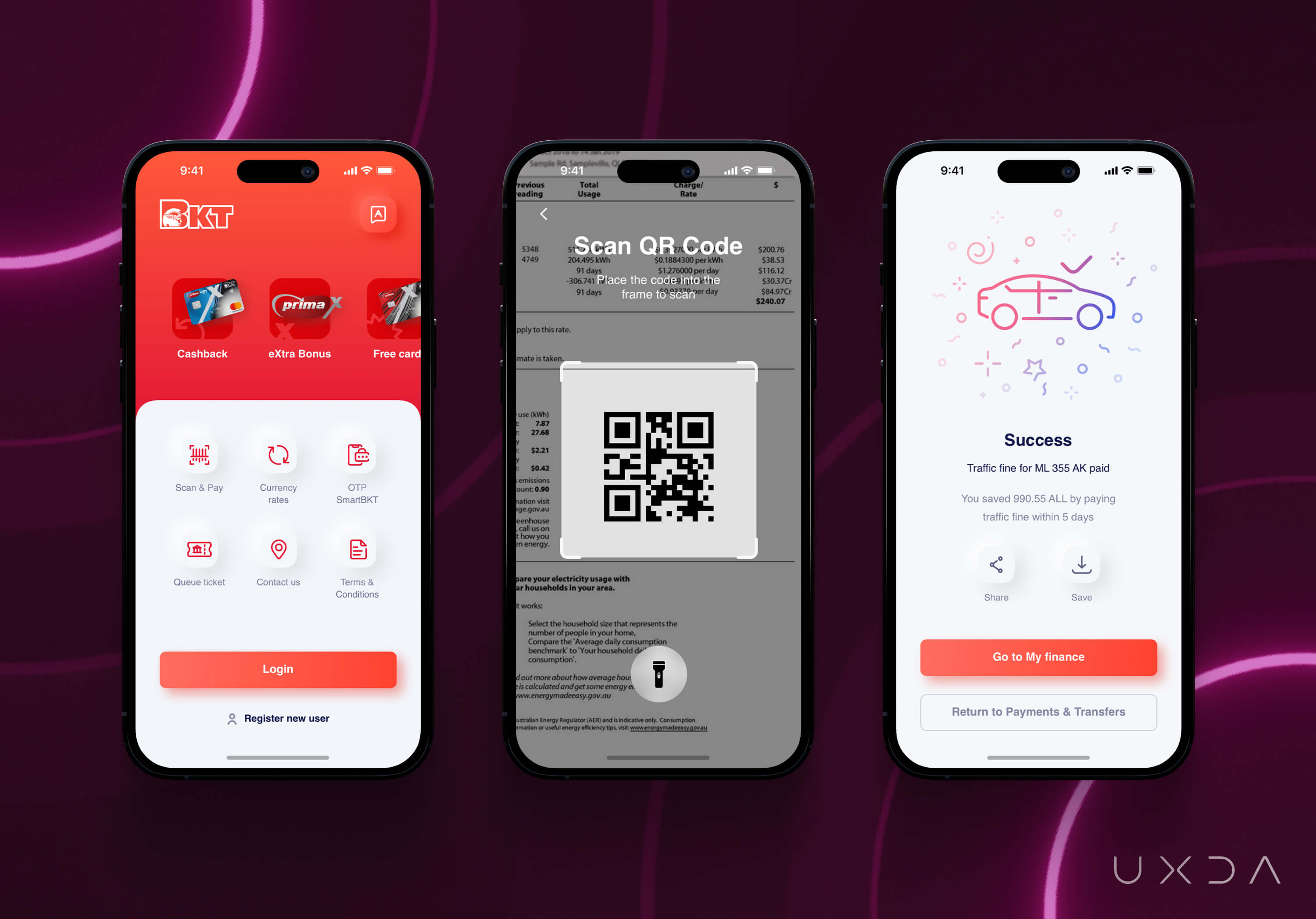
To alleviate this burden and improve the customer experience, BKT aimed to empower their customers to complete tasks independently through the app. By combining intuitive design, accessible functions and easily understandable information, users gained a sense of control and independence.
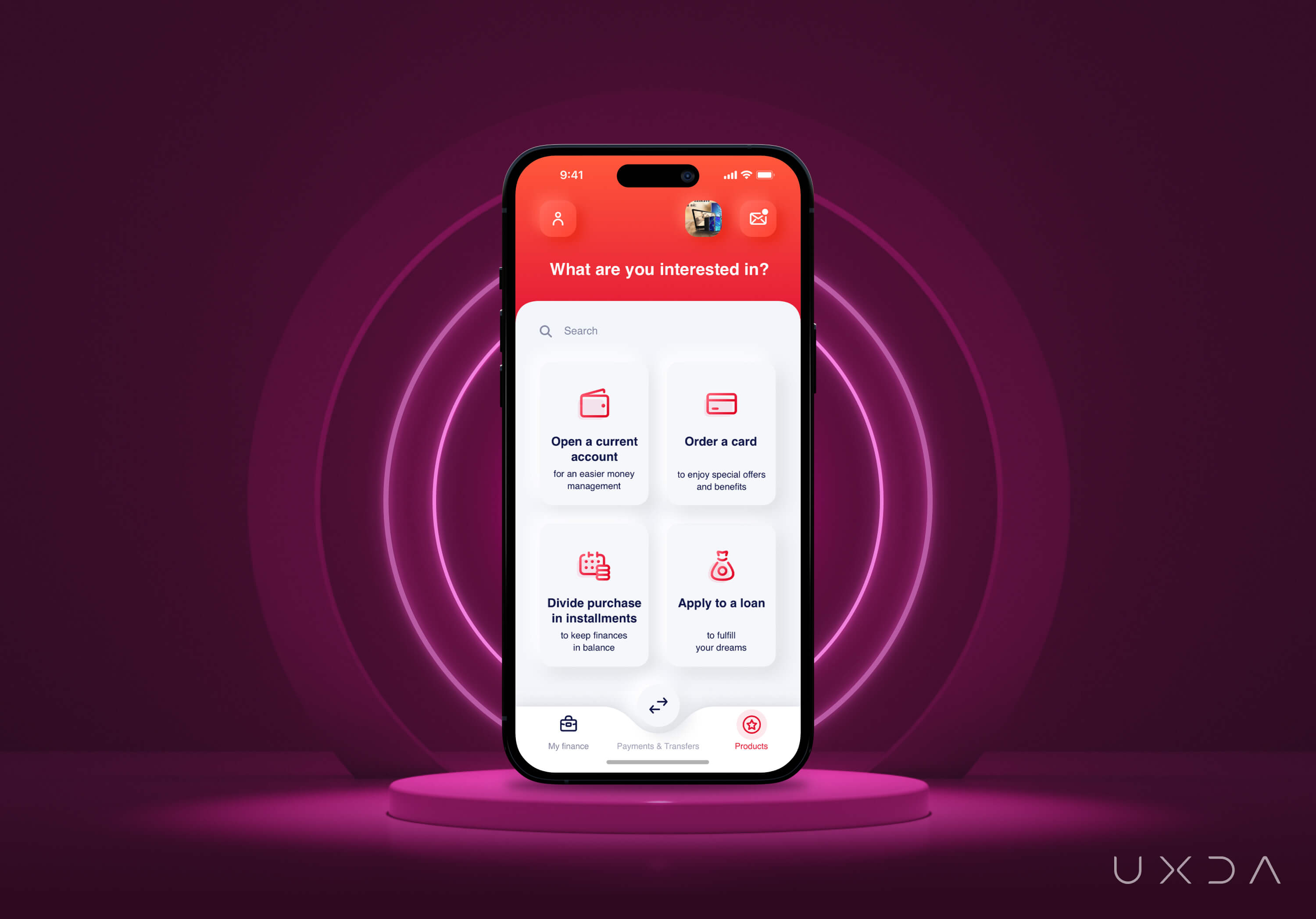
Users can now be more independent and open an account, order a card or apply for a loan without the help of bank employees or customer support. By turning the most popular functions from physical branches into a fully digital experience, BKT improved user satisfaction and reduced the need for customer support assistance.
UXDA Deliverables
- Stakeholders’ interviews
- Product strategy
- Product audit
- Contextual market analysis
- User interviews
- User personas through a JTBD framework
- Empathy map
- User journey map
- Scenario prioritization in red route map
- Information architecture
- User flow maps
- Wireframes
- Key design concept
- UI design prototype
- Product motion design
- Design system
- Usability testing
Takeaway: Established Banks Could Successfully Rethink Legacy to Evolve and Adapt
Embracing change in a large financial corporation can be a daunting task, but BKT demonstrated that even big, established 100-year-old banks can successfully update their legacy to keep up with the digital age. They recognized that the banking app was more than just a digital channel - it was a product in its own right. Therefore, they directed increased attention and funding to turn it into a key asset to execute the brand’s mission.
The bank's team was armed with courage and persistence to focus on the needs of modern customers and do their best to ensure an exceptional digital experience. By conducting extensive research and gaining deep insights into their users, the BKT team, together with UXDA, made structural and visual changes to the mobile banking dashboard, information architecture and flows, with the singular goal of improving customer satisfaction.
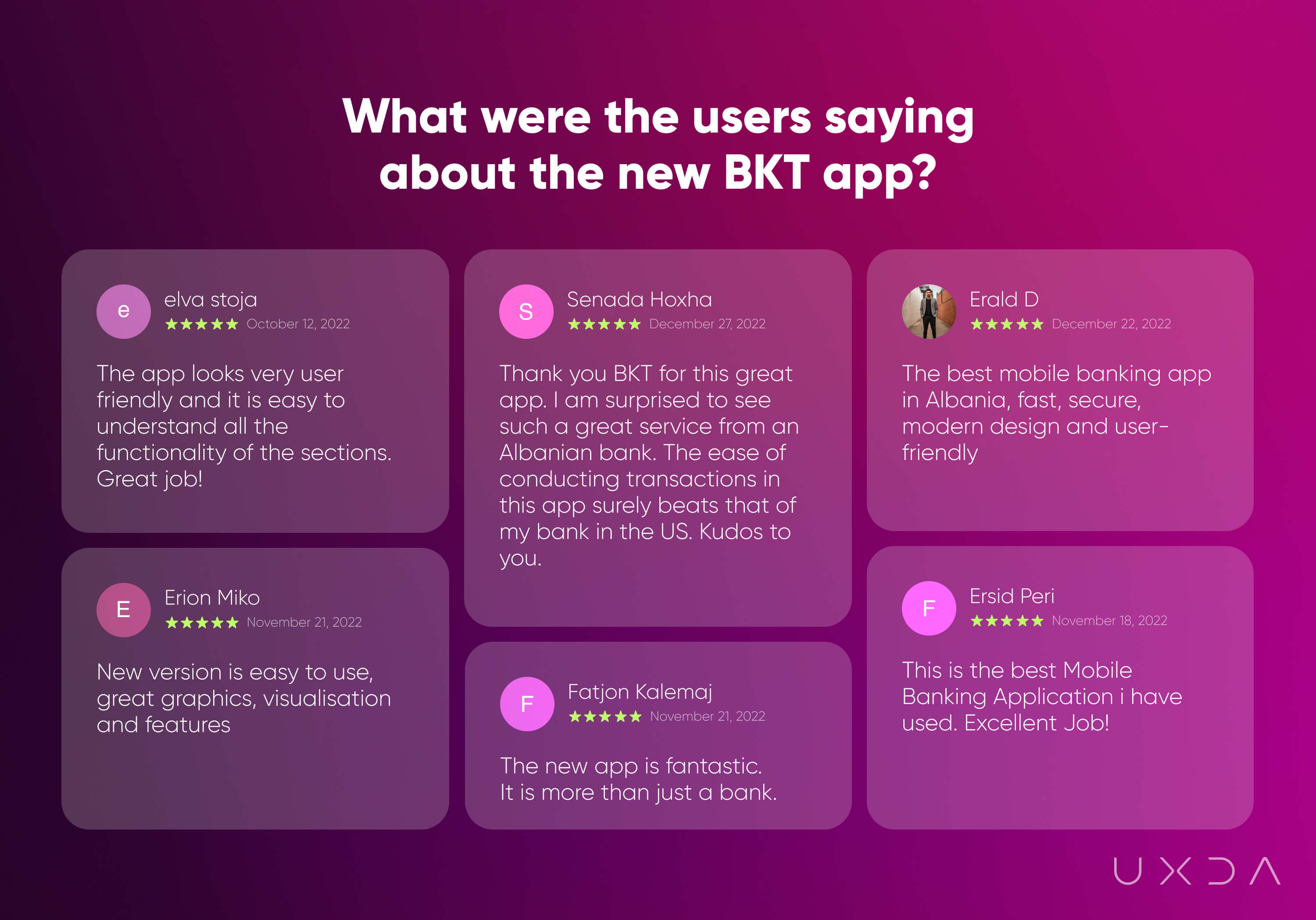
These changes not only improved BKT's market position and increased customer loyalty, but they also opened up UX design opportunities for them to transform business processes and increase the bank's customer centricity. In 2021, Banka Kombëtare Tregtare was recognized as “The Best Bank in Albania for 2021” at the Global Finance awards ceremony for the Best Banks in central and eastern Europe, and in 2023 received this award again.
The BKT success story proves that it is important for large banks to innovate and evolve in order to remain relevant in today's competitive financial environment.
The transformation of incumbent banks into digital innovators is like the process of turning a rough diamond into a polished gemstone. Just as a rough diamond is a diamond in the rough, an incumbent bank has the potential to be a valuable player in the financial industry, but it may need some refinement. Through digital transformation, these banks can smooth out their rough edges, refine their processes, and enhance their customer experiences, much like the process of cutting and polishing a diamond.
Just as a polished diamond shines brightly, a transformed incumbent bank can stand out in the industry and capture the attention of customers and investors alike. And, like a diamond's lasting value, a digitally transformed incumbent bank can provide long-term value to its customers and stakeholders.
Discover our clients' next-gen financial products & UX transformations in UXDA's latest showreel.
If you want to create next-gen financial products to receive an exceptional competitive advantage in the digital age, contact us! With the power of financial UX design, we can help you turn your business into a beloved financial brand with a strong emotional connection with your clients, resulting in success, demand, and long-term customer loyalty.
- E-mail us at info@theuxda.com
- Chat with us in Whatsapp
- Send a direct message to UXDA's CEO Alex Kreger on Linkedin


