Mauritius Telecom (MT), the largest telecommunications company in Mauritius, had the vision to ensure a powerful digital future for Mauritians. To achieve this, the MT team needed to expand their digital ecosystem by reinventing the existing my.t money app and transforming it into a digital bank. To open up new digital opportunities for the people of Mauritius, the MT team has moved beyond a regular service app and introduced the first financial Super App in Mauritian history. UXDA helped design an engaging and enjoyable digital platform that seamlessly integrates financial, telecommunications and lifestyle services in one place.
Client: Telecom Leader with the Mission to Take Mauritius into the Future
MT, established in 1992, is a leading provider of Information and Communication Technology (ICT) services in Mauritius. MT is owned by the Government of Mauritius and Orange S.A., and provides 1.3 million customers with fixed telephony, mobile, internet, TV and digital wallet services.
With a customer-centered mission, MT aims to modernize the islands of Mauritius Republic and make the lives of its 1.3 million inhabitants much more convenient and advanced through innovation and technology. As telecom leader MT uses its power to bridge a financial and payments technology gap. They launched the my.t money app in 2019, revolutionizing the payment sector and enabling users to send and receive P2P and QR code payments conveniently through a digital solution.
With total assets of 500 million USD and 2,338 employees, MT aspired to expand beyond telecom services and payments and become integral to Mauritians' daily lives. MT aimed to provide unseen world-class opportunities to its local clients and knew they needed a prime partner to achieve it. UXDA’s expertise in global financial services was exactly what they were looking for. We spoke the same language from the very start. Inspired by UXDA's super app concept, they were aiming high, and we were up to the challenge to enter the future with the first-ever Super App in Mauritius─a digital platform combining financial and lifestyle services into one comprehensive app.
Challenge: Transform Telecom Entity into a Digital Bank
To manage their financial and lifestyle needs, Mauritians were expected to switch between different apps, resulting in a fragmented user experience. Financial service users wasted significant time visiting physical branches to verify their identities just to open an account or recharge their phone airtime or mobile data packs. In addition, Mauritians struggled with complex payment forms and needed help to understand their financial situation and manage their upcoming payments.
To solve these issues, MT challenged UXDA to envision and redesign a digital my.t money platform as an integrated financial and lifestyle service ecosystem for Mauritians. They needed a super app that would upgrade the whole country. With such a major evolution of my.t money into a super app, MT aimed to empower Mauritians through a digital financial platform by transforming its own business from telecom into a digital bank. As a result of this digital strategy, MT planned to become the most beloved financial and lifestyle services brand in Mauritius, strengthening the brand's position and market leadership.
The UXDA team's task was to design a banking super app that accommodates various MT services without overwhelming users with too complex a flow, which often happens in feature-rich super apps. To achieve this, we had to explore, prioritize and validate hundreds of user scenarios to set the right priorities. Rich but well-balanced information architecture and a frictionless user journey were crucial to ensure easy access to essential everyday tasks while exploring multiple opportunities of the my.t money Super App. That required careful planning and continuous user testing and improvements throughout the user experience design process.
Solution: Game-Changer that Empowers Community
The UXDA team executed user research, design thinking and advanced financial UX design methodology to uncover users’ needs and pain points, and prioritize key users’ tasks related to finances and lifestyle needs. This resulted in a clear app architecture that facilitates seamless navigation and a delightful user experience by leveraging the app’s numerous features.
The my.t money Super App is designed as a game-changer for modern Mauritians to simplify their lives by offering an all-in-one platform that caters to their financial and lifestyle needs rather than juggling multiple apps and services.
Users may now enjoy a streamlined experience with features such as:
- Digital onboarding. MT is proud of implementing a time-saving digital self-registration for the app.
- Instant payments. Money transfers, QR code payments, bills payments and management, mobile data pack and airtime recharges are easily accessible in one place, providing full information about transactions.
- Personal financial management. Monthly budget management and tracking where money is spent, digital chit funds and savings pots are offered to motivate users to save toward a goal and be in control of their financial situation.
- Lifestyle and partner services. Benefits and special offers from partners and applications from MT (e.g., Traffic Watch, my.t Weather, my.t Home, MUGA) bring more excitement from working together with MT.
- Rewards and games. A loyalty platform, in which users earn points and can redeem products and services from MT and partners, as well as daily games with the chance to win gifts, adds more joy and fun to the service.
The purpose of the my.t money Super App is to provide a cutting-edge digital experience that makes Mauritians more productive and frees up time for the things that matter most to them, like connecting with loved ones and enjoying life's pleasures.
UXDA’s financial UX design approach helped to realize MT's brand mission to create an advanced digital platform that empowers the Mauritian community and transforms MT into a digital bank. Let's find out how it worked.
Approach: Shaping a Digital Financial Future in Mauritius
Before the design process, there was a comprehensive synchronization of the digital strategy with the client and carrying out intensive research on UX and engineering. Given MT's ambitious plans to provide a digital financial platform to the entire population of Mauritius, our team analyzed the basic user needs and use cases. The habits, pain points and jobs-to-be-done of various user segments were crystallized into three key personas understandable to the development team.
Given the huge functionality of the Super App, it was essential to prioritize all user scenarios to identify the most frequent and valuable use flows, guaranteeing quick and easy user access to key solutions.
To provide an intuitive and seamless integration of multiple products within a single digital platform, a user journey map was developed that outlined the relationship between business goals, user scenarios and app features. Based on the journey map, together with the MT team, we built a progressive plan for new feature implementation in the next few years and took this into account when creating the application architecture to ensure that it would be scalable to meet future growth plans.
Drawing inspiration from industry giants such as Apple and Tesla, MT set forth the expectation that the design had to be nothing less than innovative with a sense of futurism, reflecting the very essence of their corporate DNA.
To create an unprecedented solution with an innovative twist, the UXDA designers embarked on an exploratory journey, seeking inspiration and creating several design variations, all with the ultimate goal of unearthing a concept that would truly showcase the unique qualities through an innovative feel of the Super App and forge a profound emotional connection between users and the brand.
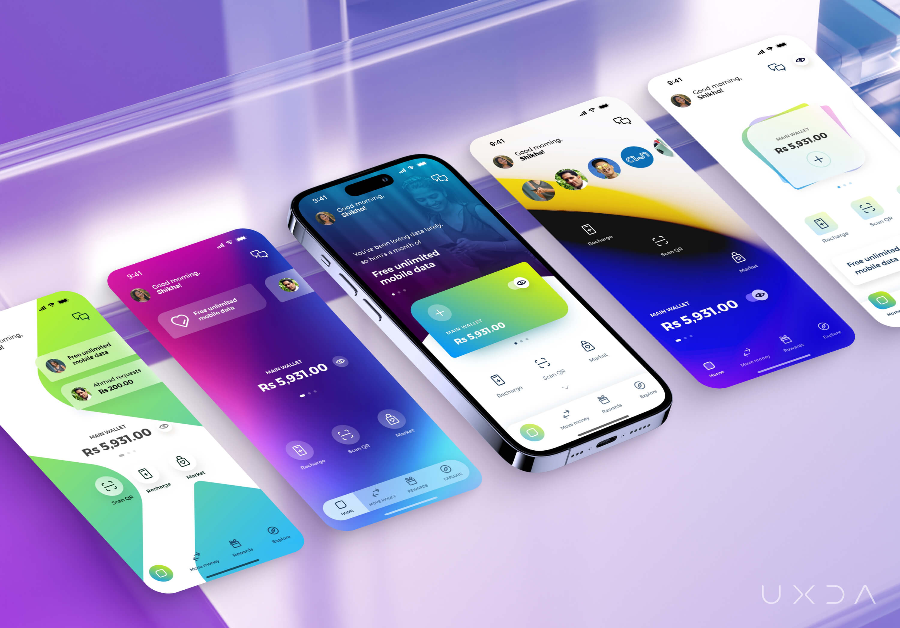 During multiple design iterations with the MT team, we came up with the final version of the app that inspired everyone on the MT team, making them excited to launch this new design vision. The my.t money Super App already attracted over 300,000 users and 200 partners in Mauritius, providing enhanced convenience and a delightful experience for users.
The my.t money Super App has a fun, energetic and modern vibe that appeals to youth while embodying the forward-thinking mentality of the company, providing the convenience of a payment solution along with the engaging experience of a social network, ultimately opening up a world of possibilities.
Dashboard Designed for Privacy, Personalization and Social Impact
By fusing the MT team's extensive experience in the telecommunications industry with their unwavering dedication to the people of Mauritius, and UXDA's specialized knowledge in UX design, we were able to conceive a product that effectively addressed the pain points of Mauritians while also propelling MT's pioneering mission to deliver future-proof digital solutions.
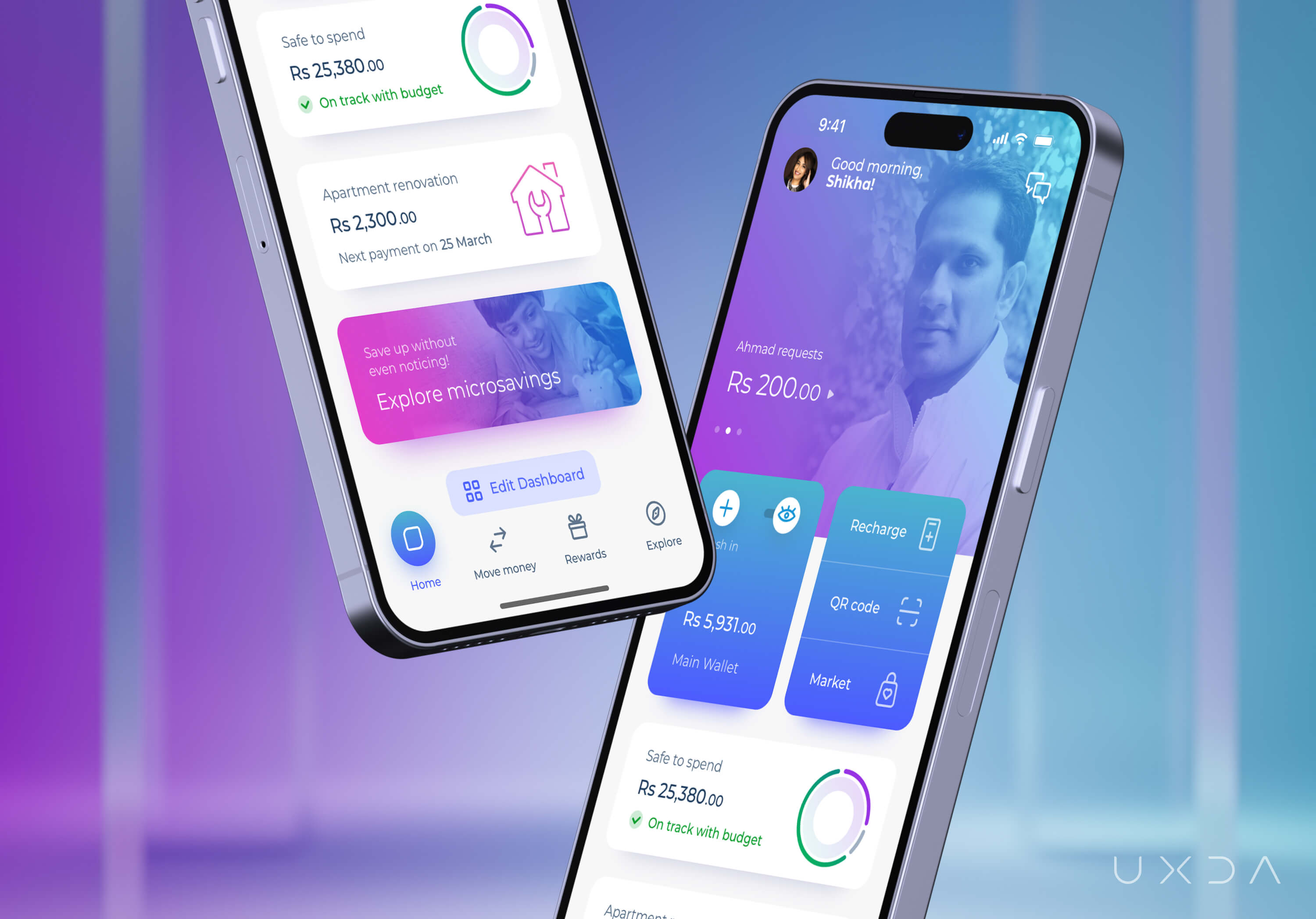
The Wallet, a vital component of the dashboard, allows users to easily monitor their account balance and conveniently add funds whenever needed.
Privacy is a crucial concern for users, and we addressed that in the design approach. The aim was to ensure a safe and secure experience for users, providing the option to hide sensitive information.
We took a unique approach when designing the Super App dashboard to differentiate the my.t money Super App from other apps in the region. Instead of using a standard grid with many functions on one screen, we allowed users to personalize their experience by fully customizing their own dashboards.
Users can change the main tiles and set quick access to actions they often use, such as recharging and scanning QR codes for payments. This approach ensures that the app is customizable for every user's needs and preferences, providing a tailored experience with access to the information and functions that are most important to their daily lives.
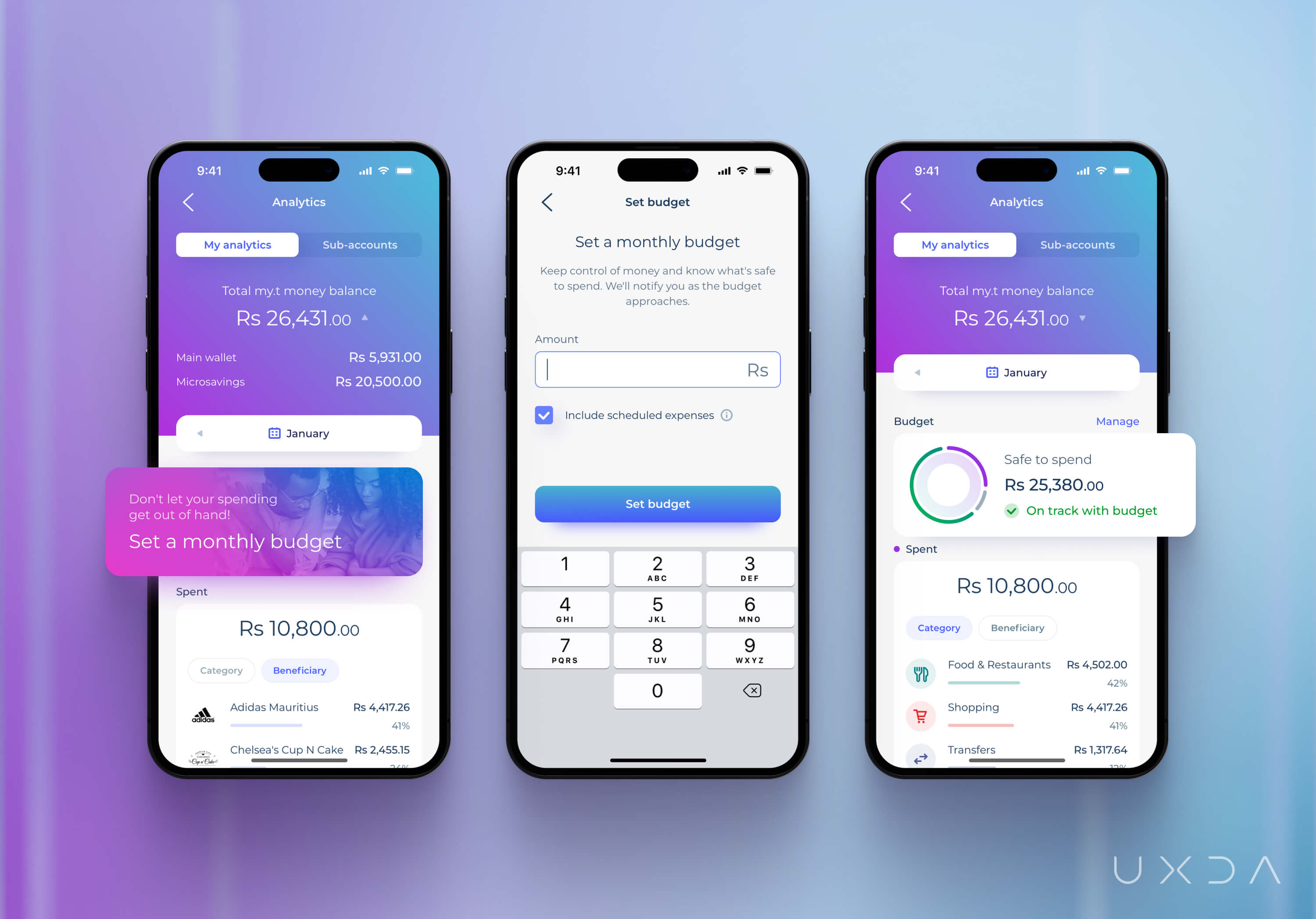
Through user research, we discovered that the people of Mauritius often struggle with managing daily expenses and budgets. To address this challenge, MT incorporated a Personal Financial Management section, enabling users to set and follow up monthly budgets, track spending and manage their children's Wallets. This empowers users to control their finances and improve their financial well-being.
Putting Together Super App Functionality From Scratch
The my.t money Super App implemented numerous innovative features to enable a flawless experience. Among these features, the digitalization of onboarding and chit funds in Mauritius marks a groundbreaking milestone, as these functionalities were introduced for the first time in the country.
Fully digital onboarding
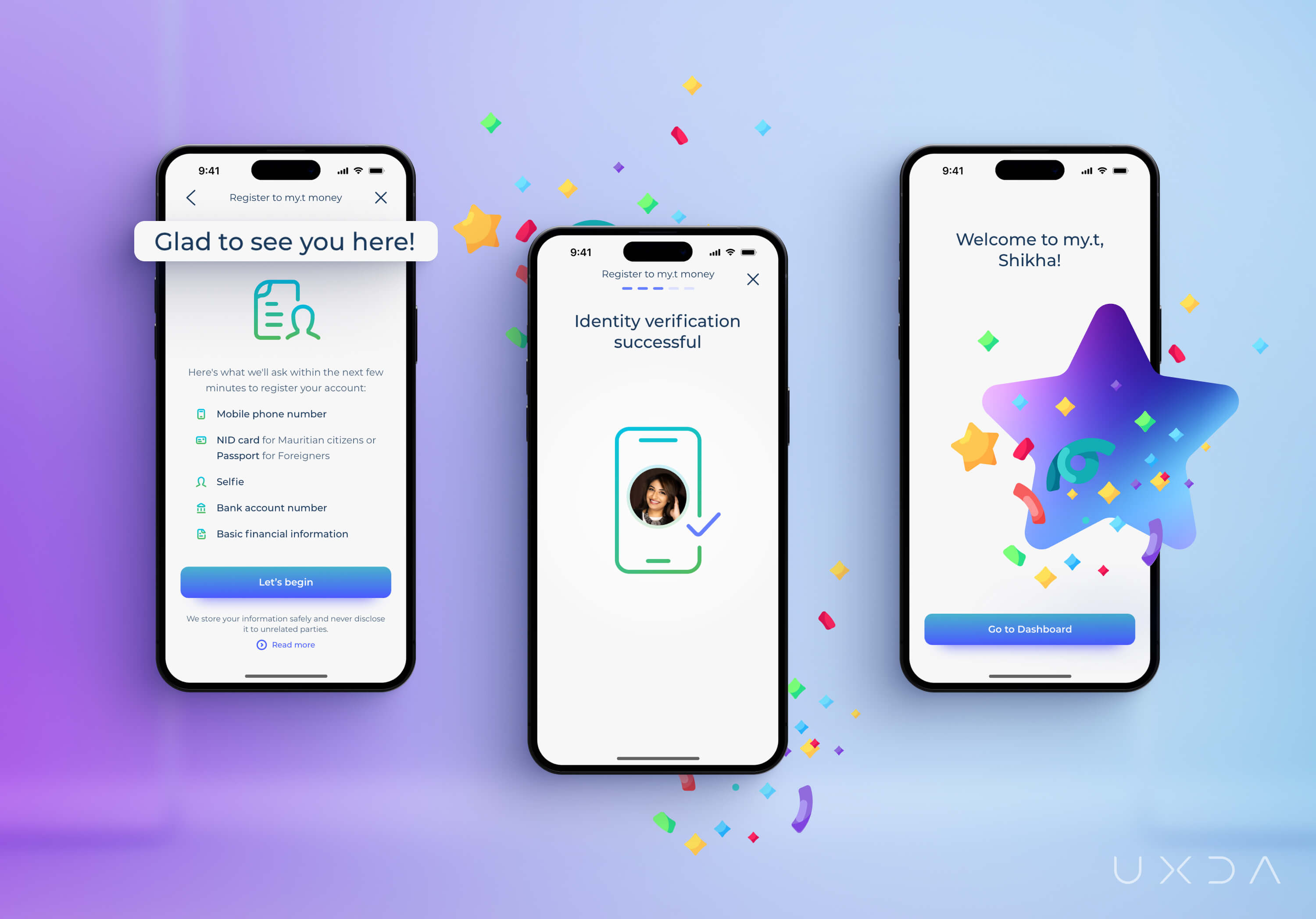
The app onboarding process for new users was created as a comprehensive digital experience, eliminating the need for customers to visit the MT shop in person to activate their accounts. Notably, the my.t money Super App is one of the first payment solutions in Mauritius in which onboarding can be done online at a time and place convenient for users.
Cash-in
The my.t money Super App introduced a new feature - topping up a Wallet. By linking a bank account, users can now instantly add funds to their Wallet, enabling them to make payments or purchases using the my.t money app. This marks a significant improvement because users previously had to wait up to three days for a regular bank payment to be processed.
Recharge
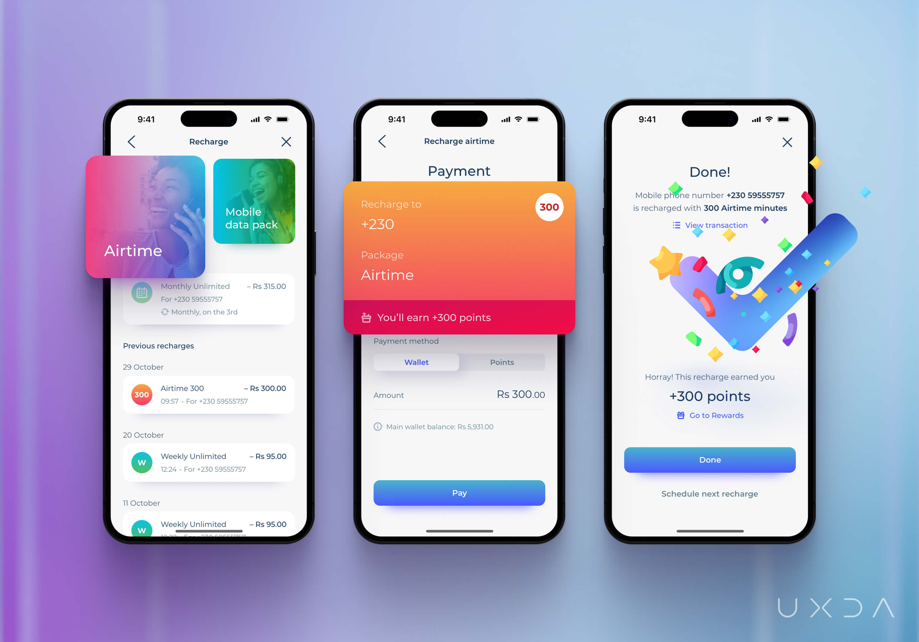
MT has taken steps to address common issues related to mobile recharge. Previously, users often chose to visit a store in person to recharge their airtime or data, as they did not totally trust the digital alternative, which took some time for a recharge to be usable, and it was not possible to track previous purchases.
In contrast, the new app solves these problems, and users can understand the package they are buying, view their past recharges, schedule automatic recharge and use reward points earned through the app's reward program and games. In addition, users earn reward points for every purchase made, thereby increasing their loyalty and enhancing their overall experience. As a result, users can see and manage all recharge information and plan next recharges in a seamless way.
Interbank transfer
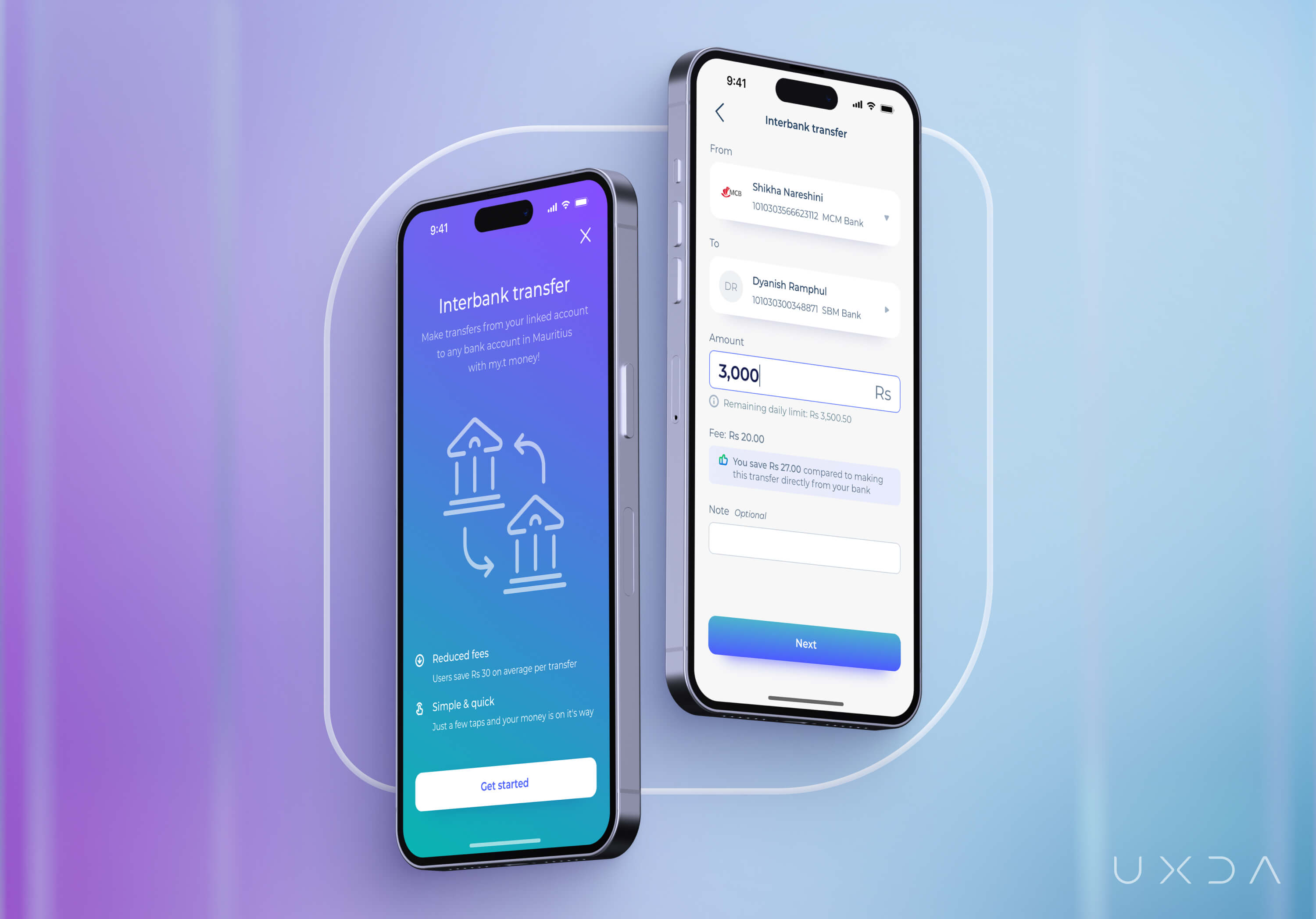
With the latest update to the my.t money app, users can link their bank accounts and transfer money to other accounts while enjoying lower commission rates compared to those offered by traditional banks. That has provided users with an excellent opportunity to save money on transfer fees.
Bill payments
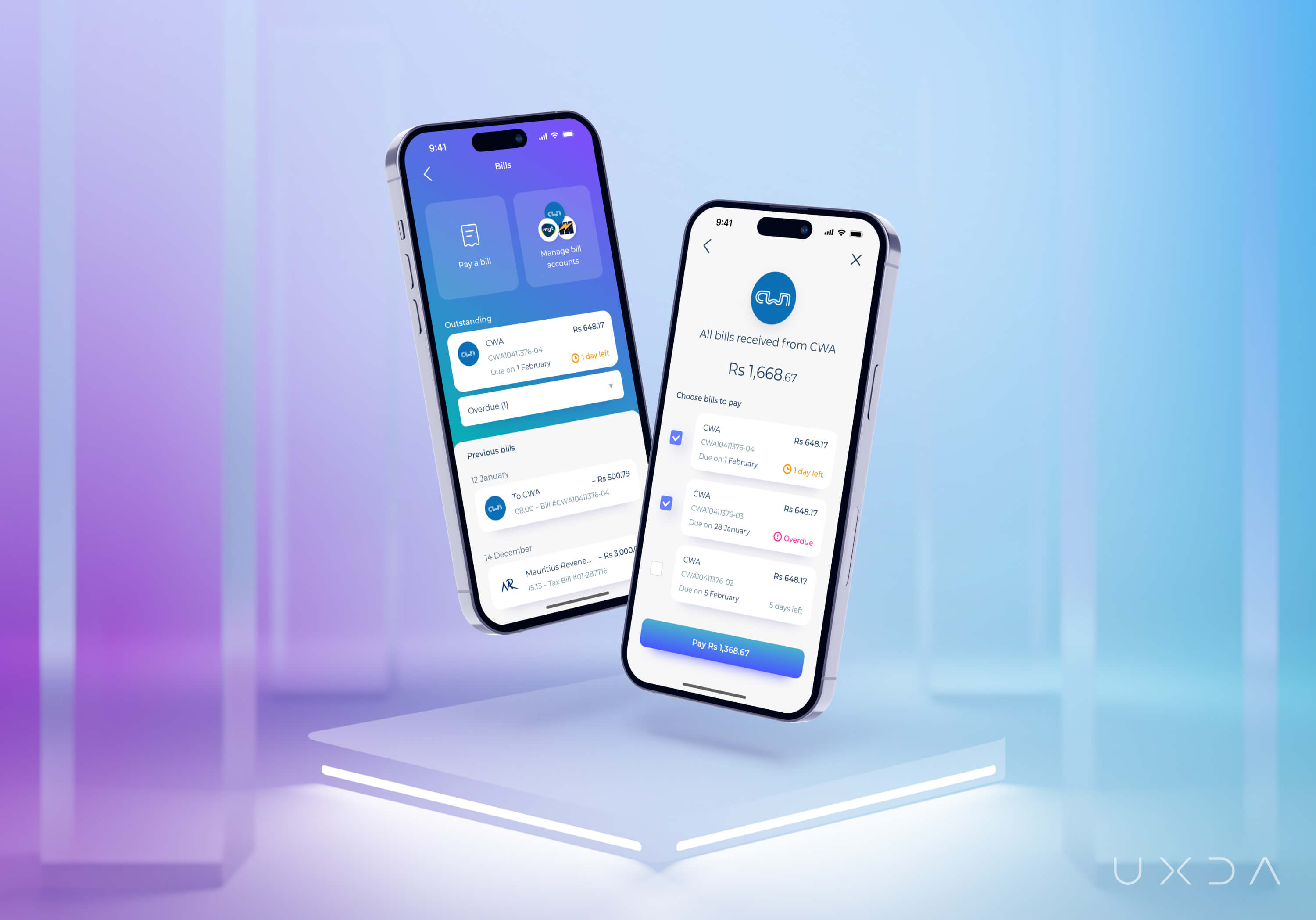
The my.t money Super App introduced a new feature that allows users to receive their utility bills and pay immediately or schedule payments for later, all within the app. Now users have greater transparency and a better understanding of their household budget. Users can plan expenses ahead and enjoy greater financial flexibility.
Microloans
MT integrated micro loans into the my.t money Super App, providing users with access to a comprehensive view of their credit ratings, along with valuable tips on how to improve them. Furthermore, users can easily review their existing loans and receive guidance on how to repay them quickly, promoting sound financial management. That allows users to borrow money while making informed financial decisions and achieving greater financial stability.
Chit funds
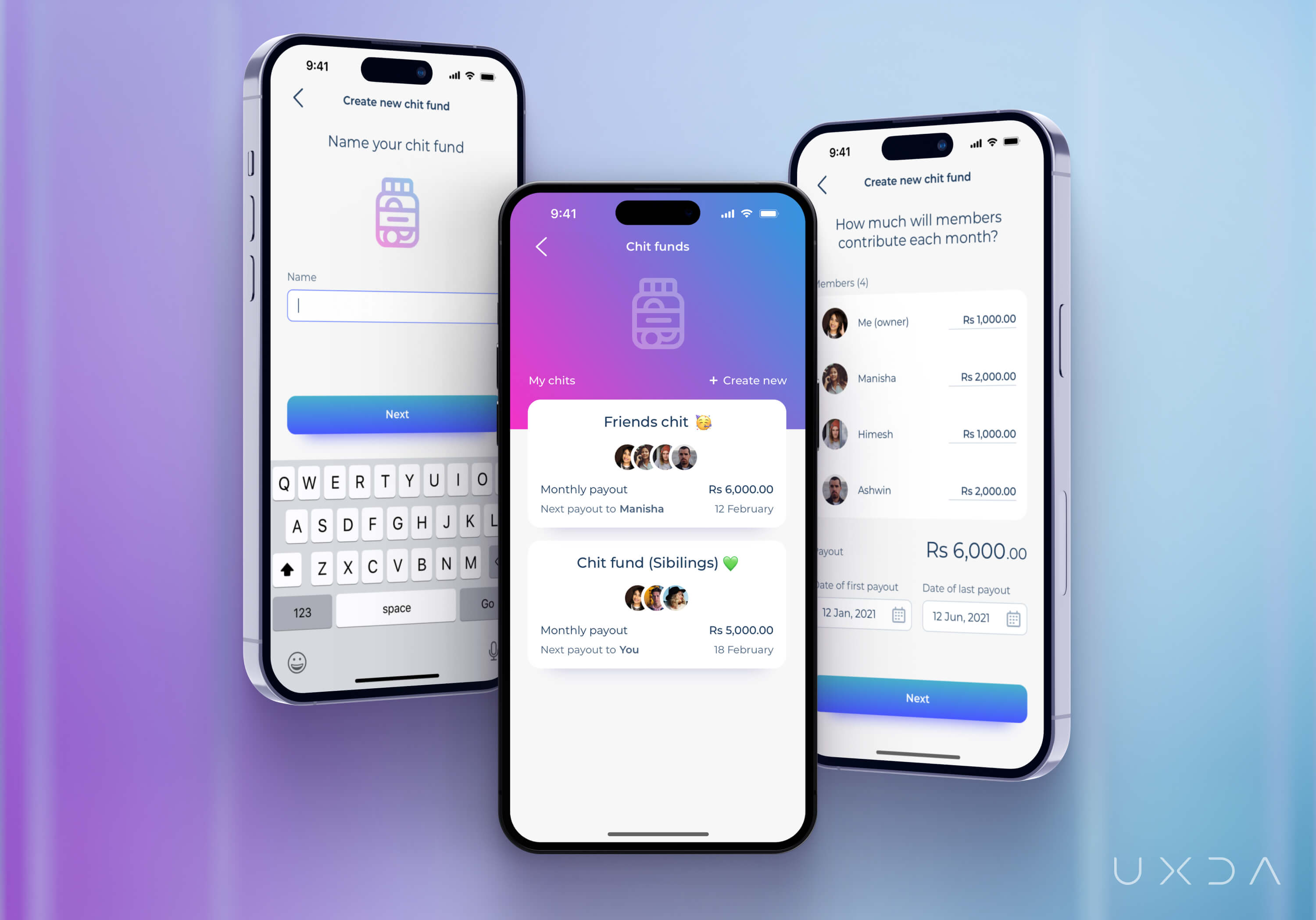
In Mauritius, it's a common practice for friends to form chit funds, in which each member contributes a fixed amount of money each month, which is then lent to someone in need. However, banks and apps in the country didn't offer this service digitally. MT saw a great opportunity, so we created a digital solution that allows users to save and share collective savings with friends, providing more transparency about money flow between savers, thereby encouraging saving.
Boosting user engagement: gamification and rewards
The MT team wanted to change the perception that financial management is tedious and complicated by infusing the my.t money app with a sense of delight and joy through gamification and rewards. The goal was to encourage and motivate users not only to use the app for payments or mobile recharges but also to discover other features available and make the my.t money Super App a daily source of enjoyment and satisfaction.
We explored different ideas and adopted gamification and rewards features accompanied by vibrant animations to create an even more enjoyable experience. We aimed to increase users' interest and participation, making the app and the brand recognizable and memorable for users.
We implemented a novel feature, allowing users to earn points, discounts and various rewards by shaking their phones to add liveliness and dynamics to the user experience. The design approach involved using interactive animation to create an engaging and intriguing interaction that provided a brief break from daily stressors and helped users relax by interacting with the app.
Finding Middle Ground During the Development Process
When MT first approached UXDA, they had already enlisted developers to work on the project. The developers had proposed a standardized approach for the super app, using a grid-based dashboard with icons leading to super app features. While this was a quick and easy solution, the MT team felt it didn't reflect the brand's innovative spirit. They trusted UXDA to advocate for the users and push the boundaries of what was possible.
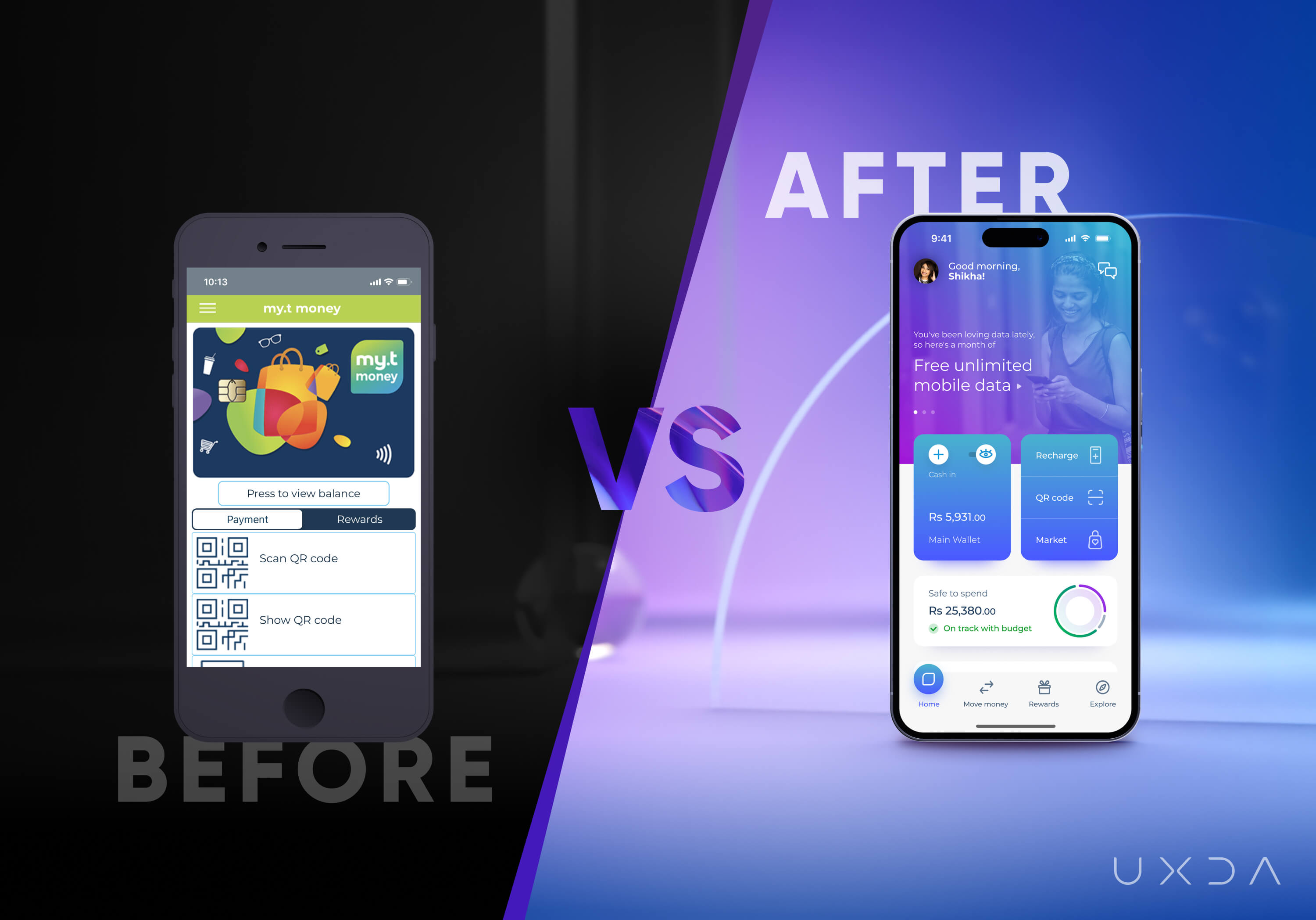
The UXDA team worked closely with the developers throughout the project, leveraging the team’s distinct skill sets to create a final product that balanced MT's vision, user needs and technical feasibility. The planning was critical in ensuring that the work on the user flows and design was aligned with developers' priorities, allowing them to do development work in parallel with the design process and use their time efficiently. UXDA assisted and challenged developers to find the best solutions to ensure that the final result met users’ needs and the high standards MT had set for their product vision.
UXDA Deliverables
- Stakeholders’ interviews
- Product strategy
- Contextual market analysis
- User personas through a JTBD framework
- Empathy map
- User journey map
- Scenario prioritization in a Red route map
- Information architecture
- User flow maps
- Wireframes
- Key design concept
- UI design prototype
- Product motion design
- Design system
Takeaway: Chasing Ambitious Goals Requires Reducing Friction
The my.t money Super App is an excellent example of how a company can keep evolving by developing innovative ideas and making their customers’ lives easier. MT started as a telecommunications company but now provides the first Super App in Mauritius.
Users no longer have to switch between apps or wait in lines to manage their finances and lifestyle-related matters. They can do it frictionlessly with the my.t money Super App. MT is not stopping there-it aims to become a digital bank.
Mauritians can enjoy the Super App that is always with them for all of their significant financial needs, which delights users with even more opportunities that bring value and benefits to their daily lives. MT’s customers have their own personal digital companion in their pockets for their unique daily life situations.
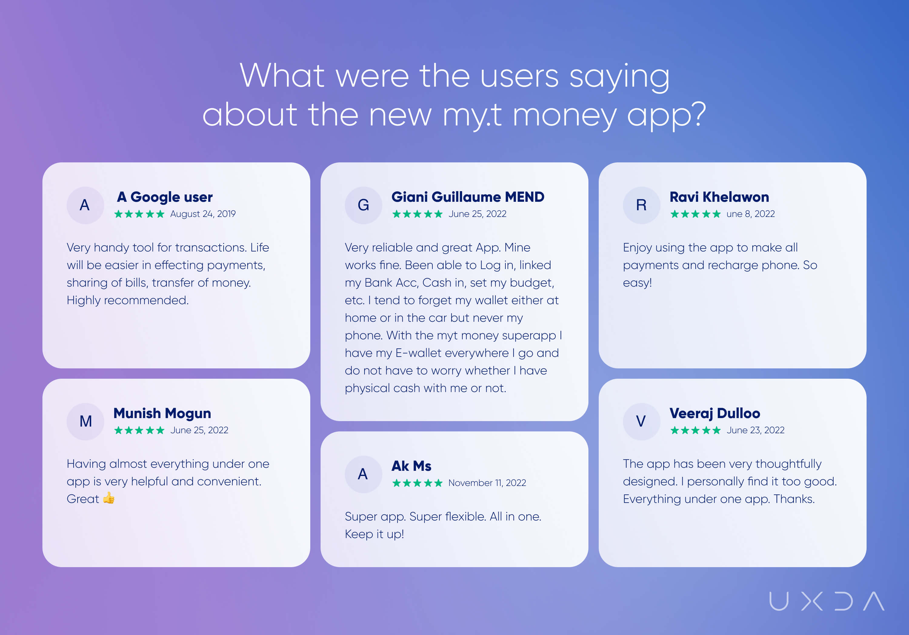
To move forward with such ambitious goals, the government-owned telecom corporation needed to eliminate friction in the following aspects:
1. Focus on personalization instead of features to enhance the experience in the Super App
One of the major challenges facing super apps is their feature-heavy nature, which can overwhelm users and complicate navigation. This issue often arises due to a company's focus on revenue at the expense of user needs and value creation. To stand out in a crowded marketplace and drive growth, companies must prioritize the user experience.
At MT, we conducted comprehensive UX research to identify users' pain points and map the user journey with MT's innovative spirit in mind. By prioritizing personalization over features, we developed a super app that places users at the forefront. As a result, the my.t money Super App has many features, but they are tailored to users' specific needs and preferences. The result is a seamless and frictionless user journey that serves as a valuable companion for daily needs, enhancing the Mauritians’ digital experience.
2. Effective collaboration between designers and developers is essential for achieving project goals
Collaboration among teams ensures that designs are created with technical feasibility in mind and that the development process is well-supported through thorough planning and communication.
By fostering a collaborative and frictionless environment between these two teams, we can promote successful outcomes and avoid potential roadblocks that may arise during the development process.
3. Innovation and improvements as key factors for long-term growth
The team's clear and unified vision of the required digital innovations and improvements ensures synergy and friction-free collaboration for long-term growth efforts. The my.t money Super App story demonstrates how strategic design thinking can transform traditional financial experiences and enhance customer loyalty.
By considering short and long-term goals, companies can create scalable and effective solutions that distinguish them from competitors and position them for lasting success.
Discover our clients' next-gen financial products & UX transformations in UXDA's latest showreel.
If you want to create next-gen financial products to receive an exceptional competitive advantage in the digital age, contact us! With the power of financial UX design, we can help you turn your business into a beloved financial brand with a strong emotional connection with your clients, resulting in success, demand, and long-term customer loyalty.
- E-mail us at info@theuxda.com
- Chat with us in Whatsapp
- Send a direct message to UXDA's CEO Alex Kreger on Linkedin


