It took six months for the Bank of Jordan’s mobile banking app to go from a 2.8 to 4.7 star rating on Google Play. How? By teaming up with UXDA to create a comprehensive UX transformation. This changed the app dramatically for millions of customers, making Middle East banking more accessible and convenient than ever before. In a step-by-step UX case study, we guide you through this unique digital transformation that completely changed the way so many people view their banking.
Digital Transformation in Middle East Banking
In the last couple of years, there has been of a rapid Middle East banking digitalization in the region. Many huge and influential market players have launched new mobile banking apps for their retail customers. One such success story comes from our client, a well-known and respected Middle Eastern bank─the Bank of Jordan. Through a UX transformation, they have become one of the most dynamic pacesetters of the whole Middle Eastern banking digitalization. As the satisfaction rates of their clients have steadily grown since the launch of the new app, we are eager to share this victory story with our readers to demonstrate the huge impact user-centricity has on the success of digital banking.
Problem: Frustration Caused by Complexity
The initial Bank of Jordan (BOJ) app had quite a wide range of functions to offer its customers. Unfortunately, this often can become a problem. Over-featurizing confused BOJ's users, and they ended up desperate because of the inability to perform even simple frequently used actions like reviewing their checking account balances.
Due to complexity and information overload, users weren't able to use the mobile banking app to its full potential. In fact, customers had to go to a banking branch to do simple, everyday operations like bill payments, even though they could easily have done it through the app.
Users felt disappointed and frustrated while managing their own money. The mobile banking app caused many questions for the customers that they weren't able to sort out by themselves. As a result, there were plenty of dissatisfied clients, angry about having to spend unpredictable waiting times at the branch and getting robbed of activities that were more important in their lives.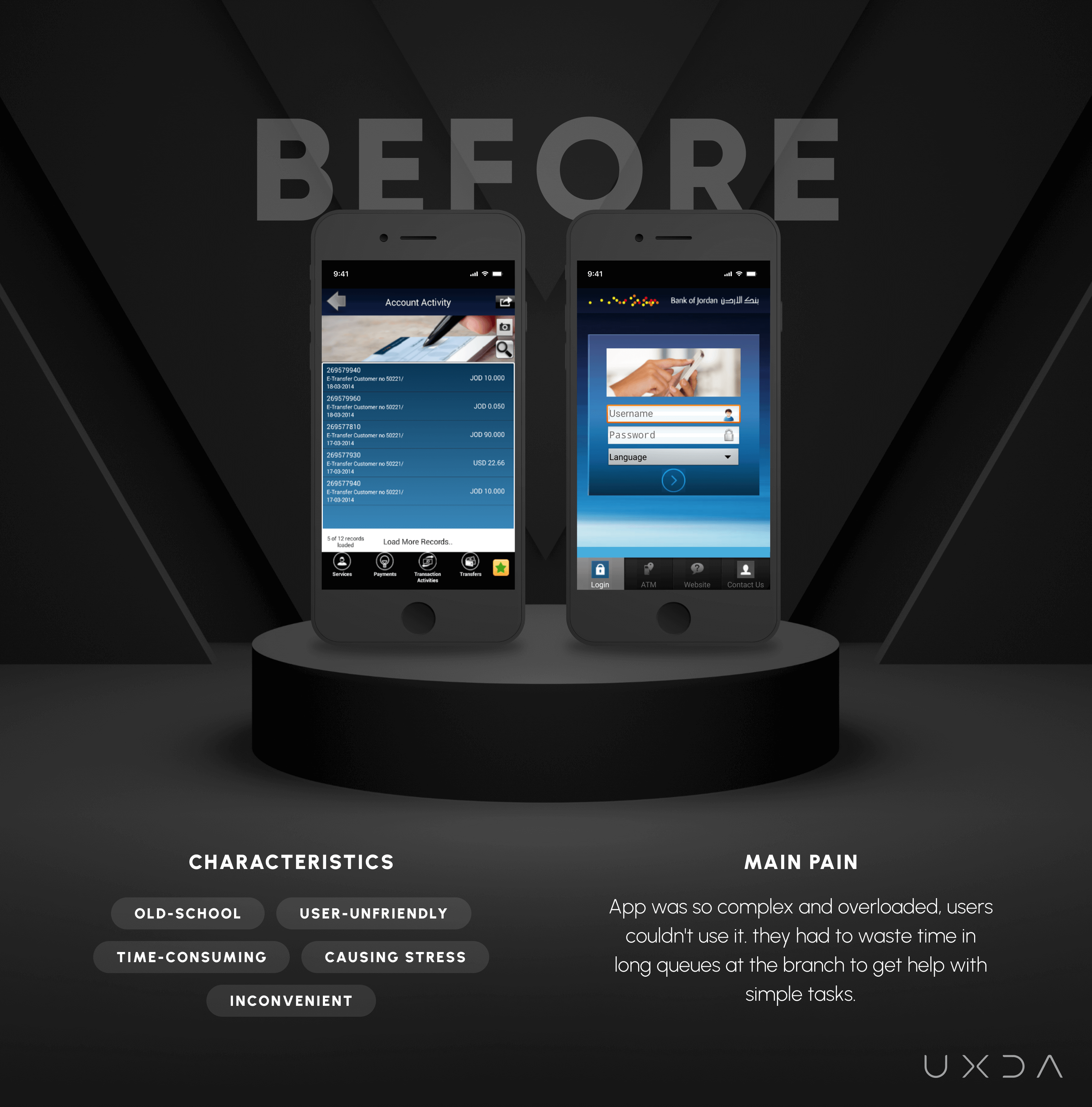
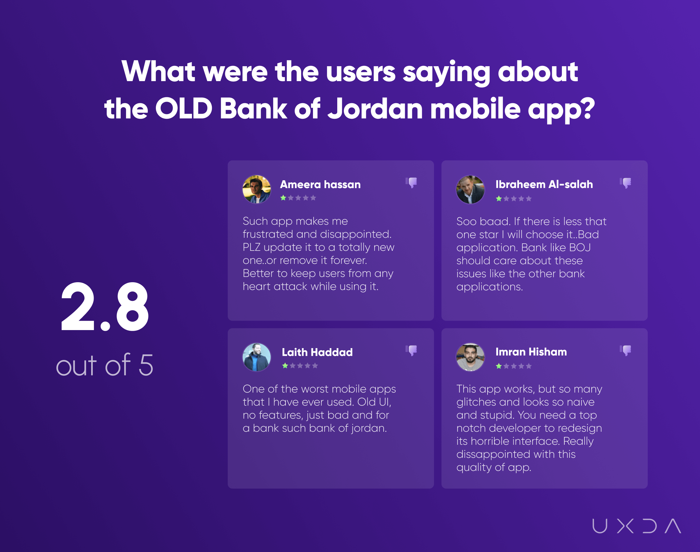
In addition, the app looked and felt outdated and didn't fulfill the users' expectations on how modern Middle East banking should look. The app was letting bank customers down, though it should've done quite the opposite ─ support, assist and ease the daily financial lives of its users.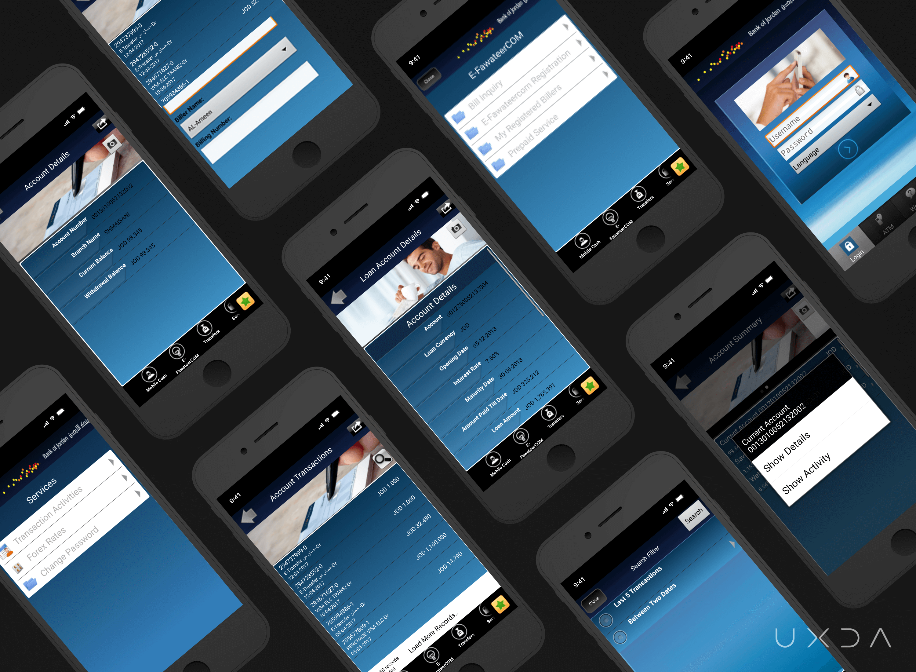 The BOJ initial app's Google Play rating was 2.8 stars out of 5. People were excessively complaining about its complexity, outdated look and overall inconvenience. If we take a look at the user reviews we have saved from Google Play, we see that users share their frustration with words like “PLZ update it to a totally new one” or “remove it forever.” ”Better to keep users from a heart attack while using it” or “Soo baad. If there is less than one star I will choose it.”
The threat was rapidly growing─the more dissatisfied the users became, the more willing they were to switch to another bank.
Challenge: Mobile Banking App Instead of a Branch
The Bank of Jordan came to us eagerly to majorly improve the way its customers managed their personal finances through the mobile banking channel.
BOJ aimed to make the new app 100% user-friendly so that it would be easy to use and understand. The goal was to keep their current customer base from leaving, as well as to attract new clients. BOJ had created the functional foundation of their initial mobile banking app according to the Product Value Pyramid, but they realized it's not enough to satisfy the users and compete with their rivals.
Bank of Jordan's aim was to create a bright mobile app that would stand out among the competition with its looks and, most importantly, offer ease of use and a great customer experience. They realized the growing need to provide users with easily manageable finances whether it's checking the account balance, making bill payments or transferring money from anywhere, even on the go.
They wanted to make it possible for customers to perform as many operations as possible without the necessity of going to the banking branch. This way, they would embrace the power of mobile banking to prevent the inconvenience of so many people who were forced to visit the banking branch on a regular basis.
To achieve this, it was time to explore the higher levels of the Product Value Pyramid and make the mobile app usable and aesthetic.
Process: Bank App Redesign Through Exploring and Solving User Problems
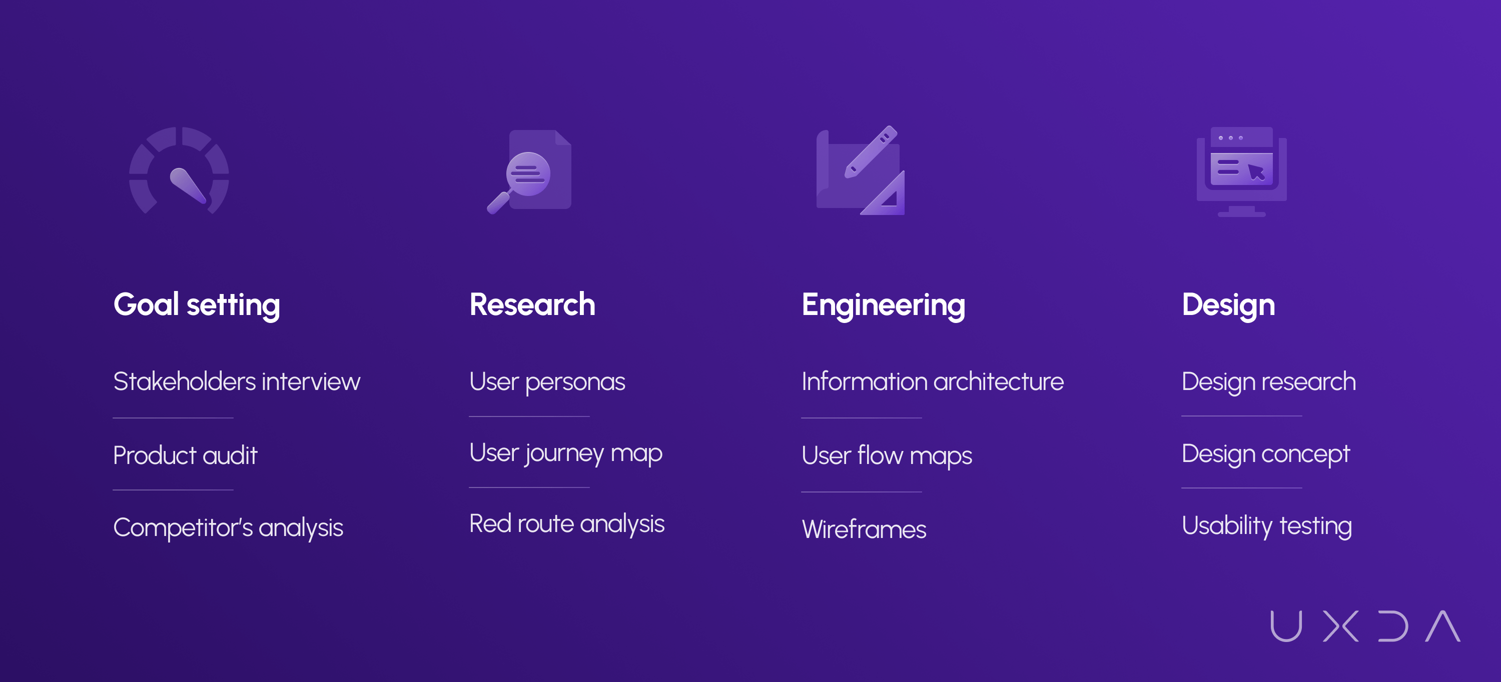
The foundation of redesigning Bank of Jordan app lies in the UXDA's unique Financial Design Methodology that consists of the Product Value Pyramid, Design Pyramid and the Experience Pyramid.
The unique Financial UX Design methodology was developed over a period of 17 years and has already proven itself by ensuring success for more than 70+ financial institution digital products in 30+ countries worldwide.
Identifying the Usage Context and Motives
To redesign bank app with an aim to enhance mobile banking user experience, we had to identify why and how the users were using the existing Bank of Jordan's app.
First, we needed to identify the main user personas. For example, one of them was a mother of two who juggles hard work with taking care of her family. This way, we were able to empathize with this woman, discover her most important and frequent tasks on the banking app and explore why those are important for her, how she feels about them and what her behavioral patterns were.
Based on the concept of the Jobs To Be Done framework for each persona profile, we prepared a list of scenarios. How would each of the personas use the new mobile banking app and what would the context of usage be? Why would the persona perform a specific scenario, under what circumstances and when? To give you an example, here are some of the key scenarios for the personas we crystalized through the process:

The JTBD framework allowed us to find out what kind of tasks the BOJ mobile banking users would “hire” the application for. No one opens the app on their phone just to look at it. Every customer has a goal in mind that he or she wishes to achieve in the most pleasant, quick and effortless way possible.
Besides, often the user doesn't have time or patience to search the app for the right function he or she needs. What the customer wants and expects from the mobile banking app is to immediately get a solution without any additional thought or cognitive load.
UX Engineering to Ease and Improve the User Journey
The previous step formed a clear picture of the problem-solution-cycle that the BOJ app users go through, including the usage context, motives and actions.
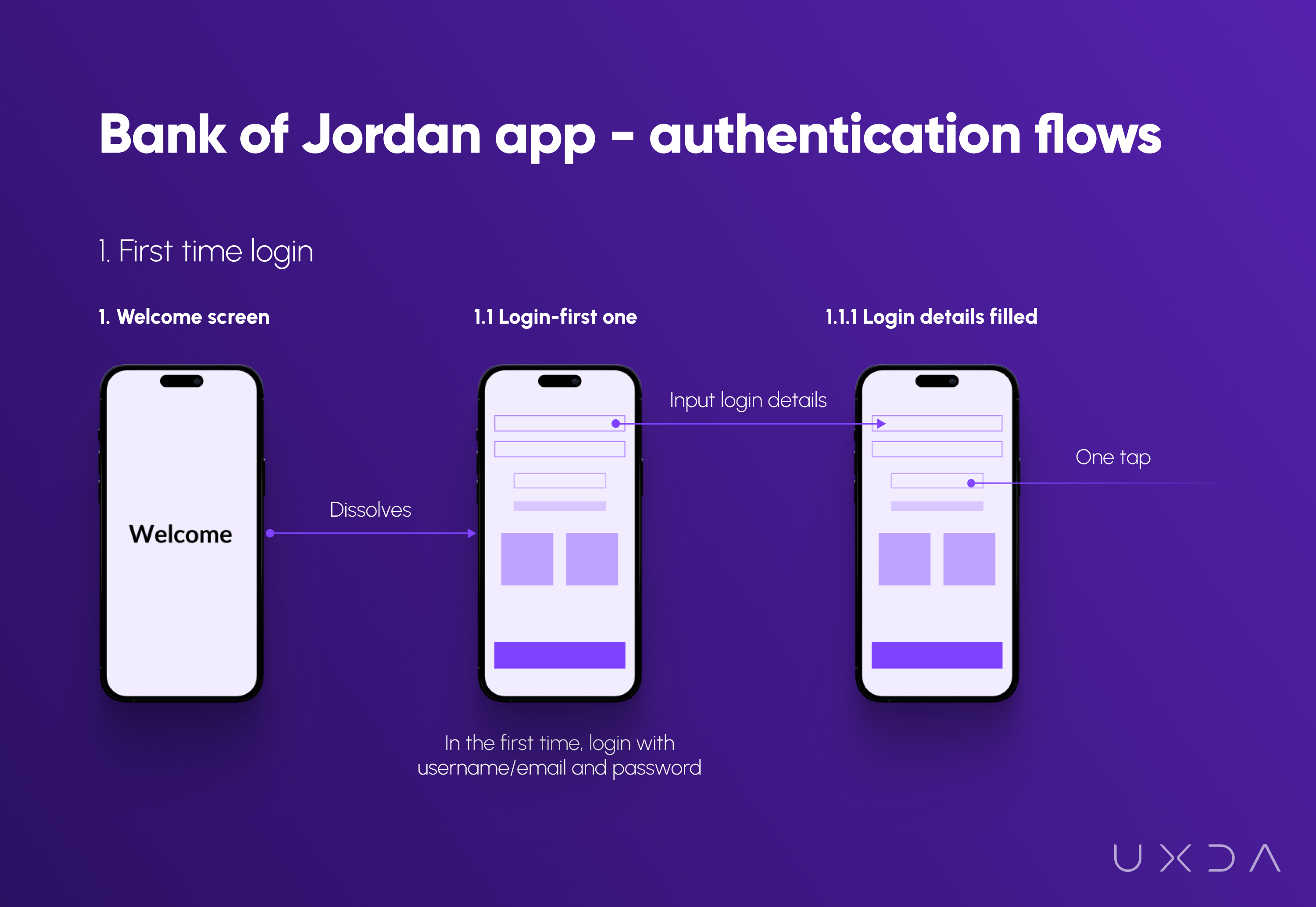
This allowed us to construct detailed step-by-step descriptions of how the bank app redesign should work in order to satisfy the users in the best way possible. We prepared user scenario flow maps describing the actions a user needs to reach a certain goal.
In this stage, together with the Bank of Jordan, we decided how the redesigned bank app should work to ensure that the users can reach their goal easily and quickly. By doing this step, we were also able to discover early on if it's possible to implement the desired flow from a legal requirements perspective as well as from the development side.
Design That Radiates Energy
Through all of the processes in the UX research and engineering stage, we crystalized how the redesigned mobile banking app should work in order to provide the best possible experience and usability for its customers. When this was formed, we were able to move on to the next stage─materializing all of it into the look and feel of a real product. The time had come for the most anticipated stage in any project: creation of the design.
It was crucial for the Bank of Jordan to fulfill the users' expectations, not only according to the experience but also according to how a modern mobile banking app should look.
BOJ had just recently updated its brand identity; therefore, the mobile bank app redesign was a wonderful opportunity to embody this new image through this digital channel.
The main goal was to capture the spirit of Jordanian culture. The BOJ bank app had to be energetic and dynamic, communicating the temper of the Middle East.
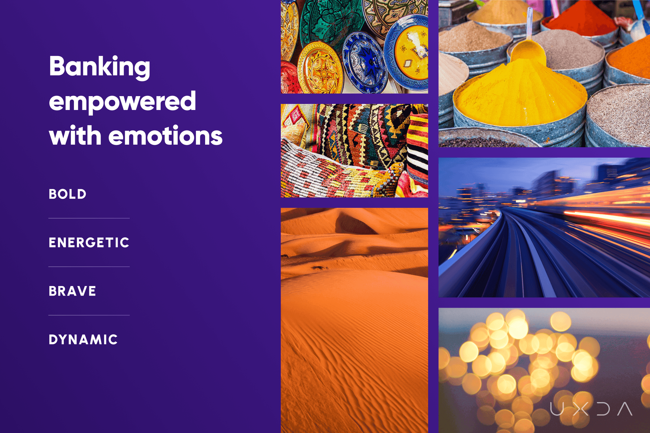
It was crucial for BOJ’s new mobile banking app to engage the users, elicit positive emotions and be so visually attractive that they would be motivated to use it more often and recommend it to their friends.
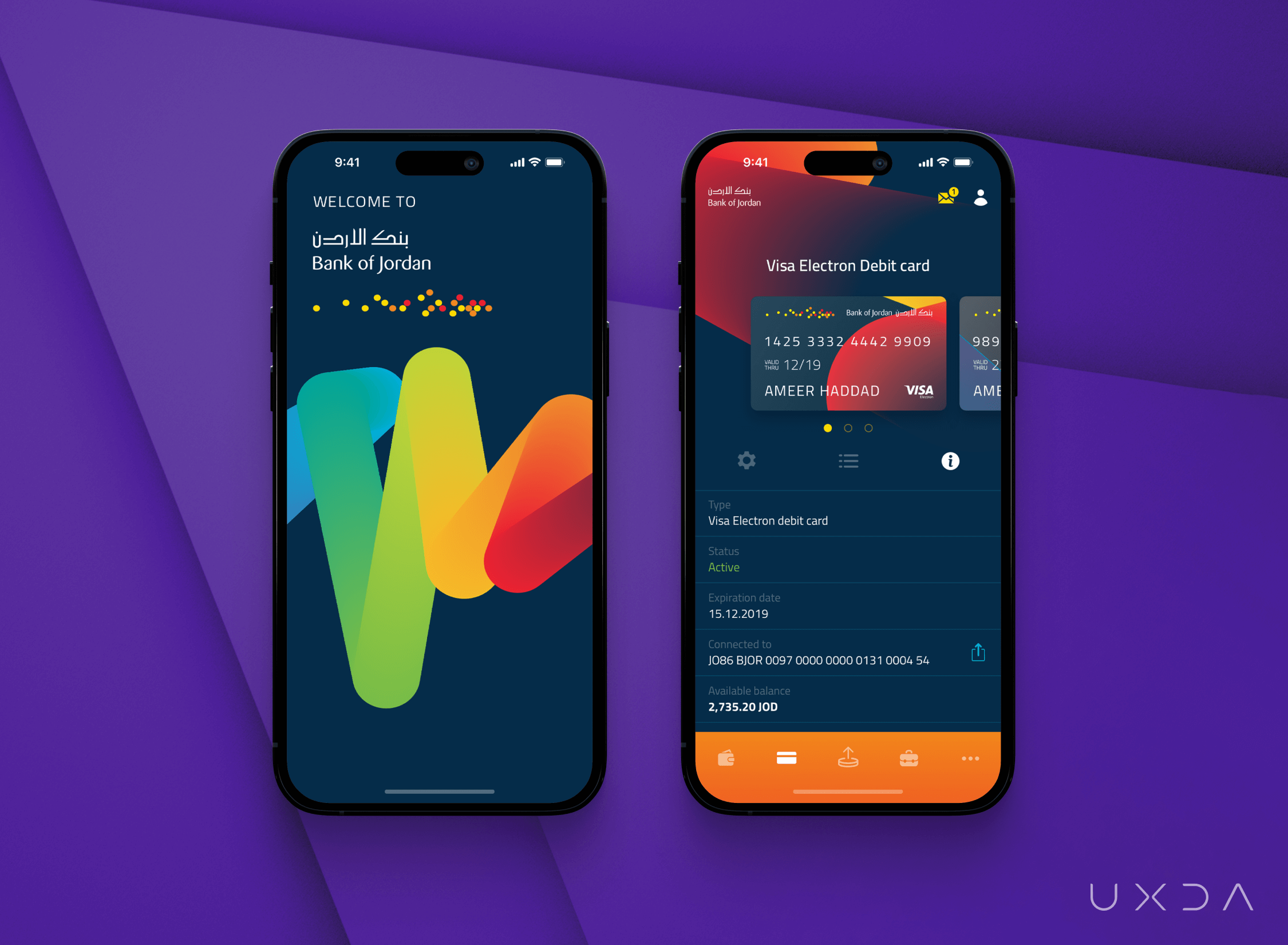
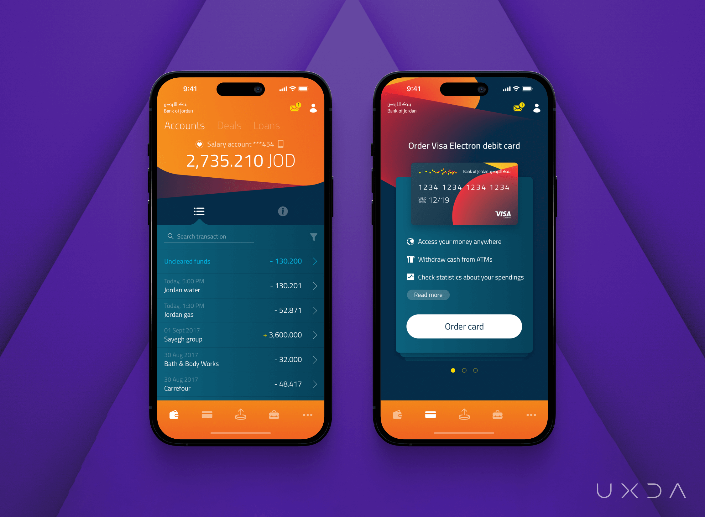
The whole UXDA team participated in the design challenge. It was clear right from the beginning that in order to make the app excel with its elegance and energy, its background should be dark for the bright, refreshing color accents to stand out. To make the design unique, vibrant and bright, UXDA's Art Director used brave gradients and shaded and colored parts of the screen that made it “pop out” on the dark background.
Result: A Mobile Banking App Redesign That Excites
The Bank of Jordan’s new app captures the temper and richness of the Jordanian spirit, offering the ultimate user experience. It's not just a banking app redesign. It's a problem-solver and time-saver that allows its users to complete most of the financial operations in the comfort of their own home, eliminating the need to waste hours standing in a long queue at the branch. This allows them the opportunity to spend this precious time on what's truly important.
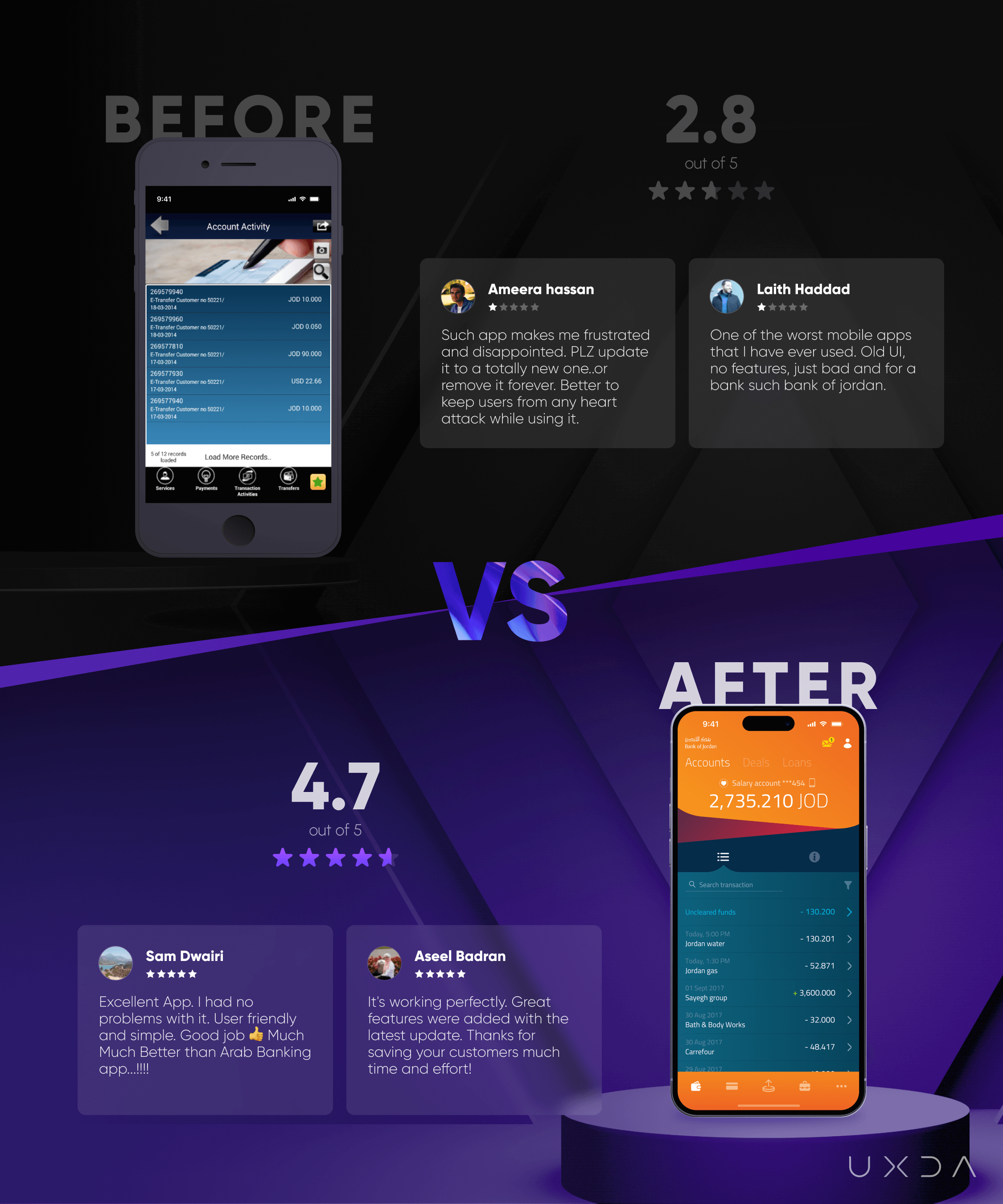
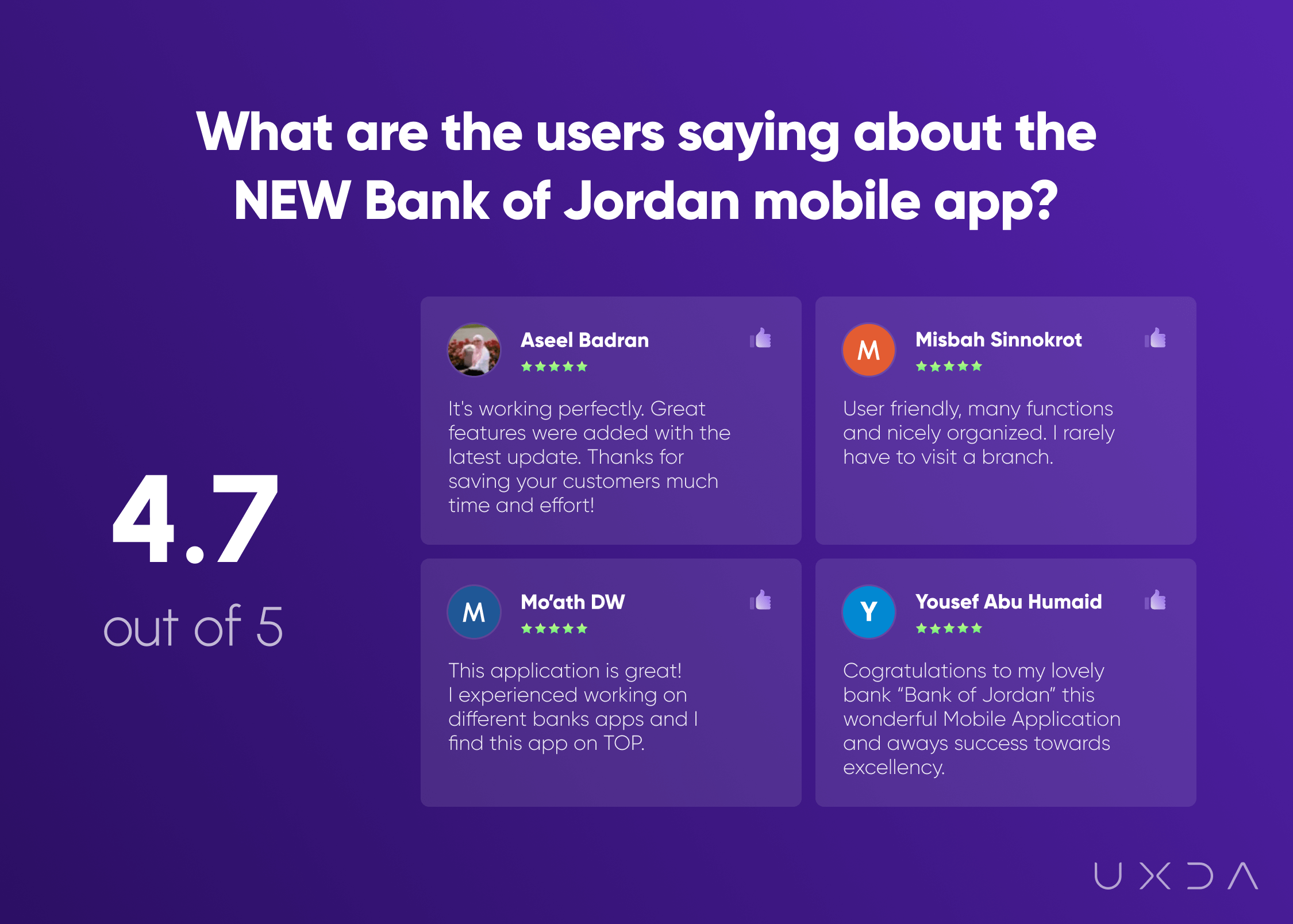
After the UX transformation, the app's Google Play and App Store rating rose from 2.8 to 4.7 stars, and it has maintained this rapid increase.
Together with the Bank of Jordan, we exceeded our main goal. We provided users with the power to manage their money to handle all daily financial operations from their home or “on the go,” eliminating the need to go to the branch. We also did it in an energetic and dynamic manner that brightens the customer's day and adds emotions to their daily financial lives.
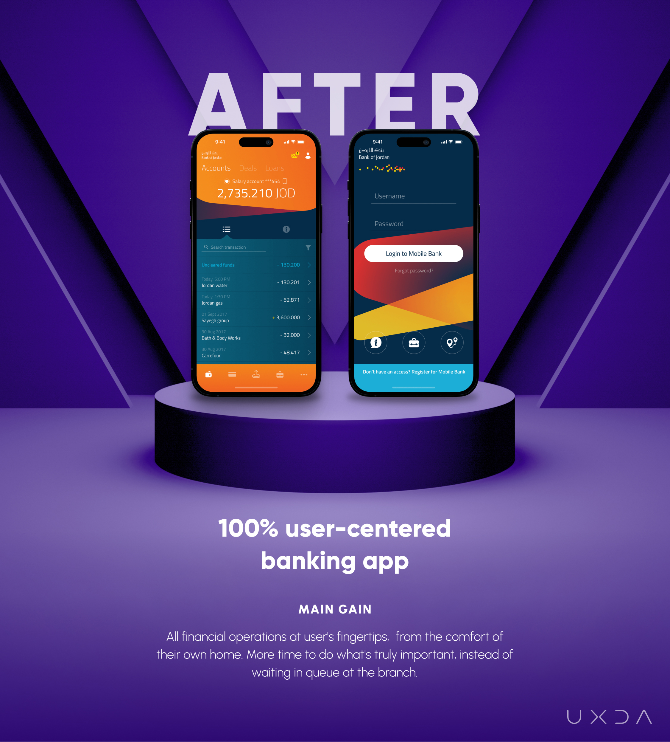
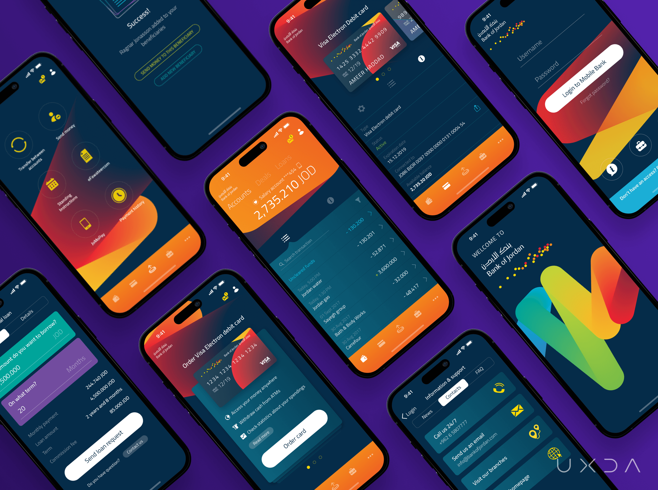
By discovering the user's pain points and problems, we made many improvements to sky-rocket the customer experience. For example, we provided the users with immediate and simple accessibility to the information about their balance, as that is one of the most important and frequent tasks.
We also created a totally new way to conduct money transfers, because we discovered that users have some specific recipients to whom they want to transfer money, and new money transactions don’t happen too often. Therefore, it was very important for us to give users a chance to easily initiate a new money transfer to a previously added beneficiary. This way, we ensured that whenever a user is on their way, a money transfer to a family member or friend can be made with only a few taps.
These are only a few examples of the different kinds of improvements we made to significantly reduce the extra steps, effort and time involved when using the previous app.
As the main goal was to improve the satisfaction of the users by giving them a banking app that supports and makes daily financial operations easier, customer feedback speaks louder than anything else.
In the reviews about the new app, users are thankful and relieved for the banking application that saves them time and has become an assistant in their daily tasks. Someone writes: “Thanks for saving your customers much time and effort!” while others state that they “love this application”!
Awarded Design
After the UX transformation done by UXDA, the Bank of Jordan’s new mobile banking app received the leading global professional services company's Accenture recognition as the “The Best Digital Design 2019."
The app was also nominated for one of the world's biggest and most prestigious design awards─the iF Design Award 2020 in the category of service design.
Dare to Become Better
It’s not easy for banks to ensure successful digitalization that takes in account all of the customers needs and growing expectations. Excellent experience is not about big marketing budgets and plenty of functions. Digital financial products have to ensure the best value for their customers in order to be chosen over the myriad of other apps offered on the market.
The Bank of Jordan’s UX transformation is living proof of the huge impact a great user experience has on overall user satisfaction. We really hope this will inspire the whole Middle East banking industry, top bank teams and other financial services to step up their game and dare to change─change for the users, to make their everyday lives better and better.
World's TOP Fintech About This UX Case Study
Take a look at what the world's TOP 10 banking and fintech influencers like Bradley Leimer, Theodora Lau, Spiros Margaris and Alex Jimenez have said about this case study.

Explore other of our client's next-gen financial digital products and UX transformations showcased in the UXDA team's latest showreel:
If you want to create next-gen financial products to receive an exceptional competitive advantage in the digital age, contact us! With the power of financial UX design, we can help you turn your business into a beloved financial brand with a strong emotional connection with your clients, resulting in success, demand, and long-term customer loyalty.
- E-mail us at info@theuxda.com
- Chat with us in Whatsapp
- Send a direct message to UXDA's CEO Alex Kreger on Linkedin


