California-based Fintech Goalry approached UXDA with a very challenging idea - to design a digital financial shopping mall full of different products that help people reach their goals in an engaging and intuitive way. It was a challenge that UXDA were excited to help with. As a result, we created an innovative 3D dashboard that takes the customer experience beyond finance with shopping and more. The design meets users where they are, whether that’s web, mobile or, in the future, even the Metaverse. This platform has already received two prestigious design awards – IF Design Awards 2022 and UX Design Awards 2022.
Ethan Taub, the founder of Goalry, noticed that there was something wrong with the way the financial industry was built around personal finance. People can see the past history of their money, but it seems that nobody looks into the future using financial behavioral data. Goalry is created for every person who needs clarity into their finances and an understanding of how to use their financial history to build their future.
“If done right it can literally be a crystal ball or history book of users' life in a lot of ways.” - Ethan Taub
Client: Passionate Leader Approaches UXDA to Fulfill his Vision
Goalry was founded in May 2016 in Newport Beach, California by Ethan Taub, who previously spent a decade developing online marketing programs for Global 100 enterprises and managed sales teams in Silicon Valley. He continued his track record of success as a C-level executive, overseeing sales, marketing and product development for a large brand and an innovative technology start-up. Then, the vision of a unified financial platform started around 2015:
It became an obsession after learning about how PayPal never finished their vision to complete the Full Flywheel for Finance. This was all in Ashlee Vance's book "Elon Musk: Tesla, SpaceX, and the Quest for a Fantastic Future”, published in 2015. That book was extremely important for me to read at the time… I just couldn't stop thinking about Elon's "Unified Theory of Everything". - Ethan Taub
Most people don't use tools to change their habits and manage their finances because they think it's too difficult. Ethan's vision was to reinvent different parts of finance - e.g., bills, taxes, investments, loans, debt and more into easy-to-understand “finance stores.” To start the project, he needed to find a unifying idea that would eventually converge fields beyond finance, such as shopping and even social media.
I needed to put all these "Finance Stores" somewhere. Then "Goal" came to me because there is nothing more altruistic, gamified and the means to the end itself other than "Goals." Later that night, I woke up at 3 am. I shot out of bed and screamed...I got it! It's a Goal Mall with Stores! A perfect place to house it all. Everyone already understands how a mall works! There it is. - Ethan Taub
Challenge: Accepting the "Crazy Idea" Challenge Doubted by Others
Ethan approached us with the idea to create an innovative financial platform using an intuitive concept - a shopping mall for 10 different financial services, where users can shop, socialize and get educated to reach their goals more effectively. His vision was to introduce a totally different way to approach finances and help to change users' perceptions about financial management as a whole. He also understood that if you build financial services as the base within the mall, all other types of experiences fueled by finances could be added later.
Despite a large number of design agencies in the US, finding a design agency to bring this idea to life was challenging. Design agencies, including the top ones from Silicon Valley, didn't completely share his vision and found the idea crazy.
So, I looked outside of the US and then boom… there you guys were. Brilliant, fresh and as excited as we were to build it! - Ethan Taub
At UXDA, we understand people who struggle with managing their finances and being unable to reach their goals. Unfortunately, financial services often take into account only one small part of overall financial well-being, and it is too difficult to understand the full picture in order to make well thought-out financial decisions. Too many people in their old age regret not achieving their financial goals because they didn't know how.
A goal can be something like taking a trip to India to find yourself, saving for a down payment on a house or visiting all the national parks, whatever really. And there is no better way to fit everything in one place better than a mall. That's why it exists in the offline world. To take a lot of things you want and put it in one place. It's so natural and easy to navigate. We all know how one works. Your money should be that easy to navigate. - Ethan Taub
Solution: Implementing the "Crazy Idea" in the 3D "Money Mall"
It took us six months to implement the "crazy idea" into an immersive financial product design – a 3D "Money Mall" that offers a 360-degree view on users' finances from different perspectives.
Based on the founder's vision, we came up with a digital strategy that helped to not only create product design, but also provided a clear basis for the Goalry team to find the best direction for further development and launch stages.
The UXDA team used a combination of user research, design thinking and UX design methodology to assemble a user journey map from over 500 pieces of data. The Goalry business strategy was to understand users’ financial habits and guide them toward their goals using their own financial history and current data. The product’s role is to adjust daily financial habits through defined steps in order to turn users' dreams into real goals.
In the Goalry UX design, we have combined many financial well-being services into one place, complementing each other with data, thus offering insights to the user. The platform takes into account every aspect of finance - earnings, spending, taxes, loans and debts, real estate valuation, insurance and bills to pay.
Moreover, users have the ability to apply for loans and credit and find new insurance or tax solutions. Instead of searching different providers for each service, users can now save time by using Goalry. The platform ensures that users have accurate information about their finances and minimizes the risk that some of it might be misunderstood.
Original content and a “cinema” with educational videos was added to the platform to provide a strong educational basis about finances. Additionally, we have provided users with the opportunity to access the community to receive support and ideas from like-minded people on the path toward financial wellness. The Goalry product design embodies powerful tools for people who want to gain an understanding about their finances and develop healthy financial habits.
Approach: How to Design an Innovative Platform That Helps Users Reach Their Goals
To create the platform's end-result architecture and 3D UI design, UXDA worked closely with the whole Goalry team, including the development department. Constant synchronization was extremely important to develop a UX strategy that would bring the idea of a "money mall" to life. A tight deadline before launch, multiple challenges during the project and a never-before-seen product idea required us to push the boundaries of what is possible and made this project extra challenging.
We had an exciting vision from Ethan, but the product strategy was in a complete fog. So, the UXDA team started with deep research on user context to define a user’s empathy map and pain points that Goalry could solve.
To figure out how to make it all work as a digital mall in an intuitive way, we did a deep dive into each financial store that Goalry provides and extracted user scenarios, as well as the value users would get. This allowed us to find a solution for how to combine the digital experience with the financial stores in a way that is understandable to users and improves their lives.
Goalry unifies different parts of finance, e.g., bills, taxes, investments, loans and others, in finance stores like Billry, Taxry, Wealthry and Loanry. Each of the trademarked stores are based on our everyday habits within the finance arena.
Given it’s a mall, naturally it’s designed to include additional floors in the future, such as shopping. Rather than push people to buy more, especially if they can’t afford it, the platform promotes smart decisions. It gamifies savings, retirement and debt goals. It’s a place where experiences converge for consumers - finance, shopping, education, social, Web3 and more - to keep users engaged throughout the day.
Inspiring Users with Goals
Goalry is about goals - so it's the first thing that users are being asked. An important step is that people define and set their personal goals, so we can help them stay motivated and focused. After defining the goal, Goalry analyzes the user's financial data and habits and makes a projection on how and when their goals could be reached. On a daily basis, users also gain different insights that help them get closer to achieving their goals, such as understanding their spending, tips on how to save on bills or a recommendation to use the Budgetry store, for example, to track their monthly budget.
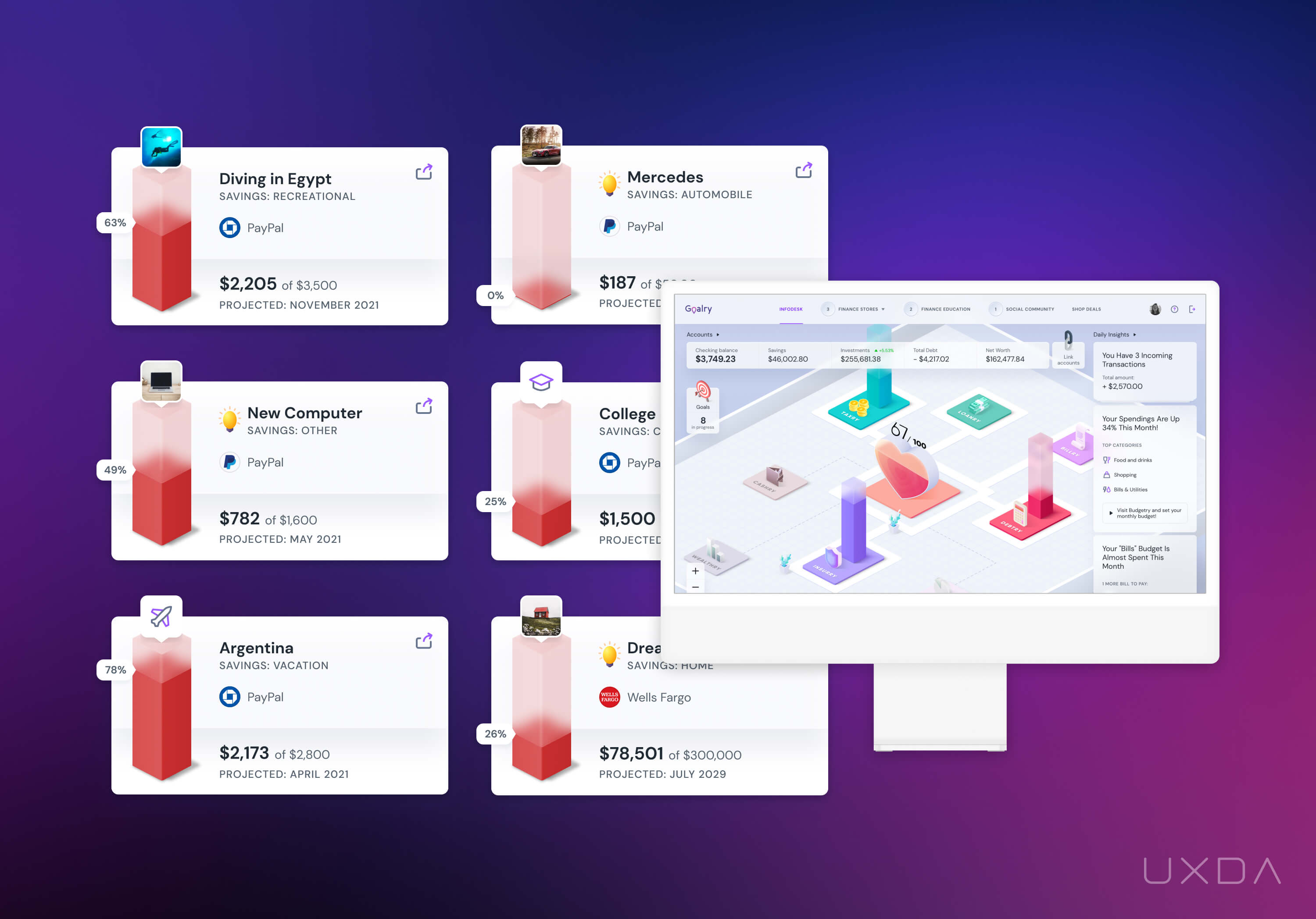
Goalry works together with its users on the path of reaching their goals and also celebrates together with them, through gamified badges and rewards. Users have access to a Goalry memory book, where all their achievements are recorded, even the smallest ones. If day-by-day progress is less noticeable, then here we wanted to sum everything up and give users a motivational boost toward their next goals. The memory book is highly shareable content that connects to either friends on social media or those that users invite to join in the Goalry experience.
A central element of the user's Goalry is a beating heart. The heart acts as the user's compass pointing toward financial freedom.
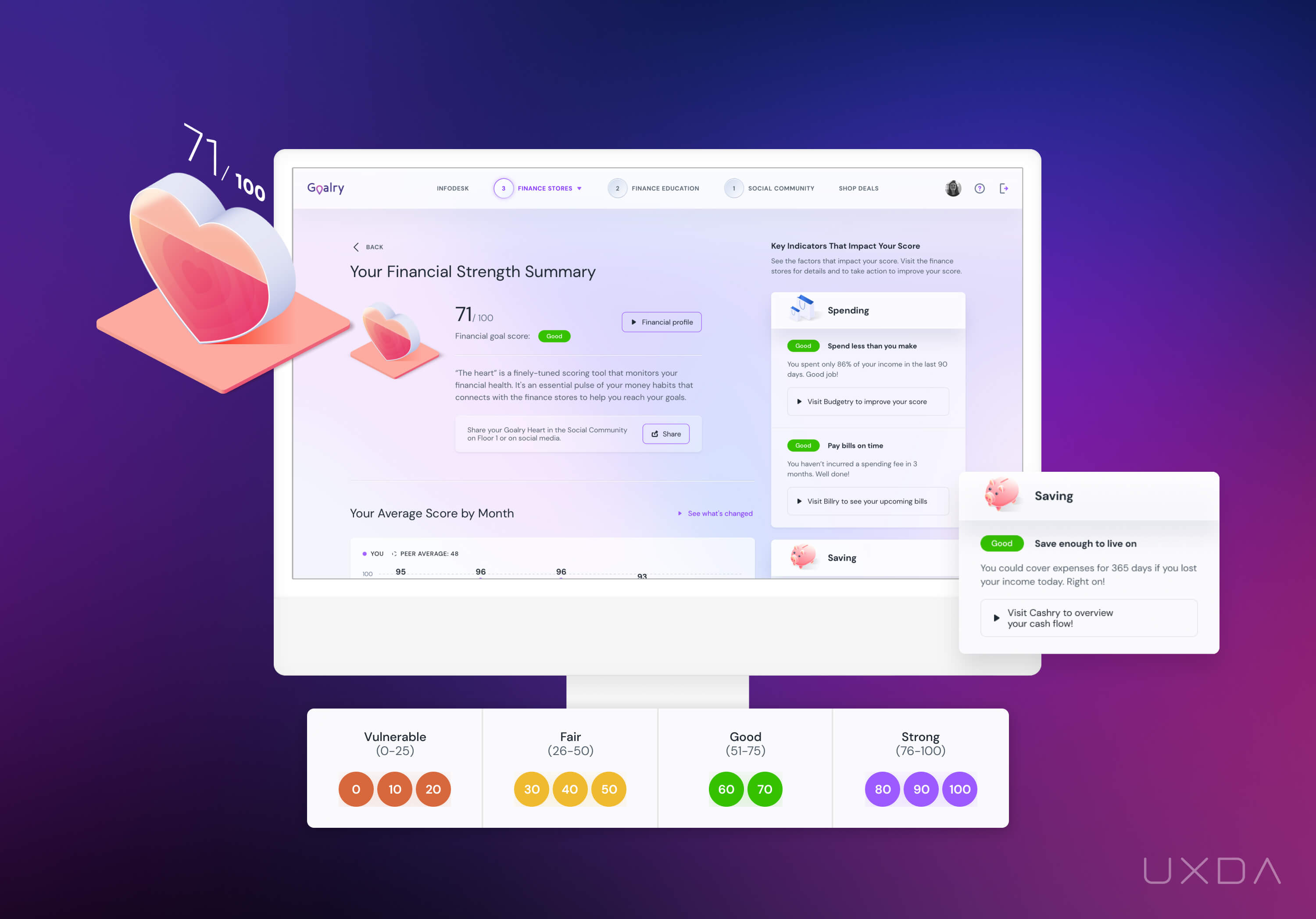
It includes a financial health scoring tool based on behaviors. It takes financial data, such as spending, savings habits, loans and much more, and breaks it down into an easy-to-understand overall score. It's like a pulse that monitors a user's financial health in order to reach their financial goals.
Adding a New Dimension to Finance
Our first product concepts were in a flat 2D design. It felt like something was missing as the design did not make us want to explore the mall. We needed something different.
Visiting shopping malls is a routine activity for most people. We needed to detect existing perceptual patterns that would make the design intuitive.
We explored digital representations of shopping centers for inspiration. After analyzing dozens of websites, we found the needed insight. It was necessary to add a third dimension to the design of Goalry to convey the main idea of the product. The 3D elements, animations and spatial placement of objects provide a sense of depth, tangibility and materiality, helping users understand and take control of their finances.
To make the mall concept engaging and realistic, we designed a customer journey to navigate through the mall. Users have floor plans and are able to move between them easily, like moving on elevators. Infodesk, the crystal ball of finance, shows the overall financial situation with all the goals, accounts and financial tips.
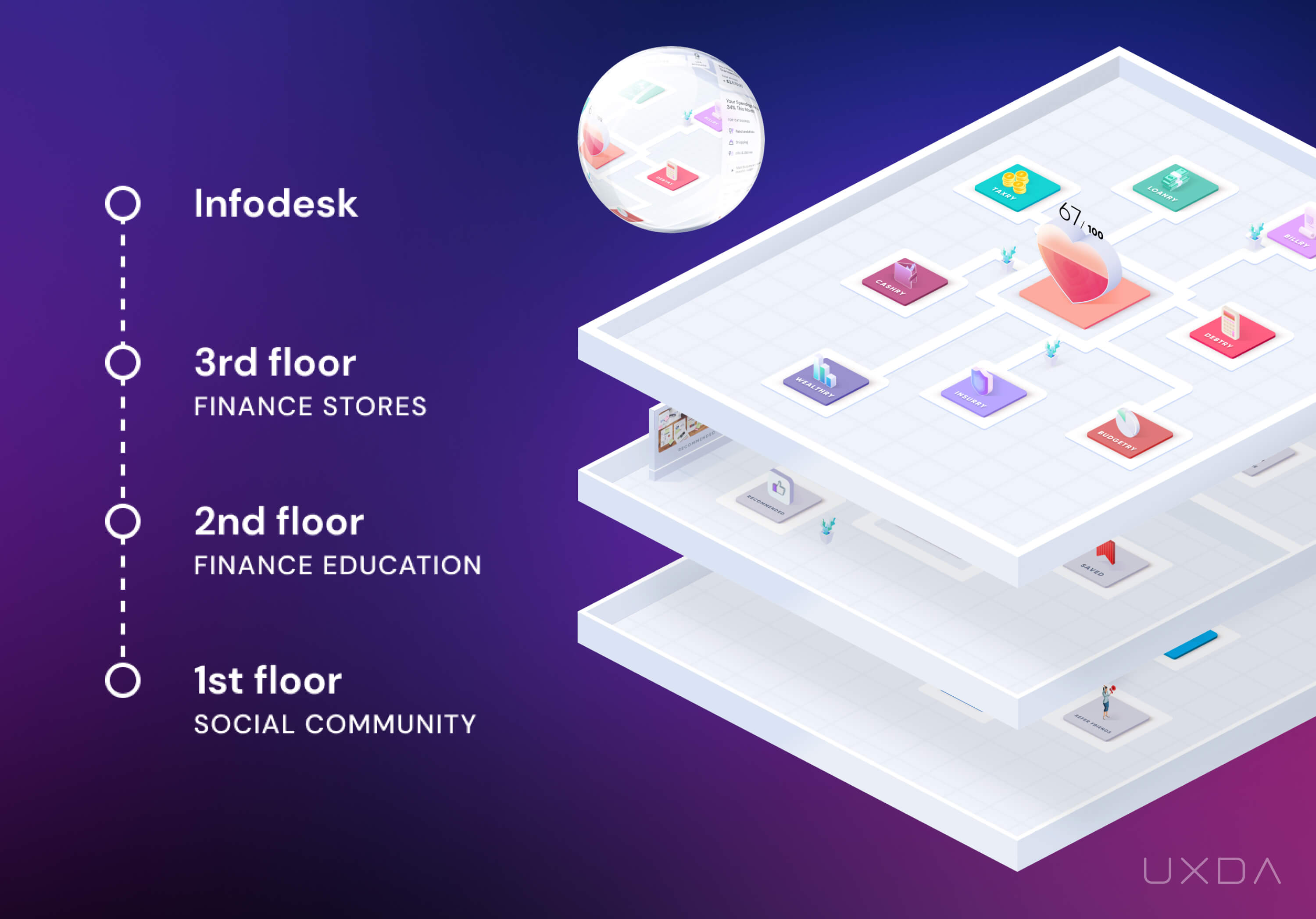
This concept fits perfectly into the future development of the product in the Metaverse, in accordance with the vision of the Goalry founder. With the company outpacing other financial products that need to be adapted, Goalry is poised to be the pioneer of financial management in the Metaverse.
Integrating a Third-party Solution
To develop the product, Goalry partnered with MX - the leading financial data and open API platform. The main challenge here was to incorporate the personal financial management features provided by MX into the Goalry user interface, consistent with the unique product architecture and visual language.
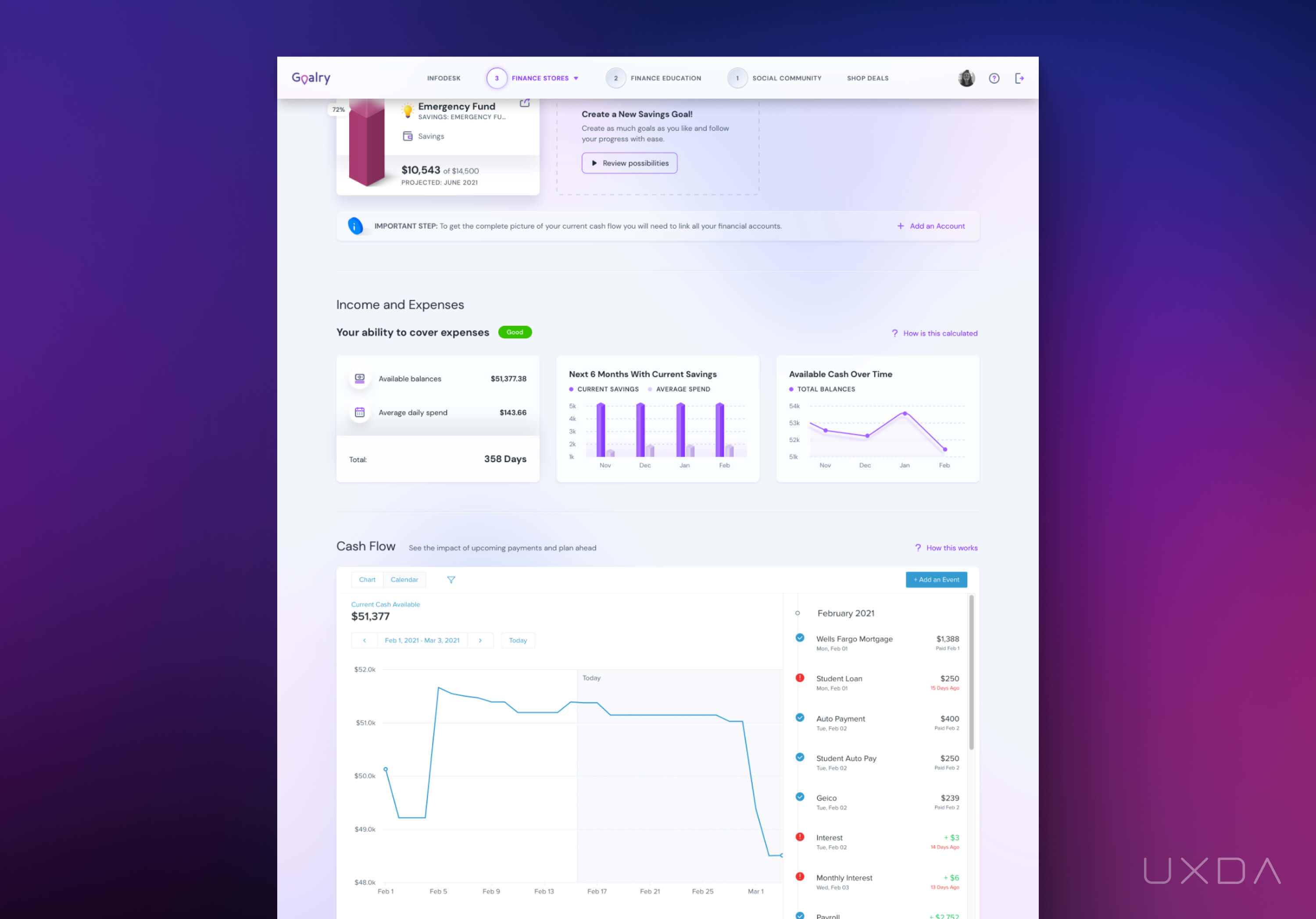
For us, it meant that we needed to ensure a smooth and pleasant user journey despite several restrictions to adjust the design of the MX solution. We solved this problem with surgical precision by balancing the unique vision of the founder, along with ready-made solutions from MX and user scenarios.
Educating Users in an Engaging Way
There is one dedicated floor for financial education - Goalry employs financial experts to create useful content. Users have the ability to read mall blogs with a wide spectrum of topics, like retirement saving tips, children’s education about finances and personal budget planning. Users can also visit the mall cinema. At the moment, users can choose from a library of over 300 YouTube videos that Goalry has created around finance.
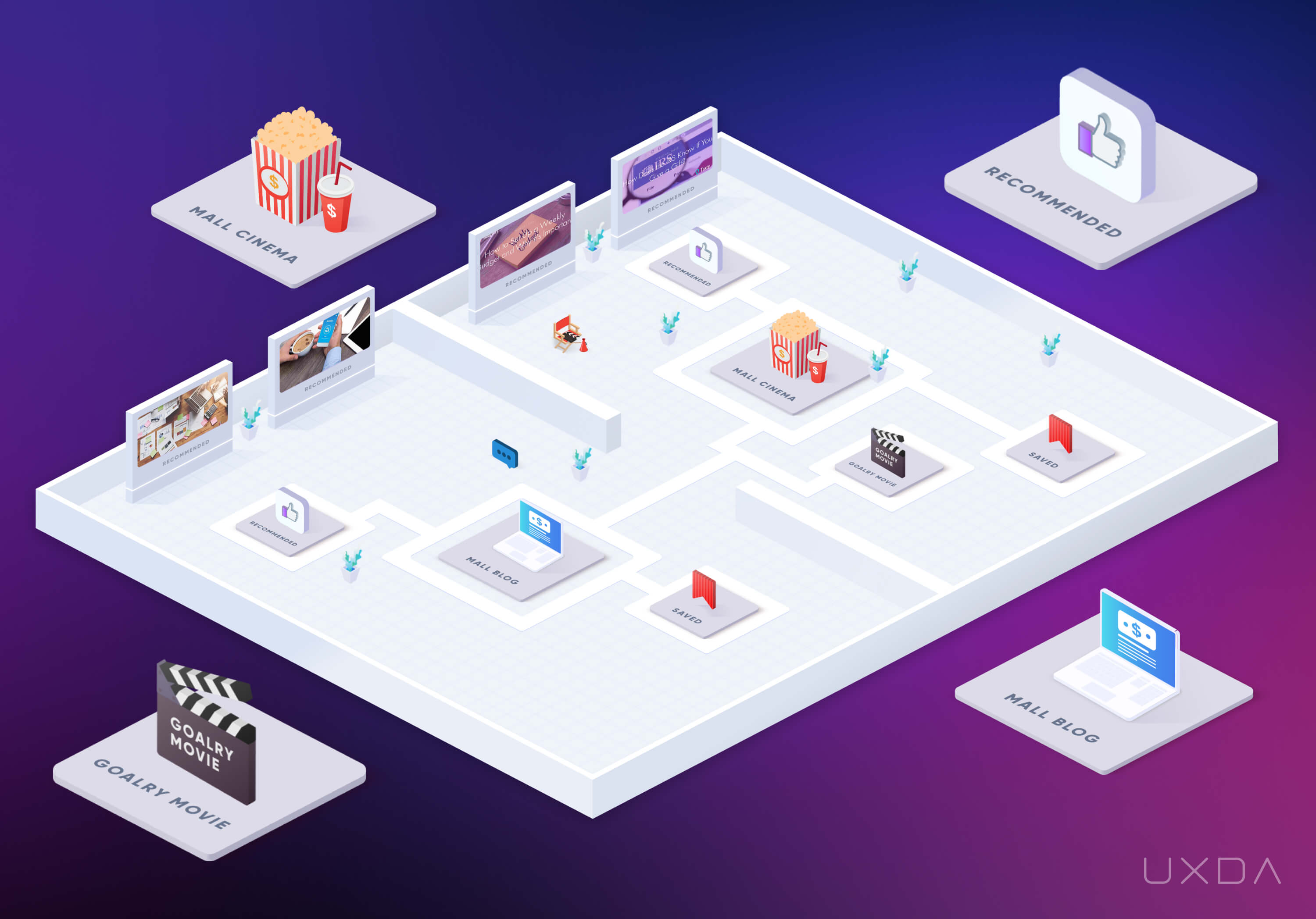
When the educational content comes into practice in the user's real life, it will be reflected in the Goalry heart as a financial health score and also in achieved goals.
Supporting Achievements Through Like-Minded People
The Goalry community is a place where users can feel that they are not alone on their financial wellness journey. They can share goals and achievements, challenges and tips for others. There is no right or wrong as financial management is different for everyone, and we never know when one's experience can be life-changing.
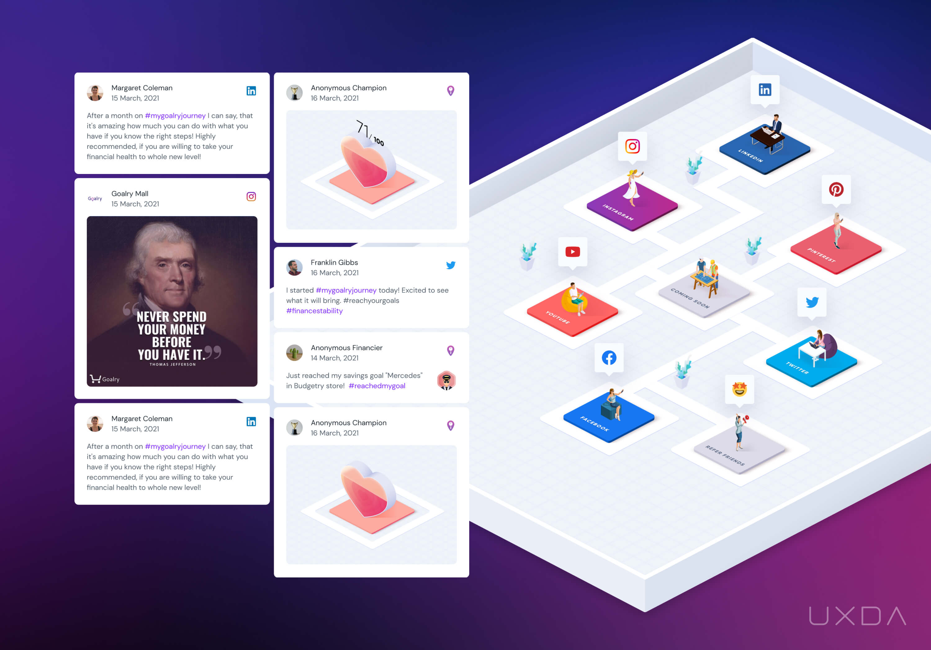
Currently, Goalry collects users' content from social media, such as posts about the set or achieved goals, but, in the future version, users will also be able to communicate with one another on the platform and share their personal experiences, talking about topics outside of finance.
Enhancing Brand Trust
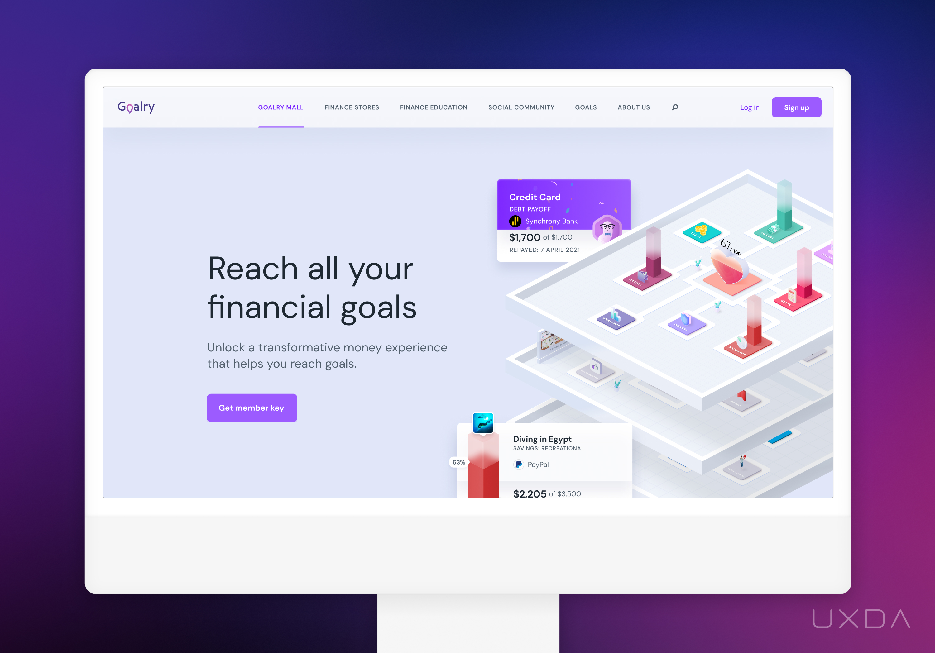
Users often hesitate to trust new financial platforms due to credibility concerns. To address this, we designed a landing page that flawlessly aligns with Goalry's visual identity, incorporating a clean layout, dynamic animations, and 3D elements. These features highlight the excitement of managing finances on the platform while establishing a consistent visual language. The result builds trust, sets clear expectations, and ensures a seamless, reliable brand experience.
UXDA Deliverables
- Stakeholders’ interviews
- Product strategy
- Contextual market analysis
- User personas through JTBD framework
- User journey map
- Scenario prioritization in Red route map
- Information architecture
- Value storyboard
- Product experience movie
- User flow maps
- Wireframes
- UI design
- Design library
- Usability testing
- Product motion design
- Landing page design
- Product launch support
Takeaway: Even “Crazy Ideas” Can Come to Life With the Help of UX
Digital financial platforms are meant to improve people's lives. Nowadays, where there are so many different experiences, it’s important to think differently to keep it interesting and engaging. The thing we should always remember is - the user is key.
With the help of financial UX, it is possible to incorporate even extraordinary ideas into the world of finance. Research-based UX strategy and cutting-edge visual representation of the idea will ensure that financial products will be developed according to users' needs and will bring a practical value to improve their financial well-being.
We are excited to help Goalry make a playful leap ahead toward the creation of an “everything app.” It’s easy to grasp the concept of many stores on different floors as everyone understands how a shopping mall works. While Goalry currently focuses on stores for financial needs, it’s thoughtfully designed to include any type of store (e.g., retail, food delivery, health, etc.).
Together in the Goalry project, we were able to achieve unique results that today can inspire us to think outside the box. And, last but not least, there should always be people around who will really believe in your idea and help it come true.
Discover our clients' next-gen financial products & UX transformations in UXDA's latest showreel.
If you want to create next-gen financial products to receive an exceptional competitive advantage in the digital age, contact us! With the power of financial UX design, we can help you turn your business into a beloved financial brand with a strong emotional connection with your clients, resulting in success, demand, and long-term customer loyalty.
- E-mail us at info@theuxda.com
- Chat with us in Whatsapp
- Send a direct message to UXDA's CEO Alex Kreger on Linkedin


