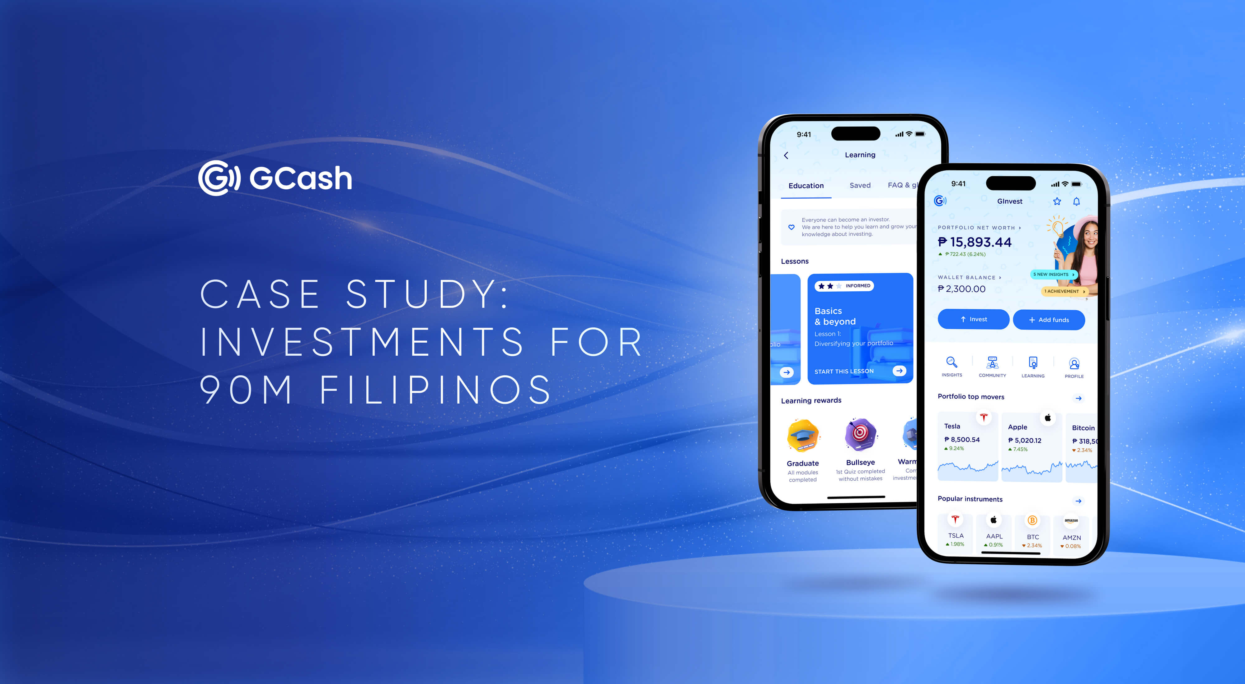
The Philippines’ #1 Finance Super App, GCash, with 22 financial and lifestyle services, has challenged UXDA to integrate an entirely new investment experience into its existing product ecosystem. The new and improved GInvest service was aimed to provide Filipinos with an investment opportunity that previously seemed unattainable. An experience designed by UXDA is set to transform the mindset of 90 million Filipinos, showing that investing isn't only for rich and financially savvy people.
Client: Largest Philippine Finance Super App Hires UXDA
GCash is a double unicorn startup and the largest digital ecosystem in the Philippines. The mobile eWallet app acquired 20 million users in 7 years since it first launched in 2012 and has skyrocketed to over 90 million users to date, accounting for about 90% of the eligible market in the Philippines. GCash has certainly contributed to the increase in the percentage of banking customers utilizing digital channels from a mere 12% in 2017 to an impressive 85%, as the survey by McKinsey & Company reported.
Such a magnitude and rate of growth have been attributed to GCash's customer centricity and a mission of care in all the provided services with the aim to democratize financial services for all Filipinos. GCash is taking advantage of each opportunity to show that they are a part of the financial industry’s humanization ideology, and they wanted to embody it in a new accessible investing experience for Filipinos.
GCash allows its users to make payments, save, shop, get insurance coverage and a lot more, with its 22 financial and lifestyle services. To further expand its list of services, GCash has chosen UXDA to help create the GInvest investment service, addressing users' needs and pains. Such an approach is a shining example of how GCash treats its customers.
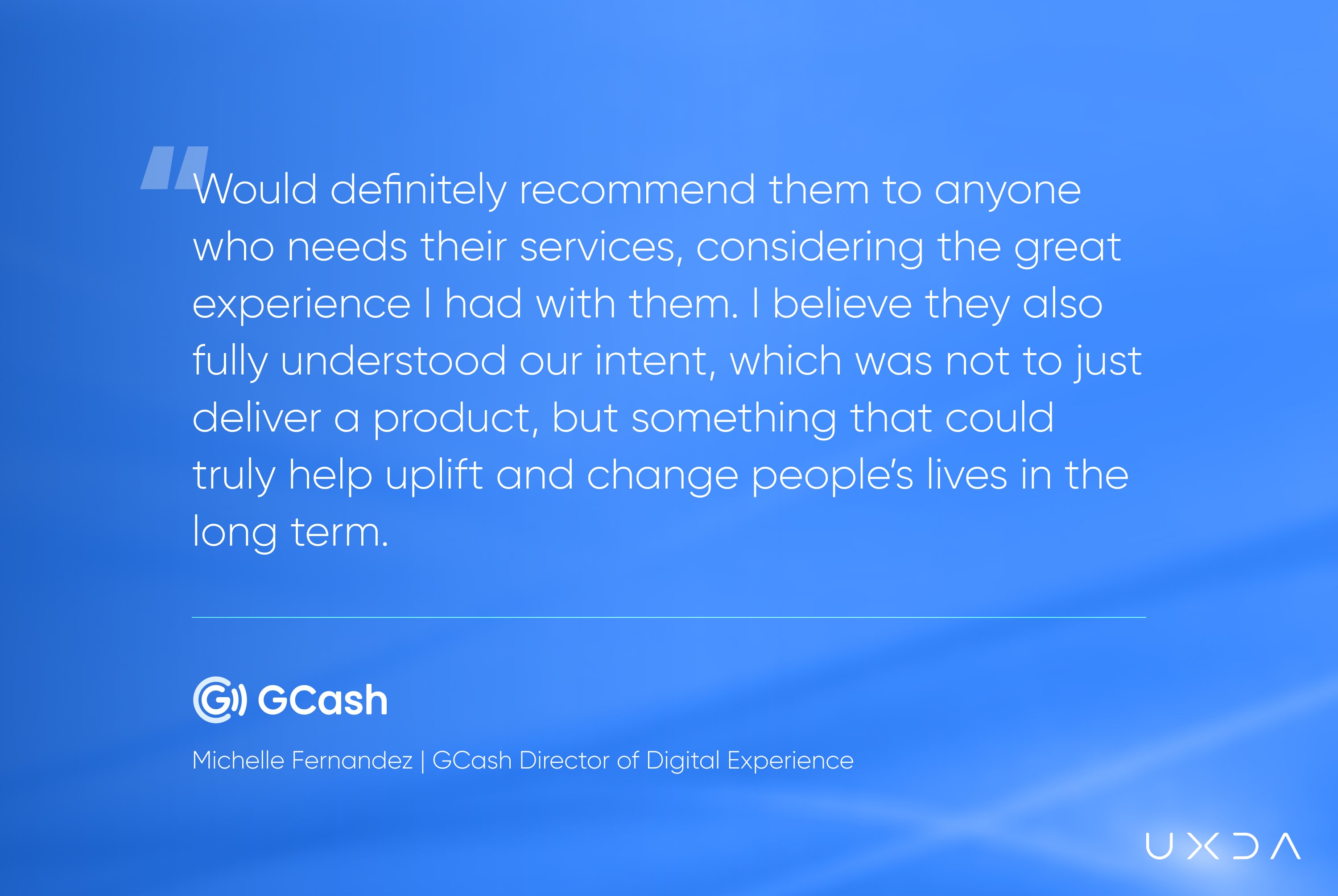
“Throughout the project, we were always on track in terms of timelines, and I believe that we have had a very harmonious working relationship with UXDA. The collaboration progressed smoothly since the beginning of the partnership, and the internal stakeholders leveraged the vendor's technical expertise to improve the product. The flow they developed for our customers is easy and close to seamless, and the designed screens are beautiful and well thought out.” - Michelle Fernandez, GCash Director of Digital Experience
GCash's product development approach is focused on care, empathy and soul, thus building a long-term emotional connection between the brand and customers, resulting in users' trust and loyalty. UXDA and GCash teams have been constantly in touch to synchronize and direct the project in the desired strategic direction. Each UX methodology step ensures that we stay on the course of creating a value and purpose-driven product for the clients’ users.
Challenge: Highlight a New Service while Remaining Part of the Ecosystem
The GCash finance super app recognized great potential in entering the investment market and becoming the number one investment platform for novice investors in the Philippines. А standard trading terminal is unsuitable for 90 million GCash users because such investment platforms are too complex for newbies and full of friction.
Novice investors are often frustrated by information overload with tons of complex information and high entry requirements. Foreign investment apps are also not broadly familiar and accessible to Filipinos. So there is a high potential demand for a new digital investment service that is built on user-centered design principles with a robust visual design system.
GCash came to the UXDA team to design a unique investment interface, GInvest, with a welcoming and accessible experience. The GCash team discovered the UXDA portfolio and spotlighted a special financial UX design approach. This was exactly the way they wanted to implement their strategy – not the boring functionality of yet another investment service in the market, but an outstanding and emotionally attractive product with a soul that would engage and retain users.
* Here and hereafter, the visual representation of the app may vary from the real-life example, and certain features may be under development and scheduled for release at a later date.
Here is where the first big challenge arose. Usually, the creative design process involves a certain degree of freedom, but here it was very important to ensure consistency by integrating the new service into the existing GCash ecosystem with its already established architectural and visual features. The second challenge was that the GInvest service should be easy and pleasant to use for the 90 millions of GCash users. And third, the product needed to provide an acceptable balanced solution for often mutually exclusive profiles. On one end, there are a lot of beginners who are keen to jump into the investment world, and, on the other end, there are experts who have already tried many of these services.
Solution: New Frictionless Service to Make Investments Accessible for Millions of Users
Together with the client team, we have created a new product vision that has assisted in the expansion of GCash’s digital eWallet into the mainstream investment market. We used UX research to deeply understand and match GCash's digital strategy with their users' needs. As a result, GInvest was designed as the first unified and simplistic investing service for Filipinos with a starting amount of only 50 pesos (0.82 EUR / 0.90 USD).
As a digital investment platform within the GCash super app, GInvest provides unified access to multiple investing options without any paperwork. These include stocks, cryptocurrencies and mutual funds. The app offers help in choosing the most appropriate investment pathway, even for completely inexperienced users.
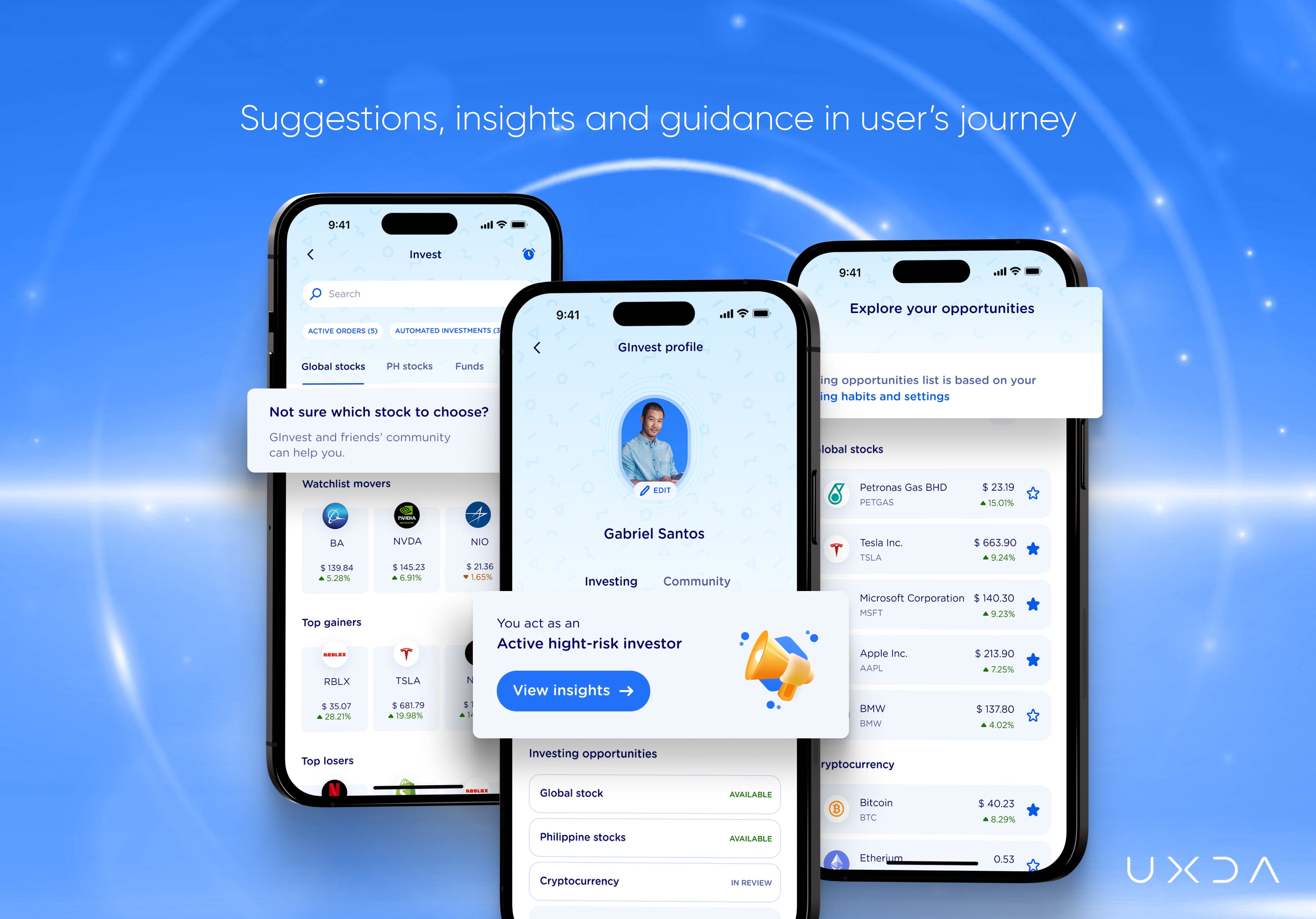
Each investor is guided through the GInvest experience as it analyzes users' behavior and provides individual suggestions on investment choices. GInvest helps users evaluate their investment strategy, follow the market activity, interact with the investors’ community and become educated. This creates a healthy balance between the beginner-friendly and data-heavy investing platform. To make the experience even more welcoming, gamification elements will eventually be available to encourage and reward users for their investing and exploratory activities.
We empowered the GInvest service with an emotional design while keeping its visual and functional compatibility within the established GCash ecosystem and brand. One of the key tasks was to carry the same key values of the brand while organically and seamlessly integrating GInvest into the overall GCash super-app infrastructure. With the GInvest service, over 90 million GCash users have access to an opportunity to experience a traditionally complex investing environment in a simple and beginner-friendly digital solution.
Approach: To Make Investments Easy, Focus on Personalization, Simplicity and Empathy
We were delighted to help GCash, a purpose-driven financial company, promote equality through an accessible digital investing experience and share the same customer-centered philosophy. The GCash team assisted in defining the main considerations for the overall GInvest concept creation by interviewing active and potential investors regarding their attitude toward investing.
In order to deliver a delightful experience for its users, we conducted market research, overlaid the findings with the data GCash provided us and created the user personas, which gave us a deeper understanding of the users' needs, expectations and pain points. Truly knowing your users' needs and expectations helps you to direct the product development to the desired soulful financial solution.
Respecting the Product’s Soul
Our task was to design a completely new experience that can be integrated into an already existing environment with a set style, ideology, identity and interaction patterns of the GCash finance super app. We were challenged to adjust and add new breadth while transmitting the overall GCash experience through design and structure.
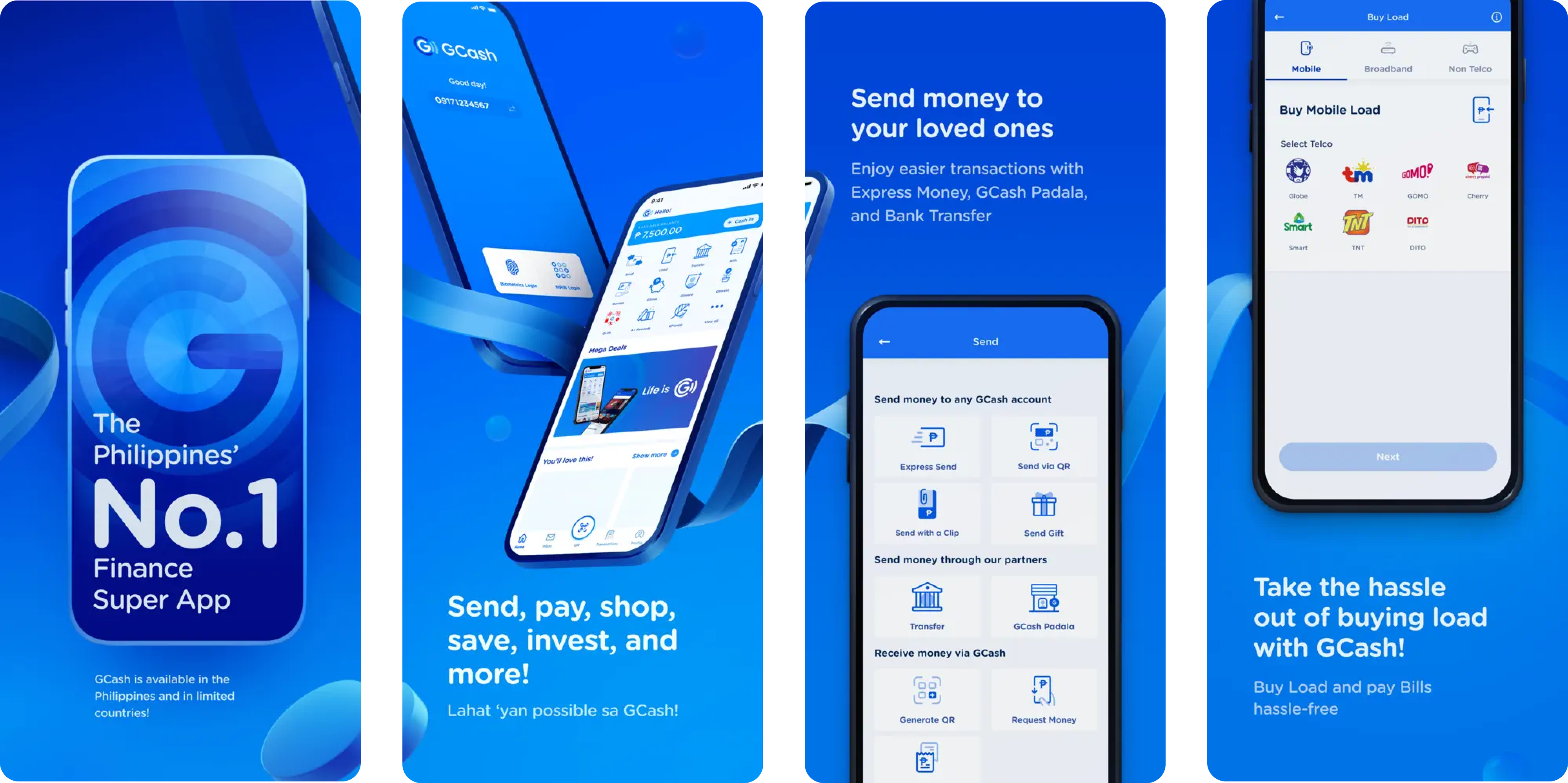 GCash's existing app design from the app store.
Design concept creation is always a very non-linear and creative process. However, GCash's design language, branding, user experience and the overall feeling within the enormous GCash eWallet ecosystem kept us constantly aligned with the soul of the existing eWallet.
We have implemented unique value-based solutions in the key sections of GInvest. GInvest is designed to deliver the appropriate level of guidance and help users to analyze their investment performance better, follow the market news, communicate with other investors and get educated. Users should feel that they are totally capable of dealing with the provided opportunity in a diverse, ever-changing and risky world of investments.
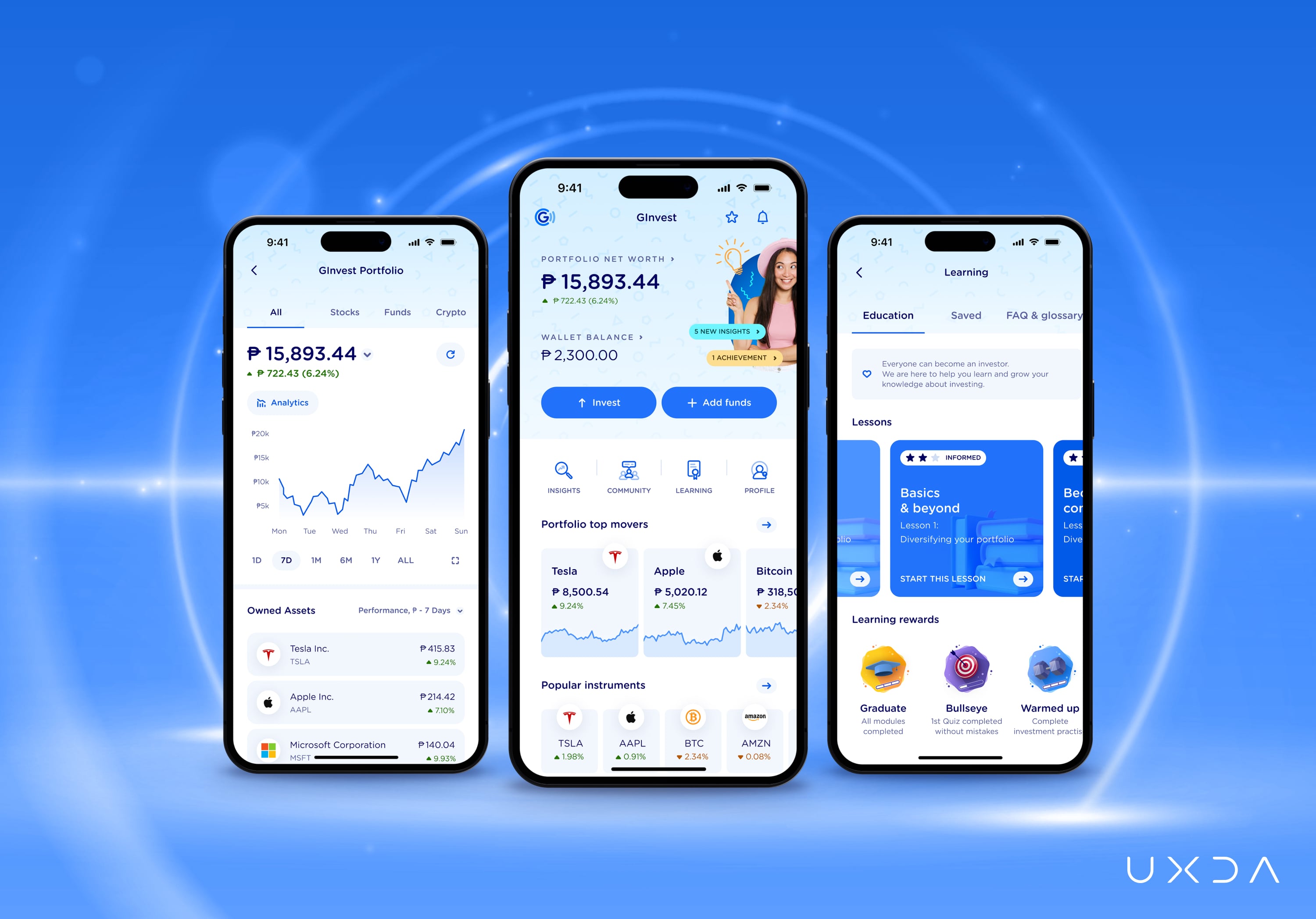
Most investment platforms contain sophisticated information and features that are challenging for novice investors to navigate. Our goal was not to exclude any information but to make it easily perceivable and familiarize users with the investment environment.
Together with the GCash team, we sought and explored ways of creating a healthy balance between the beginner-friendly and data-heavy investing platform, which suits users with a wide range of financial literacy.
The service is designed for users to grow from the very basic level; however, experienced users also have enough tools at their disposal to trade effectively. As users advance, gaining more knowledge and experience, the more understandable the content information becomes for them.
Keeping Users Up-to-date
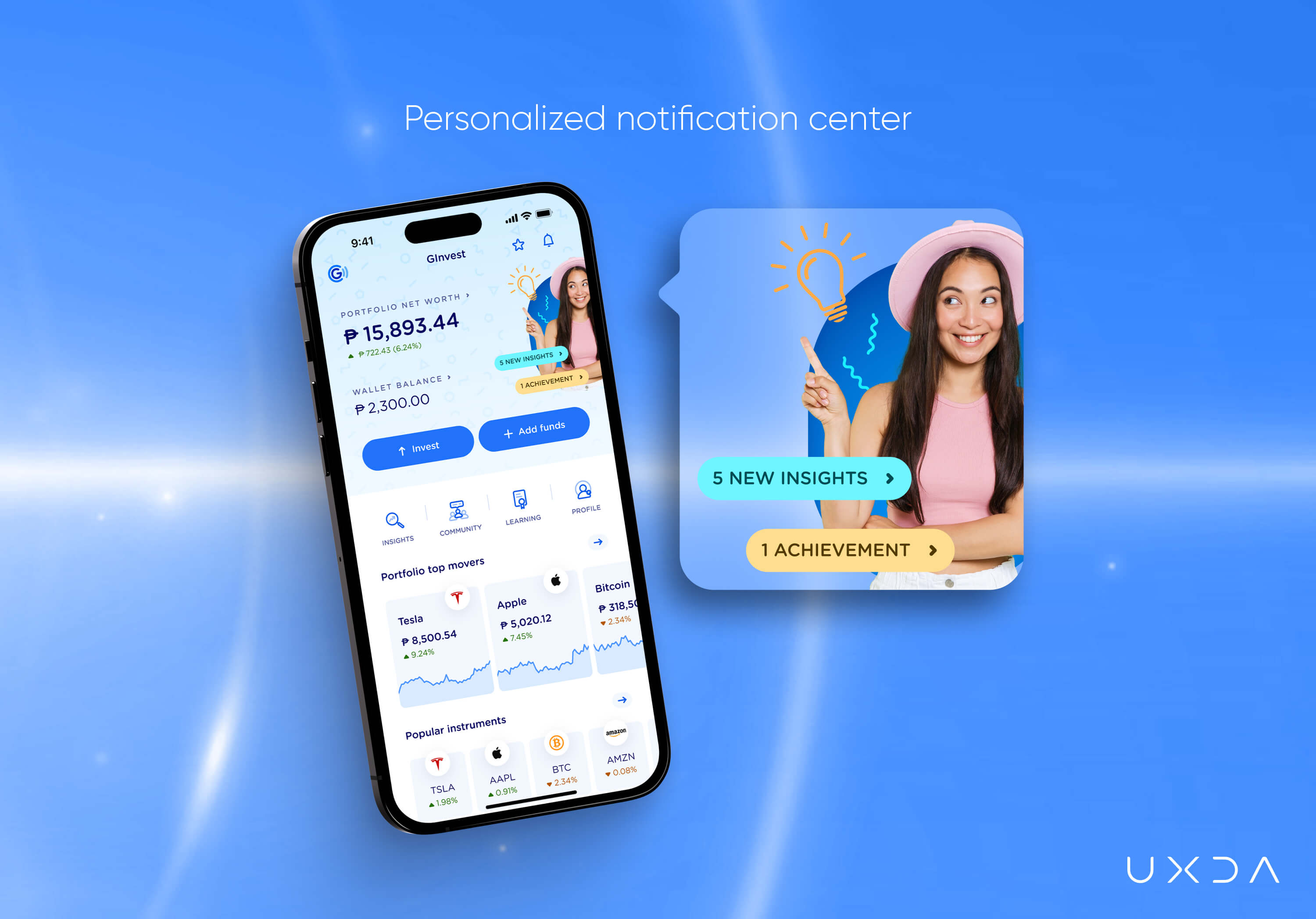
The first element of the consolidated GInvest dashboard will be a live, personalized notification center. It will be the main source of key information, insights and suggestions, regardless of the users' expertise level. Being with the users throughout their whole journey lets them feel informed, comfortable and confident and prevents them from feeling abandoned in an unfamiliar environment.
Educating Users
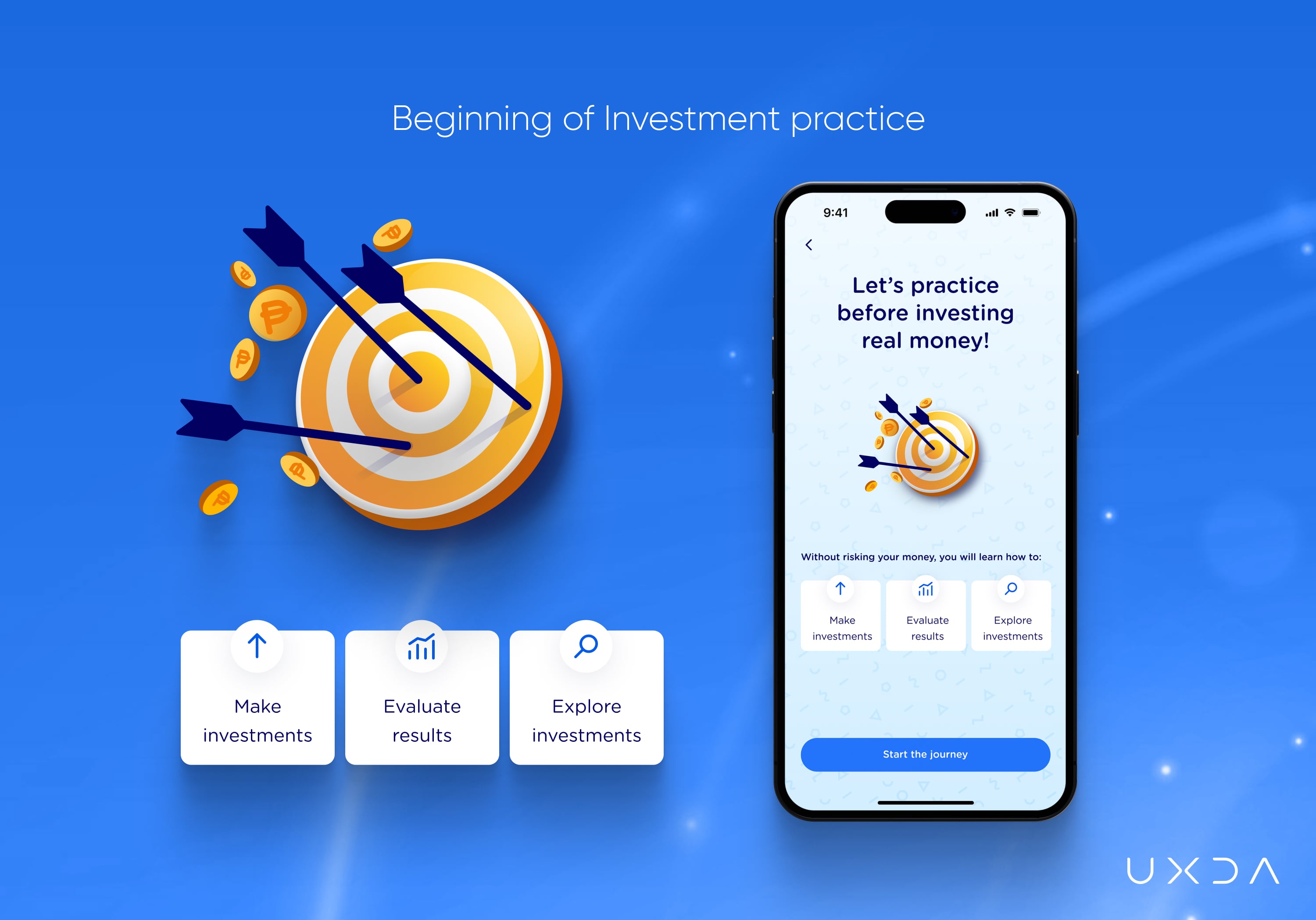
GInvest smoothes the beginning of the investor's journey by offering an educational practice through simulations on the GCash website and the Learning Hub on the GCash app. Instead of letting users trade virtual money with live data, we introduced a short investment practice journey that guides users through the key investment scenarios they would come across in GInvest. It explains the principles of investing and educates them. Learning the market through virtual simulators could take months, potentially resulting in a number of lost opportunities.
Guidance and Support Throughout the Investment Journey
One of the struggles was due to the fact that any kind of direct investment suggestion is regulated and restricted in Philippine’s investing platforms. To care and give feedback to the users regarding their investment behavior, we had to think of ways to demonstrate how aligned they are with their initial goals and, more importantly, lead them toward better investment decisions. As a result, GInvest analyzes the users' behaviors and offers individual suggestions, such as correcting their investment choices, thus guiding users within the allowable limits.
Making it Engaging for Users
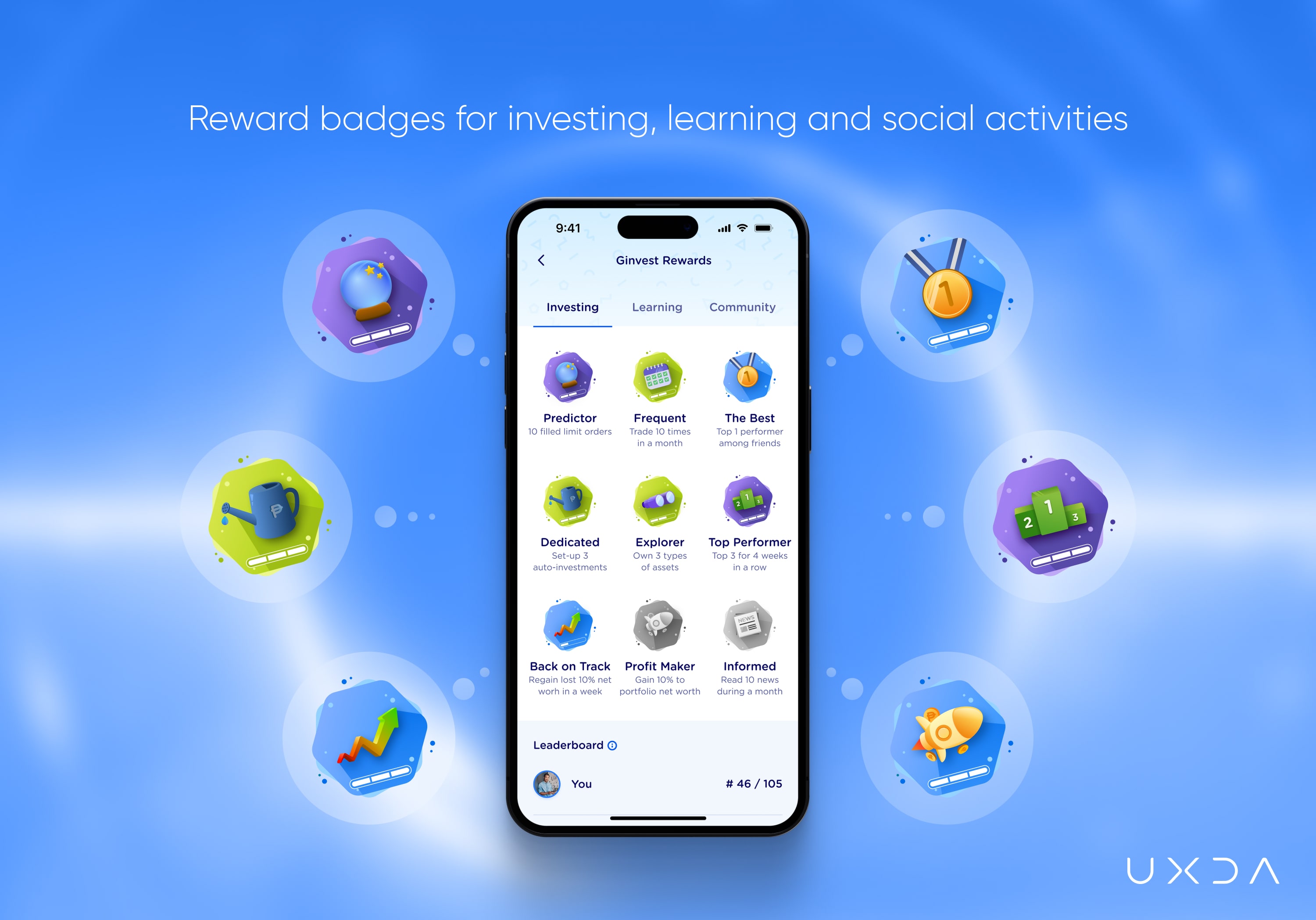
To make the whole experience interactive and engaging, we used gamification elements that encourage and reward users for their investing and exploratory activities. The personalization within GInvest will adjust the investor's experience to the individual's literacy and interests.
GCash has inspired us with a gamification idea from the GCash Junior service, in which younger eWallet users are rewarded with badges for completing the tasks. By progressing and gaining more knowledge, people who are taking their first steps in investing will get more motivated to carry on their investment journey, so we inherited the idea and adapted it for GInvest. Users will receive reward badges for learning, exploring investment opportunities and socially interacting in the GInvest community.
Bringing Support Through the Community
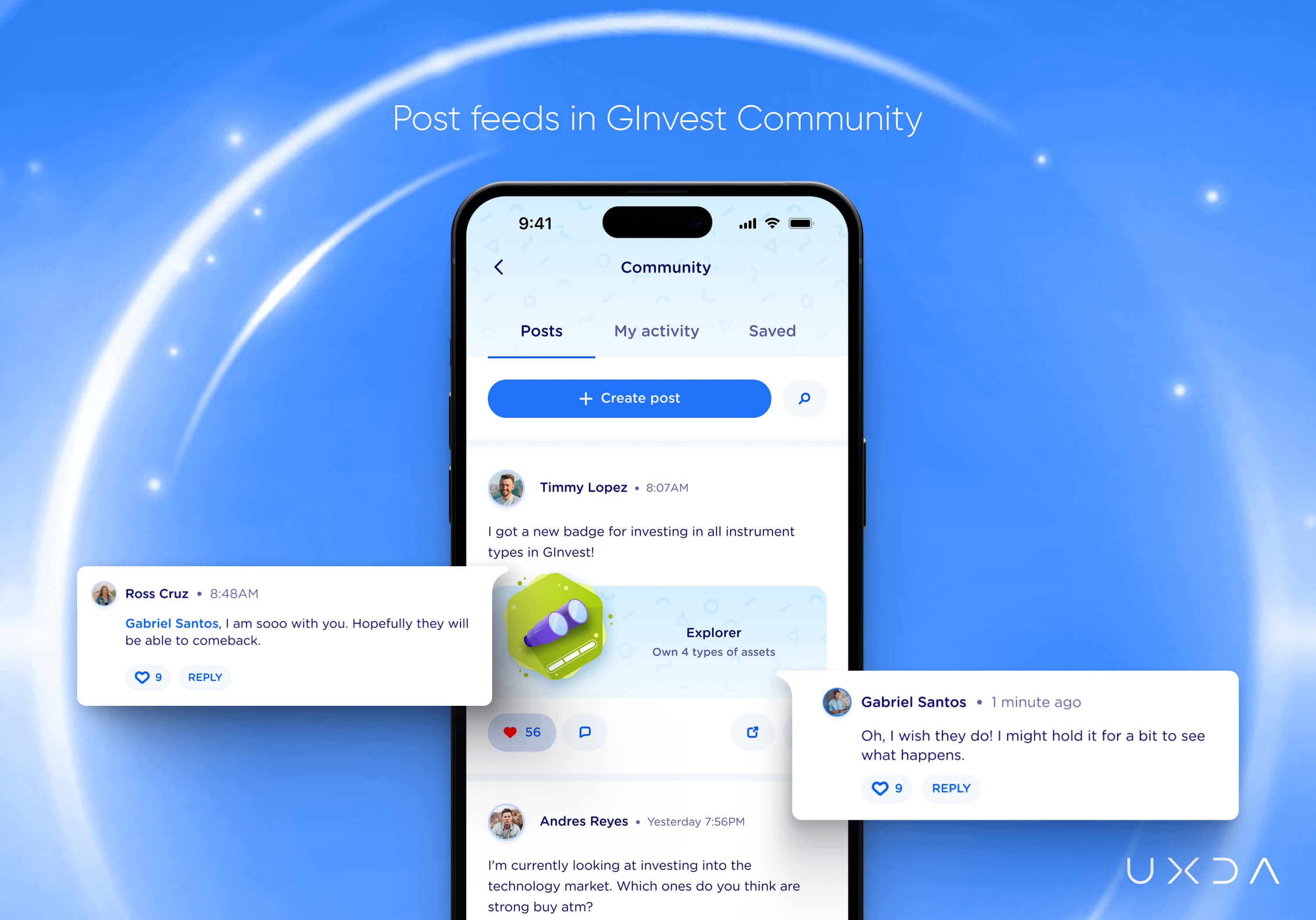
GCash is willing to transfer discussions about investment decisions and strategies from Facebook pages to GInvest, so we designed an internal social network in which GInvest users can share, observe and communicate with friends to enhance their investing experience.
Additionally, the GInvest community is intended to make users feel safe, witness the ups and downs their friends experience, get inspired by others and understand they’re not the only ones who are having a hard time becoming comfortable in the investment world.
UXDA Deliverables
- Stakeholders’ interviews
- Product strategy
- Product audit
- Contextual market analysis
- User personas with empathy map
- User scenarios trough JTBD framework
- User journey map
- Scenario prioritization in red route map
- Information architecture
- Value storyboard
- Product experience movie
- Wireframes and UI design with a unique set of illustrations
- Design library
- Product motion design
- Product launch support
Takeway: Respect the Product and its Users to Avoid a Fragmented Experience
Often, the regular addition of new features turns the product into a Frankenstein creature, assembled from a bunch of dissimilar parts. This is a huge problem for super apps growing at the speed of light. Inconsistency ruins the user experience, making it difficult to use the product. However, even a very complex service can be neatly and seamlessly integrated into the existing digital ecosystem if done with care and respect for the product and users.
An effective UX methodology used while creating the GInvest finance super app proves that even a large variety of complex information can be adapted and presented in an easy and understandable way, making the service flow easily and be accessible for everyone.
This case also shows that, with the right approach, there is always room for creativity and innovation, even when creating a section inside the platform with certain design constraints. Clients loved the product vision and user experience of GInvest, as we were able to make it belong to the GCash family, transmit the key values for the users and share the same ideology and approach toward providing accessible investments.
Explore our client's next-gen financial digital products and UX transformations:
If you want to create next-gen financial products to receive an exceptional competitive advantage in the digital age, contact us! With the power of financial UX design, we can help you turn your business into a beloved financial brand with a strong emotional connection with your clients, resulting in success, demand, and long-term customer loyalty.
- E-mail us at info@theuxda.com
- Chat with us in Whatsapp
- Send a direct message to UXDA's CEO Alex Kreger on Linkedin


