What is financial dashboard design?
UXDA experts define a financial dashboard as a digital user interface that shows primary data or key performance indicators (KPIs) based on actual service processes. In banking, it could be the first page of desktop banking or mobile banking that shows balances, monthly income and spending, recent transactions, budget forecasts, recent bills, key notifications, etc.
To design a financial dashboard, you need to audit banking features, explore user context and expectations and find the best way to provide complex financial information in an easy and clear way. It is not easy to combine multiple forms of data into a smooth and clear dashboard, so it is vital to explore best financial dashboard designs that ensure a fresh and inspiring approach to banking UI design.
How to create best financial dashboard design?
1. Explore users' goals, pains, tasks, patterns and expectations;
2. Prioritize user scenarios;
3. Choose TOP insights to provide;
4. Make intuitive and simple Information Architecture (IA);
5. Design the user interface in accordance with IA using the right visual accents and hierarchy.
Check out our articles to find some banking dashboard examples in UXDA’s portfolio and articles.
UX Case Study: a Bugatti-Caliber Experience for UHNWIs with $200 Billion in Assets
Private Wealth Systems aimed to revolutionize wealth management by delivering a user-friendly and visually stunning solution that meets the luxurious needs of multi-millionaires. Delve deeper to understand how UXDA partnered with Private Wealth Systems to facilitate a fundamental shift in wealth management.
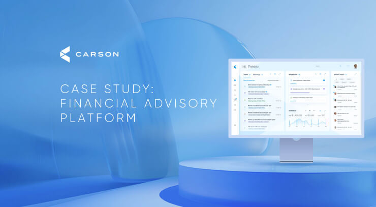
Carson UX Case Study: Crafting Purpose-Driven Platform for Financial Advisors
To ensure clients' dreams are realized through financial advisor strategies, Carson Group has created a powerful financial advisory platform and has become the frontrunner of purpose-driven financial innovations.
From Outdated to Outstanding: 10 Experience Redesigns in Fintech and Banking
Today's consumers seek seamless, intuitive and emotionally resonant interactions with their financial institutions. We offer ten examples of how financial products can be transformed to exceed expectations and create an emotional connection through a stunning UX design by UXDA.
ITTI UX Case Study: Next-Gen Core Banking Digital Transformation in the Cloud
With ITTI Digital’s permission, we are sharing an exclusive step-by-step case study on designing a next-generation banking back office that will definitely become a game changer in the industry.
Core Banking UI Design That Will Change The Perception Of Service Design
Following the success of our article about banking back-office flaws, UXDA dared our team to create never-before-seen banking back-office financial UX designs that would clear a path to a different approach.
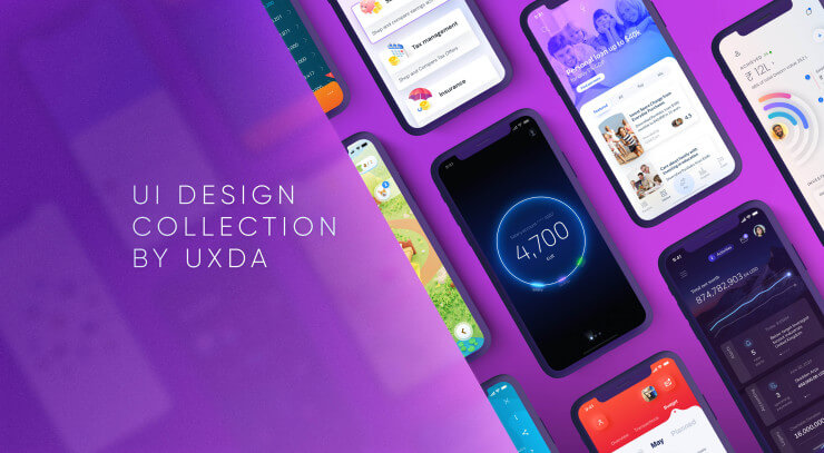
Finance Mobile App UI Design Collection by UXDA
There's no doubt - UX design is the key to success in the digital age. We have created a collection of our latest and most refreshing designs to prove - banking can be beautiful, easy-to-use and yet maintain the full functionality.
A Collection of 20 the Most Interesting Banking Design Ideas
There are so many beautiful visualizations of banking interfaces on Dribble and Pinterest. Unfortunately, if you look closer, quite often they are meaningless from the user experience perspective. Many of them are just beautiful animations that ...
