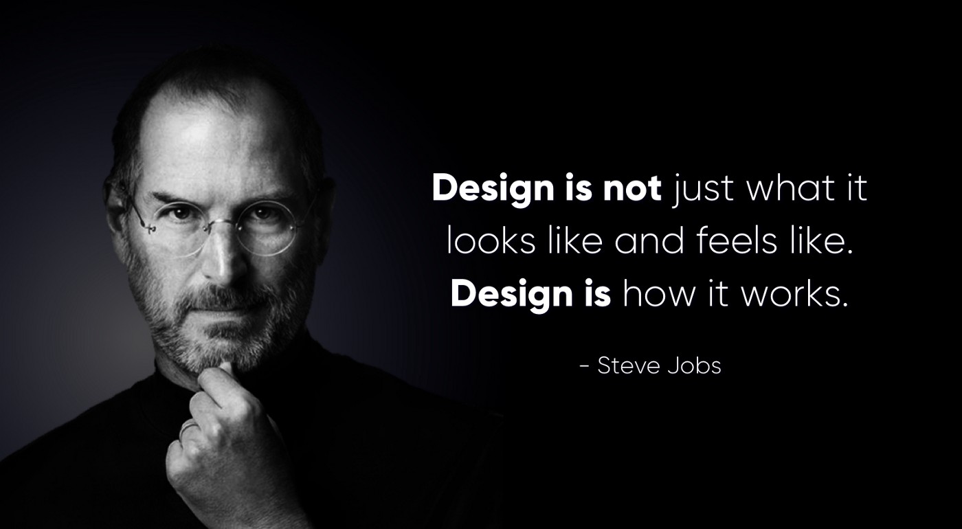
Many financial companies believe that packing their apps with countless features and the latest technology will attract and retain users. However, this approach could result in the opposite effect, driving users away due to overwhelming complexity. The true key to user retention is not more copycat features, but a more simplified, user-friendly experience. Apple’s approach to product design provides a perfect blueprint for this.
Banks often assume that users want more—more features, more options, more complexity. This belief leads to bloated apps that are difficult to navigate and understand. A study by UXDA revealed that during usability testing, 100% of respondents identified navigation issues as a significant pain point in banking apps. The problem isn't a lack of features but an excess of them, leading to cognitive overload and user frustration.
Apple's philosophy is to "Think Different" by prioritizing simplicity and elegance. This approach has proven highly effective in creating intuitive, user-friendly products. Imagine if banking apps adopted a similar mindset: stripping away the unnecessary, focusing on the essential, and creating a seamless user experience that feels natural and effortless.
What Is Apple's Product Strategy Focused On?
Where other companies give up and tell employees, “It's enough, let's put it in production,” Apple always persistently refines even the smallest of details to achieve the perfect simplicity. They are not satisfied with mediocre execution, and their team is always looking for new ways and approaches to provide the best customer experience and highest quality.
Everyone in the world calls Apple an innovative company because it uses the latest technology and innovations in its products. However, many of these technologies appeared on the market under other brands even before they appeared in Apple products. But, Apple engineers carefully evaluate innovations in the market and integrate them into their products in a way that ensures the best possible user experience. As a result, users get a product that is not packed with a bunch of useless functions but well-thought-out and convenient functionality that helps to make everyday life easier, creative and more fun.
This approach could apply to any company in any industry. You can get the same recognition, reputation, and demand in your industry as Apple if you use a similar approach every day to your services and customers. Even a tiny cafe can become the best and most sought-after service provider in the city─like the Hong Kong Soya Sauce Chicken Rice and Noodle by Chan Hon Meng, which received a Michelin star in Singapore. Travelers from all over the world wait in line for the exceptional experience provided by this food stall.
Steve Jobs was well known for his uncompromising approach and autocratic style. Many Apple employees were outraged and afraid of his autocratic leadership, so much so that at some point he was fired from his own company. And this brought Apple to the verge of bankruptcy in the 90s. Later, in his interview with Walter Isaacson, Jobs commented, “I don’t think I run roughshod over people, but if something sucks, I tell people to their face. It’s my job to be honest.”
Steve Jobs returned to Apple for his second stint in 1997, got up on stage and asked everyone to tell him "what's wrong with this place." After some murmurings and bland responses from managers, Jobs cut everyone off, "It's the products! So what's wrong with the products?" Again, more murmurs, Jobs shouted, "The products suck!" Jobs returned to save Apple and turn it into a technology leader. He designed iconic products that changed the world.
Apple's success is rooted in uncompromising design strategy─a design that helped deliver such a fantastic user experience that customers became fans of the company, and Apple's philosophy became their "religion." Consider how you can ensure such a design strategy breakthrough in your company. It will take a lot of energy and time, of course, but it's easier than it sounds.
Primarily, it should be understood that financial product design is not just about the attractive interface or "packaging", even though Apple, more than anyone, pays attention to packaging. Design is a way of thinking and solving problems using a scientific approach to find new ideas─ideas that are later executed with such an uncompromising quality of service, products, and experience design that customers fall in love with the company.

The Power of Simplicity in Apple Wallet’s Design
Apple Wallet's design is a powerful example of how simplicity, security, and emotional engagement can be balanced to create a user-centered financial tool:
1. Simplicity and Minimalism
Visual Hierarchy: Apple Wallet utilizes a clean and minimalistic design that emphasizes essential elements like cards, passes, and payment options. This simplicity is a hallmark of Apple's design ethos, reducing cognitive load on users and making it easier to focus on key functionalities.
Gestures and Navigation: The interface is gesture-based, allowing users to swipe between cards and other items with ease. This aligns with the minimalist approach by keeping controls out of sight until needed, thus maintaining a clutter-free interface.
2. User-Centered Design
Contextual Accessibility: Apple Wallet is designed with user convenience in mind. For example, it automatically presents relevant cards and passes based on location or time (e.g., a boarding pass when you're at the airport). This anticipatory design improves the user experience by reducing the steps needed to access information.
Ease of Use: Adding new cards or passes to Apple Wallet is streamlined, often requiring just a scan or a few taps. This ease of use is crucial in financial UX, where frictionless transactions can significantly enhance user satisfaction.
3. Emotional Design and Trust
Security and Privacy: Apple Wallet's design emphasizes security without making it obtrusive. Features like Face ID or Touch ID are integrated seamlessly, reassuring users of their data's safety while keeping the interaction smooth and quick. This builds trust, which is critical in financial services.
Personalization: Users can customize their Wallet with different types of cards, passes, and even loyalty programs. This personal touch can enhance emotional engagement, as users feel a sense of ownership and personalization in their digital wallet.
4. Integration and Ecosystem
Seamless Integration with Apple Ecosystem: Apple Wallet is deeply integrated with the broader Apple ecosystem, from iPhones to Apple Watch. This integration ensures that users can access their Wallet easily across different devices, creating a seamless experience.
Third-Party Integration: The Wallet also supports third-party apps and services, allowing users to manage a wide range of cards and passes in one place. This integration is crucial for maintaining a unified experience and simplifying financial management.
5. Visual and Interaction Design
Card Presentation: The cards and passes in Apple Wallet are presented in a way that mimics their physical counterparts, using skeuomorphic design elements like shadows and textures. This familiarity helps users transition from physical to digital wallets without losing a sense of comfort.
Interactive Feedback: Apple Wallet provides immediate visual and haptic feedback during interactions, such as when a card is selected or a payment is confirmed. This feedback loop is essential for reinforcing user actions and ensuring they feel confident about their transactions.
Moving Beyond Functional Design in Finance
Previously, customers of any company made decisions about using products only based on their functionality: useful or useless, good or bad. Currently, the basic functions of well-known products are very similar. If you compare Apple and Samsung smartphones, or Mercedes and BMW cars, these products do the same thing. There are practically no functional differences, or they are minimal, and the only ones who can identify them are those who compare these brands or use both daily.
Each of the well-known brands has its own identity, its legend, and unique value. Value is the foundation on which a brand of any company builds long-term relationships with its customers and strengthens their faith and trust. Value is what the brand's customers pay for because nowadays, they rarely buy only functionality.
If you want your business to become as beloved as Apple, just a good product or service is not enough. You need to create significant added value that magnetizes the attention of your customers. The size of this value determines how much your product or service will be in demand and what price people will be willing to pay for it.
Apple is an excellent example of creating the best possible customer experience with design-centered innovations and corporate culture. And any business can be transformed into such a company. To ensure such a culture of innovation, you need to speed up the design maturity of the company.
To execute a business idea, an entrepreneur needs to create a business model by defining the key processes for producing a product or providing a service. The next step requires a team of professionals capable of realizing this idea and performing business processes. Once the team is formed and follows the planned processes, the right actions need to be taken to start manufacturing or providing services.
To make sure your financial product design is moving in the right direction, you need to identify and measure the results of your team's actions. By doing so, you will ensure the unique value that your product or service will deliver to your customers, thereby making your business successful. So, design helps to create and increase this success if it is implemented at all five levels of the company: process, team, actions, results, value.
Here's how the UXDA team applies Apple's lessons to the design of financial services:
- User-Centric Onboarding: The first interaction with the app should be smooth and welcoming. Apple's onboarding processes are known for their simplicity and effectiveness. Banks can emulate this by using progressive disclosure techniques, where information is revealed gradually, preventing users from feeling overwhelmed from the start.
- Streamlined Navigation: Simplify the user journey by mapping out the most critical tasks and making them easily accessible. UXDA's approach involves restructuring navigation to ensure that the most commonly used actions are front and center, reducing the steps needed to complete tasks.
- Purposeful Personalization: Just as Apple personalizes experiences without overwhelming the user, banks should use data analytics to offer meaningful personalization. This means providing tailored financial advice and offers that resonate with individual user needs, without cluttering the interface with irrelevant information.
- Emotional Engagement: Apple's products evoke emotions through design. Similarly, banks should focus on the emotional aspects of their UX design. As the UXDA expert team highlights, humans are emotional beings, and our irrational emotions drive 80% of our behavior. Creating an emotional connection through delightful micro-interactions and pleasant design can significantly enhance user engagement and loyalty.
- Consistency Across Channels: Ensuring a seamless experience across all digital touchpoints—mobile, web, and beyond—is crucial. Implementing an omni-channel strategy that includes native solutions for major platforms ensures that users have a consistent and familiar experience, no matter how they access their banking services.
- Simplification Without Primitivism: It's important to distinguish between simplification and primitivism. Simplification should make achieving tasks easier, not reduce the functionality. For instance, transforming a car with manual transmission to an automatic one simplifies control without removing the essential driving functions. Similarly, simplifying banking interfaces should enhance usability while retaining core functionalities.
- Feedback Integration: Continuous user feedback is essential for refining and improving the app. Regularly gathering user insights through surveys, usability testing, and analytics helps identify pain points and areas for improvement, ensuring the app evolves to meet user needs.
- Holistic Design Systems: A cohesive design system ensures consistency and efficiency. This involves creating a set of standardized design principles, UI components, and style guides that streamline the development process and ensure a unified user experience across all platforms.
- Usability Testing and Iteration: Continuous testing and iteration are vital. Apple frequently iterates on its products based on user feedback, and banking apps should do the same. This approach ensures that the app remains relevant and user-friendly over time.
- Empathetic Design: Understanding and addressing the real-life stories and needs of users is crucial. Empathy maps and user personas help designers create experiences that truly resonate with users, ensuring that the app not only meets functional needs but also emotional ones.
Empower Financial Product Design at All Levels of Business
We've all heard that a restaurant starts with the kitchen. If the kitchen is in perfect order, adheres to high standards of cleanliness, and all products are properly prepared and stored, this ensures the prepared dishes' quality and shows the company's attitude toward its customers.
Also, the original and pleasant design of the restaurant's interior, amazing details such as free water with rose petals or unusually served snacks, attentive service, thoughtful choice of dishes and delightful plating, as well as compliments from the chef, can encourage visitors to tell their friends about the establishment. Such clients become loyal and advertise the restaurant. This works only if the food is great, of course.
Apple's product design is not created in some department in a distant basement, it is formed and improved at all levels of the company, starting with the CEO and ending with support employees. The same approach works for financial product design at all levels of the organization:
1. Prioritize design through all the processes
The first step is to prioritize customer-centered financial product design across all business processes to ensure that everyone in the company cares about the customers. This will create and significantly enhance your company's overall brand value. In every business process, you need to ask questions: How does this help our clients? How does it improve customer relationships? What positive emotions does this invoke in our clients? Ask yourself these questions even when it comes to internal processes that customers do not see.
2. Ensure design competence in your team
The next step is your team. If you want your business to succeed through design, then creative and responsible professionals focusing on the design must be involved in the work. If they are difficult to find, you can create them by training an in-house team and practicing a design-centered approach to service creation and company development.
You can also hire outside professionals because there are many UX design agencies around. But, this can only work if company managers understand the power and impact of design and actively integrate and develop it within their team. That's why Steve Jobs was obsessed with perfect design, and one of Apple's top executives, Jonathan Paul "Jony" Ive, was a designer himself.
3. Bring design into action by sharing responsibility
Next, if you have professionals who can improve your financial product design, you need to figure out the right course of action. If a designer just sits and creates beautiful packaging for a product, this will not give you anything that will sustain the company's long-term development. The company's designers must be able to participate in the creation and development of the product.
Example: A company has built a great financial product design team but hasn't improved the service. The reason is that all service decisions were made at management meetings, at which the designers were not allowed, since this was their responsibility.
If you want to quickly and significantly improve your product or service, involve your entire team, and even your customers, in the financial product design creation. This will give you many intriguing ideas and insights, and a better understanding of your customers need and how you can exceed their expectations.
4. Measure design with the right results
The fourth step concerns measuring execution. Results and KPI (Key Performance Indicators) are what you define in the company as the goal that your team must achieve. If you want to develop design thinking in your company, results must be defined and measured accordingly. Business performance metrics should include your customers' reaction to your product or service.
How satisfied are your customers? How willing are they to recommend you to others (NPS - Net Promoter Score)? How actively do they use your product or service? How often will your customers come back for a repeat purchase?
5. Apply design to the value
The most crucial step is to identify the brand's core value and ask the right questions. By applying customer-centered financial product design in all of the above steps, it is possible to deliver incredible value for your customers.
You could also apply design right to the key customer value definition because design helps you answer the main questions that determine brand value: Why are we doing this? What does this give our clients? What makes us special? and Why should customers choose us?
Conclusion: Find Your "Why"
The financial services must shift their focus from adding more copycat features to enhancing user experience. By adopting the Apple way—prioritizing simplicity, emotional engagement, and user-centric design—banks can create digital experiences that not only meet but exceed user expectations. It's time to rethink and renew digital banking interfaces, crafting solutions that are not just functional but delightful, turning every user interaction into a meaningful and satisfying journey.
This was very well explained by Simon Sinek, who also used Apple as an example. In his concept, The Golden Circle, Simon explains that Apple outcompeted thousands of other electronics companies with their "Think Different" motto and creativity support. Only after the answer to the question, "Why are they doing this?" can follow the questions "How do they do it?" and "What are they doing?" Only by focusing the entire company on a single idea did they manage to inspire customers, employees, and the whole world, resulting in a unique and strong brand. The value we are talking about is not provided by individual Apple products but by the entire Apple ecosystem and strategic approach, bringing together all the services into a continuous user experience flow.
Unfortunately, most companies do not define their value by formulating an answer to the question, "Why are you doing this?" It’s because they believe that everything is for the sake of profit. But, as Simon says, profit is a result, and a business's real purpose is different. It's about serving people’s needs. Many companies find it easier to answer the question, “What do we do?” and “How do we do it?” That's why Apple and companies with similar design-centered approaches are at the top. They use the power of design to communicate their “why” in absolutely everything they do.
The value of this is so great that sometimes users are willing to forgive even partial shortcomings of a product or service while still maintaining their loyalty and paying a much higher price than the market average. Customers forgive imperfection only to those who are obsessed with perfection and love what they do. Use Apple strategy as an inspiration, and use the power of design to provide your customers with the highest quality service.
Get UXDA Research-Based White Paper "How to Win the Hearts of Digital Customers":
 If you want to create next-gen financial products to receive an exceptional competitive advantage in the digital age, contact us! With the power of financial UX design, we can help you turn your business into a beloved financial brand with a strong emotional connection with your clients, resulting in success, demand, and long-term customer loyalty.
- E-mail us at info@theuxda.com
- Chat with us in Whatsapp
- Send a direct message to UXDA's CEO Alex Kreger on Linkedin


