It can be a major challenge to adapt a financial company to the fast-paced digital world. For some banking services, it's not only about success in the future but a question of existence. At the same time, there are hugely successful companies that are achieving extraordinary results with minimal resources. What's their secret? After analyzing their approach, we’ve identified five customer experience based brilliant trends that lead the transition to digital and make it extremely successful.
Listen to the article in audio format:
Following these trends allows you to move in the shortest possible time from the old models that are no longer working to the new - using the capabilities of the modern world. It seems some already are able to leverage the possibilities of the digital world to the fullest. Why lag behind?
To get the maximum out of this article, use this PDF worksheet while reading. This way you can test whether your own financial company applies to the mindset of the digital age, and think about the ways to improve it.
Hello, New World of Customer Experience
Some time ago, companies used TV, magazines, billboards and radio to inform consumers about their products and services. Those were the days when marketing was a guaranteed path to any product success.
If you remember, Coke was a medicine transformed into a refreshing drink and expanded throughout the globe with aggressive advertising. The basic idea of those times was that you can make a product from almost anything and motivate people to buy it using a marketing push strategy. You’ve all seen those Top-Shop TV ads, right? They were pushing all kinds of crap, and people bought it like crazy. We can call this time the Golden Marketing Age. Everything was driven in one direction: how to increase sales. It was about gaining market share, fighting competitors, manipulating customers, massive advertising and other marketing schemes.
However, with the development of digital technology, something significant has happened in the world, and the tools that have been proven for decades have stopped working. The world is making new demands on business, and banking services is no exception. To better understand these requirements, let us briefly review how the development of digital technologies has impacted the world.
Network Effect
Today, we are seeing a sharp decline in the effectiveness of the marketing model.
The world is ruled by online consumption. Classic advertising channels and the usual forms of advertising no longer work, and people simply ignore them. In connection with the network effect, even the most successful strategies of the past can lead to a devastating failure.
For example, in the past, almost any product or service could be sold by running a large-scale advertising campaign. Today, in the case of insufficient quality, such advertising further boosts the exchange of negative opinions on the internet, similar to one entrepreneur who ordered OEM products from China. He created attractive packaging and paid for huge advertising campaigns, but the product quality was terrible, and multiple negative reviews on social networks ruined his business.
Nevertheless, the same network effect can be used for fast and inexpensive promotion of quality products. For example, FinTech startup Revolut secured two million users with no advertising budget at all. The internet, smartphones and global digitalization is disrupting the world we live in, and that's a fact.
Direct Connection
Previously, there were a lot of intermediaries between the manufacturer and the customer. Many decisions had to be made blindly as the reaction of consumers was difficult to track. Today, business has the opportunity to build a direct communication with the client using digital channels.
The internet and social networks have made transparency an inherent characteristic of life. People are not afraid to share their private information with one other, exemplifying their reputation and trust in the digital environment. They expect the same from business. The way it is represented in the digital world and how active it is shows what values are important and how much it can be trusted.
Transparency has ceased to be unique and has instead become an indispensable attribute of progressive companies. Consumers are seeking information about businesses on the internet, and it is important for them to understand what entrepreneurs have done, what drives them, how they relate to other people, what values they have and how they act in difficult situations.
Therefore, direct communication through digital channels allows one to not only represent the company on the internet, but to receive feedback, establish a trusted dialogue with its followers and become part of their network.
Increase in Competition
Recently, in some countries, large banks were almost monopolists because they had a very strong and stable market share. Strong barriers of the financial services market entry, loyal customers and the absence of worthwhile alternatives ensured good positions for decades.
The development of digital technology has changed everything. Today, customers have dozens of new alternatives every year because it’s never been so easy to launch a FinTech startup due to the following reasons: low entry barriers, work and support from anywhere in the world, the ability to offer solutions using infrastructure external suppliers, the use of outsource solutions and cloud solutions. Add open banking to this list, and it will become clear that banking will never be the same.
Not only banks and FinTech startups, but also global tech corporations and crypto-enthusiasts have entered the battle for user finances. Only time will tell what will come of it - the largest competitive war in history or a new type of economic system based on digital cooperation.
Customer Expectations
In the old days, perception of services was divided according to their physical location. It seemed logical that a restaurant and a branch of a bank were two completely different things. Today, technology invites you to the world of mashup, sharing, peer-to-peer and crowds.
You can have a bank, restaurant, shopping mall and a grocery store in a single space, digitally, on your smartphone. After all, both food orders and bill payments can now be made through mobile applications. This dramatically expands the usual boundaries of consumption, forming cross-industrial user expectations and user experiences.
So, why one application is easy and pleasant to use, and the other isn't? This is a question that people ask more often. The most popular services set the bar high, which establish generalized customer expectations regardless of the industry.
Automation
In the digital age, it feels quite strange when a bank is asking you to fill in a form in handwriting even though you know they have all your data in their database.
Of course, this process has worked this way for many years. There are boxes with thousands of forms printed stored with a thick layer of dust. Customers seemed to accept it and played by these rules for a very long time until products that offered the same solutions, but much quicker and simpler, appeared on the market.
And today why would you choose a boring and difficult service if there are so many other choices available on the market? Nowadays, automation is not a business improvement; it’s the only way to conduct business!
Most Important Transition to Purpose-Driven Business
In the old days, it was all about numbers. It was enough to focus on your budget, reach, conversion and, of course, sales. The outdated approach implies that the client should be seduced, and it is necessary to convince them to use your service. This requires bright, interesting advertising, placed wherever possible and repeated as often as possible.
Today, it’s all about people. You can reach almost anyone with no cost using social networks, but do you have something the consumer actually needs? Something that solves their actual problem and provides a delightful user experience? If not, there will always be someone who can and will. We can name it the age of experience.
It is obvious that the previous approach is no longer so effective. There is a huge gap between the Industrial Age and Digital Age. It’s not about the tools we use, but rather about our mindset. For some of us, it is really difficult to jump over it, but there is no other way to get success in the future. To fit into the new conditions, a business must integrate customer-centered purpose at the level of mindset and culture.
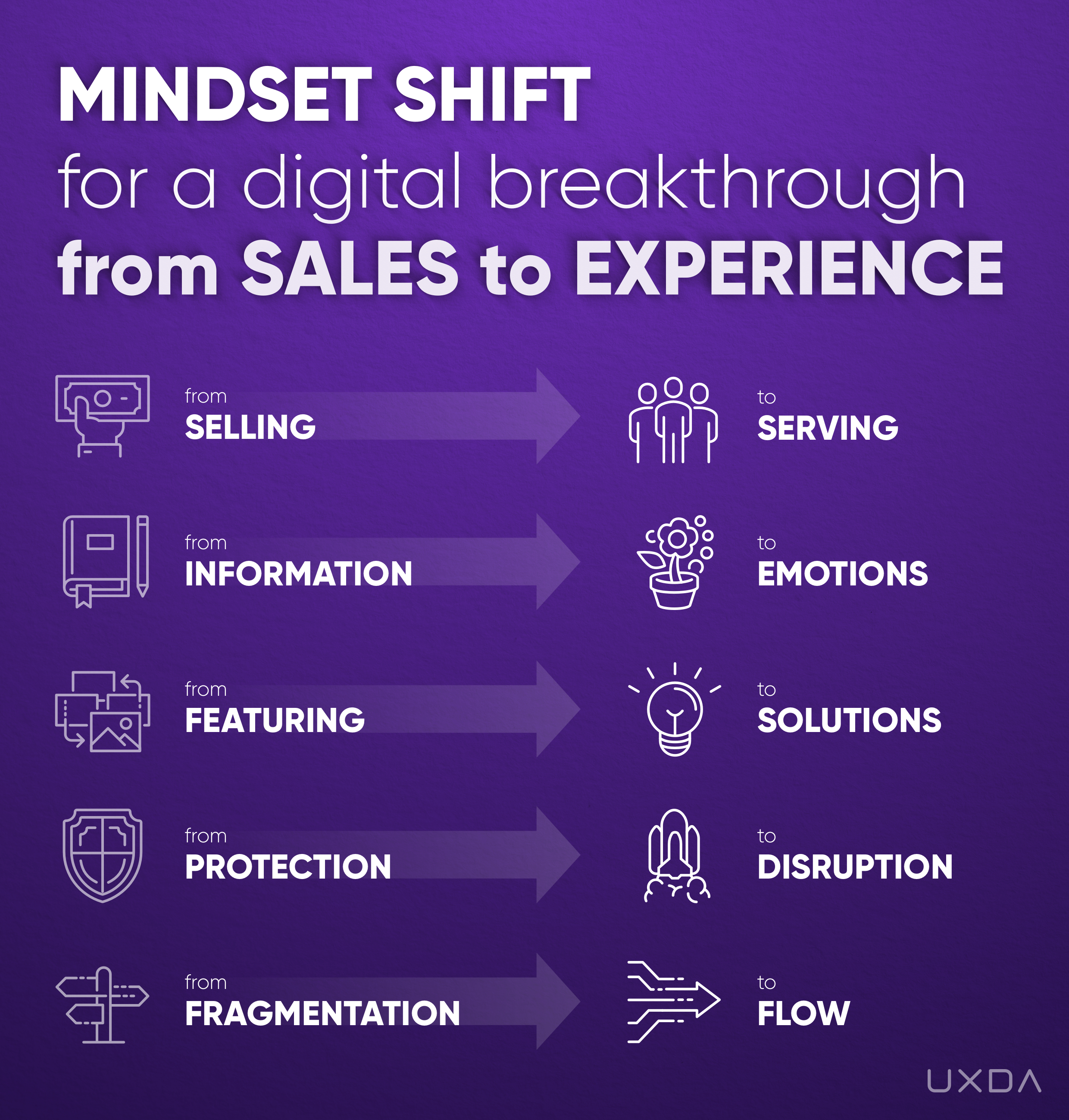
Customer Experience in Banking - Mindset Shift from SALES to EXPERIENCE
How to Ensure Banking Transformation Based on Experience Mindset
We see that successful Fintech companies fundamentally differ from traditional financial institutions in their attitude towards customers and businesses. The successful modern approach is aimed at helping the client instead of manipulating; it requires other business priorities and ethic.
First and foremost is concern for the client, their needs and experiences. This is the only way to design a delightful experience, so that the client would highly appreciate it and even become a brand ambassador.
If you want to adapt your financial business to the realities of the digital world and do it successfully, I have collected the best lessons I've learned from my own experience working in the field of digital financial services design in 36 countries.
Switch From Sell to Serve
Traditional companies rigidly focused on sales, perceiving users as objects of manipulation from whom to get money in any way possible. We have all watched Wolf of Wall Street, right? Therefore, even such trends as Design Thinking, User Experience and User-Centricity become just marketing tools that allow the wolf to put on sheep's clothing to lure the buyer closer and perform the “win-lose” model.
Companies that actively implement the work principles of the Experience Age aim to bring maximum value to the client, in exchange for which the client will gladly reward the company and support its development. This is a sincere “win-win” relationship that truly makes the world a better place.
The most efficient enterprises today place customer experience metrics to the forefront, including Net Promoter Score, feedback monitoring, support request statistics, speed of key scenarios performing, retention rate, etc. This allows to measure the quality of customer experience and declare it as a key value in the company.
During the Experience Age, sales efficiency is increasingly dependent on the service value to users. Thanks to the network effect, positive reviews become the best advertising. Therefore, the most successful companies of our time have already switched their focus from sales to service. They support their products and their culture through metrics, values, experience design and learning.
For example, traditional banks use their homepage on the internet to promote all services, turning it into an advertising platform. This causes the user to drown in a large number of bank offers and lose direction.
FinTech companies, in an easy and accessible way, prioritise key scenarios, for example, opening an account and only then gradually make a contextual upsell. User experience and customer emotions are really important to them.
Unfortunately, some specialists believe that a knowledge of psychology is a good tool to increase conversion. But, instead of using human psychology to trick users into buying useless products, we should think about how human psychology can increase the value of our products and help to deliver an experience customers will appreciate.
TAKEAWAY
Where would you place your business approach, culture and goals on this scale? What is the main driver of your activity - to “sell” or to “serve”?
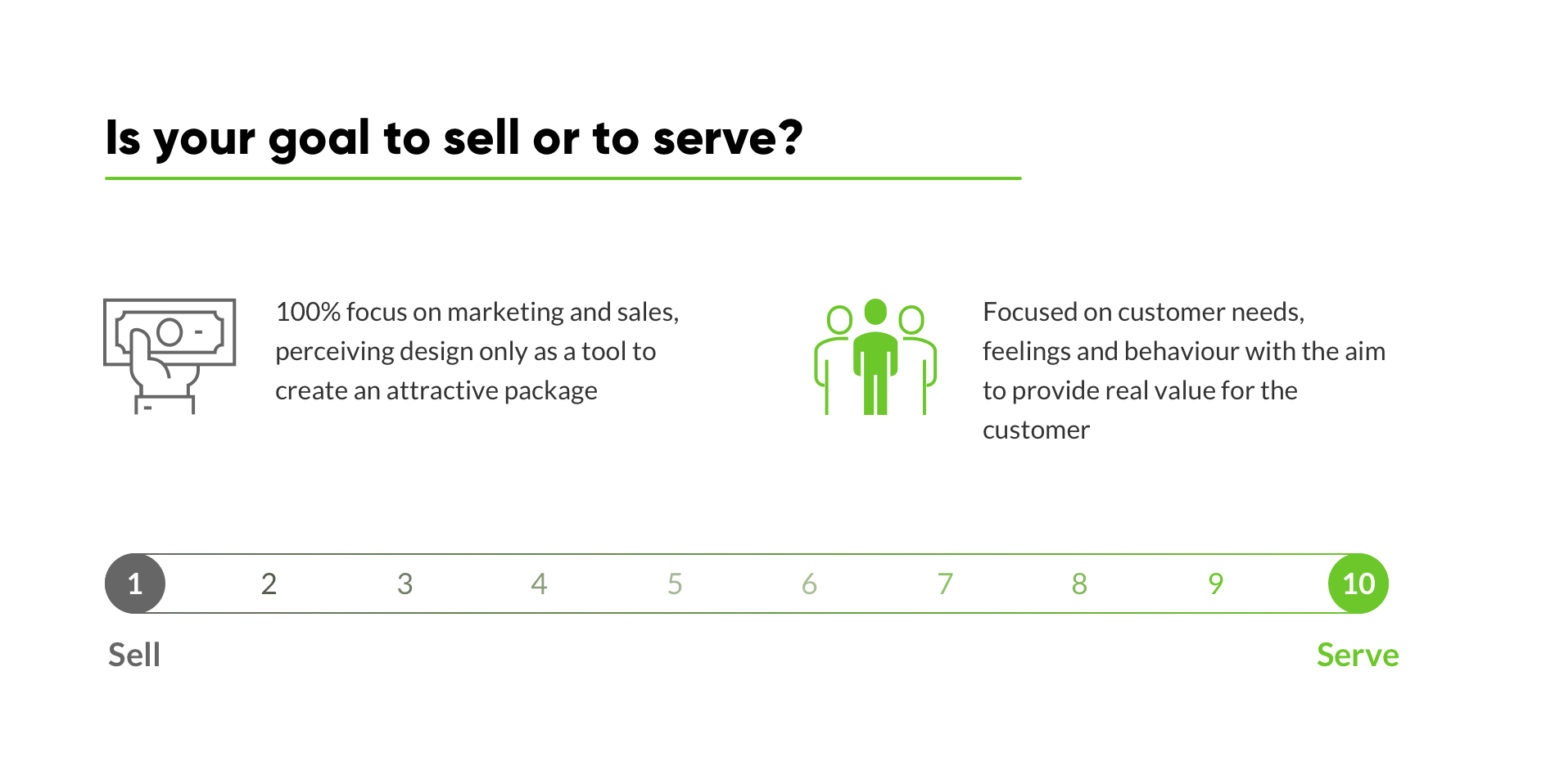
Once again, “sell” is about a focus on marketing, looking at people as numbers behind conversion. Design in this case is only about making the package attractive. And UX is a tool to manipulate user behaviour. “1” on the scale is about a selfish company that is driven only by profit and selling, perceiving customers as walking wallets. They absolutely don't care about their customers’ feelings or product quality.
“Serve” is focused on customer needs, feelings and behaviour. Conversion is just a metric to evaluate product clarity. The main aim is to provide real value for the customer, to make some difference with the product and to generate an outstanding customer experience.
Selling and money comes as a result of such activity. A “10” rated company is one that provides ultimate value to its customers by changing their life and world for the better. You might think about Google, Apple or Tesla here.
How could you move closer to a 10? What are the key actions that can take you closer to “serve” principle? For example, you can share some inspiring insights with clients instead of pushing products to them.
If you really want to make a significant change, I would suggest writing down the ideas that come into your mind while doing these exercises.
Focus on emotions instead of information
You might wonder, what's the problem with information? Isn't it a good practice to explain everything to your user?
From a marketing perspective, it is. In the previous age, people read the description of products in magazines to find out how it could help them. Basically, advertising was about simple information about products. Even today, you can see a lot of attempts to promote products just by informing customers about product features.
Unfortunately, it’s not working well for digital products. Today, we have too much information around us and too many competitive solutions, but only 20% of our brains think rationally. We perceive and act through emotions and instincts - so-called subconsciousness. This protects us from information overload.
If you open a website in search of a solution, would you read a paragraph about the company? Or would you form a first impression and quickly scan the page in seconds? Let's take a look at how this works in banking design.
Imagine you want to take out a mortgage and choose to look at the bank's website. You look around, and there's lots of information, some parts even duplicating themselves. It provides information, but does it create an emotional connection for you?
Users forget information but remember experiences, and experiences are created from emotions. This means that information should be integrated into a context of usage. It should become an organic part of the banking user experience.
To achieve this, we must focus on emotions our product delivers, using intuitive information architecture and a delightful UX design to manage it. Use customer experience design methodology to explore your users and connect with them emotionally.
Do not make your user read. Show them the right path using visual accents with simple and clear tags. Landing pages of FinTech services create this vital connection by delivering a clear message of who they are and why we should trust them. They usually use emotionally engaging visuals to show that they offer something revolutionary. They want to create the emotional connection through simple messaging and a clear banking interface.
Of course, there are “smart” marketing guys who misuse the principles of Experience Mindset in a malicious manner. They manipulate with human irrationality and emotions just to increase sales. And here it's very important to understand the difference.
In the Marketing Mindset emotions are used to trick people. Whilst in the Experience Mindset emotions are the language to communicate with the customer, understand his needs and expectations, in order to deliver the best possible experience.
TAKEAWAY
How can you implement this in your practice? Ask yourself, where would you place your business approach, culture and goals on this scale? What is the main drive of your activity - to inform or to create an emotional connection?
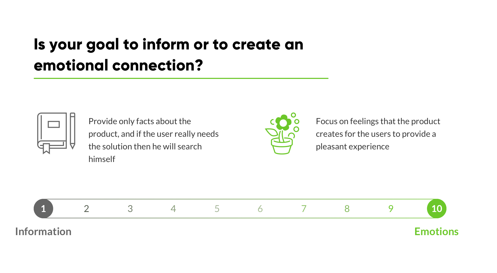
Once again, “information” is about providing some facts about your product or service, like the do-it-yourself approach. If a user really needs our solution, then they will search for it as long as it's needed by carefully reading all the information on our website. “1” on the scale is about a company that absolutely has no idea how the user feels and does not let them get too close.
“Emotions” means to focus on the feeling that our product or service creates. Such a company is interested in understanding its users well, their thoughts, emotions and behaviours. Why do they need our product, how will they use it and how can we better help them? What could be a pleasant banking customer experience in our case?
“10” on a scale could be given to a company that tries to perceive the world through its customer eyes and creates a close connection through its service. Apple is a good example of such approach.
If you wish to improve your result and get closer to a “10”, you could simplify your website by reducing some content, making the design more emotional or establishing a closer connection by asking your customers for feedback.
Maybe you already have great ideas of designing customer experience and adding emotions to your financial product? Write them down!
Provide a Solution Instead of Features
Another misconception of using UX is to generate killer features that will help to sell a product. For some companies, featuring is an obsession. The company believes that customers measure the value of the product by how many features it has.
A common way of thinking is to assume that the more features we deliver, the more likely customers will buy our product. This worked perfectly during the Marketing Age. If you come to a shop and compare two similar gadgets, and one has twice as many functions at the same price, then the choice is obvious. And it's not so important that only 20% of functions are ever used.
At some banks, if you want to do an online payment, you have to click on 'Payments, cards, accounts,' and it opens a huge list of 23 payment options. Then, after opening domestic payments, you’re offered a huge list of inputs to fill.
In the Experience Age, it works differently. Users are not interested in buying the functions of your drill. They simply need to hang a picture on the wall.
Businesses can provide this in many ways, especially in banking. To make a payment in e-wallet, you only need choose your friend from a contact list and enter the amount. That’s it.
Actually, we see that people do not like over-featurized services because they’re difficult to use. That’s why simple solutions provided by Fintechs are in great demand. They are easy to understand and simple to use. If you think in terms of customer experience for the user, you will see that some features have no value at all, while others play a key role. Prioritise features based on their value for a solution that the user is seeking.
A product with one feature that is simple and over-delivers an expected result achieves greater success then a complex service with dozens of confusing features. Here we can see a trap for some rocketed startups that tried to design a lot of new features after successfully launching MVP (minimum viable product). This must be done carefully to preserve usability of the basic solution and simple architecture.
We tackled this challenge for one of our clients. Instead of providing different payment forms for domestic, international, crypto, mobile and email payments, we designed a banking solution that determines what payment form would be needed by the respective recipient.
With this, we delivered a solution rather than a list of features for performing the payment. The user wants to send money, not to think about how to send it. In the digital age, it's our job to think about delivering the best possible experience to our users, keeping technical issues on the back burner.
TAKEAWAY
How would you rate your product - a feature or solution provider? What is more important - to create new advantages or to maximally fit your solution to customers’ needs?
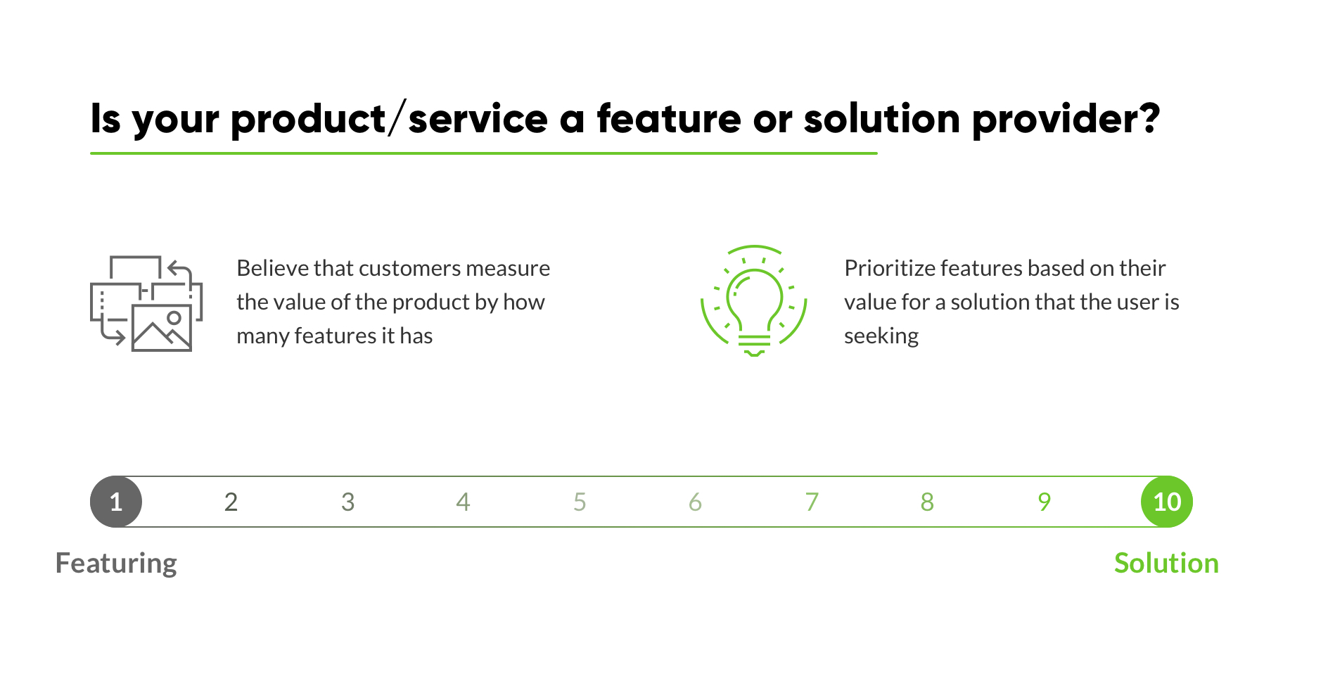
What can be done to immediately start improving your business right after reading this article? You could begin with the evaluation of your service features from a solution perspective or maybe even reduce the complexity of the existing product design.
Ensure Disruption Instead of Protection
Ok, let's move on. A Marketing Mindset would perceive the world as a battlefield. You have to conquer your market share and then protect it. Marketing people are sure that everyone wants to compete with them, steal their secrets and copy their successes. So, for them, the world is actually a threat.
In FMCG (fast moving consumer goods), a market where marketing was born, this mindset became the only way to survive. It was too easy to copy one other’s products. So, for thousands of non-unique products, the only difference was brand name and marketing presentation.
The worst part is that protection applies not only to competitors but to customers as well. “Protect” the product from customers getting to know the real features or side effects and don’t embarrass the buyer and ruin a sale. As we well know, these kinds of actions have caused serious health issues to thousands of loyal customers. As the marketing age money sign says, "If the cash is there, we don't care."
We can see the same in the banking world. For example, does the transfer payment form show how much sending 1,000 euros to other countries will cost you? Based on the rate that money will be converted, is it good? This information is hidden so as to not confuse the user and divert their attention.
The Experience Age, in this case, should be a better place to live because such an attitude will appear instantly on the internet. It is hard to keep it for very long. And we’ve heard a lot of similar revelations recently.
We should not fear the world or be aggressive towards it because the world is full of opportunities. Everyone can find their unique place in it and deliver value to the people around them.
So, why would you protect your business from market disruption if you could lead it? Instead of protection, gain inspiration from others!
In 2007, Nokia reached 1 billion customers and 100 billion in capitalization. The same year, the first iPhone was released. Years later, the Nokia Devices Unit was sold for $350 million. They failed to protect themselves from disruption. At the same time, Samsung nowadays sold even more smartphones than Apple because they nailed it.
We still see a lot of protection cases. Recently, some of my friends could not add funds to their FinTech e-wallet account with top-up by card. Their card issuer just didn’t allow those transfers. That raises the question of who's blocking and why.
Instead of thinking about how to protect their product and stop customers from leaving, banks have to change their mindset to figure out how to disrupt themselves and their competitors.
In the Experience Age, disruption is the only way to provide more meaningful and pleasant experiences for users. Let’s challenge the outdated legacy and design an innovative financial solution that matches user needs more effectively.
For example, Transferwise offered wire transfers with low transparent fees and fair currency rates using peer-to-peer technology. On average, Transferwise is 83% less expensive than the big four UK banks on major currency "routes" and moves over £2 billion every month globally. You can easily calculate your transfer costs right at the main page with no registration. They are not hiding anything.
Transferwise disrupts the industry by reducing fee instead of hiding it, which became common practice. Should banks protect themselves from it or enter it and bring more transparency and fair rates? It depends on your business priorities - to make profit or deliver value. Fidor Bank found the answer and implemented Transferwise into its services.
TAKEAWAY
Where would you place your modus operandi? Are you still trying to save your business from dangerous trends and aggressive competitors? Or, are you like pioneers who open new paths and challenge things around you?
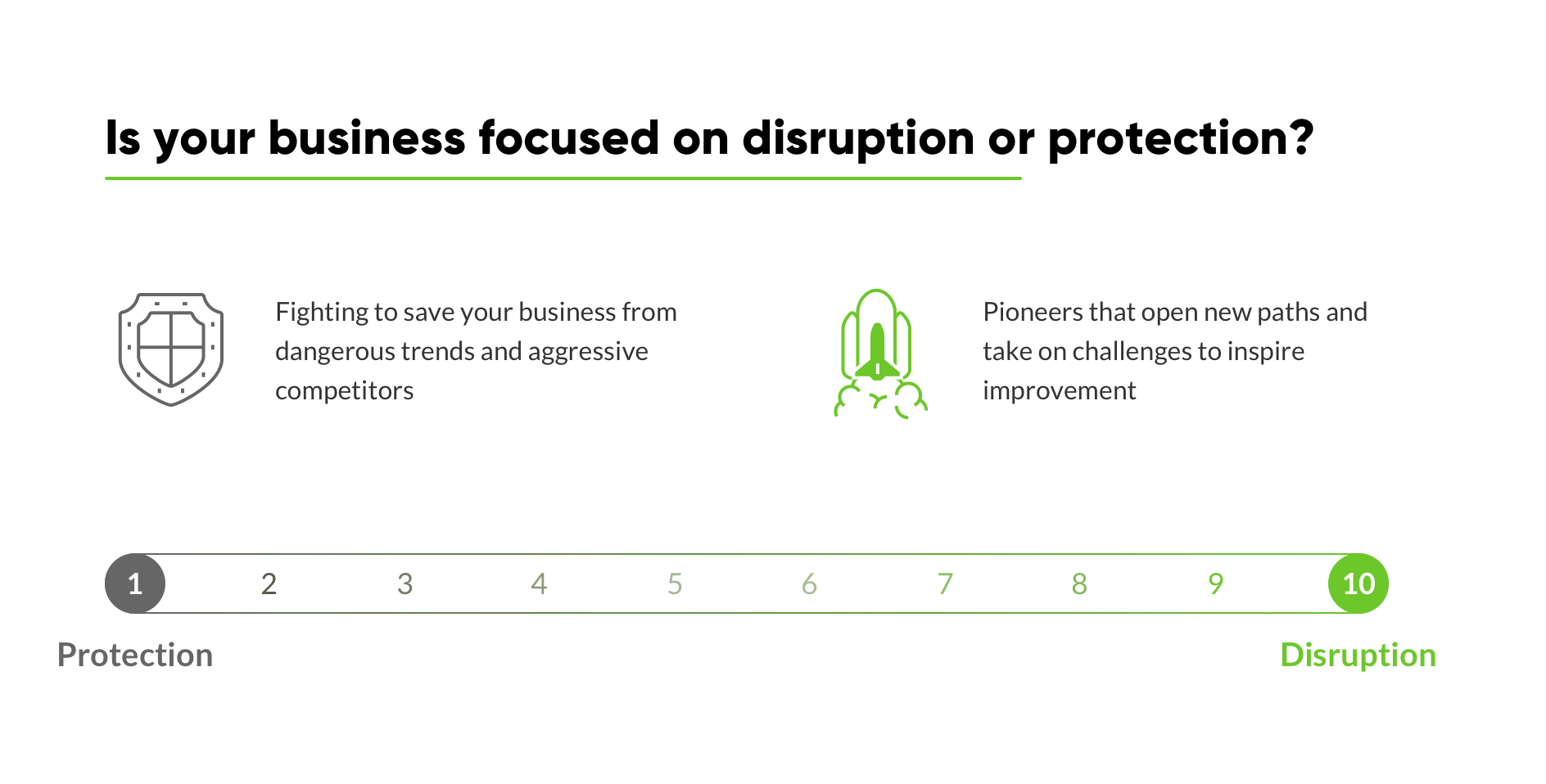
Evaluate your strategy, values, employees and products and mark your position at the scale.
And let's think about some key actions that can get you closer to a “10.” You can start by rearranging your targets or maybe try out disruptive technology or cooperate with some startup.
Create Flow and Avoid Fragmentation
It is common to overlook business or products as separate parts. Do we have some problems with sales? Ok, let’s upgrade our marketing department. We have too many claims; just change the script for the support team and get "fresh blood". Is UX design trending? Add it to our marketing activity list into the section with different digital channels.
Does it look familiar? It is a traditional approach in marketing-oriented companies caused by growth problem. Even in the organizational structure, such companies have different departments that compete with one another for budget and power. Such silos lead to an internal war over resources, decision-making, and power. This war weakens the company from the inside, making it ineffective and dangerous for customers. For example, Accenture survey found that 75% of more than 1,500 global senior and C-level executives confirm that different business functions are competing against each other (e.g., R&D, engineering, production, marketing, operations, and sales) instead of collaborating on digital transformation.
Management perceives reality and business as fragments that can be changed or upgraded separately. That's why their products usually look like Frankenstein’s monster, different pieces that don’t fit one other. And, of course, they take a lot of time to develop because different departments have their own opinion. As a result, such best business intentions can look very frustrating from the user's perspective. Imagine an attractive shiny restaurant with a messy, dirty kitchen. Would you like to have dinner in such a venue?
As Walter Isaacson wrote in Steve Jobs biography:
“But Sony couldn’t. It had pioneered portable music with the Walkman, it had a great record company, and it had a long history of making beautiful consumer devices. It had all of the assets to compete with Jobs’s strategy of integration of hardware, software, devices, and content sales. Why did it fail? Partly because it was a company, like AOL Time Warner, that was organized into divisions (that word itself was ominous) with their own bottom lines; the goal of achieving synergy in such companies by prodding the divisions to work together was usually elusive. Jobs did not organize Apple into semiautonomous divisions; he closely controlled all of his teams and pushed them to work as one cohesive and flexible company, with one profit-and-loss bottom line. “We don’t have ‘divisions’ with their own P&L,” said Tim Cook. “We run one P&L for the company.”
And I believe the same thing happened with the fall of Nokia a few years after the iPhone was released. Could this happen with highly fragmented organizations like banks?
For example, one bank decided to switch its authorization process to a fully digital flow. To make it secure enough, they provided it through another app. To log in, users have to switch between two apps several times. Such a fragmented flow causes frustration to the majority of users. Obviously, this has been done with the best of intentions to ensure payment security. But does it really matter if the user has to quickly send money to a friend and is confused by the complexity of such fragmented flow?
In another example, consider a form in which the button “next” is placed on the right but then, before confirming the purchase, it appears on the left. It looks like those screens were designed by two different people without using the same design system. If we look at a larger perspective, then starting an online application for a bank account and then confirming the account in the bank branch creates frustration for users who are aware of digital-only alternatives.
As user-centered architects, we know that the human brain perceives experiences as a continuous flow and usually connects different contexts with one other as a whole entity.
For example, customers don’t care that sellers don’t manage claims and it is necessary to contact the support team. They simply want a solution from the same person who sold the product. If we look deeper at this particular struggle, we can even find that those claims are not a job for the support team but a result of the sales team’s over-promises and production team’s weakness.
It works the same way for the user experience. If your map your service as a user journey, you can detect fragmentation and reunite the flow through proper banking design.
Think about the user who has insufficient funds to make a payment. Why does he need to learn that after he has already spent time entering the data and tapping the sending money button? Instead, show the balance before or during the payment flow.
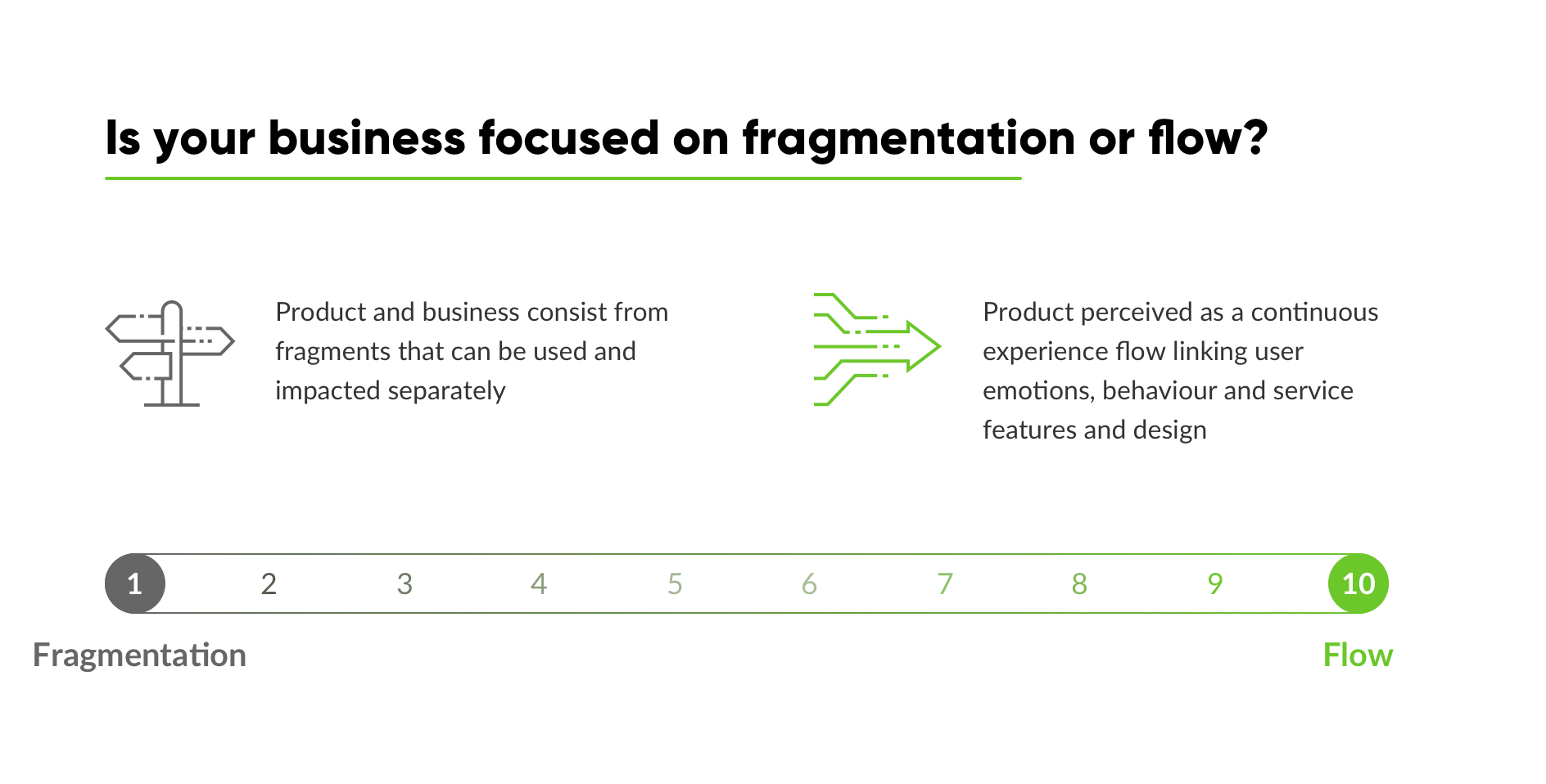
The Experience Mindset does not perceive products as separate parts; instead, it sees the product as a continuous experience flow, even lasting for years. Such thinking allows one to detect links between user needs, emotions, behaviour and service features, designs and strategy.
TAKEAWAY
Where are you on this scale? Does your company generate fragmented solutions in the majority of situations and perceive product as unconnected parts? Or, maybe you have already created a holistic journey for your product from a customer perspective?
Try to find at least one solution that can take you closer to the “flow” mindset. Maybe you can reduce friction in your onboarding process, make customers engaged with a fully digital experience or create a user journey map. Find the first step and write it down.
Conclusion
So, as we can see, the Digital Age requires an absolutely new way of thinking and operating a business. It challenges us to become more human-centered and deliver experiences instead of manipulating our customers. And user experience methodology can help with this.
Design Thinking and UX design is not some sort of marketing tricks; it is a new mindset, and it should be implemented at every company level, from strategy to operations, in order to succeed in the digital age.
Allow me to repeat once again those five attitudes that everyone could develop for establishing an Experience Mindset:
- Start serving instead of selling
- Put an emphasis on how people perceive your product emotionally
- Create solutions rather than multiply features
- Disrupt instead of protecting your legacy
- Think of the product as a connected flow that the user takes.
That's what we suggest first for delivering the best possible financial customer experience. And you will easily find appropriate UX design tools and UX design methodology if you will have the will to implement an Experience Mindset.
We encourage you to move profit out from the center of your business and think about how to put the customer in this place instead. Profit will result from this, I assure you.
Get UXDA Research-Based White Paper "How to Win the Hearts of Digital Customers":
 If you want to create next-gen financial products to receive an exceptional competitive advantage in the digital age, contact us! With the power of financial UX design, we can help you turn your business into a beloved financial brand with a strong emotional connection with your clients, resulting in success, demand, and long-term customer loyalty.
- E-mail us at info@theuxda.com
- Chat with us in Whatsapp
- Send a direct message to UXDA's CEO Alex Kreger on Linkedin


