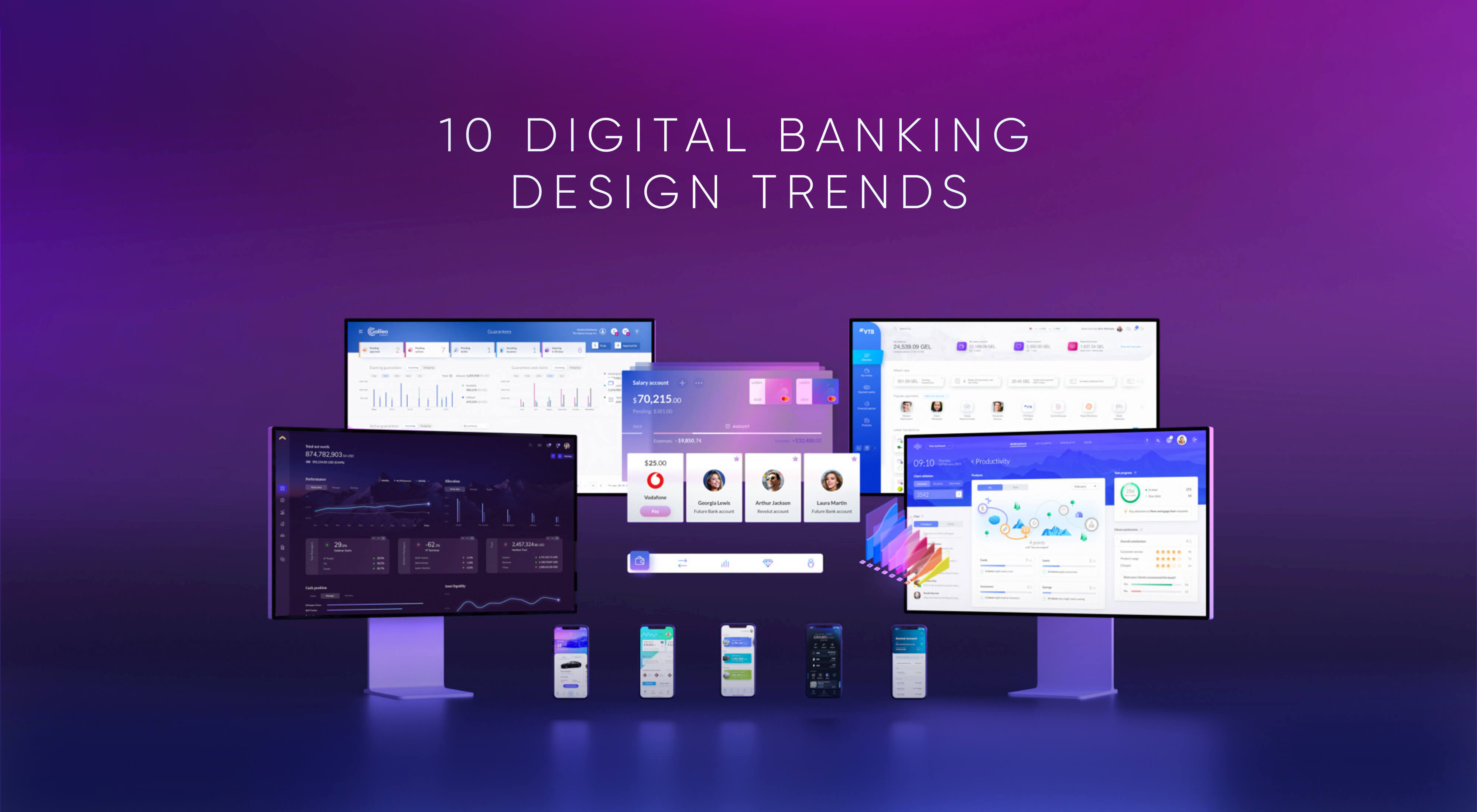
This is NOT another article covering such well-known UX / UI design trends as glassmorphism, neomorphism, 3D elements, vivid colors, brutal fonts, etc. The goal of this article is to go beyond the surface level. Dive deep into the true impact that design has on the financial industry to generate some fresh fintech UX ideas. UXDA team has highlighted 10 fintech UX design trends that demonstrate the innovation of digital financial products and the way financial interfaces are created and perceived by the users.
Financial organizations search for banking innovation ideas for many reasons:
- To improve customer experience: Banks are constantly looking for ways to improve the customer experience, and innovation can be a key driver of this. For example, banks may look for innovation ideas that can help them to offer more convenient and seamless services to their customers.
- To increase efficiency: Banks are under pressure to reduce costs and increase efficiency, and innovation can help them to do this. For example, they may look for ideas that can help them to automate manual processes or streamline operations.
- To stay competitive: Banks face intense competition, and they need to stay ahead of the curve in order to remain competitive. Innovation can help them to offer new and differentiated products and services that meet the needs of their customers.
- To meet regulatory requirements: Banking is a heavily regulated industry, and banks need to stay compliant with constantly evolving regulations. Innovation can help them to develop processes and technologies that meet these requirements.
- To drive growth: Banks are always looking for ways to grow their business and tap into new markets. Innovation can help them to identify new opportunities for growth and develop strategies to capture these opportunities in a long term.
The world is rapidly changing, and so is the financial industry. Customer expectations are growing along with the necessity to satisfy them. In this article, we will demonstrate the power financial design has in searching for banking innovation ideas.
What makes a great digital banking and finance design? When it comes to a field as specific as finance, the ability to design interface elements is only a minor part of the required competence. Truly great financial products are based on great usability in sync with specific user needs inside a well-developed digital ecosystem.
10 Fintech UX Design Trends
Delivering dozens of financial UX/UI transformations each year, we decided to show the 10 most significant fintech UX design trends in recent years. Using our recently designed products, we highlight the valuable possibilities that financial UX/UI design uncovers for such diverse products as core banking, neobanks, challenger banks, wealth management, corporate finance, retail banking, ATMs, credit scores and even metaverse banking.
1. From Default “Bootstrap” to Exceptional Tailor-Made Design
When it comes to creating digital financial products, for the past 20 years, there has been a deep-rooted belief that the role of design is minor. Mostly, design has been perceived as packaging that is nice to have for marketing purposes, while the main emphasis has always been placed on the functionality and features of the products.
This kind of approach explains why it's common practice to use standardized design templates (aka “bootstrap” design) to speed up and facilitate the product development process. Unfortunately, this also explains why many financial services seem so similar─typically plain, boring and user-unfriendly.
A decade ago, the perception of design was disrupted by the emergence of Fintechs. They dared to be different by maximizing the power of design potential to attract customers.
Today, we can witness an even broader paradigm shift. The new players that enter the financial industry deliberately focus on unique and innovative design that communicates and highlights their brand identity.
Most customers are tired of boring and complex financial design, typical of the incumbents.
Tailor-made design is a brand-new idea, providing users with something fresh and invigorating. This marks a new era of tailor-made design as a trend that skyrockets the market advantage of financial companies.
A brilliant example of this banking innovation idea is the wealth management platform by Private Wealth Systems. It's a magnificent industry-first product that executes the power of tailor-made design to provide Ultra High Net Worth Individuals (UHNWI) with the kind of luxury experience they expect from every aspect of their sophisticated lives.
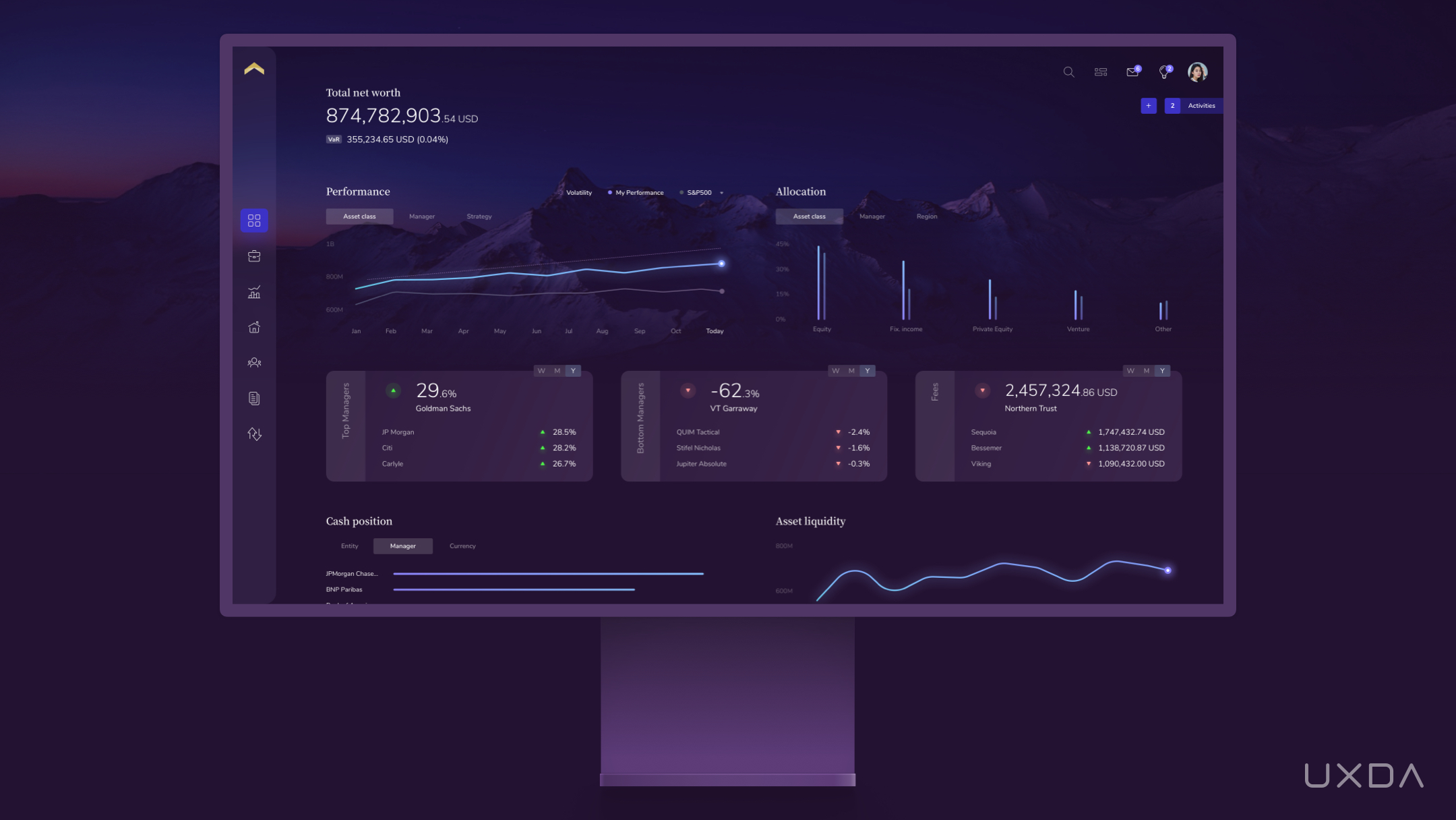
Wealth management platform UX design by UXDA
The UX transformation of this voluminous, highly complex solution has allowed it to become a unique gem in the industry that eases friction and makes managing complex wealth delightful. It's powerful yet intuitive enough with a touch of luxury and refined design vision so that every Ultra-high-net-worth individual would feel the absolute necessity for it.
This kind of financial UX design turns “nice to have'' into a “must have” and has the power to fundamentally shift the behavior of the most powerful consumer cohort on the planet.
This tailor-made design was tested before its official launch, and the people who tried it were over the moon. The platform excels among others as it aims to solve a myriad of pain points users encounter on a daily basis. It demonstrates that it cares about the wealth of the customers and does its best to assist in managing it.
The advantage of the tailor-made design is used more and more often among different kinds of financial services, as it enhances the emotional connection between the brands and their customers.
The financial institutions (FIs) that dare to break taboos and invest in creating bold and modern designs that stand out know that this will definitely pay off with increased customer loyalty and engagement.
Takeaway for Product Designers
Create a digital product interface that's unique in accordance with the visual identity of the financial brand. This will make the digital product delightful and allow it to stand out among the growing competition.
TAILOR-MADE FI PRODUCTS DESIGN BY UXDA
2. From Limited Mono-Functional to Upbeat Super-App Design
The industry transition to a mobile-first approach led to the emergence of several Fintechs whose main advantage was the mono-functional approach. In a very simple and understandable manner, they offered to solve a specific user problem. For the customers, this was like a breeze of fresh air compared to the multifunctional but complex and user-unfriendly banking services. Solutions created by Fintech instantly stood out with their pleasant user experience dressed in a modern and uplifting interface design.
Right now, open banking is broadening the range of possibilities to connect external services that allow the increase of functionality in any financial product. We can cite Revolut as a great example of banking innovation idea here that's constantly scaling its functionality to gradually become a financial super app.
The Fintech mono-functionality design approach seemed simple for the customers, but, as expectations grew, so did the need to present more functions in the same manner. How do you display more than 100 features in a way that's intuitive and pleasant for the user?
Digital financial solutions are becoming more and more complex, providing better functionality to the customers, but it's not a simple task to design them in such a way that would prove enjoyable to use. This is where close collaboration among UX architects and experienced UI designers plays a major role.
The main design challenge is to provide a friction-free experience by creating an intuitive product architecture and a logical, user-friendly interface layout.
A great example of an intuitive multifunctional banking app is the banking super app design concept by our UXDA team. It provides a vibrant challenger bank design that fits dozens of banking features into a single app by using the top technology trends, such as blockchain, gamification, nudge theory, robo advising, voice processing, biometrics, social integration, personalization via banking AI, big data, open API and clouds. It's a bank-as-a-platform design concept with endless integrations and possibilities for the users, taking the user experience to a brand-new level. Explore how this mobile banking super app was created in this case study.
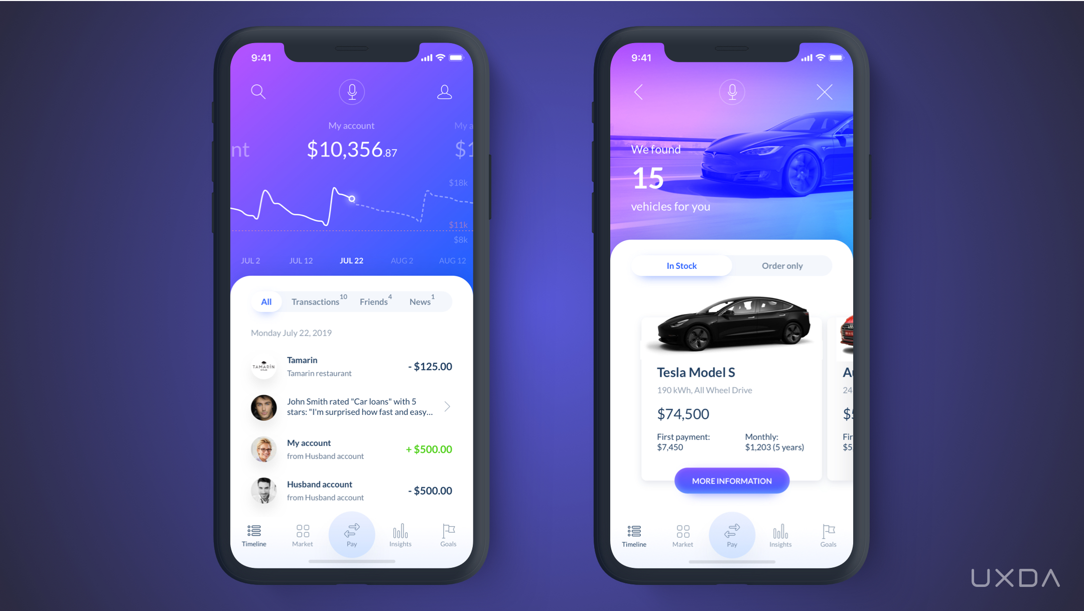
Banking super app design concept by UXDA
Digital solutions are constantly evolving. More and more well-thought-out multifunctional services are emerging that provide great usability and are able to conquer the UX of mono-functional mobile applications.
This explains why so many financial institutions are striving to create their own neobank or super app. Though it really uncovers a lot of possibilities for the users, it's extremely important to align it with the overall vision of the financial company and its ability to design and execute it.
There needs to be an understanding of how to maintain a balance between user needs and the ability to satisfy them in an effortless and user-friendly way. From our experience, there have been situations in which financial brands aim to include a ton of “modern” functions in their products just because they believe it will make the solution stand out among the competition, while this might actually have an opposite effect, leading to user disappointment because of frustrating design. In such cases, during the UX research phase, these FIs should determine that their customers don't require most of these modern functionalities but are seeking other features important to the specific audience of this brand. As a result, hugely successful financial products are designed based on the specific needs of the brand’s audience that provide extra value to the customers.
A super app approach that's based on a clear vision of the financial product, and the role of UX in it, marks a pathway toward the endless possibilities of scaling the future potential of both the product and the financial brand.
Takeaway for Product Designers
Learn the best practice from super app designs and get ready to scale your product while maintaining simplicity and usability.
3. From Demotivating Excel-Like Interface to Dopamine-Rewarding Gamification
Many people not connected to the banking industry would probably be shocked to see what most of the banking back-office solutions look like. Working with those could be compared to coding, as the employees have to work with several software programs simultaneously, following instructions and manually entering codes in order to use the required function.
To learn to operate such a system takes a few months. But, even years after working with it, employees still get confused and keep a notebook with the right number and letter combinations by their sides.
It's a fact that these solutions are very complex and data-driven, as there are huge lists of different kinds of data about the customers.
But, in a world that's based on the power of digitalization, how can the beating heart of all banking operations make their employees travel 20 years back in time?
Many banks are trying to reduce their back-office costs, often not realizing the impact on the customer experience. This results in a paradox: banks are investing large amounts of money in digital transformation in order to improve the user experience, while cutting the costs of the core banking system leads to significant damage to customer service. Bank employees’ negative experiences affect service quality and end-customer satisfaction. Improvements in the back-office system could lead to a meaningful increase in service quality and speed, resulting in happier, more satisfied clients. Here's an article that explains the risks behind an outdated banking back office and explores ways to turn this around.
Today, when the user-centered design approach is becoming more and more popular in creating financial products, it can be applied not only to the external banking products but to the internal solutions as well.
To ensure customer-centricity at all levels of the financial organization, the needs of the employees must be considered as well as the client. By creating a better design, we provide them with motivation and tools to offer a better experience for the bank's customers.
One way to significantly increase employee engagement and productivity is to design core banking solutions by using gamification as a banking innovation idea. This kind of design approach allows the transformation of the entire work process by making it more modern, as seen in the case of the innovative cloud-based banking back-office vendor ITTI Digital.
Their core banking could be compared to a breath of fresh air in a field of banking that hasn't changed for decades. This intuitive, user-centered cloud-based solution is unlike any other banking back-office product available on the market.
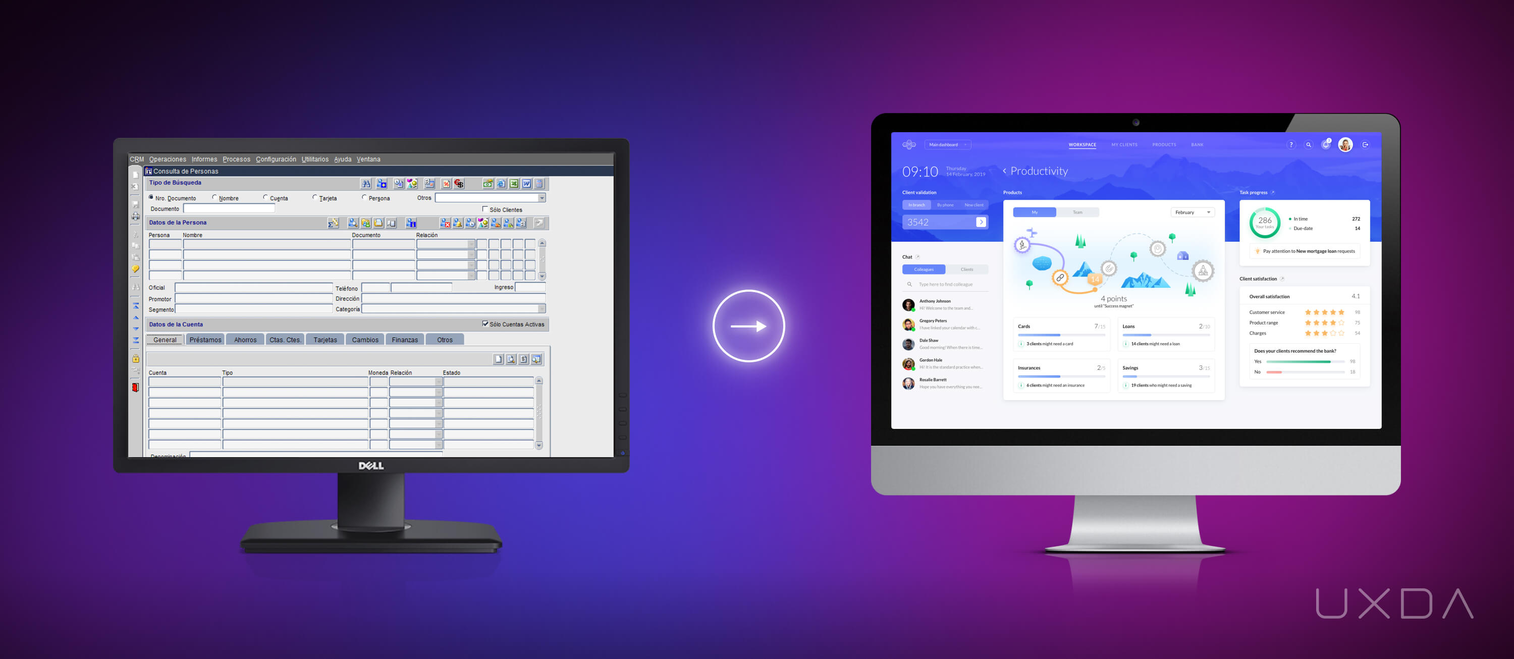
Cloud-based core banking solution UX design by UXDA
To make it user-centered, UXDA's team translated huge amounts of heavy data into human language. The employees couldn't believe their eyes when they saw the new look of the core banking solution. Their learning curve was reduced from several months to a few hours. What once seemed like the Chinese alphabet was now easy to understand and enjoyable to use. The potential of human error decreased significantly, ensuring a huge increase in service speed, employee productivity and customer satisfaction. You can explore the step-by-step process of this huge core banking UX transformation in this case study.
In addition to the huge internal and external value the UX and gamification approach created, this core banking solution was also recognized on a global scale.
It received one of the world's most prestigious design prizes, the IF Design Award, alongside Apple that was awarded for its digital finance service design of the well-known Apple card.
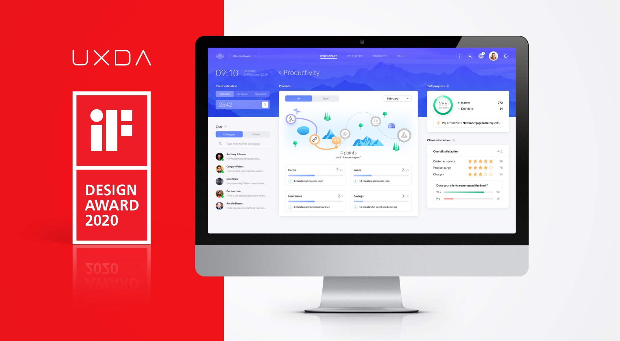
This type of approach is another example of how user-centered design and the financial UX methodology can be applied to accelerate the success of financial brands. In this case, the FI considers employees as internal users, creating the best possible experience for them so that they can guarantee the best service for the bank's customers. This demonstrates the evolution of the design approach used by B2B and B2C.
It's an outdated belief that gamification and banking have nothing in common. In fact, they have the power to significantly improve employee productivity and motivation, thus reaching better results overall.
Takeaway for Product Designers
Try to apply gamification elements to refresh the design of the most boring financial products to motivate users.
4. From Limited Functionality to Exciting Full Experience Design
Only five years ago, mobile apps were perceived as additional, alternative banking channels, but today they serve the majority of customer requests. Given this fact, it's surprising that often the mobile channels have very limited functionality and offer a rather poor user experience. For example, to select transactions using filters, customers are forced to use the desktop solution. Why is it still not available in every bank app despite the fact that similar functionality is provided every day when shopping in online stores?
It's even more surprising that several banking services are still only available at branches. The pandemic highlighted the harsh truth of the situation: the financial industry is unprepared to embrace the digital age.
In these circumstances, it seems absurd that there are still cases in which people have to risk their health just to visit a banking branch. What makes this situation even more unfortunate is that all the necessary technologies to avoid such situations are already available for the banks, but, for some reason, they are not utilized to guarantee a completely remote service.
To significantly improve the customer experience of the financial brand, FIs can perform a full design audit of the mobile app to ensure remote users have access to the full range of services and features, and if not, brainstorm a plan to secure it in the near future.
Successful Fintechs do not search for excuses, but use a design approach to deliver best-of-class remote experience to the customers.
An inspiring example of this banking innovation idea is the mobile banking application by United Arab Bank (UAB). When working with it, UXDA's main challenge was to ease the customer journey throughout all of the daily functionality, making it simple and pleasant. As UAB has a wide range of services available through the application, the UX approach allowed scaling the vision of further development to make the product even more pleasant for the customers.
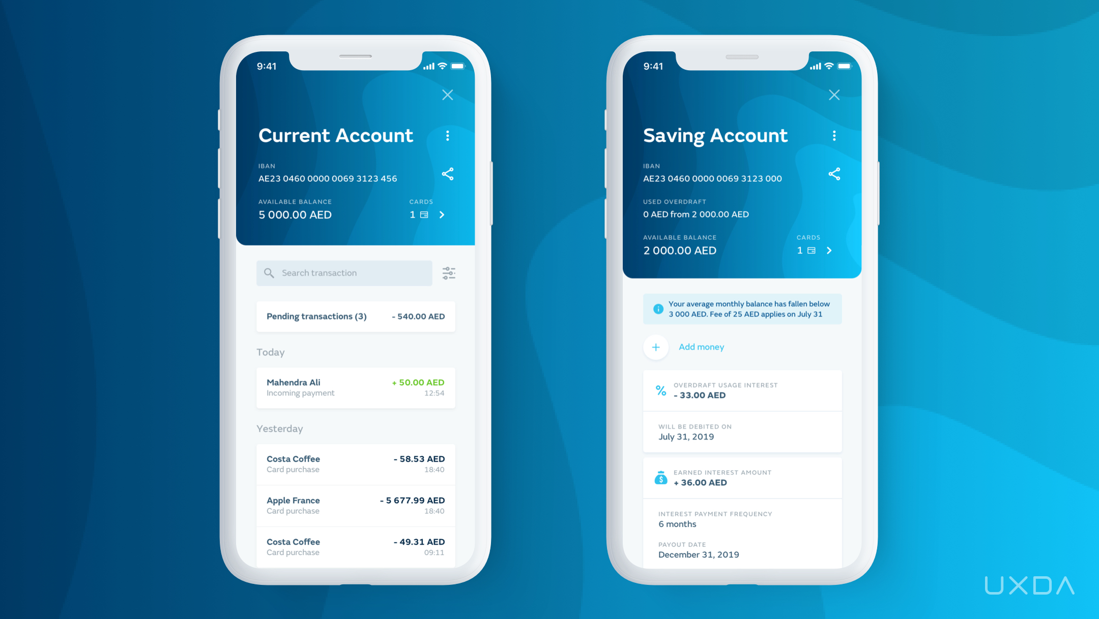
Mobile banking app UX design by UXDA
Optimization of user flow made it easier for users to navigate through the app, exploring new possibilities and encouraging them to use it more often, instead of contacting the bank or visiting the branch.
This led to a rapid increase in customer satisfaction. Only a few months after the release of the new UAB app, their App Store and Google Play rates increased, and customers were eager to share their gratitude for the improvements that were made.
This kind of holistic approach ensures that the customer experience won't be fragmented and disappoint the customers who expect to manage all of their finances right from the mobile app.
Takeaway for Product Designers
Find the missing desktop functionality for mobile solutions and create a mobile design out of it.
5. From Legacy Incumbents to Confident Digital Out-Performers
More and more traditional banking incumbents are daring to step out of their legacy and challenge themselves to embark on a thorough digital transformation journey.
Inspired by Fintechs, the incumbents empower the potential of UX design to create products that wow their customers and motivate them to stay loyal in the long run.
To do that, they team up with external and internal UX and UI designers who help to integrate the design approach at all levels of the company and the culture of the financial organization. The "fresh blood" of the design-focused teams ensure a successful, user-centered digital transformation that results in customer loyalty. As a result, these kinds of brave incumbents become strong rivals of the Fintech unicorns in the market.
A brilliant example of such banking innovation is VTB Bank Georgia. It's a bank trusted by millions that was re-born through an upgraded customer experience and a design that exceeds the standards of the digital age. As a result, a modern online banking UX design was created that embodies trust and stability for its digital customers.
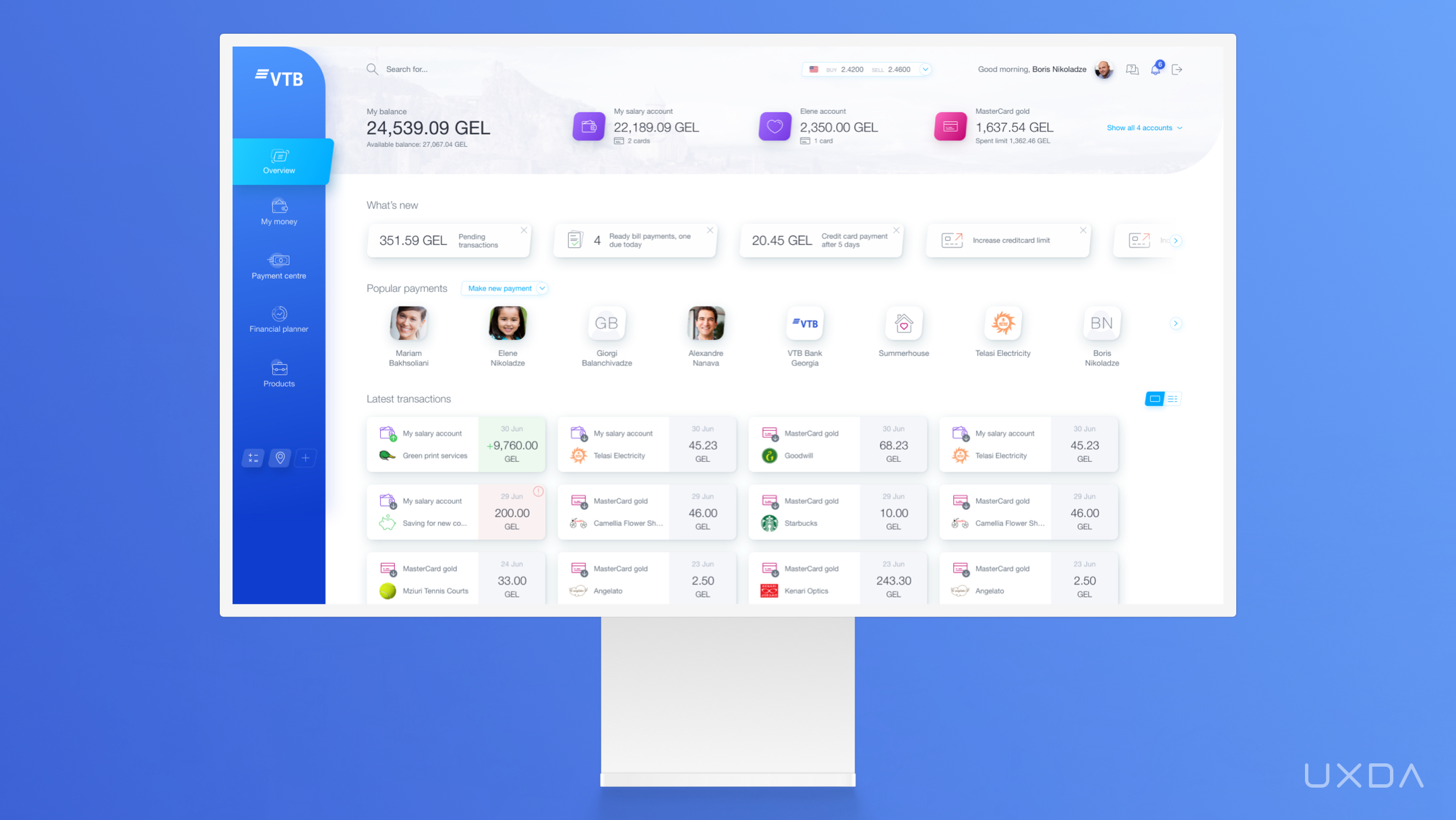
Online banking UX design by UXDA
As of now, the customers are sharing that the bank's products correspond to their lifestyle and expectations. Also, the employees have stated that they are proud to be working at a well-established financial brand that lives up to the changing times and takes the best care of its customers.
Takeaway for Product Designers
Operate from the design-first principle by stepping out of the legacy to design a world-class digital product.
20 Dos & Don'ts in Financial UX Design
6. From Frustrating Fragmentation to an Enjoyable Digital Ecosystem
Often, products provided by a single financial institution might differ visually, depending on the digital channel. This kind of fragmented approach is often caused by the fact that the products have been developed by different teams of developers and designers over different periods of time, based on different vendor solutions. This causes high fragmentation within the customer experience as the usability, information architecture and the interface itself differ.
It might not harm the financial institution from the inside but will probably increase the customers’ frustration and digital friction and could result in them switching to another financial company. This is because customers expect the brand experience to be a connected, holistic flow and not separate fragments. Fragmentation breaks the customer experience by causing a lot of struggle and confusion.
The main problem is caused by the lack of a united vision that would include all of the products and services provided by the financial institution. This is often due to the fact that digital channels are considered an alternative or additional form of service delivery. This was true many years ago but no longer. Stats show that, in recent years, digital has become the main delivery channel, and its popularity keeps on increasing. The COVID 19 lockdown proved it by showing no mercy.
Customers expect all of the channels to be equally well designed, communicating the same visual brand language and usability patterns. It shouldn't matter which of the platforms customers use. They all need to be holistically united to ensure consistency across all channels.
A great example is the remarkable banking ecosystem innovation that well-known software vendor CR2 has designed for its white-label products, including a desktop solution, mobile app and even an ATM. It communicates the same visual vibe and usability patterns across all of these different platforms so that the customers wouldn't even notice switching between the channels.
The main challenge when working with CR2 was to design a full-service ecosystem of products that would be able to provide the ultimate customer experience, replacing the need to visit the banking branches.
The attractive white-label mobile app is customizable for any bank. It provides the ultimate way to satisfy user needs and expectations on-the-go, wherever and whenever the customer has a necessity for it. Throughout the experience, the app provides a modern look and inspires joy into the everyday lives of its users.
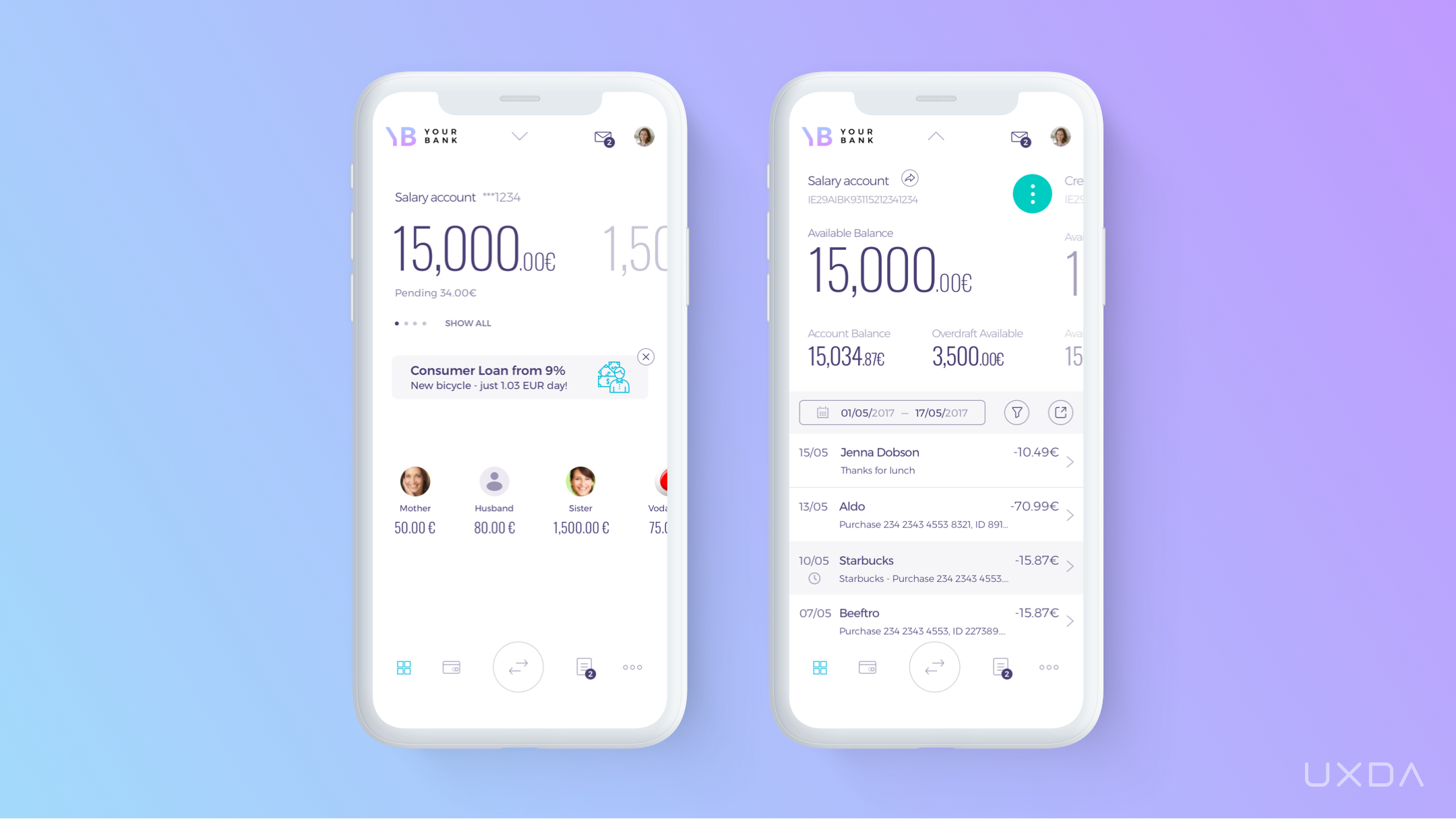
Mobile banking, desktop and ATM UX design by UXDA
The desktop solution speaks the same visual language as the app. It's a unique experience for every desktop banking user that's adjustable to the specific needs of any financial brand.
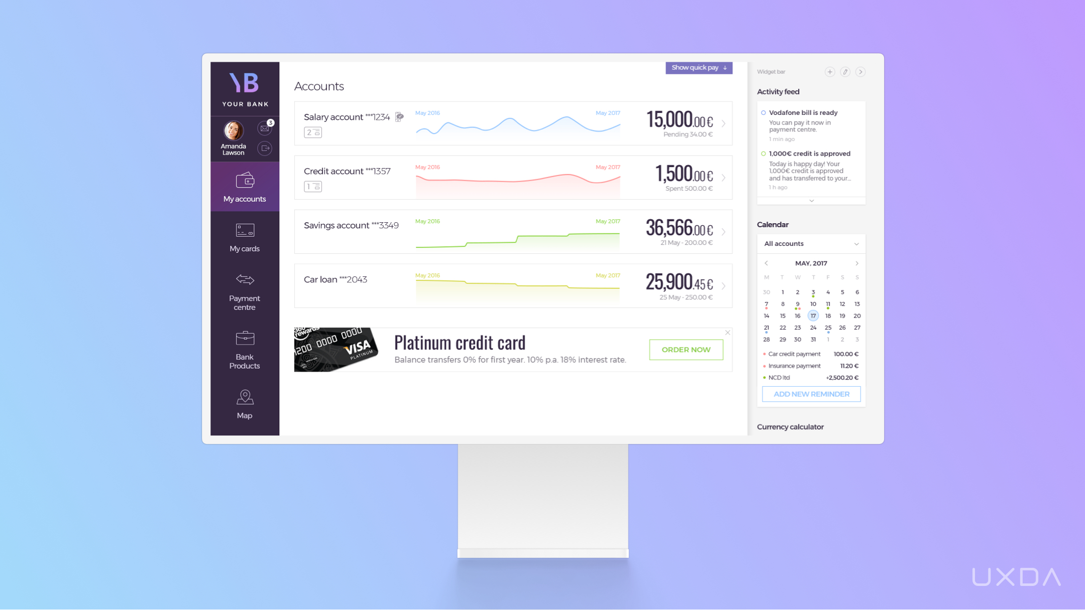
Finally, there's the innovative ATM experience. UXDA's main goal was to create an ATM that could replace the banking branch, offering customers all the needed services without long lines and wasted hours. We made it emotional, bright and user friendly to stand out among the others.
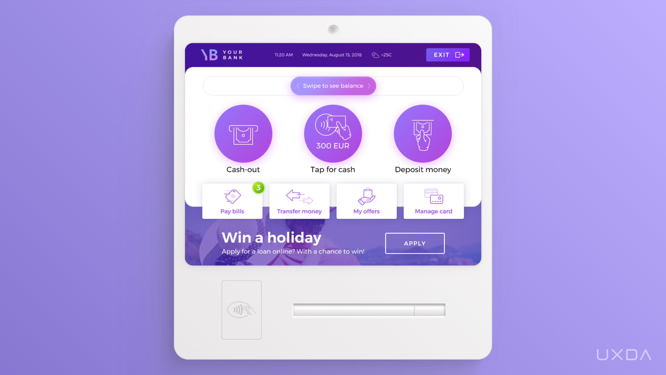
As you can see, all of these different channels are united into a connected flow that makes the user experience smooth, clear and frictionless.
Takeaway for Product Designers
Use design to unite company products into a consistent ecosystem that overcomes service and organizational silos.
7. From a Complex Puzzle to an Effective Design System
In order to create a well-functioning digital ecosystem, it's essential to base it on a proper design system. When it comes to financial services, the design system is especially important to ensure a rapid and consistent digitalization due to the complexity of such products.
In some cases, design files can be compared to the pieces of a puzzle. If they are not sorted out and arranged, it can get very messy and frustrating to create the “bigger picture.”
When it comes to huge financial digital services that consist of thousands of screens developed by several hundred professionals spread over different continents, a carefully thought-out approach is needed.
How do you maintain the consistency and usability of the design when working on a project that has thousands of puzzle pieces that need to fit at the right place and in the right time?
Technology is evolving, competition in the financial market is rapidly growing, and consumer expectations are changing so frequently that digital products need to be improved daily to meet the customer needs and expectations. As digital financial services differ from many other products with their complexity, such a continuous need for iterations and improvements can turn into a mission impossible. Therefore, design systems come to the rescue, helping to organize all of UX/UI guidelines, assets and the overall vision of the product development so that all of the teams involved are always on the same page.
Contextual Banking Experience (CBX), a corporate banking product by one of the most well-known banking software vendors iGTB, consists of more than 5,000 screens. It's a one-of-a-kind contextual platform that helps any corporation manage thousands of accounts with billions of assets in a user-centered way. It would be impossible to create and develop such a product without a proper design system.
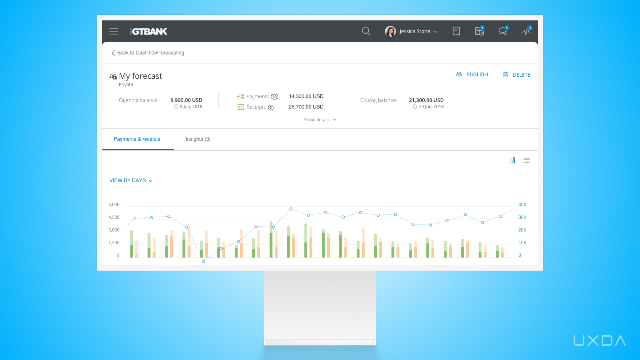
When it comes to products of such a scale, it's crucial to establish standards and frameworks (e.g., flows, storyboards, etc.) for as many UX deliverables as possible. It's extremely important to ensure consistency across different modules and avoid mistakes, as small changes can impact much larger flows. For example, one small change might impact hundreds of screens.
The use of a design system has also allowed iGTB to make all of the processes more efficient for the designers and the developers, so it's useful to componentize features as much as possible to reuse those in the future and save time.
An innovative UX/UI design system ensures consistency across the platform ecosystem, resulting in a quick and effective handover of the UX and UI deliverables to the developers so that they can start working on it immediately. It also ensures that everyone working on the project is on the same page and can easily develop the product further in their specific field of responsibility. Explore the top UX insights from working with the huge CBX product in this case study.
Takeaway for Product Designers
Take design further than interface and visual identity by transforming it into a language that establishes rapid and effective product development by using a design system.
8. From Cold and Formal to Emotional Design
People are used to perceiving banking and finance as something formal, complex and often "gray and boring". It's no wonder as the financial products often communicate such a vibe. However, as we are living in a fast-paced world filled with different kinds of emotional messages on social media platforms like Instagram and TikTok, the contrast between finance and the rest of the world seems even more striking.
The role of the media has changed. Previously, it was aimed to please advertisers, but today it's all about providing people with value. In the digital paradigm, technology brings businesses closer to the consumers through transparent, honest and personalized communication.
Why would it be any different when it comes to finance? The new generation of financial services is using this knowledge to their advantage.
It often seems that the banking industry is afraid of emotions as if it would somehow reduce their notability. In fact, it's actually the opposite. Emotions are the language that resonates with people and makes them feel heard, understood and cared about. As stats show, currently, receiving empathy and care from brands is more important than ever.
Emotions allow users to make intuitive and quick decisions. We use cognition to understand and interpret our world, while emotions catalyze decision making.
It's important to remember that our financial products are used by living people, not robots, so the solutions should evoke positive emotions in order to create a bond. This banking innovation idea can be performed in different ways, often in tiny details and nuances that some designers don't find relevant. Examples are color schemes, icons and animated and eye-catching illustrations and interfaces.
Visual effects and microinteractions convey emotions, leading to a greater engagement from the users, than, for example, static elements and plain information.
This kind of emotional and user-friendly design is used by the Simah Saudi Credit Bureau. To make difficult and sometimes even depressing credit scoring rates simple and friendly, they have integrated animated characters.
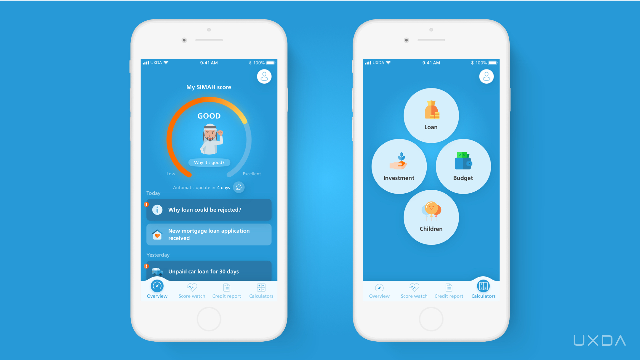
Mobile banking app UX design by UXDA
When it comes to credit, emotions such as stress, frustration and even fear might arise. Often the customers are faced with an informal, impersonal or even cold attitude that seems to exacerbate the situation. The app by Simah Saudi Credit Bureau aims to turn this around and introduced the animated character as a supportive figure to guide the user through the process. It explains the credit score and provides personalized advice, making the user feel safe and cared about.
The main goal of the Simah character is to help the user get his or her financial health in better shape.
Many financial companies fear that, by using informal, emotional designs, they will look frivolous in the eyes of the customers. There is a justification for that because there might be designers who lack understanding of the overall functionality of the product and brand's identity, and come up with a design that doesn't correspond with the financial brand. However, if the product design is based on the business goals and user expectations, it can become a powerful and unique asset of brand identity that creates a remarkable market advantage over financial solutions that lack soul.
Takeaway for Product Designers
Don't be afraid to be informal in financial design, perceive users as friends and build an emotional connection with them through design.
9. From Mobile-Only to Future Metaverse Banking
There's no doubt that mobile apps dominate the market today. It's hard to tell when this situation could change and what would be the new top tech to replace the mobile channel. However, it has become quite clear that the focus should be directed toward metaverse technologies.
According to Statista, global VR/AR market size in 2020 is about 18.8 billion dollars. In the next seven-year period, the VR sector is expected to grow at an average of 21.6 percent every year according to Grand View Research. One in five US consumers have used VR in 2020 (AR Insider, 2020). According to the McKinsey forecast, the metaverse may generate up to $5 trillion in value by 2030.
Considering the development of this technology and the possibilities it uncovers for the users, it's already clear that it will appear on the scene─if not completely replacing mobile applications, then as a popular side channel.
It's essential for financial companies to follow the development of the future “must-have” products in order to be prepared for this banking innovation when it enters the mass market. Metaverse requires a different design approach, and this development has the potential to become a serious industry challenge if not explored in time.
The World's First Metaverse Banking Design Concept inspires the financial industry to start seeking ways to adapt to the fast-approaching future. It is based on three core principles─simplicity, consistency and depth.
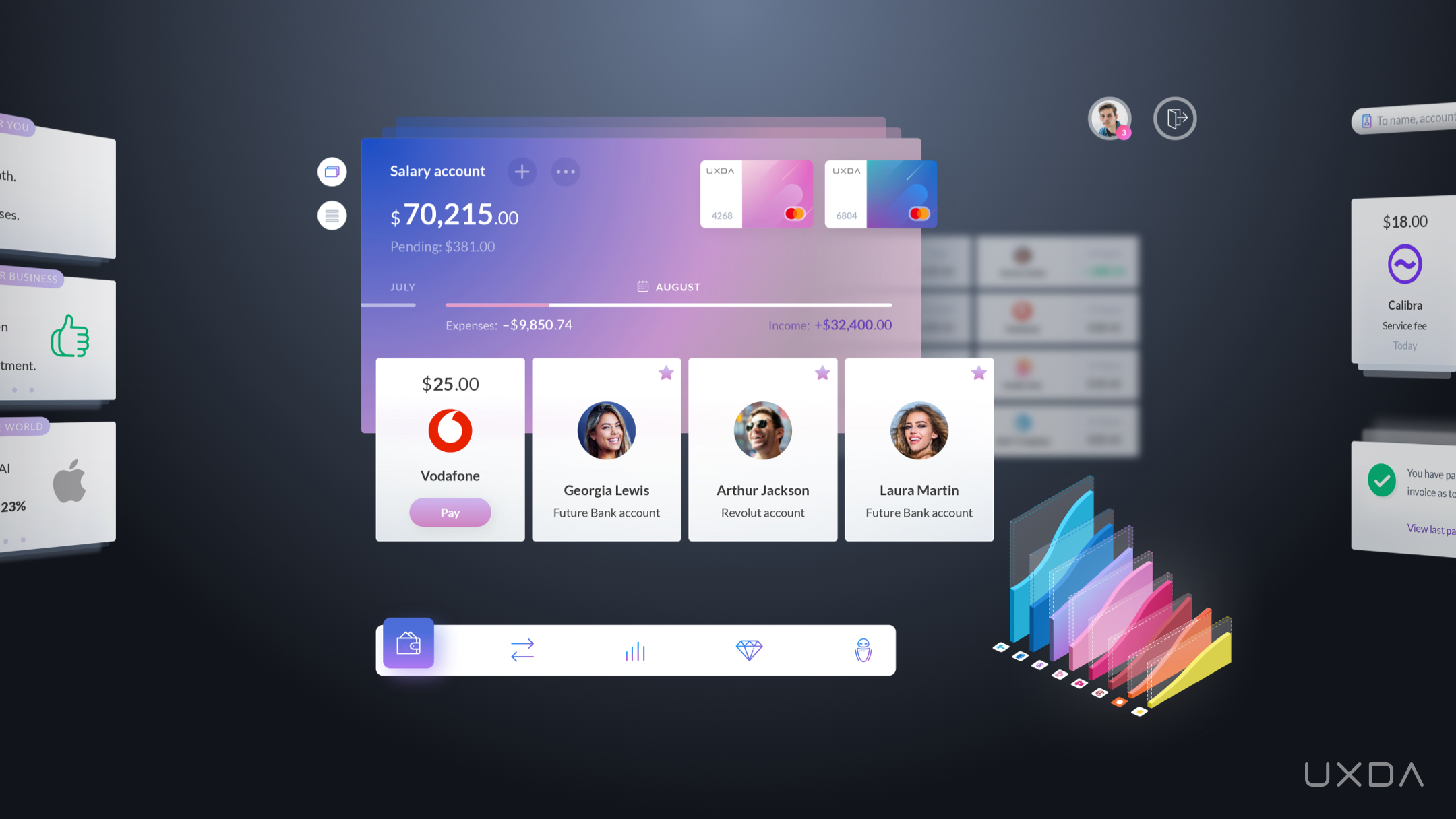
World's First Metaverse Banking Design Concept by UXDA
First, it emphasizes the need to ensure simplicity. This is because, compared to the mobile experience, VR/AR design is not limited by the screen size, and it could be tempting to want to display all of the possible information at once. However, this could cause cognitive overload and frustration for the user.
The second principle is consistency because properly structured VR design should reduce the painful effect of a mismatch caused by the difference between the eyes’ tracked movement in virtual reality and the feeling we perceive from physical reality through our other senses.
The third principle is depth. One of the most significant challenges of VR/AR banking design is user interface transition from two-dimensional (2D) to three-dimensional (3D) interactions. This requires deep adaptation of UX/UI design principles and methods for the depth of volumed space.
In the near future, we will see Bank 4.0, the experience era of banking, as financial influencer and founder of Moven, Brett King, puts it. A banking experience will be embedded in the real world through digital technology.
It will probably take several years for the technology to be properly developed; however, when it's done and it becomes easily available to everyone, we can expect the market to be shaken with the same impact as it was with touchscreen devices only decades ago.
The perception that there are still years left is faulty, as the preparation for shift to Metaverse has to start now. In order to prepare, it's crucial that FIs start viewing their products through the lens of the future, already generating ideas and design concepts on how those will improve the customer experience in the near future.
Takeaway for Product Designers
Think about the perspective of product development in the near future to be ready at the design level.
10. From Package to Ideology That Makes an Impact
In the past, design teams in financial companies were considered the creators of packaging and advertising materials. Their work usually started when the product had already been created, and there was a need to sell it. The modern design approach is antipodal to that.
In the world in which we live, design itself is an approach that creates an experience based on user expectations and needs. As this experience is directly dependent on products and customer service, design becomes an integral part of the business processes. We can integrate a design approach at all levels of the financial company.
If we look at it from an even greater depth, it's possible to turn the design into the company's ideology, a cornerstone of the business DNA, as Apple did. Their specific design philosophy reflects the principles of their world view and identifies authentic ways to convey this ideology through their products, ads and bonding with the customers. This explains why Apple has established such a global impact with its products, deservedly becoming the world's first trillion-dollar company.
Challenger companies have demonstrated the ability to scale design to the level of the company philosophy. In this case, design defines the essence of the financial business.
The company cannot be separated and exist without design. This is when the design reaches its maximum impact, defining the business advantage through a unique strategy and implementation.
Within such a business philosophy, a product or a service primarily becomes a representation of the company's world view. This greatly increases the value that the customer receives and, at the same time, requires much more responsibility from the company. Not every entrepreneur dares to take this kind of risk because, in this case, design is directly related to the company's reputation.
A bright example of design as an innovation ideology in banking is the conversational bank BELLA Loves Me. It's powered by the idea that banking can be designed with love, truly caring about each of their customers. This ideology is embodied in their app, website and even the media appearances and statements by their executives. This is demonstrated on a regular basis through action, and not only words, thus building a tribe of followers around the idea.
Here are a few examples. The BELLA Loves Me team decided not to spend a million dollars on marketing, but instead to gift this amount of money to their customers through a random cashback. Another example of this is the karma account, intended to result in random acts of kindness. Users can transfer money to this account, which will then be used to randomly pay it forward for other BELLA Loves Me customer purchases. Although it is completely anonymous, both customers can see each other's first name in their feed. This creates an emotional connection to both the anonymous donor and also to BELLA Loves Me, and hopefully encourages the recipient to continue this act of kindness.
There's no wonder that BELLA Loves Me has already become one of the hottest topics in the finance industry. They are building a community around their mission and values, and design plays a major role in it.
Takeaway for Product Designers
Look at design as your business ideology. What perspectives and opportunities does this open up, and what can you as a designer do to realize them?
Building the Banking Innovations Through the Impact of Design
Design plays a critical role in banking innovations. Good design can help to make financial products and services more user-friendly, convenient, and appealing to customers, which can drive adoption and usage. Here are some specific ways in which design can contribute to banking innovations:
- Simplifying complex processes: Financial products and services can be complex, and good design can help to make them more intuitive and easier to understand for customers.
- Enhancing user experience: Good design can help to create a seamless and enjoyable user experience, which can increase customer satisfaction and loyalty.
- Differentiating products and services: Good design can help to make financial products and services stand out in a crowded market and differentiate them from competitors.
- Facilitating adoption of new technologies: Customers may be hesitant to try new technologies, but good design can help to make these technologies more accessible and easy to use, which can facilitate adoption.
For a long time, design has been perceived as the surface, while, in reality, it's the very depth. The world is changing at the speed of light. Brand-new technology is constantly emerging, opportunities are broadened, and communication becomes more transparent, brave and emotional. When such possibilities open up, it comes with a great responsibility and a pressure to utilize them.
We hope that this article serves as a supportive guide for any CEO, product owner, UX architect, UI designer or anyone else inspired to create a long-lasting positive impact through the power of financial design.
In the digital world, design, not money, becomes the decisive factor for success.
HOW TO DESIGN YOUR PRODUCT WITH UXDA APPROACH
Get UXDA Research-Based White Paper "How to Win the Hearts of Digital Customers":
 If you want to create next-gen financial products to receive an exceptional competitive advantage in the digital age, contact us! With the power of financial UX design, we can help you turn your business into a beloved financial brand with a strong emotional connection with your clients, resulting in success, demand, and long-term customer loyalty.
- E-mail us at info@theuxda.com
- Chat with us in Whatsapp
- Send a direct message to UXDA's CEO Alex Kreger on Linkedin


