The key mission of the digital age and modern technologies is to ease the difficulties of our day-to-day lives. Every success-oriented financial entrepreneur is striving for a simple and user-centered service. But, what about the users? Why do they sometimes still put up with complex banking services, even though they might have experienced an alternative that's much more easy and user friendly? It's a million dollar question that has been discussed but still remains unanswered. This research by UXDA offers an insightful perspective to encourage further exploration uncovering the needs and expectations of the users.
An Easy Banking Solution Could Be Evaluated Through the Design of Enrolment
When it comes to digital banking solutions, the initial step that outlines the first impression of a service's simplicity or complexity is enrollment. We strongly believe that enrollment should be simple and understandable. However, we have to consider how the perception of these concepts differ in the minds of millennials and non tech-savvy older generation members. The research team of UXDA strived to uncover the factors that affect the perception of enrolling in a bank according to previous experience and expectation gaps among X, Y and Z generations.
Becoming a client of a bank is a step that a high number of people are taking at some point in their lives. Whether it's by visiting a branch or opening an account online, enrollment is often the main factor that determines a user’s first impression of the bank. This is the point at which it's crucial to create a sense of trust and credibility. This is the moment during which users, regardless of their age, should have complete peace of mind and assurance that they are making the right decision. Banks must place a huge focus on creating this first touch point to correspond with users’ expectations. But, what is it that users actually expect from this process? And, do their expectations and perceptions differ depending on their generation?
Knowing that Generations X, Y and Z have all been growing up in different times, without a doubt, there are differences in their expectations, needs and habits when it comes to the perception of banking and we need to detect it for improving user experience strategy.
Can Simplicity Kill Trustworthiness?
Nowadays, when technologies and digitalization are at their peak in the financial industry, bank enrollment processes are often created to be as frictionless, simple and rapid as possible. Institutions are competing with one another on who will shock the world with their sparks of innovation, creativity and rich variation of ideas. But, at its center, expecting to be understood and heard, is the user.
If user expectations are not met right at the very start, they will seek another service that will. How will users be able to enjoy the full functionality and experience of the bank itself, if enrollment is not completed?
In fact, approximately 40% of people quit online enrollment, according to The Financial Brand. The typical reasons for abandoning online applications are outlined in the chart below.
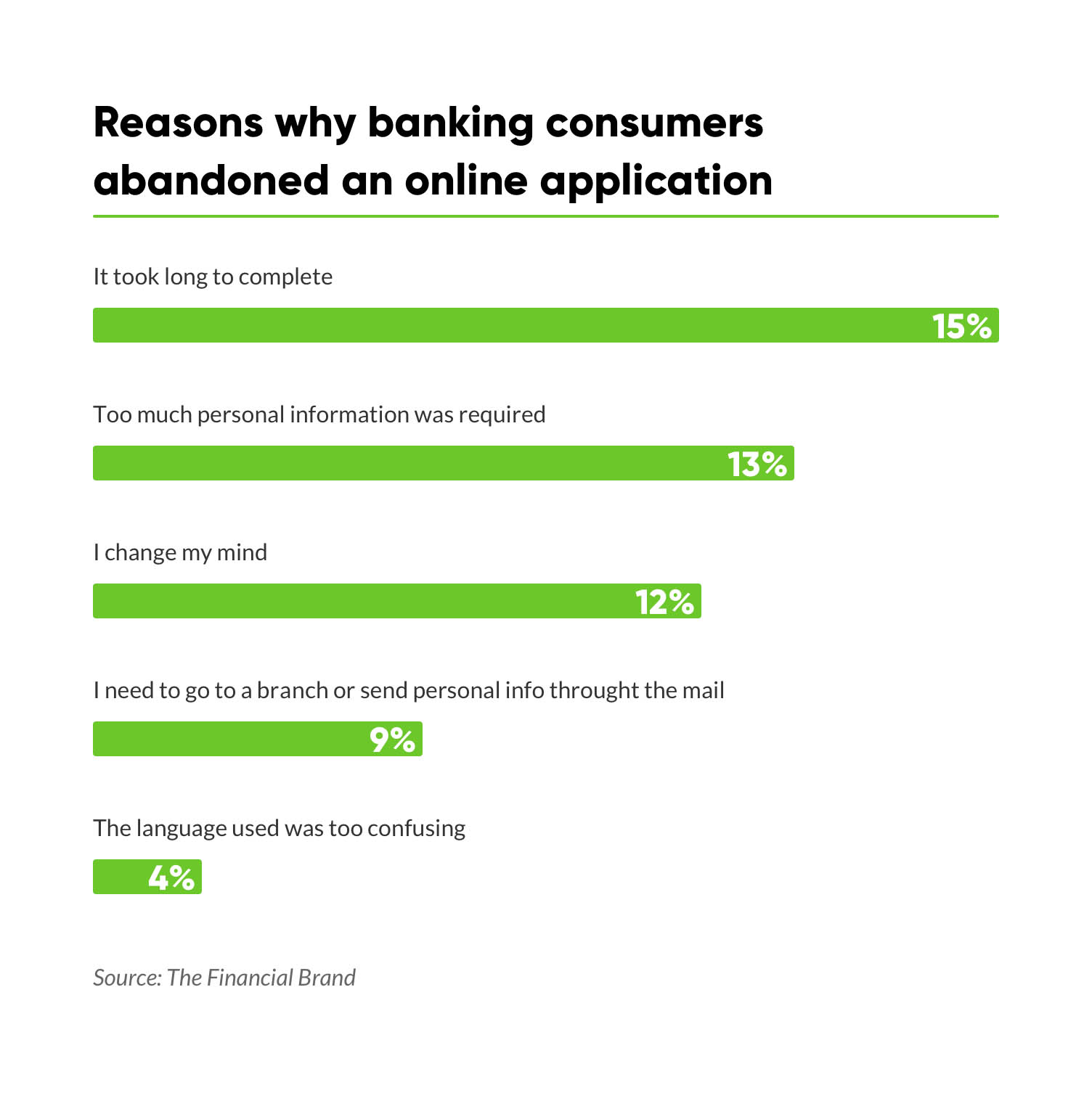
But, what is it that potential banking clients expect and wish for this process? Do they expect it to be fast and easy, or do they prefer a more secure-looking, complex solution? People might appreciate that entrepreneurs try to offer a process in a simple and quick manner. However, at the same time, there are other aspects that have to be assessed in order to make the service successful.
Imagine delivering an outstanding, super-simple, fast and easily usable enrollment process. Would people from different generations perceive this service as secure? Could the feeling of security decrease due to the simplicity and speed of the authentication process?
How do you find a balance between simplicity and trust, so that the enrollment process of a financial service could be simple while, at the same time, create a feeling of trust and security?
Is Digital a Curse for Older Generations?
Enrollment has been made remarkably simple in the digital age. There's no necessity to head to the branch; all you need is a smartphone app. But, let’s explore the typical mental models of bank customers created through the decades. For the longest time, the only way to create a bank account was to be physically present at a branch, wait in line, fill in all the forms and, in the end, get the account in a few weeks.
Imagine a 50-year old who has practiced this kind of process for most of his or her life. What would be this person's perception of a new digital bank enrollment that now takes less than a minute? Would this type of process feel legitimate and be perceived as safe and trustworthy?
Could a person from this generation trust all of his or her life's savings in a mobile bank that took just a few minutes to enroll?
In fact, the habits of older generations are being changed dramatically, mostly because the choices they took are becoming less available. For example, the number of bank branches is rapidly shrinking as everything is shifting toward a digital instead of a physical environment. As reported in a study by JLL, the number of bank branches in the United States will shrink by as much as 20 percent in five years.
Here's an example from my friend experience: 10 years ago, there were two active banking branches in his small hometown. At that time, it felt like a lot for such a small city. Ten years later, these branches are replaced by two ATMs. Now, if the people of this town wish to visit a branch, they must go to the nearest city, which is approximately 30 kilometers away. People of the older generation now have the choice to either adjust to an online or mobile bank or have the inconvenience of making a trip to the city.
Now, let's think, what would influence and shape the perception of a 27-year old millenial when it comes to enrolling in a bank? They might be fast paced and have a shorter attention span, but, at the same time, it's important to take into account their life experiences, such as witnessing several financial crises during the years. While some banks declared bankruptcy, their parents and grandparents often lost huge amounts of lifetime savings. Even though the millennials aren't direct victims themselves, these events have made imprints on their perception when it comes to banking in general and becoming a client of a bank themselves.
At the opposite end of the previous two examples, there's the perception of youngsters from Generation Z, who are used to registering on various apps and services within seconds. Would they even consider doing an enrollment that would take more than a minute?
To illustrate the differences, when users are filling out a long KYC form and stumbling upon a question, like “what are your planned number of monthly transactions?”, the emotions caused by such a question could differ quite dramatically among the age groups. Some users would have an approximate estimation right away, while others might not really put much thought into it and just enter a random number. But, what if there is someone who becomes frustrated and starts wondering, “What will the consequences be if I don't get this right? What if I enter something that does not turn out to be correct? Will I be punished? How it will affect my credit score in the future? This is a bank, after all. I cannot make mistakes, because the stakes are high.”
Looking up the subject, we found many articles and studies with insights into the financial behavior of the generations, yet none of them provided the answer to our initial question: “What kind of enrollment would be the most suitable for each generation?”
We felt determined to gain insights that might help not only us but also others who are invested into finding the best solutions and information architecture best practices for their customers. So, here's our story and our approach to finding the answers and define information architecture that works.
The Research
We hypothesized that each generation has their own level of trust in banking that correlates with the complexity of the digital enrollment process─meaning: people of older generations would rather trust traditional enrollment processes that are more complex, while younger generations would prefer financial services with a quick and simple registration. We wanted to test the assumption that members of each generation would prefer enrollment that would live up to their expectations and needs.
The active research phase was divided into four sections:
- Creating three banking enrollment prototypes that differed in their length and complexity;
- Surveying the respondents about their previous banking experiences to obtain insights about their background;
- Testing all three prototypes on respondents from each of the age groups, documenting their real-time emotions and impressions of each enrollment;
- Surveying respondents by gathering insights about their preferences of tested prototypes.
Defining Generations of Banking Customers
We started the process of research by gathering information about the most common views of each generation’s characteristics.
Generation Z (1995-2015, currently aged below 24)
The generation that will make up the future clients and workforce, replacing the largest consumer group of today─millennials. They are the ones who want everything “here and now, as quickly as possible.” These post-millennials have a very short attention span, which is why they don't invest either time or energy in anything that takes more than a few minutes. Instead, their attention is distorted due to bright and quickly changing flash-like images on social media.

It's important for them that the financial service fits into their digital world and not the other way around. God forbid they would have to adjust their schedule to the working hours of a branch. It’s no wonder they expect financial transactions to be almost frictionless, according to Kasasa. Generation Z is characterized as tech-savvy, individualistic—but also socially responsible, according to An Hodgson of “Euromonitor International.” These post-millennials are sometimes even called the “iGeneration,” indicating a profound use of mobile technologies as well as individualization.
Generation Y (1980-1994, currently aged 25 to 39)
They are also known as millennials. They grew up in a technology-filled, socially-networked world. Millennials are the first digital natives and often act as social influencers, who dedicate their lifestyle to exercising and eating right, while intensively documenting this on social media. Faced with problems, they won't hesitate to give feedback for mishaps to be addressed. Millennials are confident and live by the mantra, “Follow your dreams.”

A fraction of the millennials had their first banking experience with the support of their parents. Others have been approached by banking representatives at shopping malls and student campuses, to later receive the card and access details via postal services.
Generation X (1960-1980, currently aged 39 to 59)
Parents of millennials who have to experience the transition from an analog to a digital environment and are pushed to adapt to the online world. At the same time, a strong attachment to the offline dimension remains. They tend to perceive face-to-face personal communication more trustworthy than a digital one.

When it comes to banking, this generation values security above all else. After all, savings of a lifetime and financial legacy are at stake here. According to this, they tend to trust the labels and brand names as signifiers of good quality and trustworthiness. That's why they prefer traditional banking with solid “roots” established through decades, and find it hard to trust e-wallets that allow you to send money in just a few minutes without a two-factor authentication or other tested and proven security methods.
Building Bank Enrolment Prototypes
We architected the banking enrollment prototypes based on the commonly known characteristics of each generation, displayed in the chapter above.
The prototypes had their similarities as well as aspects of difference. The main differentiating factor was how fast the user was able to complete each of the processes.
First, we built the lengthiest prototype. In order to make the second two enrollment processes quicker to complete, we evaluated which steps or specific parts of the flow (like particular questions) can be removed while, at the same time, keeping the process totally legitimate to open an account.
To illustrate the lengthiness and complexity of each process, below is the count of steps respondents had to take in each process from starting the enrollment to officially becoming a client and logging in to see the dashboard.

First prototype: Complex flow
As the name states, this prototype was built for the members of generation X who are used to be physically present at a branch and invest a lot of time and energy into any affair related to their financials.
A prototype was created based on their previous experiences prior to the digital age. In this case, by stepping into the user’s shoes, we understand that, for many members of this generation, a certain level of complexity feels like a standard and a necessity to be secure and build trust in the banking service.
Based on this kind of brick and mortar type of background, we created a quite lengthy and complex enrollment process consisting of personal information, “Know Your Customer” questions and identity verification. The steps included questions about social status, workplace, position, work field, sources of income, tax residency, planned monthly income amount, etc.
Second prototype: Moderate flow
The second banking enrollment form was dedicated to the preferences of Generation Y, or millennials. Currently, as there's a huge choice among different financial apps, this generation tends to quickly switch between different services if their expectations and needs have not been satisfied. Knowing this, we wished to create this enrollment prototype as a step up from the first one in a sense of simplicity and speed while, at the same time, maintaining a level of credibility as this generation has experienced the complexity of “the banking branch age.”
We removed the “Know-Your-Customer” questions, such as participant’s workplace, income, etc., questions that aren't vital for opening an account. Instead, we focused on asking only the standard ID verification questions of personal information and participant’s contact data.
Third prototype: Simple flow
The banking enrollment for Generation Z was created in sync with their need for “here and now,” keeping in mind that some members of this generation are most likely to quit when faced with time- and effort-consuming complexity.
We divided the enrollment into two parts to prevent the youngsters from quitting due to frustration. We simulated the feeling of reaching the goal quickly with little to no effort. This was achieved by dividing the enrollment process into short and simple steps─name, phone number, phone verification, creation of password, etc. These were the only actions the user had to take to access the dashboard.
By doing this, we aimed to make the process more convenient for the user by providing an option to validate the identity at a later time. An example is a situation in which the user fills out the first part of the process in public but has the opportunity to verify the ID document at home.
Another element used to keep the attention of youngsters was to divide the questions into smaller chunks. This could be called the “one step at a time” principle─one action per question. In this way, we focused on reinforcing the feeling of the process moving more rapidly.
The dashboard was reached so easily that it provided a satisfactory feeling of getting a result quickly although users couldn't carry out any financial actions until the second step of identity verification was completed.
Surveying
Designing financial solutions for very different kinds of users, we have learned that a person's perception is shaped not only by age, gender, nationality and other characteristics, but also by the user’s prior experiences.
To attain more in-depth knowledge about it, we asked questions that would allow us to understand their backgrounds, for example, whether the participant is tech-savvy, what their habits of using online banking were and what their first encounters were with opening a bank account.
This information would help us determine patterns emerging from each of the different age groups as well as to profile each of the respondents individually.
Testing
During the prototype test sessions, our team of interviewers carefully documented every comment and emotion expressed. After that, we had a handful of additional questions to gain insights on the participants’ perception of each particular enrollment. It was crucial to understand which of the enrollment prototypes would feel the most satisfying for each of the age groups. To extract more qualitative and useful insights, we questioned the participants about the exact elements that made the enrollment credible or unreliable.
There was a fundamental question throughout the process of conducting this study─does trust and convenience conflict with each other when it comes to banking? In the banking world, it is impossible to stress enough how important aspects of trust and security are in the eyes of the users. People are deeply concerned with the safety of money that has been earned through hard work, even more so if we're talking about savings earned over a lifetime. It's unimaginable for someone to trust their life funds to a service that seems even a bit unreliable.
To find out which of the processes were viewed as the most trustworthy, we asked whether the participants would receive their salary to the newly created account starting the next day. As salary is the leading source of income and vitally important to people, it was a crucial question to determine their level of trust in the particular service. We also investigated which of the processes felt most secure and which one of them was the most convenient.
What We Discovered
This research over-delivered in the sense of unexpected results. Here are the most influential insights from our perspective, combined with our experience, knowledge and a theoretical explanation. We hope this research will inspire banks and financial institutions to take further steps in exploring their customers’ needs and expectations.
1. There's Much More Than Just Age
After conducting the tests using our three prototypes, we discovered a surprising revelation, which strongly contradicts with our initial assumption. The idea that people of older generations would rather trust a lengthier and more complex enrollment while the younger generations would prefer a quicker and simpler registration did not prove itself to be entirely true.
Even though Generation Z is used to the fast-paced digital world, when it comes to finance, they know it's not a game but a serious matter.
In fact, one of the younger participants stated that the simplest and fastest enrollment process seems suspicious and untrustworthy because “it's as easy as opening a new account in Facebook.”
This strongly contradicts with the “common knowledge” of Generation Z, measuring everything by the simplicity and speed.
Another respondent from Generation Z stated that the simplest enrollment didn't seem legitimate because the identity wasn't verified by a call from a banking employee: “How can they know that it was really me that did the enrolling? What if someone else photographs my ID? Also, the confirmation with a selfie seems untrustworthy and could be easily tricked by fraudsters.”
Even though some members of Generation Z might never have had an encounter with an actual bank branch, their vision of this topic has been shaped by the environment around them.
This perception of “banking as a serious thing” has evolved by seeing and hearing how their parents and grandparents talk about banking, as well as from what has been seen in the movies or heard in the news. This way they have “learned” and, at times, assumed that the more serious and complex the bank is, the safer and better for your finances.
At its core, this insight resonates with a principle of “mental models”─the way people perceive and understand the world. By having a previous experience of opening a bank account at a branch, people have a certain, perhaps even hidden, expectation that online enrollment would also resemble that experience.
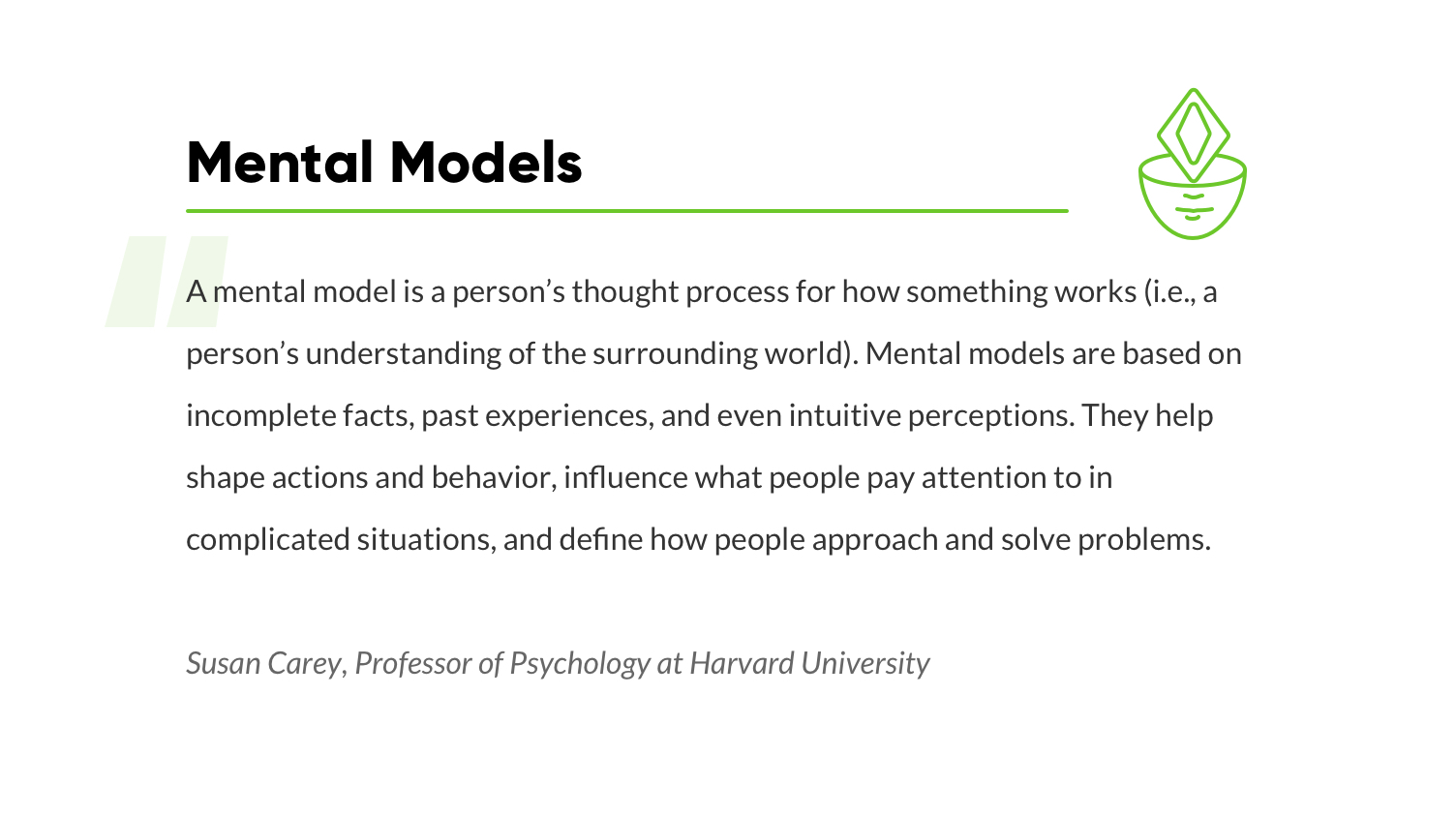
When creating a service, it's useful to try thinking as a psychologist first─analyzing, understanding and finding out what characteristics are actually meaningful for people independent of their age.
When it comes to building a perception of enrolling in a bank, a significant meaning lies not only in the sense of the year that the person was born, but a much bigger sense behind the context of people's lives. It's crucial to take into account the radical differences between their previous experiences that have shaped how each of them perceive the world of today and digital channels banking.
To gain knowledge about these previous experiences and contexts, we asked the participants about opening their first bank account─if they remember this process and how it happened. We figured that, for some people, it might be something that they had far forgotten and, for some perhaps, it was a recent experience. We also wanted to have an insight into what memories and emotions people have for this particular event in their lives, so it can be compared with different methods of enrollments to digital banking solutions we see today.
As it turns out, 60% of surveyed participants did remember opening their first bank account and did it by visiting a banking branch. For the people of Generations Y and Z, they shared mostly similar memories and emotions about this experience. For them, it started by visiting the branch together with a parent, providing the password to a bank employee, signing legal documents and waiting until the process was complete.
For the majority of people from older generations, it also involved visiting a branch. What emotions does this embedded pattern create in people's minds, when they now encounter an enrollment process that is as simple as opening an account in Facebook? While, nowadays, digital platforms are on the rise, there is a significant percentage of customers who prefer branches for their banking needs rather than online interactions.
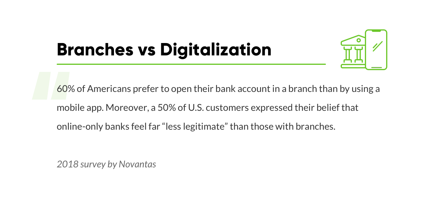
Data collected in our study emphasize the importance of exploration and analysis of the user context and user experience. It's a fact that different nationalities, ages, backgrounds, mindsets and expectations affect the way we act. Which bank was the leading one in the country when this user was growing up? What influenced the person in their first encounter with a bank? These imprints last in the person's mind and further create their mental models and expectations even from digital banking solutions.
The main goal of creating successful UX is to help make people's lives easier. At the same time, we must understand the solutions that people have lived with for decades. As opposed to fast and simple solutions offered by current Fintechs, there used to be and still are a lot of complex approaches, long, tiring forms and bothering, unclear questions. This has created a perception that is difficult to change. This also, unfortunately, at times can and does interfere with accepting solutions that are made with the best intentions to make a positive difference in the users' lives.
Designing experiences in consideration with the users’ past events is the basis of the so-called MAYA Principle (“The Most Advanced. Yet Acceptable”). The author behind this principle is Raymond Loewy, an industrial designer of the Coca-Cola bottle and numerous other world-renowned logos, such as Air Force One, Shell Oil and many more.
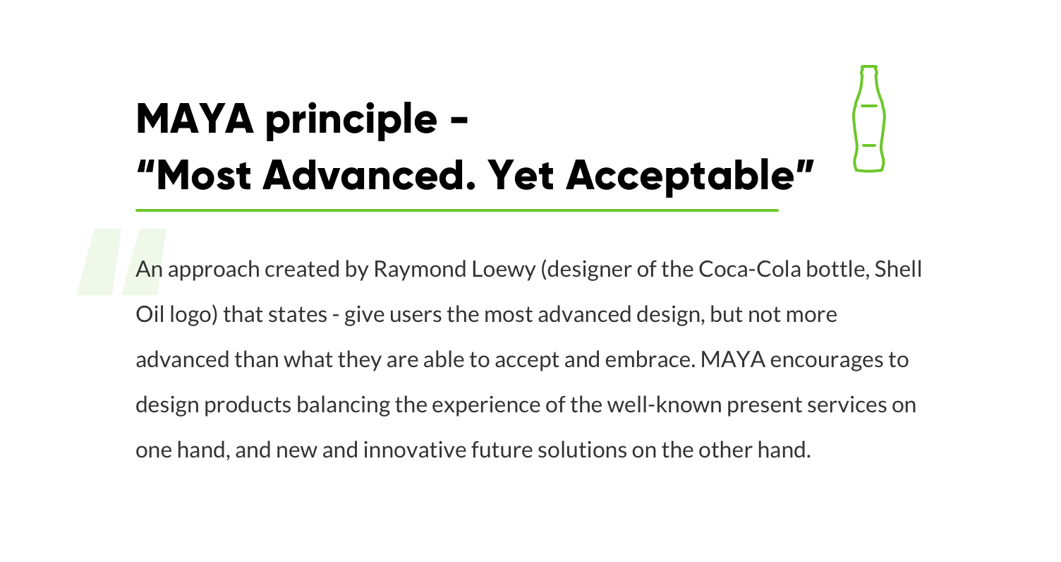
The main idea of principle is that if the designers don't find the right balance between future innovations and users’ present stage of skills and mindset influenced by past experiences, users won't use the product. As Loewy has stated, "The adult public's taste is not necessarily ready to accept the logical solutions to their requirements if the solution implies too vast a departure from what they have been conditioned into accepting as the norm."
As the enrollment process is one of the first steps in a user’s interaction with a bank, it is an important moment to meet the user’s expectations and convey a feeling of trust. The key is to make this change in a gentle and gradual way, respecting the mental models influenced by the years-long traditional approach to managing finances.
By understanding where your clients come from, what concerns them and what their expectations are, it's possible to create a starting point that forms a strong long-term bond. This emphasizes the importance of paying close attention to the customer background that has shaped the way they perceive the world of today. In fact, it's a crucial factor to take into consideration in order to deliver a brilliant user experience.
2. Conflict of Simplicity and Trust
One of the research questions was set to investigate whether trust and convenience would conflict with each other when it came to banking. The results were quite convincing. The majority of the tested participants (88%) considered the simplest and quickest enrollment process to be the least trustworthy. As stated by the respondents, for them it did not create “a feeling of a legitimate bank.”
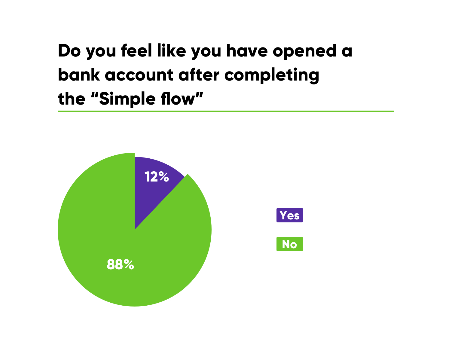
After finishing the process, the participants questioned the shortest enrollment flow: “Was that really it?” or stated their skepticism: “It was too easy and fast for it to be taken seriously.” Some respondents even expressed concern about their security: “If it is easy for me, then it's also going to be easy for people with bad intentions.”
And, here it gets a bit confusing.
On one hand, people appreciate handy and simple solutions that are making their lives easier, but, at the same time, if some actions become too simple and fast, the feeling of trust, security and thoroughness becomes less evident in the eyes of these users.
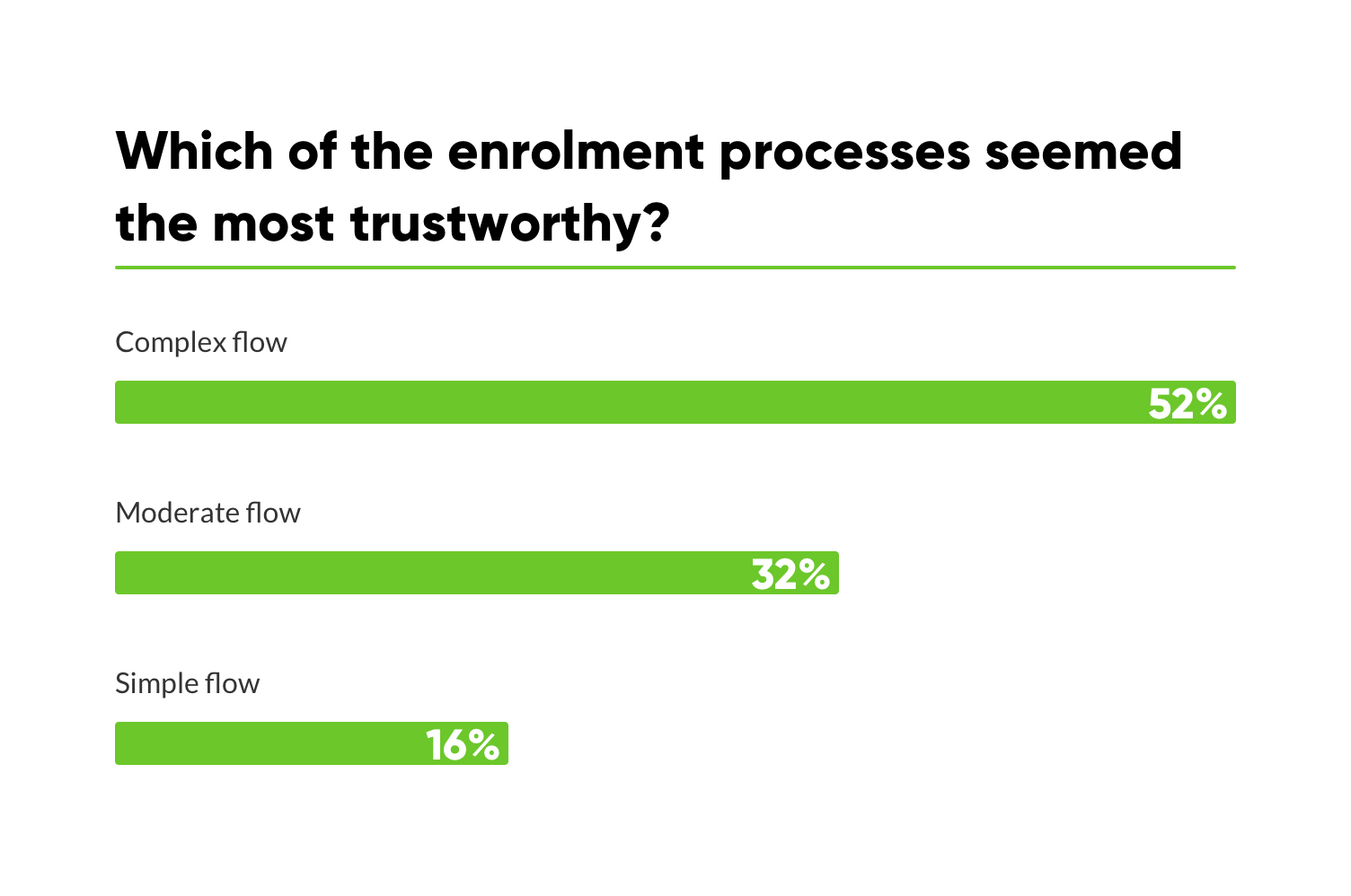
As you can see in the graph below, 52% found the “Complex flow” to be the most trustworthy. At the same time only 16% felt like they could trust the “Simple flow”.
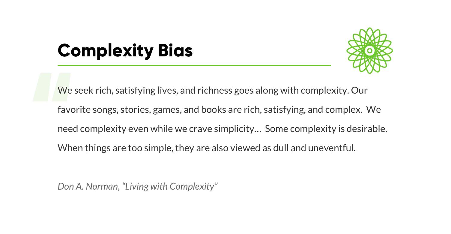
This insight relates to one of the cognitive biases named “complexity bias.” It states that people tend to prefer complex solutions over simple ones because they seem more credible.
Here is an illustrative example from our everyday lives of how this bias can sometimes manifest: when hearing someone using complex terminology or “big words,” some might tend to assume this person to be more knowledgeable about the subject than he or she might actually be. In the same vein, there's often a notion that a more complex solution would solve a problem better while a simple one “will never work” or won't be as effective. However, even though this is a bias, there are certain ways in which we can benefit from it when creating trustworthy user experiences in banking enrollment.
There's also a rather crazy real life story that correlates with this bias and demonstrates how the user experience was improved by adding more “complexity.” A startup company had created a PC optimizer, meant for system scanning. In comparison to the tools from competitors, this optimizer was so fast that its users did not believe it was doing any actual work. Eventually, it came down to a point at which the developers had to slow down the scanning process in order to create an artificial feeling of “more complex work being done.” What were the results after introducing these changes? Their conversions almost doubled; they experienced a rapid growth in their user base, hence, the users now had more belief and trust in the optimizer.
As the results of our study show, when the enrollment process is quicker and more simple to do, people start questioning its legitimacy. When it comes to banking, a certain level of complexity is associated with security.
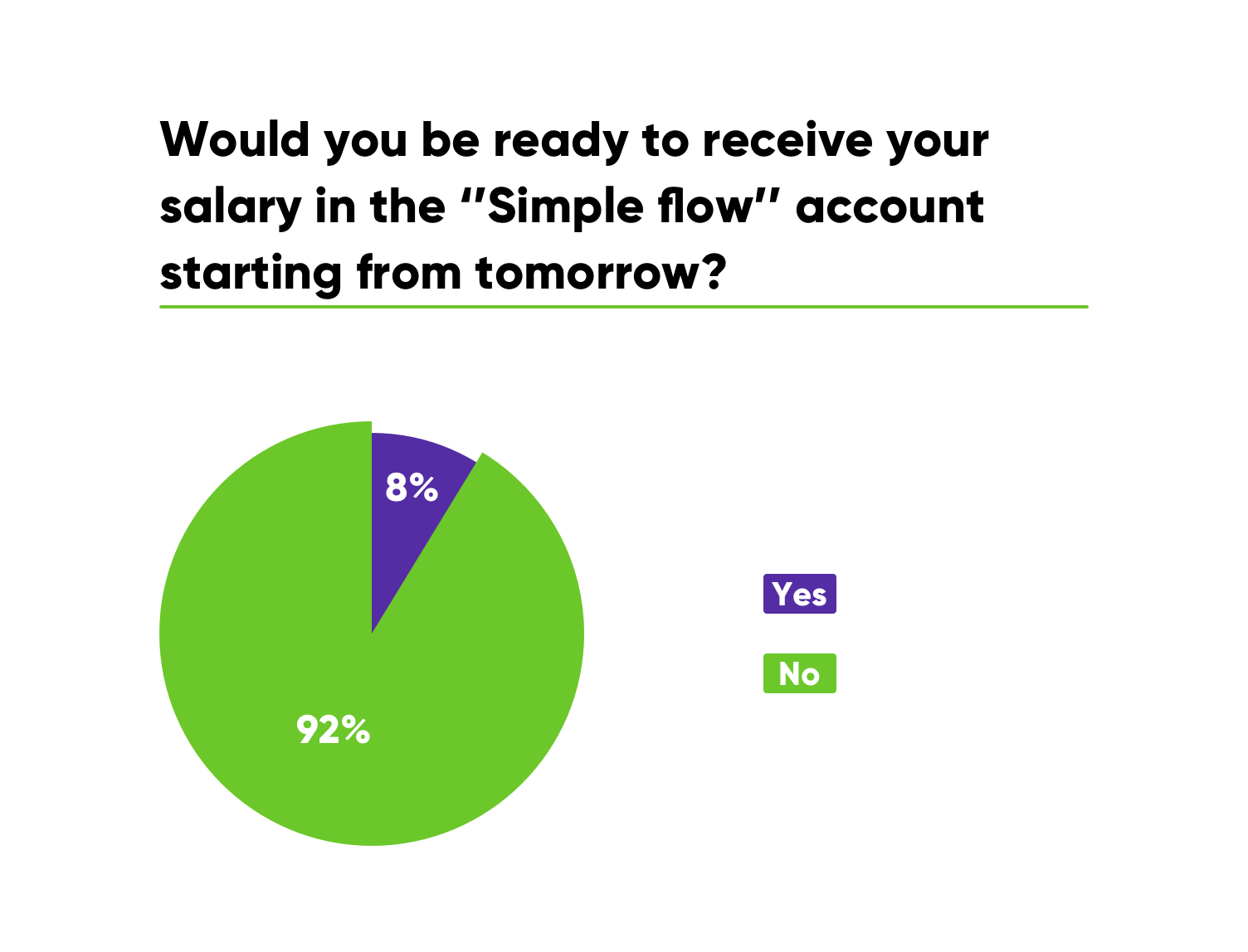
When the participants were asked about whether they would be ready to receive their salary in account that was created by the “Simple flow” 92% felt that this account wasn't reliable to trust it with their finances.
For many people, the world of finance is not something they consider to be simple. People need to have confidence in the service in which they are entrusting their money.
You might be thinking: “Wait, does this mean that simple and easy-to-use service won't ever be perceived as trustworthy? And, should I add some “artificial” level of complexity to my solution so that it looks more credible?” The answer is a certain “No.”
Following the technological development, it's crucial to be aware of human psychology as it dictates the way we perceive things. In order to use the digital age to the fullest, it's extremely important to understand the best possible way to make these technological advancements useful for the people. It's impossible to do that without taking into account their previous experiences that have shaped the way they perceive the world of today. In fact, this is one of the factors that cause prejudice toward current services.
At times, it seems that some financial services wish to compete with one other: which will have the quickest enrollment? Which will have the registration with the least friction? Which account can be opened with the fewest steps? But, let's stop there and think about the people first. How will they react to such rapid development in an industry that's based on trust and security? What would be the best experience according to the user’s needs and expectations? The focus needs to be on the customer. We have to take into account human psychology and bias.
There's no doubt that every service should be valuable for the user─meaning, each step, wording and element has to be well thought out by the UX designer, so that it serves a purpose and conveys a meaning. Unfortunately, there is a myriad of banking services that are over-complicated with features even the developers themselves don't completely understand. Some may think that this creates a feeling of credibility through complexity, but that is not the case.
The mastery of UX design is to deeply understand the thinking, perception and expectations of the user and deliver a delightful solution that balances all of the above.
3. Building Trust Through Control
During the testing, we inspected the elements that made some enrollment processes feel credible while others unreliable. Out of all three processes, the majority of respondents preferred the one that had medium complexity. It was characterized by the “optimal amount of questions” for it to remain credible while, at the same time, was valued as easy to do. Respondents also stated that the questions asked seemed appropriate and understandable.
It was appreciated that “only the crucial information was asked,” and there were not many questions.” The process was described as “not too long and not too short,” therefore indicating the user’s preference for a well-balanced registration flow.
The most complex enrollment process that included all of the possible “Know-Your-Customer questions” left the respondents frustrated as they didn't know the answers to some of the questions, for example, the number of planned monthly transactions and monthly incoming amounts in the bank account. Besides that, respondents felt that questions about their occupation and salary seemed sensitive and raised suspicion.
Similar emotions were caused by the third enrollment. Dividing it into two steps so that the users could quickly reach the dashboard decreased trust and raised suspicion as some of the respondents felt tricked by wrongdoers who could abuse their data.
A unifying factor in the responses of the tested participants was that enrollment was perceived as trustworthy and acceptable if it provided a sense of control─meaning, it's clear for the user exactly what is asked and why, as well as being guided throughout the process. If the customers are aware of why confidential information is asked, they will have a shared understanding with the service provider resulting in trustworthy relationships.
So, what if people are not receiving an explanation and given reasoning behind why certain information is required from them? What if the terms are unclear and not understandable? It leads to a feeling that they are not in control of the situation, causing further mistrust in the service.
It is essential for humans to feel like they are in control even if, in reality, they are not. This feeling is intrinsically established within us, giving us comfort and peace of mind.
Knowing the crucial importance that people place on their funds and hard-earned personal savings, the process of enrollment should not lead to a fear of whether the service can be trusted or if it's a threat to their financial well-being.
Financial services can build trust through control by providing a choice for the users, guiding them through every step, explaining why certain information is asked of them, providing an understanding of how things work and being able to predict what will happen next.
Every interaction in a customer journey builds a relationship, and these relationships are based on trust. It takes time to build it but just one moment to break it. Hence, banking enrollment is the frontier on which you can build a base for a strong and long-lasting relationship with your client.
It is important to focus on creating a flow that will leave a positive impact on the one who is using digital banking, an impact that will meet expectations and convey a feeling of trust and care.
It All Boils Down to..
We began with the question: “Why do some people tend to reject banking services that are made for their convenience?”, it's literally a million-dollar question as often that's the amount invested in their financial services. The results of our study provide an insightful perspective on this matter that encourages further exploration.
Even though the initial focus of the research was put on the differences among generations, there was another fundamental factor that strongly caught our eye. In fact, it provided an insightful perspective on why people sometimes tend to reject simple and easy-to-use services.
During the testing, we observed that perceptions of today are mostly shaped by the respondents’ past experiences, even if these experiences were intermediate, conveyed by parents, friends or media.
When it comes to banking, these experiences are often associated with complexity while complexity is perceived as proof of security. This kind of judgment has left a long-lasting imprint, not only on the older generations who have experienced it themselves but also on the youngsters. There's an overall society narrative about the way banking “should” function. And as you can imagine, this is rooted deeply in their psyches.
Turns out it's not that much about the age, gender or nationality, but rather the background and the wider context. The unpleasant experiences of the past have shaped the perception of today's modern world services.
This clearly indicates that
the background and context of past experiences holds people back from fully accepting and trusting the seemingly convenient solutions modern technologies are offering. This is where the incomprehensible resistance to simplicity is formed.
The fundamental question that arises from this is how to create a service that meets the trustworthiness criteria developed by the previous banking experience, without sacrificing simplicity and user experience.
We can deduce that it's not a truly user-centered solution if the crucial human factor is not taken into account. How do you shape the past experiences into new ones that would impact the way people perceive the world of today? How do you simplify services so that they wouldn't lose the feeling of credibility and provide a legitimate sense of reliability?
You can hire marketing agencies to conduct voluminous market research that will try to extract data-based explanations to these questions. However, we are certain that the true answers to these crucial questions can be found only by carefully listening to the users themselves. At the end of the day, they'll be the ones who will judge whether or not your service lives up to their needs and expectations.
Get UXDA Research-Based White Paper "How to Win the Hearts of Digital Customers":
 If you want to create next-gen financial products to receive an exceptional competitive advantage in the digital age, contact us! With the power of financial UX design, we can help you turn your business into a beloved financial brand with a strong emotional connection with your clients, resulting in success, demand, and long-term customer loyalty.
- E-mail us at info@theuxda.com
- Chat with us in Whatsapp
- Send a direct message to UXDA's CEO Alex Kreger on Linkedin


