
Imagine the effortless satisfaction of a single-click purchase on Amazon, one tap Uber hail or the perfectly timed recommendations from Netflix—these aren’t happy accidents from generic experience. They have carefully enriched the digital experience, contributing to multi-billion dollar success. Thousands of banks and Fintechs try to tap into the same principles. In this article, we’ll uncover 13 iconic UX breakthroughs from the world’s top tech giants—and show you exactly how to adapt these brilliant insights for financial services. Because if a single tap can revolutionize e-commerce, just think what it could do for your financial brand. Let’s dive in.
You will likely recognize the 13 user experience (UX) improvements featured in this article; most of us use them daily. These innovations were central to the success of multi-billion-dollar tech corporations—yet they’re surprisingly underutilized in financial services. How can banks and Fintechs leverage these proven UX strategies to transform generic copycut products into unique experiences that increase user engagement, build trust and increase key business metrics?
Historically, the banking industry has struggled with a reputation for complexity and formality. However, today’s consumers expect the same frictionless and rich experiences they enjoy in e-commerce and digital entertainment. Advanced banks and Fintechs are discovering that even small design tweaks can translate into major gains in customer satisfaction and revenue.
Applying 13 Iconic UX Breakthroughs to Financial Services
Below are 13 widely cited examples of interface adjustments—such as refining a single button or streamlining the onboarding process—that drove significant improvements in both business outcomes and user experience. While they may appear modest, these best practices solve pressing user needs and have already become the standard across digital products in multiple industries.
At UXDA we refer to this with our “dopamine banking” approach: using UX design to create micro-rewards and positive emotional triggers that keep users engaged, satisfied and returning to digital financial service. The core idea is that seemingly minor updates to enrich user experience can deliver remarkable returns in customer adoption, engagement and gained revenue.
Dopamine, frequently called the “feel-good” neurotransmitter, is released when users perceive rewards or positive outcomes. By aligning UX choices with these reward mechanisms, financial institutions can guide user behavior while raising overall satisfaction.
Because these UX techniques have gained amazing results in the world's top digital services, a lack of them can place your product at a competitive disadvantage. Let’s explore how these small but powerful interface design enhancements can generate unexpectedly large benefits for financial services:
1. One-Tap Actions
Example: Amazon’s “One-Click” Checkout
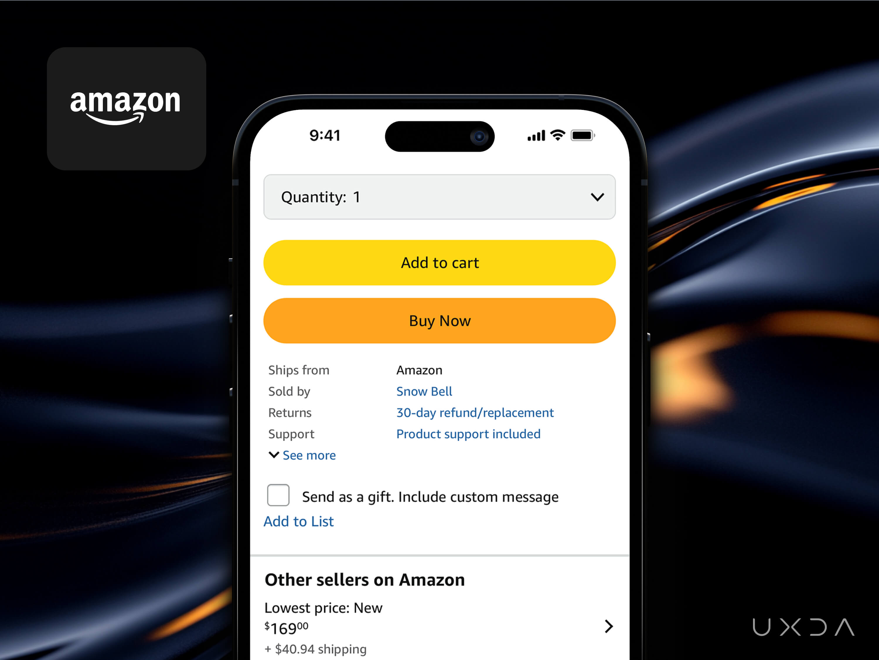
Instead of requiring users to fill in shipping and payment details repeatedly, Amazon introduced a single-click purchase flow once the user’s information was saved.
- Drastically reduced cart abandonment by removing friction.
- Demonstrated how investing in a single, streamlined flow could transform the entire experience.
- “One-Click” became one of Amazon’s competitive advantages, credited with boosting conversion and recurring orders.
Why It Matters:
- Eliminates friction: Streamlined workflows for common banking transactions (e.g., paying bills or sending peer-to-peer transfers) reduce dropout rates.
- Boosts engagement: Customers who see banking as fast and convenient are more likely to open and use the app frequently.
- Creates loyalty: By removing repetitive tasks, banks can delight users with near-instant, secure transactions.
Implementation Tips:
- After user identity verification (via Face ID or a PIN), provide a single-button action: “Pay This Bill” or “Send $50 to John.”
- Offer a short confirmation step for high-value transactions to reassure users.
Dopamine Trigger:
- Instant Gratification: When users pay a bill or send money with a single tap, they receive immediate feedback (“Payment successful!”), which provides a quick sense of accomplishment. That momentary success can release dopamine as the brain recognizes a goal was achieved with minimal effort.
- Reduced Friction: Fewer steps mean fewer opportunities for friction, which can dampen positive emotion. The simpler the flow, the clearer the reward path.
Emotional Effect:
Users feel empowered and in control because they accomplished a meaningful task (paying a bill, making a transfer) with little friction. This positive emotional signal can reinforce future usage.
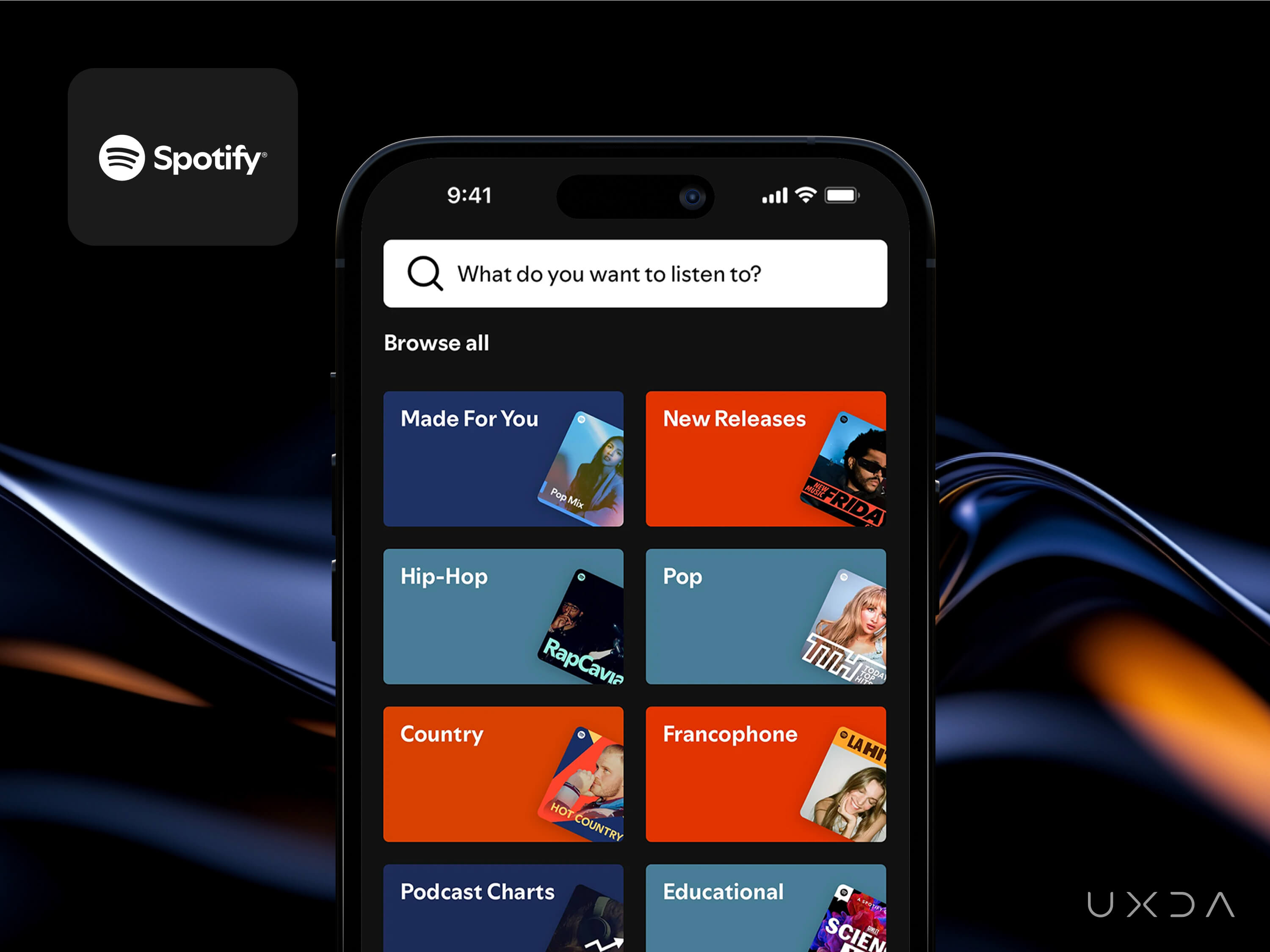
2. Minimalist First Screen
Example: Google Search’s Simplified Homepage

From the earliest days, Google maintained a minimalist homepage, focusing on a single search bar and little else. Over the years, they’ve retained that simplicity, carefully avoiding clutter.
- The clean, simple interface helped users find what they needed faster, becoming a hallmark of Google’s brand.
- Lightning-quick load times enhanced user satisfaction, keeping Google as the world’s leading search engine.
- This design choice arguably paved the way for “less is more” in modern UI design.
Why It Matters:
- Reduces cognitive load: Users can find critical information (e.g., balances, upcoming payments) at a glance.
- Improves speed and learning curve: A clean screen with fewer elements typically loads faster, which boosts app performance ratings and is more intuitive for newcomers.
- Enhances brand clarity: Simple design conveys confidence and modernity, often associated with trust and authority.
Implementation Tips:
- Make the landing screen highly focused: show only key balances, upcoming payments and a primary action (e.g., “Send Money” or “Pay Bill”).
- Hide or tuck away secondary features, ensuring the main page remains uncluttered.
Dopamine Trigger:
- Visual Clarity and Calm: Overly cluttered dashboards can trigger anxiety and reduce attention, blocking the potential release of dopamine associated with navigating something clear and intuitive.
- Sense of Mastery: A minimalist dashboard that focuses on top tasks gives users a sense that they know exactly where to go—mastery itself can be rewarding and can produce small dopamine hits.
Emotional Effect:
Users feel relieved and confident rather than overwhelmed. This sense of calm clarity helps them trust the app, making them more open to exploring other features.
3. Personalized Suggestions
Example: Netflix’s Seamless Auto-Play and Personalization

Netflix introduced auto-play of previews and next episodes, along with a dynamic UI that personalizes title images and recommendations for each viewer.
- Substantially increased viewer engagement and watch time by reducing friction (no more manual browsing).
- Encouraged binge-watching behaviors, driving up retention and subscription renewals.
- Reinforced Netflix’s image as a data-driven, user-centered streaming platform.
Why It Matters:
- Creates relevant user journeys: Contextual nudges like “You could save $X by refinancing” or “Try our new savings plan” resonate more when tailored to the user’s financial profile.
- Increases product uptake: Users are more inclined to explore new features or products when prompted with concrete, personalized benefits.
- Builds advisory value: Over time, customers see the bank as a trusted advisor rather than a mere transaction processor.
Implementation Tips:
- Provide contextual offers: “Based on your spending behavior, you could save $X per month if you…” or “You have $Y available in savings—would you like to explore investing?”
- Use spending patterns or deposit trends to offer personalized suggestions.
- Employ simple infographics or progress bars to explain how each recommendation can benefit the user.
Dopamine Trigger:
- Personal Relevance and Novelty: Unexpected or relevant suggestions (“You can earn 2% more interest!”) provide a pleasant surprise, stimulating dopamine through novelty and perceived reward potential.
- Timely Interventions: Well-timed prompts (e.g., “You have $300 left this month—why not set aside $50 in savings?”) give the user a sense of immediate reward for taking a beneficial action.
Emotional Effect:
Users feel cared for by the bank, experiencing positive emotions from receiving relevant, seemingly tailor-made tips or deals. The bank shifts from a faceless institution to a helpful advisor.
4. High-Quality Visuals
Example: Airbnb’s Emphasis on High-Quality Photos
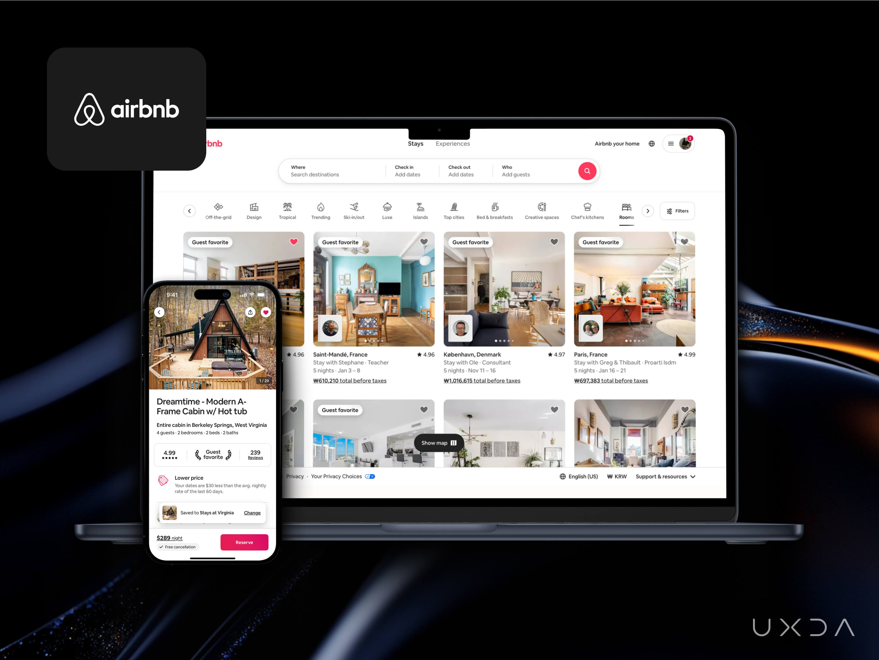
Early on, Airbnb discovered that better photos drove more bookings. They made photo quality a prominent part of their listing creation and updated the platform UI to feature large, appealing images.
- Listings with professional photos earned more views and significantly higher booking rates.
- Simplified the user journey: travelers could more easily judge the property, which boosted trust and conversions.
- This visual-first approach became a core design principle for Airbnb, helping them scale globally.
Why It Matters:
- Conveys professionalism: Clean, high-resolution images, intuitive icons and well-structured graphs reinforce the bank’s credibility.
- Enhances feature adoption: Users are more likely to try budgeting tools, investment products or robo-advisory solutions if the interfaces look polished and easy to understand.
- Humanizes the brand: Featuring real customer support avatars or representative photos can reassure users that people are behind the scenes.
Implementation Tips:
- Make all your service interfaces aesthetically pleasing, modern and consistently authentic to your brand identity.
- Replace generic stock images and icons with consistent, authentic illustrations and icons that reflect your brand identity.
- Ensure all charts and dashboards use clear color coding and labeling for quick comprehension.
- Use clear, confidence-inspiring illustrations and real images of your representatives or customer support teams.
- Provide visual dashboards for spending, savings goals or investment performance to reinforce transparency.
Dopamine Trigger:
- Aesthetic Pleasure: Attractive, cohesive visuals can spark aesthetic appreciation, a subtle dopamine release when encountering good design.
- Emotional Safety: Seeing modern, clean dashboards and friendly illustrations can reduce stress and create a welcoming environment, making it easier for users to feel a small emotional “lift.”
Emotional Effect:
Users experience greater trust and comfort, which is critical in finance. This emotional security can heighten positive user experiences and keep them coming back.
5. Streamlined Onboarding
Example: Basecamp’s Simplified Signup Flow
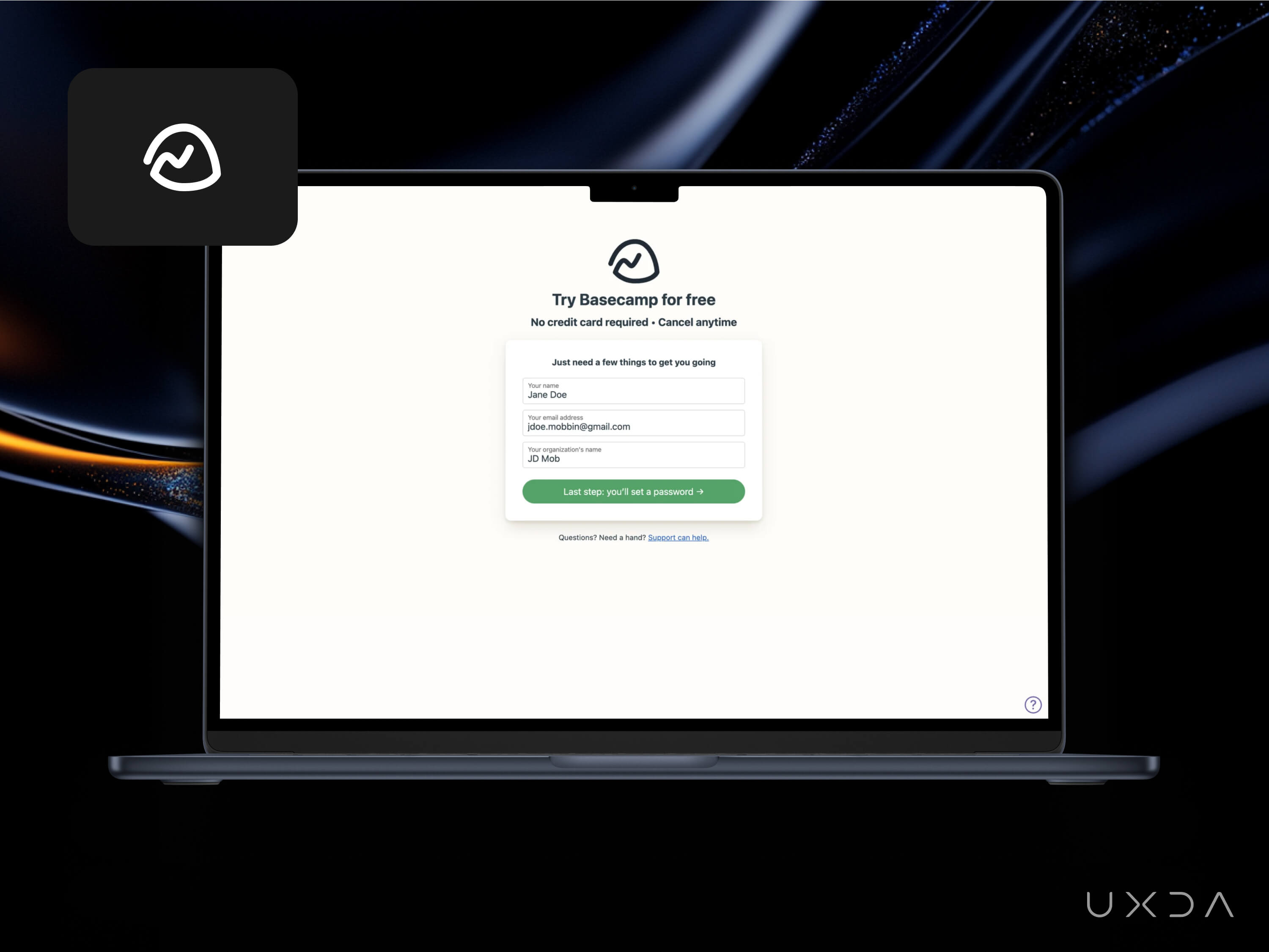
The team behind Basecamp is famous for minimalist designs. One change they cite repeatedly is removing unnecessary fields in the signup process and clarifying each step of the workflow.
- Lowered the barrier to entry, leading to a jump in completed signups.
- Reinforced the brand’s commitment to frictionless user experiences.
- Provided a template for many SaaS products that copied the “less friction, more clarity” signup ethos.
Why It Matters:
- Shortens time to value: The faster users can open an account or apply for a loan, the sooner they’ll start engaging with your services.
- Reduces abandonment: Fewer forms and clearer step-by-step instructions mean less friction and dropout.
- Enhances perception of modernity: Smooth digital onboarding sets your bank apart from clunky, time-consuming competitors.
Implementation Tips:
- Use progressive forms: show only what’s needed at each step (e.g., personal info, then ID verification, then income details).
- Integrate real-time validation to catch errors on the spot (e.g., incorrect ID format).
- Remove extraneous fields or combine them smartly.
Dopamine Trigger:
- Progress Feedback and Small Wins: Breaking down account creation into manageable steps (with real-time feedback) gives the user multiple mini “wins,” each capable of sparking a dopamine release.
- Reduced Anxiety: A simpler process means less cognitive load, so users can be more receptive to the small emotional highs of completion.
Emotional Effect:
Users feel accomplished at each step instead of stressed or frustrated. This sense of steady progress encourages them to finish onboarding and remain engaged afterward.
6. Referral Prompts
Example: Dropbox’s “Get Space” Referral Prompt
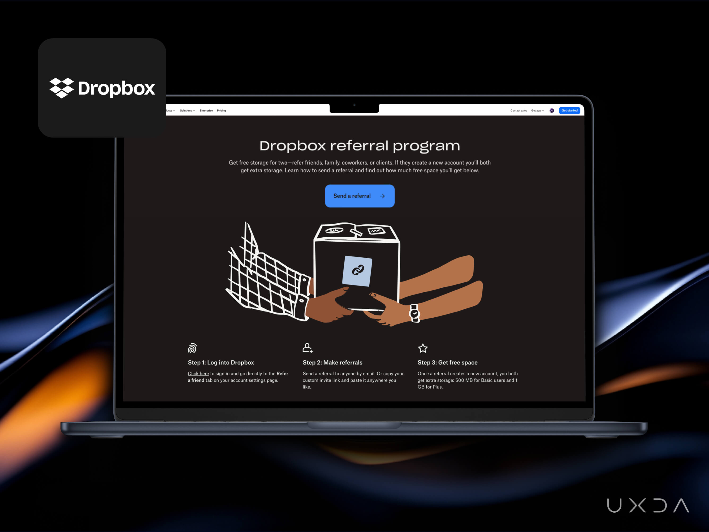
Dropbox made a small tweak to highlight their referral program—offering extra storage if you invite friends—more prominently within the app UI.
- Skyrocketed referral-driven account signups, becoming a core viral loop for Dropbox’s early growth.
- Simple, unobtrusive calls to action resulted in widespread brand advocacy at a very low cost.
- Became a legendary example of how product-led growth can hinge on a few well-placed nudges.
Why It Matters:
- Accelerates user acquisition: Referral programs encourage organic word-of-mouth expansion with minimal marketing spend.
- Increases loyalty: Existing customers get a “win” when they successfully refer friends or family.
- Validates trust: People are more likely to trust a bank recommended by someone they know, which can amplify your brand’s reputation.
Implementation Tips:
- Make sharing easy: a simple banner or button in the app that lets users send a unique referral link or code.
- Offer tangible incentives like cash rewards, waived fees or bonus interest for both parties.
- Offer a simple in-app invite (“Refer a friend to open a checking account and you both get $XX”).
- Make the referral prompt a friendly, unobtrusive banner on the homepage or in user settings.
Dopamine Trigger:
- Social Validation and Reward: Getting a bonus for referring a friend—and knowing the friend also benefits—creates a win-win scenario that triggers dopamine both through social approval and the tangible reward (like cash or bonus points).
- Positive Anticipation: Waiting to see if the referral converts is itself a mini thrill, and receiving the reward spikes dopamine upon success.
Emotional Effect:
Users feel valued by the bank and take pride in sharing a good product with friends. The reward structure cements loyalty and fosters a community feeling.
7. Progress Bar
Example: LinkedIn’s Progress Bar for Profile Completion
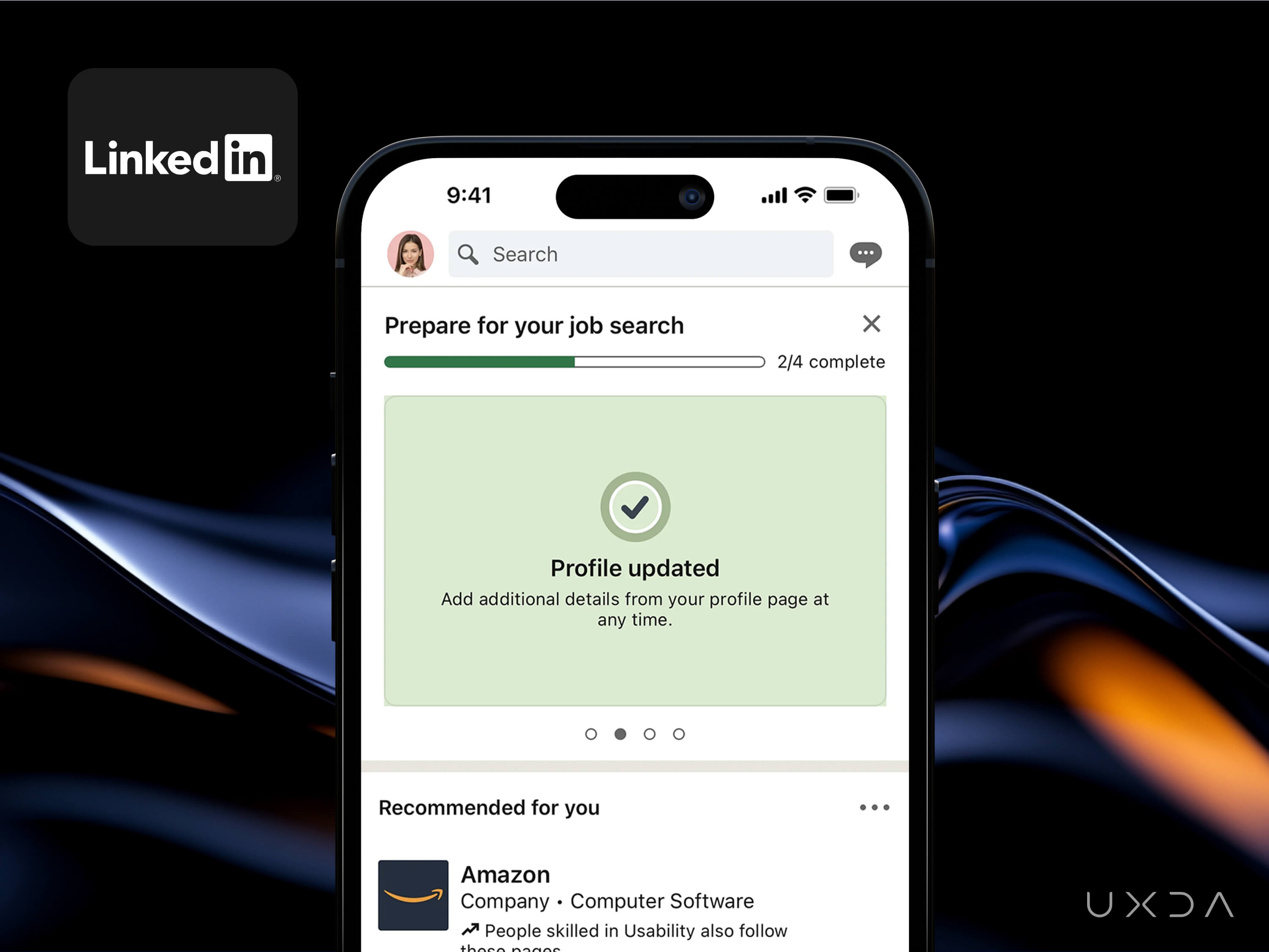
Adding a visual progress bar and step-by-step guidance encouraged users to complete their profiles or any other applications.
- More complete profiles led to better matches and increased recruiter engagement and user satisfaction.
- Significantly boosted LinkedIn’s key metric: time spent on the platform and networking success.
- Set a precedent for gamified “onboarding journeys” now found in countless apps and services.
Why It Matters:
- Encourages thorough KYC: Seeing a profile progress bar can nudge users to verify their address, upload identification or add income details.
- Improves overall service: A fully updated profile unlocks faster loan decisions, personalized advice and lower compliance risk.
- Adds a gamification element: Users experience a sense of reward when reaching 100% completion, increasing the likelihood they’ll continue exploring the app.
Implementation Tips:
- Introduce a visual tracker that shows how much of the user’s profile is complete (e.g., address, ID documents, phone verification, etc.).
- Provide incentives: “Complete your profile to unlock faster loan approvals or instant transfers.”
- Show clear benefits at each milestone: “Add your employer to boost credit limit possibilities.”
- Use celebratory micro-animations or badges when users reach a new completion level.
Dopamine Trigger:
- Gamification and Achievement: Each incremental fill in the progress bar is a mini-achievement, which can consistently trigger small amounts of dopamine as the user edges closer to 100%.
- Clear Goals and Feedback: The brain loves clear goals with visible feedback loops—hitting them translates into tangible reward signals.
Emotional Effect:
Users feel rewarded and motivated to complete their profile (or KYC steps), associating the banking app with a sense of accomplishment rather than dread.
8. One-Tap Feedback
Example: Facebook’s “Like” Button (and Reactions)
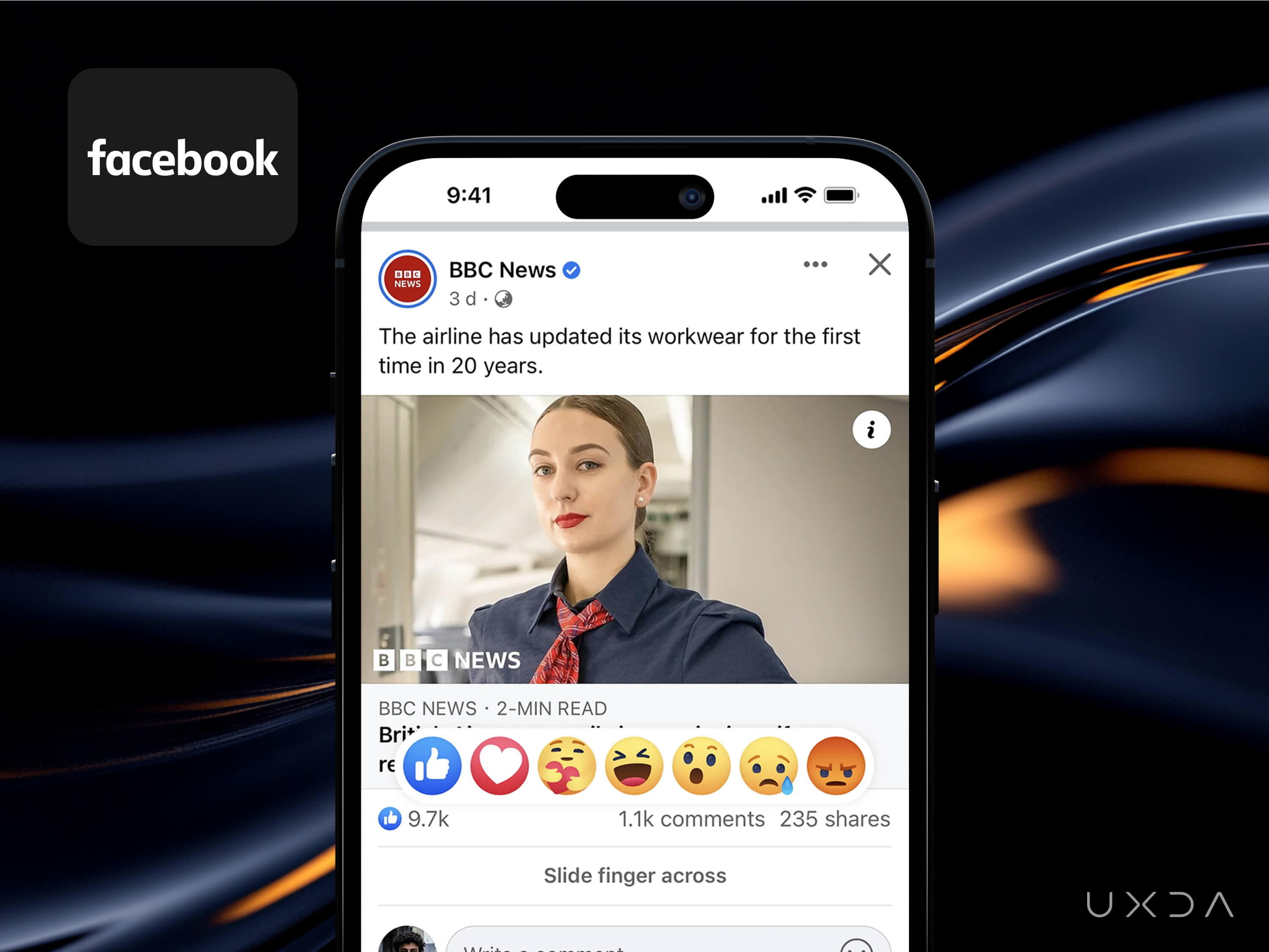
Initially, adding the simple “Like” button offered a low-effort way to acknowledge posts. Later, other reactions (e.g., love, angry, sad, etc.) were introduced for more nuanced engagement.
- “Likes” quickly became a core social metric, encouraging users to engage with content.
- Reactions gave Facebook deeper data on user preferences and emotional responses.
- The small tweak of going from zero to multiple “reactions” changed the way users share feedback, spurring increased interaction.
Why It Matters:
- Ensures continuous improvement: Quick feedback loop helps the bank measure customer satisfaction on-the-go “thumbs up or down” or a 1–5 star rating.
- Customer-centered culture: Creates a culture of continuous improvement, powered by data-driven insights on customer satisfaction.
- Builds customer trust: Users see the bank is genuinely interested in their experience, not just the transaction.
Implementation Tips:
- After a chat or call with customer support, show a one-tap feedback mechanism (like a thumbs up or 1–5 stars).
- Provide optional expanded reactions for more nuanced feedback (e.g., “fast response,” “friendly agent,” “issue not resolved”).
- Instant experience rate request with optional fields for more details: “Please tell us why” if the user gives a low rating.
- Sum up feedback in dashboards to identify trends and training opportunities.
Dopamine Trigger:
- Instant Sense of Contribution: Providing a quick reaction or rating triggers a small psychological reward, as the user feels “heard” by the service.
- Social Mechanism: Positive feedback loops—like a quick “thumbs up” for a helpful chat—mirror social media’s reaction mechanisms, each delivering micro doses of dopamine for both the user and the service agent (if they see high ratings).
Emotional Effect:
Users feel empowered and believe their feedback matters, building a stronger emotional connection and sense of loyalty to the institution.
9. Biometric One-Tap Payment
Example: Apple iPhone’s “Apple Pay” One-Tap Checkout
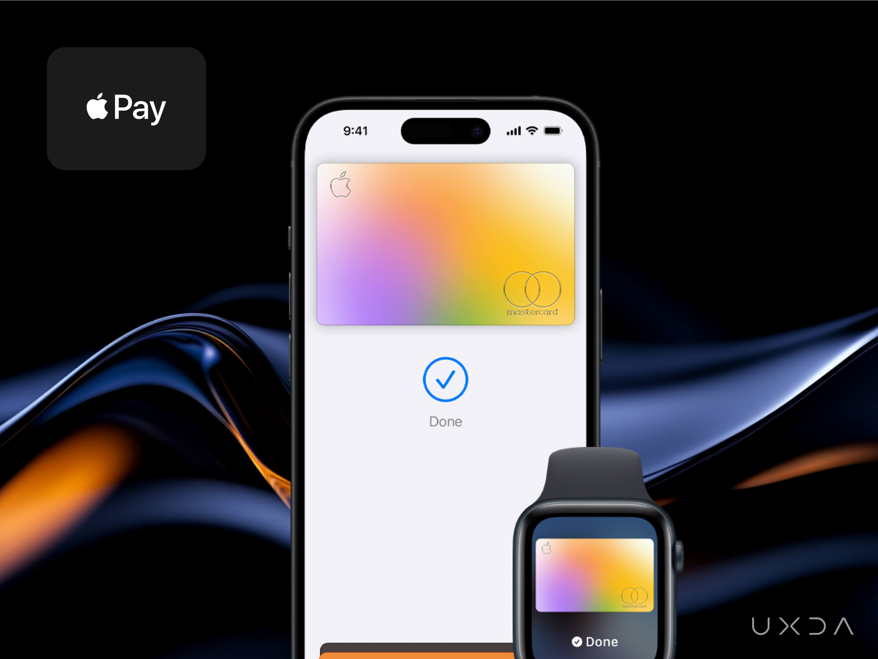
Apple seamlessly integrated “Apple Pay” into the iPhone’s core experience, allowing users to authorize payments with Face ID or Touch ID in just one tap.
- Eliminated friction: Removing the need to type credit card details or billing addresses significantly shortened the checkout flow.
- Boosted adoption: Partnerships with major retailers and apps helped “Apple Pay” become a ubiquitous, go-to payment method.
- Strengthened ecosystem: The convenience factor kept users locked into Apple’s ecosystem, reinforcing brand loyalty.
Why It Matters:
- Frictionless transactions: One-tap or one-look authentication for financial transactions sets a new bar for quick, secure payments in banking apps.
- Increased user trust: Apple’s strong privacy and security stance assures users that their sensitive data is protected.
- Future-proofing: As users grow accustomed to instant payments, banks that fail to offer similarly smooth experiences risk losing relevance.
Implementation Tips:
- Biometric integration: Tie into the device’s biometric security (Face ID, Touch ID) to reduce login friction and confirm transactions seamlessly.
- Enter Apple ecosystem: Present the Add Card to Apple Pay (or equivalent) button prominently in your app.
Dopamine Trigger:
- Instant gratification: The speed and ease of paying with a tap or glance release small hits of dopamine associated with accomplishing tasks effortlessly.
- Security + convenience rush: Users get the dual reward of feeling both safe and efficient, reinforcing positive emotions.
Emotional Effect:
The marriage of security and speed makes users feel their bank is modern and protective, increasing emotional loyalty.
10. Recurring Personalized Discovery
Example: Spotify’s “Discover Weekly” Personalized Playlists
Spotify pioneered user-specific music recommendations with “Discover Weekly,” a curated playlist updated each Monday.
- High engagement: Users often check the playlist regularly, boosting in-app listening time.
- Built habit loops: The anticipation of new, tailored songs each week fosters a loyal user base.
- Industry-defining: It became a blueprint for recommendation systems across music and media platforms.
Why It Matters:
- Contextual insights: Banks can similarly offer spending insights or saving tips based on a customer’s “financial habits.”
- Habit formation: Recurring personalized prompts (like monthly spending reviews) can keep users returning to the app.
- Deep user bonds: Showing you “know” your customer’s preferences builds trust and longer-term engagement.
Implementation Tips:
- Weekly or monthly insights: Provide automated “Financial Snapshot” playlists—like recommended budgeting steps or relevant offers
- Data-driven personalization: Leverage machine learning on user transaction data to highlight products or services with the highest personal benefit.
- Easy discovery: Place these personalized recommendations front and center on the home screen or via push notifications.
Dopamine Trigger:
- Novelty and surprise: Finding a new favorite song (or, in banking terms, discovering a new benefit) sparks a dopamine hit.
- Positive reinforcement: When suggestions prove helpful, users feel validated and look forward to more customized tips.
Emotional Effect:
Users feel recognized on an individual level, forging an emotional link with your brand.
11. Single-Tap Rides
Example: Uber’s One-Tap Ride Request
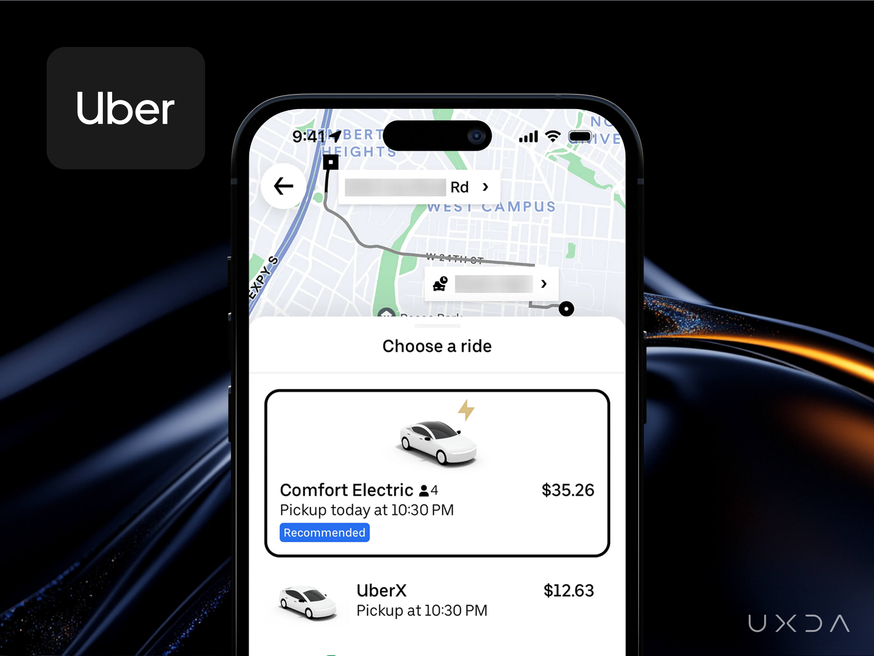
Uber simplified ride-hailing to a single tap, automatically detecting location, matching a driver and processing payment in the background.
- Revolutionized convenience: Removing the need for phone calls, manual address entry or cash changed urban transport globally.
- Increased retention: Customers repeatedly chose Uber for the seamless experience over traditional cabs or slower competitor apps.
- Set user expectations: Ride-hailing is now synonymous with “tap, ride, done.”
Why It Matters:
- Reduced friction = higher usage: In finance, simplifying complex tasks (like requesting a loan or splitting bills) can lead to more frequent user activity.
- Automation of details: Users appreciate not having to re-enter repeated data points, echoing the convenience of “no-cash, no-hassle” rides.
- Brand differentiation: A bank offering near-instant processes (e.g., quick loan approvals) stands out in a crowded market.
Implementation Tips:
- Auto-fill data: For repeat transactions, pre-fill as many details as possible so users just confirm.
- Transparent process: Show real-time status updates (e.g., “Your request is being processed,” “Approved in 10 seconds”).
- Built-in payments: Keep the payment mechanism seamless within the app rather than redirecting to external portals.
Dopamine Trigger:
- Immediate outcome: One-tap actions that instantly produce a tangible result (like calling a ride) reward the brain with a sense of competence.
- Predictability and control: Knowing exactly when the “car” or result will arrive fosters calm satisfaction—tiny dopamine bursts.
Emotional Effect:
Minimizing complexity helps users feel they’re effortlessly in control of their finances, reducing stress.
12. Live Collaboration Canvas
Example: Figma’s Real-Time Collaboration
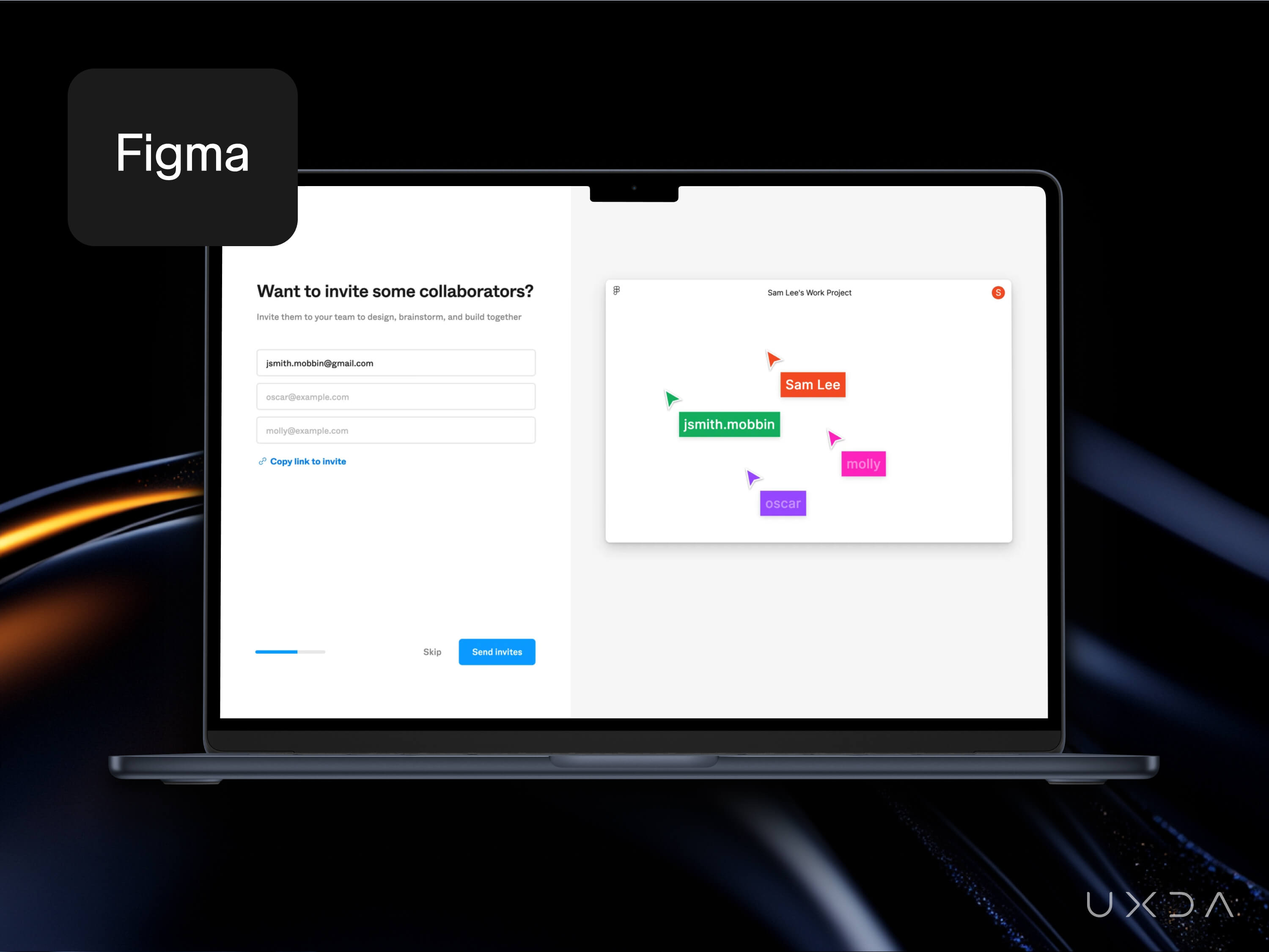
Figma introduced live, multi-user editing in a design tool, allowing teams to collaborate in the same file simultaneously.
- Eliminated version chaos: No more “v2-final-FINAL” file versions. Everyone sees updates instantly.
- Supercharged productivity: Designers, developers and stakeholders communicate in one place, reducing the number of back-and-forth emails.
- Community effect: Shared templates and plug-in ecosystems flourished around real-time features, fueling word-of-mouth growth.
Why It Matters:
- Transparent collaboration: In banking apps, real-time co-browsing with support agents or co-managing finances with family members can build trust.
- Instant updates: Shared budgeting tools or joint account management can show immediate changes, fostering teamwork.
- Modern user expectations: People now expect seamless, synchronized experiences—bringing that to finance differentiates you from outdated, siloed systems.
Implementation Tips:
- Multi-user features: Offer “joint account views” in which spouses or business partners see real-time transaction updates and can add notes.
- Co-browsing support: Enable support reps to view a user’s screen (with permission) to guide them through complex tasks.
- Notification system: Keep relevant stakeholders in the loop with instant push alerts or in-app updates on shared financial tasks.
Dopamine Trigger:
- Synchronous collaboration joy: Seeing real-time input from others can be exciting and rewarding, sparking mini-dopamine boosts.
- Reduced friction in teamwork: A frictionless group experience fosters a positive emotional response and a sense of collective achievement.
Emotional Effect:
Shared ownership and trust provides real-time transparency to build trust among users and between users and the bank. Feeling “in it together” increases satisfaction.
13. Endless Personalized Feed
Example: TikTok’s “For You” Infinite Feed
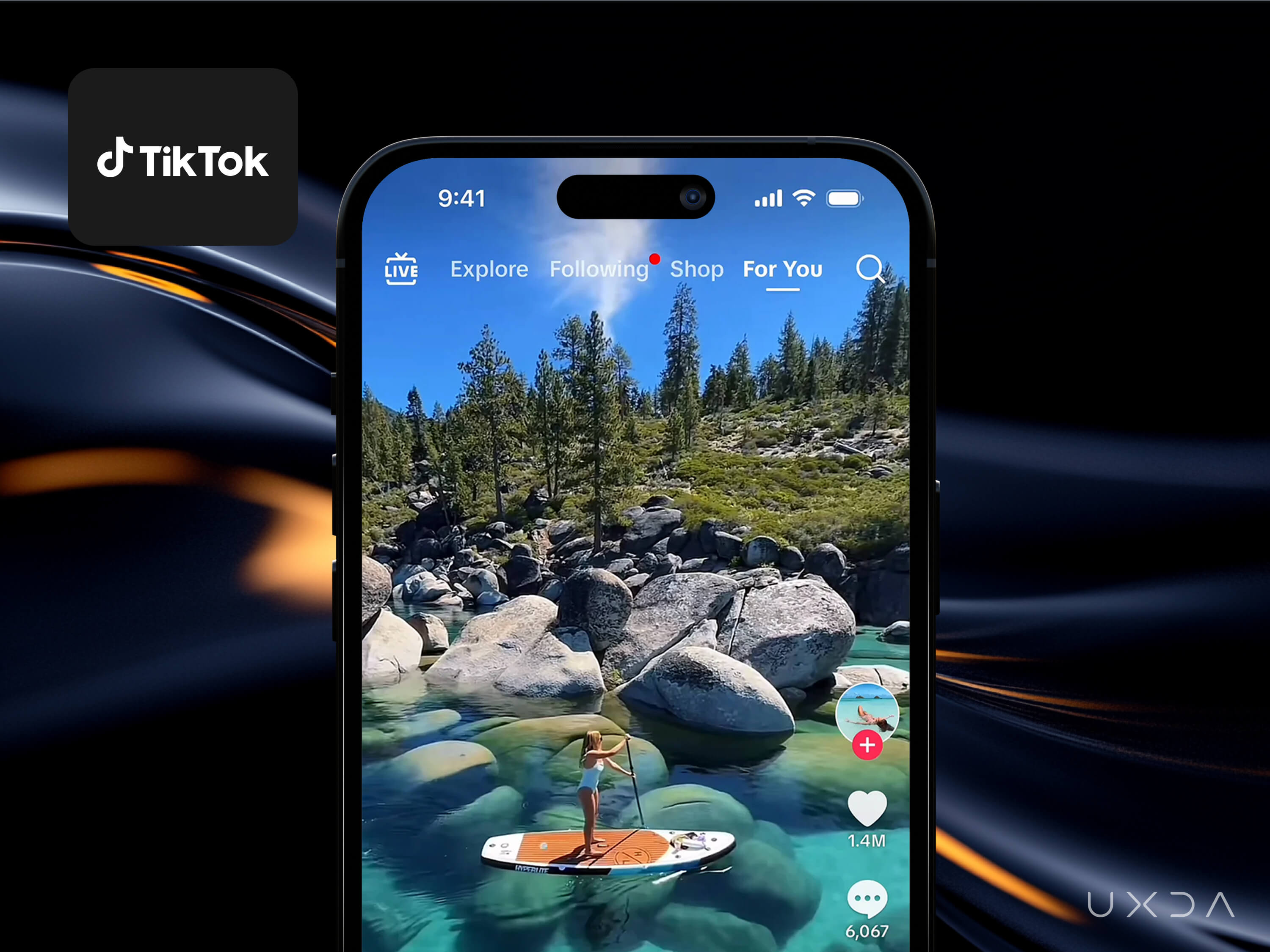
TikTok’s vertical feed quickly personalized videos based on watch time, likes and replays, hooking users into continuous viewing.
- Hyper-engagement: The algorithm’s accuracy and infinite scroll keep users scrolling far longer than they initially intend.
- Viral content engine: Easy video creation plus mass distribution turned TikTok into a cultural phenomenon.
- Redefined short-form media: The “For You Page” is now the gold standard for endless, highly personalized entertainment.
Why It Matters:
- Contextual curation: Banks can adopt similar “infinite” but curated feed concepts—like continuously updated financial insights.
- User stickiness: Engaging, snackable content (short tips, quick budgeting wins) can keep users returning daily.
- Behavioral data: By analyzing user interactions, the bank can refine future recommendations, from loyalty offers to credit advice.
Implementation Tips:
- Short-form updates: Provide quick, scrollable financial tips or “stories” (e.g., daily spending insights, saving challenges).
- Personalized content feed: Prioritize recommendations based on each user’s spending patterns, goals and previous interactions.
- Easy shareability: Let users quickly share these insights or achievements with friends, echoing TikTok’s social “duet” effect.
Dopamine Trigger:
- Endless novelty: Rapid-fire personalized content can trigger repeated dopamine surges as each new “card” or insight might bring value.
- Micro-rewards: Even a small, useful tip or motivational nudge can feel rewarding, encouraging continued scrolling.
Emotional Effect:
Users feel a slight “thrill” in checking what will come up next, building habit loops around financial literacy. Presenting financial guidance in an engaging feed reduces intimidation and builds a positive, exploratory mindset.
Final Thoughts
While banks and Fintechs must navigate strict regulations and prioritize robust security, interface innovations needn’t be complex to succeed. A single button, a strategic piece of microcopy or a well-placed progress bar can guide user behavior, inspire trust and drive meaningful business results.
In a digital world in which consumers can switch providers with a few taps, thoughtful design enhancements are paramount. By adapting proven UX patterns from retail, media and tech to the specialized needs of finance, banks and Fintechs can surprise and delight customers, creating enduring loyalty. Even minor changes—like shortening forms or enabling one-step transactions—can reduce user effort and boost satisfaction. Clear, streamlined interfaces also reassure users that their finances are secure.
Psychological nudges, such as progress bars, rewards or urgency indicators, can further influence positive user behavior while distinguishing forward-thinking institutions from those clinging to legacy systems.
By weaving small, gratifying user experiences into every step of the banking journey, financial institutions can harness the power of dopamine to boost user satisfaction and build deeper loyalty—all while helping customers manage their finances in a more streamlined, empowering way.
Whether it’s removing unnecessary steps, adding a single button or surfacing the right information at the right time, these micro-optimizations often become major growth levers—proving that small, thoughtful design changes can have an outsized impact on both user behavior and business metrics.
- Minimize friction: Just like in e-commerce or media streaming, faster and simpler interactions increase conversion and satisfaction in banking.
- Use microcopy and visual cues: Subtle text prompts, progress bars and well-chosen animations reassure users about the seriousness and security of financial actions.
- Personalization matters: Deliver the right suggestions at the right time—be it a savings prompt or a referral link—to dramatically increase uptake of financial services.
- Build trust: In finance, trust is paramount. High-quality visuals, clear confirmations and frictionless onboarding reinforce user confidence.
- Balance and Transparency: Overusing urgency tactics or “dark patterns” can erode trust. Ethical design focuses on helpful nudges rather than manipulative tricks.
- Sustainable Engagement: Dopamine-driven design should improve financial wellness and user satisfaction, not pushing impulsive actions.
- Long-Term Loyalty: Positive “micro-rewards” around money management encourage recurring, long-term usage of your platform.
Discover our clients' next-gen financial products & UX transformations in UXDA's latest showreel:
If you want to create next-gen financial products to receive an exceptional competitive advantage in the digital age, contact us! With the power of financial UX design, we can help you turn your business into a beloved financial brand with a strong emotional connection with your clients, resulting in success, demand, and long-term customer loyalty.
- E-mail us at info@theuxda.com
- Chat with us in Whatsapp
- Send a direct message to UXDA's CEO Alex Kreger on Linkedin