Modern technology has taken banking to a whole new level. Ease, speed, enjoyment, and convenience are rewriting the history of the user experience in banking. While many banks still struggle to digitize their products, new Neobanks have rapidly emerged, changing the rules of the game. One of the biggest challenges is how to create and develop a banking ecosystem that could organically deliver dozens of products as a connected user flow with the possibility to scale up into the bank-as-a-platform. Ultimate banking super app UX/UI design concept shows how any finance company could upgrade its mobile banking ecosystem with 10 banking trends.
Motion video of UXDA's Banking Super App UX/UI design concept that was nominated for one of the world’s biggest and most prestigious design prizes - the Red Dot Awards 2020 final judging
What are Examples and the Definition of a Super App?
The definition of a super app first appeared in Mike Lazaridis’ statement in 2010. A super app is an app that delivers a compelling user experience by leveraging the unique capabilities of the platform.
A super app is the kind of app that people love and use every day because it offers such a seamless, integrated, contextualized and efficient experience.
Unlike mono applications that offer one function in the most convenient and understandable format, the super app advantage is in building an ecosystem capable of providing a solution for different consumer needs as an organic user flow. Such a platform collects a large amount of data about users and increases personalization and the speed of customer engagement on this basis.
So, what is the financial super app? A financial super app is a mobile application that provides a variety of financial related services, such as banking, payments, investments, insurance, and more in one convenient place. In other words, it is a digital ecosystem with wide range of features and services that are tailored to the needs of most users. These apps are designed to make it easy for users to manage their finances and use additional services on the go, so the user experience and seamless flow are extremely important. They typically offer features like account management, online shopping, mobile payments, and the ability to track expenses and investments.
Well known example of the super app is WeChat, launched in 2011 by the Chinese internet giant Tencent. WeChat messenger contains more than a million products and micro applications from financial transactions, loans and trade to games, entertainment and ticket booking. Over 800 million active users use the app every month. Other super app examples include Grab, Line and Gojek (Get).
The presence of a large number of products and the flow of big data passing through the bank can become a promising basis for building a highly personalized banking ecosystem around a specific user. And, today, there are more and more advanced technological solutions of data processing and personalization through AI in banking accessible on the market.
However, despite the technological opportunities, the key challenge is delivering the super app experience in a clear and user-friendly way.
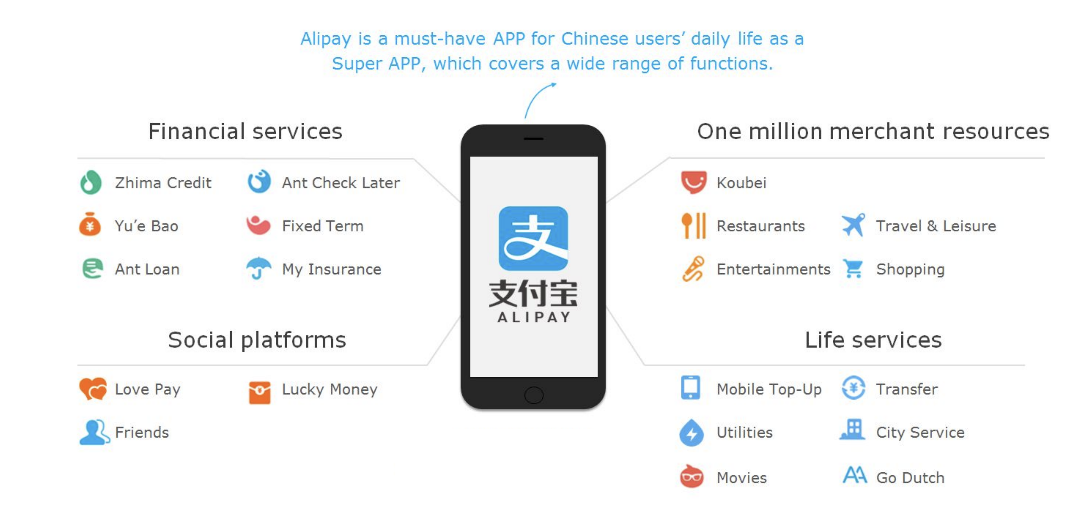
Banking super apps already have a heavy impact on the financial industry development and digitization. The most popular super app is Alipay, service owned by Jack Ma's Ant Group has more than 1,3bn users.
One more huge financial super app example is PayTM from India. It has 350 million users and according to Aakash Gupta review, PayTM can claim to helping India digitize its payments because 11% of India’s 1.38bn people have paid with PayTM in the last 12 months.
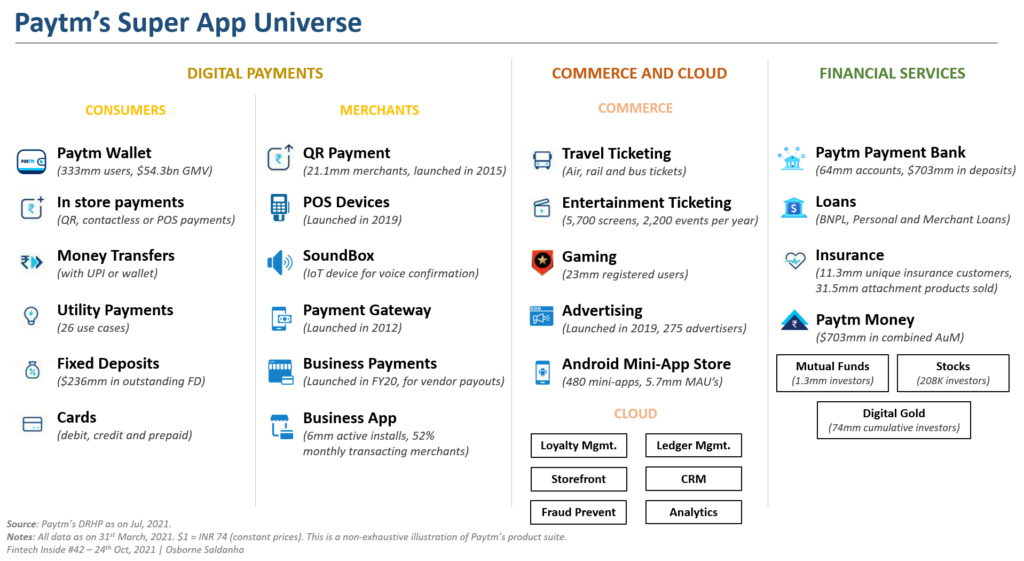
Another fast growing financial super app is GCash in the Philippines. GCash is a mobile wallet and online payment platform used by 71 million or 84% of all adult Filipinos in the country. It allows users to pay for goods and services, transfer money, pay bills, withdraw cash, invest, buy insurance, pay for transportation and more.
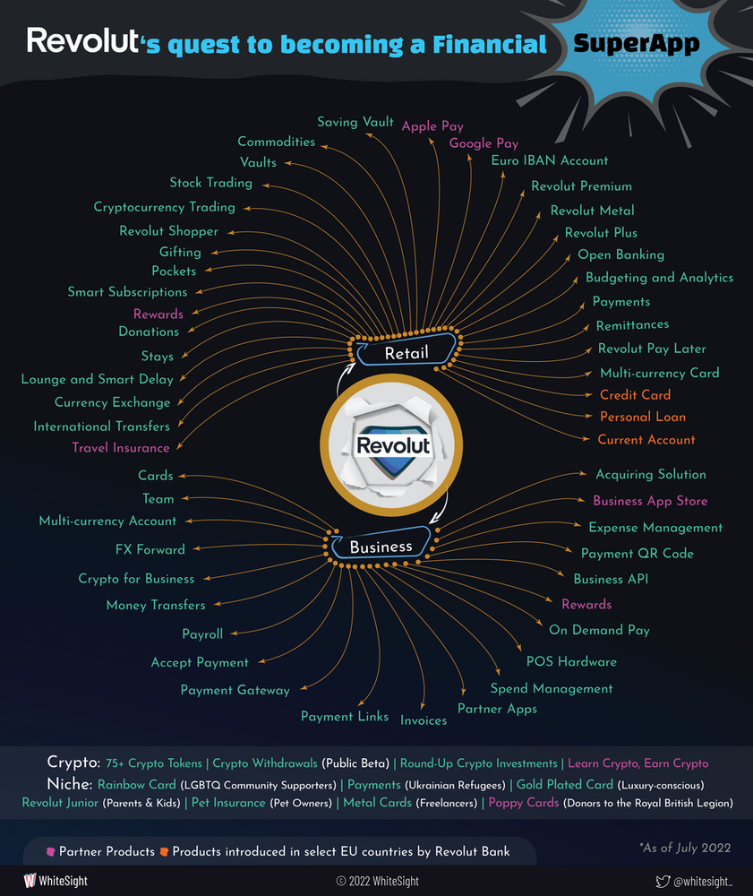
European Revolut is also actively scaling its banking ecosystem by adding new features and products, including those provided by third-party institutions. In its mission to become financial super app, Revolut follows aggressive global expansion strategy, persistently increasing a wide range of products, features, and tools for the customers, accordin to WhiteSight analysis.
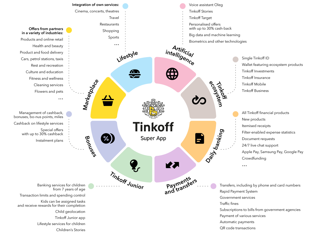
Another interesting example of super app in banking is a Tinkoff Bank strategy to launch a banking super app that, along with financial products, includes a marketplace of goods and services, a health support system with the ability to choose a doctor, and lifestyle services like travel, restaurants, and events from third-party providers. The application is personalized and uses machine learning and AI to select products specifically based on the needs of a particular user.
UXDA first introduced our vision of the Fintech super app solution in 2016 in the Neobank UX Fintech Case Study. Our team visualized how a mobile banking platform can operate and expand indefinitely through aggregating third-party products via APIs.
This banking concept has become one of the best UX case studies, reaching more than 300,000 financial professionals from 147 countries.
How to Design a Mobile Banking Super App Based on the Latest Fintech Trends
When we consider how to create a banking super app ecosystem, there's an important question to answer: how will it work technically? As this kind of financial digital product is complex, a banking super app could rely on 10 fintech trends that you are already familiar with:
- Blockchain
- Gamification
- Nudge theory
- Robo advising
- Voice processing
- Biometrics
- Social integration
- Personalization via banking AI
- Big data
- Open API and clouds
When it comes to the UX architecture of this banking super app, we have to take into account that the person's financial life involves not only the user and his money but also his/her family, friends and dozens of financial products that solve different financial needs.
For example, to manage the family budget, the user has to overlook the financial status of his/her family members. Also, the ability to review the financial behaviors of a customer's friends could provide great insights into how to better manage his/her own finances. Finally, the user would expect for the bank to provide services that would guide them, track the situation and advise on the best ways that the customer can manage his/her financial life.
Considering this, we based our financial super app UX architecture on five key elements:
- User
- Money
- Family
- Friends
- Services
When it comes to the financial UX process in designing this bank super app concept, the main stages we underwent were:
- identifying the primary user scenarios;
- analyzing and determining key app functionality;
- creating information architecture;
- exploring trending technologies to provide the most simple and clear solution for the user’s financial journey;
- creating a delightful design.
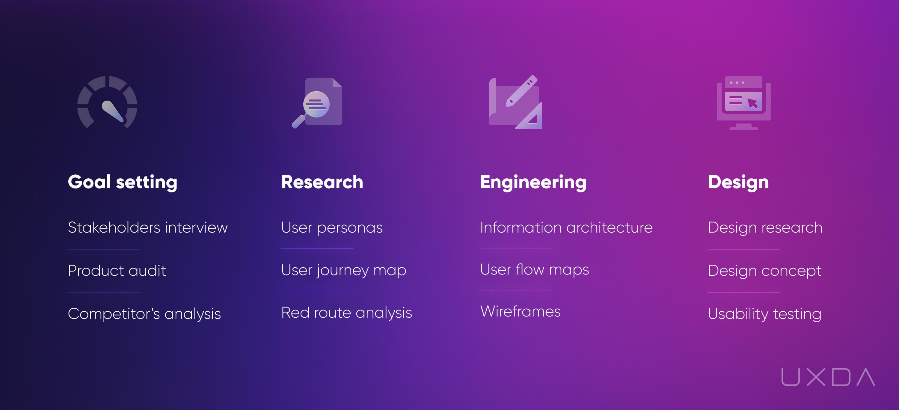
In this mobile banking case study, we will not delve into a voluminous description of our financial UX design process. If you are not yet familiar with it, UXDA's approach is thoroughly described in our other financial UX design case studies:
How We Designed the Most Awarded Banking App Concept in the World
Banking Back-Office Transformation that Led Vendor to a Global Expansion
How to Raise the Rate of a Mobile Banking App from 2,8 to 4,7 in Google Play
Creating a Banking Motion Prototype as a Proof of Concept
In lots of cases, especially for innovative banking apps, it is useful to create a banking motion prototype that helps to explore real-life user experience. The Super App banking prototype that’s based on the design concept allows to go through the main usage flows and test them.
Motion banking prototype looks and interacts like a real app, which uncovers the following possibilities:
- testing the usability of the future product and customer reaction even before coding is started;
- providing an engaging real-life touch and feel experience of the product to impress your stakeholders or investors;
- setting up final product interaction and motion features to the development team.
Banking Innovations Behind the Banking Super App Design
UXDA's financial super app functionality is based on three main banking innovations.
Personal Financial Assistant in the Shape of AI
A Fintech super app must be a champion in personalization. It should become a handy financial assistant and advisor that's able to provide truly useful insights, based on the user's unique needs and requirements.
This can be achieved using the technology of full banking automatization, artificial intelligence in banking and predictive analytics.
When it comes to personalized assistance, the core tasks of a Fintech super app should be to:
- inform the users about any situation that requires their attention;
- help to improve users’ financial health by monitoring it and providing recommendations;
- make financial forecasts and offer uniquely crafted possibilities according to the user's specific needs and goals.
In addition, AI opens up many different opportunities to take the banking customer experience to a brand new level. For example, in the near future, it should enable the users to conduct financial operations using voice processing, gestures, neuro, VR and AR.
This kind of app should also be able to predict the exact moment when a user needs a specific product, and provide it by combining big data with behavior-based predictive analytics.
Super Bank as a Platform for Integrations
Financial super apps have to integrate third-party services. The apps could use the external infrastructure of banking vendors for processing payments and other financial services.
The financial super app serves as a platform that unites financial solutions with retail services. This ensures a holistic banking customer experience that allows the user to manage everything they might need concerning their private and financial lives, all from a single app. This is the only way to deliver a full neobank service that covers every issue related to the user’s financial life and needs.
To become bank-as-a-platform, the main challenge is reinventing the financial ecosystem. This could be done by using open APIs and cloud storage. Speed and transaction security would be provided through blockchain technology used by all platform members.
Next Level Personalization
When it comes to banking, one of the biggest pains the users cite is filling out long and complex forms. They often ask for data that people don't even know where to find. This is where the Fintech super app takes personalization to a new level.
If we could get rid of these forms, at least in 90% of the cases, the users may cry tears of joy. We believe this can completely change the customer’s banking experience.
To provide customized proposals for each customer, AI could be used for a more accurate customer credit scoring based not only on the user's bank's profile and credit history, but also social profiles and offline activity.
This would allow the bank to generate a personalized proposal even before the user has requested it. So, no more struggling! All that the customers have to do is choose the proposal that best fits their needs and tap a single button.
This would provide not only an amazing experience for the users but also a key factor that so many financial services of today lack─speed.
How to Humanize a Mobile Banking Super App UX Using Mobile Banking Trends?
It's time to guide you through the recipe how we have integrated all of the previously mentioned banking innovations and mobile banking trends into this banking super app UX design concept.
1. Make Authorization Effortless
Biometrics is a must in modern financial solutions. The banks that still struggle or don't even look for ways to implement this are putting themselves at great risk. As more and more neobanks, as well as traditional players, provide this convenient and effortless option, customers have already begun to expect it from their financial services.
Users want to have access to their banking app as quickly and easily as possible. Regardless of whether it's an urgent bill payment, quick balance check or sending money to relatives in a hurry, for the ideal banking customer experience, every second counts.
Today, biometrics is a well-developed technology that provides instant access to mobile banking while maintaining an adequate level of security. It means that the traditional authentication with passwords and codes is definitely not something the users will expect to have in a modern, user-centered financial app.
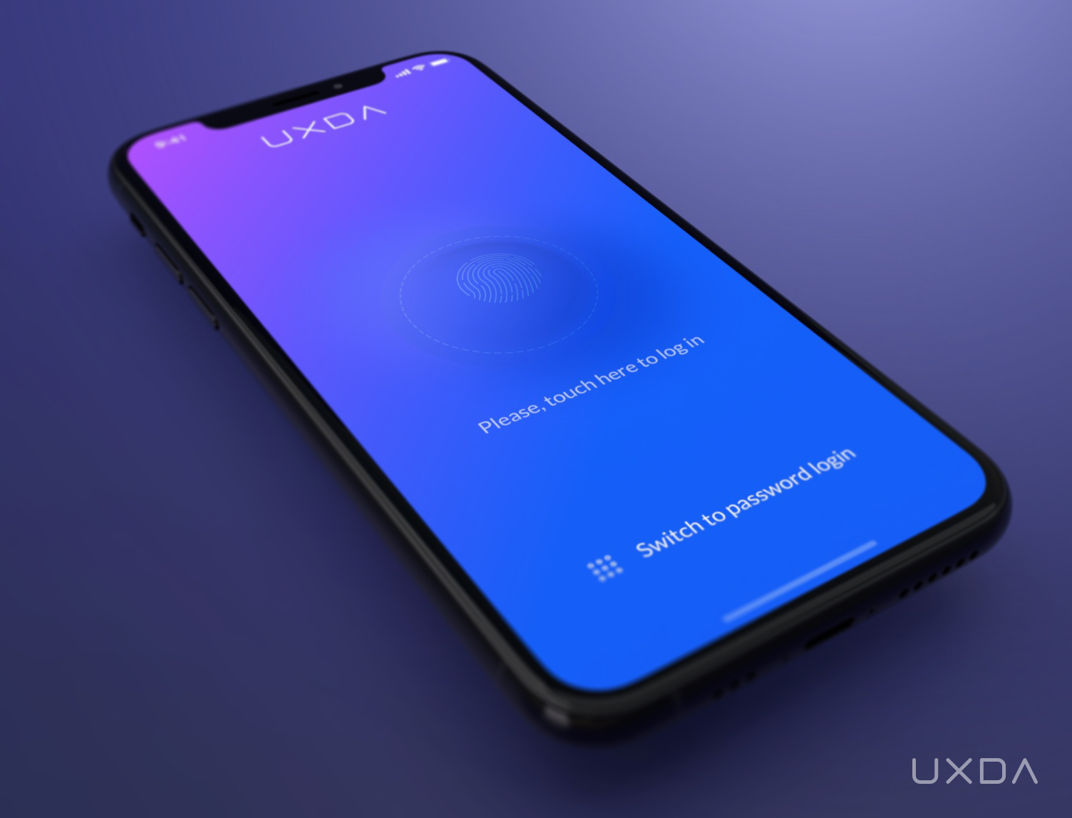
Authorization with biometrics
To maximize security, UXDA's banking super app uses multi-factor security solutions. For an effortless login, we provide a quick entry through biometrics (TouchID or FaceID/ VoiceID), but, for high-sensitivity functions (security settings, changing limits, etc.) and for transfers of large sums, additional authorization will be required.
2. Ensure Key Data at User's Fingertips
A financial status overview is the first thing users should see after opening the application.
Here, a pain point the users often state is that they just simply want to see how much money they currently have without the credit limit or reserved amount.
The main banking dashboard of UXDA's fintech app design concept is easy to understand. It displays not only the user’s overall balance but also demonstrates the movement of a person's finances and recent financial notifications. Our goal was to spotlight key data and preserve a minimal visual density to ensure transparency and ease of use.
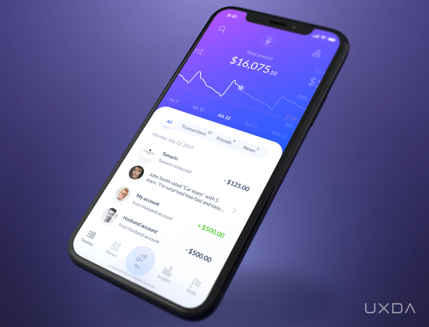
The main dashboard
Here it's also important to think about a scenario in which the user has multiple accounts or/and manages the family budget. The customer would want to see the status of each account and the overall balance of his/her family. UXDA's neobank UX design offers a convenient and intuitive way to quickly switch between the accounts via a simple swipe, while the balance chart makes it easy to evaluate money movement in each account.
3. Show All the Financial Insights at a Glance
To have a proper understanding of their financial situation, the users need to know their planned balance, excluding money needed to pay routine bills.
Another very convenient feature of UXDA's neobank concept is the ability to explore income and expenses for the last month and compare those to the average levels in the same period for a particular account.
To provide an instant view of how much money is actually available, this banking super app concept offers a forecast of the account balance to the time of the next scheduled financial income amount.
All of this is easy to discover by simply clicking on the balance summary. In this way, the users can quickly evaluate their financial situation and can plan their expenses accordingly.
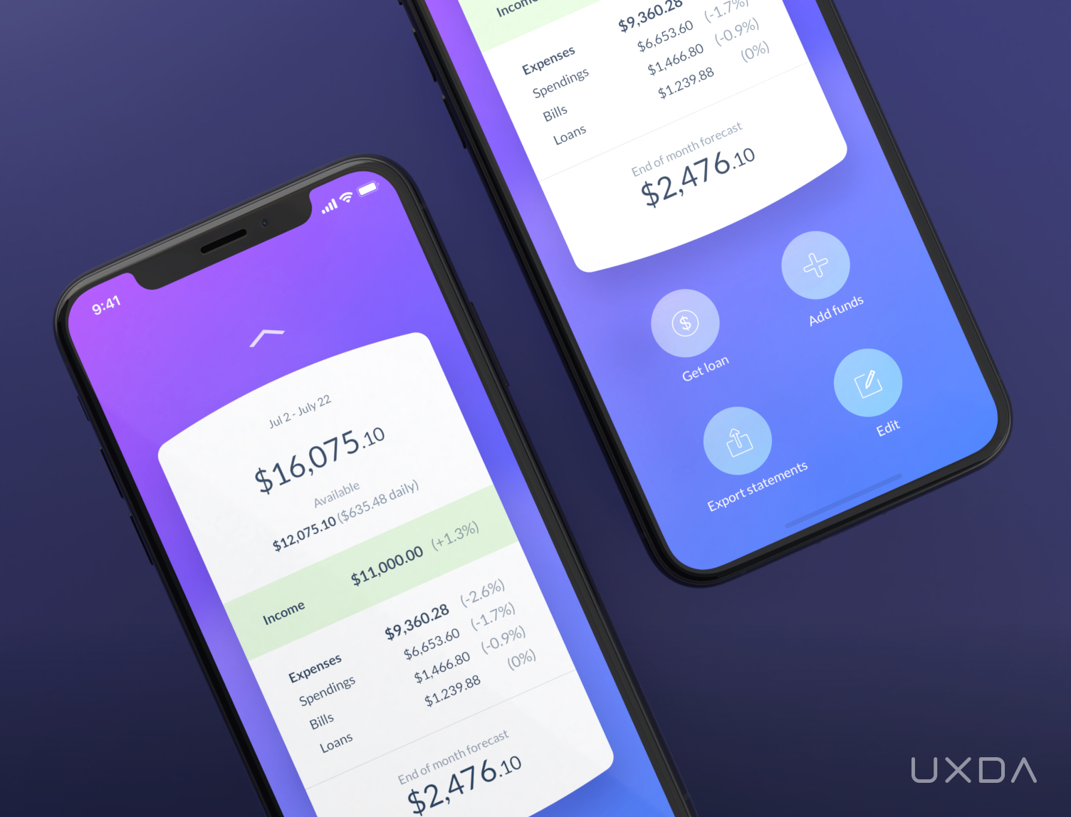
Income and expenses overview
To reach the account menu, the user only needs to pull up the account data card. The card locks, and the menu appears below. Customers have the opportunity to get financial support through an overdraft or pre-approved fast loan with just a single click.
Everything that the user needs is just a few simple clicks away in the UXDA's neobank app UX concept.
It's convenient and quick to add funds to the account and to download an e-statement. Customers can also effortlessly edit the account name, configuration and its primary status.
4. Deliver Spending Insights That Provide Value
The balance chart in UXDA's Fintech app design provides a lot of valuable information by simply taking a quick glance at it.
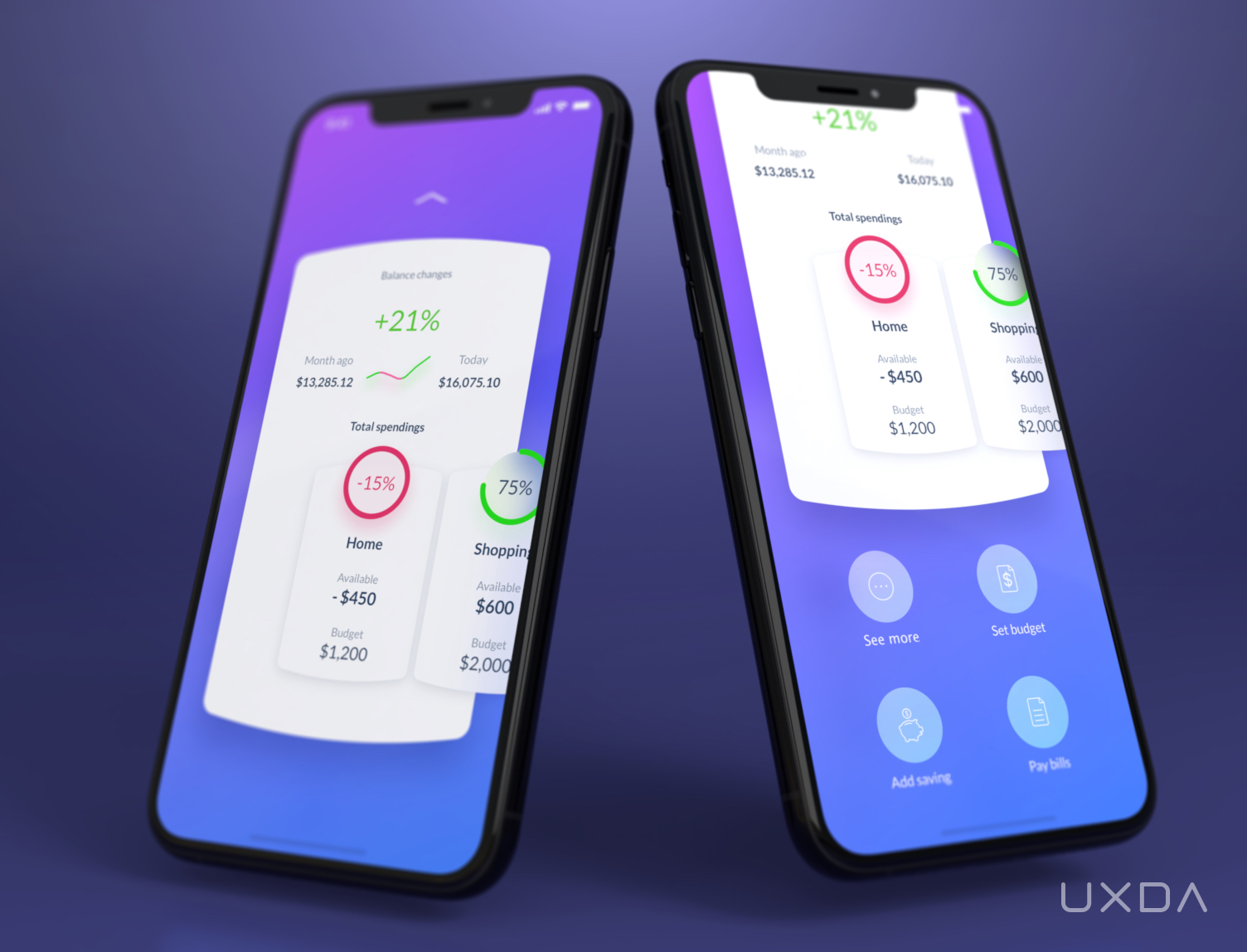
Spending insights
This Fintech app design concept not only displays the overall dynamics of the user balance but also provides a forecast for the near future. This is a convenient way for the customers to always stay on top of their finances by having the ability to easily explore paid, unpaid and scheduled bills, as well as their budget level.
The user can gain instant insight into the categories that he/she has spent the most on by clicking on the chart.
UXDA's neobank UX concept goes even further by providing recommendations on potential savings generated by the app's AI.
By pulling up the card, the user can discover more spending insights, set a budget and goals and pay the bills, resulting in a delightful experience from the digital bank interface.
5. Design the Best Banking UX for Any Type of an Account
Customers often have several kinds of accounts, like deposit accounts, credit accounts, investment accounts and many others. The mission of the banking super app is to provide a delightful banking user experience for any type of account, so that the activity in all accounts would be easy to review, monitor and manage.
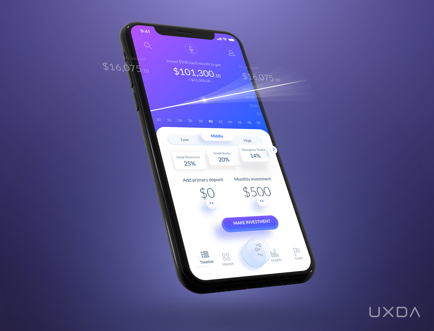
Account overview
All types of financial accounts from different banks or even crypto wallets can be connected to UXDA's banking super app so users can get overall insights about their actual financial wealth in a single bank interface.
On the basis of big data analysis, banking AI can determine a given client’s preferred investment strategies and make recommendations, adding some new accounts that may be beneficial to the user’s specific goals.
6. Make Financial Activity Feed Inspired by Social Networks
We live in a fast-paced digital world ruled by social media and technology. Why should banking lag behind if there are already such great examples of customer engagement in the social media environment?
Therefore, we rethought the transaction history of a typical bank interface and transformed it into an activity feed inspired by social networks.
Viewing a transaction history is the second most important user scenario after checking the balance. We believe users should get more value out of it than just simply viewing the recent account transactions that often lack any information or insights.
So, we created a timeline that allows the user to conveniently review all information on transactions, suggestions from friends, system recommendations and notifications in a clear and simple way that is reminiscent of Facebook and Instagram feeds. Such a UI is familiar to the users and integrates banking into their social space.
The social aspect doesn't cover only the looks of the UI. UXDA's banking super app activity feed displays users’ friends' opinions about various financial services and products, as well as other social-based recommendations.
It also includes advice and service tips that improve the user’s financial status. Contextual recommendations are created by banking AI using predictive analytics based on big data, according to the nudge theory.
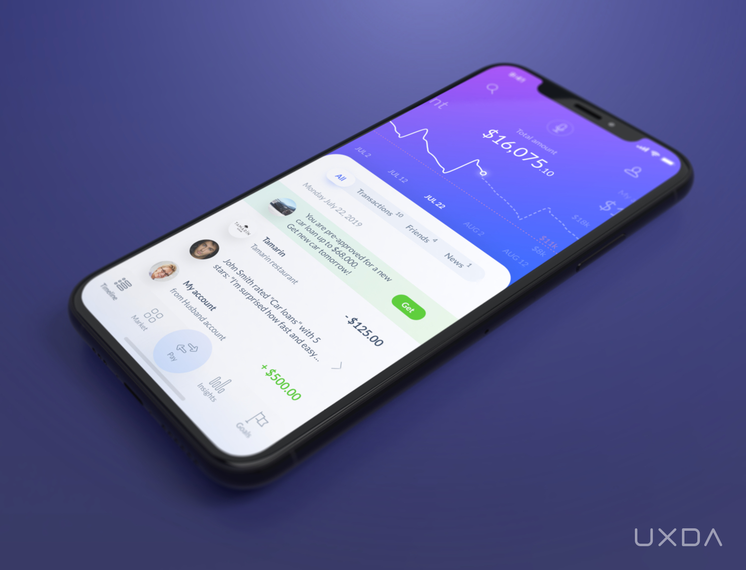
All of a user's financial information in a timeline inspired by social networks
These recommendations may include anything that would help to enhance the user's financial life, for example:
- tips on how to reduce spending in the categories in which users spend the most;
- notifications about urgent financial activities that require immediate attention;
- recommendations about savings and investments according to the user's goals;
- reminders to pay bills and make other regular payments;
- useful contextual messages, such as suggestions for nearby ATMs when traveling;
- mindful budget alerts when visiting shops, etc.
To create a truly intuitive banking user experience, we placed the transactions list under the accounts screen and linked it with the balance chart. Therefore, when moving the chart, users can see all transactions for a particular period.
7. Ensure All Transaction Details are Available
Detailed information about each transaction is available by simply clicking on it. The banking super app dashboard conveniently displays details about the transaction, including the beneficiary, amount, category and even a location on the map where the transaction was made.
The banking super app design makes it simple to split bills, request and send money and send a friendly reminder to friends and other beneficiaries who have forgotten to pay.
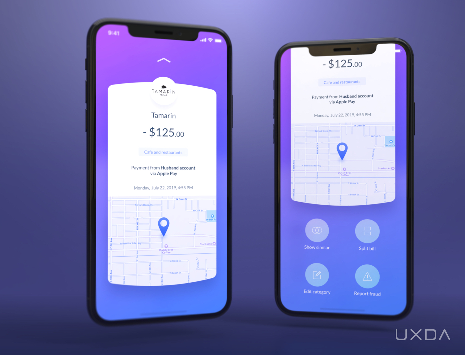
Detailed information about each transaction
Customers can also easily sort out all related transactions, edit transaction categories and report suspicious activity instantly.
8. Provide Payments Quicker Than the Messenger
Money transfers and bill payments are one of the TOP priority scenarios of the digital banking customer experience. Unfortunately, these also cause the greatest struggle to the users as they often require quite a lot of time and effort.
Many traditional players have already started acting on it, adopting the Fintech experience of instant payments and payment requests. But as we all know, the traditional long payment forms with several input fields that cause headaches to the users are still common practice.
What if we had to wait days to send a Whatsapp message to our friends? It would seem like we’ve gone back in time when there was no digital technology, and everyone sent letters. So, why do we have to suffer from this kind of experience while sending money?
Many challenger banks have already found ways to tackle it. Users are now able to send money in seconds within the app, without commissions, regardless of the bank account you and your friends have. However, many banks still struggle to implement this.
Money transfers and bill payments should be no more difficult than sending a message on Whatsapp or Facebook Messenger.
In UXDA's Fintech app design, these options are conveniently available from the main menu. Smart contact synchronization from a core banking database, social networks and phone book should compile all of the contacts into a single list. Further, future banks should find and combine identical contacts to ensure the ultimate banking user experience.
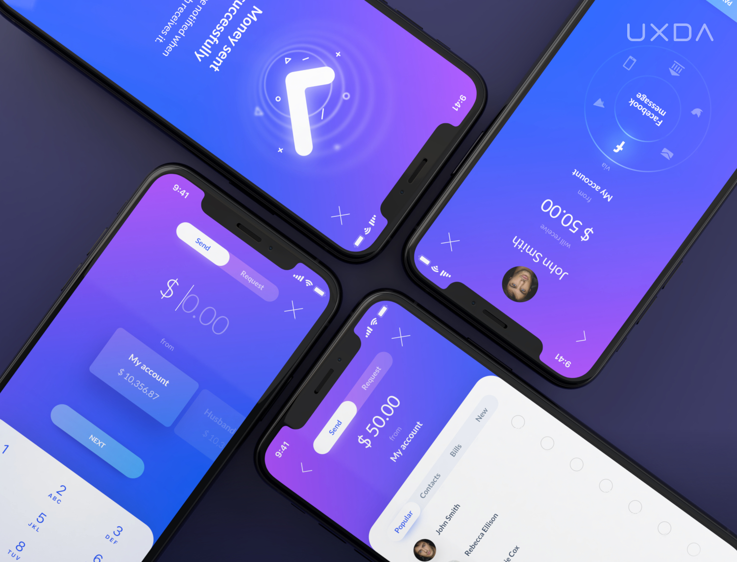
Instant payments made in a few seconds
In this way, the customer would be able to use any attribute for the search recipient in the contact list (e.g., name, e-mail, phone number, account number, debit card, social ID), then select the money amount and transfer channel and simply click the “send” button, easily transferring the money in just a few seconds.
After receiving the money, the recipient's card and account number would be automatically added to the contact list. If the recipient starts using the banking super app, the user will be able to see this person's activity in the feed according to their privacy settings.
In UXDA's banking super app interface, we have taken into account and designed a full range of financial transfers, including:
- P2P payments;
- bill payments;
- automatic payments;
- international transfers with currency exchange and payment requests.
All of these transfers are just a few clicks away and take a minimum amount of time and effort.
Maximum safety, transparency, convenience and speed of payments would be ensured by the use of the blockchain network by all banking platform vendors and the adoption of PSD2 analogues by financial institutions from around the world, resulting in a wonderful experience for the users.
9. Let Bills Take Care of Themselves
Why should users waste their precious time by regularly going to the payments section to pay routine bills? We propose to use financial AI settings to automatically prepare or even pay bills. UXDA's vision of the banking super app offers customers the opportunity to place regular bill payments into the user's activity feed and send push notifications so the user can pay those with a single tap, as easy as that!
So, how does that work? The regular payments are displayed on the financial chart, and their payment status is marked with a color.
With this UX feature, it would be very difficult to forget to pay a bill, which eases the everyday lives of the users.
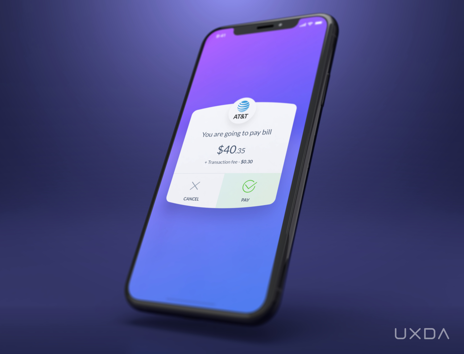
Paying a bill that reminds of itself
When it comes to payments, many users state that they hate the hidden fees almost all banks have. This creates an unpleasant surprise leading to a very disappointing user experience. We believe that, in the near future, banks would not add hidden fees. But, for now, it is a must that they at least inform the customers and clearly display the fees of the service directly on the payment card UI.
10. Create a Mobile Banking App You Can Talk to
Two of the key expectations of the customers in the digital age are for everything to happen as quickly and effortlessly as possible. UXDA's banking super app vision offers the ability to instantly perform any task or get help from the app's support through digital banking AI voice assistant service.
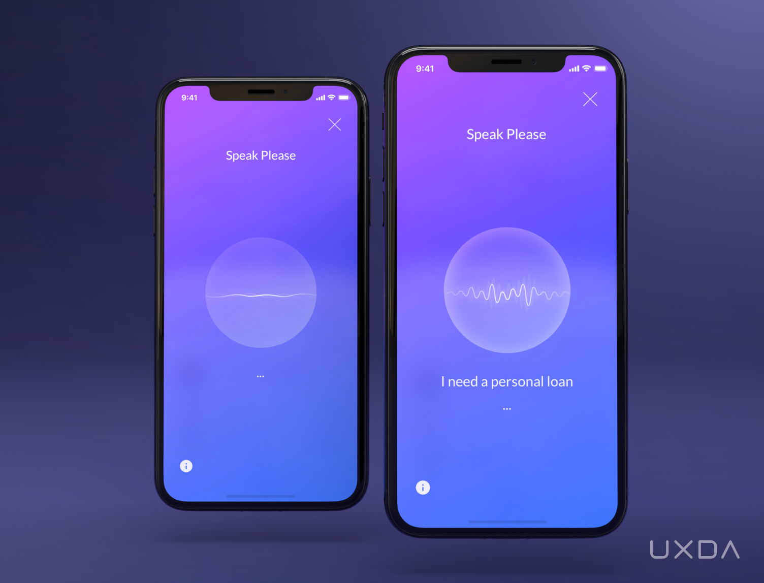
Digital banking AI voice assistant
The user can easily submit any request, from "Send $50 to my brother" to "Find the nearest ATM" and get it done in a matter of seconds. In this way, we reinvent the banking user experience into a financial assistant that saves the user time and effort.
To make conversational banking available right from our home, the Internet of Things (IoT) would integrate UXDA's banking super app AI advisor with smart home assistants like Amazon Echo or Google Home. All it takes is just an authorization with voice ID biometrics… and, voila. the customer can check his/her balance, upcoming payments and even make transfers without pressing a single button… and all of this from the comforts of their couch.
Let's model an example of how the workflow of a voice assistant in the conversational banking super app would work. Suppose the customer wants to take out a personal loan. He/she taps the mic icon and voices the request. Banking AI would identify the request and offer a choice of available options that have already been prepared and approved according to the customer's credit score. All that the user has left to do is just to tap “Confirm,” and the money would appear on his/her balance in just a few seconds.
Proactivity instead of reactivity... this is one of the key principles that the future banks should integrate into their customer experience.
Instead of waiting for a user's request, the financial AI assistant would automatically prepare and approve proposals for the maximum number of services using big data-based predictive analytics. This would take the financial customer experience to a brand new level by providing an instant service, instead of long waiting times and complexity.
11. Design an Unlimited Financial Marketplace
Banks offer their customers a myriad of different financial services, but, despite that, the users aren't able to achieve the maximum value that these products can provide. This is due to the difficulty of identifying what benefits the product would bring, whether the user needs it after all and how to apply.
The ideal banking super app UX should be focused on providing the ultimate value for each customer. This means not only offering simple to use and easily understandable services but also significantly increasing the number of available products, even hundreds of times if needed.
Here, it's important to note that too many options might cause decision paralysis and confusion in customers. But this is not the case where the banking user experience is fully personalized and is able to come up with solutions that fit each customer's specific needs in specific circumstances, right when the customers need it.
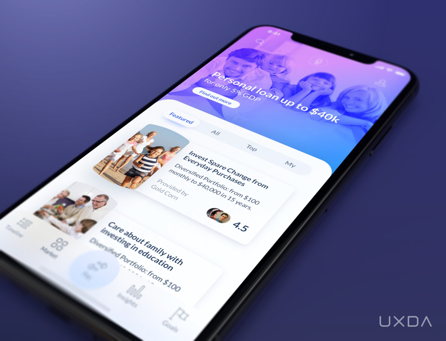
Financial marketplace with dozens of services
The Card-UI marketplace is the best way from the UX perspective to interact with a large number of services. This is the most familiar and convenient interface format for mobile users. This UX frame provides an easy categorization of the banking services, a personal recommendation component and subscription management.
12. Ensure a Personal Finance Management That Fits the User Needs
Many people struggle with monitoring their finances. This is where the financial app should come in handy with help in not only providing an insightful overview but also giving recommendations.
This is exactly what UXDA's bank super app concept delivers. It displays money movement in a clear and intuitive way, allowing the customers to have greater control over their finances. In this way, the users have an instant understanding of the nature of their spendings and get clear recommendations on how their financial situation could be improved.
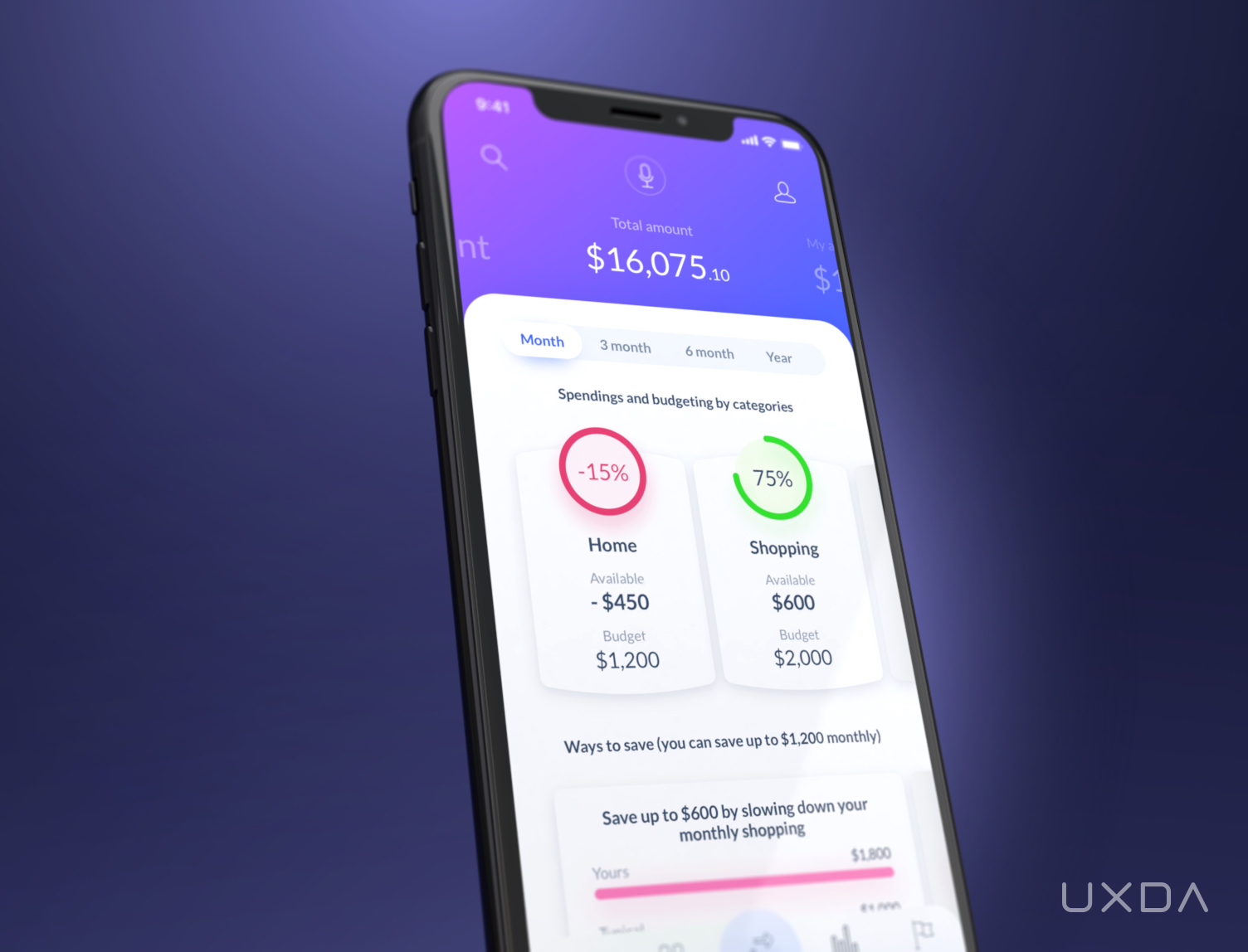
Financial situation displayed in a clear and intuitive way
UXDA's banking super app personal finance management allows sorting all transactions by category for which the users can set a budget. The customer can also review how expenditures are moving in any of the categories on the timeline.
There's also an ability for the customer to compare his spending levels with friends or the average bank customer. This allows the users to evaluate and optimize their financial patterns.
13. Stimulate Motivation to Reach Financial Goals
For the financial app to become a part of the customer's lifestyle, it has to serve as a companion in achieving bigger financial goals─motivating and helping the customer through the process.
Everyone passes certain financial milestones throughout their lives, it could be paying for university or college, buying a car or an apartment, saving for a vacation, investing or creating retirement savings, etc.
To guide and support the customers through the journey toward reaching a certain financial milestone, UXDA's banking super app UX design offers templates and relevant objectives, as well as a feature to set up automatic transfers into saving or investment accounts to more quickly reach the user’s goals.
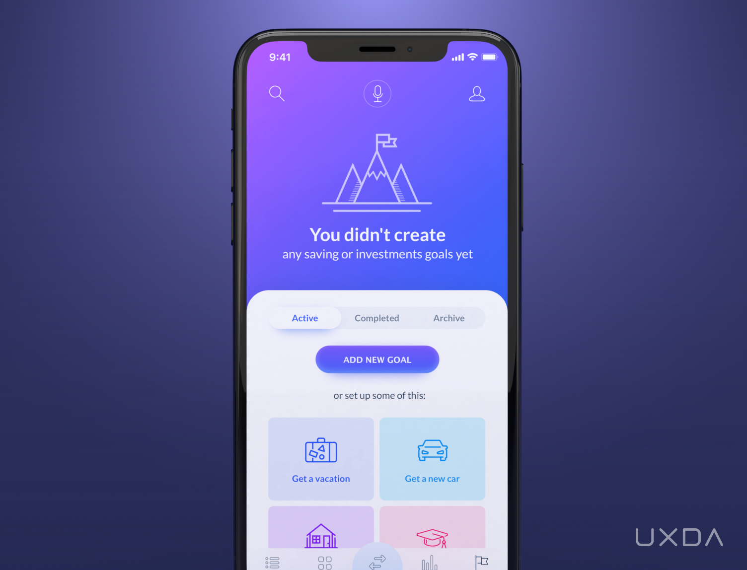
A financial app that motivates to reach users financial goals
14. Make Finances More Exciting
Technology makes our lives more interesting, interactive and simple. Why would financial services UX lag behind and offer a dreadful experience?
UXDA's banking super app brings fun and positive emotions to the financial experience by using gamification.
Gamification is the craft of deriving fun and engaging elements found typically in games and thoughtfully applying them to real-world or productive activities. This process is what I call “Human-Focused Design,” in opposition to what we normally find in society as “Function-Focused Design.” Human-Focused Design optimizes for human motivation in a system as opposed to optimizing for pure functional efficiency within the system.
Yu-Kai Chou, Actionable Gamification
This is exactly what UXDA followed by integrating the gaming elements. In the settings panel, the user has rewards points. These are given out for trying new services, sharing the user's financial experience, participating in the banking community and achieving personal savings and investment goals. Such a banking gamification platform could also be used for cross-promotions from different partners.
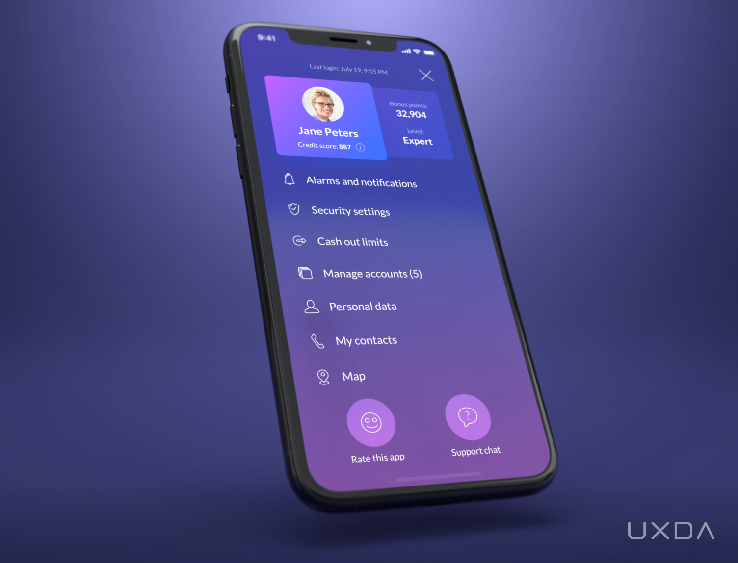
User's profile with the bonus points and credibility level
The financial status of the customer is also monitored and evaluated, displaying the banking experience and credibility level. For users, it will ensure service discounts or exclusive offers with limited access. Points can be redeemed for gifts or free goods and services.
Users’ achievements can also be shared with their social connections to gain respect for the financial expertise.
All of this information is displayed under the user profile where he/she can easily manage their settings or check their credit score and find out what could be done to enhance it. From this screen, it's also easy to access the support chat. Furthermore, it also allows the users to contact the bank via text or make a video call.
15. Compile Personalized Offers That Care About the Users
One of the most powerful features that digital banking AI can provide is personalized promotions. This can be ensured by using predictive analytics. It should combine analysis of the user's financial activity, their social environment and big data analysis on typical behavioral patterns, geolocation data and contextual analysis.
For example, location-based push notifications about the location of local ATMs may come when the user crosses the border.
Purchasing a flight ticket could be a good chance to offer an insurance policy for travel.
Child expenditures or maternity grants detected by the banking AI could become an ideal reason to offer a loan on increasing the living space.
Car warranty period expirations detected by leasing or insurance data is the perfect time to offer a new car purchase. Moreover, each promotional offer must provide everything needed for instant one-button receipt of goods or services.
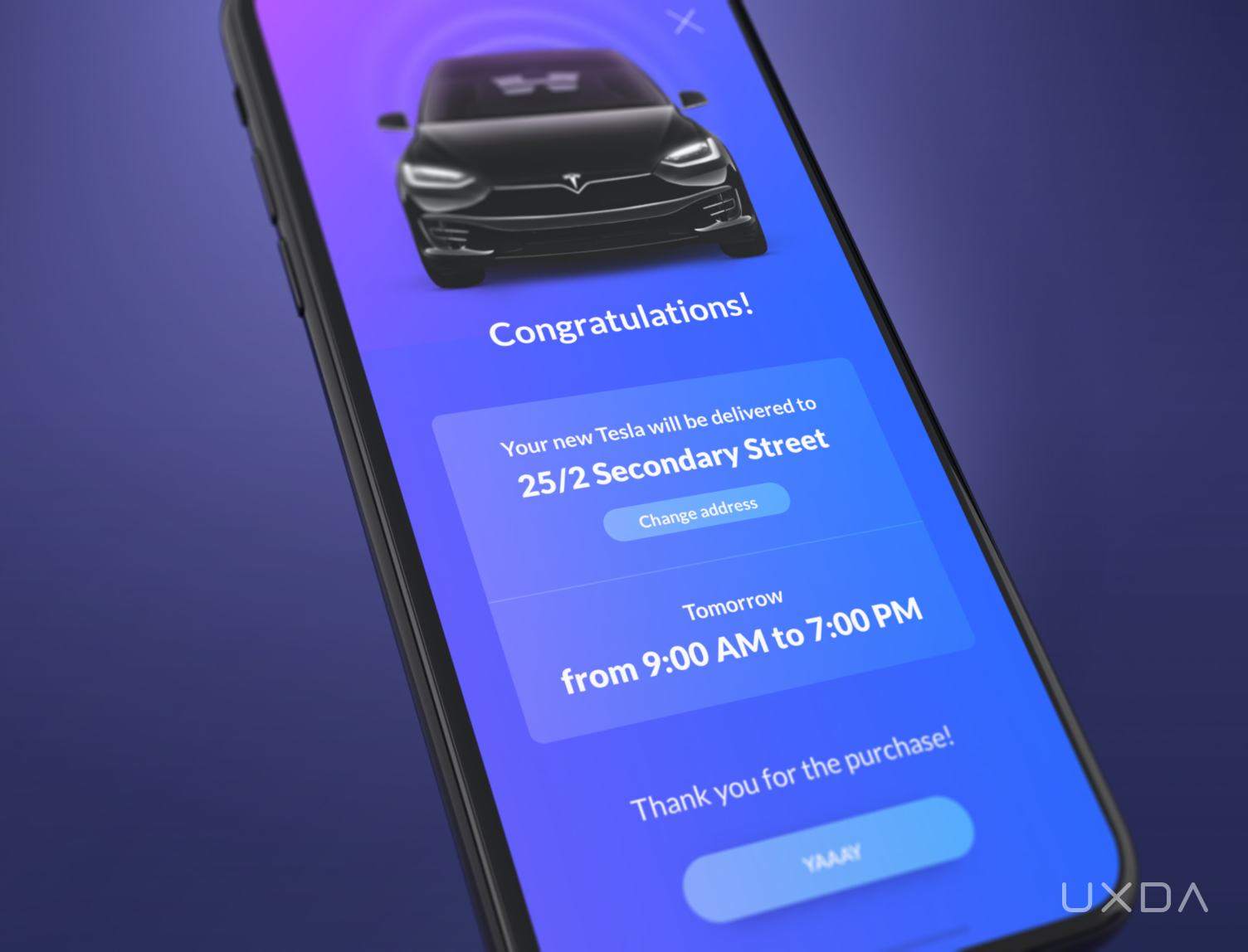
Personalized promotions and services even before the user has thought of it
For example, a customer gets a push notification about a pre-approved loan offer for a brand new car. The user checks it out and concludes that this is actually an offer that he/she would like to consider. Now, they’re asked to log in to the banking super app and will be presented with a list of cars. All cars are divided into two categories: available right now or only on request. If the user is eager to get the new car instantly, he/she can choose the one with the best fit from the available options and receive it by the next day just by clicking the “Buy” button and confirming the agreement.
The customer's new car, with all the documents, will be delivered to his/her home in just one day, all without the tiring, time-consuming visits to several car dealerships or, bank branches. In this way, the user can purchase a car faster than in the online store. Welcome to the future of banking!
HOW CAN CX / UX DESIGN HELP WITH YOUR PRODUCT
The Future is Near (Here)
Four years ago, we disrupted the industry in a positive way by presenting our neobank UX concept. Today, we look back and see that a significant part of the predictions we made were realized in several Fintechs and progressive challenger bank applications like Revolut, Monzo, Moven, Klarna, N26, Monese, Starling Bank and many more. This banking super app UX case study is aiming to create a new wave of motivation for the new banks, as well as the traditional players, to strive for even better financial experiences for their users.
Get UXDA Research-Based White Paper "How to Win the Hearts of Digital Customers":
 If you want to create next-gen financial products to receive an exceptional competitive advantage in the digital age, contact us! With the power of financial UX design, we can help you turn your business into a beloved financial brand with a strong emotional connection with your clients, resulting in success, demand, and long-term customer loyalty.
- E-mail us at info@theuxda.com
- Chat with us in Whatsapp
- Send a direct message to UXDA's CEO Alex Kreger on Linkedin


