Is it possible to unite dozens of traditional banking features through fintech app design? The answer is “yes” if you combine mobile banking trends with cutting-edge banking innovations and delightful banking experience. These are the secret ingredients in UXDA's recipe for fintech app design of future Neobank.
It all started at a banking innovation conference, one of the international bank executives came up to me and asked a question about how to create a banking app:
What you tell me about UX design possibilities in the digital banking sector is incredibly inspiring, but how to create a financial app if my bank offers more than 100 different products? Maybe it could be possible in the future somehow, but we can’t travel there to get insight.
And who of us has not dreamed of a time machine that allows a glimpse into the future? However, if I was bank employee, I'm not sure that I would do it. In the near future, millions of bank employees will face losing jobs and millions of lost revenues. And we already see it happening; thousands of bank branches are closed, and alternative financial services receive billions in funding to entice banking customers.
Fintech App Design in Search of the Best Neobank Vision
We have spent the last few months combining our knowledge and experience from engineering dozens of financial services in UXDA with recent trends in the financial industry to create Fintech case study of the mobile only neobank UX design.
UXDA team of financial UX experts and UI designers created this Fintech app design to demonstrate how user-centric banking customer experience might look.
Mobile Banking Trends to Use in Fintech App Design
So, if we are talking about digital banking disruption in the near future, how will it work? I believe, Neobanks, as an advanced banking customer experience providers, will be based on 10 emerging mobile banking trends that you may already know:
- Blockchain - Neobanks are integrating blockchain to enhance security and facilitate faster, transparent transactions. Fintech app design can utilize blockchain by incorporating wallet features that support cryptocurrencies and smart contracts, providing users with a secure and innovative banking experience.
- Gamification - By incorporating game-like elements into their services, neobanks aim to make banking more engaging and rewarding. Fintech apps can leverage gamification by introducing reward-based challenges and achievements to encourage savings, investments, and healthy financial habits.
- Nudge Theory - Neobanks use nudge theory to guide customer behavior towards more financially sound decisions through subtle prompts. In app design, this can be utilized by sending personalized notifications and insights that encourage users to make better financial choices, such as saving more or reducing spending.
- Robo Advising - Automated investment advice provided by algorithms, or robo-advisors, is becoming a staple in neobanking. Fintech apps can integrate robo-advising features to offer personalized investment advice, helping users to manage their portfolios efficiently based on their risk appetite and financial goals.
- Voice Processing - Voice-activated banking through AI-driven voice assistants is enhancing customer interactions. Fintech app design can incorporate voice processing for hands-free operations, allowing users to make transactions, check balances, and receive financial insights through voice commands.
- Biometrics - Neobanks are leveraging biometric technology for enhanced security and user authentication, utilizing fingerprints, facial recognition, and voiceprints. Fintech apps can employ biometrics not only for secure login but also for authorizing transactions, combining convenience with high security.
- Social Integration - This trend involves integrating social media features into banking services for sharing financial goals or savings challenges with friends. Fintech apps can utilize social integration by enabling users to connect their financial goals with social networks for motivation and support from peers.
- Personalization - Neobanks are offering highly personalized banking experiences based on individual user data. Fintech app design can capitalize on this by using AI to analyze user behavior and preferences, offering customized product recommendations and financial advice.
- Big Data - Utilizing big data analytics, neobanks can gain insights into customer behavior, improving services and offering tailored financial products. Fintech apps can utilize big data to enhance user experience by providing personalized financial insights and improving customer service through predictive analytics.
- Open API and Clouds - The use of open APIs allows neobanks to easily integrate with other financial services and technologies, while cloud computing offers scalability and flexibility. Fintech apps can leverage open APIs and cloud infrastructure to quickly introduce new features, enhance functionality, and ensure seamless integration with third-party services, making banking more interconnected and efficient.
When we asked people what banking service is about, their most popular answer was: “Me and my money.” That’s right, but, in real life, it’s a bit more broad. Financial life involves not only you and your money, but also your family, friends and dozens of financial products.
Users need to know the overall financial status of their families to effectively manage finance, right? It would also be helpful to know friends’ financial behaviours to get some useful insights as examples. And, finally, users want smart banking app to serve well, to answer questions, suggest best solutions, track financial situation and advise how to manage money. All of this could be really helpful in everyday financial life.
Considering this, we based our fintech app design architecture on five key topics:
- User
- Money
- Family
- Friends
- Services
In this fintech app design case study, we will not delve into a huge description of UXDA's financial UX engineering process, because our approach is described in one of our case studies. The most important things we need to do at engineering stage of UX process are identifying primary user scenarios, analyzing and determining key functionality, creating information architecture and exploring trending technologies to provide the most clear and simple fintech app design for the user’s financial journey.
Innovations in the Fintech App Design
During the UXDA engineering process, we have identified three key innovations which can be used by a modern bank to design best Fintech app. To transform these technological innovations into a truly engaging customer experience, we apply UXDA’s Dopamine Banking approach. It ensures that each user interaction is emotionally rewarding and intuitively contextual. By leveraging principles of behavioral psychology and human-centered design, we craft every touchpoint — whether it’s the AI-driven personal assistant, seamless third-party integrations, or proactive service recommendations — to spark curiosity, reduce friction, and deliver instant emotional satisfaction. This emotional context amplifies trust and connection, turning complex financial tasks into effortless, even enjoyable experiences. The Dopamine Banking method elevates the value of personalization and proactivity by aligning them with the user’s emotional triggers, ensuring they feel understood, empowered, and continuously motivated to engage.
Artificial Intelligence (AI) as a Personal Financial Assistant
The Neobank of the future must become a personalized financial assistant and advisor. The technology of full banking automatization, banking artificial intelligence (AI) and predictive analytics will lead the financial industry to a new level in the near future. It will go outside of a traditional bank interface.
Smart banking app must properly inform about any situation that requires user attention, help to improve the financial health and make financial forecasts to offer a range of required actions. Voice processing artificial intelligence will be offered as an instant service in the majority of neo banking customer experience scenarios. Combining big data with behaviour-based predictive analytics in neo banking user experience (UX) will ensure the precise moment when the user is ready to accept the proposal.
Future Bank-As-A-Platform
Future banking should be open for integration with third-party services; in fact, they will use the external infrastructure of banking vendors for processing payments and other financial services. Such an online banking platform can even combine financial and complementary services. In this case, the role of the Neobank design is to cover our financial activity in full by uniting cool FinTech and retail services into a holistic banking user experience.
Only in this way we can provide a complete bank interface UX solution for any issue related to the user’s financial life. To integrate those services, challenger bank platform should use open API and cloud storage. Speed and transaction security can be provided through blockchain technology used by all platform members.
Foreseeing Service
The game is ahead of the curve. In our opinion, it is a key principle for user-centric services from future banks that could bring personalization to the next level. We all hate filling in those long forms, which are required even if we just want to explore the banking service terms. Imagine if we can get rid of them in 90% of cases. We believe this should completely change banking user experience in the near future.
Secure exchange of user data via blockchain, automated scoring using big data and social networks, as well as the predictive analytics by AI in banking, will allow to generate a personalized proposal even before the user requests it. So, users only have to choose the proper proposal that fits his/her needs and tap the button. This will provide not only a fantastic engagement into financial services, but also a key factor that they lack today—speed.
Main Steps to Fintech App Design According to the Best Practices
So, let's proceed to our Fintech case study that reveals receipt of our fintech app design based on latest mobile banking trends.
1. Ensure Instant and Imperceptible Authorization
Users would like to have access to functionality as quickly as possible; for ideal banking experience every second counts. It could be needed for urgent bill payments, rapid balance checks or sending money to relatives in need. And, today, biometrics is well developed to provide instant access to the financial dashboard with an acceptable level of security. It means that traditional authentication via passwords becomes a throwback.
To maximize security, we recommend the use of multi-factor security solutions. At the start, we provide a quick entry through biometrics (TouchID or FaceID/VoiceID), but, for high-sensitivity functions (security settings, changing limits, etc.) and for the transfer of large sums, additional authorization could be required.
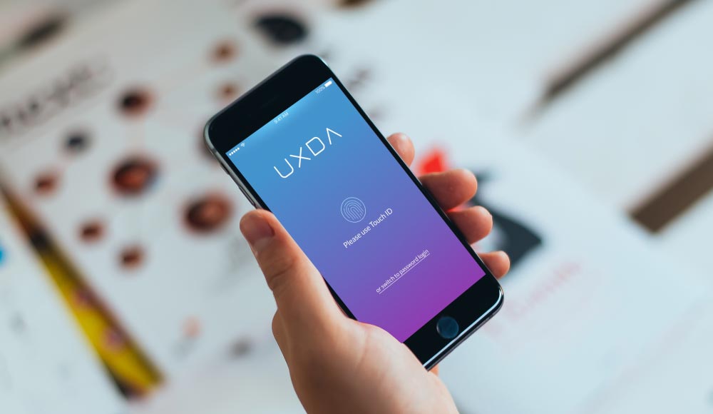
Authorization With Biometrics
2. Provide Helpful Introduction to the Key Data
Understanding actual financial status is the highest priority of any banking user experience scenario, and that is exactly what our challenger bank interface will provide after running the application. The main dashboard is easy to understand. It includes not only your overall balance, but also shows movement of your finances and recent financial notifications. We tried to spotlight key data and preserve minimal visual density of banking design.
But, what if the user has multiple accounts and manages the family budget? The task then becomes more complicated. The user wants to see the status of each account and the overall balance of his/her family. In our banking user interface (UI), we do offer a convenient and intuitive switching between accounts via swipe. At the same time, the balance chart will make it easy to evaluate money movement in each account.
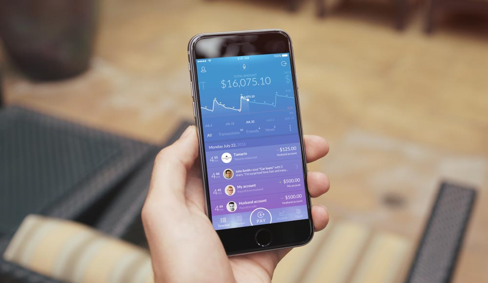
All Key Data in Main dashboard
3. Show All User Money at a Glance
For a proper evaluation of their financial situation, users need to know their available balance, which includes the rest of the budget, excluding money needed to pay routine bills. It would also be a good idea to explore income and expenses for the last month and compare them to the average levels in the same period for a particular account.
Our Fintech app design also shows a forecast for the final account balance to the time of the next scheduled financial income amount. And all this should be easy to discover by simply clicking on the balance summary.
Therefore, our users will get the general picture of their finances, and where they’re moving, at any particular moment, and they will also be able to relate their planned spending to their capabilities using our bank interface.
To reach the account menu, you only need to pull up the account data card. The card locks, and the menu below will appear. Users should have an opportunity, with just one click, to get financial support through an overdraft or pre-approved fast loan. It is also important to provide a method to add funds to the account or download an e-statement. And, of course, good banking user experience will ensure access to edit the account name, configuration and primary status.
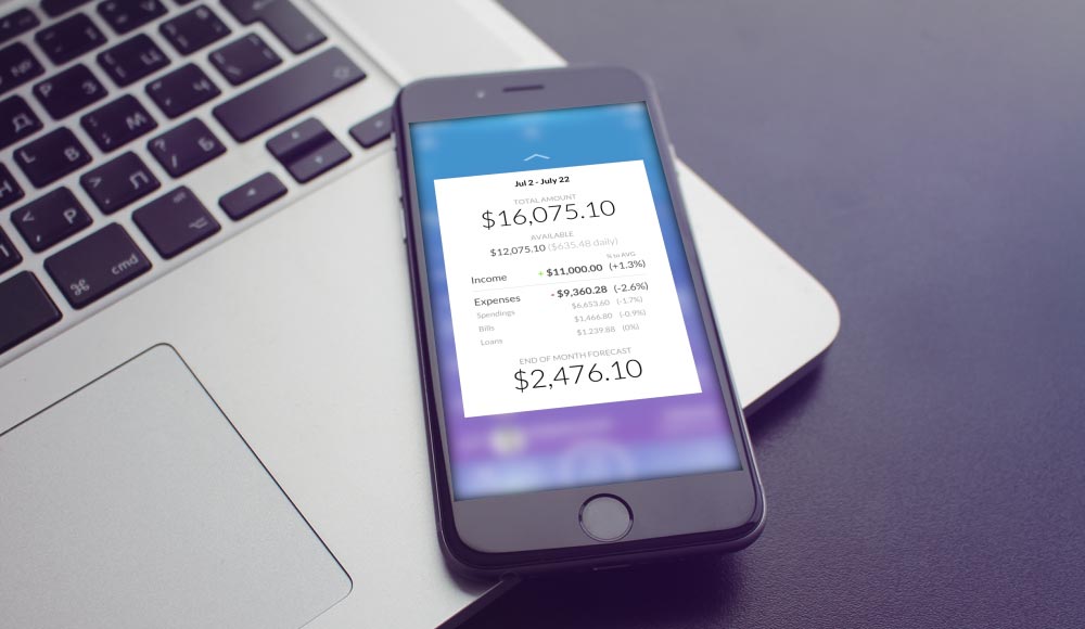
Account Balance (Income and Expenses Overview)
4. Deliver Quick Spending Insights
The balance chart, despite its apparent UI simplicity, can provide a lot of valuable information across banking customer journey. In addition to the overall dynamics of the user balance, the chart shows a forecast for the near future. This part of mobile banking UI can also allow bank customer to explore paid, unpaid and scheduled bills, as well as his budget level.
Clicking on the chart allows users to get an instant idea of the most expensive categories and possible savings recommended by the challenger bank app AI. By pulling up the card, the user is able to discover more spending insights, set a budget and goals and pay the bills getting awesome FinTech experience from digital bank interface.
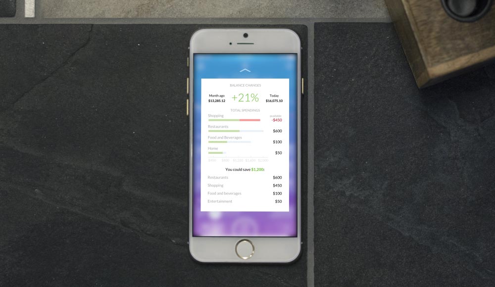
Spending Insights With Budget Levels
5. Create “One Stop” for all User's Accounts
In addition to the deposit accounts, users can also have credit accounts, investment accounts and others. We believe that the ideal challenger bank of the future must perform ideal banking user experience for all types of accounts, enabling users to easily monitor, manage and add them. All types of financial accounts could be connected to our mobile banking app so users can get overall insights about their actual financial wealth in a single bank interface.
We could also recommend adding some new accounts that may be beneficial to users. For example, on the basis of big data analysis, banking AI can determine a given client’s preferred investment strategies. In this case, banking AI put investment robo-advisor UI between other accounts allowing users to start investments with one click.
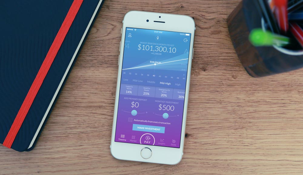
All Your Accounts at One Place
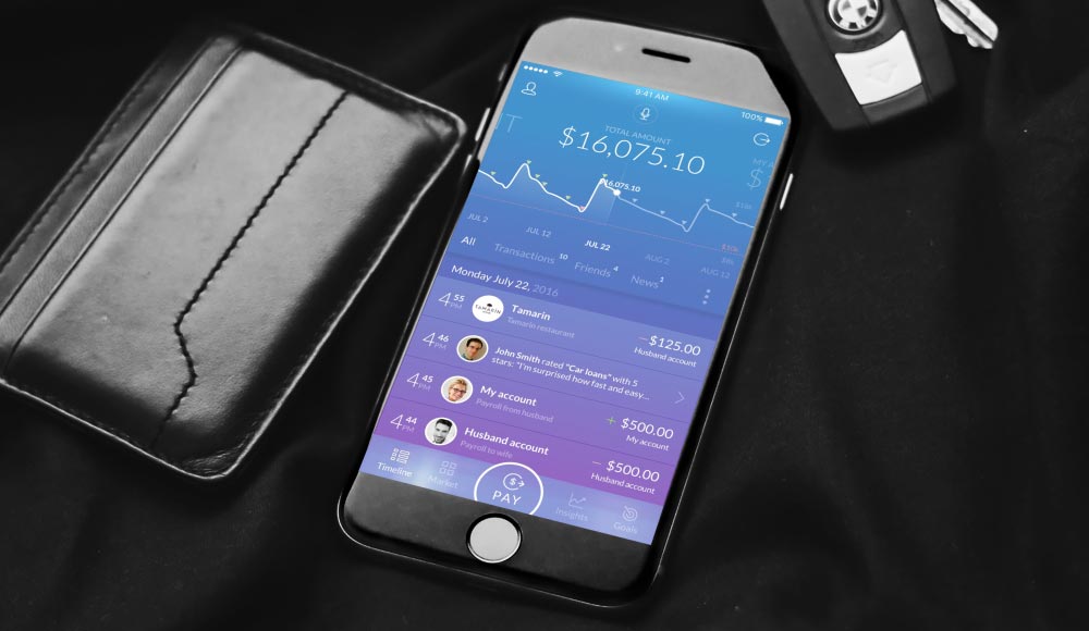
6. Show Financial Activity Feed Instead of an Outdated History
The next most popular financial user scenario, after checking the balance, is viewing transaction history. We think that users have to get more value than simply viewing recent account transactions. After all, as we mentioned above, customers’ financial experience involve many elements.
Therefore, we have rethought the transaction history of traditional bank interface and transformed it into an activity feed. Now it’s possible to see information on cash transactions, suggestions from your friends, system recommendations and notifications in one timeline UI.
It could be explained as something similar to the Facebook or Twitter timeline, in which you can simply scroll down to see all that happened recently. We assume that this format would be more familiar and clear for mobile users.
Besides financial transactions, the activity feed UI should show users’ friends' opinions about various financial services and other social-based recommendations. It should also include advice and service tips that improve the user’s financial position. Users will see contextual recommendations from banking AI using predictive analytics based on big data according to the nudge theory.
Recommendations may include how to reduce spending in certain categories, information about critical financial status, recommendations about savings and investments, reminders to pay bills, contextual messages about nearby ATMs when moving abroad, contextual budget alerts when visiting the shops, etc., in other words, everything that helps to keep and enhance user financial experience and health.
From the UI perspective, we put transactions under the accounts screen and link them with the balance chart. Therefore, when moving the chart, users can see transactions for a particular period. Easy and intuitive banking user experience delivered by smart banking app.
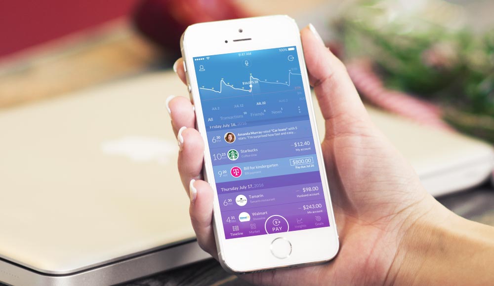
All Your Finance Information in Understandable Timeline
7. Ensure That Every Transaction Counts
Detailed information on each transaction should be available by simply clicking. Therefore, our mobile banking dashboard design will provide users with detailed information on transactions, including the location on the map. We believe such bank interface design would be particularly convenient to use the quick menu for splitting the restaurant bill with your friends by sending them a payment request. Users can also sort out all related transactions, edit transaction categories or instantly report suspicious activity.
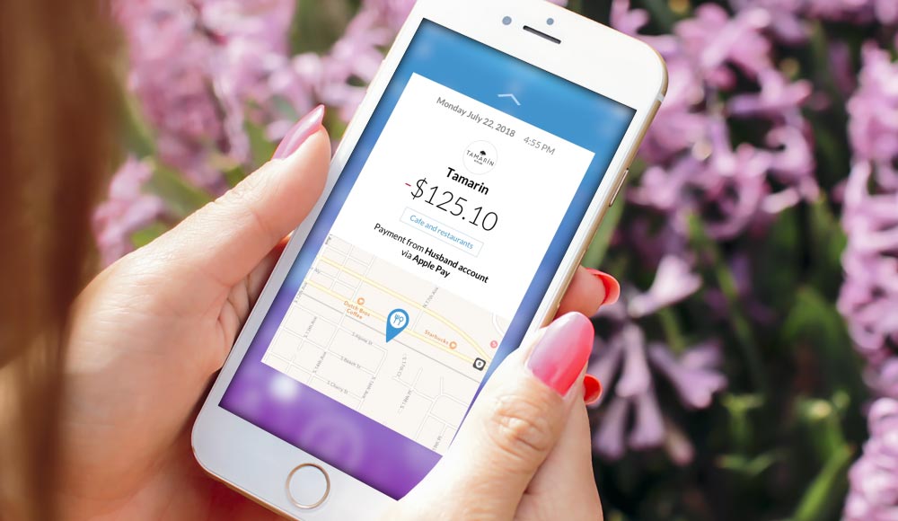
Detailed Information on Each Transaction
8. Provide Instant Payments as Easy as a Favorite Messenger
Money transfers and bill payments are included in the top priority scenarios of every digital banking case study and usually cause the greatest dissatisfaction in users because of the time and effort usually required. We wondered if we want to send someone a message on Facebook UI, why it takes a few seconds, but sending money still takes days.
In our mobile-only bank interface, money transfers and bill payments should be no more difficult than sending a text via messenger UI and is always available from the main menu. This will require smart contact synchronization from a banking core database, social networks and phone book into a single contact list. Neobanks in future must find and combine identical contacts to ensure an ultimate banking user experience.
As a result, the user will be able to utilize any attribute for the search recipient in the contact list (e.g., name, e-mail, phone number, account number, debit card, social ID), then select the money amount and transfer channel and click the “send” button. After receiving the money, the recipient card and account number will be automatically added to the contact list. If the recipient starts using an application, the user will be available to see its activity in the feed according to their privacy settings.
In this Fintech case study, we have taken into account and designed a full range of financial transfers, including P2P payments, bill payments, automatic payments, international transfers with currency exchange and payment requests. All of this is always available with just two clicks from the user and takes a minimum amount of time.
The use of the blockchain network by all platform participants, and the adoption of PSD2 analogues by financial institutions from around the world, will ensure maximum safety, transparency, convenience and speed of payments UX.
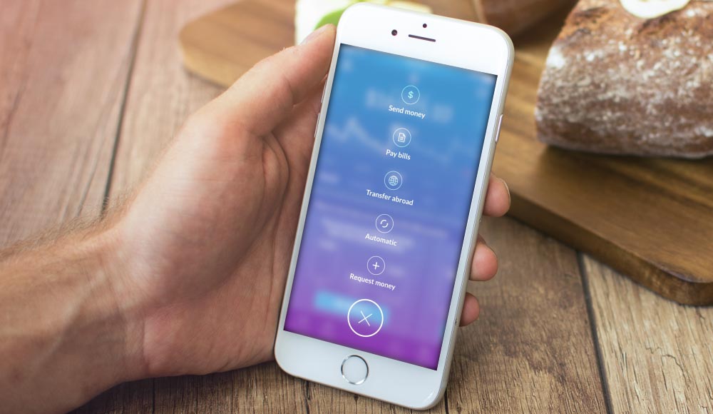
Send Money within a Few Seconds
9. Help Your Users Never Forget to Pay the Bills
Why should users have to be forced to open the payments section to pay routine bills? We propose to use the banking AI settings to automatically prepare or even pay bills. Soon banking of the future will put regular bill payments into the user's activity feed and send push notifications so the user can pay them with one tap.
At the same time, we believe that, in the future, the banks should not add hidden fees. It should show the fees of the service directly on the payment UI. The regular payments can be seen on the chart interface, and payment status is marked with a color. With such UX, it will be very difficult to forget to pay a bill.
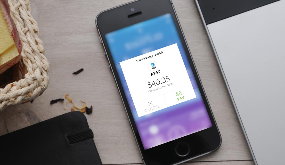
You Will Not Forget to Pay Bills Anymore
10. Create a Personal Financial AI Assistant
Actually, in our banking user interface it is not necessary to open a particular section to perform any operation or to receive help from our Neobank. We believe such tasks must also be solved through the digital banking AI voice assistant service. In our vision of the Fintech app design you can easily submit any request, from "Send $100 to my mother" to "Find the nearest ATM." We are reinventing banking user experience into a financial assistance that saves you time and effort.
Internet of Things (IoT) will allow us to go even further and integrate the challenger bank UX with smart home assistants like Amazon Echo or Google Home. It will bring us voice-enabled banking UX right from our home. Through authorization from voice ID biometrics… voila! You can check your balance, forthcoming payments, make transfers without pressing any button… and all of this without even leaving the couch.
What will the workflow of a voice assistant in the Neobank app design look like? Suppose you want a personal loan; tap a mic icon and voice your request. Banking AI identifies your request and offers a choice of available options. In this particular fintechcase study, one of the offers has already been prepared and approved according to your credit score. All that remains is to tap “Confirm,” and the money will appear on your balance in seconds.
This is one of the basic principles of the future bank user experience — proactivity instead of reactivity. Future banks won’t have to wait for a request from a user. Banking AI assistant will automatically prepare and approve a proposal for the maximum number of services using big data-based predictive analytics. This will significantly enhance the banking customer experience and provide instant service.
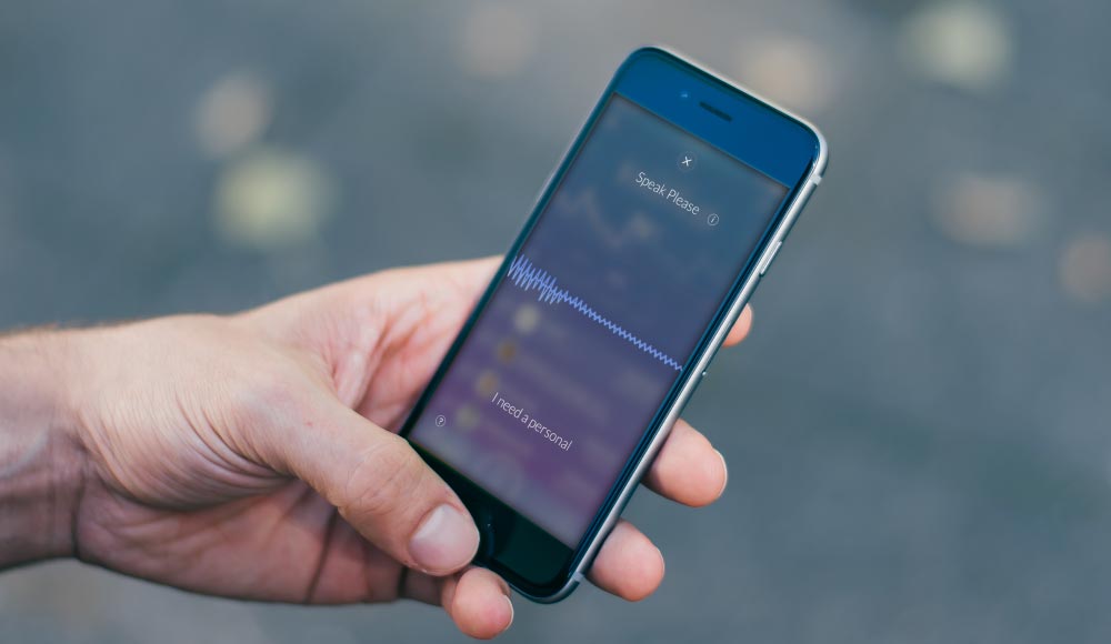
Personal Financial AI Assistant
11. Launch a Financial Marketplace for Hundreds of Services
Today banks are offering customers dozens of services. But, unfortunately, users can’t easily figure out how to use them in order to reap the maximum value. The ideal challenger bank UX should be focused on providing ultimate benefits for customers, not only by offering more simple services, but also by increasing their number hundreds of times, if needed. Only by using open banking in future outstanding user experience personalization could be achieved for different types of customers.
The only way to ensure such banking experience is to create a Neobank app on the principles of an open banking platform. Bank-as-a-platform must be able to integrate not only financial services but also retail and other types of services. It will let AI of the banking app provide the user with the necessary service at the right time. The bank app will be transformed into a personal assistant that could ensure maximal user satisfaction.
In terms of Fintech UI, there is nothing invented that can interact better with a large number of services than the card-UI marketplace. This is the most familiar and convenient interface format for mobile users. This UX frame will provide easy categorization of bank services, a personal recommendation component and subscription management.
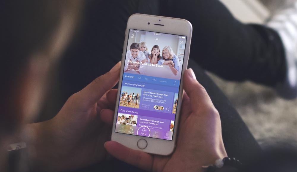
Financial Marketplace With Dozens of Services
12. Deliver Insights About User's Financial Behavior
For most people, it is difficult to track movement of their funds, especially through electronic channels. That’s why shops prefer cashless methods, so that consumers do not feel that they spend too much. Our task is to show money movement in a clear and simple Fintech app interface design, thus returning financial control to the consumer. Users should have an instant understanding of the level and nature of their spending and get clear recommendations on how their financial situation could be improved.
To provide this customer experience, our personal finance management UI module will sort all transactions by category, and allow users to set a budget for each category. If needed, the user will also be able to see how expenditures are moving in any of the categories on the timeline. Comparing spending levels with friends or typical bank customers helps the user to evaluate his/her financial patterns and optimize them.
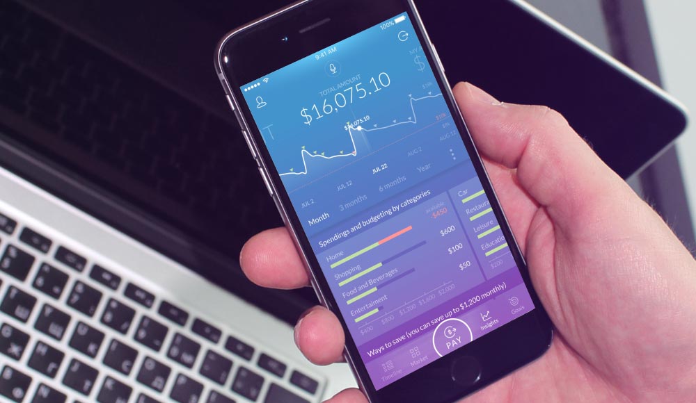
Financial Situation in a Clear And Intuitive UI
13. Ensure Guidance Through Financial Milestones
Every socially active consumer passes certain financial milestones, including the payment of higher education, buying a car, purchasing vacation tickets, buying home appliances, investing, buying a home, retirement savings, etc. Customers need support to set up the next target in their financial development. To provide this, we designed banking UI templates and relevant objectives, as well as the feature to set up automatic transfers into saving or investment accounts.
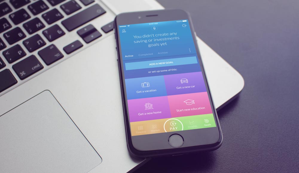
Your Personal Savings And Goals in One Place
14. Add fun to Finances
Technology makes life more interesting, more interactive, even if we do not leave our home. So, why do financial services UX have to be boring and outdated? Let's bring fun and emotions into banking.
The most interesting thing that we include in the settings panel are your rewards points and financial status that are used for gamification of banking user experience. Examples are rewards for trying new services, sharing your financial experience, participating in the banking community or achieving personal savings and investment goals. Such banking gamification platform could also be used for cross-promotions from different partners.
A higher status shows banking experience and credibility level. For users, it will ensure service discounts or exclusive offers with limited access. Points can be turned into gifts, free goods or services. Customer achievements could be shared with user social connections to gain respect for financial expertise.
Additional information about the rewards program and next-level opportunities and terms can be expanded by tapping on the points sum or status.
Of course, you are able to change your settings through this menu, and access the support chat. Support chat allows you to contact a bank consultant not only via text, but also via a video call. You can also easily check your credit score right under your profile and find out what could be done to enhance it.
Menu With Your Financial Status and Bonus Points
15. Transform Ads Into Care Using AI
The most powerful feature is available with the digital banking AI assistant—personalized promotions. Financial AI allows you to choose the most important and useful services and provide information about them at the right time thus significantly increasing user engagement.
Maximal banking user experience personalization could be ensured by using predictive analytics. In particular, it has to combine analysis of the activity and the user’s financial status, the analysis of user’s social environment, big data analysis on typical behavioral patterns, geolocation data and contextual analysis.
For example, location-based push notifications may come at the time of crossing the border and contain information about the ATM’s location as well as the location of other useful services. Child spending or maternity grants detected by banking AI could become an ideal reason to offer a loan on increasing the living space. Flight ticket buying transactions will be a good occasion to offer an insurance policy for travel. Car warranty period endings detected by leasing or insurance data is the perfect time to offer a new car purchase. Moreover, each promotional offer must provide everything needed for instant one-button receipt of goods or services.
In particular, let's say you got a push notification about a pre-approved loan offer for a new car. You find it attractive and it takes you to the challenger bank app login, and then to the car list. All cars are divided into two categories: available right now or only on request. This means that you are able to get a new car tomorrow by choosing from the available options. Just tap on the “Buy” button and confirm the agreement. That’s it; your new car with papers will be delivered to your home tomorrow. Without visiting car dealerships, without visiting the bank, you are saving you time and effort purchasing a car faster than in the online store. Welcome to the future of banking!

Personalized Promotions And Services
The main aim of this Fintech case study is to share financial and future banking trends in UX / UI design to inspire financial industry professionals on driving innovation and user-centricity.
© This Neobank app design concept is delivered by the first financial UX design agency - UXDA. This visual concept is not a mobile app and not available in the App Store or Google Play.
Discover our clients' next-gen financial products & UX transformations in UXDA's latest showreel.
If you want to create next-gen financial products to receive an exceptional competitive advantage in the digital age, contact us! With the power of financial UX design, we can help you turn your business into a beloved financial brand with a strong emotional connection with your clients, resulting in success, demand, and long-term customer loyalty.
- E-mail us at info@theuxda.com
- Chat with us in Whatsapp
- Send a direct message to UXDA's CEO Alex Kreger on Linkedin


