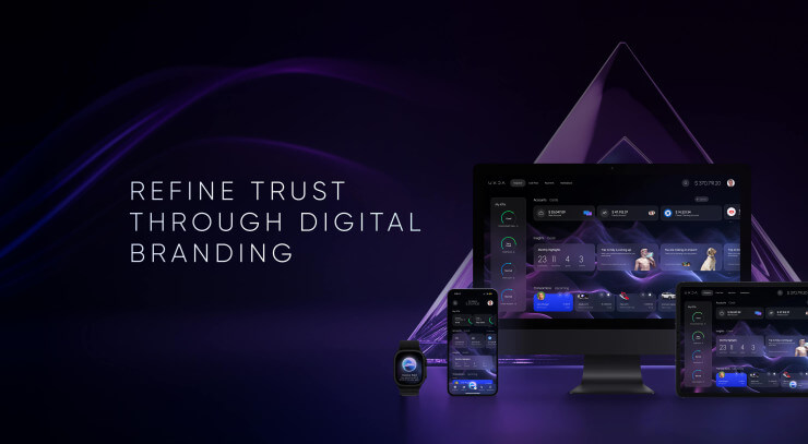
Next-gen of AR/VR devices such as Apple Vision Pro and Meta Quest 3 hit the market in 2023, but the potential of VR/AR's power to create a next-gen user experience in banking is still undiscovered, which is why’ UXDA took on the challenge to demonstrate how this kind of future banking in Metaverse would work. Let us introduce you to the first mixed reality banking concept that includes virtual reality banking, augmented reality banking, tablet, desktop, wearable and mobile banking.
Download this case study in PDF
Today, without a digital presence, there is no successful trade or service in the digital age. The next revolutionary disruption will be caused by the Metaverse. Virtual reality and augmented reality have already become mainstream in the gaming industry. Thanks to its potential to engage, it attracts a lot of interest from gamers who want to enjoy lifelike, immersive experiences.
But, true mixed reality potential lies far beyond games; it's a new Metaverse platform that provides a revolutionary user experience. VR and AR technologies will merge digital content with the real world to create one constant Metaverse reality.
We could say that the modern digital world as we see it today is only the basic preparation stage for the Metaverse that we will fully experience in a few decades.
This will enrich consumers' experience with as-seen-in-a-movie opportunities in all the industries, especially after AI and 5G integration. Metaverse has one of the highest projected growth potentials, according to tech experts.
This means that every company that strives to succeed in the digital world should expand its digital transformation plans and include a Metaverse strategy.
The main question is: how will everyday services work in the new Metaverse environment, especially banking? For example, if we are in a virtual or augmented reality session, do we need to exit out to check a few transactions or send money to relatives using mobile phones?
UXDA's team of financial UX architects and designers introduces you to the first metaverse banking UX concept that includes VR and AR banking design, tablet, wearable, desktop and mobile banking UI / UX.
Let's say “hello” to the future and dive into how Metaverse banking service could look in VR/AR and how we would be able to use it.
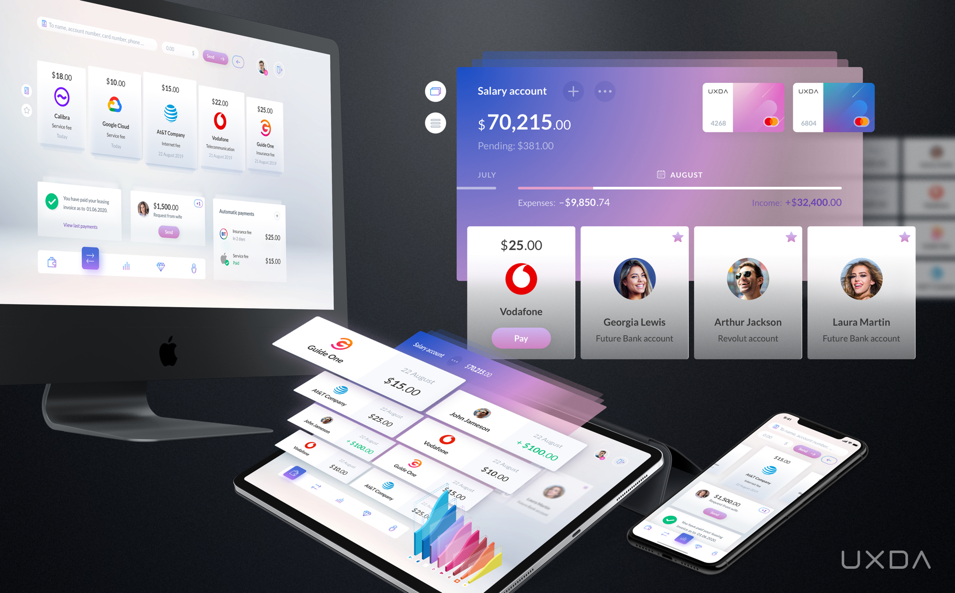
The first mixed-reality Metaverse banking concept that includes virtual reality banking, augmented reality banking, tablet, desktop, wearable and mobile banking by UXDA
EXPLORE FINANCIAL PRODUCTS DESIGNED BY UXDA
How to Become Pioneers in VR/AR Banking
In the future, a bank that strives to ensure an easy and smooth flow for its users should be easily accessible inside a VR/AR experience.
Innovative banks and Fintechs, which will be the first ones to realize this and prepare mixed VR/AR experience for their users, will become the pioneers of the new banking in Metaverse.
Some banks and Fintechs are already trying out VR/AR features in their products. For example, Westpac Banking Corporation and Current provide financial data visualization and budgeting through smartphone-based augmented reality. There's no doubt that it looks impressive, but it's questionable whether it makes banking itself more convenient and user friendly.
We can expect that the situation will change dramatically after the widespread distribution of VR/AR devices, just as we have already seen it happen with touchscreen devices decades ago.
To create Metaverse banking solutions, we need to develop technology that's behind VR/AR, but the main success factor is still all about the user experience. First, we need to explore VR/AR features to understand how it affects user expectations, needs and behavior in mixed reality.
Simplicity
Compared to the desktop or mobile experience, VR/AR design is not limited by the screen size. Although tempting when you want to display all possible information at once, this wouldn't be a great idea as it could cause cognitive overload and frustrate the user. In the case of VR/AR banking design, we especially need to remember that the main criterion for quality is simplicity.
Consistency
Both virtual and augmented reality should relate to the experience in the real world. Properly structured VR design should reduce the painful effect of a mismatch caused by the difference between the eyes’ tracked movement in virtual reality and the feeling we perceive from physical reality through our other senses.
Depth
One of the largest challenges of VR/AR banking design is user interface transition from two-dimensional (2D) to three-dimensional (3D) interactions. This requires deep adaptation of UX/UI design principles and methods for the depth of volumed space.
Metaverse will be established by two types of devices─holographic and immersive. Holographic devices place digital objects into the real world as if they are really there. Immersive devices create an immersive experience by hiding the physical world and replacing it with virtual reality.
UXDA's First Metaverse Banking VR/AR Design Concept
Let us introduce you to the world's first Metaverse banking design concept by UXDA:
In this Metaverse banking design concept UX case study, we will not delve into a voluminous description of our financial UX design process. UXDA's approach is described in great detail in our previous financial UX design case studies:
1. How We Designed the World's Most Awarded Banking App Concept
2. How to Create Banking Super App Based on 10 Latest Tech Trends
3. Banking Back-Office Transformation that Led Vendor to a Global Expansion
4. How to Raise the Rate of a Mobile Banking App from 2,8 to 4,7 in Google Play
With this Metaverse banking design concept our aim was to overstep the boundaries of the physical world by designing a rich, 3D sensory banking experience that corresponds to the person's movement in virtual reality.
This allows the user to “feel” his finances in a completely different way and discover a revolutionary, previously unseen virtual banking environment.
By blending the physical and the virtual world with augmented reality, Metaverse banking overcomes the limitations of a physical screen, bringing finances closer to the user.
AR banking expands the opportunities an interface can provide to ensure the fastest and most convenient banking experience of the future.
In addition, we should remember that Metaverse will not instantly replace desktop and mobile banking solutions, which is why VR/AR design solutions should be easily adaptable for online multi-channel use. For UXDA, it was a daunting challenge to create a cross-platform design language that makes our VR/AR banking solution available for every channel, but we succeeded.
So, let's explore in detail how UXDA's designed banking in Metaverse could enrich the future banking experience.
Delightful 3D Dashboard
We assume that login screens will not be needed in the VR/AR Metaverse future. You just ask your voice assistant or choose from the app list to open a banking app and get automatically authorized to log in. In most cases, the banking dashboard will be the first screen the user will see.
In considering the transition from 2D screens to a 3D VR/AR platform, we have rethought the app interface from a 3D perspective by adding depth.
In the case of the VR/AR experience, the main sections are located around the user, who can rotate them simply by swiping or by turning your head.
To adapt this 3D interface design for 2D devices, we placed elements in front and behind the main dashboard. The elements behind are out of "depth of focus," thus creating a space volume effect.
On the dashboard, the user sees a summary of his/her main account, cards connected to the account, an expenses/income bar, upcoming payable bills, favorites to whom to send money, a budget data chart, profile icon and five-section navigation bar.
It is possible to swipe or tap every element on the screen, just like in the physical world. For example, a user sees a blurry recent transactions list in the background and can move it to the front by just clicking on it or swiping up the payment list.
The user can easily swipe account cards to see the balances of his/her other accounts. They can also swipe favorite contacts to the left to quickly find a recent one and send money instantly, or swipe the right balance bar to compare this month’s expenses with the previous month.
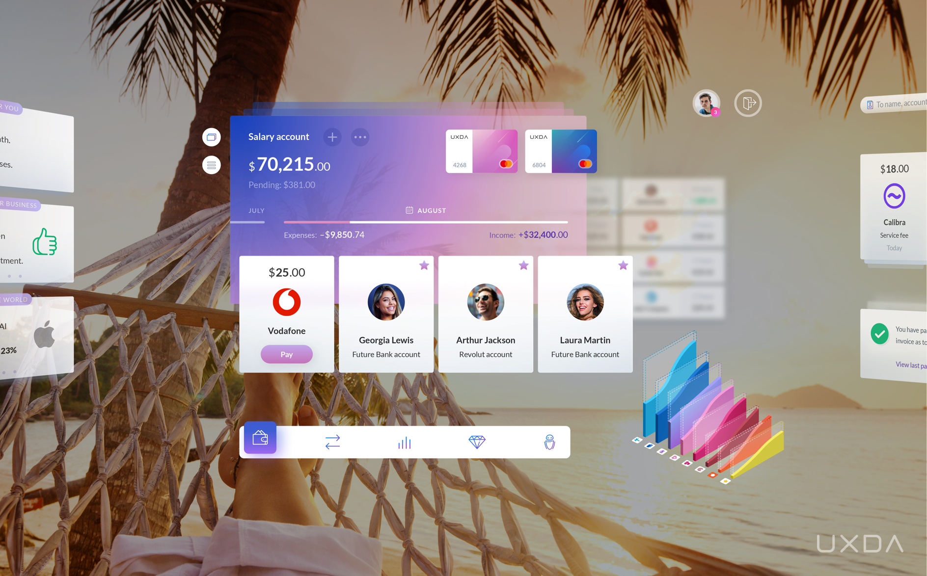
Delightful banking 3D dashboard overview through smart glasses while enjoying the sunset on the beach
Handy Accounts List
The user can switch accounts from a card view to a list view just by tapping the switcher in the upper left corner. This will provide a scrollable accounts list convenient for multiple account owners. Users can see more account details by tapping on it.
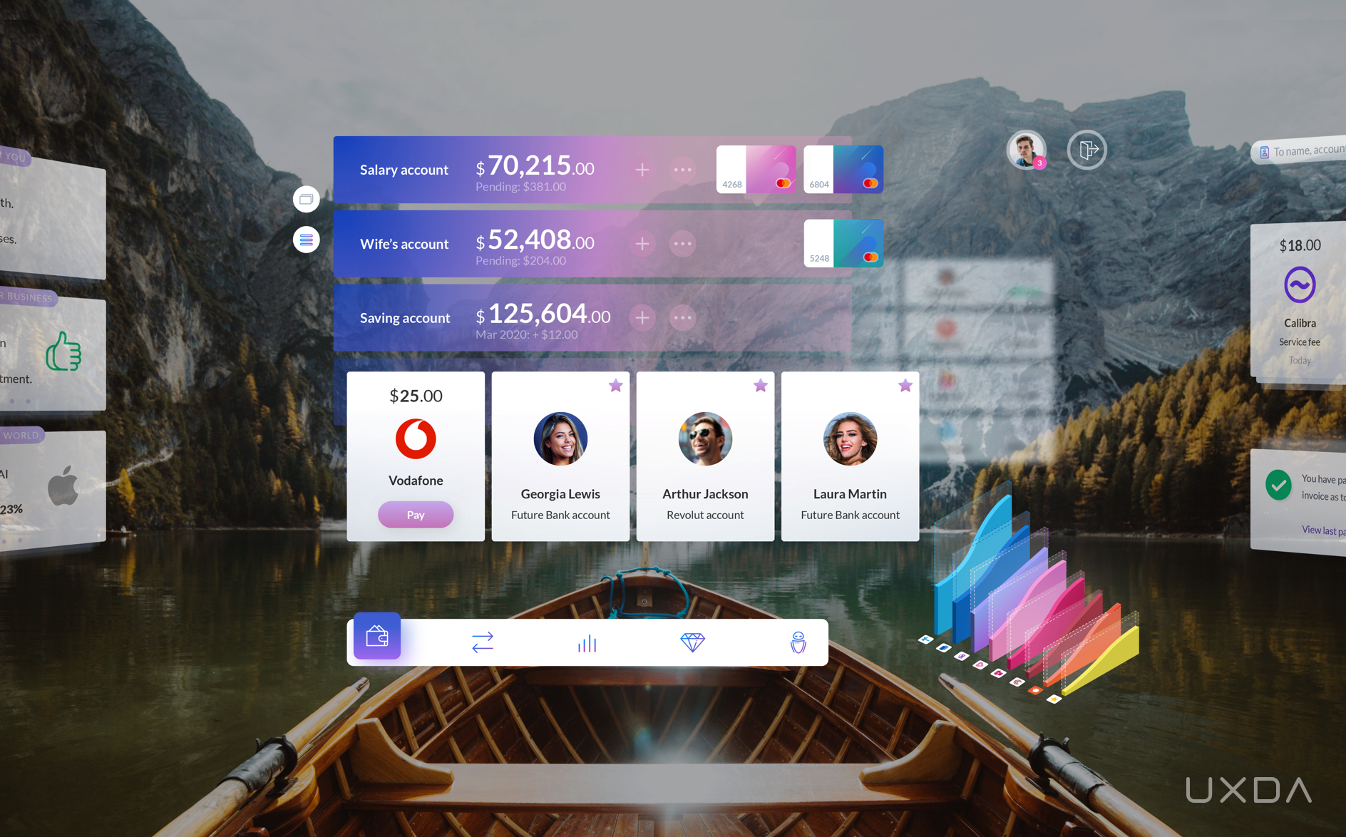
Checking the banking account list through AR headset while relaxing in a boat on a picturesque vacation
Crystal Clear Transactions
After opening a list of particular account transactions, users can use the menu on the right to search for specific transactions, change the history time range or filter transactions by type, beneficiaries or categories.
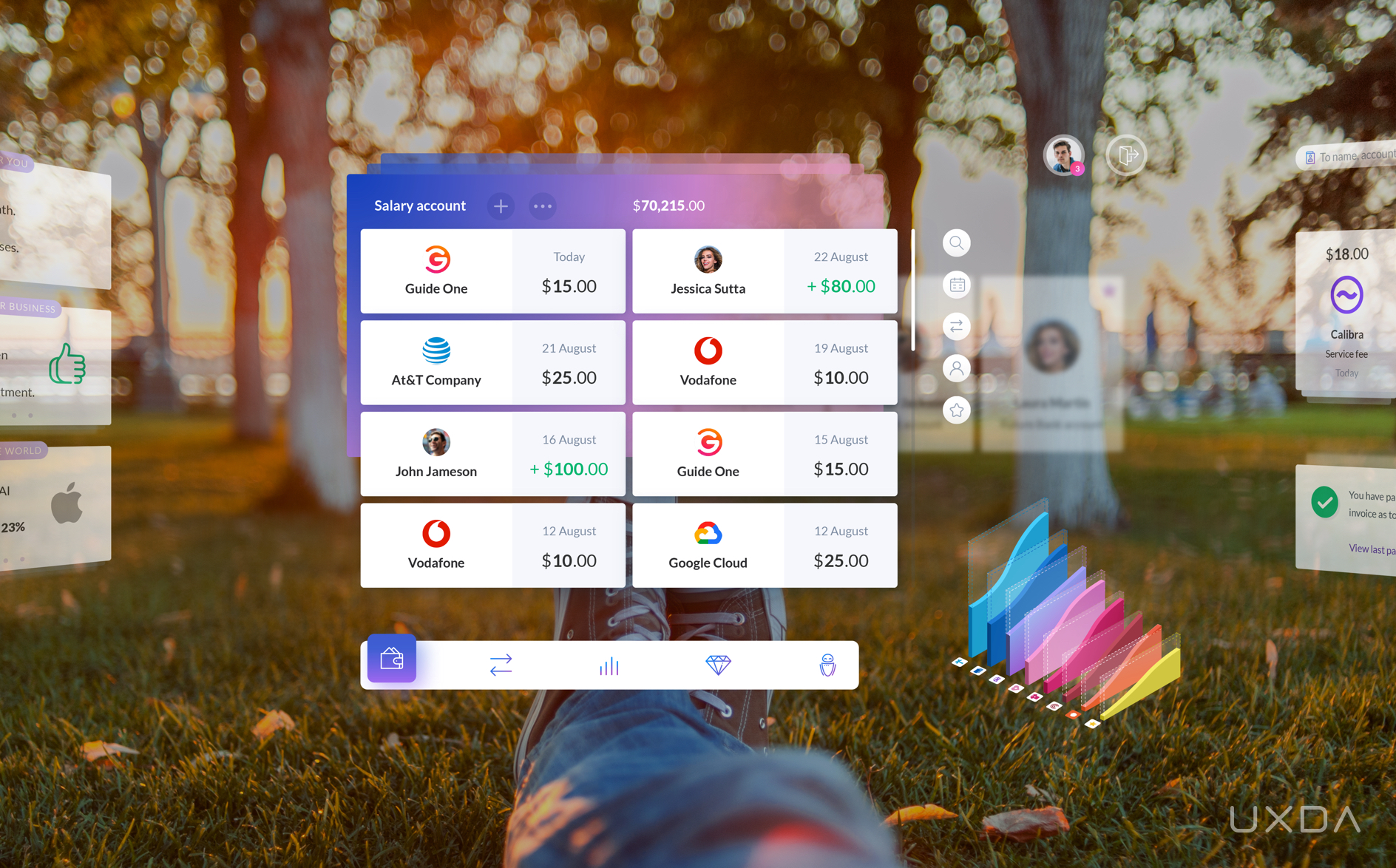
Checking recent transactions through an AR headset while having a picnic in the park
Enjoyable Payments
By simply tapping on the payment icon in the navigation bar or swiping the screen to the left, the user is taken to the payment section where he/she can manage bills and regular payments, as well as transfer funds to his/her mates.
Users see all the upcoming bills but can switch to their list of favorite recipients list that works as a carousel menu so they can see the latest paid bills, requests and automatic payments.
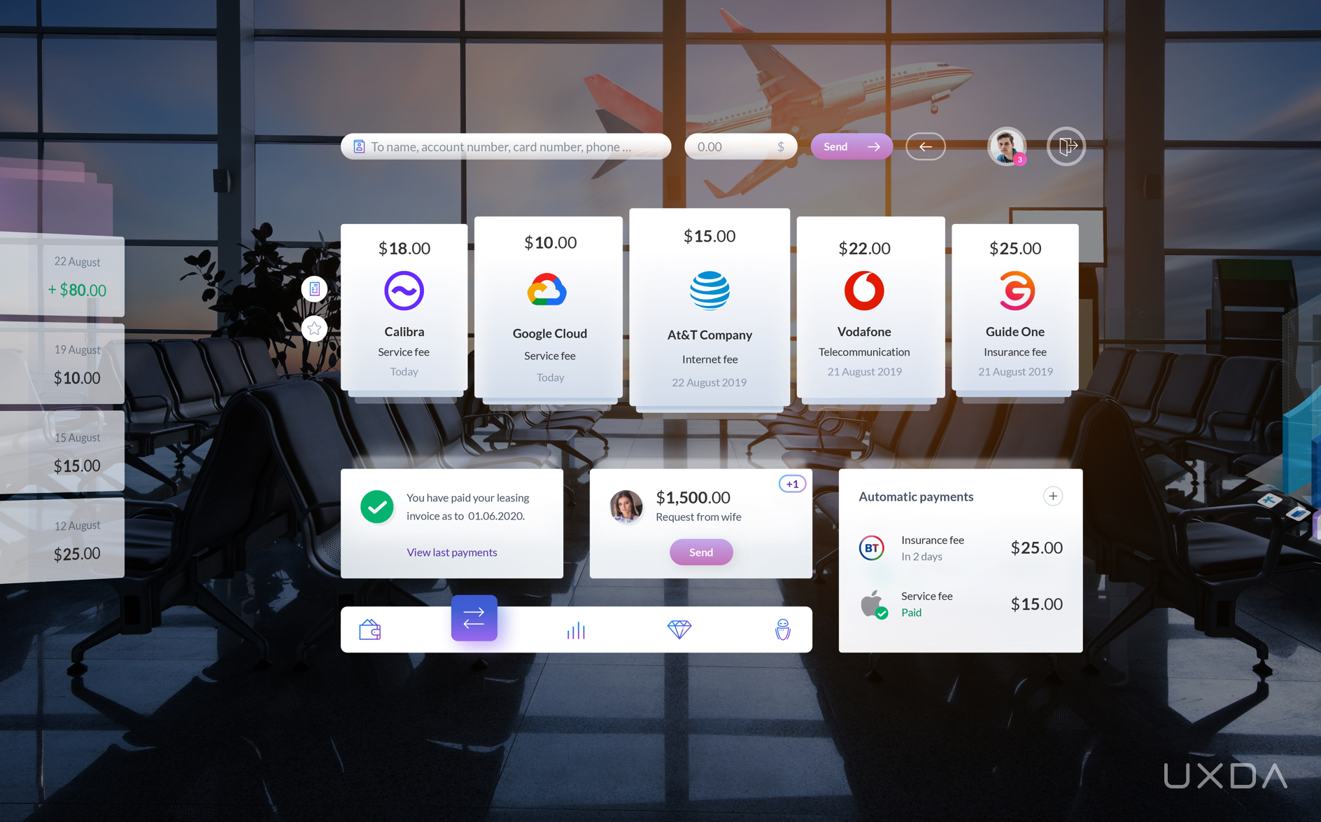
Managing the bill payments through smart glasses while waiting for a transfer between flights
The search bar in the payment section is for searching previously made transactions, as well as creating new ones. The user just has to input the card number, name, surname, ID number, phone number or any other recipient's details, and the virtual bank matches it to the database and requests any additional info that might be needed.
We believe that, in the future, this will be a rarely used function because, thanks to open banking connections and global digitalization, the majority of recipients could be easily found since they will already be connected to the user account.
By tapping on the backward bullet, the user easily switches from sending money to requesting it.
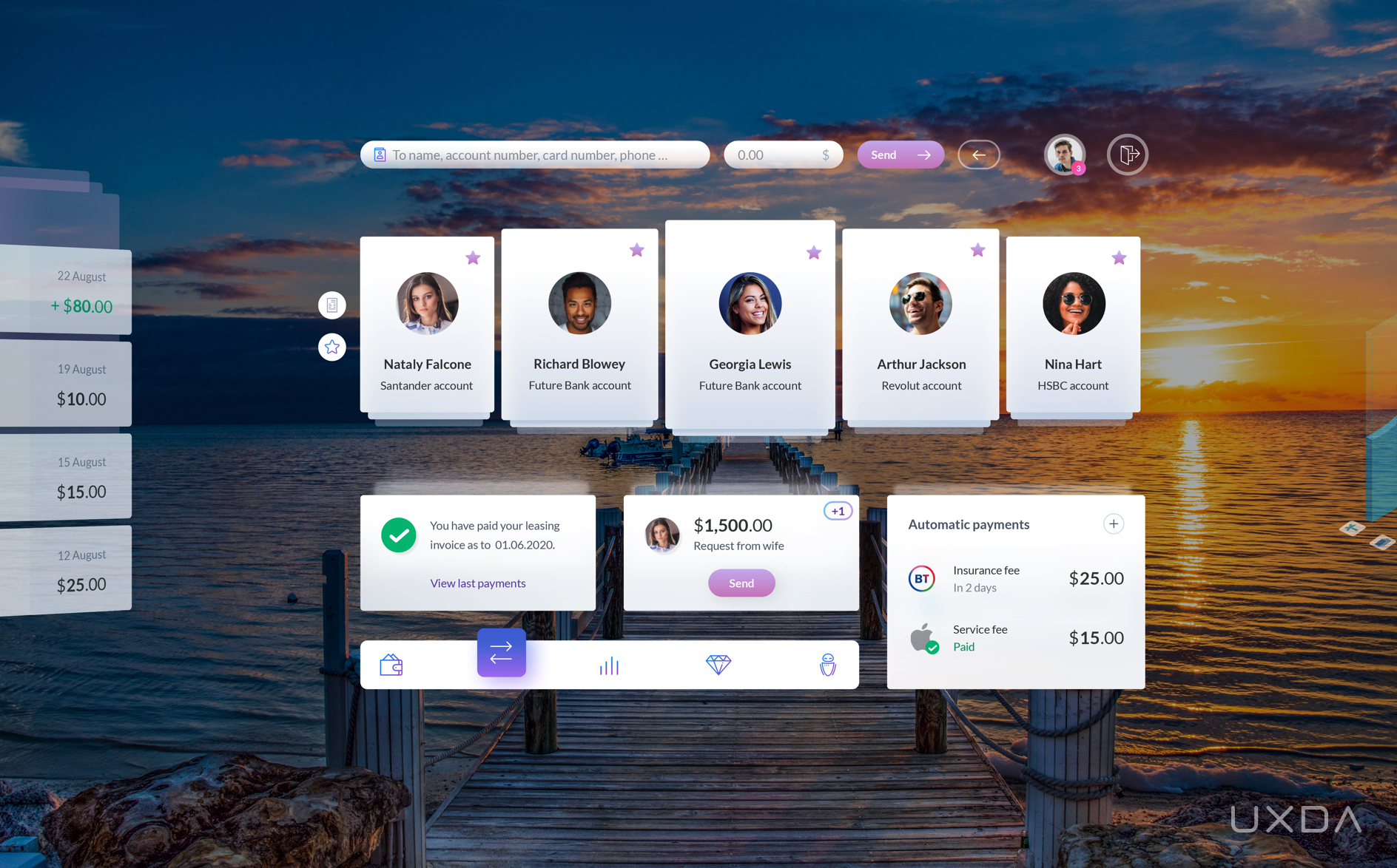
Viewing favorites payments through an AR headset to quickly split the bill between friends right after you had a wonderful dinner by the seaside
Powerful Budgeting
It is highly important for users to maintain control over their finances, so we provide users with simple but powerful budgeting features to track and manage their expenses.
The summary shows how much a user has spent and how much is left to reach his/her budget limit. Customers can easily detect the situation with expenses by exact categories and compare it to budget limits. Such budget data visualization is provided for every connected account.
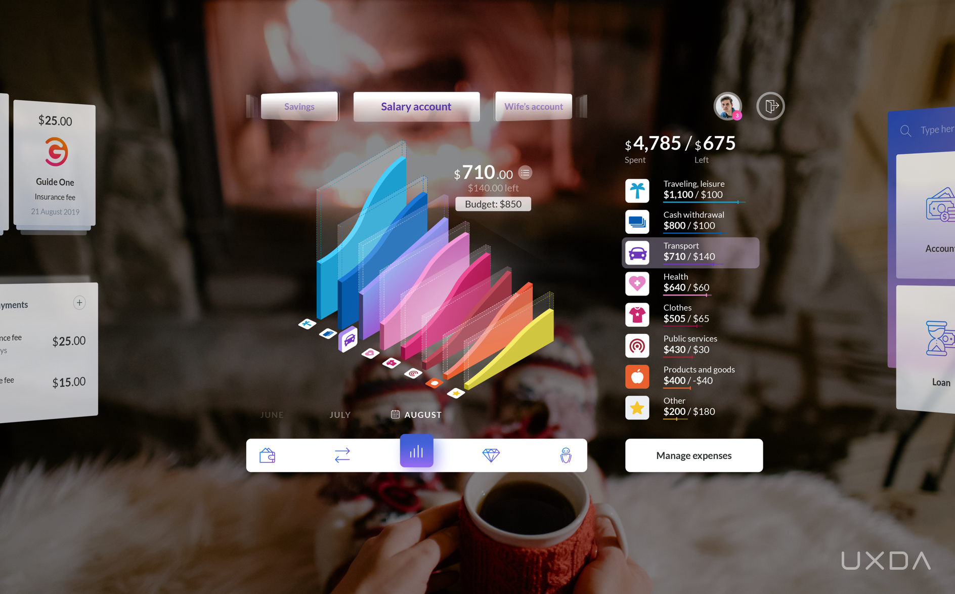
Analyzing spendings and setting up budgeting through an AR headset while enjoying hot cocoa on the winter holidays in the countryside
Surprising Product Marketplace
There are hundreds of useful financial products, but the majority of bank users aren't even aware of them. The virtual bank ecosystem of the future should provide not only its own products but also third-party services. This is the only way to enable the best possible service and opportunities for the user.
In addition to traditional financial products, such as new accounts, cards, loans, insurance, investment, or business-related banking services, there could also be a funding platform on which the user can create crowdfunding for his/her project or help other projects. There could even be a marketplace for cars, yachts and electronics.
Such a virtual bank could prepare personal offers based on a customer's preferences, financial track record and similar customer analytics.
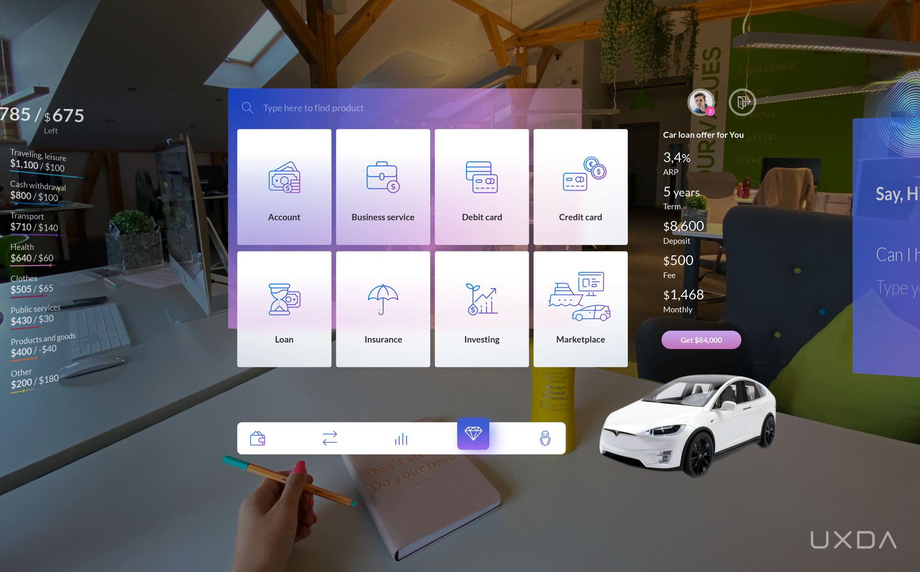
Overviewing the financial product marketplace through AR headset right from the office to get additional funding for the business
The Heart of Virtual Banking - AI Advisor
The last section, and the heart of virtual banking, is a banking AI-based advisor. It has voice processing and could serve the customer even without opening a virtual banking app.
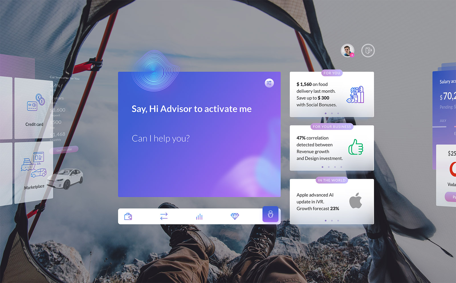
Activating the banking AI advisor through an AR headset to schedule financial tasks while on an adventurous mountain hike
If the user opens this section, he/she can ask anything and see recent personalized offers and insights prepared just for them. Thanks to AI, those are more than the usual advertising. AI analyzes the customer’s financial context and provides insights on how to become more effective and improve their financial life.
For example, it could find and suggest ways to save more money, detect a positive correlation between your business design investments and income growth or even provide a forecast on stock growth based on your trading interest.
Read more about the possibilities of AI in banking in this Mobile Banking Super App UX Case Study.
EXPLORE MORE UXDA CASE-STUDIES
This is Only the Beginning
This VR/AR banking case study demonstrates UXDA's vision of the future of banking in Metaverse. This is not an attempt to make some precision forecast.
Instead, we hope to inspire the financial industry to explore the next step in making finance more user-centered in the future.
The only way to be ready for the revolutionary switch to Metaverse reality is to start generating ideas and concepts today. With this case study, we encourage you to view your own financial products through the lens of the future.
As technological advancements are rapidly developing and bringing more and more benefits for the customers, this is a must for any company that strives to become more successful, not only today but also in the future.
We used to call the previous age industrial, since the industrial approach was the main driver of development and the creation of consumer value. Today, all industries are undergoing digital transformation, and consumer behavior is shaped through digital channels. Digital helps to understand the nature of the changes around us, but hides its essence. How to explain all the strange phenomena, such as overcapitalization of joke cryptocurrencies, startups without sales and crowdfunding experiments?
We believe, this is not about the emergence of a digital economy, but about an economy of experience. The essence of the changes is that digital created a new paradigm, where the economic relations are formed by experience. It takes the attention and emotions of consumers to the forefront. Experience becomes the determining factor of value in the modern world and to survive the Metaverse you need Digital Experience strategy.
We might not be able to know exactly what tomorrow holds, but we can do our best to prepare today and become the pioneers of the future Metaverse.
Get UXDA Research-Based White Paper "How to Win the Hearts of Digital Customers":
 If you want to create next-gen financial products to receive an exceptional competitive advantage in the digital age, contact us! With the power of financial UX design, we can help you turn your business into a beloved financial brand with a strong emotional connection with your clients, resulting in success, demand, and long-term customer loyalty.
- E-mail us at info@theuxda.com
- Chat with us in Whatsapp
- Send a direct message to UXDA's CEO Alex Kreger on Linkedin


