To understand how a purpose-driven strategy can impact revenue, PwC found that 79% of business leaders believe purpose is critical to success. Purpose-driven companies have higher productivity and growth rates, along with a more satisfied workforce, according to Deloitte. Such companies report 30 percent higher levels of innovation and 40 percent higher levels of workforce retention than their competitors. No wonder leaders like HSBC and DBS are betting big on purpose-driven banking.
Purpose-driven financial institutions have values that are shared by customers, employees and stakeholders, because they are in business not only to make money but to act for the benefit of people. The main challenge is how to align banking services and products with a human-centered purpose.
Little Things Make a Huge Impact on the Banking Industry
To better understand how to implement a purpose-driven strategy at the level of customer experience, I propose to explore the real case in detail. Thousands of such incidents hugely affect the banking industry every day. This one happened to my friend whom we will call Steve.
Steve wanted to buy a house by taking a loan at a bank he desired, but, in the end, he used another bank. I thought, it’s just a common thing because the offer from the other bank was better. Surprisingly, my friend denied this, saying the proposals were absolutely identical, which really intrigued me.
I asked Steve to tell me more details about what caused him to switch to another bank from his primary choice. It was important to understand what this bank did wrong. How was the first bank able to so easily lose a ready-to-pay customer with a good credit score?
During my investigation, I came up with interesting and perhaps frightening conclusions. It seems many banks are losing customers because of outdated product designs and poor banking customer experiences caused by non-purpose-driven and non- customer-centered business practices. And, the size of these losses is staggering.
Even by rough, but conservative, estimates, medium-sized banks lost millions of potential revenues each year. For the larger banks, total losses from non-purpose-driven business practices over the next 10 years could be in the billions of dollars.
A thousand times smaller budget is enough to improve the situation. But, it's not happening because the reasons that cause such losses may look at bank employees as "little things." So, they do not pay the needed attention to increase bank revenues, and do not take any actions to eliminate "leakage".
To Get Service From a Bank Should not Be a Challenge
How did I come to the conclusions that are mentioned above? Steve’s history began when he decided to secure a mortgage for buying a house. He chose a bank he had heard a lot about, which ran a huge advertising campaign often seen in his state. When I asked why he did not choose his primary account bank, he argued that the conditions were not as good.
First of all, Steve visited the bank’s page on the internet. To his great surprise, Steve did not find a mortgage proposal on the first page. Instead, there were many promos about how good the bank is, how they appreciate their customers, which socially responsible projects they support, how many millions of credits they have issued, etc.
According to Steve, he spent 10 minutes unsuccessfully trying to sort out all of this information by clicking the various buttons and navigating around different areas, but he did not find a mortgage section with an online form that he could use to apply. Anyone in such a situation would simply close the page and look for an offer from another bank. But, Steve never gave up. So he found the contact section and sent a request to the bank’s email about his intention to secure a mortgage.
To this day, Steve has not received a tempting invitation to become a client of their bank. As he said, there was a feeling that the bank just did not need him as a client. It was as if the bank was turning away potential customers by creating obstacles. And, this occurred despite the fact that the financial institution, according to the advertising activity, is spending hundreds of thousands per year on marketing.
But, as I said, Steve is a stubborn man, so he decided not to wait and found the contact of a loan officer from this bank through Google. He called him directly by phone. Instead of reacting with joy from hearing from a potential new client, the officer asked Steve where he got his contact information. After receiving an explanation, the loan officer offered to book an appointment for an interview at the bank the following week.
Disaster Starts With a Bad Customer Experience
Here I have to note that my friend is from the Y-generation and therefore prefers to solve all issues remotely via the internet. According to polls, he is not the only one. Thirty percent of U.S. consumers secure a mortgage online. On top of that, he was about to solve this issue instantly because he finally found a suitable home and was leaving for vacation the following week.
After hearing the description of this situation, the loan officer offered to fill out an online application for the loan, which was somewhere on the web page. Unfortunately, the bank employee wasn’t able to provide more information on the online mortgage application procedure because he was just another department employee. Nevertheless, he sent my friend a link to the online application form.
Opening the page, my friend saw more than 50 fields to be filled in. He spent about an hour filling out all the information, including an upload of an excerpt from his account and other documents. Having encountered some frustrating questions at the end of the form, he decided to ignore them and pressed the "Continue" button. Imagine his feelings when the bright red error message appeared on the screen, and all the information he had inputted disappeared! This was the final straw.
As a result, as you have guessed already, my friend got his mortgage, but from another bank with similar conditions. Now he is very satisfied, and I use this story as an anecdote at parties.
How Many Customers Lenders Lose
While carefully listening to the story, I was wondering how many customers banks lose due to a banking UX design that is not purpose-driven. Using Google search, I found that this particular bank provides an average of 3,000 mortgage loans per year. It is not surprising that the bank is not worried if someone leaves them for a competitor.
The average purchase loan size is a $453,000 according to CNBC news. According to ICE Mortgage Technology research, 58% of borrowers say that availability of an online application would likely impact their lender decision. Data shows that 91% of lenders offer online applications to borrowers and 61% of borrowers used an online application which equates to 1830 customers a year in our case.
No wonder, 63% of consumers believe that an online mortgage process would make buying a home easier than an in-person process. That's why 99% of lenders think that technology improves the mortgage application process, by simplifying the entire process, reducing time to close and minimizing data entry. We must clearly define the context of the client to understand how to help.
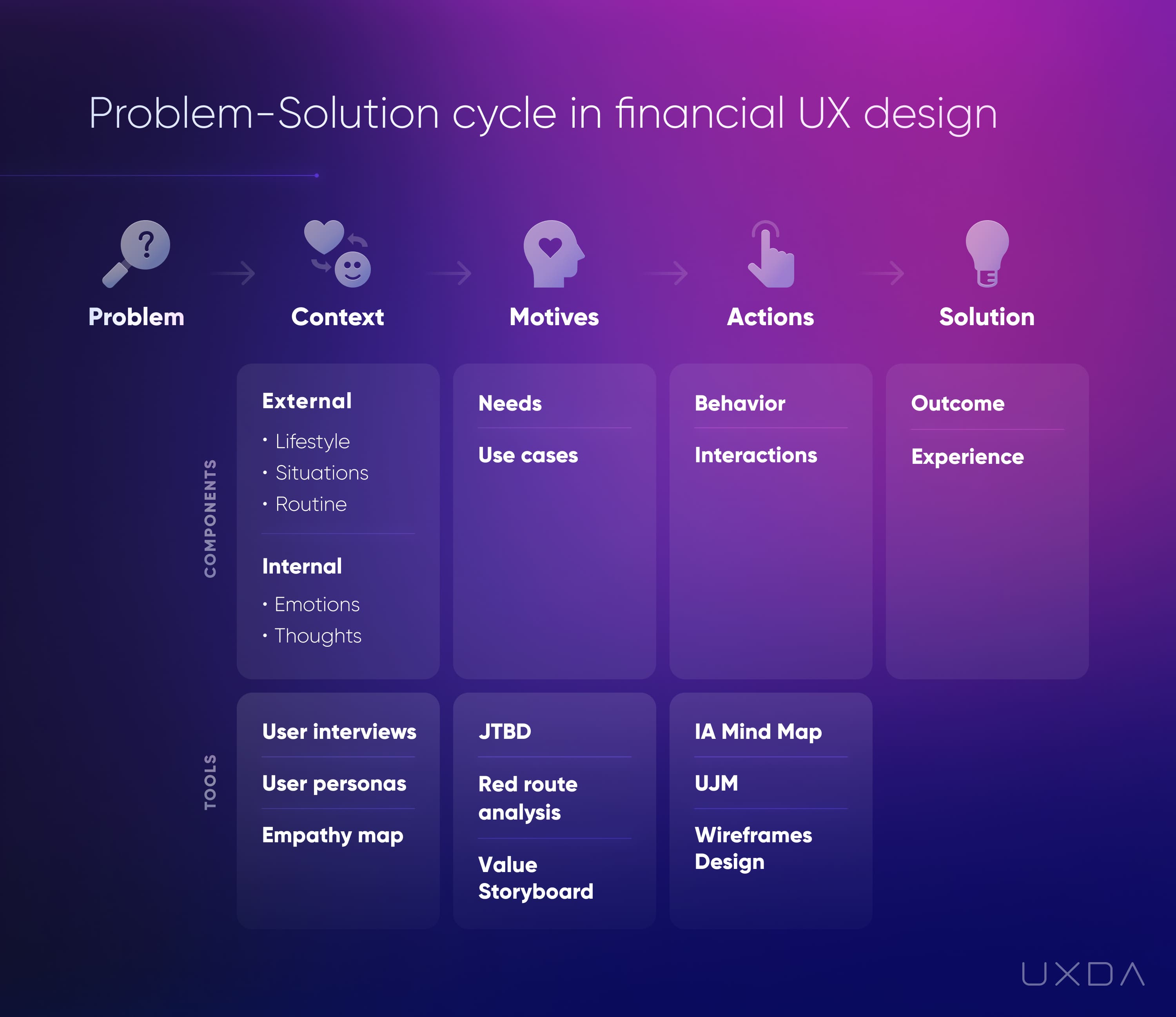
Pay attention and don't let financial experience fail ignoring the problem-solution cycle.
Nearly 9 in 10 lenders (86%) said borrowers should spend less than 30 minutes filling out a loan application, but 68% of borrowers said they actually spent 30 minutes or more completing their application finds ICE Mortgage Technology. Top reasons for why online loan applications weren’t finished were that the application took too long (30%), the borrower needed assistance (29%), the borrower was missing required information (29%), or the borrower was distracted (28%).
So, to estimate the number of lost customers, we have explored 100+ case studies of conversion rate improvement on the neilpatel.com. The average conversion growth across all case studies was 64%, with the minimum 2% and maximum 591%. I also explored the statistics available from 100+ financial services redesigned by UXDA.
The range of results is quite extreme, so I focused on case studies related to simplified main page design and improved navigation, emphasizing key services and form optimization ─ similar issues that caused the bank to lose Steve as a customer. Average improvement in similar cases was 37%.
Given the large flow of requests and the specifics of the banking sector, we will be cautious and lower the forecast seven(!) times to 5%. This means that, by correcting the aforementioned problems in the product design and customer experience, this bank could increase the number of new customers minimally by 90 people (and up to 630 people as well).
Non-Purpose-Driven Bank's Revenue is Under Attack
Ninety lost customers per year. Is that a lot or a little? Well, actually, it is a lending volume of $40,770,000. Mortgage Bankers Association (MBA) has reported that independent mortgage banks (IMBs) and mortgage subsidiaries of chartered banks made an average profit of $4,202 on each loan per year. It is easy to calculate that 90 lost mortgages in the first five years will cost the bank around $2,000,000 (or $14,000,000 in case of 630 lost customers). It is scary to imagine how a bad customer experience impacts interactions with other products of the bank, since mortgages are not their only product.
These calculations do not occur to loan officers who refuse to help a new prospect due to lack of time; project managers who create overly long application forms; bank UI designers who add to the home page all they were asked about without defining key user scenarios; and even software developers who ignore the usability rules.
They are not bank executives, so lost profits do not scare them much. To reverse this vicious cycle, banks need to change their attitude, mindset and culture. And, this is where a purpose-driven strategy comes in. It is the ultimate focus on delivering value for people at all levels of the organization.
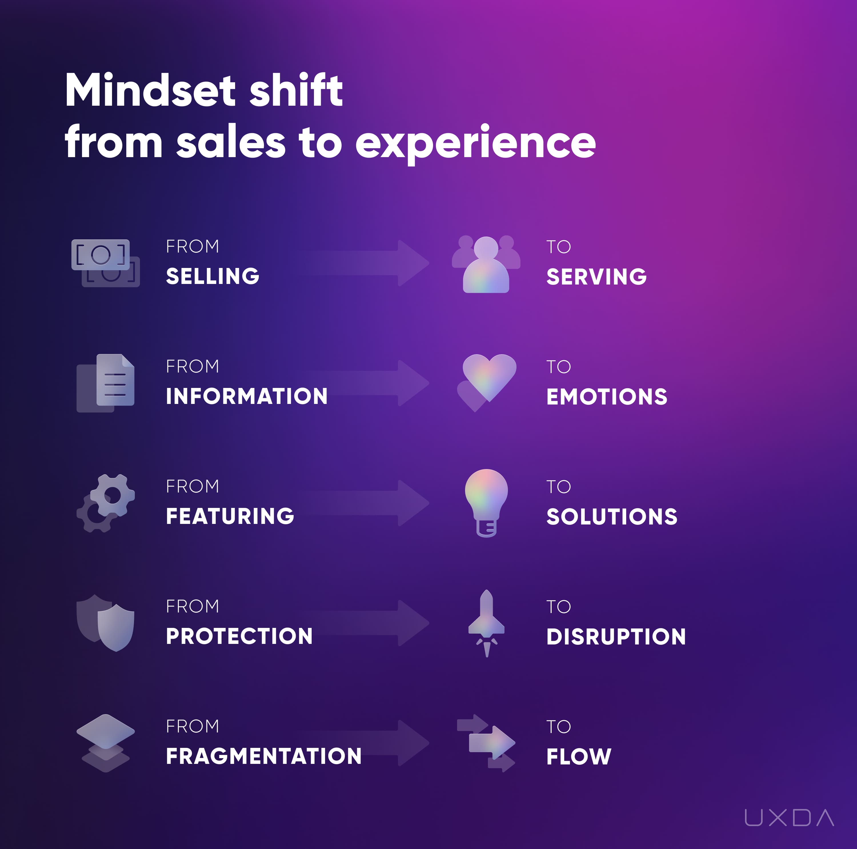
Find out If Your Mindset Fits the Value-Driven Digital Age.
As Tom Blomfield, the founder of Monzo said, "The choices consumers and employees make will dramatically favor those companies and brands with purpose, especially if they can show that they genuinely live for that purpose. Too many companies just talk about a nice mission statement and don’t back it up with action. It is clear that this will have an impact over the upcoming decade or two."
According to Mambu and The Financial Times Focus (FT Focus) research, 81% of banking executives strongly agree that replacing outdated mindsets with a progressive social purpose is vital to growth strategy.
To clearly define the main purpose of why the product exists and then implement it on all digital service levels, we need to understand what customer problems the financial company wants to solve, identify its mission and goals and determine why any potential customer should care about it. We need to ensure that the entire mission-based bank or fintech product's team is on the same page to have a successful kickoff.
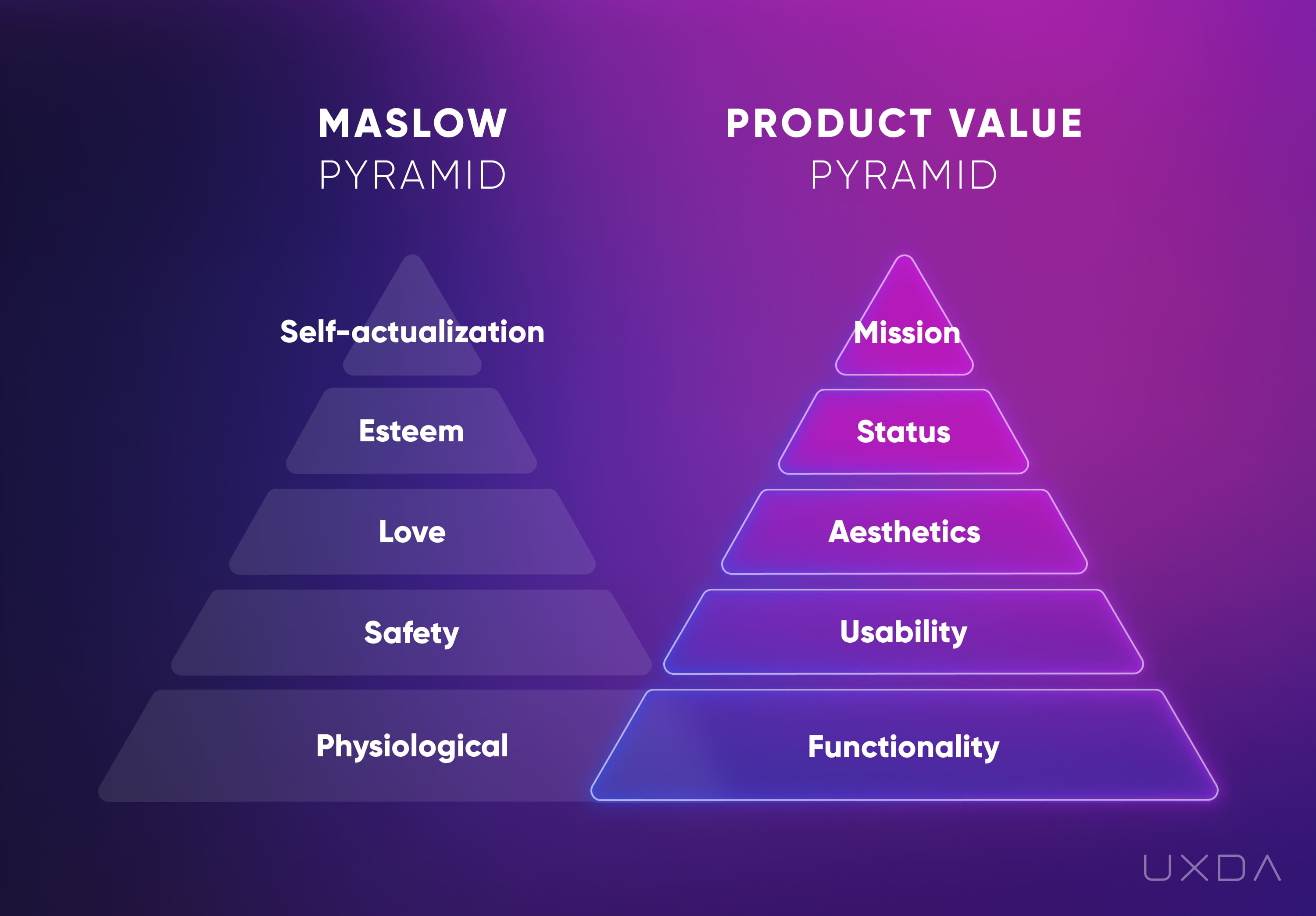
Explore how to add more value to your financial service.
For example, DBS bank builds its business in accordance with the purpose-driven banking strategy "Make Banking Joyful". It means leveraging digital technologies and embedding banks seamlessly into customers’ lives to deliver simple, fast and contextual banking solutions and experiences.
From the time of DBS and POSB being founded as the Development Bank of Singapore and “People’s Bank”, respectively, they have believed in the importance of good citizenship. Building on this illustrious heritage, DBS has continued to reinvent over the years with a view to creating a more sustainable bank by focusing on three sustainability pillars: responsible banking, responsible business practices and creating social impact.
Take a look into How Purpose-Driven Banking and Fintech Create Exceptional Products.
Time to Transform the Mindset
It is definitely not easy to implement a purpose-driven banking strategy into the culture, practice and especially digital product experience. It takes time and effort. But, it pays off with customer satisfaction and extra profits.
It's not easy to step into the customer's shoes to understand people, but we can't forget that clients are willing to pay for a product that cares for them, excites them and is easily understandable. When the financial product design is not just a template, but it's aligned with a customer-centered purpose, customers will feel the soul of the product, providing huge potential for growth.
We should not be afraid to pay attention to the words not spoken, and find the best way to implement a purpose-driven approach into the common business practice and customer service. Modern financial brands establish deep emotional bonds with their customers by transforming to a customer-centered mindset that first and foremost brings humanity and understanding to clients. We know it because we have done it before and we are here to help with it.
Get UXDA Research-Based White Paper "How to Win the Hearts of Digital Customers":
 If you want to create next-gen financial products to receive an exceptional competitive advantage in the digital age, contact us! With the power of financial UX design, we can help you turn your business into a beloved financial brand with a strong emotional connection with your clients, resulting in success, demand, and long-term customer loyalty.
- E-mail us at info@theuxda.com
- Chat with us in Whatsapp
- Send a direct message to UXDA's CEO Alex Kreger on Linkedin


