Premier Blog on Financial UX Design and UX Innovation

We’re proud to share that UXDA has been honored with the prestigious German Design Award 2025 by the German Design Council for the my.t money SuperApp in the "Excellent Communication Design" category!
7 Ultimate Digital Banking Trends Shaping Financial Brands UX
In a world in which anyone can download a banking app, just being digital is no longer a differentiator. The real challenge now is building a brand's digital experience that goes beyond basic functionality—an experience that bridges the financial brand with customers’ values, emotions and long-term aspirations.
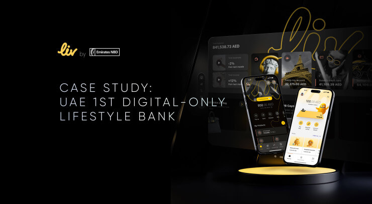
Liv Bank Case Study: Lifestyle-Driven Innovation of MENAT Digital Banking
Through a strategic and forward-thinking UX approach, we expanded the Liv ecosystem to three groundbreaking solutions: the Liv X app for seamless lifestyle and financial management, an immersive spatial banking experience for enriched user engagement and the Liv Lite app to empower children's financial education.
How UXDA Redefined 150 Financial Services Through Exclusive Digital Experience Branding
Could design, often seen as an afterthought or just decoration, truly revolutionize finance? The toughest markets need the softest touch. Confident in their beliefs, Alex and Linda embarked on a mission to demonstrate that human-centered design could play a pivotal role in the financial sector.
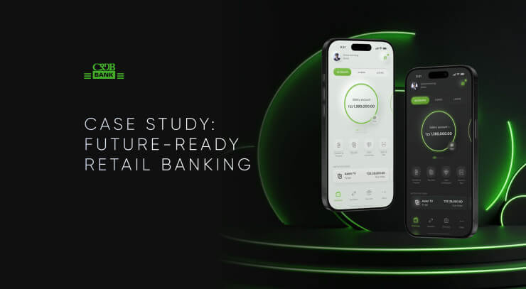
CRDB Case Study: Moving from Standard Digital Banking to a Future-Focused Brand in Africa
CRDB Bank, a leading financial institution in Tanzania, recognized the need to transform its outdated mobile app into a cutting-edge solution for the future. By partnering with UXDA, CRDB not only modernized its app but also reinforced its reputation as the bank of tomorrow.
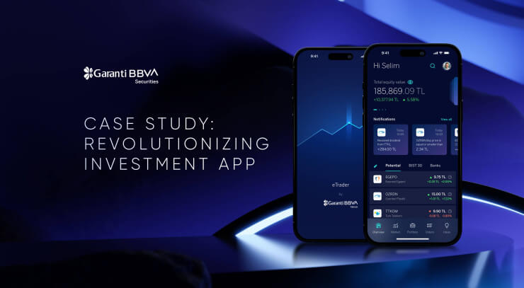
Garanti BBVA Securities Case Study: Designing a World-Class Investing Experience
Garanti BBVA Securities aimed to move beyond third-party solutions by setting a new standard for investment experience in the Turkish market. The challenge was to transform eTrader into a highly personalized, user-centered app that delivers outstanding digital experience.
Digital Transformation in Banking as a Branding Challenge
The most successful transformations in banking are not those that simply leverage technology, but those that seamlessly integrate powerful digital branding to create an emotional connection with customers.
Breaking Institutional Self-Deception to Improve Banking Customer Experience
Financial companies and banks worldwide are investing heavily to improve customer experience in banking. Despite these genuine efforts, many banks struggle to achieve the desired results. The culprit? Self-deception.
ChatGPT Prompts in Digital Banking and Fintech Product Design
This article unveils the secrets of using ChatGPT prompts to drive innovation in banking UX, providing insights into how this tool can be integrated into the standard design process for transformative results.
Role of Emotions in Banking CX: Is There Silent Revolution in Banking Services?
Successful banking apps like Revolut and Cash App thrive by creating sexy user experiences that go beyond basic functionality. In this article, we explore why injecting "sex appeal" into your financial product is the key to making it a market leader.


