There is a huge misconception that investing in customer solutions is enough to ensure successful banking digitization. According to a World Economic Forum report by Bain & Company, only 1% of $1.2 trillion digital transformation investments will actually achieve their set targets. We believe one of the causes is that only a few realize - everything starts from the core, the inner culture, the back office. As Peter Drucker has said, “the culture eats strategy for breakfast.” The UXDA team has collected a number of real-life cases that demonstrate the dramatic impact inner culture has on customers, while offering possible solutions from the UX design perspective.
What You Will Find From This Post About a Core Banking Solution's Impact on UX
- Why improving the banking back office UX is a crucial part of a successful banking digitization strategy;
- What core banking system changes can be made to significantly improve the quality and speed of the service, resulting in increased customer satisfaction;
- Why the shift to an Experience Mindset in the inner culture is critical for the survival of the traditional financial institutions;
- What is the “secret weapon” of service development all traditional financial institutions already have but don't use;
- Specific insights of the many benefits a bank could have by applying the “user experience” approach for the employees at the back office.
"Design creates culture. Culture shapes values. Values determine the future."
― Robert L. Peters
“False Missile” Threatens Banking
On January 13, 2018, a false ballistic missile alert was issued over television, radio and cell phones in Hawaii. People thought there was an incoming ballistic missile and sought shelter, because the message concluded with, "This is not a drill." It is hard to imagine what the Hawaiian people must have felt during the half hour before the next message informed them that it was a false alarm.

It looked like the fault was due to human factors as usual, but it was not. The failure was caused by a terrible interface design. “Real alarm” and “test alarm” options on the desktop were too similar, resulting in errors.

Could this happen in banking? Probably the majority of customers don't think so, because everyone nowadays is talking about banking digitization. And, if customers look at online and mobile banking solutions, it seems like everything is developing. However, the majority of financial specialists know that errors like this tend to happen quite frequently.
Skeleton in the Bank's Closet
In August 2020, the loan operations team at New York's Citibank mistakenly transferred $900 million to various hedge funds on behalf of Revlon Inc. At the epicenter of this colossal financial blunder also lies a "clerical error," as a result of a poor user experience.
Citibank was acting as Revlon’s loan agent, meant to send about $8 million in interest payments to the cosmetic company’s lenders. Instead, they accidentally wired 100 times that amount by accidentally sending $900 million to Revlon’s lenders.
Behind Citi's embarrassing fiasco looms an antiquated Flexcube interface, compounded by a lapse in the scrutiny of approving authorities. According to Ars Technica, the bank's protocol mandated a 'six-eye' or a three-person review process for greenlighting a transaction of large amount. All three reviewers—a subcontractor, an associate in India, and a senior Citibank official in Delaware—assumed the transfer going to the internal clearing account and approved it.
The subcontractor presumed that ticking the 'principal' checkbox alone would confine the funds within the bank's system. It was later disclosed that he should have set both 'front' and 'fund' fields to the clearing account.

The Flexcube UI violates almost all design heuristics and UX principles and was not completely redesigned after 2001. A simple confirmation prompt and easy-to-understand form titles could have saved Citibank half a million.
Some lenders did return the money, but others did not. Citibank filed a lawsuit in 2020 seeking the return of its funds, but a federal judge ruled in 2021 that Citibank isn't entitled to the return of $500 million. Outdated software with a poorly designed user interface contributed to an expensive human mistake.
Could any customer imagine that such a disaster could happen in the bank's backstage, behind the fancy tall glass buildings and modern front office systems such as online banking and mobile banking apps? Few people are aware that all of this is based on the work of the back office. It seems unbelievable that, despite the up-to-date appearance, banks are still operating with back-office systems architected twenty years ago.
A typical millennial, using a smartphone and other convenient tech solutions daily, would probably lose his/her mind if asked to work with a banking back-office system. Even worse, if they were aware of the level of errors the system was causing, because even experienced employees find it extremely complex and confusing to work with, their trust in the institution might decrease dramatically.
A Bain & Company analysis shows that digital natives have generated 80% of the growth in market capitalization of the top companies over the past 10 years. But, if we look at bank's digital maturity model, we realize that, despite it being the 21st century, most of the banks are still in the manual stage.
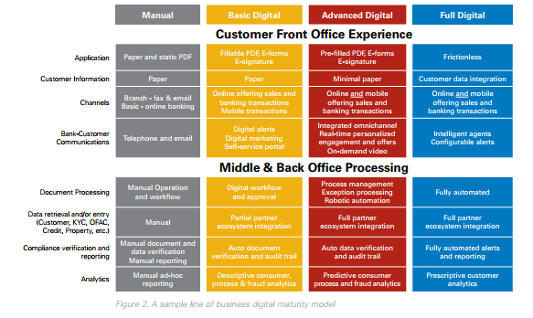
Source: kofax.com
Customer Experience Starts From the Backstage
One of the best-known entrepreneurs, Richard Branson, has said, “Clients do not come first. Employees come first. If you take care of your employees, they will take care of your clients.” In the world of business, it's a well-known truth that motivating employees is essential for the growth and success of the company.
Many financial institutions have done a lot to improve the customer experience. Digital banking has become more convenient, and now clients are able to conduct transactions and other activities via their mobile phones. Unfortunately, there are many financial organizations that disregard their employees─those who, at the end of the day, are the ones who ensure a satisfactory customer experience.
Manual paperwork still dominates the bank back office, even though there are thousands of customer requests that employees need to address. In the end, it not only causes system and human errors but also takes a lot of time and makes the process painful and unpleasant for their customers. What about creating a user experience for employees that would result in customer satisfaction?
Keep reading to explore 10 real-life experiences from the daily life of a banking employees, and how a successful financial UX design can solve these problems.
1. Truth: Priorities stuck in a legacy
Front office is the division of the company that has direct contact with the clients, whilst the back office provides the required documentation and technical support to the front office to facilitate the course of work and the business transactions.
The top priority for most banks is to improve the digital customer experience. The good news is that banking industry leaders understand that, in order to achieve a better customer experience, they need to remove the legacy system and replace it with a modern core banking solution. The bad news is that not every bank uses design thinking and has UX architects for their system development. In addition, not every core banking vendor provides user-centered, modern-looking, automated solutions.
2. Truth: Every banking “Titanic” has its own iceberg
Metaphorically, we can compare the situation in banking with a huge iceberg: the customer sees only the tip of it─the front office. What happens “under the water” at the back office is unknown to them.
The same can be attributed to the management of banks. They invest a lot in the “visible part of the iceberg” that makes the customers falsely assume that there is a high level of digitization across all financial organizations. Conversely, the real situation can be seen in the images below.

For some banks' the back-office systems still look like this. In order to work with it, employees have to read the instructions first, then manually enter the codes to choose the required function. Learning to operate with this kind of system takes approximately a month.
Real-life experience:
We were discussing partnership options on redesigning a back-office solution with a large retail bank. We went to their office meeting room for clients. It was beautifully designed and full of expensive furniture. During our conversation, we found out that the budget for getting a better designed solution was half the cost of the chairs in the room!
This example may say a lot about the priorities of banks. If we talk about the financial side of banks, the overall picture is quite simple. Stakeholders want to make a profit and reduce all expenses. Usually, the highest expenses are operating expenses, which include salaries, office, IT costs and much more. And, if the company values are all about reducing operating costs, will it invest in digital back-office transformation for employees?
Many banks are trying to reduce their back office costs, often not realizing the impact on the customer experience. This results in a paradox: banks are investing large amounts of money in digital transformation in order to improve the user experience, whilst cutting the costs of the core banking system leads to significant damage to customer service.
Bank employees’ negative experiences affect service quality and customer satisfaction. Improvements in the back-office system could lead to a meaningful increase in service quality and speed, resulting in happier, more satisfied clients.
3. Truth: Serve money instead of customers
Many customers know that banks may apply exceptional rules (like a personal manager or special price plans) for customers who have high-balance accounts. But a lot of customers might have no idea that some of the rules applied to “exceptional” clients can be in violation of the official bank's internal policy rules and could also overstep ethical values.
In the first month, an employee who has recently been hired needs to learn the Know Your Customer (KYC) principles and identity rules. Employees have to memorize these exceptional clients because it is forbidden to ask them for an ID document when they come to the branch. That is against the standard procedure and could cause a security breach because new employees don't always know who is special and who is not.
Real-life experience:
A new employee who had been working for only a few months was serving a client as usual and asking him for a passport. The client instantly got angry and explained that he is never asked to show the ID documents, so he had left them at home. The employee politely explained that every client must be identified. At that moment, one of the experienced colleagues walked by, recognized the client and started apologizing to him. It turned out the standard identification procedure did not apply to “special clients” who have an account balance of at least 6 digits, and it is forbidden to ask them for an ID.
The digits are the priority not people. This kind of mindset is quite widespread. When a person starts working at a financial organization where this kind of thinking dominates, soon they become like others and start thinking in the same patterns.
For example, an employee who had recently started working at a bank became a witness to a conversation between two friends─one very wealthy and considered “special” and the other just the “usual client.” During the conversation, they discovered the dramatic differences in the banking service that was provided to them. The employee probably would feel ashamed and wouldn't even know what exactly to say if asked, “why such unfairness?”
Real-life experience:
A client came to the branch to open another bank account. The employee filled out all the required documents and informed the client that the standard process takes approximately two weeks. The client asked if it's possible to speed it up because he wanted to receive the next transfer to the newly created account. The employee went to the head of the department who told him that it's possible to activate the account within one week, but they need to check the client’s profile. As the balance of the current account was only around 600 EUR, the client wasn't considered “a big fish,” and his request was denied. After a week or so, the client returned to the branch for additional paperwork in connection with the incoming transfer. The head of the department was addressed repeatedly, but this time he got indignant, asking why the employee hadn't contacted him the first time this client came with his request (even though he did but was declined). The manager declared that the account will be activated the same day. A lot of things went through the mind of the employee at that moment, but one thing was clear: the bank activated the account because the amount of transfer the client was expecting exceeded 1 million EUR.
Unfortunately, this is a culture impact. If you don't share the same value system, it is not possible to go on with everyday duties, cooperate with all the other departments in the organization and constantly be under the manager’s supervision. As a result, employees are trained to constantly look for ways to get more money, instead of ensuring the best possible service for the customers.
For such organizations, there is a risk that digital transformation and user centricity could become just a few of the many marketing strategy tricks to extract money from clients. And, even though most banks are built on traditions established through the years, the image of stability might be faulty. In the context of digital age requirements, such thirst for stability might lead to extinction.
Truly human-centered organizations perceive their customers not as wallets, but as humans whose problems must be solved. Those companies provide care and value to make the world a better place for living. Such an attitude inspires their employees and customers so, at the end of the day, the companies get needed funds and support to scale up their impact.
4. Truth: Features instead of solutions
Usually, the core banking software is fully overlooked by the IT department. And it is no secret that people who work there are very technical. Empathy for IT professionals might seem like an unnecessary trait, maybe even a burden. But, empathy is the core of creating a product that provides solutions for clients’ problems and pains. Often, the IT professionals, whilst great at solving complex programming issues, can't imagine what the user scenarios will be, what is the usage context and how it impacts customer service.
Real-life experience:
The bank's IT department had to integrate a new function connected with cash operations. Serving a client, an employee needed to use the new feature but wasn't able to find it in the system. He thought that, since the function had a connection with cash operations, it could be grouped together with the other cash functions, but that wasn't the case. As a result, the employee had to call the IT department. They explained that the function could be found under the section “Other.”
Needless to say, in this situation, the client was frustrated because it took a long time to complete the operation, and it seemed that something was not right, either with the employee’s knowledge or with the client’s account which resulted in stress and anxiety.
Most likely, in this case, the IT department didn't even consider this situation their mistake. They were told to add a function, so they did. And, from the customer’s viewpoint, was it a good service? Did it give a good impression of the bank?
To solve these kinds of situations, banks could create a position of Chief Experience Officer whose duty would be to ensure that the business processes and services are designed according to customer and employee needs.
5. Truth: Sitting on a gold mine
Banks spend a lot of time and resources on business consultants, but there is always a free source of improvements available: their employees. Among thousands of employees, there are always some who constantly want to improve everything and have great ideas. Unfortunately, most banks do not appreciate this source. The usual mindset states that, if the employees are performing their daily work, everything is fine in the company and additional initiative is not welcome.
Banks have historically been very conservative in hierarchy rules. That's understandable, because they are holding third-person money reserves. The problem is that some managers and executives pretend that the innovations and fast digitized financial world does not apply to them. Or, even better, they acknowledge the needed changes but try to make others and themselves believe that it's still possible to survive with the traditionally conservative mindset. The question is...for how long?
This kind of culture value might be damaging for the people who have high potential. They have only two options: to become the same as others─robotic performers of their daily duties, no questions asked─or leave the organization.
How can you change a mindset like this that is rooted deep in the bank’s structure? The answer is to disrupt the culture of the organization. To challenge all the possible status quo and search for better solutions. It is incumbent upon us to find those employees we described, make them innovation ambassadors and put them in the place of those executive team members who blindly reject the need to change.
6. Truth: Complexity overdose
As one of the bank employees said: “When I was accepted for a position at a bank, my friends who had been in touch with the financial institutions warned me about the complexity of the back-office software I'd have to face. At that time I thought, it can't be so bad, the bank seems really modern. But, when I finally saw it with my own eyes, I was shocked. It looked like some computer programmes I had seen in my childhood, about 20 years ago. I wondered, is this a joke?” Turned out, it wasn't.
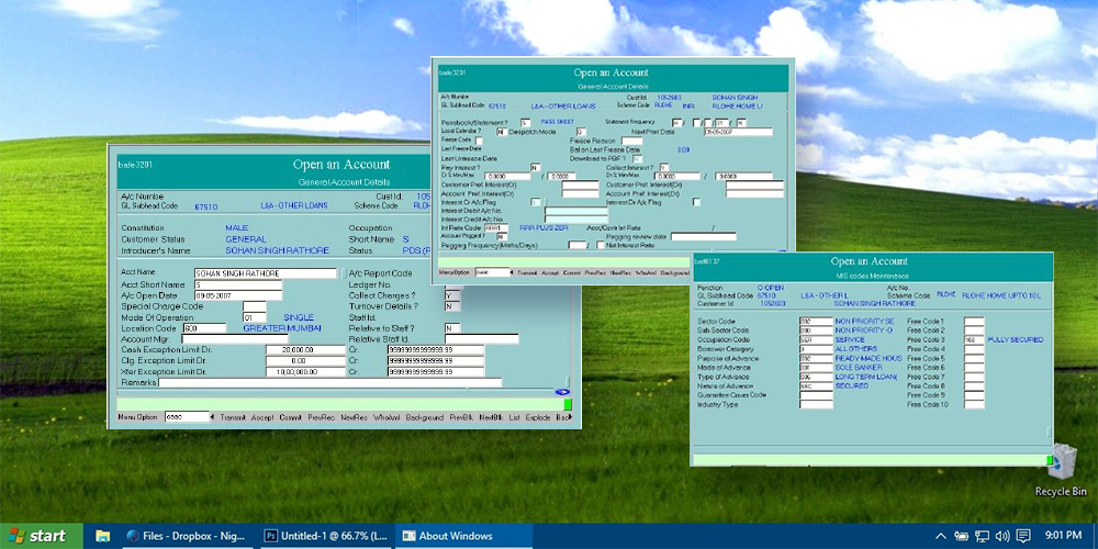
A similar example of how some core banking systems look like
When an employee is put in front of a system like this, all of the illusions about a job at a modern, innovative bank fade, especially if there is a millennial in this position. A comparison here can be made. Imagine your discomfort and shock if you had to switch from an iPhone to an old Nokia.

There can be up to four different kinds of software that employees have to learn to use, remembering the numbers, codes, functions and which kind of information to look for in which of the software systems. It is self-evident that, with this amount of information, the risk of making mistakes increases dramatically, and let's not forget we are discussing finances here.

Another crucial factor: most often, these different core banking software systems are provided by different vendors, so the design and information architectures are totally different. The employees should make a great effort to learn how to solve this puzzle, instead of investing the time in figuring out how to make customers happy. By the way, all the needed functions are often not included in those multiple programmes, so the employees have to use MS Excel.
The right solution from the design thinking mindset would be to perceive everything as a whole, instead of fragmented, unconnected parts. In this case, it should be one system that is consistent and connected, that applies the same principles and rules for action, so that the employee doesn't have to adapt to the different features of every system.
There is no doubt that, when it comes to finances, it's extremely important to ensure a proper security configuration, but it should not impact the employee journey and ruin service flow.
The proper way of ensuring the right information and visual architecture is by conducting full user research, mapping pain points and defining and identifying key user personas and scenarios. Only after user-centered design process can the product then be tested. Once the tested architecture has been implemented into a design, a specialised Design System works as an unifier for all visual and architectural components in order to ensure a perfect consistency on all levels.
7. Truth: Provoking human error
People are used to the comfort of digitalization: food ordering by phone, online stores, e-government, voice assistants, even medical monitoring by wearables.
Customers expect the same automation level in banks. After all, they trust the employees to help manage their finances. Despite that, as mentioned earlier, banks still use a lot of document forms that have to be filled out manually by hand. But, usually, the bank blames the client, not its system, for signing the document before carefully reading it.
In a study of one of the European banks, it was found that more than 70 percent of the applications are paper-based. In addition, up to 40 percent of the forms contained errors and required reworking. Applications often got stuck in the data-verification stage for more than five days before being processed, and, because of the lack of IT integration, branch and back-office staff had to enter data manually into the workflow from several systems (source: mckinsey.com).
The daily job in client service takes up a lot of an employee's energy. It is necessary to adapt to every customer, to understand their needs and find a better solution. Sometimes (and not rarely), there are demanding clients who morally push the employee. Of course, with this kind of stress and overall workload, there is a high probability of mistakes. To fix the mistake, the employee should call the client and ask to come back to the branch. This is usually an embarrassing process resulting in the client being very angry, so it is double the stress and negativity for the employee.
As Howard Rheingold has said, “When designers replaced the command line interface with the graphical user interface, billions of people who are not programmers could make use of computer technology.” It might sound ridiculous, but banking employees still have to remember the ciphers and/or codes to use the full functionality. Most often, it's very difficult to make sense of all the ciphers and/or codes and the function they activate because there is no logical, understandable connection. The employee just has to memorize a huge amount of information. So, there is no intuitive way through user-centered information architecture to find the necessary function quickly and without a lot of effort.

To access the function the employee has to manually enter the code consisting of letters and numbers displayed on the screen
Real-life experience:
A client wanted to sign a deposit agreement with interest payment frequency every three months. First, the employee had to find the function through a code or in the list. After that, he had to select the type of deposit─not by name, but by a code. The employee had written down all of the codes in his notebook, so it took some time to find the right number and letter combination to enter in the system. When that was done, the employee had to indicate the interest payment frequency that also required a code. Unfortunately, the employee didn't know the exact code for this function, so he used a similar one that could also apply to this situation. Finally, the client (kind of annoyed about how long the process took and surprised about the employee using the notebook) signed the papers and left. After a while, the employee received a call from the Deposit Department asking, “Are you sure that the client doesn't want interest payments?” As it turned out, the employee’s assumption of the correct code was wrong. The employee was disparaged and had to call the client and ask to come back to the branch to re-sign the agreement.
Who was responsible for this mistake─the employee or the core banking software? One of the main UX principles is that the interface should be foolproof and intuitive. The user must be able find the required function with minimal effort and be safe from failure or misunderstanding. Maybe instead of investing tons of time and money in employees’ learning and failure solving, it might be more beneficial to make the software usable.
Digital transformation is about eliminating paperwork and implementing usable automation tools to manage the documents. Also, as a part of eliminating mistakes in core banking with UX design, it is really important to create a Failure Map, recognising actions, patterns and conditions that lead to upcoming errors and ensuring they are reduced.
8. Truth: Search in a “dark room”
Looking at this from the UX perspective, the productivity of the core banking software could be increased dramatically if the back-office system could “communicate” with the employees, guide them if necessary, give a learning tip and remind them if something is forgotten. This could result in a significant reduction of human errors.

Example of a real-time checking that might help reduce the errors
Real-time checking is actively used in customer forms. The support of artificial intelligence in banking allows the prevention of mistakes by analyzing previous failures and considering the context. This could be implemented in the back-office solutions as well. For example, after entering the account number, the system automatically displays the client's name and other details that the employee would otherwise have to fill out manually. Also, employees have confessed that, when working with foreign clients, an incorrect spelling of the name is a common mistake. A smart, user-centered banking software could automatically provide the correct name and save both the customer and the employee from making mistakes.
Real-life experience:
A client wanted to open an account for his company. The employee filled out the form and submitted it to the department that had to review it. After a while, the employee received a call. He had left out the field of the year when the company was established. As all of the forms were filled out on the computer, it was forbidden to just fill the empty space by hand. So, the employee had to call the client and ask him to come back to the branch to resign the documents.
This wouldn't have happened if the software communicated with the employee, notifying that it's not possible to finish the process because there is an important field left blank.
Real-life experience:
At some banks, there is a possibility of ordering cash withdrawals for a third person. A client requested a cash order for his friend, who would receive it the next day. The employee had to fill out a special form with many input fields, but he knew from his experience that it is was not necessary to fill all of them. The next day, the employee received a call from the cashier who told him that a person had arrived for the cash, but it was impossible to give it out because all of the fields had not been filled out. The employee tried to explain that this is not the first time he had submitted a form with blank fields, and it had always been accepted. The cashier refused to accept the form, and the client did not receive his money.
In this case, there wasn't a clear understanding of the quality standards that resulted in an unpleasant situation, not only for the client but for the employee as well. We need to take the financial solutions out of the “dark room” by ensuring their сompliance with usage patterns, perception laws and user expectations. In the digital age, software should adapt to the users and not vice versa. User-centered design process could help to solve this problem by reducing the learning curve and cognitive load.
9. Truth: Hat-trick with the paperwork instead of a rabbit
When the organization has all the documents in paper format, and they have to be reviewed by two or three different departments, it's no surprise that something gets lost… and that something might be important for the client.
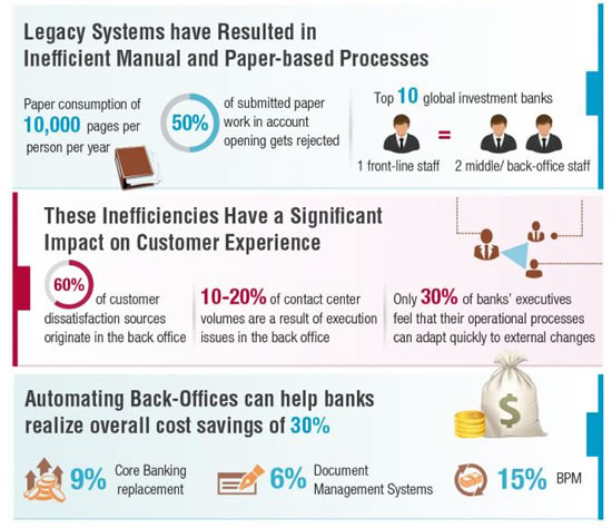
Source: Capgemini Consulting
As we can see from the infographic, automating and improving banking back offices can not only dramatically increase the customer and employee experience but also help banks realize overall cost savings as high as 30%.
Real-life experience:
A client requested a new payment card and chose to pay the additional fee in order for the process to be expedited. The employee filled out all the forms and promised that the card would be ready the next day. When the client arrived for his new card, the bank had nothing to give him. As it turned out, the request for the card was lost somewhere between the departments. The situation was made even more frustrating and unpleasant for the client because he had a business flight in a few hours and had ordered the card specifically for the trip.
It really seems unbelievable that this kind of situation is still possible in the age of digitization. We are talking about huge banking institutions with billions of dollars owned by people. How is it even possible that something can just get lost? And, if this is a document, then where is the guarantee that the next time it won't be money? Situations like this critically lessen the trust in banks. It is no secret that this results in more and more people deciding to leave their banks and trust traditional financial solution alternatives like FinTech.
This could be solved by a centralised banking software, that would allow employees to fill out the forms digitally and quickly with minimal effort, store all the information in one database and make it not only easily accessible for all the involved departments but even deliver a notification that a new high-priority request has come in that has to be reviewed immediately.
10. Truth: The invasion of “Bugs”
Unfortunately, human errors are not the only ones. There are also system errors or “bugs.” Of course, this happens with every software, but, unfortunately, banking employees have to face the bugs much more often than acceptable. Even more so, let's remember we are talking about a banking software that has to be especially safe and stable.
Real-life experience:
A client was buying new equipment for his business. He and his business partner came to the bank to make a transfer of 300K. As this was a deal of a considerable amount, the business owners had come to the branch to fill out some additional paperwork. The two businessmen were waiting in line for about 20 minutes, when the employee came to them and told that, unfortunately, the system was not responding and they could try to come back in an hour. Of course, this turned out to be a very unpleasant situation, because the busy man did not have more than two hours planned to make a single transfer.
There are also other types of errors. For example, the document suddenly doesn't save so the employee has to fill the form in again. Or, another error, the banking software is not able to perform several tasks at once.
Real-life experience:
A client knew that soon he'd have to make the last payment of his mortgage loan. So, he went to his credit manager and asked for his credit report. The employee selected the appropriate function in the banking system and entered a date. This was a voluminous report covering the last 20 years. For the next 15 minutes, they were both just sitting and staring at a wall because the software was very slowly generating the report, and there was no possibility of performing other tasks because other functions on the computer were simply not working.
To prevent such situations, software developers should uncover the most critical scenarios and how software should operate. It is really helpful to analyze “bottlenecks” by collecting employee feedback, thus taking out friction and greatly improving the customer experience.
Summary
Some readers may think that all these banks we have described are outdated. The truth is that almost all the aforementioned banks have quite modern-looking front-office systems. They are seemingly suited for the customers’ needs, with responsive online banking and awarded mobile banking apps.
Most of the people have never even thought of the idea that all of their money, maybe even their life savings, could be subjected to errors because of a complex, outdated core banking software. Unfortunately, the human errors and the system “bugs” are only a few reasons why it causes such inconveniences, takes a lot of time and is not secure.
There is a solid correlation between the customer experience and successfully developed banking back-office systems (that integrate user-centered design principles). Despite that, for some executives, it might still be a hard decision, because UCD process takes huge investments and a lot of time, sometimes even years.
What we advise is that the banks don't rework the whole system of the business at once. It's crucial to start with shifting from a Marketing Mindset to an Experience Mindset. This radical change will enable the transformation of the organization's inner banking culture to become user-centered, automatically highlighting functions/departments that need immediate improvement. In the end, this is not a question of whether to do it, it’s a question of surviving in the digital age.
Read a case study of humanizing a banking solution and moving it to the cloud >>
Get UXDA Research-Based White Paper "How to Win the Hearts of Digital Customers":
 If you want to create next-gen financial products to receive an exceptional competitive advantage in the digital age, contact us! With the power of financial UX design, we can help you turn your business into a beloved financial brand with a strong emotional connection with your clients, resulting in success, demand, and long-term customer loyalty.
- E-mail us at info@theuxda.com
- Chat with us in Whatsapp
- Send a direct message to UXDA's CEO Alex Kreger on Linkedin


