After a successful exit to Zomato, a company from India with revenues of $890M USD, a couple of entrepreneurs dreamed of a FinTech product that would help make financial decision-making easy for the masses. Thus the Runrate app was born. The Runrate app seamlessly combines planning, budgeting and investing with a philosophy of manifesting the future. And, to create such a never-before-seen product, you need the courage to change your mindset and enter the unknown.
Challenge: Reinvent Financial Management by Using Manifestation
The Runrate team challenged the UXDA team to design an app that provides a guide for better financial decisions. Users typically invest based on in-app offers, but, to help customers achieve their dreams, the Runrate team questioned that approach. We found that users needed help to first formulate the meaning of these investments by manifesting the desired goals and only then build a financial strategy.
The Runrate team were looking for financial service architects who were able to implement the purpose-driven philosophy in the digital product and translate it into design ─ to inspire customers and provide a sense of fulfillment and excitement. In other words, add soul to finance and focus on what really matters ─ the person. So, our key challenge was to find the true meaning behind financial management and investment.
The Runrate team noticed that a lot of advisors and wealth managers only talk about how much capital growth they can produce but don't help their clients prioritize financial life goals and understand the opportunities this money can bring.
So, the Runrate project united a team of different specialists with a silent mission to free people from a compulsive lifestyle driven solely by money ─ they wanted to be well-meaning evangelists. They shared a belief that positive affirmations lead to materialization; you can achieve anything you want if you just put your mind to it. These ideas also inspired the UXDA team, and we wanted to implement their philosophy into financial management product.
Solution: A Next-Gen Platform to Help Users Manifest Their Future
Together, we created a unique vision and product strategy that helped the client clarify the business model and development strategy. We have introduced a next-gen product design that combines habit formation and motivation and goal setting and gamification theories, focusing on creating an engaging experience that helps users manifest their future.
With a UX approach, Runrate clearly defined what their financial management app should feel like and strategically implemented their creative ideas into the product ─ from UX strategy and killer features to the visual language and design system.
Product scope, strategy and priorities frequently changed while we were looking for a vision for the Runrate application. The UX research process, on the one hand, continuously expanded our knowledge about users and the product. On the other hand, it introduced new variables and ideas into the vision of the product. At some point, this led to heated debates about what to take into the project and what to discard.
We developed dozens of new ideas, such as financial advisory services and a community section. These ideas often led us in different directions and required a rethinking of the purpose and vision of the full product. Because of this, at times it was hard to keep the team on the same page about a shared product vision. Unfortunately, we were aware of projects that could not overcome such disagreements and ended up crashing.
Developing a new type of product always runs the risk of being unclear to users. As we implement non-standard features, user interaction may get complicated because of the need to learn and adapt to an unfamiliar mental model. To seamlessly integrate that unique model, we focused on researching user scenarios, prioritizing features in line with the business purpose and developing intuitive user flows.
To overcome this creative chaos, we strictly followed the user-centered principle in our work ─ to build functionality according to the needs of the user. Therefore, during the project, we placed emphasis on carefully developing user flows for the main scenarios in this particular product.
This strategy helped us turn a threat into an advantage. We used this ambiguity to the project’s benefit: a vague statement of the final goal of the application untied the hands of the team and gave us the courage to generate and test even the craziest of ideas.
Approach: Find Meaning Behind Money to Bring Back Users' Excitement About Living
Financial planning isn't the most interesting thing for many. It's not easy to create long-term saving or investment habits, as that often isn't associated with positive emotions, and immediate needs feel more important. Also, at some stage, financially affluent people lose the joy of living. They earn money but no longer have a sense of fulfillment.
That made us switch focus from “Where do our users want to invest?” to “What do they want to achieve?” By taking into account insights from the UX research and placing a human being with hopes, fears and doubts at the center of our approach, we were able to create a financial management product vision that allows users to focus on their dreams and helps them bring back an excitement for life.
The Magic With Two Dashboards
Users of the Runrate app can sort their dreams into three categories: short, long and lifetime. They can also follow their savings visually with three progress bars: the pink color indicates short-term dreams, blue is long term, and green means lifelong dreams.
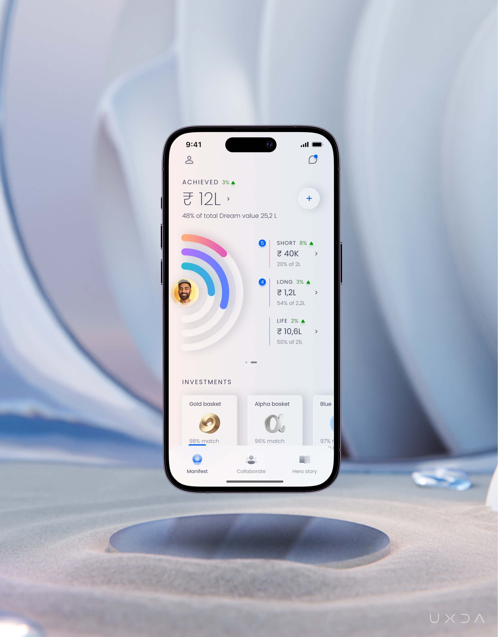 Dashboard with dream categories
When a user sees their short-term dreams being fulfilled, it excites them and gives the confidence boost to reach even their wildest long-term dreams. We based these categorization and motivation solutions on the Goal-setting theory ─ if you want to achieve a goal, it should be specific, measurable and time-based.
The next important step in achieving their dreams was visualization. This is where the manifestation comes into play. To help the users manifest their future, we created a second dashboard option, a visual experience that encourages the manifestation process. Here, the users can turn all of the progress bars into pictures of their dreams; now they are literally living inside of their dream future.
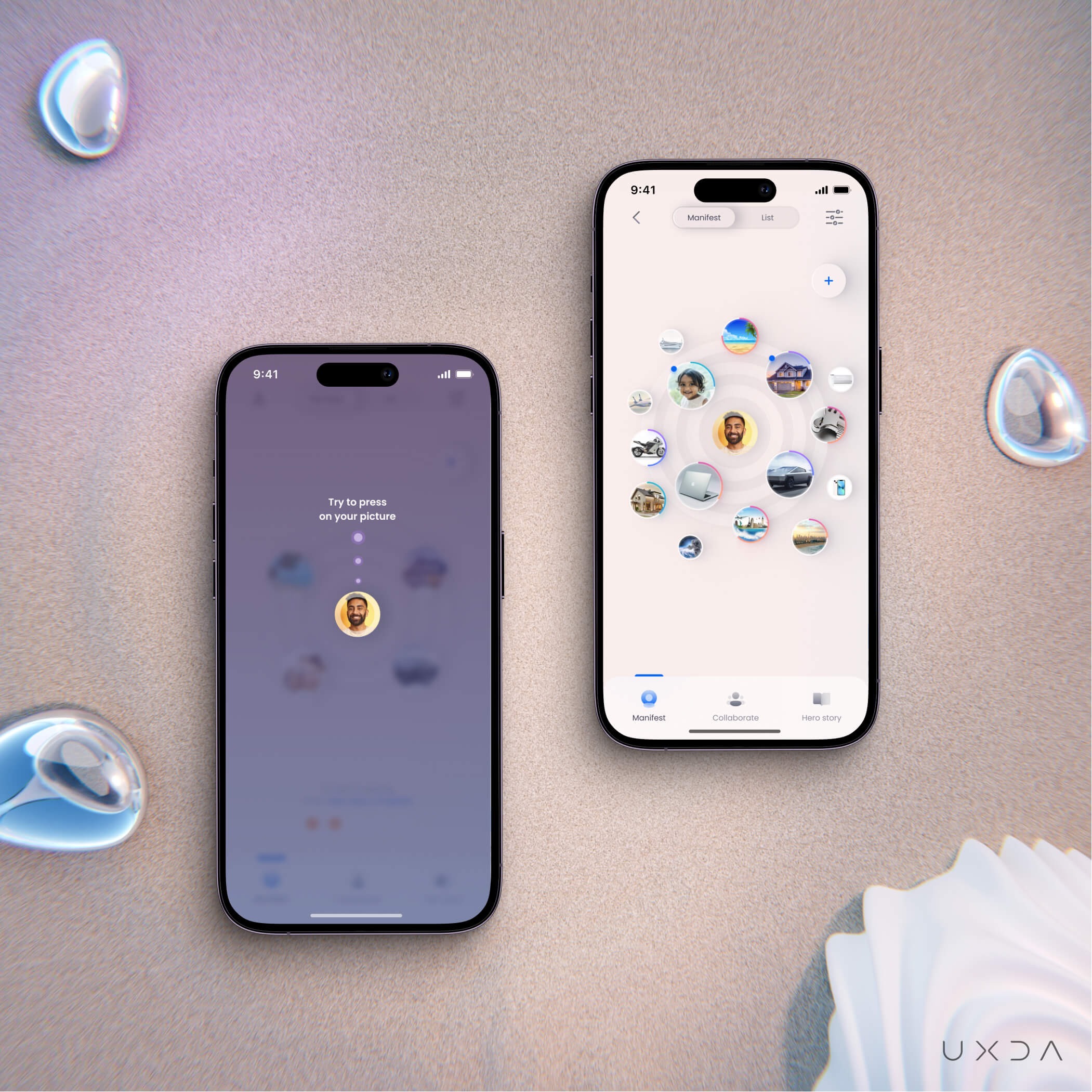 Dashboard with dream manifestation
To Achieve Dreams, We Need a Plan
When the users share their financial data and set up all of the dreams they want to achieve, Runrate then creates a step-by-step plan with tasks and instructions on how to achieve these specific dreams with given value and in the established timeline.
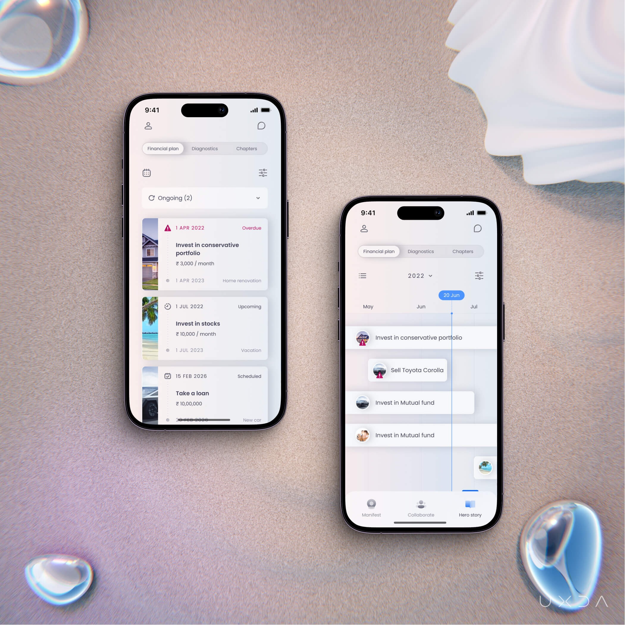 Task screen - list and calendar views
To avoid the risk of losing motivation by setting unrealistic dream goals, Runrate assigns tasks that are customized for the user. For example, if a user’s annual salary is not measurable, the app won't let him set up a “Buy a new house every year” dream.
In this way, the users are more likely to feel excitement knowing that, with the Runrate app, their dreams can actually become reality. In addition, following the progress bars creates a healthy habit ─ keeping a hand on their “financial pulse.”
The flow and structure of this app was built so that the users can establish their life dreams and focus on the work needed to achieve them.
Reduce Potential Client Drop-Off Rate
In order for the Runrate app to set up a realistic dream-achievement plan, it was necessary to collect a massive amount of data from the users. But, nobody really wants to spend a lot of time filling out information about themselves. So, how do we find a balance?
Balance is the outcome of teamwork. In the beginning, the client came to us with a seemingly logical idea: users should input all data about themselves to continue with their dream creation. However, in our experience, this solution wouldn't get users excited; instead, they'd have to spend a lot of time setting up their profile.
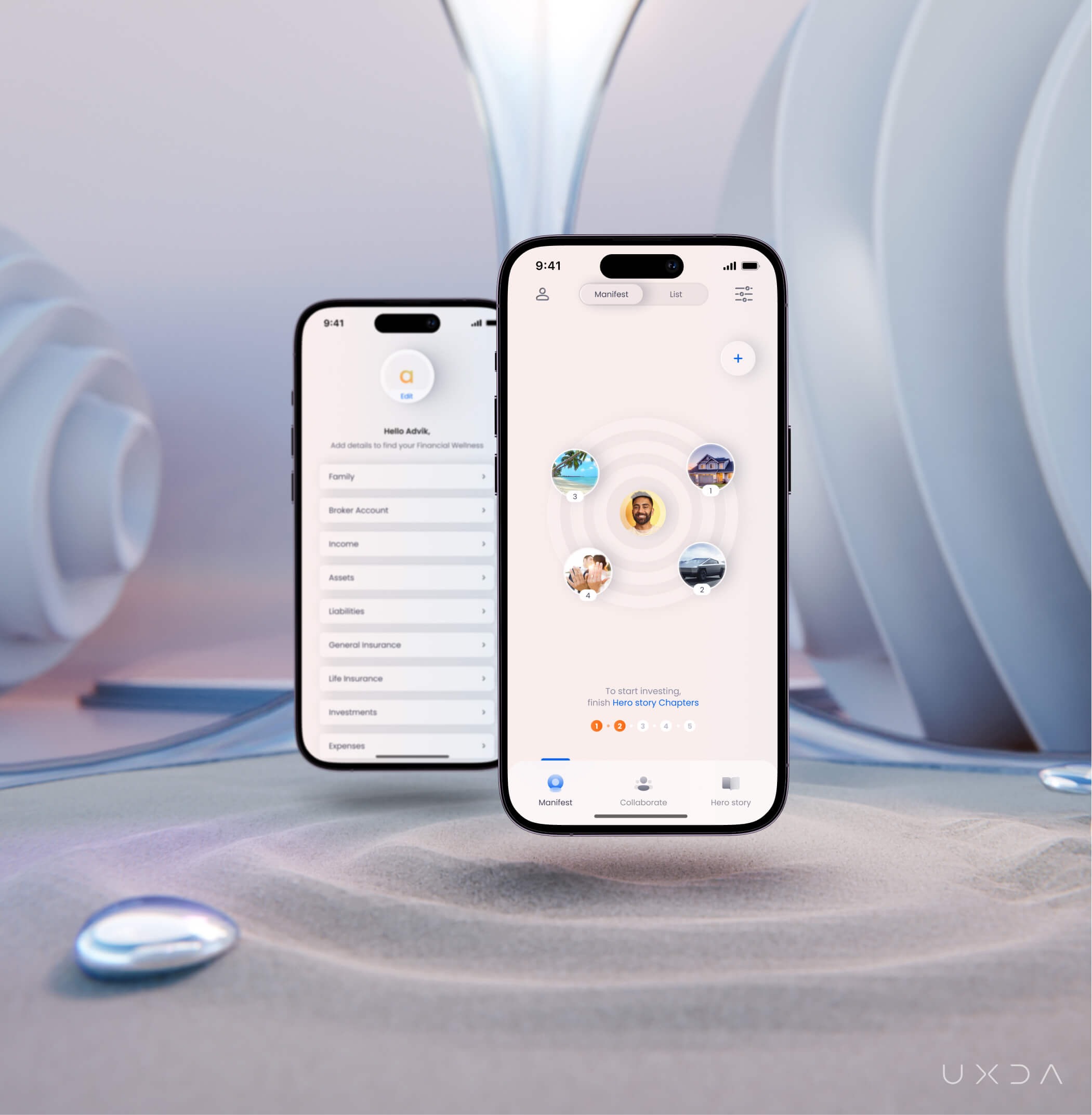 Before - After screenSo we turned it around. Users were then able to quickly add their dreams, and only then would they have to input all of the data to receive a plan for achieving them. In this way, the app builds motivation and gives an answer to the question in mind ─ why should I spend so much time setting this all up?
Have You Written a Chapter of a Book?
Not only is the amount of information input decreasing nowadays, but the users are also becoming increasingly conscious about sharing personal data at all; they need a good reason to do so. So, we implemented a storytelling approach throughout the whole product experience in which our user is the main character. By sharing their personal data, they are writing their own story.
To further emphasize this idea, we divided the needed data into five chapters so the user can “write” his/her book chapter-by-chapter. For example, their income and expenses are under the chapter “Once upon a time,” but their loans are under the chapter “Hero's luggage.”
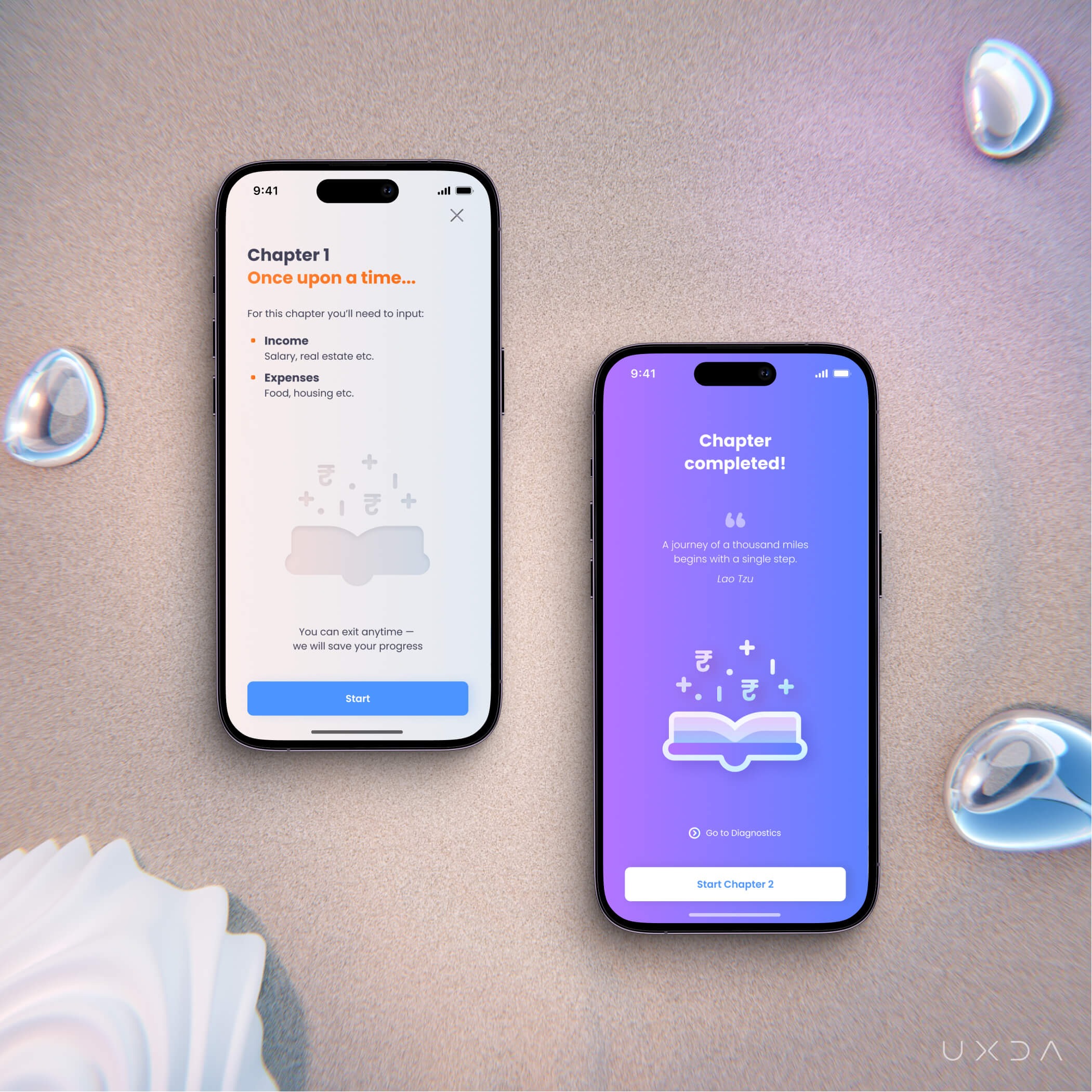 Starting a chapter screen, and finishing a chapter screen
Rewards for Information
To continue motivating the users to actually finish all the chapters, we implemented gamification elements with rewards, because who doesn't like being rewarded?
First, in the beginning of each chapter, the user sees the outline of a “sticker,” and, when a chapter is finished, they receive it as a reward. This strategy utilizes some of the users’ core motivation drives.
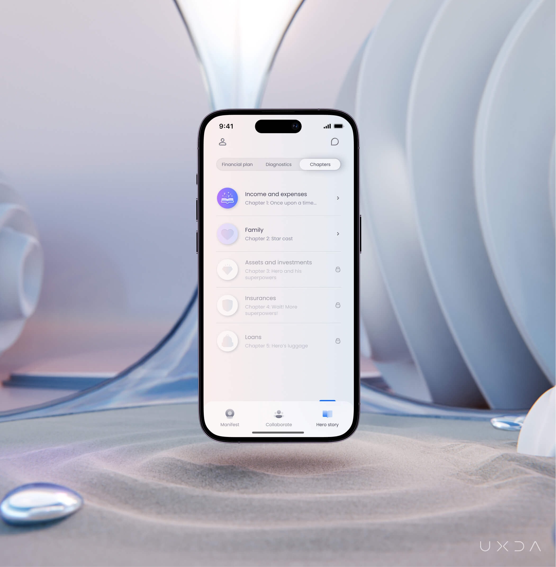 Chapter list with stickers
The “sticker” concept also solves the design need ─ to visually distinguish completed and incomplete states, as well as highlighting and celebrating the completed parts.
By gamifying the experience and evoking core motivations, we might be able to reduce the drop-off rate of new users and set the tone for further interactions with the product.
Helping the Dream Creation Process
As we discovered by interviewing potential users, often people know that they want a better future, but it's hard for them to name specific dreams. Therefore, if a goal is not known, it's impossible to reach it. How do we get the users to put their dreams in writing?
To ease the decision-making and help users discover the possibilities, we introduced the “dream catalog.”
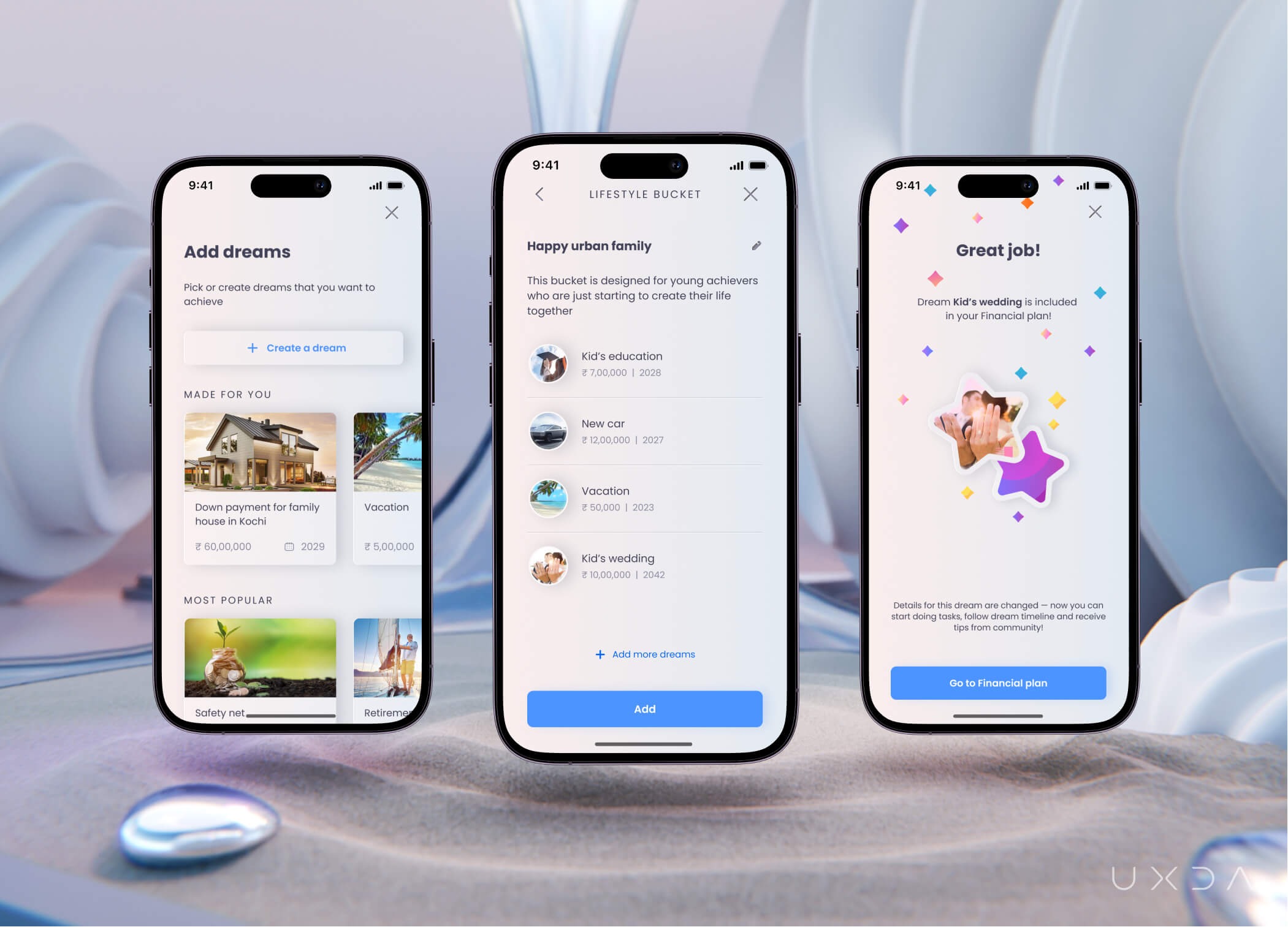 Dream catalog, dream "bucket" and dream visualization screens
The dream catalog makes it possible to choose pre-set dreams based on the data the user has provided. Users can also choose dream “buckets'' with dreams that might be suitable for their desired lifestyle, for example, “wellness improvement.”
By focusing on providing visual experiences, we were able to reduce the cognitive load for the users and offer ideas for future dream goals.
Disruptive Innovations Arise From Crazy Ideas
Creating a financial management product from scratch is often a confusing and complicated process. If there are only a few strict requirements, then the insights from the research process can take us in many different directions.
However, this blurry setting of what exactly this app is gave us the opportunity to put a heavy research focus on behavioral science and gamification principles, as well as generating and testing the craziest of ideas. And, despite the creative chaos resulting from the project, we adapted functionality to the user needs and not vice versa. That was how we were able to build a human-centered product.
The app is now available on the Indian market in App Store and Google Play.

UXDA Deliverables
- Stakeholders’ interviews
- Product strategy
- Contextual market analysis
- User interviews
- User personas through a JTBD framework
- User journey map
- Scenario prioritization in a red route map
- Information architecture
- Value storyboard
- Product experience movie
- User flow maps
- Wireframes
- UI design
- Design library
- Product motion design
Takeaway: Have the Courage to Shift Your Mindset
With a creative team and open-minded approach, it's possible to carry out extraordinary ideas and combine even seemingly unimaginable things, as in this case, finances and dream manifestation. We all get inspired by many different things ─ art, music, philosophy, movies, etc., and we don't even think about how these things can sync with the financial industry. But, all of this relates to the human experience, to our emotions and the meaning of life. And we need the courage to shift our mindset and bring all of that into the financial world to put real meaning behind the money!
Discover our clients' next-gen financial products & UX transformations in UXDA's latest showreel.
If you want to create next-gen financial products to receive an exceptional competitive advantage in the digital age, contact us! With the power of financial UX design, we can help you turn your business into a beloved financial brand with a strong emotional connection with your clients, resulting in success, demand, and long-term customer loyalty.
- E-mail us at info@theuxda.com
- Chat with us in Whatsapp
- Send a direct message to UXDA's CEO Alex Kreger on Linkedin


