Some banks are still using products designed 10 years ago, while some Fintechs do updates every 5 days and full redesign every year. If you are unsure when to redesign your digital bank's app, test your situation using our 10 red flags checklist and explore the 7 steps to take toward a successful redesign.
Based on years of research and experience in developing more than 100 financial services in 36 countries, I offer you a test to measure how much your financial service needs a redesign. I go over and explain each point in detail below, and outline seven key steps for an in-house digital product redesign strategy.
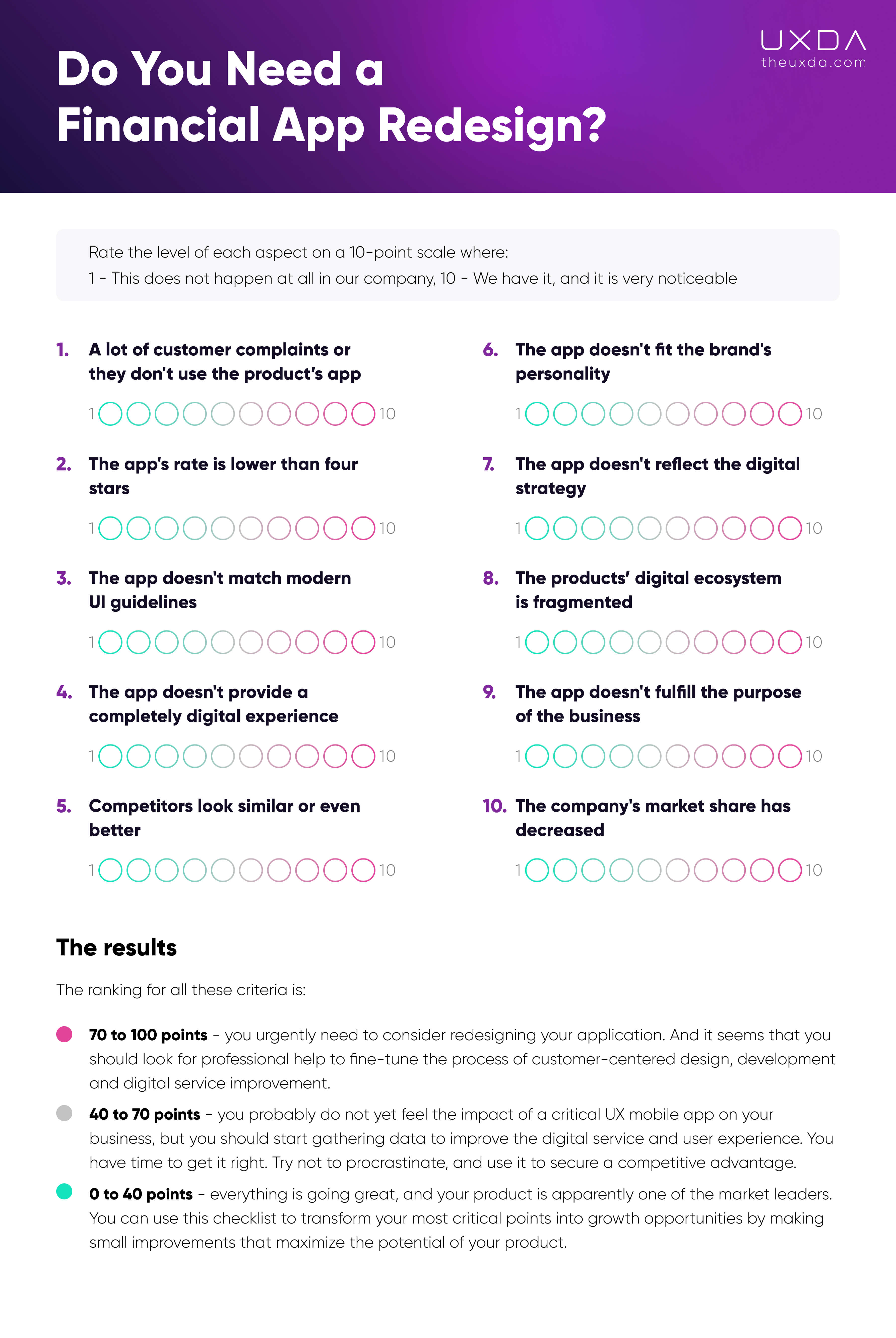
Test: Do You Need a Financial App Redesign?
Rate the level of each aspect on a 10-point scale where:
1 - this does not happen at all in our company
10 - we have it, and it is very noticeable
So that you can progress through the checklist efficiently, the list in PDF format is available for saving and printing:
1. A Lot of Customer Complaints or They Don't Use The Product’s App
What percentage of your customers use your mobile app? According to statistics, 90% of customers already use mobile banking. If your customers prefer a desktop solution or branch visit, it's not because of their age or mentality; it's a wake-up call. It means that your mobile app does not meet their expectations, and is not easy to use.
Check how many complaints you receive, and how many users contact your technical support. If your contact center is overloaded with questions about how the app works, and the wait time is increasing, then a redesign of your app should be considered as soon as possible. If there is insufficient information to define clear improvement criteria, you can conduct a customer survey. Regular customer surveys are a great way to keep your products competitive.
2. The App's Rate is Lower Than Four Stars
What's the easiest way to understand what users think about your app? Certainly, ratings and reviews in the App Store and Google Play. This valuable data source should be gathered and reviewed after uploading the app. If the score of your application is lower than 4 stars, it's worth thinking about the reasons why and using it in your favor by implementing a redesign and offering your users an improved FI solution.
What are the most common complaints and users' pain points reviewed on your app page? Make a list of critical issues and include them in your redesign plan. Verify this data with additional research. Even if these shortcomings seem minor, you should discover why this is important for your users. Small details can become a powerful source of growth.
3. The App Doesn't Match Modern UI Guidelines
How does your financial app compare to popular apps from other industries? New versions of operating systems are released annually. They change the standards of interaction with devices and impact new design trends. Top apps set new standards for user experiences affecting digital consumers' expectations.
Does your financial app take into account the UI guidelines of mobile OS and current design trends? This strongly determines the user's perception of the product and, accordingly, the brand as modern or outdated. And, by the way, don't be afraid to overstep the stereotypes and get inspired by competitor solutions to make yours even better, so, by the time of launch, your app will look fresh and get noticed for its great quality and innovative user experience.
4. The App Doesn't Provide a Completely Digital Experience
If your bank customers still have to visit branches despite their readiness to use a mobile app, maybe it is because the services they need are simply not accessible digitally. Are all the services you provide available on your mobile banking app?
To reduce the load on branches and shift employees' focus to solving important business growth tasks, many FIs integrate a fully digital service into their apps and provide a complete digital banking experience. This reduces costs and improves the efficiency of modern financial organizations.
5. Competitors Look Similar or Even Better
What do your customers and employees think of your competitors? Look at their digital products. How do they differ from your products? How does your product look against theirs? Does it stand out? Is it more user-friendly? Or, on the contrary, do your competitors offer more modern, stylish and convenient solutions that attract your customers and make your employees envious?
A fair analysis of your competitors can provide great ideas for improving your user experience. Today, more and more people are choosing a financial service not from commercials but based on the appeal and usability of a mobile app. Therefore, hype triggered by a new digital product can be more effective in attracting customers than a huge ad campaign that leads to an outdated online banking dashboard.
6. The App Doesn't Fit the Brand's Personality
What is your brand's personality, and how does your product communicate it in the digital environment? A brand's authenticity and personality are some of the most important elements for building a long-term competitive advantage. People aren't just looking for a function to manage money; they need a service they can trust with their money.
If a lot of money and effort has been invested in building your brand's reputation and gaining customer trust, why not leverage that in your product? Make sure the customers feel a connection to your brand by using your product. Does your product speak the brand's visual language, reveal the brand identity and align with brand values, or does it look foreign and unrelated to your brand identity?
7. The App Doesn't Reflect the Digital Strategy
I'm sure your business strategy takes into account the latest changes in the market, the emergence of new technologies, increased competition and changing consumer behavior. Most, if not all, of these changes in the financial industry are affected by the rapid development of digital technology. So, the big question is, how is your Digital Strategy being implemented?
Ultimately, the Digital Strategy is implemented through digital products. How responsive is your app to the latest version of your Digital Strategy? Does it help you to achieve your goals and provide the desired digital development and market advantage, or does it need a revamp?
8. The Products’ Digital Ecosystem is Fragmented
How connected are all your products and all possible channels of service and communication? Look at the Apple ecosystem. Apple products are not just visually united; they complement one other at the level of user interaction, creating a new level of value: the end-to-end user experience. Implementing this powerful concept creates a positive long-term relationship with the customer.
What about your service ecosystem from a UX perspective? Is it consistent or fragmented? Can a user start an interaction in the app and continue it on the desktop, or take credit any way they want? Do all your products have the same style and work on the same principles, or are the brand logo and colors the only things that unite them? Is the level of digitalization of your back office consistent with client solutions? In some banks, an electronic request from a mobile app is still printed out on paper and then sitting in a pile on the clerk's desk.
9. The App Doesn't Fulfill the Purpose of the Business
The business purpose determines the support and attitude of customers and employees toward the business. The absence of a human-centered purpose leads to disunity and dissatisfaction among the team, intrigue, internal chaos and desynchronization. It happens when there is no clear answer why the team is there, where the company is going, what is the meaning of this business, why they have customers and what role digital products play in all this.
What is the purpose of your business, what value do you bring to your customers, and how do your products help with that? Are your employees motivated to support that mission through continual improvement of the customer experience and providing maximum value to customers? Do your digital products inspire your employees, and do they enjoy the business and what they do?
10. The Company's Market Share Has Decreased
According to your marketing department's statistics, has your customer base declined, or has the growth rate slowed? One possible reason is that there are competing digital products on the market that your customers are switching to, and this pressure will only grow.
Of course, digital competition brings its own adjustments to the distribution of market shares, but you can use this to your advantage. Digital transformation, new service standards, integration of innovative technologies and product redesign could improve the digital customer experience to increase market share.
The Results
The ranking for all these criteria is:
70 to 100 points - you urgently need to consider redesigning your application. And it seems that you should look for professional help to fine-tune the process of customer-centered design, development and digital service improvement.
40 to 70 points - you probably do not yet feel the impact of a critical UX mobile app on your business, but you should start gathering data to improve the digital service and user experience. You have time to get it right. Try not to procrastinate, and use it to secure a competitive advantage.
0 to 40 points - everything is going great, and your product is apparently one of the market leaders. You can use this checklist to transform your most critical points into growth opportunities by making small improvements that maximize the potential of your product.
7 Steps to Reach A User-Centered Banking Redesign
Based on the results of your previous testing, you can use the following steps to redesign your user experience to make the service more customer-centered.
Step 1. Find Out Your Users’ Actual Needs
You might know your bank’s target audience, demographic data or user age group, but how about the users’ actual life stories, concerns and pain points? Do you know what your users’ stories are when it comes to their banking experience? Do you feel enough empathy toward their struggles?
What to do?
In the digital banking CX approach, user personas bring significant value in the process of developing user-centered banking. Not only will you understand the motivation of people using your banking product but also what kind of troubles your service may cause. These are real people with real-life stories, and their concerns should be heard.
Go deep analyzing your personas─who they are, where they come from, their daily activities, other services they are using and what job they expect of your service. By exploring user context, you will be able to uncover the main user scenarios in your banking product and delight users with the best possible experience.
Find out more about User Context Exploring
Step 2. Learn From Your Competitors
Do you follow the successes and failures of your competitors? Competitors are a source of valuable information about user preferences and pain points. Are you checking out what people are saying about your competitors' products─what they like and what they despise? Аnalyze why some financial services don't survive while others excel.
What to do?
There's plenty to learn from other companies in the financial sector. Find out what problems their customers are facing. This is the ultimate tool to stay a step ahead of your rivals─seek out the customer problems, find solutions to them and integrate those in your digital bank CX design.
Enormous investments to become the first ones who implement new technological innovations is not the only way to gain market advantage. Often customers don't even use it. A more effective way to attract customers is by identifying exactly what causes them problems with competitors' services and providing solutions with your product.
Find out more on 5 Traits of Digital Disruption in Banking Industry
Step 3. Make Sure Your Product is Intuitive and Easy to Use
Do you believe in your product and consider it ideal? This is fine; it can be challenging for us to see our own flaws. But, when it comes to user experience, it's the key to truly understanding your customers. Try to step into the users' shoes and forfeit your preconceptions. To make your product intuitive and easy to use, tailor it to the customers and their needs, not marketing ambitions.
What to do?
It is finally the right moment for banks to simplify everything and offer digital solutions to make their services clear, obvious and intuitive for their users. Perhaps this is the most difficult task of all, because it requires overcoming the legacy of existing internal politics and an organizational culture. Having a banking environment that is focused on the user is the way to win over their hearts.
Make a list of user scenarios─tasks users need to complete in your financial product. Base your product design on them. Allow your customers to easily accomplish their goals in your environment.
Conduct usability tests with both advanced and novice users, and evaluate if both types of users can reach their goals successfully. Prepare a list of tasks to conduct in your product, and watch the users perform them. See where questions and moments of trouble occur: What can they do quickly? Where do they get stuck? What can't they find and understand? Analyze the results and focus on improvements.
If the process described above seems confusing, contact a CX/UX agency that's advanced in conducting research and designing a financial user experience. Also, it is important not to stop after one evaluation, but conduct the tests regularly and keep on continually improving the product.
Find out more with these 7 Steps to Make Your Banking Service or Fintech Simple
Step 4. Make the Product's Appearance Modern
Can you remember the interface of the recent Fintech solutions? Think about some finance apps that are rapidly growing their user base, like Chime, Revolut, Monzo, etc. Compare them with your app’s appearance and experience. What are your customers saying about the look and feel of your app?
What to do?
It's a myth that finance has to be boring and complicated. It's time to look around. The world is moving fast, and rapidly growing technology startups can share some outstanding CX design insights and case studies. Financial brands should discover recent trends, Big Tech guidelines and industry insights. Explore what inspires your users, and be open to digital challenges and transformation.
Try to bring more pleasure and fun to your banking. Delight users with fresh, light design and smooth, intuitive flow. Make them feel good and not depressed when entering your financial dashboard.
What if making transactions could be enjoyable? What if banking becomes a part of the user’s lifestyle? Use financial UX design to take your banking potential to the next level. Open up opportunities to be much more than just a tool for sending, receiving or managing money. Find out how to give your customers the best treatment in terms of user experience.
After all, from the myriad of banking services out there, they have decided to give yours a try. Let the users know that you care and appreciate their time, even through tiny details such as simple congratulations after completing the registration form: “Well done! We are happy to have you with us!” Or you can give the users rewards for inviting friends to your bank.

Find out more about Making a Luxury Banking App
Step 5. Match your Product With a Purpose and Your Brand
What is the purpose of your business? What value does it bring to people? How is this purpose reflected in your brand? Your users interact with your brand through the product. Therefore, a digital product today is a key element in building a brand's reputation and realizing a company's purpose.
What to do?
Don't be afraid to stand up for something. According to Havas’ global Meaningful Brands® 2019 research 77% of consumers buy brands that share their values. Meaningful brands that are viewed as making the world a better place outperform the stock market by 134%.
You should have a human-centered definition of the company's purpose and a brand book. We are not talking about the logo, motto and corporate colors. We are talking about answering the questions about why your business exists, what values it adheres to, what makes your brand different from competitors, and why people should trust it.
A company’s digital products and other communications are brand attributes through which you ensure that your brand resonates with your customers. These attributes must convey the right feelings, meanings and ideas in order to match the style, values, ideals and personality of the brand.
Find out more about How Purpose-Driven Brands Create Exceptional Products
Step 6. Ensure Consistency Throughout a Digital Ecosystem
While mobile devices already dominate digital services, there are other hotspots for financial service customers, especially if the company offers many products and services. Very often, these products work on different platforms and are developed by different vendors. As a result, users often get a fragmented and inconsistent experience.
What to do?
Conduct a full audit of your digital ecosystem. How different are your products visually and functionally? To ensure a consistent user experience, it is necessary to build a single UX strategy for all products that will unite them through the architecture, interaction principles and design system.
Ideally, all products and services of a company should be considered as part of the overall customer journey, for example, providing a seamless connection between products the way Apple does. Thus, the user experience is taken on a new dimension that goes beyond the limits of each individual product.
Today, there are still banks at which the loan manager asks you to fill out an application despite the fact that you are a long-term client of the bank. A well-established digital ecosystem can not only make a loan available in one click, it must offer it at the exact moment when the client needs it and on the device that he/she is currently using.
Find out more about Consistency and Others Digital Banking CX Trends
Step 7. Collect Customer Feedback
Check in with your team: when was the last time customer feedback was collected and reviewed? Customer feedback is the most valuable source for improving your product after launch. Perhaps if one method does not bring as many valuable insights from the customers, it's worth exploring a different one.
What to do?
Amazing insights can be gained from talking to users, researching their financial behaviors and collecting all possible feedback (especially negative) to find real pain points from their interactions with digital banking solutions.
There are various ways to gather feedback─conducting customer surveys, collecting feedback via usability tests, regularly checking and documenting customers’ emails and/or calls about any targeted areas of improvement. It can also be as simple as reading through your customer reviews on social media and the App Store or Google Play.
Also, it's critical to understand how the gathered information is used. Is your team analyzing it and then acting upon it by creating solutions? Or is it just stored away to eventually collect dust?
Find out more about 5 User Research Methods
Get UXDA Research-Based White Paper "How to Win the Hearts of Digital Customers":
 If you want to create next-gen financial products to receive an exceptional competitive advantage in the digital age, contact us! With the power of financial UX design, we can help you turn your business into a beloved financial brand with a strong emotional connection with your clients, resulting in success, demand, and long-term customer loyalty.
- E-mail us at info@theuxda.com
- Chat with us in Whatsapp
- Send a direct message to UXDA's CEO Alex Kreger on Linkedin


