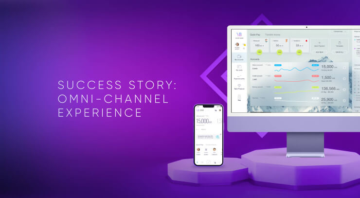
When a full revamp of the product may be beyond reach, you can still reimagine your existing product and make positive changes one step at a time. This aligns with our client, a bank with a global presence, which is striving to enhance the user experience by assessing digital banking app flows, refining layout and information architecture and enhancing visual elements. UXDA's UX audit helped to enhance the user experience without designing a new mobile app from scratch, saving the company resources. This article uncovers our UX/UI audit approach to evaluating the digital product and strategic intervention for maximum impact with minimal effort.
Client: A Bank That Serves a Global Community
We have been hired by a bank that serves a limited group of customers across over 200 countries and aims to provide exceptional service corresponding to the exclusiveness of the community.
Given the limited number of physical branches, the mobile banking app is the primary and frequently the only connection between the users of the bank and their funds. Recognizing the users' dependence on digital banking for financial control and essential transactions across multiple international borders, the bank prioritizes delivering a seamless and intuitive digital banking experience.
The bank team works hard to align with user preferences and ensure it provides the best digital opportunities for their customers. However, identified user feedback on unclear and non-intuitive digital banking interaction, coupled with the growing number of younger users like millennials and Gen Z, prompted our client's team to revamp the digital banking user experience. The bank started with a banking UX/UI audit to uphold its mission and commitment to its user group.
Challenge: Adapt Digital Service to the Most Diverse Customer Base
It's not easy to deliver a pleasant user experience through mobile banking if your customer base is extremely diverse. Unlike local banks, our client's challenge is to deliver a consistent user experience to all its users globally. Thus, following global user experience patterns and considering regional differences is crucial to ensure exceptional customer satisfaction.
Importance of following global UX trends
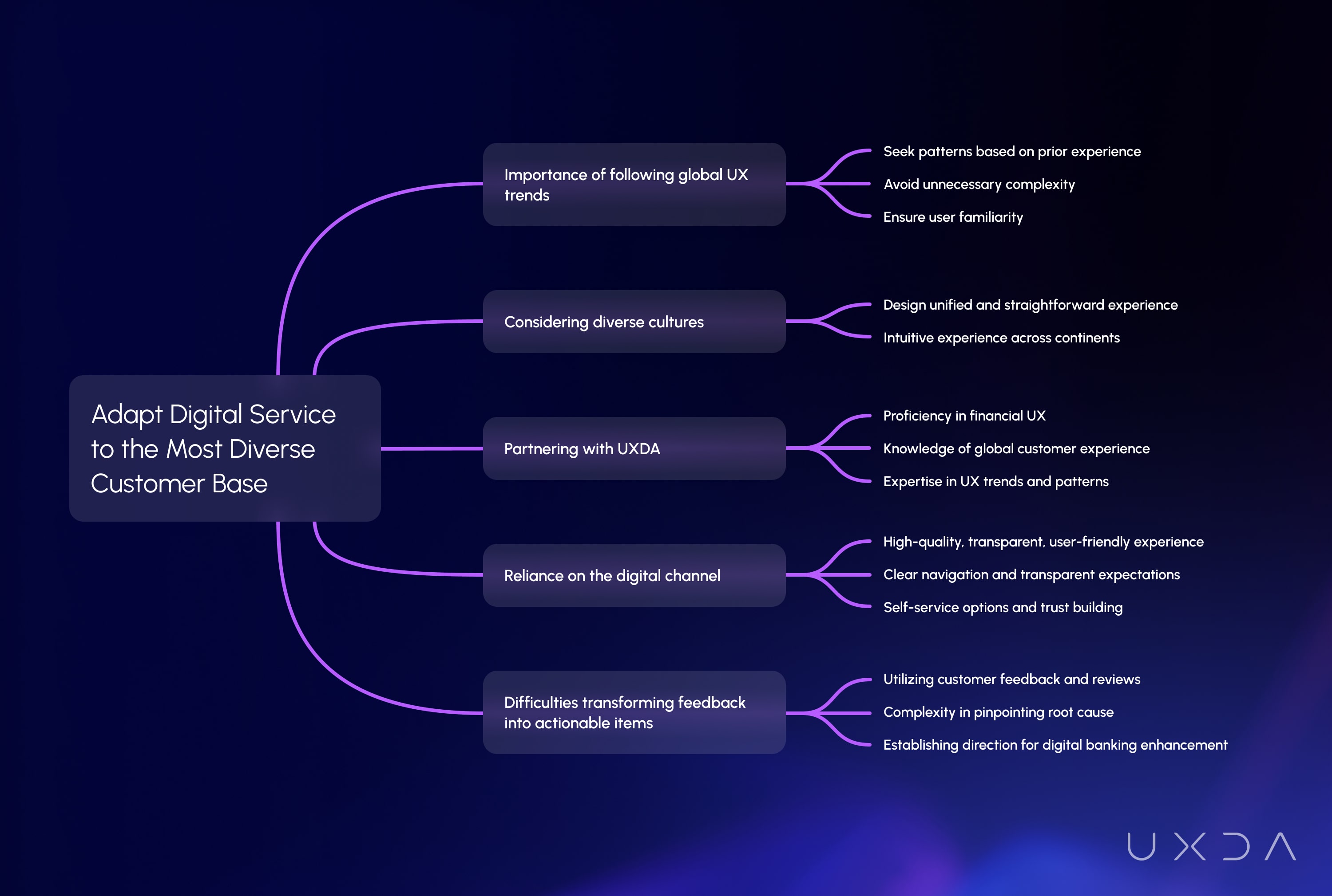
People instinctively seek patterns based on prior experience to complete tasks quickly, preferring not to spend extra time learning new things. Therefore, banking UX design should avoid unnecessary complexity and confusion, ensuring users feel comfortable and familiar with the digital product.
Considering the diverse cultures of the bank users, it's essential to design their digital experience to be unified and straightforward. The challenges of meeting users' expectations around the world require the same intuitive experience for the whole community across continents and countries, be it in Kenya, the US or Austria.
To align a mobile banking app with global customer experience patterns, our client looked for a reliable partner with proficiency in financial user experience, comprehensive knowledge of financial customer experience on all continents and practical expertise in UX trends and patterns. Leveraging their proficiency in designing digital financial products across 36 countries, the UXDA team was the perfect match to audit the bank's mobile banking app and reveal insights for improvements to ensure the app's usability and comprehensibility in all regions.
Reliance on the digital channel
The bank places a priority on providing a high-quality, transparent, and user-friendly digital experience, recognizing the limited number of branch networks and the importance of meeting the needs of global users who value clarity in financial management through digital products. This includes providing clear navigation, ensuring understanding of where to tap, and setting transparent expectations in each interaction. Additionally, the bank offers self-service options and aims to build trust in the app for both daily transactions and long-term commitments, such as loans.
Difficulties transforming feedback into actionable items
Often, global companies utilize customer feedback and reviews on social media as invaluable resources to align their products with customer demand. This is particularly vital for our client, considering users are worldwide and have diverse expectations regarding the mobile banking experience. But the mixed range of gathered feedback poses significant complexity in pinpointing the root cause of the issue, making it challenging to identify urgent, high-impact steps for improvement.
Acting on all feedback for a large bank may be too expensive and impractical, as it can create confusion among the product team regarding where to start and how to allocate resources. Still, it's crucial to establish a direction for further enhancement of the digital banking experience based on this valuable input. Accurate interpretations of customer responses from interviews and feedback on the app experience from surveys, Apple Store, Google Play and other quantitative data collection platforms require additional assistance from UX experts.
Understanding and accurately interpreting customer sentiments, focusing on the most impactful areas of improvement and prioritizing them accurately, lays the foundation for actionable enhancements of digital banking.
Solution: A Strategic and Prioritized Plan for Enhancing the Digital App
The UXDA team conducted a detailed banking UX/UI audit, focusing on:
- Simplifying navigation to enhance user accessibility.
- Incorporating feedback-driven, culturally-sensitive design elements.
- Implementing a strategic plan prioritizing high-impact, low-effort enhancements.
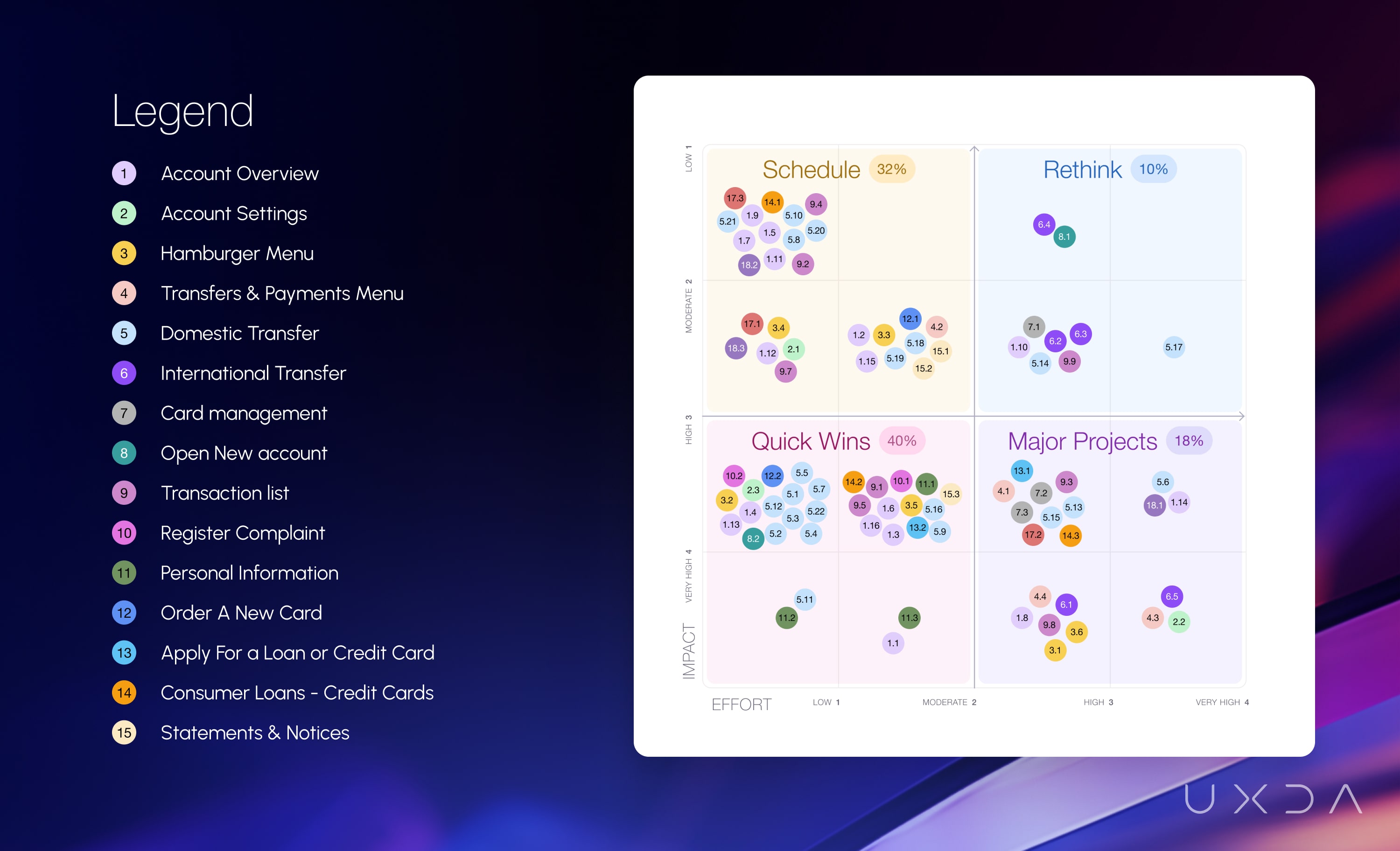
During the UX banking audit, the UXDA team thoroughly examined the existing customer experience and documented all observations. We allocated these findings in the Impact vs. Effort Matrix to formulate a prioritized improvement plan. The client gained a clear understanding of priorities to initiate improvement work, beginning with low-effort items that can significantly impact user experience.
The audit led to tangible improvements in the app's usability, aligning it more closely with the client's brand identity and mission. By applying the recommended guidelines, the bank was able to allocate its resources properly and shift users' sentiments from frustration to a confident reliance on the digital product.
Approach: Performing User Research to Establish a Unique Result Delivery System
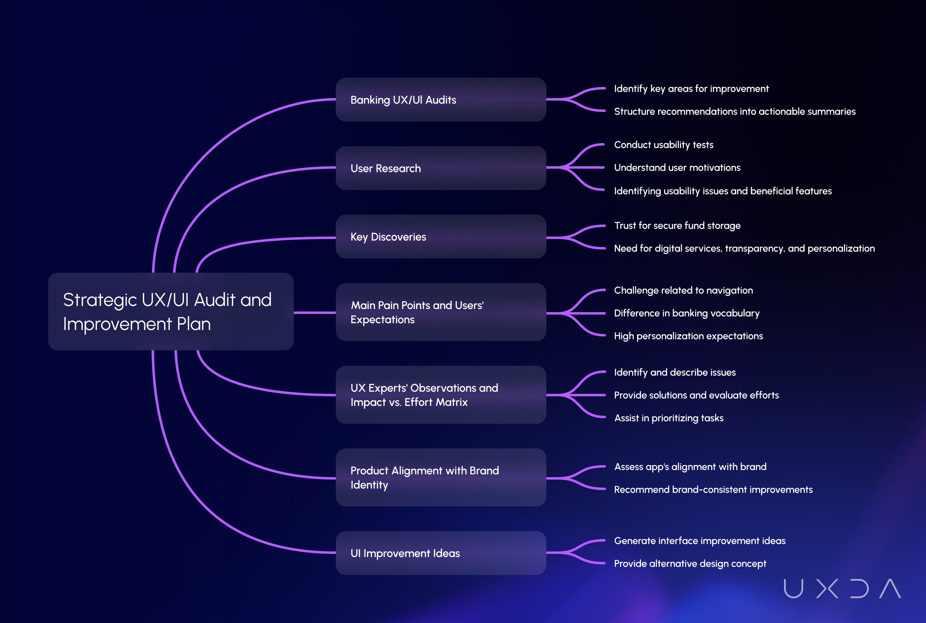
Digital app UX/UI audits are popular among financial companies to quickly identify key areas for improvement within a short timeframe. However, complex and detailed reports on issues often frustrate product teams and create uncertainty about the next steps and resource allocation. As a result, the recommendations are not implemented and remain on the table. To address these concerns, the UXDA structured all recommendations and gathered insights into a comprehensive actionable summary tailored for our client.
Usability testing purpose and outcomes
Feedback expressing the app's experience as "not intuitive" or "difficult to interact with" is not really useful and actionable for the product team. To gain specific insights of customer financial behavior, we conducted usability tests with users from various countries. We tested both user groups─existing and first-time─to take into account the impact of acquired experience.
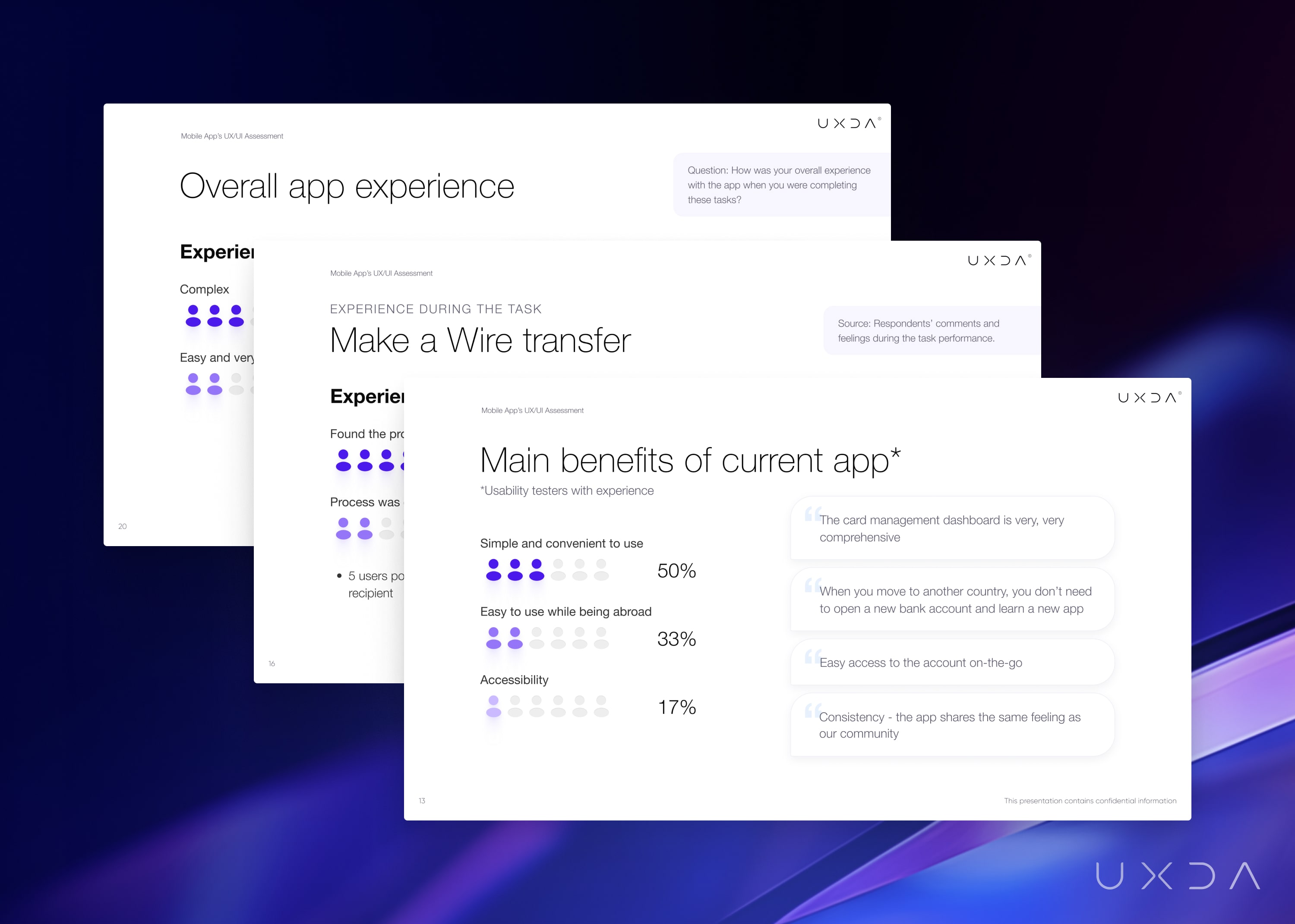
The objective was to enhance understanding of users' motivations and interpretations during routine banking operations, such as checking account balances or making money transfers to family members. The tests revealed insights into the perceived issues, pinpointed specific areas for improvement and identified beneficial features of the app.
For example, first-time users require multiple attempts and extra time to locate certain actions during tests. In contrast, experienced users seamlessly executed these actions due to familiarity with the process and subsequent steps.
It is not enough to be just a secure bank
A key discovery indicates users trust the bank for secure fund storage but often choose local banks for daily transactions. The users' answers confirmed that it isn't enough to be a secure bank to compete with other digital financial service providers.
It is crucial to correspond to users' expectations, like ensuring fully digital services, transparency, open communication, personalization and intuitive digital interactions. For example, Genesys research on the Banking empathy gap reveals that 80% of customers are likely to remain with a financial institution if it acknowledges their personal preferences across all accounts.
The main pain points and users' expectations
We used quantitative and qualitative data to identify key scenarios in the digital banking app to uncover the primary pain points. For example, during usability testing, we pinpointed a significant challenge related to navigation in the bank's mobile app—a concern highlighted by 100% of respondents. Acknowledging the pivotal role of navigation in shaping overall user satisfaction, we advised the client to restructure the navigation to ensure that the most commonly used actions are available more quickly.
Another crucial pain point affecting user experience is the difference in banking vocabulary among various countries. Users expect simple and easily understandable language in their digital banking app.
Due to a trend of high personalization in different digital services, users now expect financial services that better align with their current situation and needs. UXDA's UX architects recommended elevating the bank's personalized services by providing tailored offers and hiding unnecessary information not related to a specific user.
UX experts' observations and Impact vs. Effort matrix
During the audit, we conducted a heuristics analysis to detect the most critical usability issues and suggested specific enhancements. Our approach involved creating a distinctive structure to present the financial UX audit results, aiming to educate the client's team and offer solutions in clear and understandable language. The outcome summary reported the issues in four comprehensive steps:
- Identify the issue
- Describe the essence and potential consequences of not taking action
- Provide a possible solution
- Evaluate needed efforts and the issue's impact on the customer experience
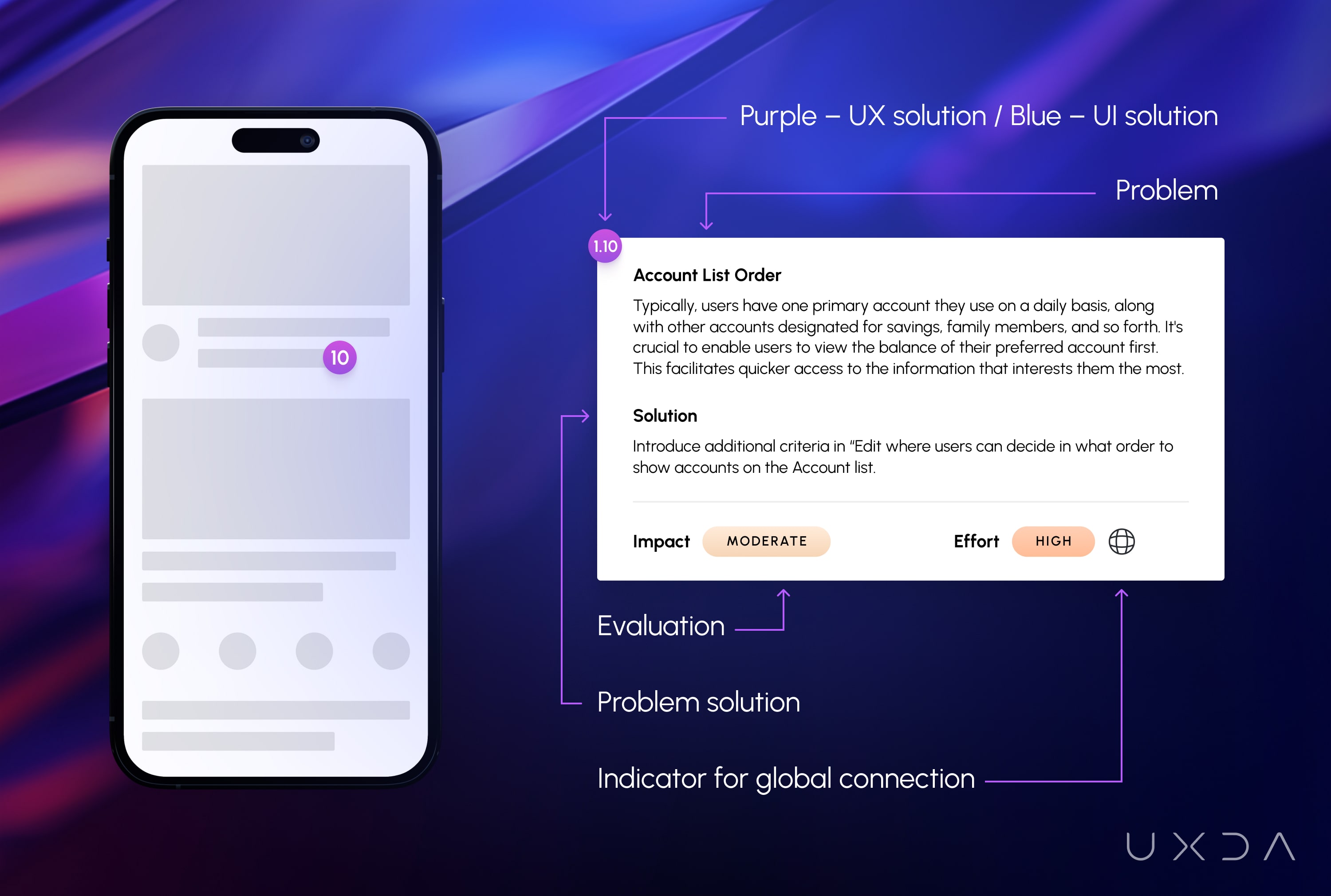
To enhance clarity and assist the bank's team in prioritizing tasks, we assigned color codes to each flow and unique numbers to each observation. As a result, this enabled us to position the issue points in the Impact vs. Effort Matrix, visually indicating to the client's team which problems have a higher impact on user experience, thus necessitating less effort on their part.
The successful outcome was attainable with the active engagement of the client's team and efficient communication. Throughout the project, we engaged in ongoing discussions about the discovered findings and their implications on the user experience within the digital banking mobile app.
As UX/UI consultants, we aim to educate our clients and explain the impact of identified issues and the possible consequences of not taking action. This approach can help the client better solve the issue and prevent it from occurring.
“The team was very efficient and ensured we stuck to the timelines while providing a quality output. We received everything and more than what was expected.” Our client.
Product alignment with brand identity
Our strategy also assessed how the bank mobile app aligns with the brand, ensuring a match between company objectives and users' experiences. Conducting interviews with 15 stakeholders, we collected valuable insights into the client's values and goals. Adhering to the client's core values, we assessed the app's alignment and guided the team to enhance it.
As a result, we recommended the use of brand-consistent colors, strategically organizing on-screen elements and improving the visual aspects of form elements to align with the brand's identity. Considering the global spread of the users, we recommended unifying the tone of voice to ensure clarity for them worldwide.
To prevent user distractions and enhance intuitiveness, the UXDA experts proposed reorganizing specific sections, boosting proactiveness and personalization by displaying relevant information tailored to the client's profile, eliminating unnecessary details.
Tight collaboration is the cornerstone of exceptional outcomes
The UXDA team's experience and proficiency in the financial user experience helped to guide the client's team on global user experience patterns. Despite a short one-month project duration and different time zones, we established close online collaboration, achieving outstanding results.
The active involvement of the client's team, providing needed data and resolving issues, as well as quick response time, significantly enhanced the collaboration and overall outcome. Utilizing data from customer surveys, analytics and mobile banking, we conducted efficient and comprehensive research and usability testing. Effective communication on time and involvement from both sides ensured the achievement of project goals.
"UXDA was very efficient in their timelines while providing a quality output on their deliverables." Our client.
But wait, there's more…
During the digital banking UX audit, we generated ideas for interface improvement based on our recommendations. We went above and beyond by presenting the client with an alternative interface design concept. We have provided an actionable improvement plan and a visual representation of how these enhancements could be integrated. This allowed us to inspire the client team for their upcoming challenge of implementing UX/UI suggestions and incorporating the bank's values into the app.
UXDA Deliverables
- Stakeholder interviews
- User feedback research and analysis
- User profiles
- Customer journey analysis
- Usability testing
- UX/UI expert evaluation with heuristic analysis
- Strategic roadmap for enhancing a digital product
- Digital product alignment with a brand identity
- Design concept
Takeaway
A UX/UI audit of a digital financial product can yield significant results in a short time and with a reasonable investment. Modern digital financial institutions regularly review and update their digital products to ensure they meet user expectations, develop a digital advantage and increase customer loyalty.
Conducting a heuristic analysis of the product, studying customers' feelings and experiences during app interactions and accurately interpreting them offers valuable insights into the most crucial improvements that bring the highest value. Staying abreast of global and regional UX trends and tailoring the digital product to a specific customer base is crucial. This ensures the product is clear, intuitive and aligns with users' previous experiences, fostering a sense of familiarity.
Improvement of financial products requires a well-defined plan outlining necessary actions and resource allocation. An effective tool for this purpose is the Impact vs. Effort Matrix. By assigning identified issues to a matrix that outlines the necessary effort to develop a solution for each specific issue and predicting its impact on user experience, financial institutions can make informed decisions on prioritization and resource allocation.
Studying customers and actively listening to their feedback can unveil issues that might not have been considered before, helping to understand what they mean by abstractions like "bad app," "non-intuitive experience" or "I don't like it." These specific insights are crucial for improving and aligning the product with the brand and user expectations. As a result, a positive user experience contributes to the company's enhanced market position and profitability in the digital age.
Explore our client's next-gen financial digital products and UX transformations showcased in the UXDA showreel:
If you want to create next-gen financial products to receive an exceptional competitive advantage in the digital age, contact us! With the power of financial UX design, we can help you turn your business into a beloved financial brand with a strong emotional connection with your clients, resulting in success, demand, and long-term customer loyalty.
- E-mail us at info@theuxda.com
- Chat with us in Whatsapp
- Send a direct message to UXDA's CEO Alex Kreger on Linkedin


