78% of the time that customers spend on offline banking services is wasted. As a customer, why would I choose to drive somewhere and wait in line to do my banking? Actually, I wouldn’t! If I could easily complete my banking transactions through online banking, I would choose online banking every time. My time is too valuable to waste, and online banking can be done from the comfort of my home or while I am on the go. In theory. Practically, it isn’t quite that easy. Every time I want to view my payment history, I can’t find it easily. Navigating through the 24 sections of my account dashboard is frustrating, confusing, and frankly, feels like a waste of my time.
How to Make UX Design in Online Banking
Today is 2014, but in fact, banks are still acting too slowly in the move to comprehensive digital services. On the one hand, they can commit to investing a lot of money to FinTech; on the other, conservatism and bureaucracy seriously hamper putting effective banking technology of the future in place. Some banks still can’t believe that the majority of customers use mobile apps and “even worse” — want to use a tablet or wearable for banking. Maybe that’s why not every bank has mobile banking or tablet banking, and those that do offer only limited functionality with awful design.
Of course, there are some innovative banks offering omni channel digital banking. But even these early adopters face yet another problem — lack of usability and appeal. We asked people about their most pleasant digital experience. To our surprise, not one person mentioned the banking dashboard, yet the banking dashboard is used by 18% of people every day. Only FinTech startups like Mint and Moven appeared in their responses. Why is that?
With their huge budgets, banks are able to hire the best UX experts and Design Thinking experts in the field to architect their financial dashboards, but we don’t see encouraging results. Perhaps we looked at the wrong bank, or maybe not every bank is ready to change from product-centered thinking to user-centered. Whatever the reason, this is a problem. We decided to share the UXDA's UX design agency team vision of the future of online banking experience… a solution that we would be happy to use to complete our banking! Here is the full digital banking case study of approach that was used to design this banking product.
UXDA's approach is thoroughly described in our other financial UX design case studies:
How We Designed the Most Awarded Banking App Concept in the World
Banking Back-Office Transformation that Led Vendor to a Global Expansion
How to Raise the Rate of a Mobile Banking App from 2,8 to 4,7 in Google Play
UXDA Methodology of UX/CX Design
1. Conduct UX Research of Online Banking Users
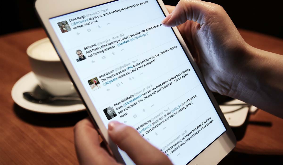
Let’s start the banking experience redesign through research into some of the real life banking “pains” that people experience. Twitter can be helpful here, and it helped us discover that in Twitter feeds, there are a lot of complaints about the “pain” of banking.
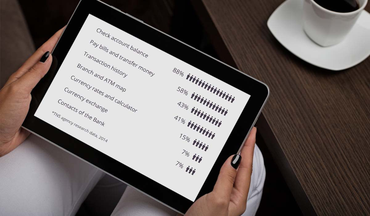
But how do people use online banking?
Next, let’s find out what industry experts think about future of retail banking. To do so, all we need is a little time spent at Slideshare where there are plenty of presentations covering how online banking should work. We see that experts advise that future banks must be based on 7 key principles:
- Personalization
- Transparency
- Self-service
- Mobile first
- Simplicity
- Aesthetic
- Holistic
We will take these principles into account and rely on them to develop our strategy and architecture. These will be important factors, forming the key performance indicators (KPI) used to check the quality of our banking solution UX strategy.
Now we can analyze competitors to compile a list of existing banking products, competitive Fintech user experience and possible online banking functions.

The Main Problem for all banks: the online experience is too complex, making navigation frustrating.
Believe us, if you try to figure out how the stuff works through 2000 sections of navigation in 20 banks it can drive you mad. But we did it for you, so don’t be afraid…keep reading!
We analyzed hundreds of features in 50+ banks, but we also needed something more emotional. Something that will make customers love our online banking, inspire them, and enable them to truly enjoy and benefit from the experience. So we set out to find out what their passions are. Through interviews and poll research, we came to understand their needs and interests.
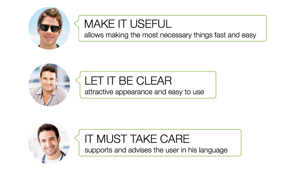
Great. We are almost ready to start creating the delightful user experience. We are millennials, so we will build a solution for millennials, clarifying all typical characters and drawing some user storyboards. We need to feel what our customers feel, walk in their shoes.

Knowledge of psychology is your advantage.
Now let’s identify red route tasks. We have to understand what people want from an online banking dashboard; how they will use it to solve their problems. These are key scenarios that we must deliver with maximum speed and simplicity.
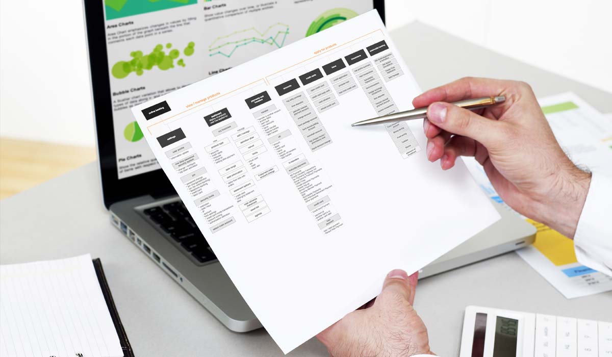
2. Create a User Journey Map, User Flows, Information Architecture, Wireframes
So that’s it. We know our business goals, KPIs, and features list, as well as the pains, passions, and needs of our customers. Now it is time to connect the dots on the User Journey Map to help us generate the ideal banking user experience of the future.

User Journey Map is one is one of the most difficult parts; we have our own method to approach it.
The final step of UX strategy development is to map interactions, making it clear how customers will use the banking product to fulfill their needs.

Now it’s time to convert all of our insights into banking information architecture and create wireframes. Banking interface prototypes will help us to test usability and get early feedback. After corrections, we are ready to design a user interface.

Wireframes are schematic screen blueprints that show a skeleton of the next interface.
Finally, it’s time to design some cool stuff for bank design concept.
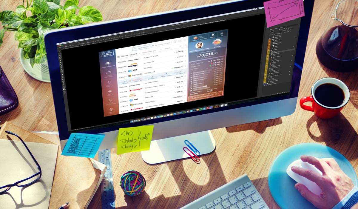
Designers usually use same tools, but result totally differs.
3. Design Login and Authorization of Online Banking
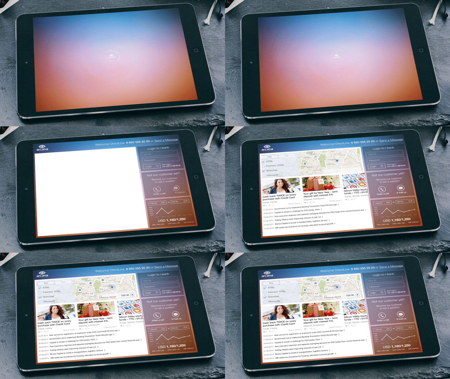
Our intro page has to be helpful and appealing, without requiring authorization/login. We decided to include:
- Sign in inputs
- Bank contacts
- New user form
- Branch & ATM locator
- Bank products promotion
- Currency converter
- News feed
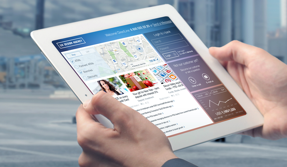
First of all, let’s make sure that our customer can easily find the nearest branch, ATM or even partner deals without login. Let’s further assist branch selection by providing time until closing and line waiting time directly on the map, using nice graphic markers. This allows our bank to distribute traffic between branches and make our service more pleasant for both customers and employees.
When you browse in the App Store, your aim is to find something interesting. Imagine if that could be possible in banking, too! Simply enjoy browsing banking product cards and choosing one that fits your needs.
Of course, users can easily contact the bank in case they encounter problems, or when they are ready to become customers.
Are you going abroad or do you have an international business? Cool, you can see currency history and current rates on our intro page, plus an integrated calculator makes it easy to perform conversions or calculations.
A news feed on the intro page? Why not, maybe there is a new branch opening near you.
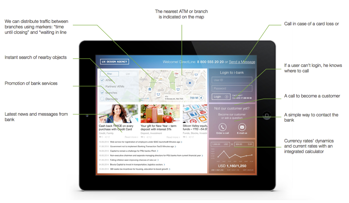
Intro page helps without authorization:
4. Design Balance and Transactions History Dashboard
So, you are logged in. Our bank design concept dashboard has some cool stuff for you, all in one place:
- Balance statement
- Monthly income
- Monthly expenses
- Monthly and daily available
- Category budgets
- Latest transaction history
- Quick Access menu for every transaction
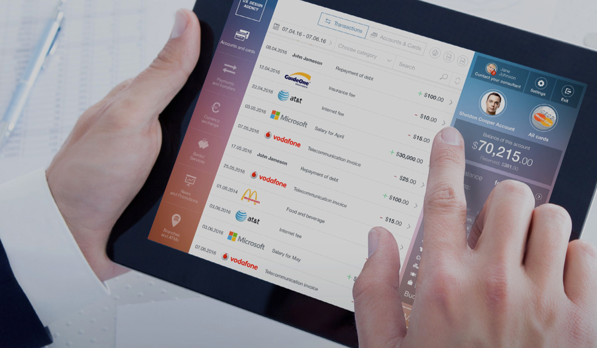
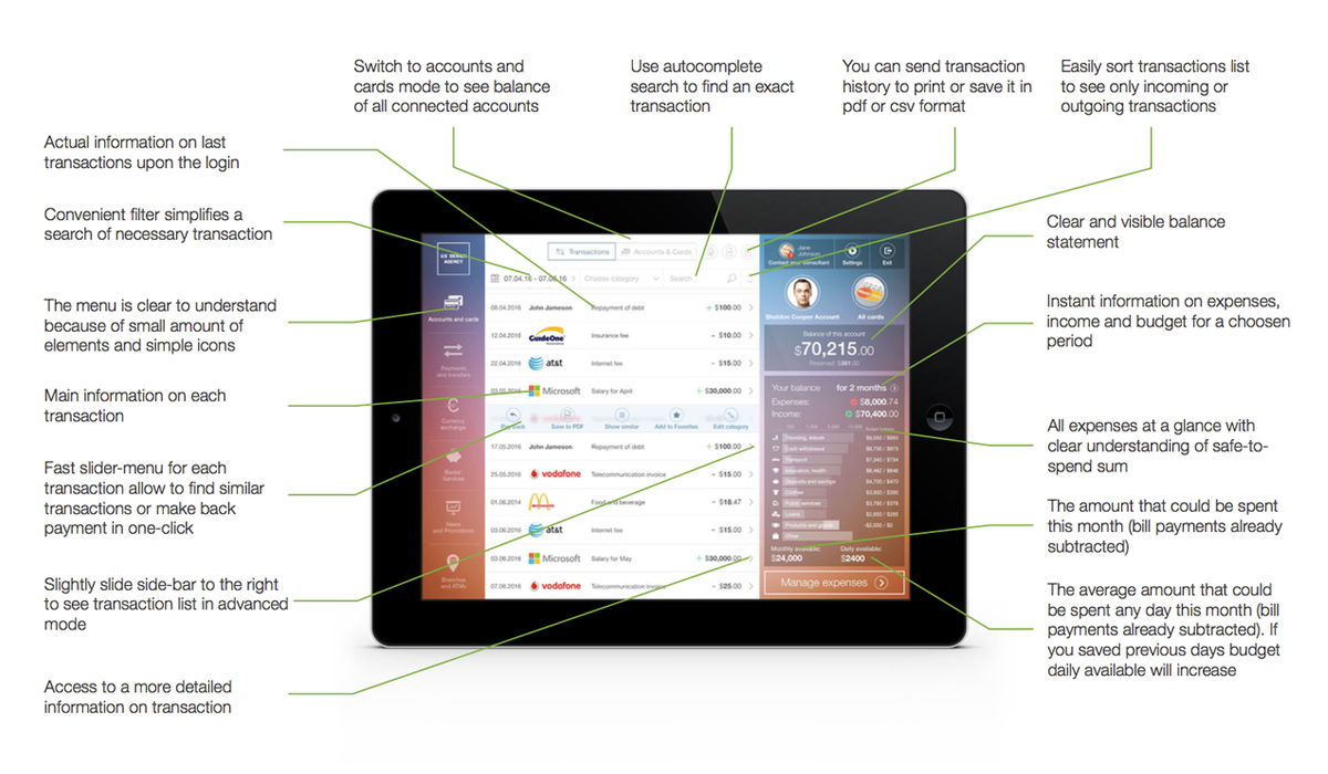
10 seconds is enough to see a clear and visible balance statement, monthly income and expenses. Another 10 seconds and you have a clear understanding of safe-to-spend sums in the category chart. This includes the amount that could be spent this month (bill payments already subtracted) and the average amount that could be spent any day of this month. By the way, we don’t like the budget pie charts that every bank uses…because they tell us nothing.
Who cares what percentage of my budget is historically spent on food? It is more important to know how much I can safely spend on food right now, based on my current situation. With our interface, if you saved some of the previous day’s budget, today’s daily available sum will increase, and vice versa. Real time tracking and budgeting to help customers.
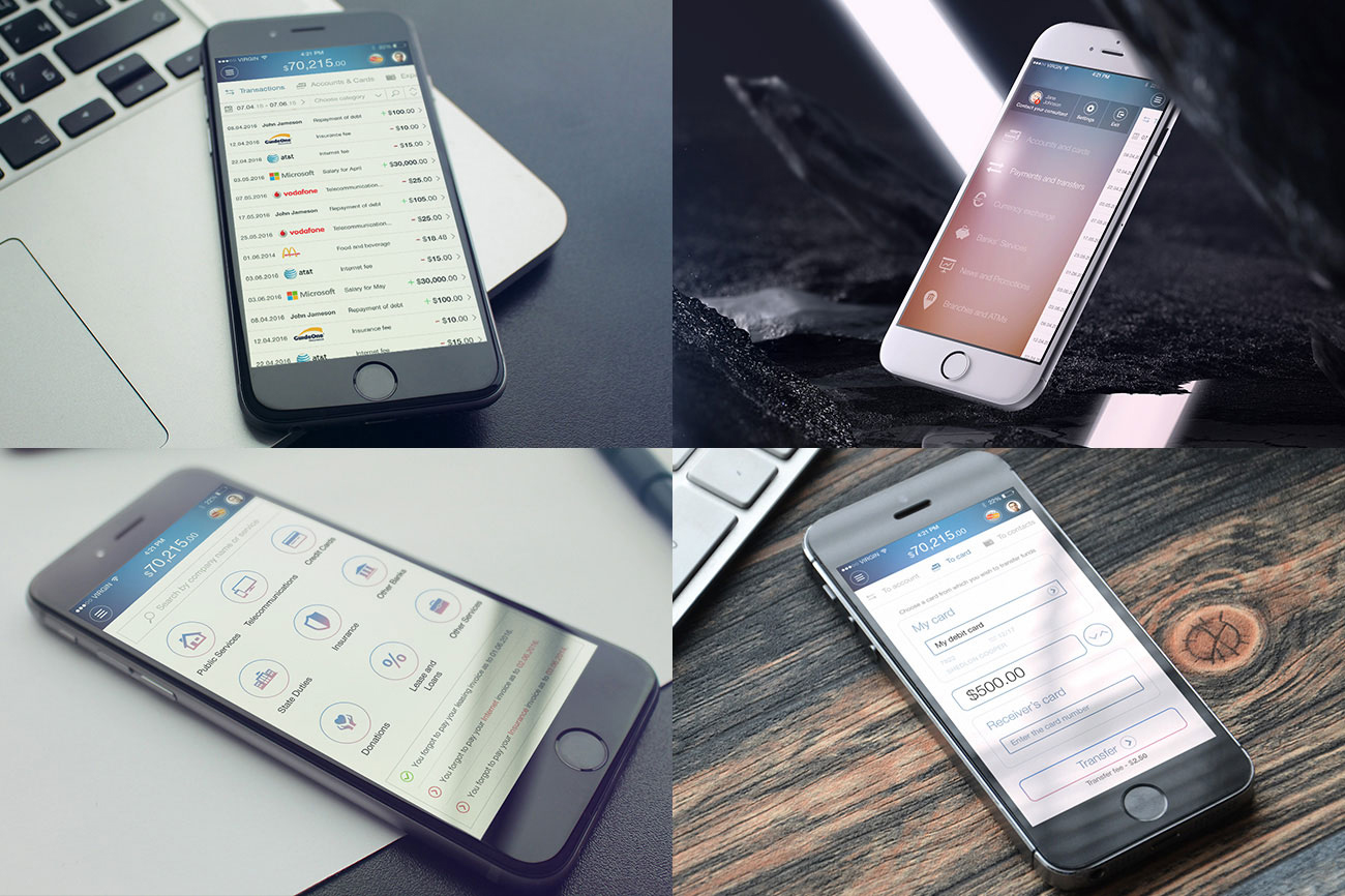
And what about transactions? You don’t need an hour to study navigation and browse sections, it’s all here in one place. Check your latest transactions list, use autocomplete search to find an exact transaction or easily sort them to see only incoming or outgoing transactions. A fast slider-menu for each transaction allows you to find similar transactions or make a payment in one-click.
Ready to find more? You will like our short and intuitive navigation and nice icons.
5. Ensure Multiple Accounts and Smart Budgeting
That’s not all you can get from the first page of our banking interface. There are more helpful features in our online banking case study:
- Multi-account and multi-card support
- Quick payment menu for every account
- Sort by category
- Easy new account opening
- Access to saving goals
- Advanced budget management
- DoD and MoM expense statistics

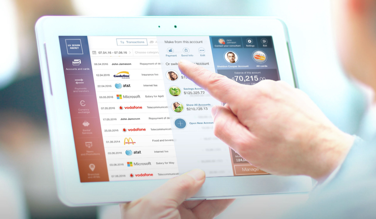
With our system, you can use an unlimited number of accounts and cards. Just click on your account to get quick access and switch between accounts and cards (including enterprise accounts).
Want to see your overall account statement? Simply choose «All Accounts» to see overall balance, budget and transaction history. Now you don’t need to spend time in a branch because you are able to add new accounts right from your sofa.
Quickly access payment forms through the same sliding action. The system will automatically choose a selected account when creating a payment. You can send your payment data to friends or service providers in seconds. In the edit menu, you can rename your account, set notifications, transfers and ATM cash out limits.
Selecting a certain category in the budget chart simplifies the view, filtering only transactions of that category in the main window. Do you need advanced budgeting? We have some, including detailed Day-over-Day and Month-over-Month expense statement dashboard, budget restrictions, saving goal setting and budget comparisons (to average bank users of your type).
6. Design Easy Bill Paying and Advice Access
Ready to explore our banking UX case study further? If you remember, our customers pay bills and transfer money as a second popular scenario. So, we will deliver that service to them. Our “three clicks” payments will include:
- Instant access to popular payments
- Popular payments automatically defined
- Predefined default bills
- Private advice from bank assistant
- Access to video advisory
- Regular payment reminder
- Transfer fees
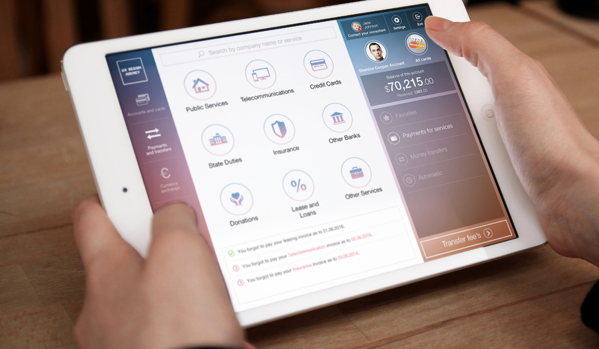
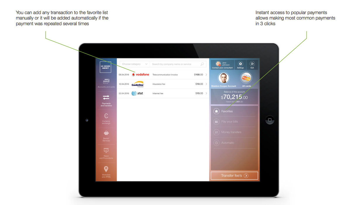
In this section, the first thing you will see is your favorite payments…just login to pay your bills; you don’t have to search for them. You are free to add any transaction to the favorites list manually; payments repeated several times will be added automatically.
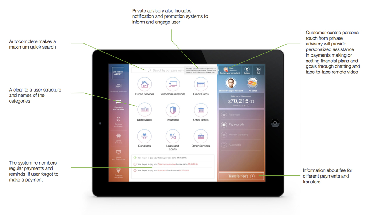
Every bank has predefined payments templates. Our instant access to popular payments has clear icons and allows completion of most common payments in only 3 clicks. What if you need to find billing accounts really quickly? Simply use autocomplete search.
Of course, full information about fees for different payments and transfers is provided.
You will be happy to hear that our system remembers your regular payments and reminds you if you forgot to make one.
Don’t be afraid of troubles, because a private advisory service is always here to help. This customer-centric touch provides personalized assistance in making or setting payments, financial plans, and goals through chat and face-to-face remote video advising. The private advisory system also includes notifications and promotions to inform and engage users.
Categories, templates, notifications and personal advisor:
7. Provide Money Transfer to Cards and Social Networks
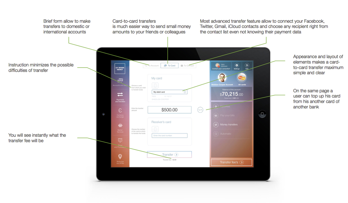
Imagine being able to send money to a friend in only 30 seconds, making it easy to reimburse someone for expenses after a party or vacation. No need to imagine, we are making that possible through
- Card-to-card transfers
- Domestic and international transfers
- Transfers to Mail, Facebook, Twitter contacts
- Top up from another bank card
- Clear transfer fee
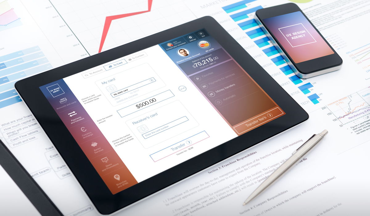
The short form allows you to easily make fast card-to-card transfers, and you will see instantly what transfer fees apply. On the same page, you can top up one of your own cards from another bank card.
Most advanced transfer features allow you to import your Facebook, Twitter, Gmail, and iCloud contacts, then simply choose any recipient right from the contact list without even knowing their payment data. Just send funds to them, and they will receive simple instructions for accessing the funds. Isn’t it awesome?
8. Allow to Browse Online Bank Services through Financial Marketplace
Banks are not only about balance, history, and payments. The average bank can offer up to 100 different products. So, how can online banking showcase the products and engage the customer to use them? Our online banking case study provides the solution:
- An online marketplace instead of a list
- Autocomplete search
- Offers separated by category and purpose
- Image based Offer Cards
- Tailored and TOP used services
- Social sharing
- Community support
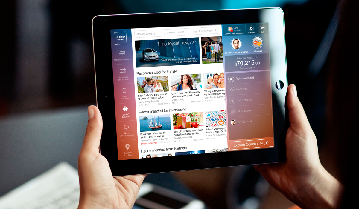
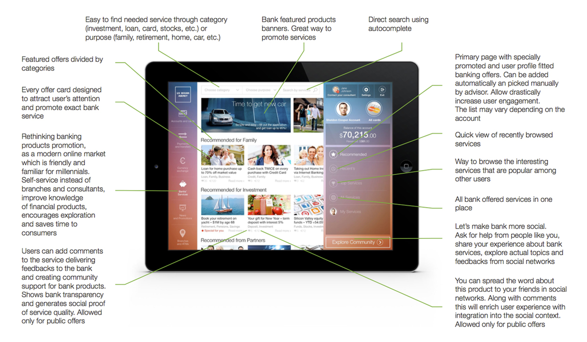
We are rethinking banking products promotion through Card UI, as a modern online marketplace which is friendly and familiar for every millennial. Self-service instead of branches and consultants improves knowledge of financial products, encourages exploration, and saves time for customers.
Primarily, you will see specially recommended banking offers matched to your profile. They may be added automatically by the system or selected manually by your advisor. We believe that tailoring these offers to your situation will drastically increase your engagement and knowledge of the bank capabilities.
Let’s make your bank more social. Ask for help from people like you in the banking community, share your experience about bank services, and explore actual topics and feedback from social networks.
Enjoy future online bank transparency and check social proof of service quality. Add comments to the services, share your feedback. You can also spread the word about public products to your friends in social networks.
Why not enrich the banking experience with integration into social context? Future of the online banking industry will benefit from this integration.
All bank products at a glance:
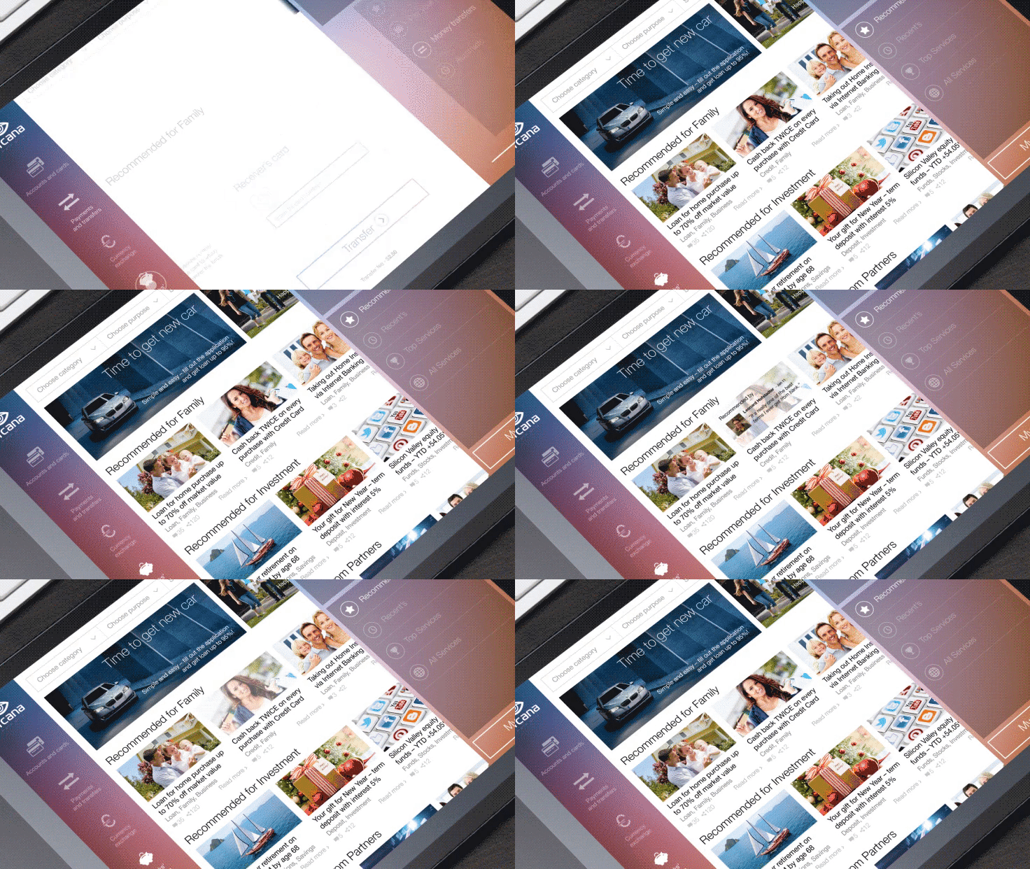
Animated Design of Mobile Banking App (2014 vision)
If you want to see the concept of our tablet bank design concept in motion — watch this banking motion design:
UX Design of Omni-Channel Digital Banking
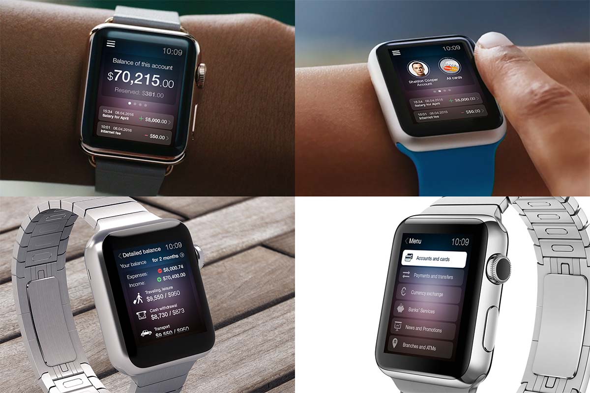
And one more thing, it is important to ensure an omni channel solution for digital banking. Users must be able to get access through any suitable gadget. At this moment, we are talking about desktop banking, tablets, mobile banking apps and wearables. In the US, 57% of smartphone owners used their device for mobile banking in the 2014.
Results
This future online bank design concept was compared to three popular banks interfaces. Required steps number in red route tasks were reduced by half compared with typical online banking product. The learning curve needed to understand all features and find all services was reduced by a factor of seven, from 1 hour 45 minutes to only 15 minutes.
The overall customer satisfaction rate was increased by 320%. Engagement for complementary banking services was increased by 85%. The Ready-To-Recommend rate increased by 460%. The readiness to switch to another bank was reduced by 26%.
Main Takeaways of the Online Banking Case Study
1. You Need to Listen to Your Customers
Listen carefully to your users’ complaints, concerns, and needs. Respond to their concerns to find the fastest, easiest way to reduce friction while increasing satisfaction. Maybe it sounds scary, but try to step back from your inner narcissism and assumptions. You will be surprised by what your customers really think about your service.
2. Do not Be Afraid to Break the Status Quo
Review your industry standards to find an opportunity window, even if it is only about simpler and smarter service design.
3. Become Customer-Centred
Switch your business strategy from product-centric to customer-centric. Deliver service to meet your customers’ needs in a way they understand, instead of hard-pushing old stuff using expensive ad campaigns.
4. Upgrade Your Digital Strategy
Discover which channels your customers prefer and use those to make your service more affordable and appealing.
5. Make Your Customers’ Experience Fascinating
Delight with your service interface, make it simple and cutting-edge because in the age of a million apps and online services users have become spoiled and lazy.
Explore UXDA Formula of Successful Digital Business
© This concept was designed by UXDA and is the exclusive property of BofI Federal Bank. All rights reserved.
Discover our clients' next-gen financial products & UX transformations in UXDA's latest showreel.
If you want to create next-gen financial products to receive an exceptional competitive advantage in the digital age, contact us! With the power of financial UX design, we can help you turn your business into a beloved financial brand with a strong emotional connection with your clients, resulting in success, demand, and long-term customer loyalty.
- E-mail us at info@theuxda.com
- Chat with us in Whatsapp
- Send a direct message to UXDA's CEO Alex Kreger on Linkedin


