
Could a banking app, knowing users' patterns, emotions and fears, possibly push them to make the wrong choice to maximize the company’s profits? In an era in which apps have become the primary financial gateway, the line between empowering and trapping digital users has never been so blurred. Are some financial services already using shady patterns to increase customer loyalty—or to create unwitting captives?
Imagine a banking customer who opens a banking app to check their balance, only to be subtly nudged into signing up for a service they never intended to use. A pop-up warns of “limited-time offers” that will expire if users don’t act now.
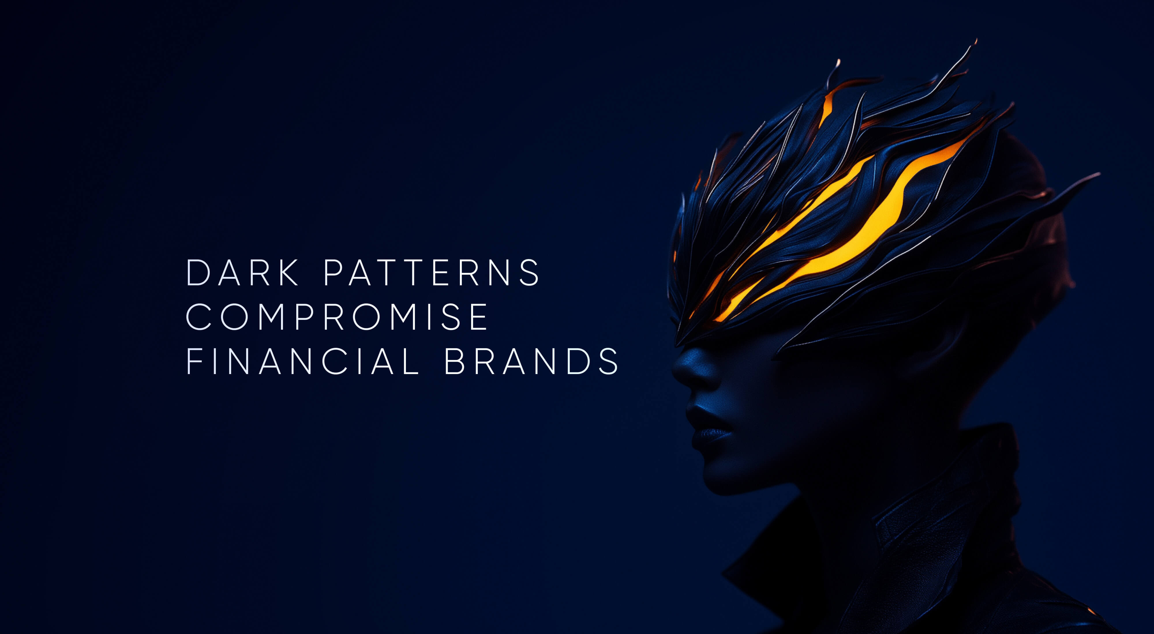
Closing an account is far more complicated than opening one. Hidden fees surface at the last moment, and opting out of data sharing feels like navigating a maze. These are not glitches or oversights—they are carefully crafted dark patterns designed to manipulate digital users' decisions. In an industry built on trust, some financial services are increasingly adopting the same psychological tactics that keep users glued to social media or addicted to gambling apps. The question is no longer whether these practices exist in banking, but how much damage they inflict on users and financial brands.
Financial companies increasingly recognize digital applications as their primary way of providing services. This transformation has placed enormous emphasis on the design of these applications, which in turn wields significant power in shaping user behavior and customer experience. However, there is a dark underbelly to this power. Some financial companies act very aggressively in digital interactions, employing dark patterns and black user experience (UX) practices, manipulating users into addiction to transform these services into digital drugs.
UXDA's Dopamine Banking concept has sparked interest in the industry, but in the digital space, especially in finance, "dopamine design" can seem suspiciously similar to manipulative design techniques that hijack and hold a user's attention. However, as envisioned by UXDA, Dopamine Banking operates on a fundamentally different ethical foundation because we’ve found how to use dopamine design for good in finance.
Instead of evolving addictive behaviors that keep users endlessly hooked, Dopamine Banking applies neuromarketing insights in a way that promotes healthy financial habits and safeguards user autonomy.
Top Dark Patterns Used in Financial Services
In 10 years, the UXDA team inspected thousands of financial apps, and unfortunately, dark patterns are more commonly used in financial services than we all believed. Dark patterns exploit human psychology to push service users toward quick decisions that may not be in their best financial interest. Often, black UX in finance uses app design techniques to influence user behavior in ways that benefit the company at the expense of the user. These manipulative practices are commonly seen in gambling services and online casinos, but disturbingly, they are creeping into the financial sector, including banking.

In December 2024, the Federal Trade Commission (FTC) announced a civil enforcement action against Dave Inc., and its CEO for alleged deceptive practices. Clients reported that, despite the company's promise of providing cash advances "up to $500 with no hidden fees," they rarely had access to the full amount and were charged an extra fee for instant cash advances. Additionally, users complained that the app used a deceptive interface to induce them to pay a tip to receive the cash advance. On Reddit, clients even state, “I accidentally tipped them on a $200 advance. 15%!! I'm still mad at myself, so be careful when punching those buttons.”
In January 2025, the Consumer Financial Protection Bureau (CFPB) sued Capital One for allegedly deceiving millions of consumers out of more than $2 billion in interest. The bank had marketed its "360 Savings" account as offering the "best" interest rates but later introduced a nearly identical product, "360 Performance Savings," with significantly higher rates—without notifying existing account holders.
In general, dark patterns in service design are manipulative tactics that trick users into taking actions they do not want to take, similar to aggressive and unethical sales practices. These tactics are especially problematic in financial services, in which trust, transparency and user control are essential. However, sometimes, they are used not on purpose but out of ignorance. Below is a list of the top dark patterns and how you can detect them in financial services:
Roach Motel
This pattern makes it easy for users to get into a solution but difficult to get out of.
A bank or credit card provider might make it incredibly easy to sign up for an account or service but make it difficult to close that account or cancel a service. For example, users might be able to open an account online in minutes, but closing it could require visiting a branch, making multiple phone calls or filling out complicated forms.
Hidden Costs
Unexpected charges or fees appear at the last stage of a transaction after the user has already invested time and effort.
A financial app might advertise a free or low-cost service but then add hidden fees, such as transfer fees, maintenance charges or account inactivity fees when the user initiates a transaction. These fees are revealed only when the user is about to complete the process.
According to a Politico article, in 2023, European consumers and businesses lost €30 billion to hidden fees when sending and spending money internationally, up from €22 billion in 2019, which is only getting worse.
Forced Continuity
Users sign up for a free trial or a low-cost service, and it automatically converts into a paid subscription without a clear reminder or easy way to cancel.
A financial service might offer a free trial for premium account features but automatically start charging the user once the trial ends without a clear warning. Canceling the subscription may require complicated steps, discouraging users from opting out.
Sneak into Basket
A product or service is automatically added to the user’s purchase or subscription without explicit consent.
When a user opens an account or applies for a loan, the institution might automatically enroll them in additional paid services, such as credit monitoring or identity theft protection, and make it difficult for them to opt out.
Privacy Zuckering
Users are tricked into sharing more personal data than they intended.
During the account creation process, a financial institution might default to requiring users to share personal data with third-party advertisers or affiliates, making it difficult for users to realize or opt out of this sharing. The settings to limit data sharing could be buried deep within the platform’s preferences.
Trick Questions
Questions are designed to lead users to make mistakes or consent to something they didn't intend to do.
A credit card or bank might ask users convoluted questions when signing up for paperless billing or additional services, tricking them into agreeing to receive marketing emails or signing up for paid services without their knowledge.
Confirmshaming
Guilt or shame is used to manipulate users into making a particular choice, typically by making opting out feel uncomfortable.
When declining a service like overdraft protection or loan insurance, users might encounter language that makes them feel irresponsible, such as “Are you sure you want to skip this crucial protection?” or “Only irresponsible people opt out of this security feature.”
Preselection
Options are preselected in favor of the company, and users are often required to deselect them manually to avoid unwanted services.
Users might find that options for costly add-ons, like fraud protection or account management services, are already checked by default when signing up for an account or service. The user has to uncheck these to avoid extra charges manually.
Disguised Ads
Advertisements are disguised as part of the regular content or user interface, tricking users into engaging with them.
On a banking or financial app, product recommendations like loans, credit cards or investment opportunities might appear as though they are essential features of the user’s account dashboard, misleading users into thinking these are personalized financial tips rather than promotional material.
FOMO (Fear of Missing Out)
FOMO is the tactic of exploiting users' fear that they will miss out on something beneficial if they don’t act quickly.
A financial service might advertise limited-time promotions on loans or investment opportunities, such as "Act now to lock in this exclusive interest rate!" This plays on users' fears of missing out on a better deal, pushing them to make quick decisions without thoroughly reviewing the terms and conditions.
Fake Scarcity
Creating the illusion that a product or service is limited in supply or availability, even when it is not.
A bank or financial app might claim that there are only a few spots left for a special offer on credit cards, loans or savings accounts. For example, a message like "Only 2 spots left to get this promotional interest rate!" can pressure users into taking immediate action, even though the offer may not be limited at all.
Fake Urgency
Users are pressured to act quickly, creating a false sense of time pressure, regardless of their actual availability or deadline.
Financial institutions often create fake urgency by sending email notifications or in-app messages such as "Act now—your loan approval expires in 24 hours!" or "Your low-rate credit card offer ends today!" when, in reality, these deadlines are arbitrary or could be easily extended. Users may, thus, rush into financial commitments without fully understanding the terms.
Drip Pricing
The practice of initially showing an attractive base price but then adding mandatory charges and fees as the user progresses through the transaction.
A financial app or service might promote a loan with a very low interest rate, but as the user continues with the application, additional fees (such as origination fees, processing fees or account setup fees) gradually appear, inflating the total cost. This drip pricing can make users feel trapped, as they’ve already invested time and effort in the process despite the final price being much higher than expected.
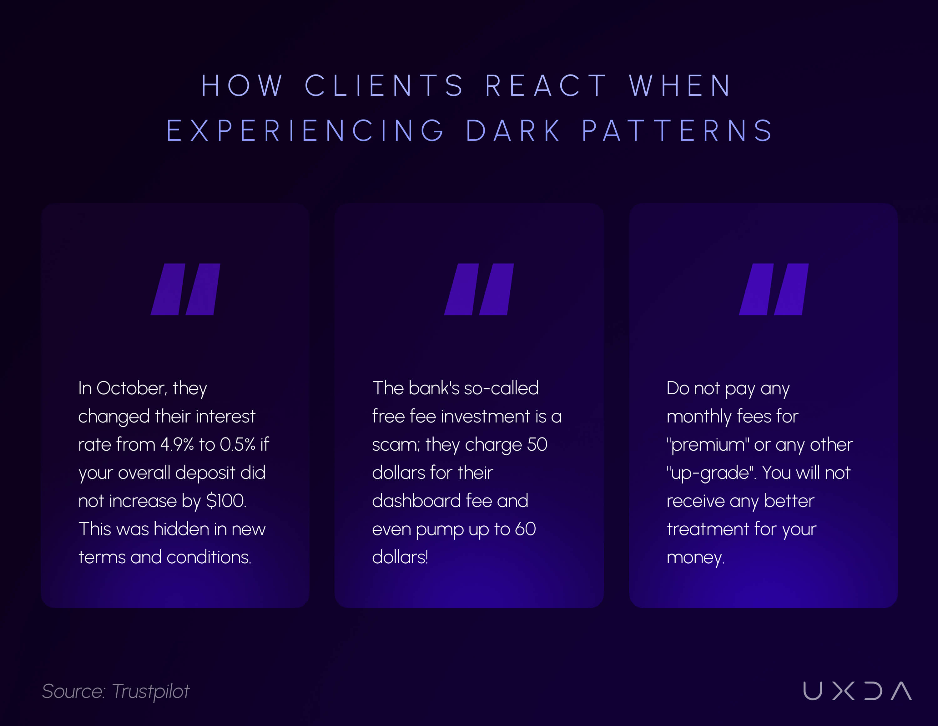
Real-Life Example of Dark Patterns Usage
А while ago, my friend started to sign up for a business account with a well-known Fintech company. The registration wasn't completed, and since then, this company has sent quite aggressive texts every two to three days, trying to convince my friend that they "urgently need" additional info (even though they don't) to complete onboarding. There is no clear unsubscribe option provided.
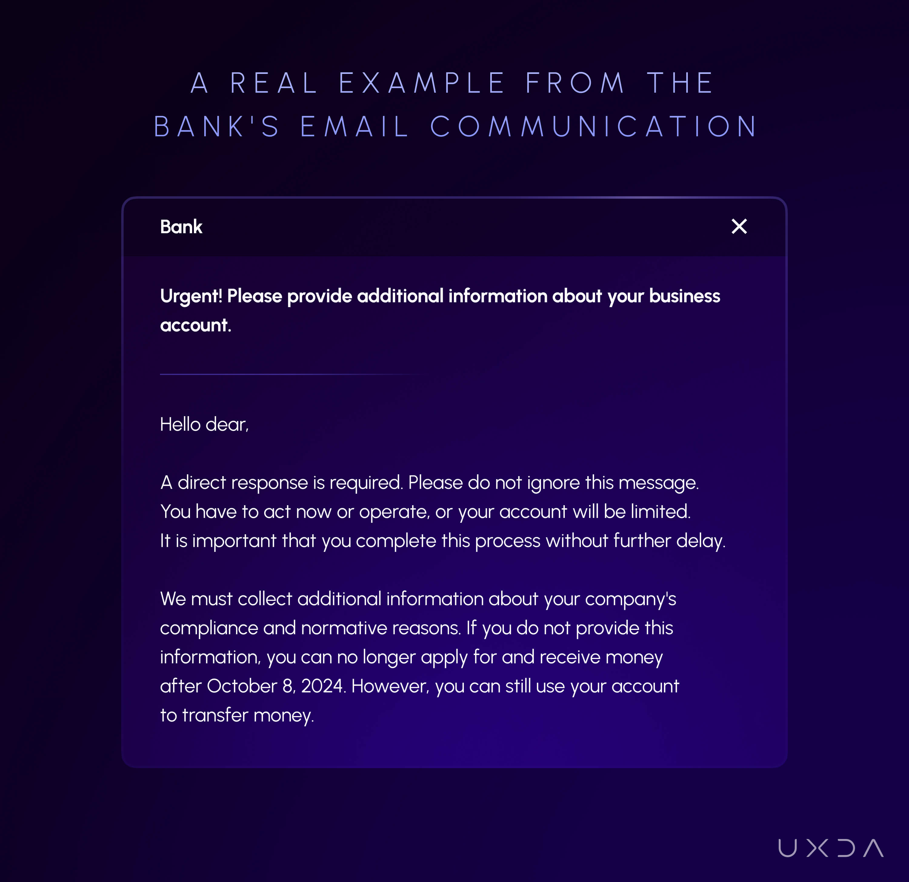
The combination of false urgency, ambiguous language, lack of transparency, difficulty opting out and fear-based manipulation practices illustrate several black UX tactics. Instead of providing a clear and straightforward way for the user to finish the onboarding process at their own pace, the email tries to manipulate the user into completing it quickly by inducing anxiety and removing autonomy. Ethical design practices prioritize user trust and empowerment, whereas these tactics aim to manipulate and coerce action based on fear and uncertainty.
Let's take a look at exactly how each of the dark patterns is used in this short letter:
False Urgency (Pressure Tactics)
The emails emphasize the immediate need to act, using phrases such as "Urgent!" "A direct response is required, "Please do not ignore this message," "You have to act now," and "It is important that you complete this process without further delay."
This tactic is designed to create a false sense of urgency, pushing the user to act out of fear that their account will be restricted. In this case, the message implies that if you do not act by a specific date, your account will face limitations or lose the ability to receive payments. These warnings are vague and intimidating, intended to scare the recipient into acting quickly, often leading to hasty decision-making without careful consideration of the situation.
Vague and Ambiguous Language
The message uses unclear and confusing language, such as: "We need to collect additional information about your companies' compliance and normative reasons."
This sentence is confusing and poorly constructed, contributing to uncertainty. It raises anxiety without providing clear, concise instructions. Ambiguity in design and communication is a black UX practice because it leaves users feeling unsure about the consequences of inaction, leading them to act out of fear rather than an informed choice.
Lack of Transparency
The email fails to explain why the additional information is needed or how it will be used. Instead, it focuses on the potential negative outcomes of not complying. By withholding important context and focusing on fear, the message manipulates users into completing the onboarding process without giving them a clear understanding of the situation. Ethical UX practices require full transparency to foster trust and ensure users feel in control of their decisions.
Difficulty in Opting Out
The message does not offer a simple way to unsubscribe or stop receiving emails, requiring you to manually email them with a statement acknowledging that you want your email removed.
This adds friction and makes it unnecessarily difficult for users to stop receiving unwanted emails. A common dark pattern in UX is the "roach motel"—easy to get into but hard to get out of. Legitimate, user-friendly designs always provide clear, easy ways to opt out or unsubscribe from communications.
Fear-based Manipulation
The overall tone of the email preys on the user’s fear of losing access to their account or being unable to complete financial transactions. Phrases like "You will no longer be able to apply and receive money" play on the fear of losing functionality that is important to the user. This type of fear-based manipulation forces users into compliance through psychological pressure rather than a straightforward, value-driven appeal.
Dopamine Banking Against Dark Patterns
The temptation to employ black UX practices for short-term gains is strong, but the long-term consequences for users and the financial industry are dire. By treating financial services like digital drugs, we risk creating a generation of financially impaired individuals. Instead, financial companies must commit to ethical UX practices that prioritize user well-being, build trust and educate a healthy relationship with money. The future of banking should be one in which digital services empower users rather than exploit them.
Contrary to these exploitative practices, ethical UX design in banking should prioritize transparency, empowerment and user well-being. Dopamine Banking demonstrates that dopamine design doesn’t have to be synonymous with digital addiction or manipulative dark UX patterns. It nurtures a mutually beneficial relationship between financial institutions and their customers by centering on ethical engagement, transparency and genuine user benefit.
The ultimate goal is to build enduring trust and positive, sustainable financial habits—rather than merely chasing clicks or maximizing screen time. This ethical application of neuromarketing paves the way for a future in which digital banking and Fintech serve users’ immediate needs and become a force for lasting financial well-being. Here’s how:
1. Reinforcing Positive Habits Instead of Addictive Loops
Traditional “dark patterns” in product design leverage dopamine spikes to trap users into cycles of instant gratification—think infinite scrolling or slot machine-like reward systems. In contrast, Dopamine Banking rewards activities that support users’ long-term well-being (e.g., saving a set amount of money, paying down debt or staying on top of bills) rather than purely maximizing screen time or transactional volume.
- Positive Reinforcement for Healthy Actions: The system provides small celebrations (e.g., animations and congratulatory messages) when users meet personal financial goals.
- Long-Term Benefit: These micro-rewards cultivate beneficial habits—like consistent savings or mindful spending—and then gently taper off once users have stabilized those habits, avoiding endless dopamine “hooks.”
2. Focusing on User Autonomy and Transparency
Dark UX patterns often rely on obfuscation—hidden fees, pre-checked boxes or confusing user flows that trap people into unwanted choices. Dopamine Banking stands apart by focusing on user empowerment and clarity.
- Clear Consent and Opt Outs: Dopamine Banking offers straightforward options to adjust preferences or exit specific programs instead of burying settings or tricking users into additional commitments.
- Full Disclosure: Fees, terms and potential pitfalls are clearly explained, strengthening user trust rather than exploiting their attention.
3. Proactive Behavioral Nudges vs. Coercive Manipulation
While dark patterns and ethical nudges leverage behavioral economics, the difference lies in intent. Dark patterns push users toward decisions that serve the business at the expense of the user’s well-being. In Dopamine Banking, nudges are designed to guide users toward financially healthier choices they’d likely want for themselves.
- Timely Reminders: A notification that appears right after payday to suggest setting aside a small amount in savings respects the user’s autonomy while promoting beneficial behavior.
- Aligning with User Goals: The system’s personalization ensures each nudge or suggestion is tied to a user’s stated objectives—saving for a vacation or clearing a credit card balance—rather than a random upsell or a push toward more transactions.
4. Ethical Oversight and Data Privacy
An integral part of dark UX is often the misuse of personal data—tracking user behavior in invasive ways to manipulate them more effectively. By contrast, Dopamine Banking prioritizes ethical data practices through:
- User-Centric Analytics: Insights drawn from user behavior are used primarily to enhance financial well-being, offering personalized tips or relevant alerts.
- Respect for Privacy: Users must consent to share financial data, with the platform employing transparent privacy policies that clearly explain how and why data is used.
5. Gradual Phase-Out of External Rewards
Addictive designs thrive by perpetually dangling external rewards (e.g., points, badges, streaks) to keep users “hooked.” In Dopamine Banking, the aim is to instill self-sustaining, internal motivation. Over time, as users build confidence, the interface can gently reduce the frequency of external “pats on the back,” helping users rely on intrinsic satisfaction from seeing their savings grow or debt diminish.
- Intrinsic Fulfillment: Celebrations and streaks are most prominent at the start to kickstart positive behaviors. Gradually, the user’s progress—seeing a debt shrink or a vacation fund rise—becomes its reward.
- Preventing Dependence: By reducing external stimuli once patterns are established, Dopamine Banking avoids the slippery slope of conditioning users to chase never-ending badges or notifications.
6. Educating Users About Financial Well-Being
Where dark patterns encourage impulsivity, Dopamine Banking fosters financial literacy and empowerment. Features might include quick tips on budgeting, explanatory pop-ups that clarify complex terms or short tutorials on investing basics. This transforms the platform from a transactional tool into a financial mentor, empowering users rather than exploiting them.
- Contextual Learning Moments: Instead of upselling, pop-ups could provide an explanation—“Here’s why making an extra credit payment now can save you hundreds of dollars over the year.”
- Ongoing Engagement: An informed user is likelier to engage in healthy ways and less susceptible to manipulative tactics.
Conclusion
By employing dark patterns, financial companies are trying to turn their products into addictive digital drugs. Manipulating users through urgency, fear and complicated processes traps them into behaviors that may not be in their best financial interest. These tactics exploit psychological weaknesses, such as the desire for quick rewards or fear of missing out, leading to addiction-like reliance on banking products. To prevent this, banks should adopt ethical UX design that prioritizes transparency and long-term financial health for users.
Dark patterns in digital banking don’t just inconvenience users—they actively erode trust and compromise financial well-being. While these tactics may drive short-term gains, they create a long-term risk for financial institutions, damaging their credibility and customer relationships. Ethical design practices, like Dopamine Banking, prove there’s another way.
Instead of using psychological triggers to manipulate users into spending more or staying trapped in services they don’t need, financial platforms can harness design to increase the value and authenticity of their brands, solve user needs, encourage smart financial habits, reinforce transparency and increase genuine engagement. Trust is the true currency of digital banking, and in a world in which users are becoming increasingly aware of manipulative tactics, the institutions that prioritize empowerment over exploitation will define the future of finance.
Discover our clients' next-gen financial products & UX transformations in UXDA's latest showreel:
If you want to create next-gen financial products to receive an exceptional competitive advantage in the digital age, contact us! With the power of financial UX design, we can help you turn your business into a beloved financial brand with a strong emotional connection with your clients, resulting in success, demand, and long-term customer loyalty.
- E-mail us at info@theuxda.com
- Chat with us in Whatsapp
- Send a direct message to UXDA's CEO Alex Kreger on Linkedin