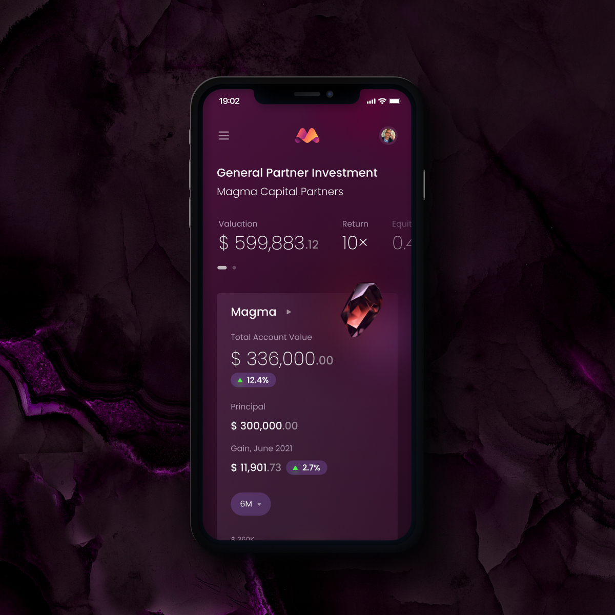
We were delighted to design the user experience for an exceptional finance platform - the hedge fund Magma. Thanks to the independent review platform Clutch, you have the opportunity to find out how this cooperation went on and read the interview with our client. The review collected by Clutch was given by the Director of Operations for the quantitative hedge fund Magma based in Chicago, USA.
About the Project
- Client: Magma Capital Funds
- Case: UX Design for a hedge fund platform
- Time: 11 months
Project summary:
A hedge fund hired UXDA to develop their investing platform. They created a user flow experience in Figma, ensured the accuracy of all wireframes, and produced several iterations based on the client's feedback.
Feedback Summary
"The team from UXDA was very professional and on top of their field."
Thanks to UXDA's work, the client successfully launched the first version of the portal and is looking forward to sharing it with their investors. The UXDA team communicated efficiently and frequently via Slack, email, and video meetings.
The Interview
Why Did Your Company Hire UXDA?
The investor onboarding process for hedge funds is a complex and fragmented process and prone to error. We wanted to streamline this process to provide our investors with a positive experience from the moment they first interacted with us. So we hired UXDA to help create a platform that our investors would enjoy using and find value in, all the way from onboarding to tracking their investments with us over time.
How Did You Make the Selection?
We searched online and selected our top few vendors and interviewed them. UXDA's stunning design and experience with financial systems were what stood out as a top choice for what we were looking for.
Please Describe the Project Scope
UXDA conducted thorough interviews with our team to fully understand the exact step by step of our investor onboarding experience. From there, they created a user flow experience in Figma that my team could collaborate and comment on to ensure all wireframes were accurate and approved prior to moving forward with design and branding.
They produced multiple iterations based on our feedback and provided easy-to-use spreadsheets to track the progress of the project over time. They were agile in pivoting priorities based on the needs of Magma and easy to get in contact with via both email and Slack.
Share any Outcomes From the Project
We are thrilled to have a beautifully branded and easy-to-use concept from UXDA. We are now working on the development of this platform with our developers, we just launched the first version of the portal last week and are looking forward to sharing it with our new investors.
How Effective Was the Workflow?
The PM was easy to get in contact with, especially considering the time zone difference. We met regularly on video and UXDA was always prepared with an agenda to keep meeting on track. We also communicated asynchronously via Slack and email which allowed the team to collaborate outside of the meetings to keep the project progressing.
What Did You Find Most Impressive or Unique About UXDA?
UXDA did an outstanding job reading our 300-page document and putting it into a simple, step-by-step process without our help. I was truly impressed with how well they did on their first attempt to create a user flow for Magma.
Get UXDA Research-Based White Paper "How to Win the Hearts of Digital Customers":
 If you want to create next-gen financial products to receive an exceptional competitive advantage in the digital age, contact us! With the power of financial UX design, we can help you turn your business into a beloved financial brand with a strong emotional connection with your clients, resulting in success, demand, and long-term customer loyalty.
- E-mail us at info@theuxda.com
- Chat with us in Whatsapp
- Send a direct message to UXDA's CEO Alex Kreger on Linkedin


