Almost 60% of all working-age Americans have no retirement savings. Four in ten adults couldn’t cover a $400 emergency expense in the U.S.* Adults struggle to manage their finances, but they want to see their kids grow up as successful people with good financial habits. At the same time, 49% of parents don’t know how to discuss finances with kids in an understandable and enjoyable way. How financial companies could design the best digital bank for kids that will help parents to ensure their kids' financial future?
UXDA explored this challenge with a purpose-driven banking app design case study. This UX case study provides insights on how an app could impact family relationships, create a good foundation for their kids’ financial future and ensure a successful inclusion of children in the modern digital economy.
We do not need magic to change the world, we carry all the power we need inside ourselves already: we have the power to imagine better.
J.K. Rowling
Here is Why it's Worth Checking out This UX/UI Case Study on How to Design the Best Digital Bank for Kids:
- Extensive research-based insight into kids and family finance-specific behaviors.
- Ways to ensure the successful inclusion of children in the digital economy.
- How banking could step "out of the box" to improve relationships in families.
- How a banking app can take a workload off parents' shoulders when teaching kids about the value of money.
- For the first time, we reveal our "kitchen" in which you can see how our team is working on the visual designs.
- How to create a meaningful banking experience based on the pains and needs of real users.
Financial Discrimination Against Our Children
What urged us to create this case study with such devotion? The primary reason was the global challenge of integrating children in the modern digital economy and improving financial literacy as an essential part of our kids’ future. But, at the end of the day, we, ourselves are parents, and the care for our children’s well-being is everything. This was the initial drive to embark on this journey and seek ways to help families around the world. So, we begin with UXDA's CEO Alex Kreger sharing a personal story as a father who cares about his children.
My 11-year-old daughter goes to school, and each day we give her cash to buy lunch or to visit the store after school. The amount is small, but she gets upset if she loses it. As a parent, I am worried about her safety. What if someone decides to take her money? Since card payments are available everywhere, I decided to get her a card. Imagine my surprise when I discovered that not all banks offer such a service. This made me feel like banks would think that parents should accompany children everywhere up to the age of 16 and pay with their own card.
To my delight, a large bank, of which I was a client, stated that children have a place in the modern digital economy. Although information about the possibilities of children's accounts wasn't easily accessible, I found it. Almost all these bank services are digitized, so I submitted an application via online banking. Soon I received an invitation to visit a bank branch, together with my daughter and wife, to open an account and get a card. I was upset that I couldn’t get it done digitally, but my daughter was delighted by the fact she would soon get her first card.
We arrived at the appointed time. Due to the pandemic, the branch worked in a limited mode, so we had to wait in line for 20 minutes. Then we spent another 20 minutes triple signing a bundle of papers related to opening an account. Finally, the bank consultant went to get the card, but she returned empty handed and said that her manager demanded additional KYC verification. This was despite the fact that they previously confirmed that the card was ready for issue in the branch. In addition, my wife and I had been clients of this bank for more than 10 years. So, we left with nothing, and they promised to call us some time later when all was sorted out on their end.
I remember seeing disappointment in my daughter's eyes. I can only imagine how her first impression of a traditional bank would influence her attitude toward banking in the future. After two weeks, we were informed that the account was opened, and the card could be picked up.
My daughter was so happy when she took this small shiny piece of plastic. For her, it represented a pass into the adult world of opportunities and freedom. As I watched her explore the mobile application and saw her starting to struggle, I wondered - why didn't the bank, with all of its resources and specialists, decide that the same application used by adults would be suitable for children? Wouldn't it be possible to come up with something better?
For centuries, we haven’t forced children to use the same stuff as adults, but finance still discriminates against children. Digital financial services could provide the perfect opportunity to serve our kids, teach them how to handle money and take care of building the right attitude. We just need to rethink financial services... make them "speak" the kids' language.
The UXDA's team of expert UX architects and designers introduces a vision of a kids' banking app that can help prepare children for the digital economy and help parents teach their children the financial rudiments.
Addressing the Conflict Between Parenting and Finance
Thousands of stories like the one Alex shared happen every day. This motivated us to do a deep dive and explore the relationships and the experience kids and families have with finances. We remembered our own struggles as kids and as adults as well.
We aimed to come up with a solution for kids currently growing up to help them achieve a positive experience and attitude toward finances and prepare them to better integrate later in the world of digital economy.
It's a statistically proven fact that adults struggle with finances; 44% of Americans don’t have enough cash to cover a $400 emergency. Then, how difficult is money management for kids? Parents try to use different apps to become better at finances and budgeting. At the same time, many questions remain unanswered about how to educate their kids: “What exactly do I tell them and how do I tell them?”; “Isn't it too early to speak about money? Or, conversely, is it too late?”; “How can I teach them to have the right attitude toward money”? In our hectic lives, parents often lack the knowledge, time and skills to address these questions in a manner that would be heard.
This creates frustration and even desperation because parents know that the future of their kids largely depends on the habits taught in childhood, but what do we do and how do we start? Procrastination on this question can have very damaging consequences, as the stats demonstrate.
The success of the result, whenever parents want to teach their kids, largely depends not only on knowledge but the family relationships. It can be a great challenge for parents to make kids listen to them so that they could establish proper habits as a stable foundation for their grown-up life. And, this challenge is behind many family conflicts.
Understanding the huge impact of childhood habits, UXDA explored ways that a banking app could support parents, reduce stress and eliminate family conflicts and help kids to better understand the basics of finances and money management starting from an early age.
We wanted to find out if financial education and adaptation is possible through kids' own experiences in an attractive, interesting and enjoyable way for the whole family. We believe we have succeeded in coming up with a design to make both effortless─the teaching from the parents’ side and the learning from the children's side. This would allow the creation of good financial habits as a stable foundation for the future.
The Research: Exploring the Heroes of the Story
Our first step was to explore financial products for kids that already exist in the market. We researched banking apps for kids and parents that are mentioned in many reviews and publications as good examples for the first steps into financial management for kids.
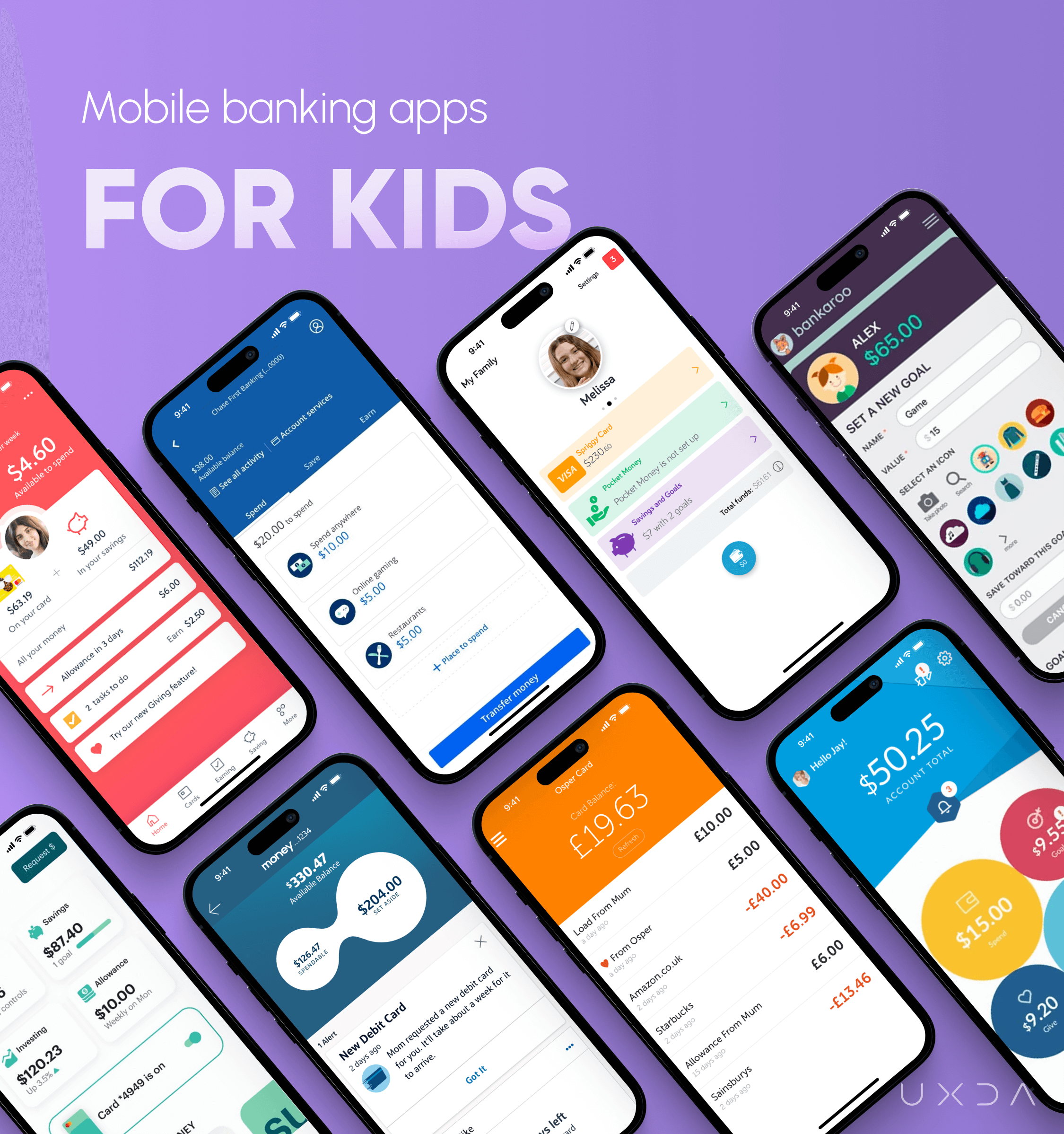
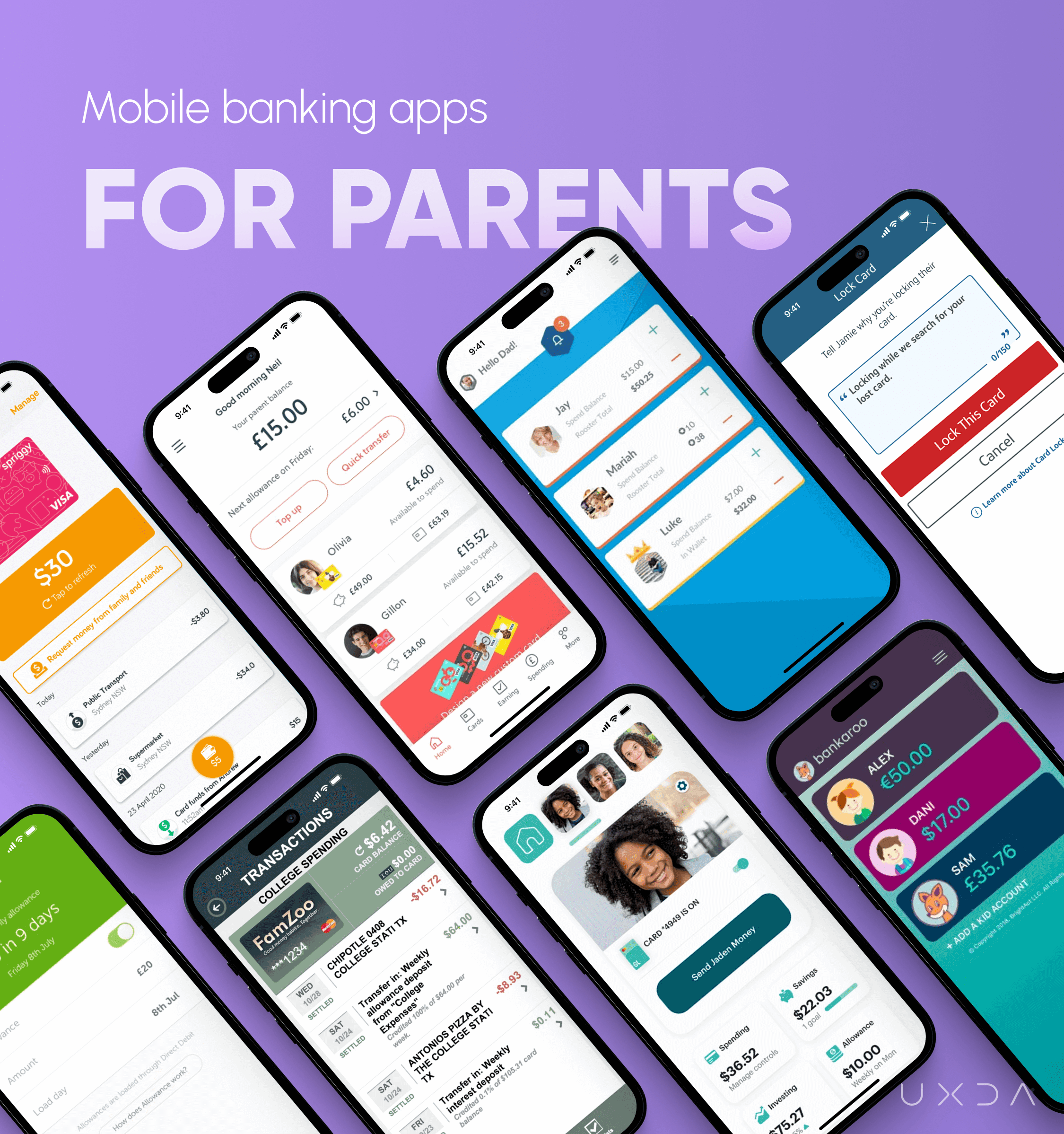
The average age range of kids that these apps are created for is from 6 to 8 years. Some of them have bright colors that attract attention, but, in general, they are similar to basic banking apps their parents use. But, are these apps understandable to such young kids who possibly didn't have any prior experience with finances? Are they engaging enough for them to learn about finances? What feelings do kids have using them? Do they enjoy them?
Parents have so many questions and doubts about finances and family matters but these apps don't provide any advice and education for them. We saw great potential and possibilities to expand banking for kids on the next level because existing products in the market unfortunately don't provide such an opportunity.
The UXDA team accepted the challenge to create an engaging and helpful banking product for the whole family─parents and kids alike. One step ahead: what additional value could a kids’ banking app bring for families? We were ready to dig deeper and conduct thorough research to understand the most important pain points parents and kids face when it comes to financial education. We researched publications and surveys about money management in families and conducted interviews with parents and kids.
All the parents who were interviewed agreed that explaining money management is very important. It is helpful in forming kids’ values, mindset and attitude toward money. Below, we have compiled the nine largest struggles of families identified during the research.
1. Parents Lack Proper Knowledge and Experience About Finances
Parents want their kids to be smart and analytical in finances, but parents don't have enough practice and knowledge on how to cultivate these characteristics in their kids. Such a lack of knowledge is often passed down through the generations.
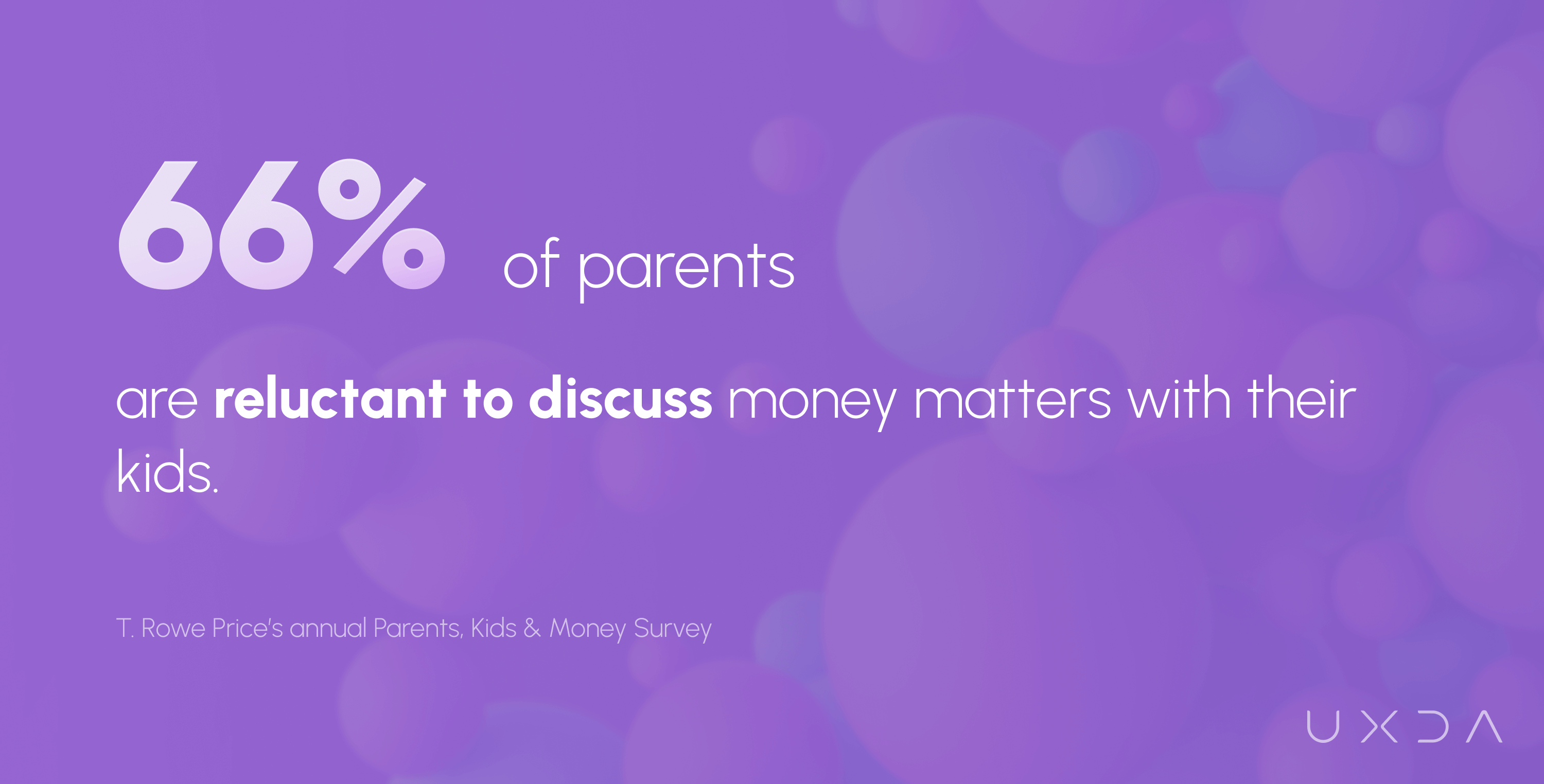
Sixty-six percent of parents have some reluctance to discuss money matters with their 8- to 14-year-old kids, and 21% of parents are very or extremely uncomfortable discussing money with kids, according to T. Rowe Price’s annual Parents, Kids & Money Survey.
2. Conversations About Money Mostly Happen When Kids Become Teenagers
Parents think that finances are a complicated topic to explain to younger kids. The research shows that a large number of parents initiate conversations about money when kids become teenagers.
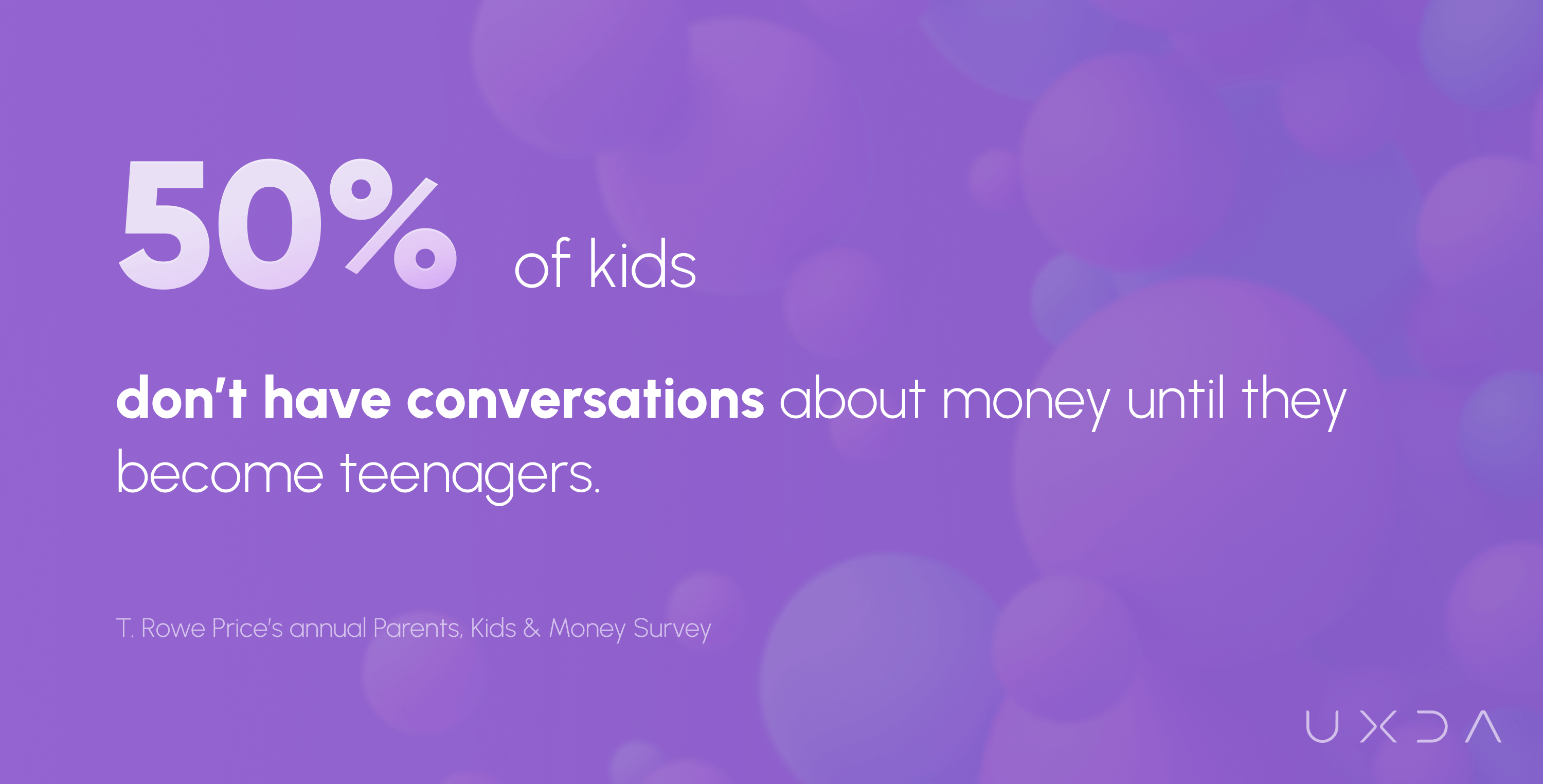
Fifty percent of young adults didn’t have money conversations until age 13 or older with their parents, and 30% didn’t have money conversations until age 15 or older, according to T. Rowe Price’s annual Parents, Kids & Money Survey.
3. Disagreements About Priorities and the Use of Money
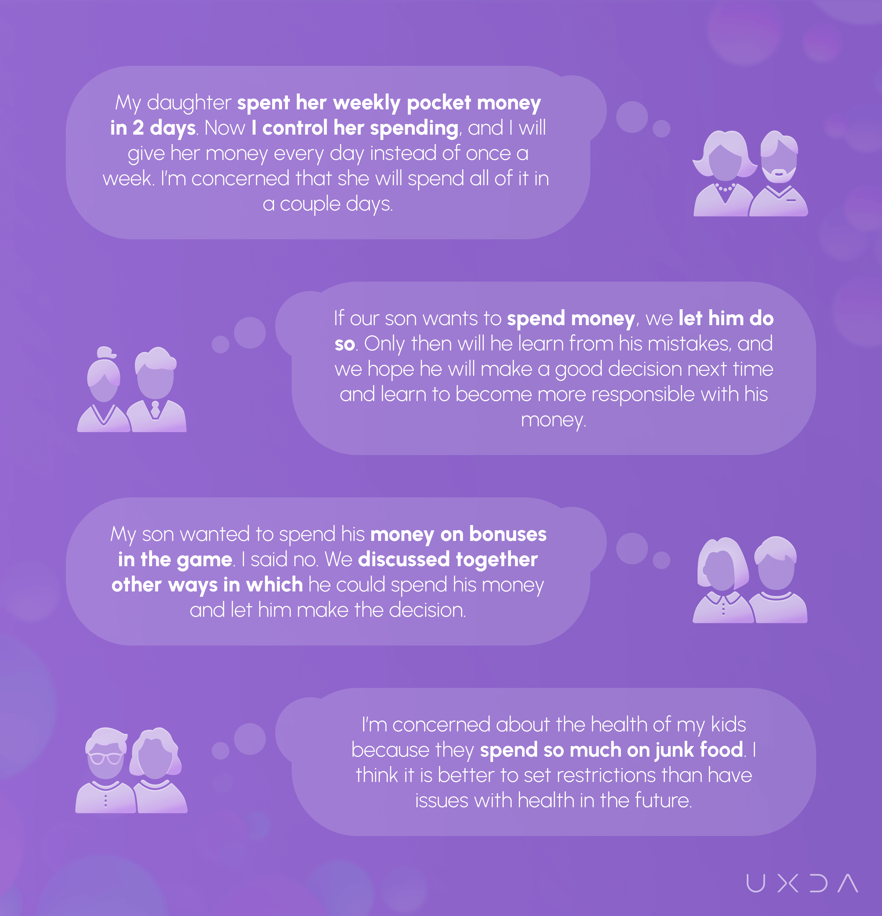
It is a challenge to find a balance between kids’ desires and parents’ expectations. We have compiled the experience shared by the interviewed parents in the image below.
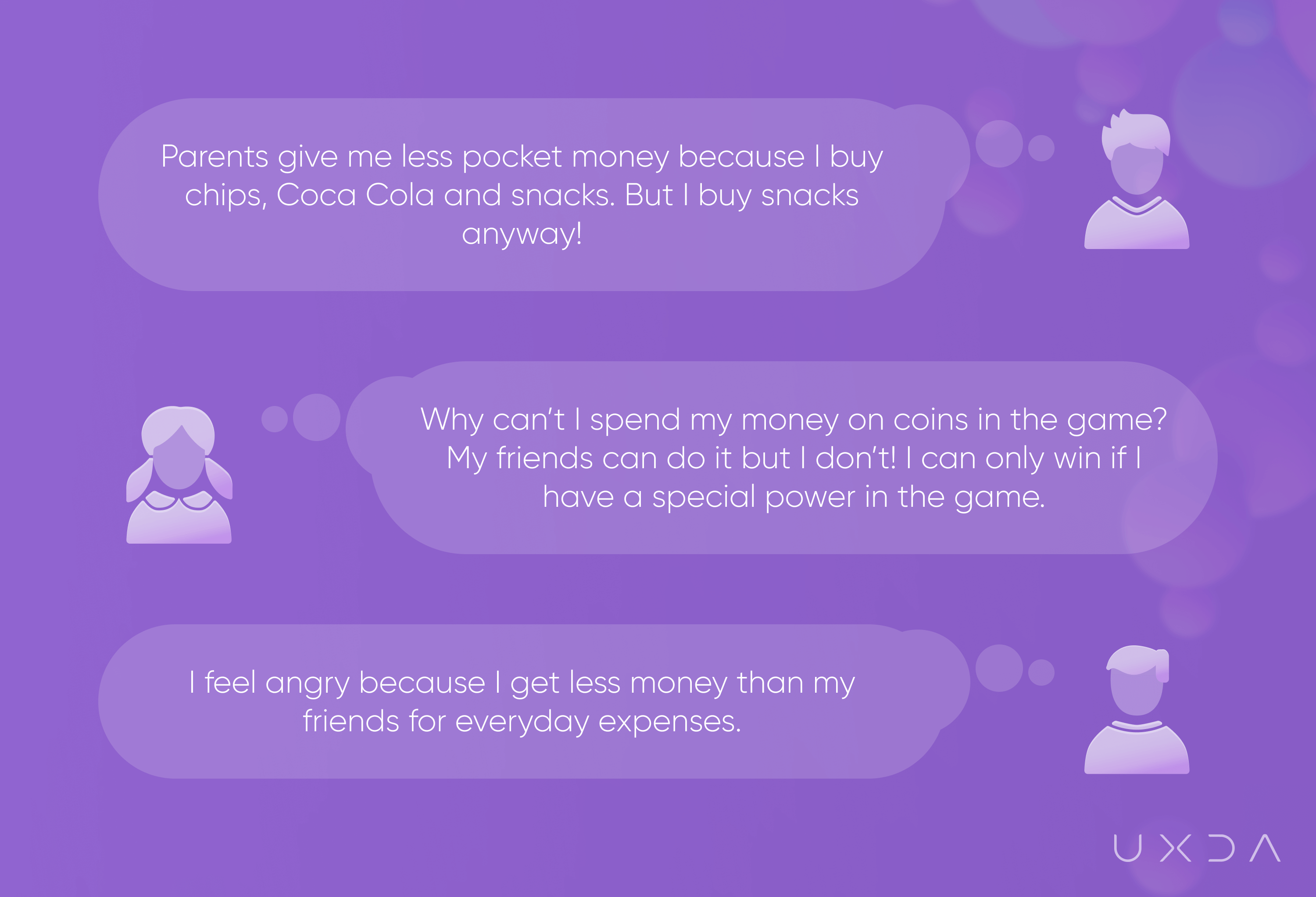
On the other hand, kids feel angry and dissatisfied with the parents' decisions. Kids shared their thoughts with us (see the image below).
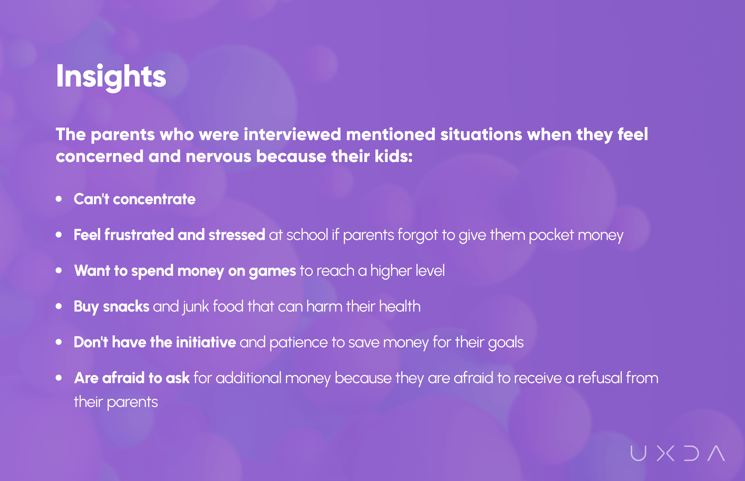
The parents who were interviewed mentioned situations when they feel concerned and nervous because their kids:
Kids mentioned that they spend allowance mostly on entertainment or snacks, but, at the same time, they save money to buy something they desire.
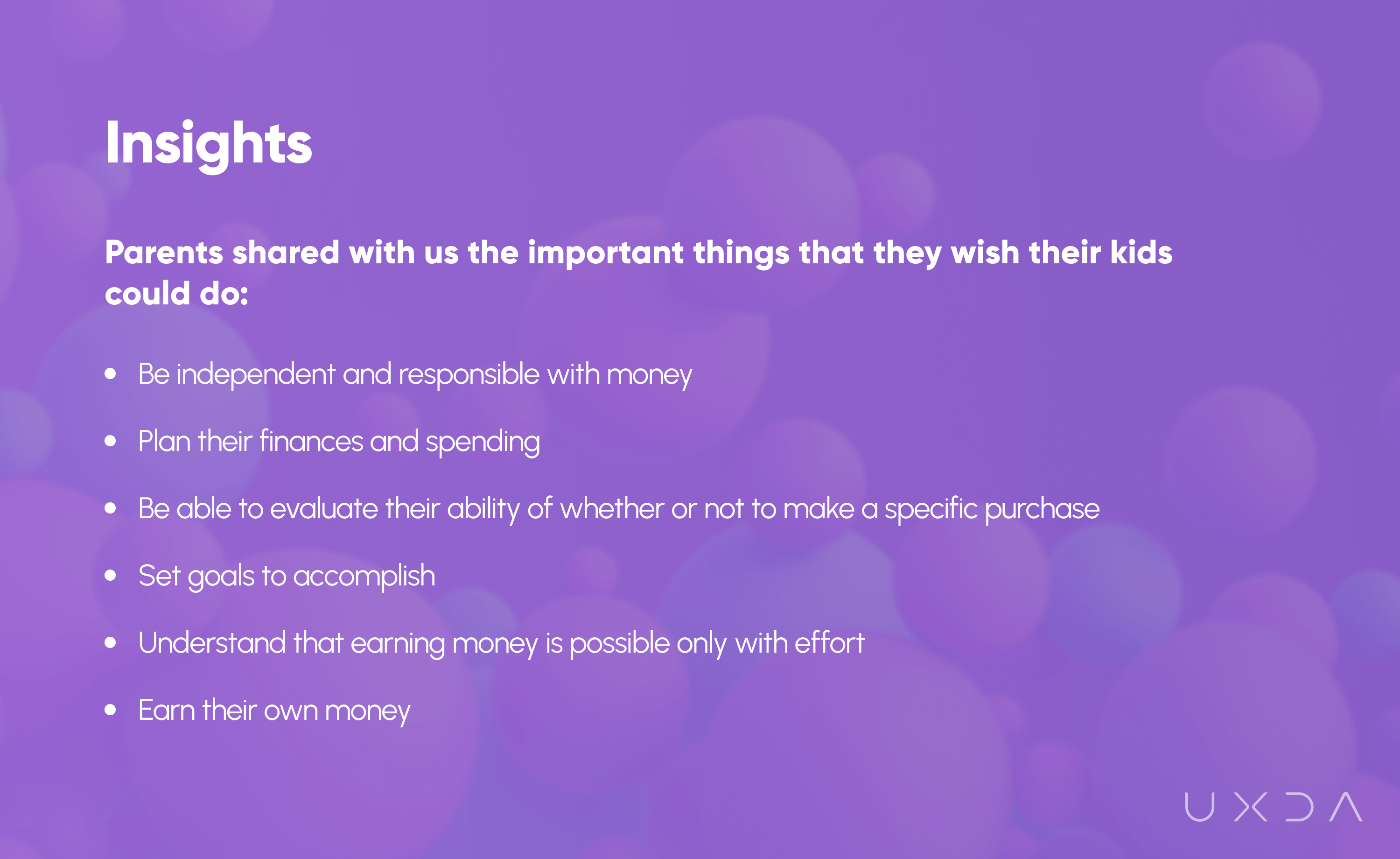
All the parents interviewed want their kids to save money and consider it to be an important habit for their kids' future. Parents mentioned goals they want their kids to start save money for: gaining new knowledge, experience, books, entertainment with friends and saving for future needs.
4. Kids Perceive Money as Something Abstract and Delightful
All of the interviewed kids understood that they need money to buy something and that parents have to work to earn it. Most kids know that they have to save money if they want to buy expensive toys or games. Younger kids perceive money as something abstract, and they don’t realize what an effort it is for parents to earn their salary and manage all expenses. They think it is enough to go to the ATM and just get money whenever they need it.
We asked kids to express their feelings about money in words:
- Delight and pleasure
- Wealth
- Shopping
- Ability to afford anything they want
Kids aged 6-11 can't express their thoughts verbally as well as adults can. They told us what they think money is, as depicted in the picture below.
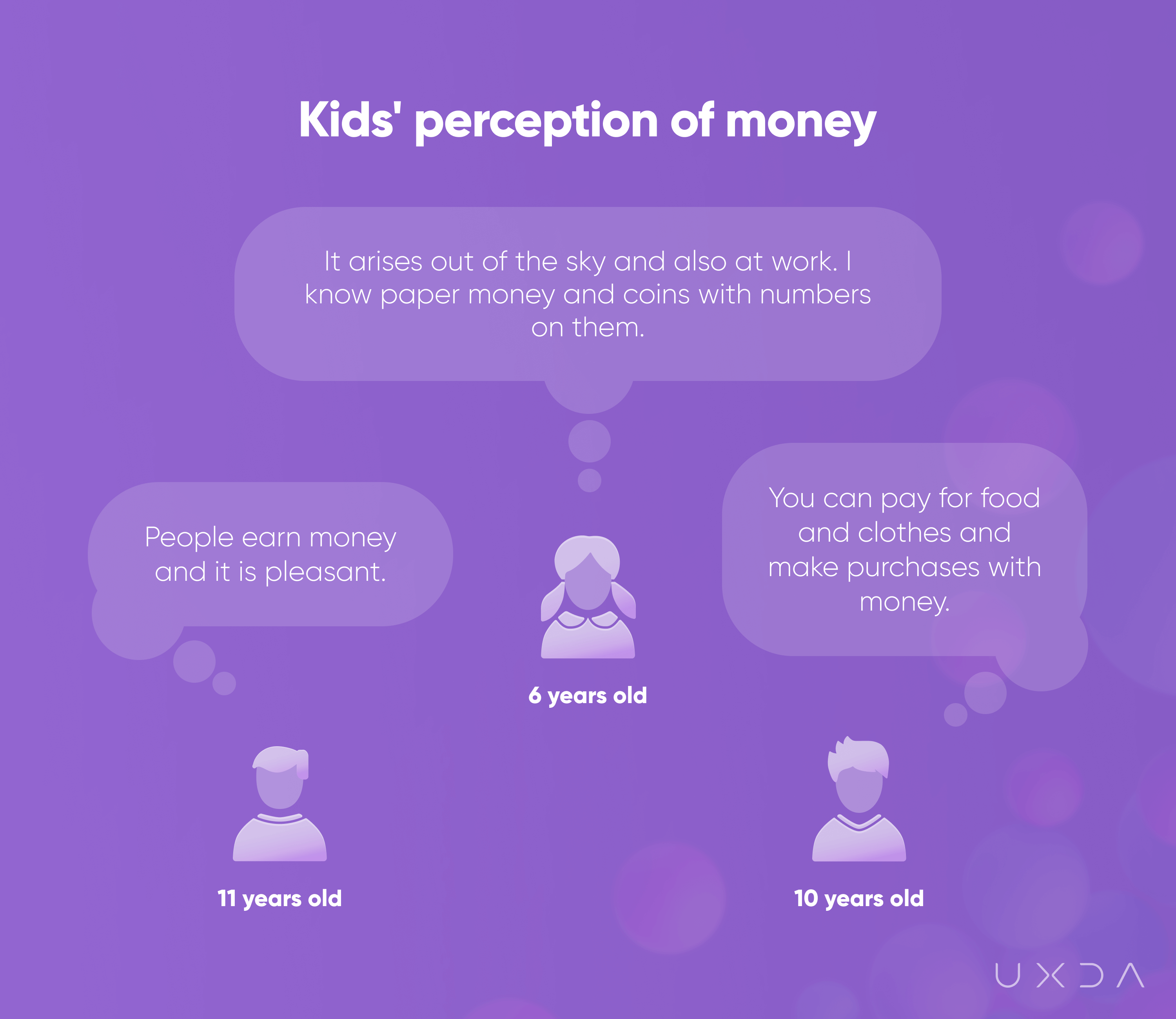
To see kids' emotions and associations about money, we asked them to create a drawing called “Me and my money.” From observing the drawings, we saw that kids understand the connection between the bank and money. They perceive money as something that is stored in the bank and has to be secured by police, in a large building that isn't so easy to enter. Kids draw themselves with a happy face and smile when they hold money in their hands because they can imagine all the desired things they could buy! If they would only have as much money as Scrooge McDuck.
5. Difficulties in Creating an Adequate Perception of Money
“Buy me that!”; “Why can’t you buy this for me?” Do these questions sound familiar? Many parents buy desired items for their kids just to prevent disagreements or to ensure that kids feel equal to others by having the same trendy items.
Parents tend to fulfill kids' wishes to compensate for the time they can't spend with kids because of the long working hours or because of divorce or for other reasons.
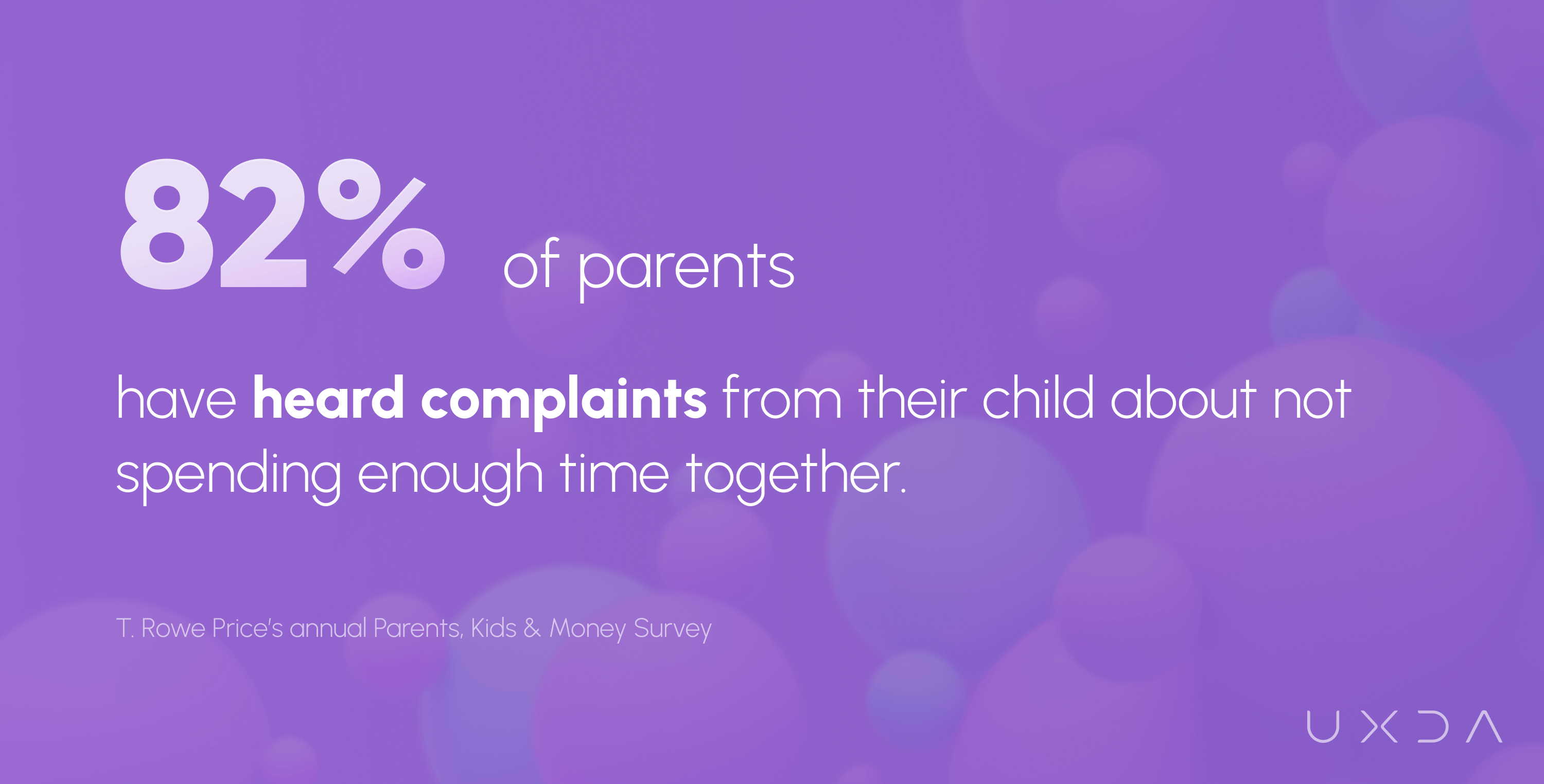
All parents want to be the “good parent.” As a consequence, kids expect to receive everything they want, they are demanding more and can become extremely spoiled. Parents mentioned that they follow good intentions buying things for kids, but, at the same time, they are afraid of creating the wrong perception of money.
6. Families Spend Less Time Together
Families in the U.S. spend only 37 minutes of quality time as a family on weekdays, according to a study commissioned by Visit Anaheim.
The time that the family spends together strengthens a sense of community, and kids learn to solve problems, make compromises, make positive choices and have better results in school. The more time a family spends together, the more kids learn from their parents, building their perception of a family.
7. Parents Do Many Things Instead of Letting Kids Do it Themselves
The parents of children of Generation X (currently aged 41 to 61) and millennials (currently aged 27 to 41) are more involved in their kids' lives than previous generations. The current kids’ generation - Generation Z (currently aged 12 to 18) and Generation Alpha (currently aged 0-11), experience more protection, attention, and care from parents than ever before. Millennials have children later in life than previous generations and fewer children per family. That leads to having more time and money to spend on their kids. Not surprisingly, current kids have the highest standard of living, and they grow with large expectations from others, expecting everyone to do things for them. As a consequence, parents have difficulties assigning chores in their family harmoniously and involving kids in household tasks.
8. Digital-Native Lifestyle
Kids like to explore new features and have fun using devices. The time kids spend daily on devices has increased during the last few years.
The average daily screen time is up to 5 hours a day for 8-12 year-olds and 7.5 hours for teens, not including the use of screens at school or the rapidly growing use of computers for homework, according to Common Sense Census: Media Use by Tweens and Teens.
We asked kids about what they like to do on their phones to better understand their experience with mobile apps and patterns they are familiar with.
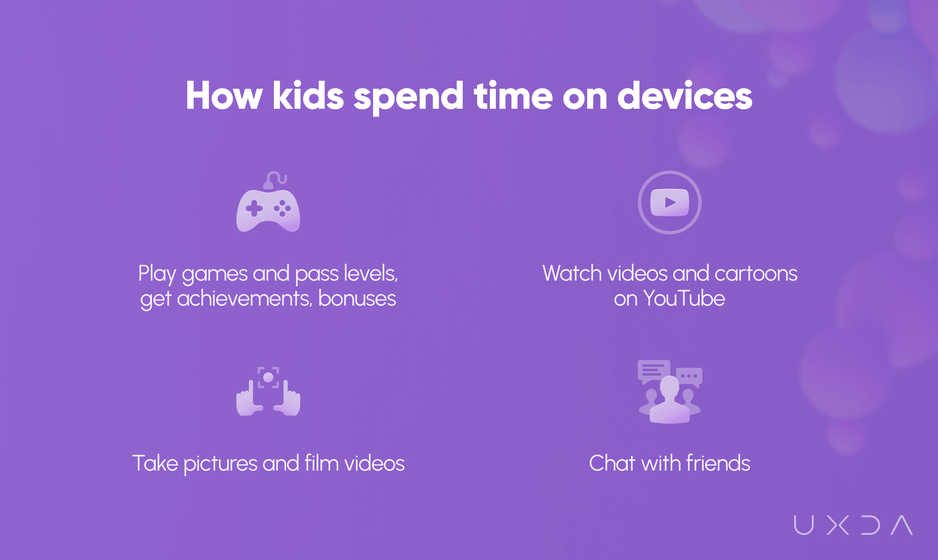
Time spent with devices in their hands is entertainment for kids, and parents face a challenge to take kids away from their screens and involve them more in family life and household tasks, spend more time together and teach them responsibility.
9. Kids Have Different Device Usage Habits as Adults
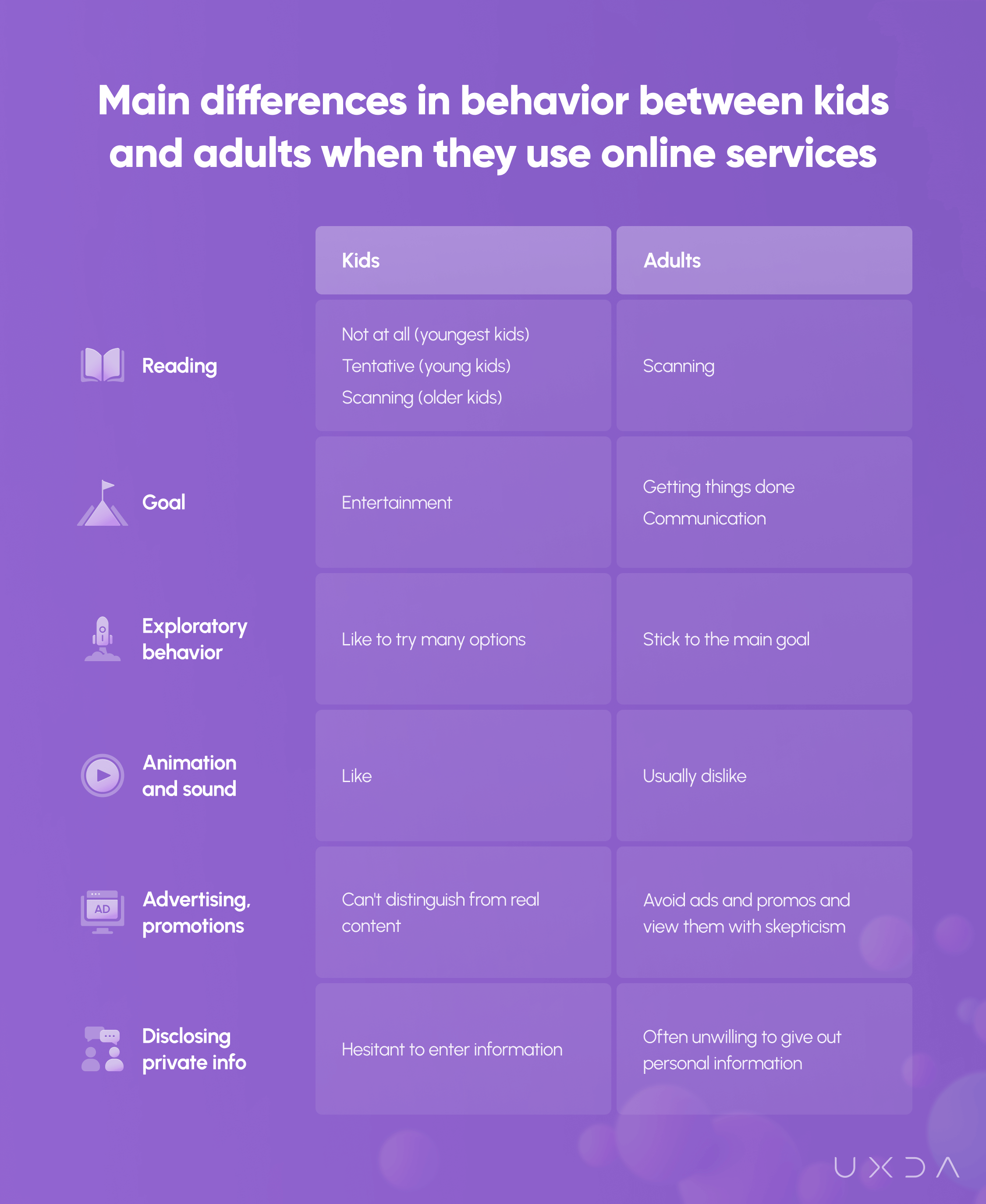
The current generation of kids typically have their first experience with devices before they are a year old. They can't speak or walk yet, but they know how to watch their favorite cartoon on YouTube or play a game. They have a good understanding of how things should work and interact online and have high expectations for the services they use. Just as with everything else in life, kids and adults are different regarding their behavior using devices.
In the image below, you can see the main differences in behavior between kids and adults when they use online services.
Main Insight: A Kid's Banking App Should Improve Family Relationships
As we discovered during the research, money matters and financial education is a difficult topic in families. More than 60% of parents have difficulties discussing these matters with their kids, and 50% of young adults had such conversations in the family only when they were older than 13. The earlier we teach our kids specific skills, the greater the possibility that they will use and adopt them when they grow up.
Kids learn numbers and basic calculation when they start school and are in their middle childhood (6-12 years of age). At this age, parents start to think about financial education for their kids or consider their first banking card. We decided to create an appropriate digital solution that would help to ease financial issues for families when their kids are 6 to 12 years of age and taking their first steps into the world of finance.
We found out during the research that kids have different goals using devices than adults─they want entertainment. Is it possible to create an engaging banking app for kids? The kids we interviewed enjoy games, and we wanted to combine gamification elements and education in a single app.
When kids are engaged and interested in learning something new, the release of dopamine in their brains increases. The feeling of pleasure motivates kids to keep learning and exploring.
At the same time, we had to take into account that kids as the users of the app differ from adults by their age characteristics, mental and physical abilities and experience with banking and other services and devices.
We discovered that relationships and the overall quality of life for the parents and kids are topics that concern family members.
Families have disagreements about money matters, and they can't find the right way for them to solve that. This has a huge impact on the future of kids.
We realized that we have to expand the horizon of banking apps by focusing not only on standard banking features and functionality but also on connecting finances with relationships between family members.
The UX Engineering: Creating a Bond Between the Heroes and the Product
During the research, interviews and communication with parents, we realized that we have many common doubts and uncertainty about finances in families and relationships with kids. We face similar issues; we aren't sure that we are doing the right things with finances ourselves, but, at the same time, we have to share knowledge with our kids, we don't have enough time to find the right answers, we are concerned about our kids spending money on junk food, we feel helpless seeing our kids demotivated, and we are afraid that we are losing the emotional bond with our kids because of all the disagreements we have.
Even more, this is not an issue that concerns only us. As we can see, parents have similar feelings and thoughts worldwide.
This app is not only about finances, but also about family relationships and kids' futures. We wanted to help parents, kids and families in their unique situations. Can the banking app impact the whole family, relationships, financial education and even our kids' future?
Defining the Core Essence of the Service - Value Board
Before the product development process, we revealed and defined the uniqueness and value the app would bring for parents and kids in their everyday lives. We call it the Value Board.
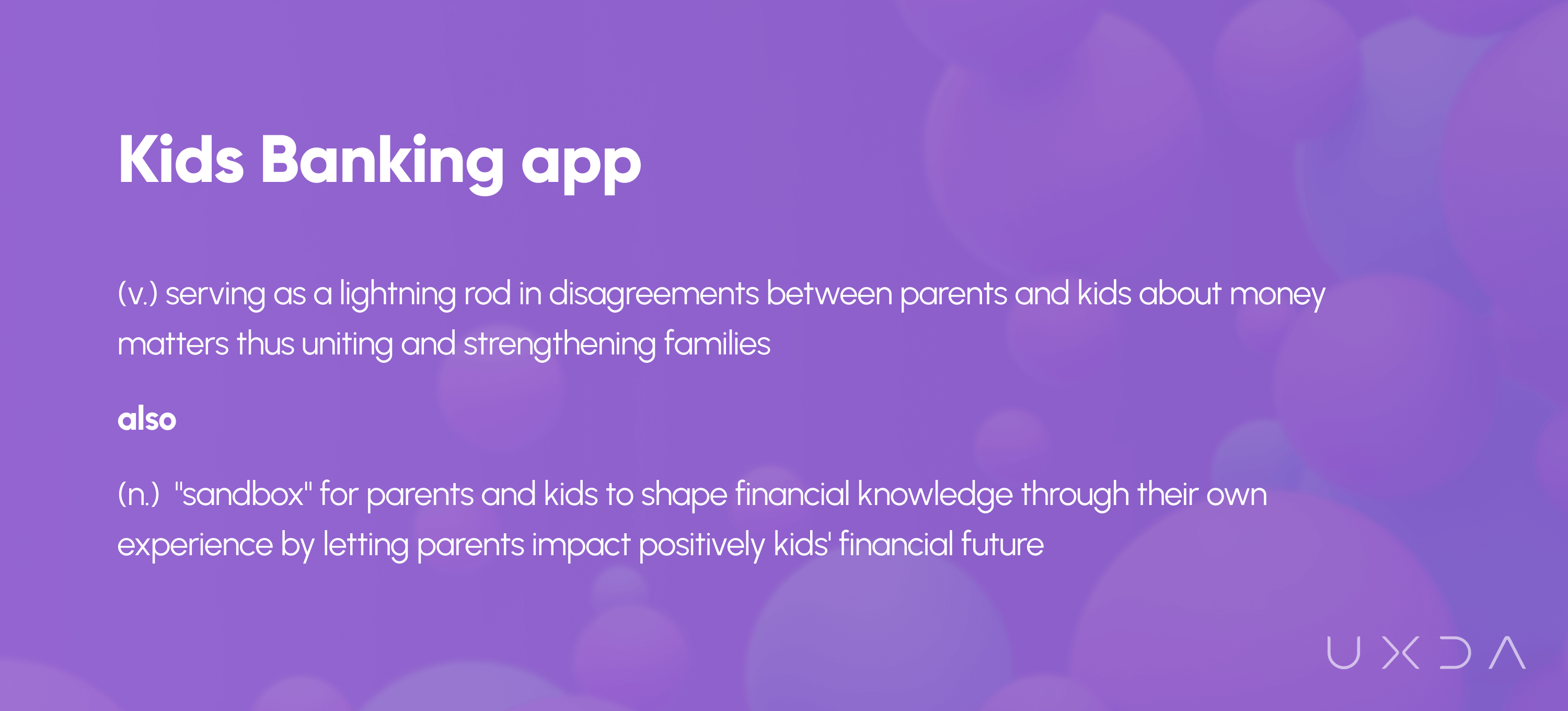
The Value Board serves as a guideline for the whole team to stay focused on the product goals during the product development process. Furthermore, it helps to define the value proposition of the whole product to users.
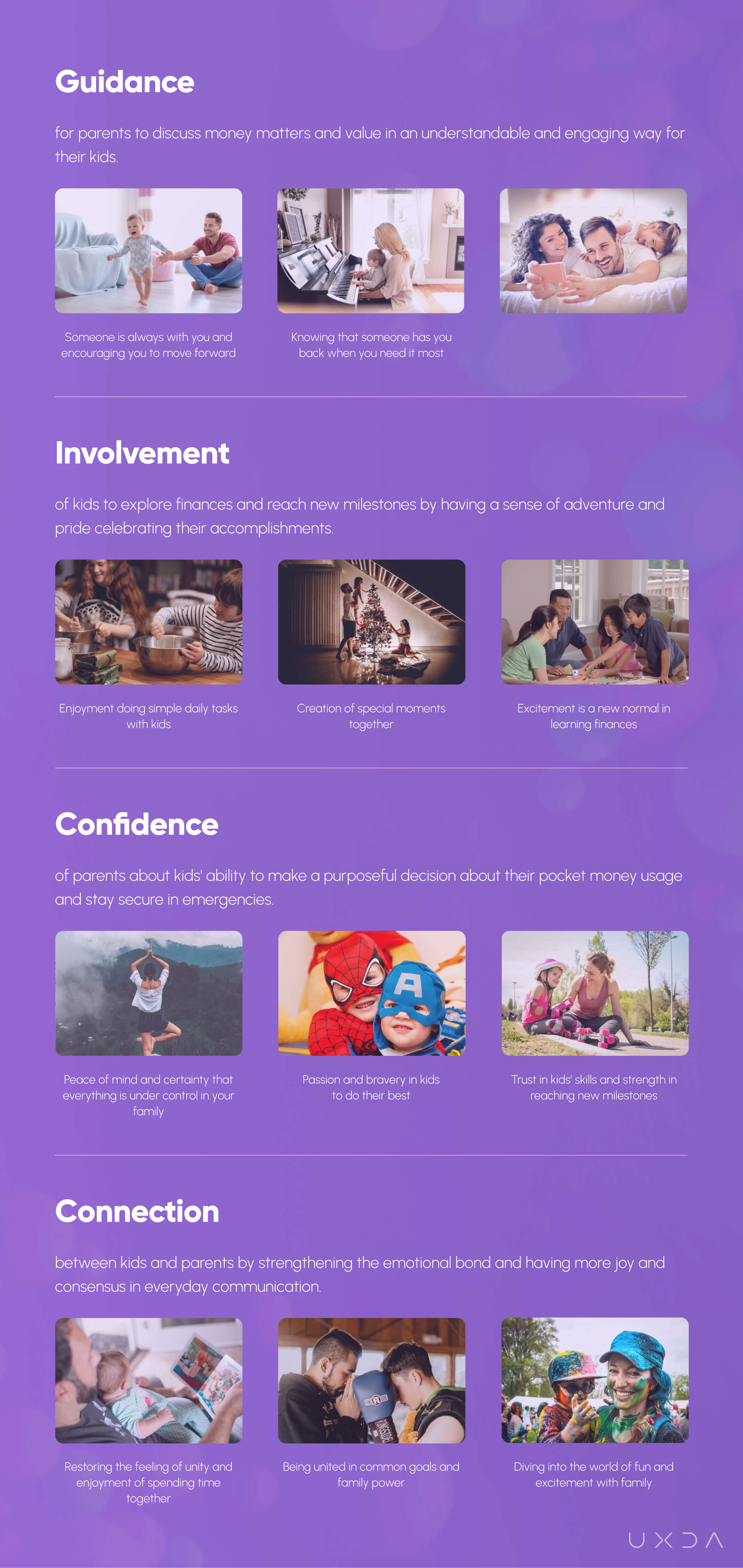
We perceive the banking app for kids as a separate service from other services provided by the bank. It would provide an opportunity for every bank or other financial institution to offer such a service without considerable changes to their existing service. It's aimed at easing families' struggles due to inconvenient financial solutions that don’t support their needs. This creates an ability for financial institutions to offer not only banking services for kids but to bring a solution to families that will combine finances and family management and help to create good habits for kids and a spirit of adventure in everyday routines.
The app could serve as a guideline and a practical tool for parents to create a stable foundation for their kids’ financial future the right way. The kids would establish meaningful financial habits that they could rely on throughout their lives.
The in-depth exploration was essential to create an app that would truly serve the specific needs of families, and not just become one of the hundreds of products that aren't of any use to real people.
Blueprinting Kids’ Banking Experiences
The success of the product doesn't depend on the number of features included in the app but on the value, experience and emotions users get from everyday interaction with the product. The banking app has to make parents and kids' lives easier and solve their problems, evoking more positive emotions.
We summarized insights from the research and interviews with families to find out why kids and parents would use the app to manage their daily finances or pocket money. Why is it important for kids to check their balances before the purchase in the shop? Why do parents want to know if the kid had spent too much money on junk food? Why are they worried if kids have lost their money after the lessons?
To have a broader view about parents and kids' motivation and situations in which they use the app, we used the Jobs-To-Be-Done (JTBD) approach to define scenarios for them. The context of the app usage helped us later generate ideas on how to solve users’ pains and remove struggles. Defined primary and secondary scenarios for parents and kids helped to set the right priorities for information architecture and tasks in the app.
Our next step was to create an emotional journey map for kids and parents in which we linked together both kids’ and parents’ needs with feelings about their future interaction with the product. Feelings that parents (and especially kids) will have about the messages in the app are very important. We defined the tone of voice of the product to implement the unified communication style and tone throughout the product. The app should speak as a friend, in a casual and enthusiastic way, and even include jokes to encourage and add cheer when necessary.
Knowing that kids have different age characteristics, device usage patterns and expectations, our challenge was to guide kids through the app in an understandable and enjoyable way─to create an app that will speak in the same language. To do so, we started with the step-by-step flow maps for the main scenarios to develop navigation through the app based on previously made users’ scenarios and insights gathered during the research and interviews with parents and kids. That allowed us to find solutions and new ideas on how kids and parents would interact with the app to complete their tasks in a seamless way.
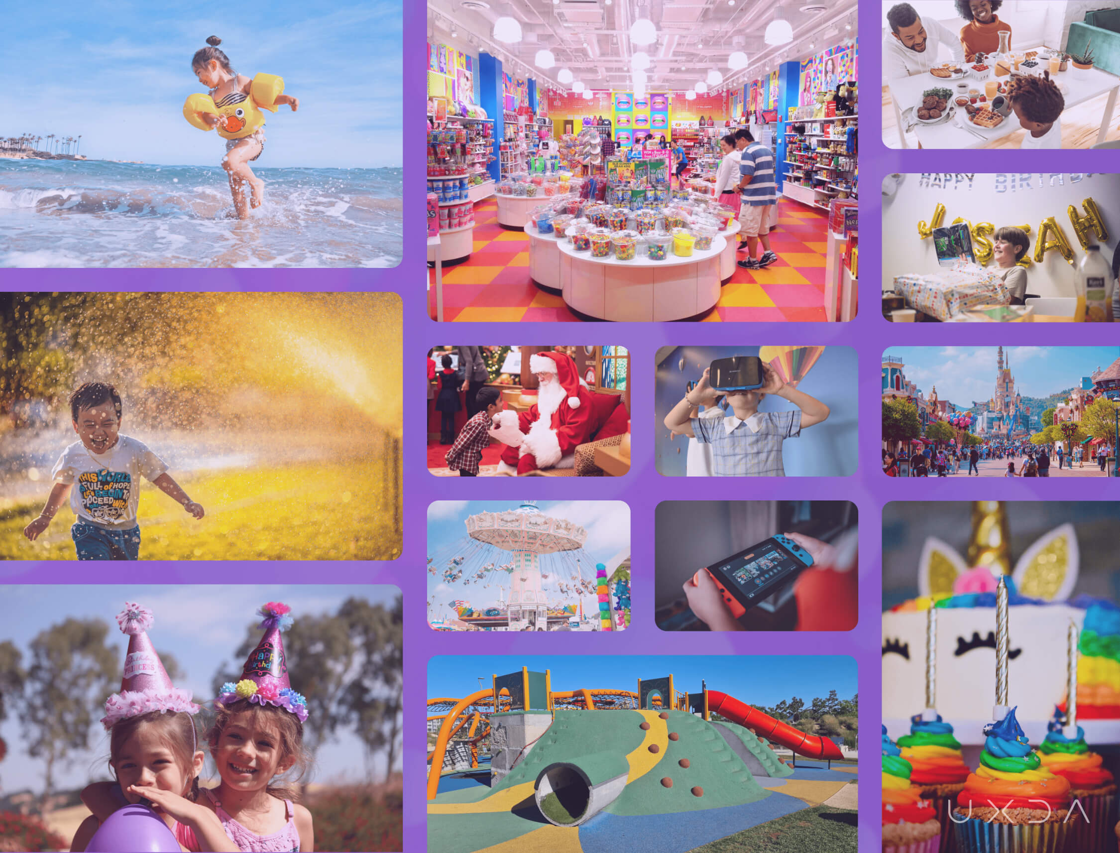
The emotional experience for kids using the app is very important because that will create their future perception about finances and even impact their confidence. The collection of emotions, moods and feelings that make kids happy, adventurous, playful, cheerful, excited and sparkling while enjoying moments of their childhood.
We created the Emotional Mood Board for kids to communicate those emotional qualities of the app for the whole team. Our goal was to follow it all the time and remember the kids' emotional experiences we have to bring to life on every screen and interaction.
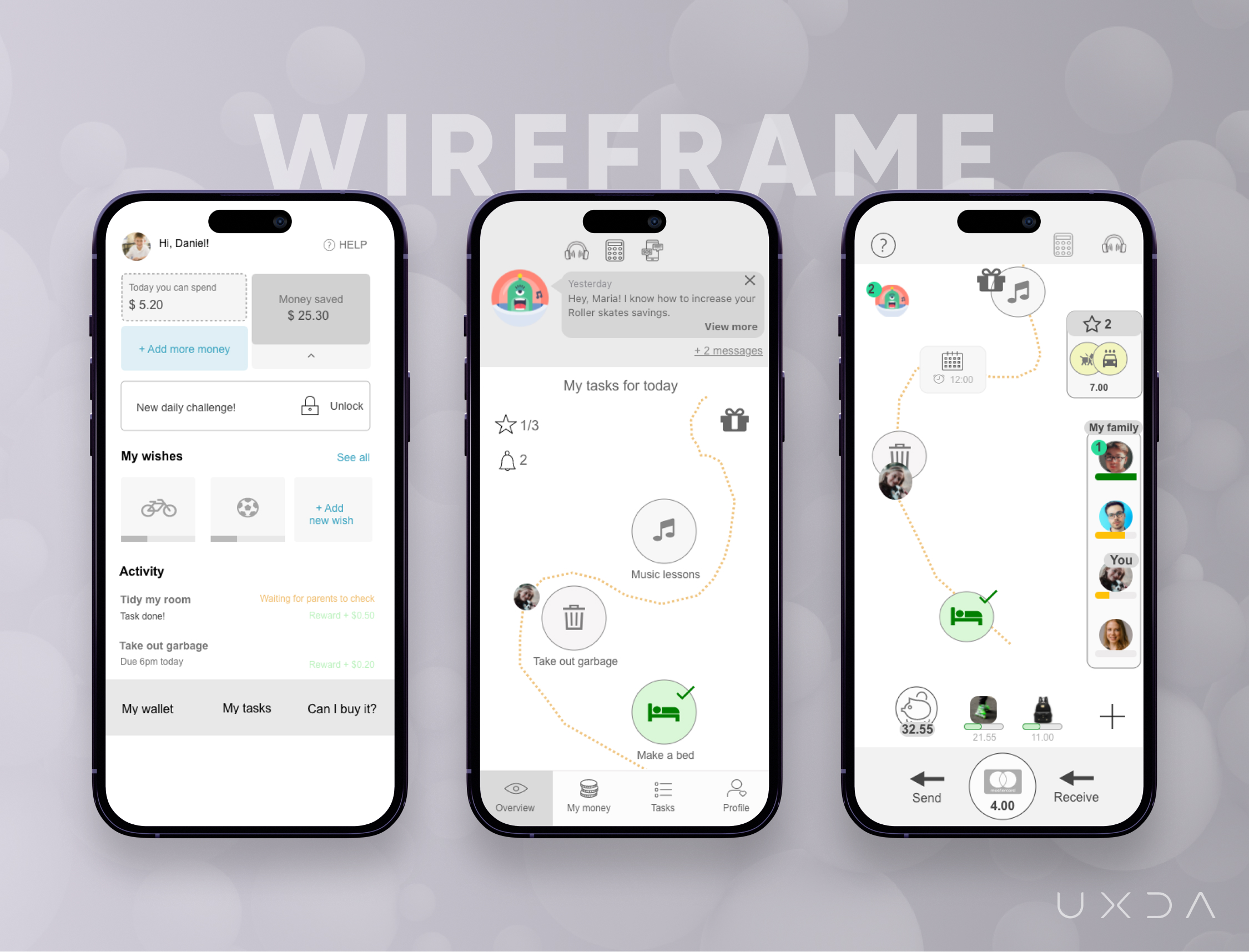
After that, we started one of the most challenging parts of the whole project - wireframes─blueprints of the app showing detailed information and layout on the screens, taking into account user scenarios, priorities for parents and kids and the creation of user flows. Remember that feeling when you tried to explain to your 7-year-old kids how to solve that task in mathematics, but they didn't understand much because your explanation was too complicated for their age?
Can you imagine how difficult it is for a 35-year-old to step into the shoes of a 7-year-old and look at the world through their eyes, experiences and feelings? This was a challenge for our whole team, even for those who have kids.
We started with the most important screen in the app─the dashboard that will navigate to all other sections of the app. Based on the research made and insights from interviews, we combined banking and financial education with family task management. As we discovered from the research, money matters and common understanding about money value are topics that often lead to disagreements. Kids will follow their daily tasks and be more involved in family life and household duties the more they learn about the family’s finances. Our goal was to help parents to involve kids and let them learn from their own experience and become responsible as this was one of the greatest struggles parents have.
After the first wireframe was ready, we realized that we need more iterations to make the screen less formal and add a feeling of simplicity and joy.
We explored apps that the kids we interviewed use and other apps popular for kids, especially games.
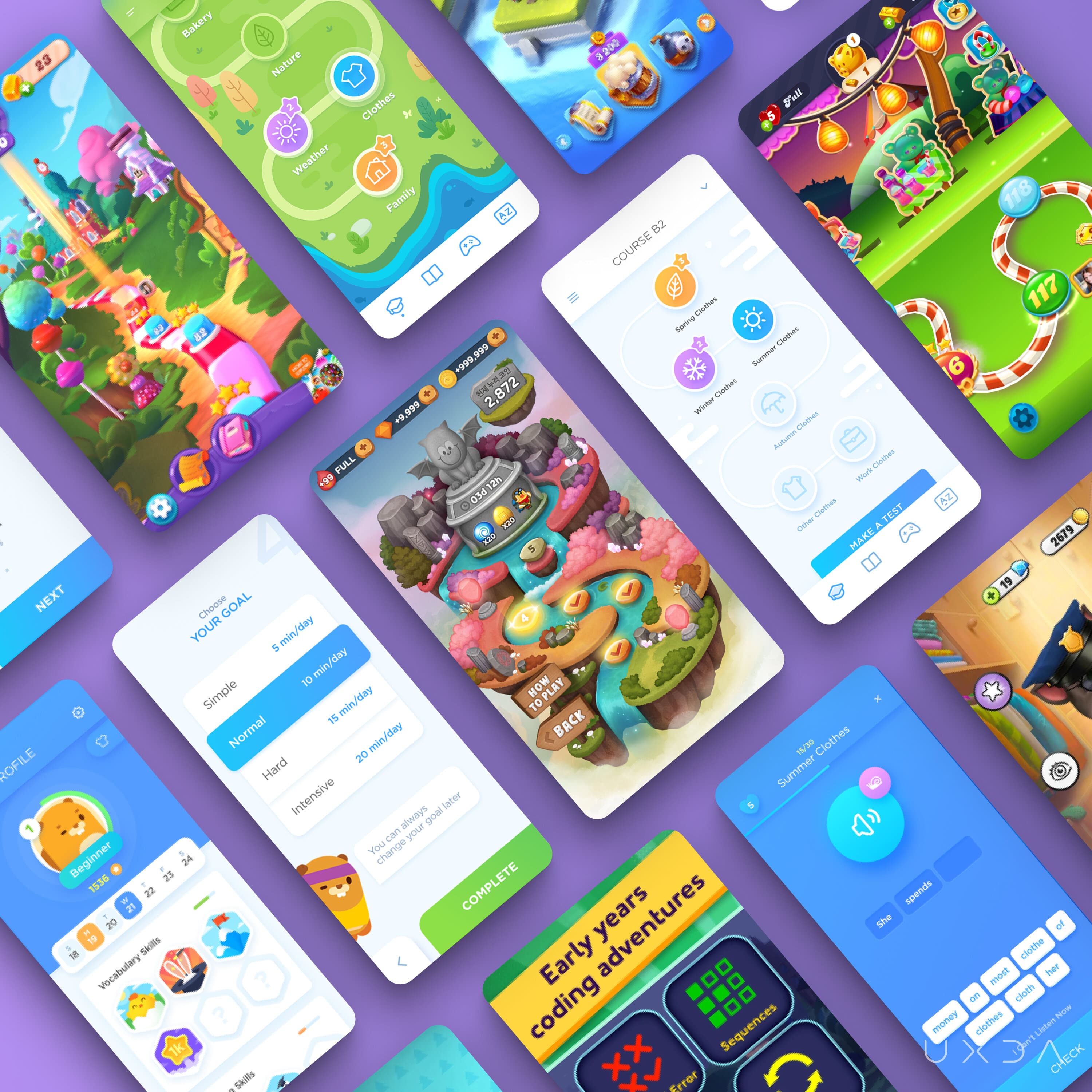
We searched for inspiration and ideas on how to add more fun and simplicity to finances and use similar elements and usage patterns in the new app to make it familiar for kids despite the fact that it is a banking app.
We wanted kids to perceive banking as something understandable and enjoyable with a sense of adventure to make them feel confident and responsible about finances when they grow up. The greatest challenge in this project for us as adults was to step into the shoes of the kids and view the world through their eyes and experience.
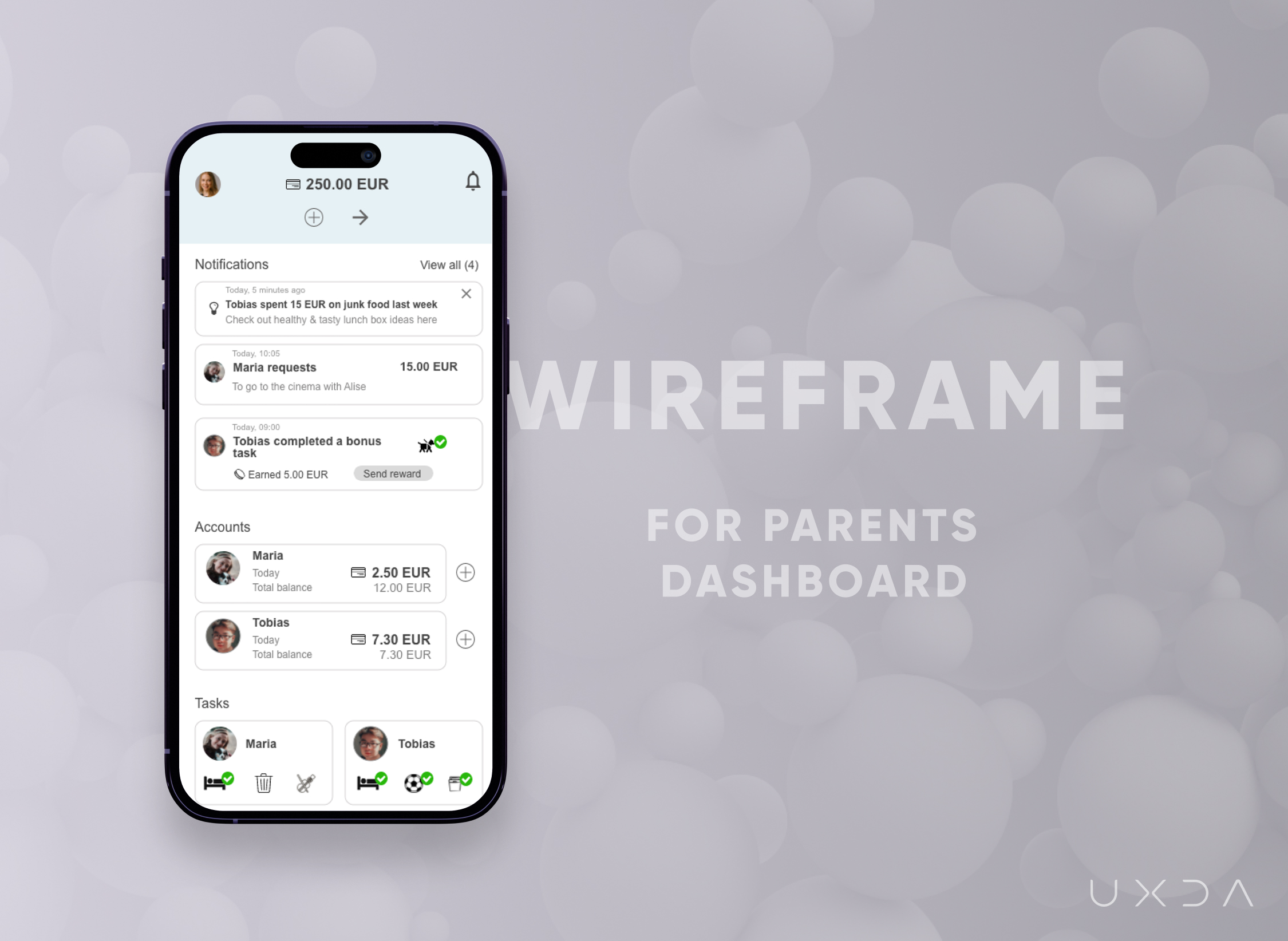
We knew from our experience and interviewing the parents that they need to know their kids' account balances and be instantly informed about their performance and any requests from them to help their kids when necessary. At the same time, the app would serve as a guide for parents to gain new insights and advice from the community - posts and interaction with specialists and other parents.
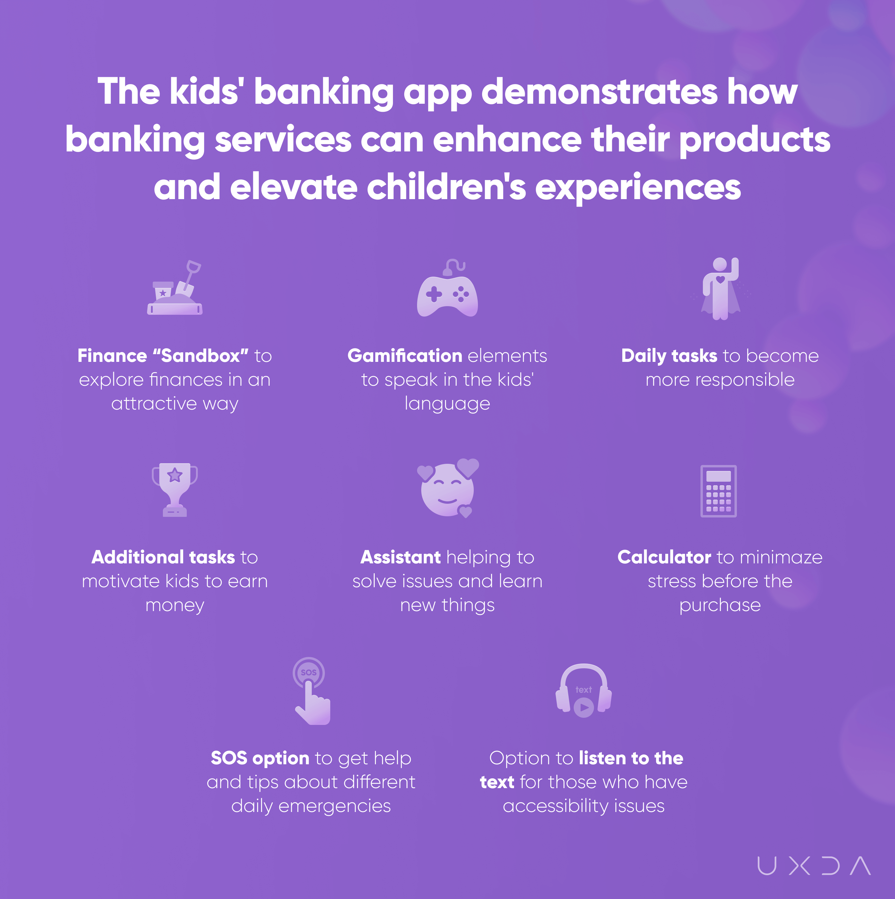
Following are the possibilities and features the banking app for kids provides for parents:
- Good financial and everyday habit creation for kids
- Overview about kids’ progress
- Adjustable daily tasks to teach kids responsibility
- Additional tasks to let kids start earning money
- Common views on money matters in families
- Personalized insights and ideas on how to improve family life
- Community to get answers related to finances
The dashboard for parents was the wireframe we felt most comfortable with because it is for an adult. Each wireframe for kids was a challenge for us adults because we had so many questions, even about tiny details and elements. Will they understand this? Is it too complicated? Will they recognize such an icon? We had several iterations and testing sessions for parents and kids’ dashboard wireframes during the path to the end result to create that one product that fits our defined goals and intentions. We had so many ideas in our heads that we couldn't wait to start the design process and make the wireframes come to life.
The Design: Breathing Life Into the Banking App for Kids
We have previously covered UXDA's unique methodology and process in several of our case studies that you can explore here:
How We Designed the Most Awarded Banking App Concept in the World
Banking Back-Office Transformation that Led Vendor to a Global Expansion
How to Raise the Rate of a Mobile Banking App from 2,8 to 4,7 in Google Play
Creation of the World's First Mixed Reality VR / AR Banking Design Concept
For the very first time in the history of UXDA's blog, we wanted to share with you what really happens “in the kitchen” while our team is working on the design. We wanted to share how challenging and inspiring the design development process is where we bring to life the vision we created for the product during all the previous steps and how difficult it can be to find the right solutions or create the needed emotions. We documented our design development process to create a story - “The making of” - and we are happy to share it with you.
Having wireframes in our hands, we felt it was time to start the development of the design concept for the Kids' banking app. The goal of the design was to add joy, excitement and friendliness to banking, encouraging kids to let their eyes shine while using the app.
After the review of the first design iteration, the team was not entirely happy with the initial outcome. The concept lacked emotion and connection with children’s apps, and it was hard to achieve the same feelings that the kids’ Emotional Mood Board provided. We understood that, if we offered a boring product, children wouldn’t find it appealing, and it wouldn’t be any better than the myriad of other kids' financial apps out there that don't serve the families.
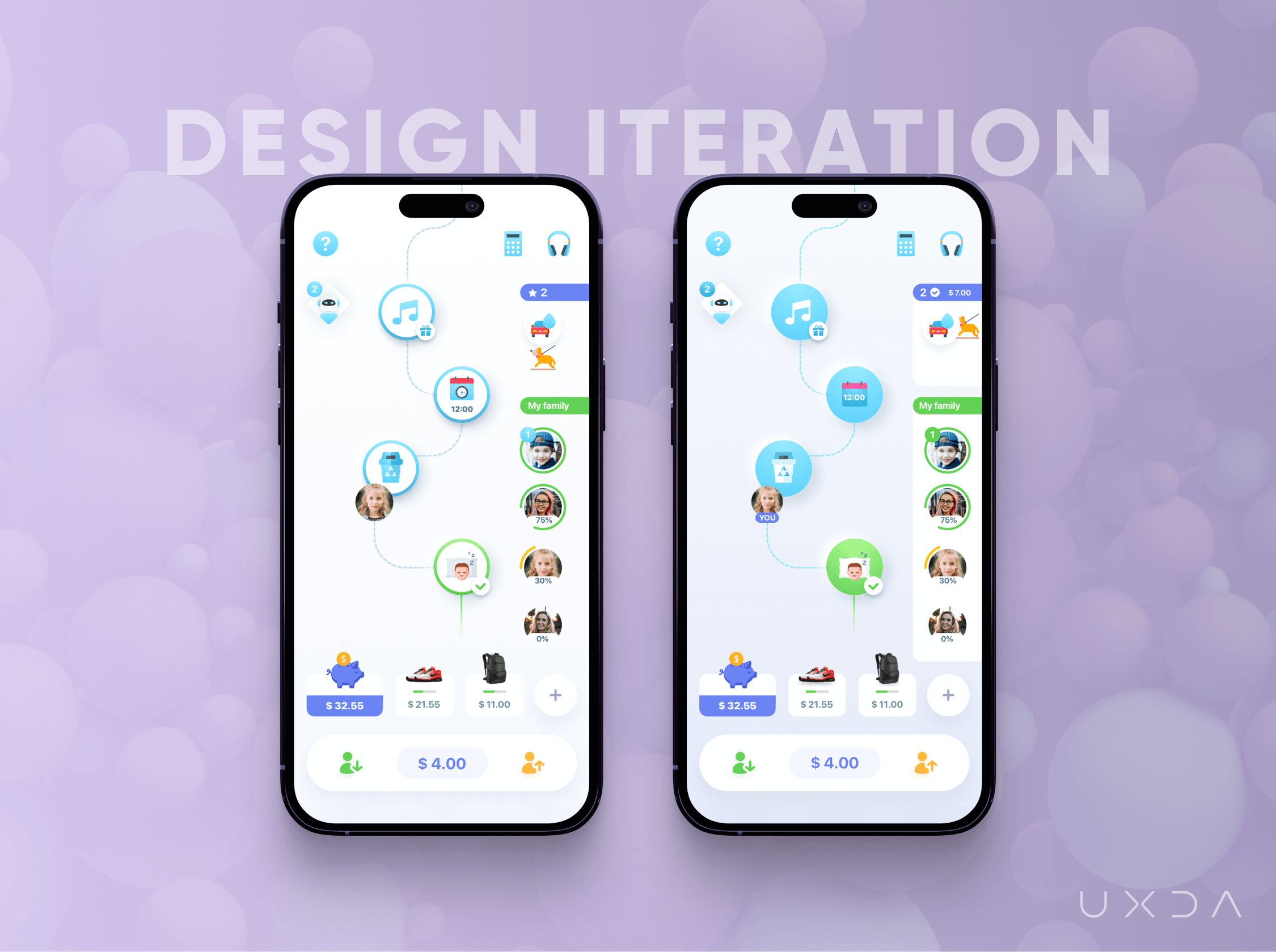
We needed to integrate a visual language that is understandable for kids, create an association that finances are like a game and evoke those exact emotions that we defined in the Kids’ Emotional Mood Board─joy, engagement and fun. The aim was to create a similar feeling that kids have when they come into a toy or candy shop: they are happy, they want to try everything, and parents hear: “Mom, dad, come here! This is something awesome”!
Design Research
Our team started to search for a new, fresh vision for the concept, how to engage with children in an inspiring way, and we understood that it's a hard challenge because we look at the world from an adult's point of view. We had to awaken the kids' viewpoint inside all of us. We dove into the kids’ world of mobile games, children movies and cartoons. We carefully studied how the content was made, what elements stood out and why kids like them.
Based on the field research, we concluded that we need to evoke emotions that feel like an adventure, like an amusement park where kids are excited about trying new things. In the initial concept, the colors were too cold and created associations with solitude, rest and contemplation. We had to heighten emotions, passion and playfulness, adding brighter colors and creating more colorful screens, maintaining a balance with such feelings as harmony and trust. To create a feeling that the app is “alive,” we had to include animation, some special effects, and constant movement in the background in the same way as games do, so it never gets boring.

For example, in Farm Heroes Super Saga, the environment is beautifully illustrated, the user can scroll through the landscapes almost endlessly, and the feel of a journey is very strong.

The steps are clearly shown, the player is guided, there is no confusion about what to do or where to go, and it's eye candy to watch. We wanted to capture the “I want to be there” moment in our app.
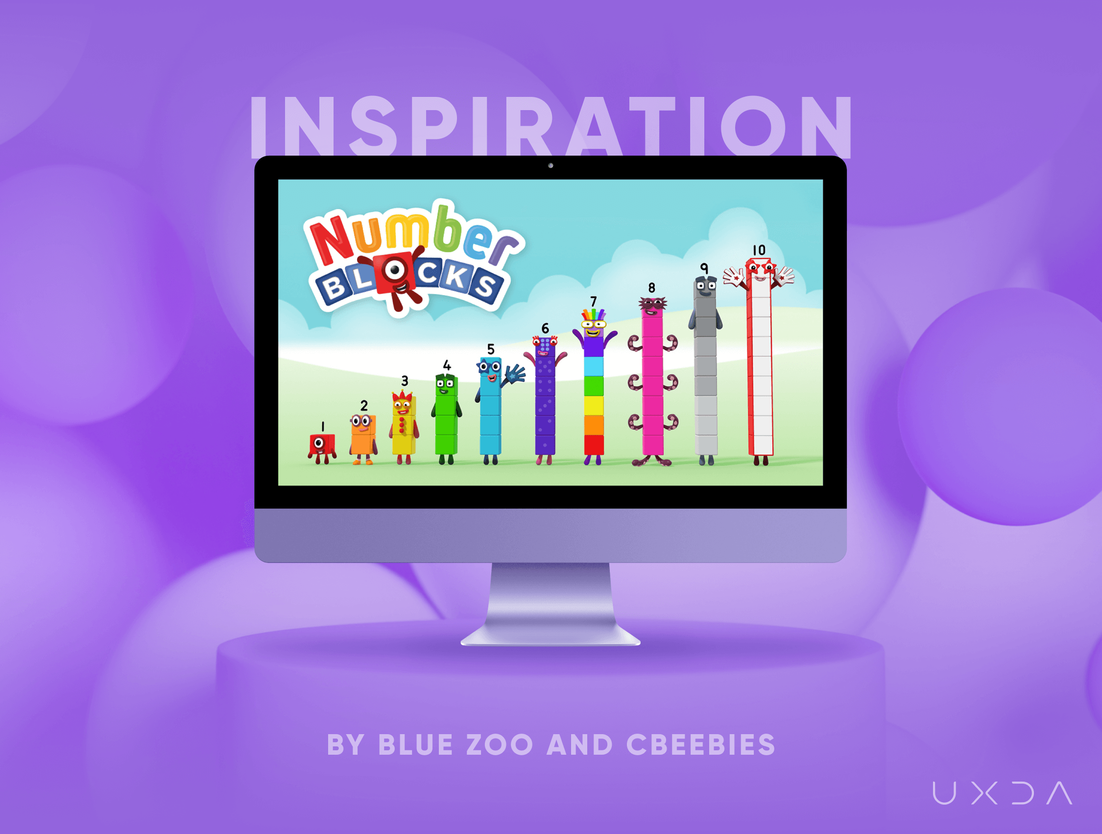
In Numberblocks, which is a cartoon about numbers, in which kids learn math in a very attractive way, the mood is dynamic and fun, and the use of 3D in cartoons has become standard. Kids and parents alike enjoy 3D animated shows because 3D is visually appealing, attracts attention, is interesting to look at, has a realistic look and portrays the movement very well. We liked this idea when the kids can feel like they’re participants in a cartoon and receive guidelines in an attractive way.
In our team, everyone shared their ideas about design, associations with adventures and memories from their childhood. For example, one of our colleagues shared a book consisting of her childhood fairy tales, “Martha B. Rabbit and Daphne the Forgetful Duck,” by Shirley Barber. The book is full of little details on every page, and that attention to detail was a crucial part of understanding how to create story-telling, the place must look inhabited, like someone is really living there.
First Design Sketches
After gathering all the references, the main goal was to design an environment that captures the feeling of a dynamic, almost fairy tale-like adventure, where you can feel the wind and want to touch the grass or clouds. For a fast concept, we used Photoshop and the Wacom tablet, because it's easier to generate ideas and make changes on the fly. Also, painting the design gave us freedom, “happy accidents” and a more natural feeling.
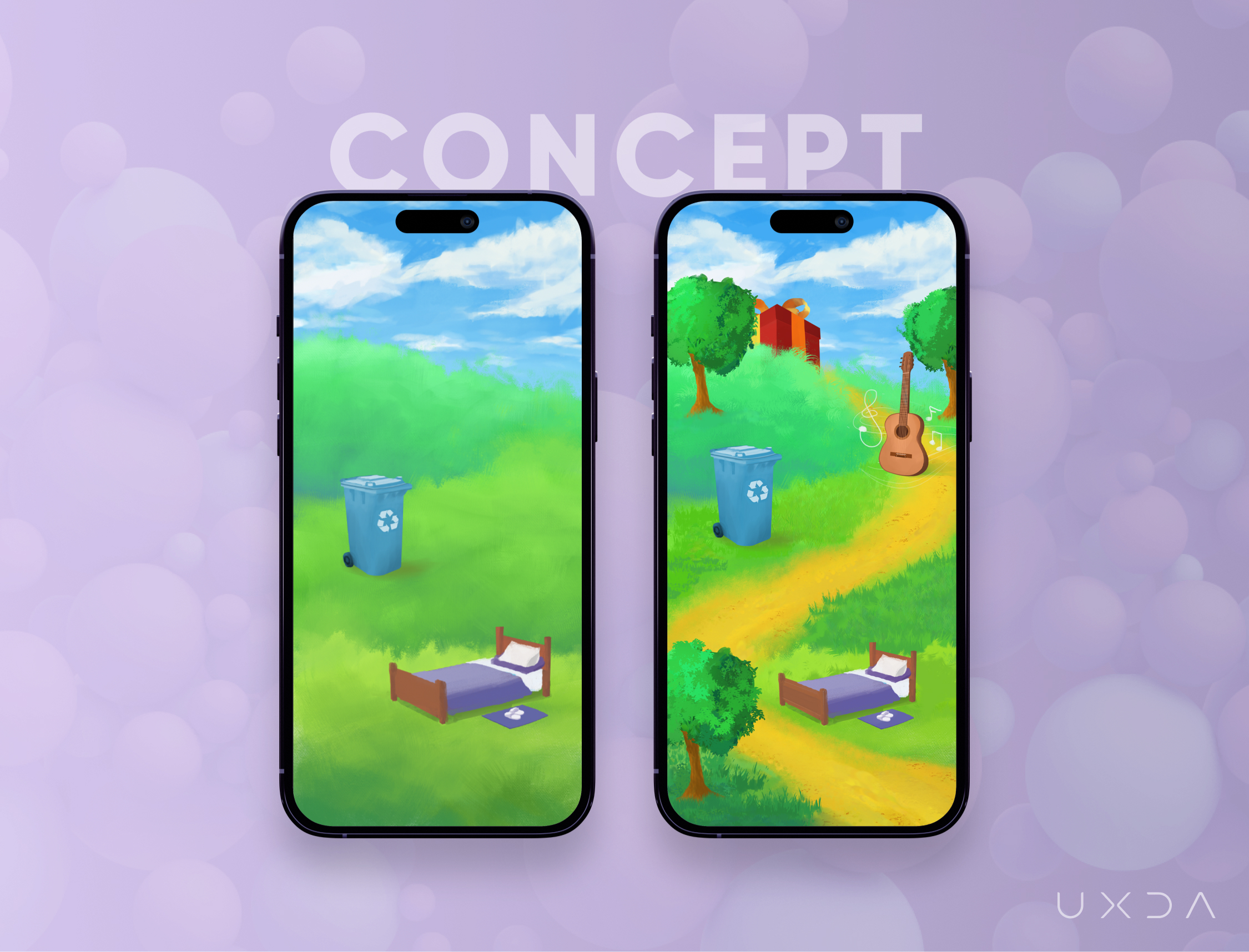
After the main landscape was completed, we added the first tasks that are popular tasks for kids in families─make the bed, take out the garbage, music lessons and, at the end of the road, a gift box. That will motivate kids to finish their tasks and get a gift, earn their allowance or other benefits agreed to by parents.
We wanted kids to be involved in family tasks and get an understanding that they have to do their tasks and be responsible in order to earn their pocket money. They will learn from their own experience that money doesn't come easily, and they have to make an effort to get it. That will place the whole family on the same page about the value of daily tasks, and kids will understand that they have to earn money.
We refined some trees and added more details to the grass to make the design more realistic and detailed─to create a feeling for kids that they are engaged in a game or a cartoon.
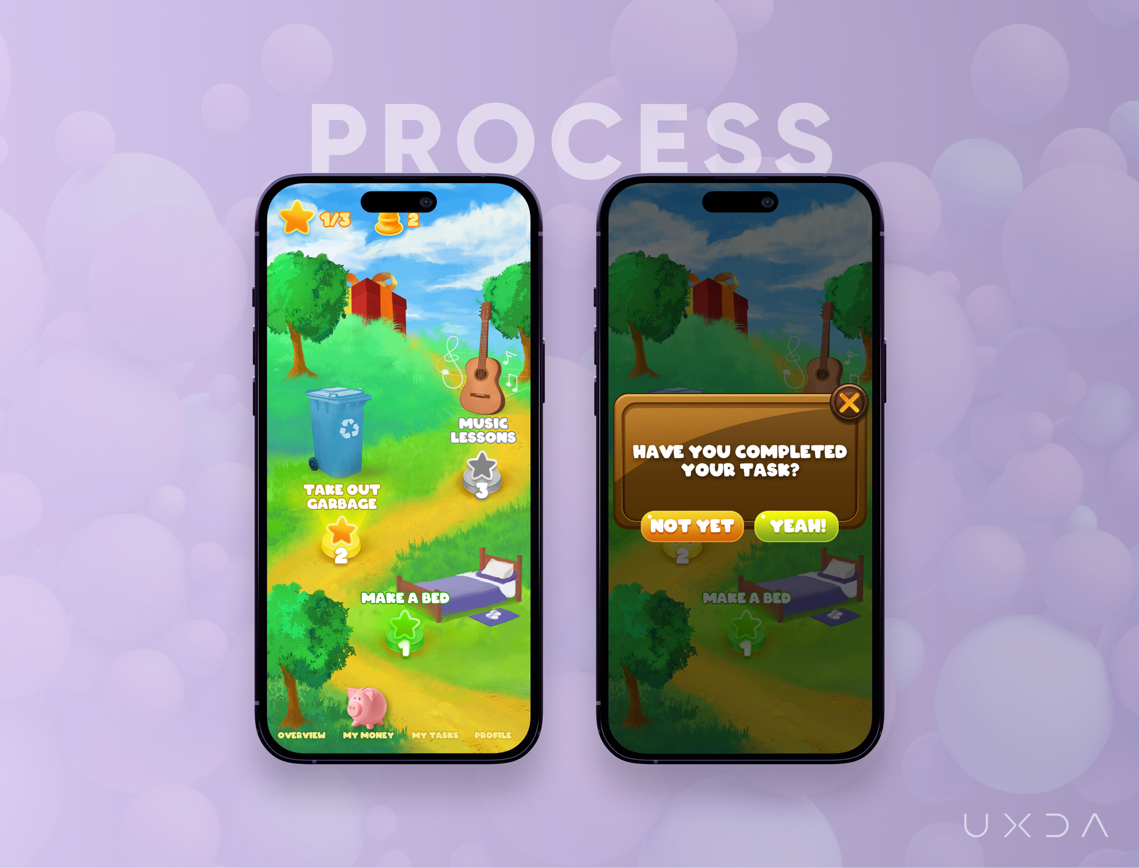
We wanted to add UI elements, not just as an overlay but to integrate elements into the environment, such as tasks on the road, so it would be a more fluid experience, not just floating items in the air. That will brighten the feeling of journey with a little bit of adventure that kids experience throughout the day.
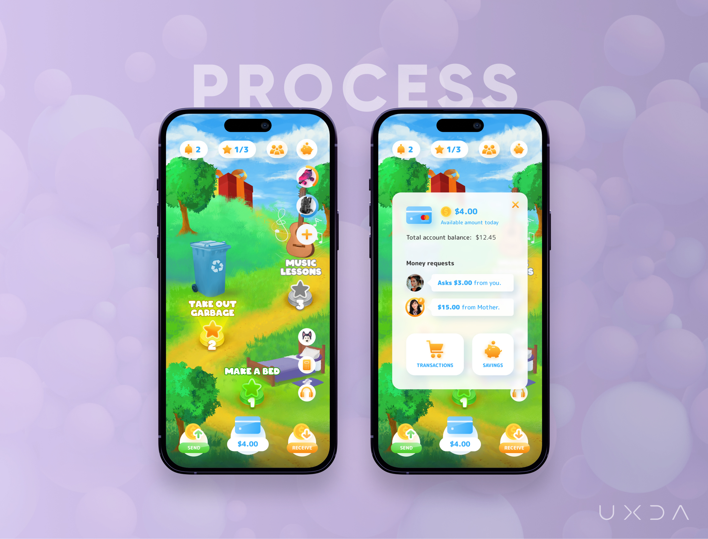
As we were working more on the UI, the screen didn’t look as clean as we first intended, mainly because the design started to look too dull, too colorful and without a clear focus for kids to know exactly what they have to pay attention to on this screen. We had to look back again at the list of the defined JTBD for kids and prioritize them to ensure that the app guides kids toward their goals.
Making a Transition to 3D
After gathering feedback from the team, we understood that we should go back to the design research phase. We needed to look outside of the traditional way of how we are used to making designs. We knew that would not be an easy task, and we needed to try hard to achieve our goal. We were convinced that, with the help of 3D, we could achieve all those missing emotions and dynamic environments, and, with a modern look, it would speak to children directly.
In the first test scene made in Blender, the goal was to figure out how to make vegetation and how to make the grass and trees detailed, but not photo-realistic. We wanted to keep a stylized, painted look, and the hand-painted road was the only thing that captured the feeling we wanted to achieve.
We searched for examples and found amazing artwork made by Carlos Cavalcante on his Twitter page. Carlos made a few posts about his process for creating 3D islands. He used Blender and created some how-to tutorials, which was a great help in understanding how to achieve the cartoon-like look and feel.
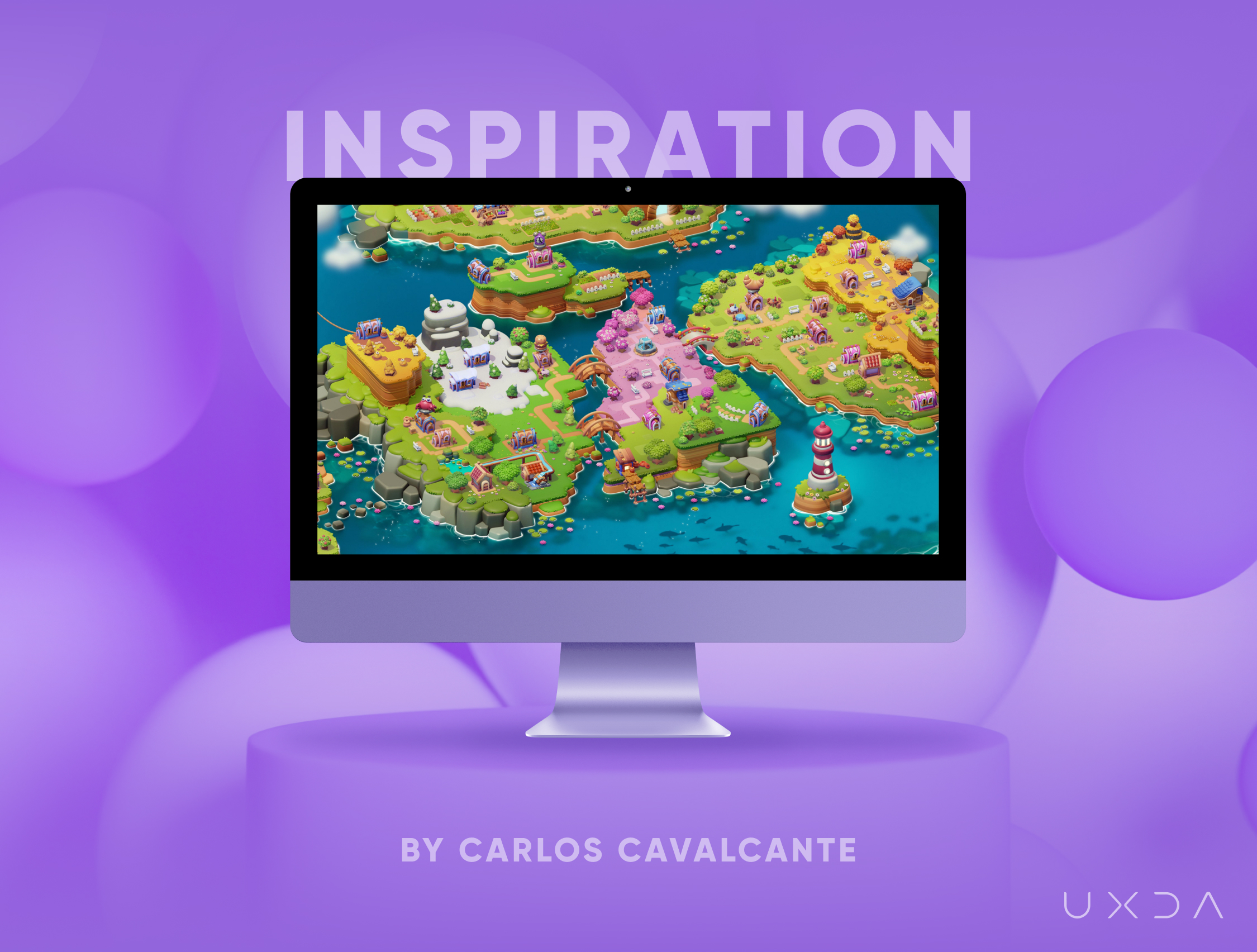
We started by making the environment as simple as possible and then enhancing it with the details. In the left-hand side of the picture, we modeled assets from the 2D concept by making the trees simpler and building a main path, but the whole scene was missing good lighting.
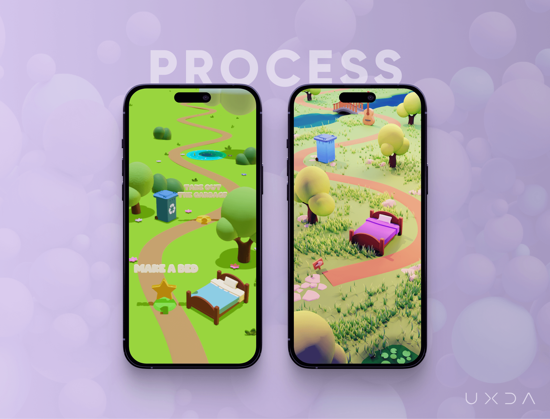
Lighting in 3D is hard, just like in photography, because it could make or break the whole scene. We started lighting the scene from scratch. With a lot of trial and error, we were finally happy with how the scene looked.
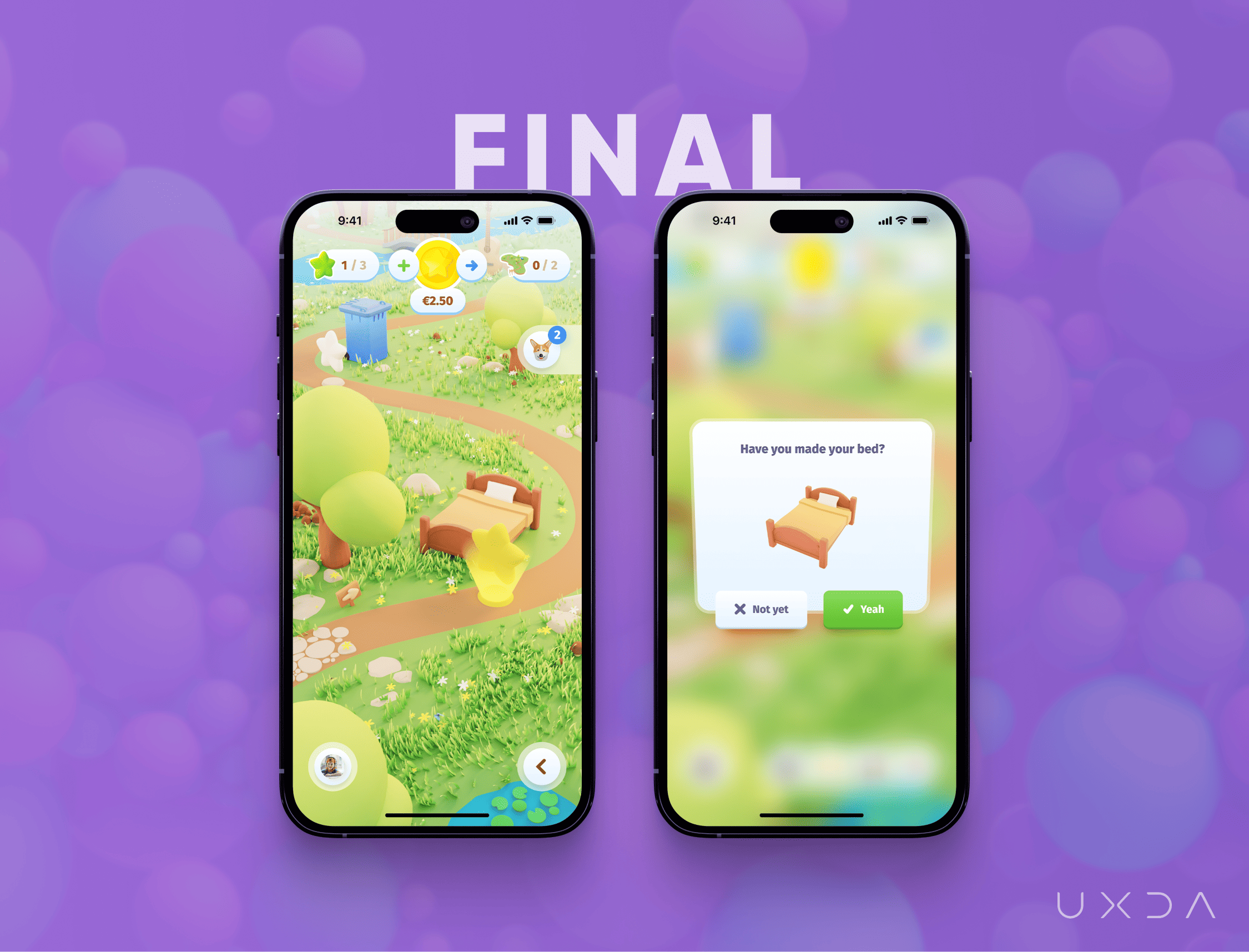
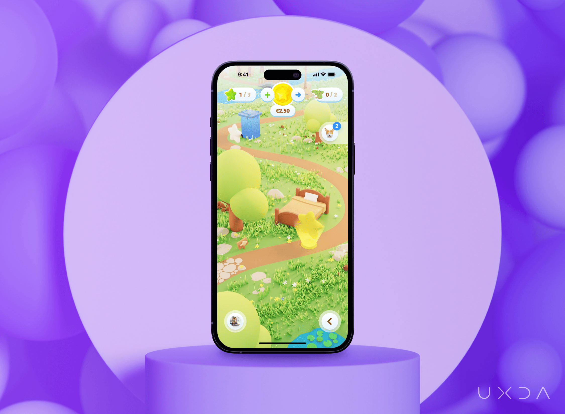
As we explored before in the research, the app should be enjoyable, easy to understand and intuitive. Kids should feel excitement, joy and willingness to start their journey in the app. We finally achieved those feelings looking at the screen. The dashboard is like a map from a visual point of view, and it leads to all the sections of the Kid app that children can explore.

All UI elements are placed on the top or bottom of the screen to avoid unnecessary tapping. At the top are the most important elements, such as daily tasks, “my money” and additional tasks for easy access. The Assistant is moveable with tap and drag across the screen, just like chat bubbles on the Android, so it's not blocking any important element in the 3D environment, and the user could have more control and also fun moving the bubble.
At the bottom of the screen, there is a Profile icon and additional options: calculator, SOS and an option to listen to a text. The SOS option will open a section in which kids will get guidelines on what to do in case an emergency situation appears and they can't contact their parents at that moment - for example, if they see a fire or see that someone is on the frozen river and needs help. All these options will be available from the main screens to ensure that kids will get support whenever they need it without additional navigation to a specific screen where they could be placed.

Based on our team feedback about details, and the book that was previously suggested, we made more assets. We included details to make the scene more inhabited, like grass, flowers and story-telling bridge, pathway, stones, lake with water lilies and other elements.

One of the most exciting moments during the app development process was the first user testing session with kids. We wanted to hear and see their first impression about the screen and how they understood the meaning of the used elements. After showing the dashboard design to kids, their first impression was - “That is so cool! Where can I download this game”?! Kids were curious, so, at this point, we knew that we were headed in the right direction.
3D Animation
While working on new UI improvements, we also started to work on Dashboard 3D animation.
The making of butterflies
We wanted to integrate as many dynamic elements as possible, so we designed grass moving in the wind, flying butterflies, rotating stars with special effects, water and clouds to make this app come alive in the tiny details.
We made close-ups of four elements: money, boat, butterflies and a gift, as they would give a better idea what the app is really about than other elements─money because of finance, boat for adventure, butterflies for a sense of something alive and a gift as an award for accomplishments and completed tasks.
The Proof of Concept
We shared with you our insights about the research, prototype building, and design process for the main screen of the Kids' banking app. Do you wonder how this app will work? What can kids do there? We created other screens as well to show you the potential of this app to integrate our kids into the banking world and create a wonderful financial experience for them─the future clients of financial institutions or banks. Are you ready to continue? Let's take a look at the entire Kids’ banking app features from the key scenario perspective and service capabilities.
My Money
There were a lot of redesigns for the My Money screen. As Thomas Edison said, “I have not failed. I’ve just found 10,000 ways that won’t work.” We found a lot of ways that didn't work. This screen is very important for the kids to have an overview about the money they have in their account and savings.
We didn't put information about the total account balance and savings on the dashboard of the app because of security issues. There could be situations in which kids open the app, want to complete the daily task or check the available amount of money daily, and they don't realize that someone might see the screen or that someone would have bad intentions about the money amount they see. That's why there is only primary information on the dashboard with full details about money that the kid can view from this screen when they really want it.
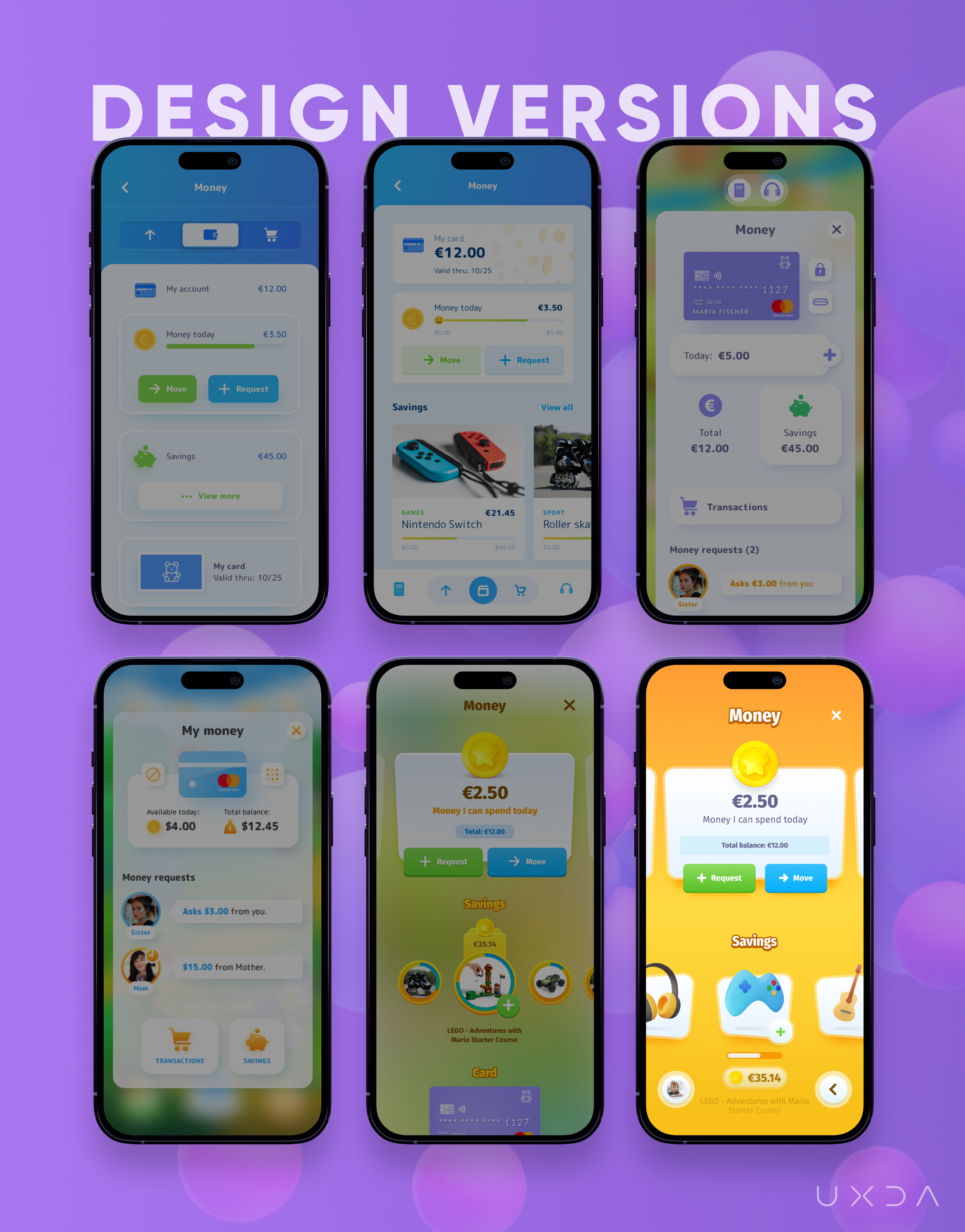
We tried to rethink the structure of the screen based on User Scenarios. The first iterations were too formal, and the use of the white color was too much, resulting in a loss of the feeling of fun. Hence, we tried to make it more colorful and integrate the styles and emotions of the Dashboard.
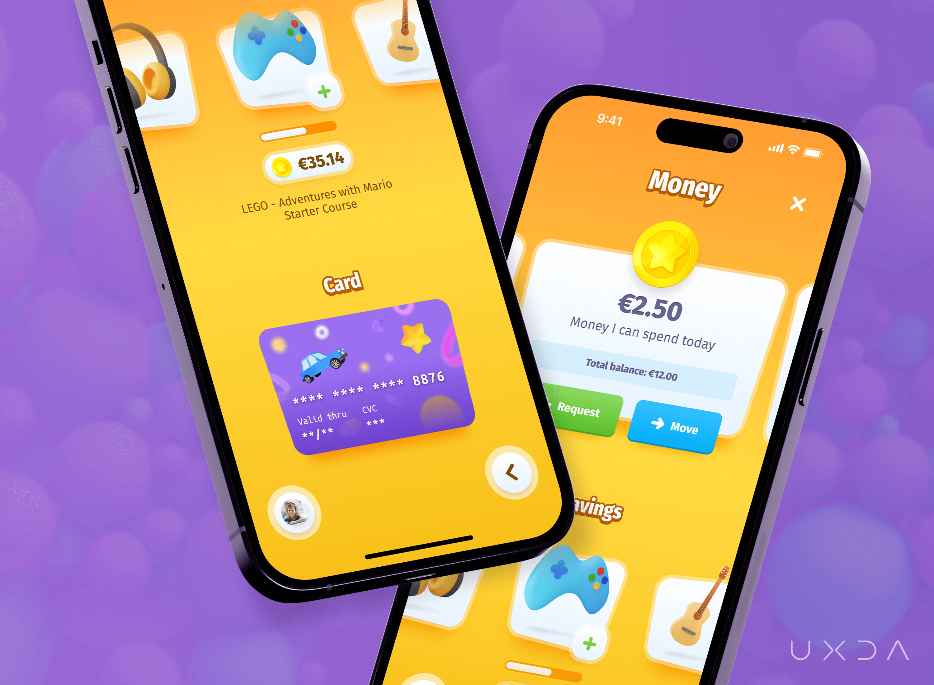
Kids will achieve a new experience in their money management, as the Kids' banking app will allow them to:
- Follow up easily on their available daily money amount
- Follow savings progress and move closer to the goal by adding additional money
- Get suggestions from their peers about popular savings goals
- Receive suggestions about how to add unspent money to the savings goal at the end of the day
- See their card's PIN code when forgotten, and block a card when lost
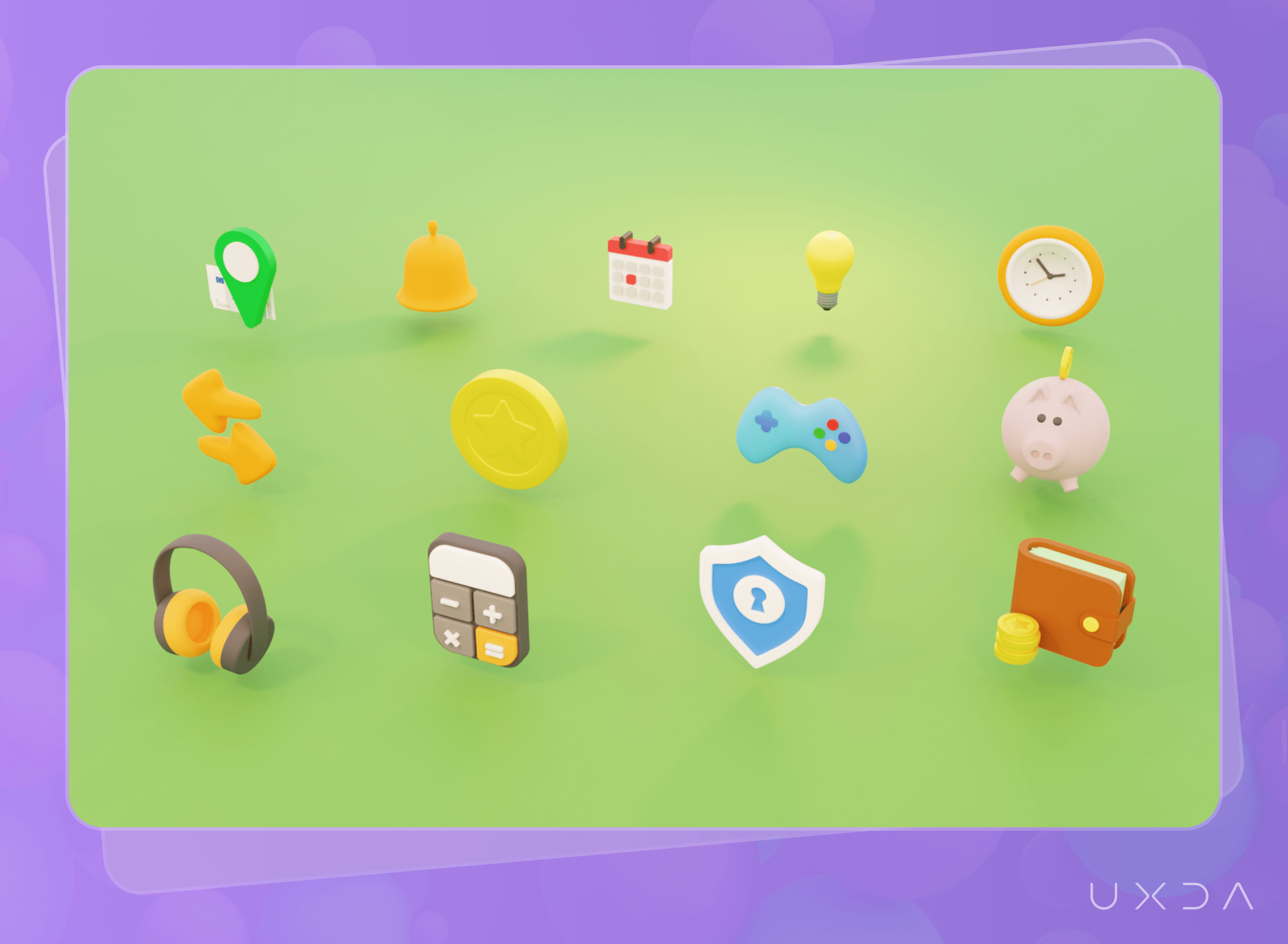
With bright, warm background colors and 3D icons, the design now looked more like a playful app for kids and created a feeling of joy and playfulness.
Daily Tasks
The Daily Tasks screen provides a quick overview of the tasks and their status that the kid must complete during the day. Each family can set their own rules for the purpose of these tasks and adapt the app to their needs. As an example, kids have to complete daily tasks to earn their salary - pocket money. In such a way, kids will learn responsibility and an understanding that, to get money, they need to make an effort.
At the same time, these daily tasks could serve as a list of things the kid should do during the day as he/she learns to complete things and follow their daily routine, establishing good habits for their whole life. It means that parents won't need to remind kids; the app will do it and send a notification to parents.
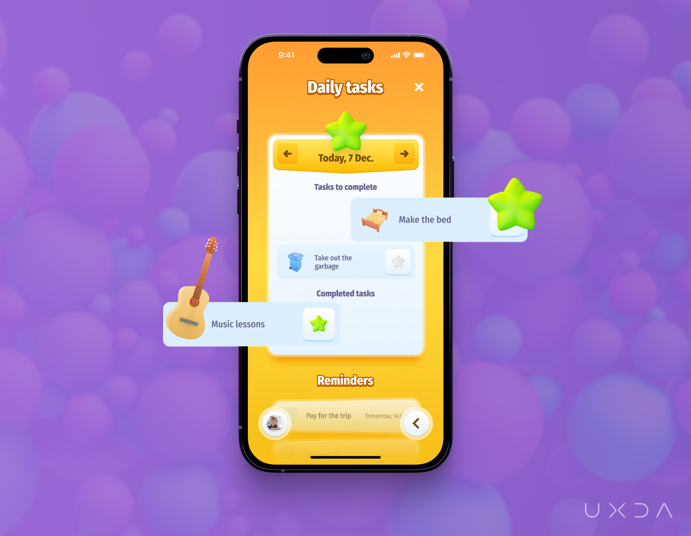
We used 3D icons from the dashboard to make it easier for kids to understand the text. In our design, we use color coding for stars: green = completed, white = not started or incomplete, yellow = in progress or active. With clear color distinction, it is easier to see which tasks still need to be completed.

If you see a boat on the coast of the lake, what would you think about? How would it be to get in and get to that island you see from the coast? They will have a little adventure to explore the world around them.

The same applies to the Kids' banking app: kids can get to the neighborhood island and find out all the possibilities their parents are ready to provide them to earn additional money by completing a task, such as washing a car or walking the dog twice a week. Kids will learn that, only after finishing the task with a good result, they will get a reward. They will learn that they need to work hard and expend more effort in order to earn more money.

Additional Tasks
At the beginning, there was only one island with Main Tasks, and Additional Tasks were available on the screen on a separate list. After many ideation sessions with a team, we came up with an idea about an island for Additional Tasks, one in which kids could move between them by zooming in or out the screen or with a boat. Children would become explorers and travelers in this Kids' banking world and would complete their tasks and earn additional money resulting in positive emotions.
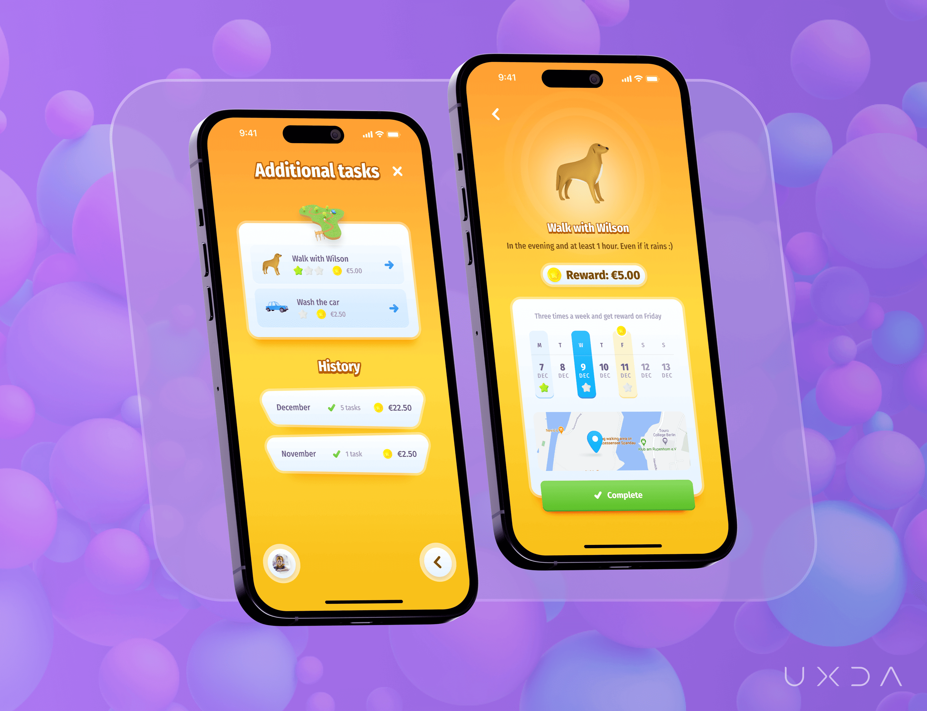
Parents can set their own rules for Additional Tasks regarding the time, frequency and amount of reward. If the task needs to be completed multiple times a week, like “Walk with the dog,” only after completion would the kid receive one green star for each time they completed it. Kids would learn to plan their time and be responsible, because to get a reward they will have to complete the task, often several times.
Each task has additional information for kids: what they need to do, when and how often, and we added a calendar and a map, so it would be easier to track the task and complete it correctly. Children will get into the Kids' banking world in which tasks could differ day-by-day, and kids will feel excited to explore new opportunities on the island, which will dynamically change depending on the tasks list. Each day will be an adventure quest in which, after completion, they will feel very proud of themselves.
History is a summary of each month: how many tasks were completed and how much money was earned. Here we wanted to show kids that, even if they complete a task with a small reward (but many times or different tasks), they can earn quite a large amount of money in total during the month. Everything depends on their diligence and responsibility.
User Profile
The Profile screen contains the most-used settings. Very important is the “text-to-speech” feature, which the kid can toggle on or off according to his/her needs. This is a good feature for kids with vision problems so they can use the app and be part of a digital bank.
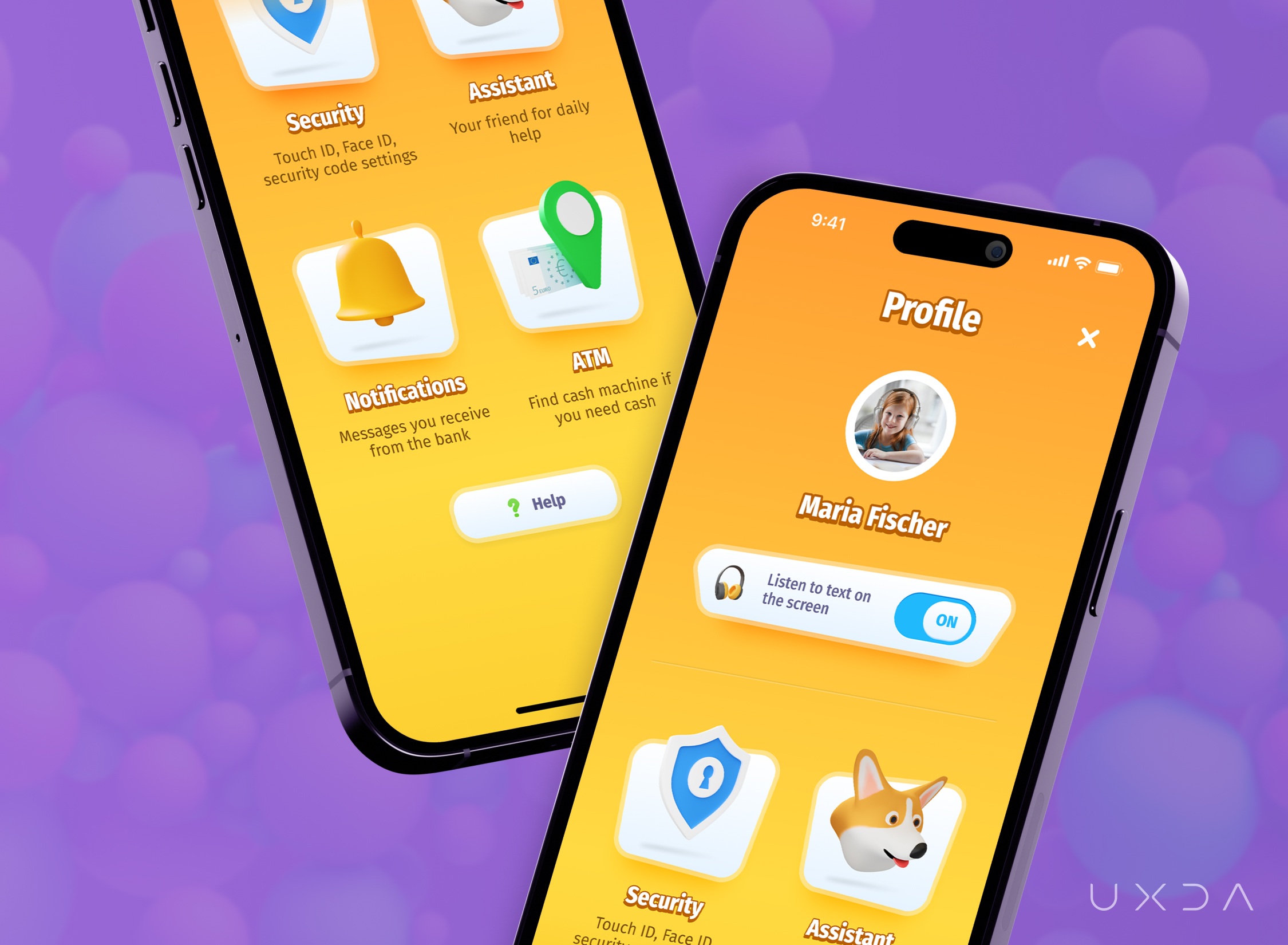
The white panel behind the 3D icons gave other categories a clear distinction from the orange background, and, with non-symmetrical form, it is easier to focus on the icon itself than reading text, and that is important because, in our study, we found out that kids don't read text but rather pay attention and interact with familiar items, icons and colors. In this way, kids can easily and effectively play games on mobile devices even if they don't understand the language used.
Assistants
Assistants are an important part of the app because, through them, the financial service will communicate and inform the kid about any matters. We had so many examples (bad ones, unfortunately) in our team about the way banks communicate with us. Usually we receive formal messages, and sometimes, even for us adults, it is hard to understand the meaning of them.
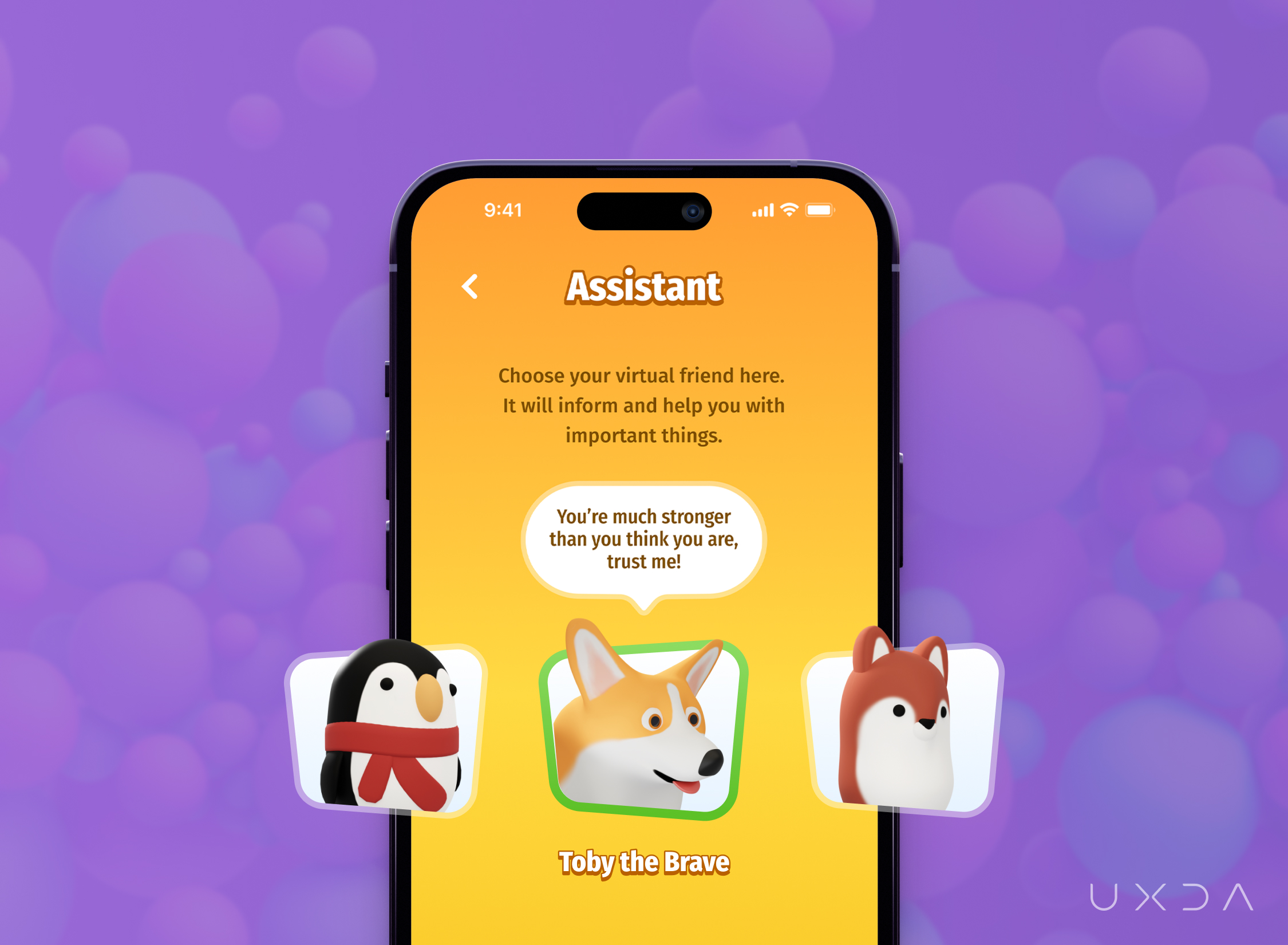
We want to show kids a completely different experience with the bank, in which the assistants will be fun and evoke positive emotions when everything is okay. At the same time, they will be persons who kids can trust and would not be afraid to ask difficult questions or assistance. Assistants will communicate as a friend when something goes wrong and support and encourage kids to find the best solution together.
Assistants would be an advisor for kids to create savings and teach them how to do it more effectively. Some parents mentioned in interviews that kids don't have the motivation to save because they don't know what they want. Here is where Assistants would allow the sharing of popular savings ideas among peers.
Kids become annoyed when parents call and remind them to do something. What if an assistant would do that together with a little joke or sharing a fun fact? An Assistant would ease parents' lives and would help kids complete their tasks and encourage them.
Our original idea was to make Assistants like superheros (e.g., Princess, Captain, etc.), but, after discussions with parents and the team, we understood that there would not be enough emotions for kids to really trust those unknown heroes.
That's why we started to think about animals. We thought of a game that is popular among kids called Animal Crossing.
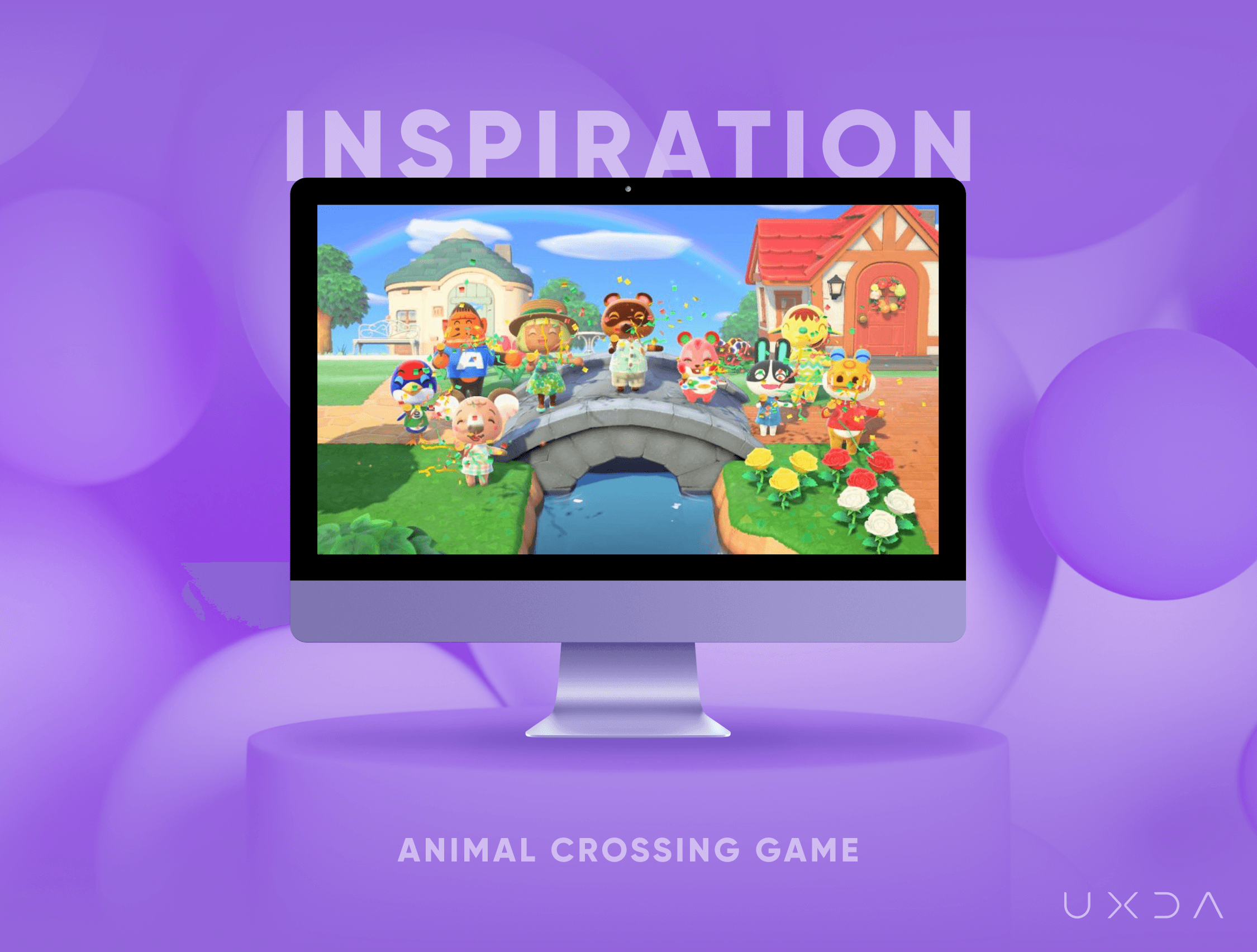
We asked parents which animal their kids liked the most and who they could trust, and the most popular answer was a dog, so we made a corgi our main assistant. We wanted the Assistant to feel like a supportive friend. Whenever the kid needs help or feels sad, the Assistant is always there for him or her. Kids can choose the character that resonates best with the kid’s personality and temperament.
Calculator
The Calculator would be used mostly by younger kids who don't yet have good skills in mathematics. The goal of the calculator is to assist kids when they are in the shop and want to buy some items but they don't know if they have enough money.
Usually, kids trust a cashier who can count their money. But, what happens when kids try to buy many items and don't have enough money at checkout? Kids become nervous, stressed and shamed. They can't make a decision quickly enough in such a situation, especially if there is a line after them.
Imagine the confidence and pride of the kid when they are able to calculate the total amount of the purchase by themselves. The assistant will share helpful tips on what to do if kids don't have enough money.

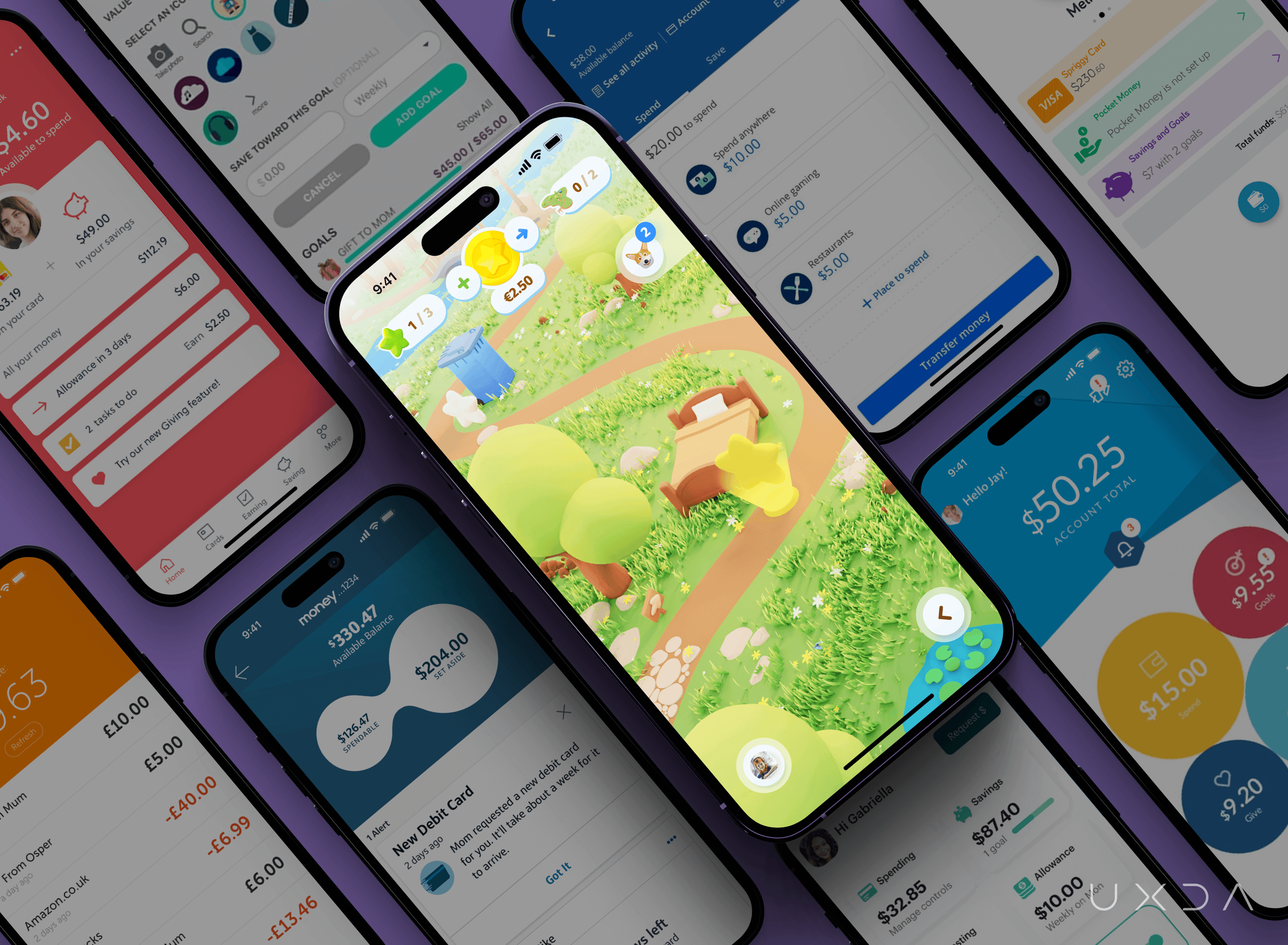
One of the most important steps in the design evaluation is to compare it with similar services on the market. Does it stand out among the competition? Do we feel those emotions that we wanted to evoke?
Parent Dashboard
During the design of the kids app, it was evident that there should be a clear distinction between the kid dashboard and parent dashboard. As we found out during the research, kids like animation and sound. They want entertainment, and, if parents had the same design app, that wouldn’t work well for them. Because parents are busy and are more goal oriented, they want to complete specific tasks as soon as possible, such as checking their kids' account balances, transferring money to kids and viewing their task performance during the day.
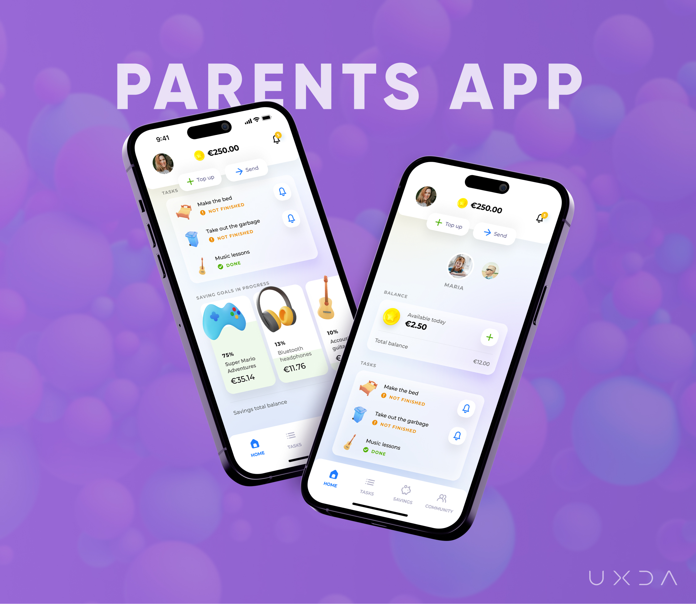
We created the parents dashboard to be clear and modern, using similar elements and structures that they already know from using other banking apps, leading parents without distraction toward their goals. The parents banking app dashboard has a light background and soft colors so as not to distract them from their tasks and to bring the content forward, because it is most important for parents to achieve a sense of confidence about their kids and their progress during the day.
Parents and kids’ apps have a different design, but we used familiar elements from the kids app, such as 3D icons, to guide parents through the app and easily communicate the information displayed.
According to the research and the previous parent interviews, we prioritized jobs parents want to complete so that parents would get a quick overview of what was happening in the family. Information about kids is displayed on the dashboard according to priority, importance and frequency.
The most important task is to see the account balance for every kid, because parents are concerned about their kids having enough money, so they can react immediately when it is needed. They can manage their kids' accounts, track the kids’ task progress and get an overview of the kids’ savings. Detailed information and settings about tasks and savings are accessible from the bottom menu sections.
Community
When we discovered that so many parents struggle with financial education in families, our aim was to support them and let them feel confident in situations when they need help the most, and they don't know what they should do.
The guidance, support and advice for parents are available in the Community section. There they can get quick access to advice from specialists or other parents, share their knowledge and learn from other parents, attend webinars and follow discussions.
The Kids' banking app will help educate parents and guide them, giving a sense of confidence that help is just a few clicks away.
Notifications
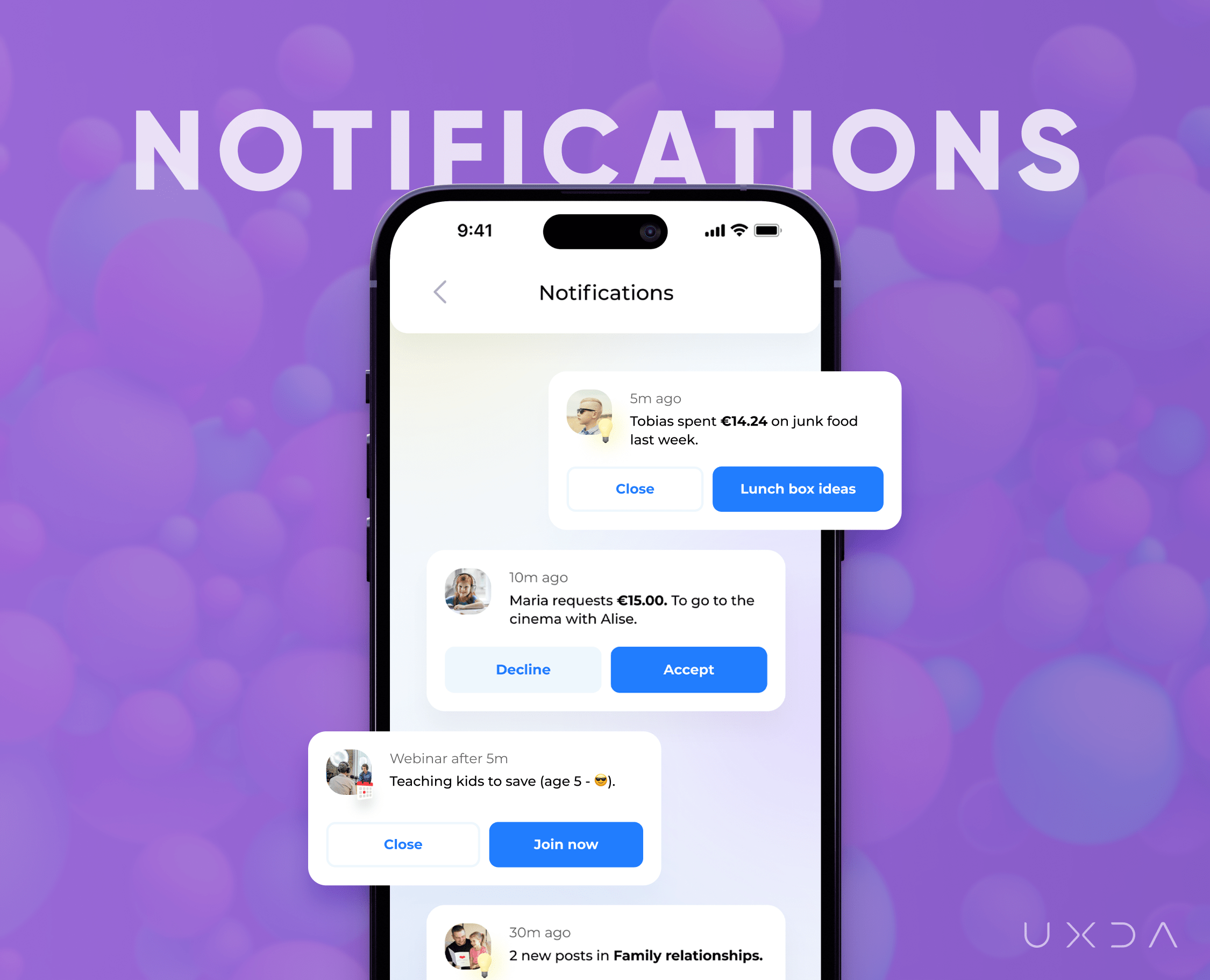
In the notification center, parents can quickly see all important messages from kids and react immediately, reducing stress for kids when they wait for a response from parents. Through the notifications, the app will inform about upcoming webinars about relevant topics for parents and kids’ task performance.
The app will inform and share advice with parents about trends they should pay attention to regarding their kids’ expenses. As an example, if the kid regularly spends money in a junk food cafe, the app will inform parents about it and provide suggestions on how to improve the situation in a friendly way for the family. An example is showing parents ideas about how to prepare tasty lunch boxes so parents could share healthier alternatives with their kids.
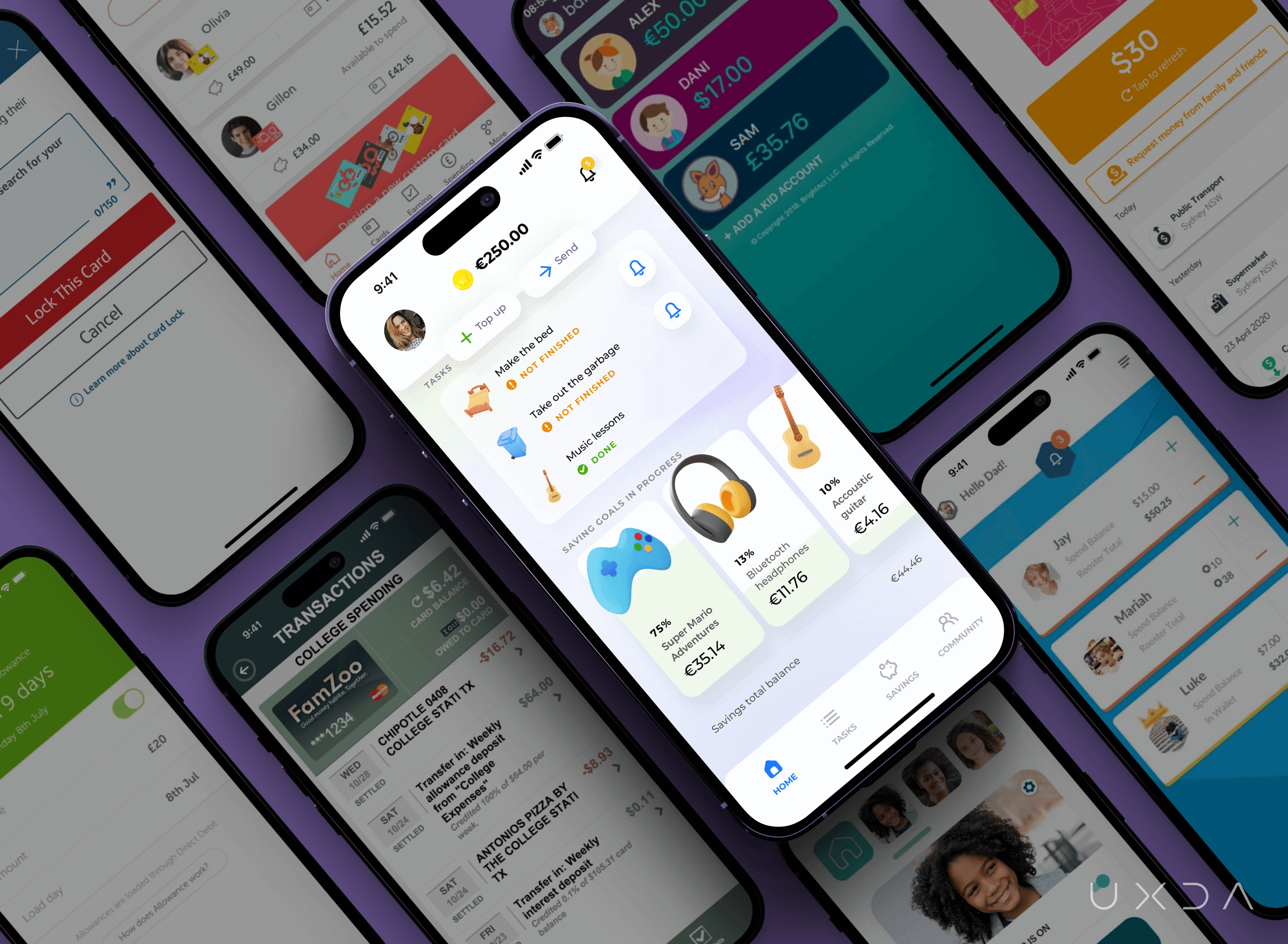
Before finishing the design for parents, we compared it with competitors. We wanted to evaluate if the parent app looks simple, light and delightful compared with other services.
Testing Results
As soon as the main screens of the app were ready, we asked our little experts to try the prototype. Our goal was to get insights about kids' reactions and emotions viewing such an app. Are they interested in exploring it and performing some key scenarios to evaluate how they operate and understand the app?
Kids were interested in trying the app and looked excited and surprised. They explored the app and performed scenarios in it, and we saw that kids understood the navigation and used the features, even those who didn't know a language. We saw that visual elements guided them through the app because they were visually prominent and similar to elements used in gaming and entertainment apps for kids.
Following is some feedback we heard from kids:
“Is it a game?”
“I want to play this game!”
“Looks like a game, not a bank.”
“I would like to have such an app.”
“Looks like it's made of plasticine!”
“This is like a quest. Cool!”
We were happy that we reached our goal to make banking a game and evoke positive emotions and excitement in kids.
Kids were interested in an option to complete additional tasks and receive a reward. Those kids who haven't previously used a banking app didn't understand what it means to request and send money. When parents explained these options, some of the kids were excited that they could manage their money like adults.
A 7-year-old kid who didn’t have any experience with banking cards was surprised about such a colorful card in the banking app because the parents' cards looked different. One kid started to laugh when he saw the dog as an assistant and said, “Here is a dog! In the bank?” Assistant was the first thing kids wanted to explore and choose the right one in the Profile section. They already perceived it as a friend and wanted to interact with it.
After seeing their kids so excited during the testing session about tasks, parents said that they would like to have such an app in their family. They had grown tired of disagreements and said that such an app would be very helpful to maintain peace and also have a transparent overview over family finances.
Parents mentioned that the Community section that they were anticipating most would reduce the struggles and uncertainty they have. They were upset that their banks only showed them the financial information but did not provide enough assistance, not even talking about real support in helping to manage their finances.
Afterword
One of our little experts, some days after the prototype testing, asked his parents, “Could you download for me that app with tasks?” He was disappointed upon realizing that the app was not yet launched. “I wanted to do tasks!” he cried. Amazing thing here is the fact that the boy was engaged to complete household tasks by his own initiative without any disagreements because the app generated interest and changed his perception of household tasks to something positive.
Testing results prove that we are going in the right direction with such a concept of the Kids' banking app. We see kids' interest and willingness to explore banking solutions because it is understandable for kids, not only from a language point of view but also from a visual point of view. Parents were interested in any additional value this app would provide for the family─support and advice from specialists─ because sometimes they feel lost in the financial jungle. They saw the opportunity that such an app could provide in helping to improve relationships in the family.
In creating this Kids' banking app concept, we offer the matrix for families and financial institutions. Families can use it to build relationships between parents and kids based on cooperation, support, encouragement and strengthening emotional bonds, thus reducing disagreements.
Financial institutions have the ability to become an important part of the whole family by sharing knowledge and integrating young kids into the world of a digital economy. This is an excellent opportunity for financial institutions to create positive associations and emotions with their brand. Kids are future clients of financial institutions. Some day, they will grow up and make their own decisions about whether to open a new account somewhere else or continue to be a part of an already known brand for them.
Explore our client's next-gen financial digital products and UX transformations showcased in the UXDA team's latest showreel:
Get UXDA Research-Based White Paper "How to Win the Hearts of Digital Customers":
 If you want to create next-gen financial products to receive an exceptional competitive advantage in the digital age, contact us! With the power of financial UX design, we can help you turn your business into a beloved financial brand with a strong emotional connection with your clients, resulting in success, demand, and long-term customer loyalty.
- E-mail us at info@theuxda.com
- Chat with us in Whatsapp
- Send a direct message to UXDA's CEO Alex Kreger on Linkedin


