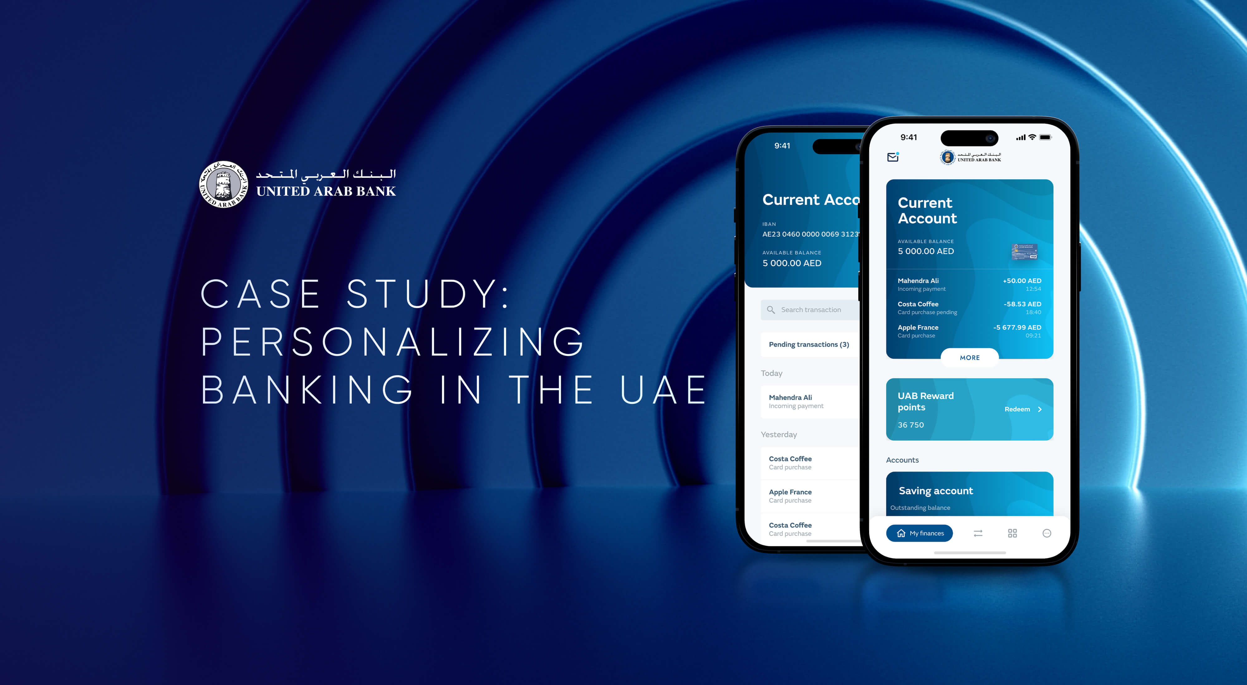
United Arab Bank (UAB) is an established, leading financial solutions provider in the United Arab Emirates (UAE), which offers its clients tailor-made financial services in both corporate and retail banking in the UAE. However, they felt that UAB's mobile banking does not entirely reflect their brand's values and mission of providing an excellent customer experience for digital banking in the UAE. UAB wanted to serve customers with a full range of digital offerings, but, for some tasks, people were still visiting the physical branch.
So they approached UXDA with a challenge─to change people's habits by rethinking main customer tasks and transforming them into a very intuitive digital flow.
Download this case study in PDF
Client: An Innovative Arab Bank with a Valuable Heritage
UNITED ARAB BANK, P.J.S.C. (UAB) was founded in 1975 as a joint venture between UAE investors and Société Générale (SG). UAB is considered among the longest-standing and most innovative banking providers in the United Arab Emirates.
United Arab Bank offers commercial banking and financial products through a network of 20 branches across the United Arab Emirates. Their mission is to build sustainable and long-term partnerships with customers by providing a superior experience and also combining innovative approaches with loyalty to its nation’s heritage and contribution to the overall development of the UAE.
Consequently, UAB’s values include integrity, customer focus, competency, consistency and courteousness. To put these values into practice, UAB prioritized user-centric measures to define what an app redesign should accomplish for the business, which is to increase customer satisfaction and loyalty, as well as recognize the bank as one having a strong digital proposition.
Challenge: Time to Help Customers Move Online via Digital Banking in the UAE
The UAB team faced a challenge in enhancing the mobile banking experience for its users. They viewed the existing app as having a complex, confusing flow and an outdated design, which made it difficult for users to perform tasks and left a negative perception of its functionality and even the brand. Users were presented with a lot of information and description of details before performing the action. As a result, many users preferred to visit a physical branch rather than use the app.
The UAB challenged UXDA to transform its mobile banking experience to one that is easy, clear and highly engaging. Ultimately, our goal was to create a digital banking in the UAE that would encourage users to shift their habits from visiting physical branches to using the app, which would provide a sense of relevance, ease and contextuality with the information presented.
As the app is a key touchpoint for the bank's customers and has a major impact on their perception of the UAB brand, we had to carefully balance the need for modern design and functionality with the importance of maintaining the bank's established brand identity.
Solution: Improved App in Line With Brand to Elevate UX
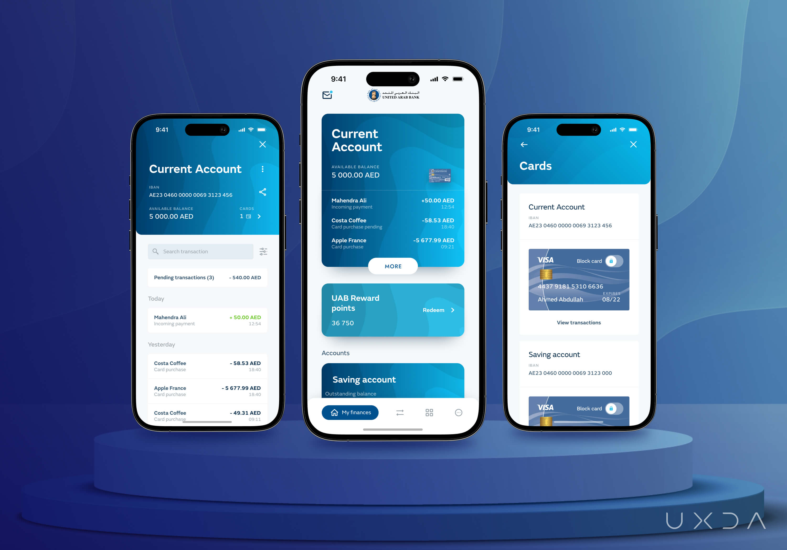
We have integrated the UAB brand identity, values and business strategy into the app to improve the user experience and provide a more cohesive brand image across all touchpoints. As a result, UAB modernized its digital banking in the UAE, thus becoming more competitive in the increasingly digital financial landscape.
Tasks within the app were made self-explanatory, allowing users to easily control and manage their finances without requiring extensive efforts or visits to a physical branch. To achieve this, we restructured the information architecture of the app to make it intuitive and easy to use.
We completely redesigned the app to create a more modern and cohesive look and feel. By providing contextual information when necessary, we were able to eliminate information overload and create a more streamlined user experience. This helped the bank adapt to the digital age and elevate the overall user experience.
Approach: Designing for Habitual Change
After the initial research at the start of the project, we were able to set three main goals for UX engineering and design approach:
- design habitually changing flows to reduce the number of customer branch visits;
- help users perform tasks in the app by reducing information overload;
- incorporate existing brand artifacts into the new design.
Reinventing Customer Behavior Patterns
At the start of the project, one of the KPIs was set to reduce the number of customer branch visits. We needed to improve the existing app so that users changed their habits, and, in the future, instead of going to the branch, they opted to perform the needed tasks right in the app. However, the enhancement must occur within the "framework" of the current UAB recognition set by the brand.
To achieve that, we needed to build a service that allows customers to perform these tasks digitally. First, the existing product and services were audited to understand current offerings and digital abilities.
Secondly, user behavior patterns were researched and the main user scenarios determined. We discovered that, most often, customers visit the branch to make local and international transfers, request a debit card, make credit card payments and open an account.
Detected key scenario flows were reinvented and set as a priority for the digital strategy. Flows were implemented in the design as easily understandable to encourage and serve the customer. UAE digital banking customers were guided with contextual information highlights about the best actions to complete their tasks successfully in the app, offering immediate support in case of errors.
Scraping the Confusion and Out-of-Context Information
In the existing app, the screens were overloaded with information. Before performing the majority of tasks, users were presented with descriptions, details and nuances about it. The intention was to thoroughly inform users about every step they were taking.
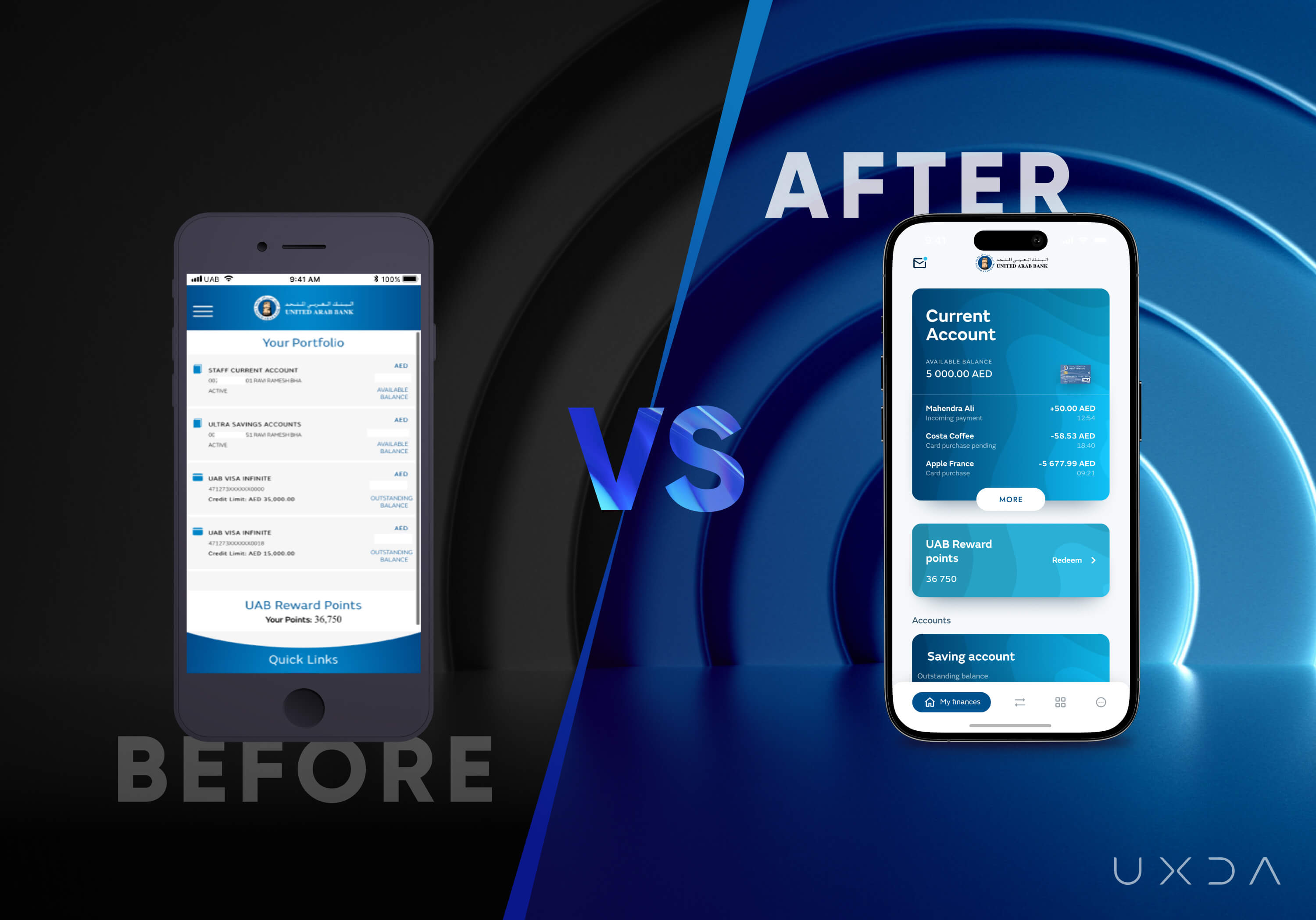
However, often these details even didn't apply to the specific scenario the user was trying to perform. That resulted in a very confusing structure and information overload.
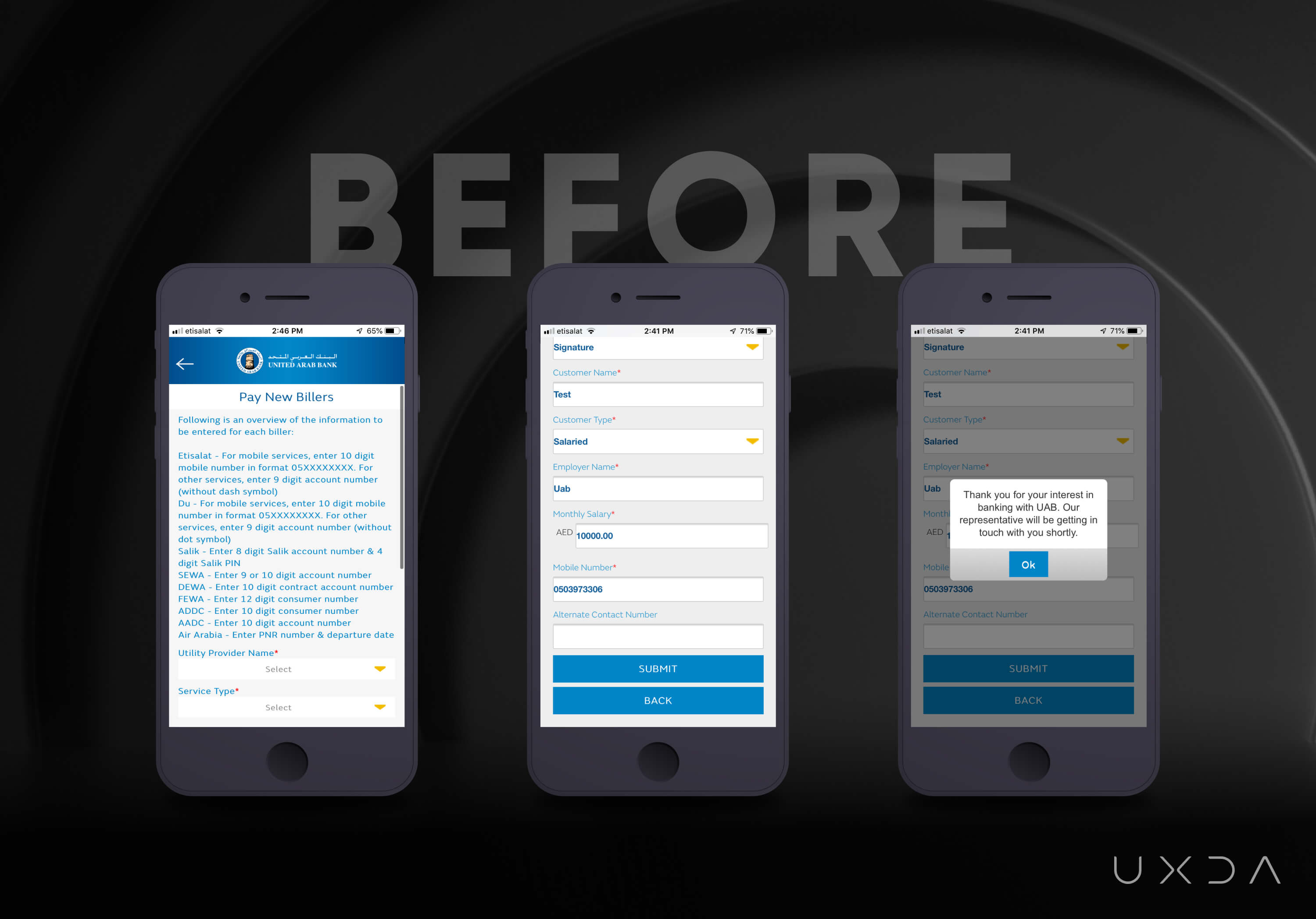
During the UX transformation, the mobile banking architecture was restructured to arrange an information hierarchy according to the user's contextual needs. For example, gradually expanding details across the task steps so as not to confuse users, and provide relevant information only to a specific action.
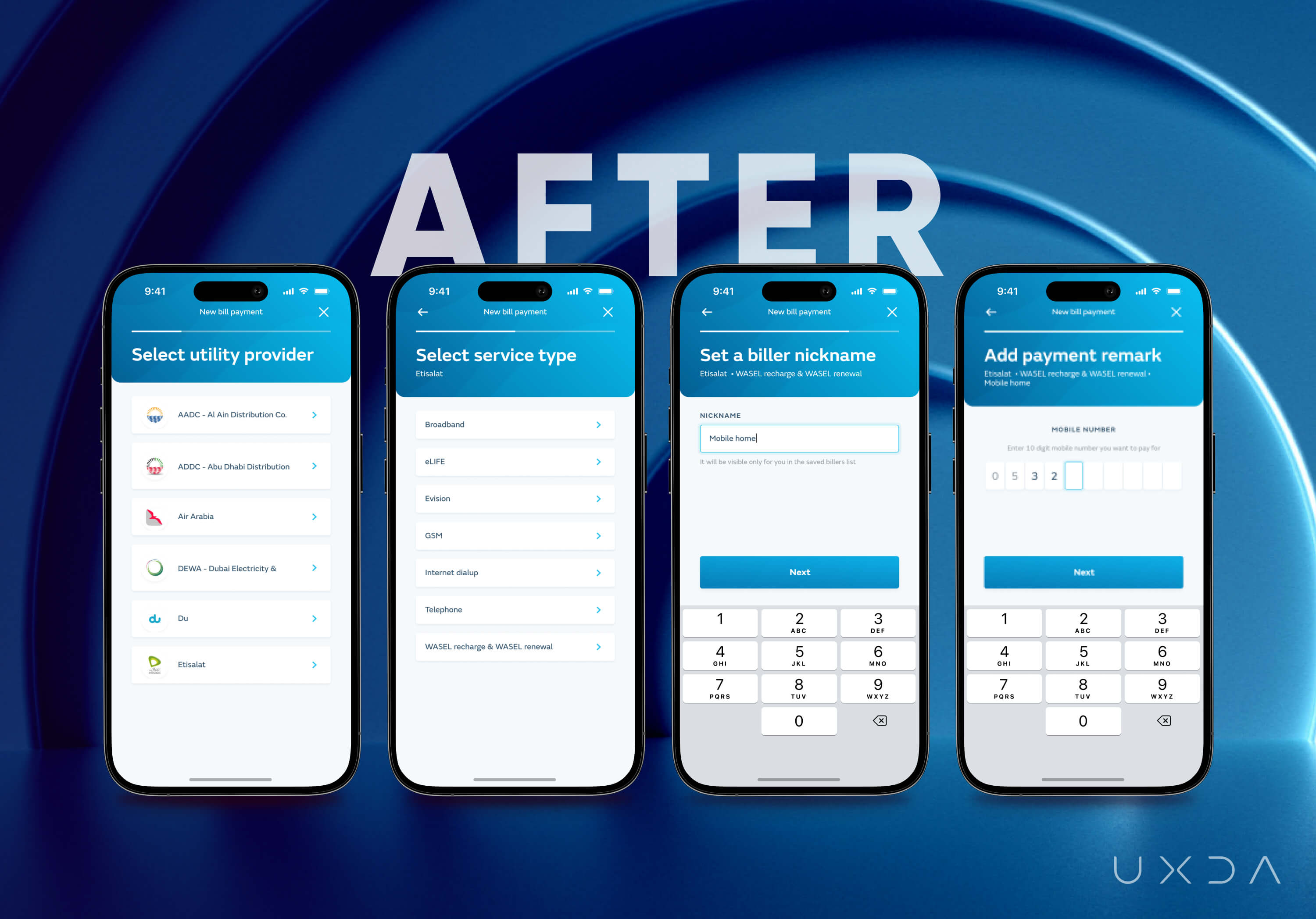
Building a Clean Design that Freshens Up the Brand
After research discoveries and insights and reinvented flow architecture, the next challenge was to incorporate the logo, brand colors and visual artifacts into the new design.
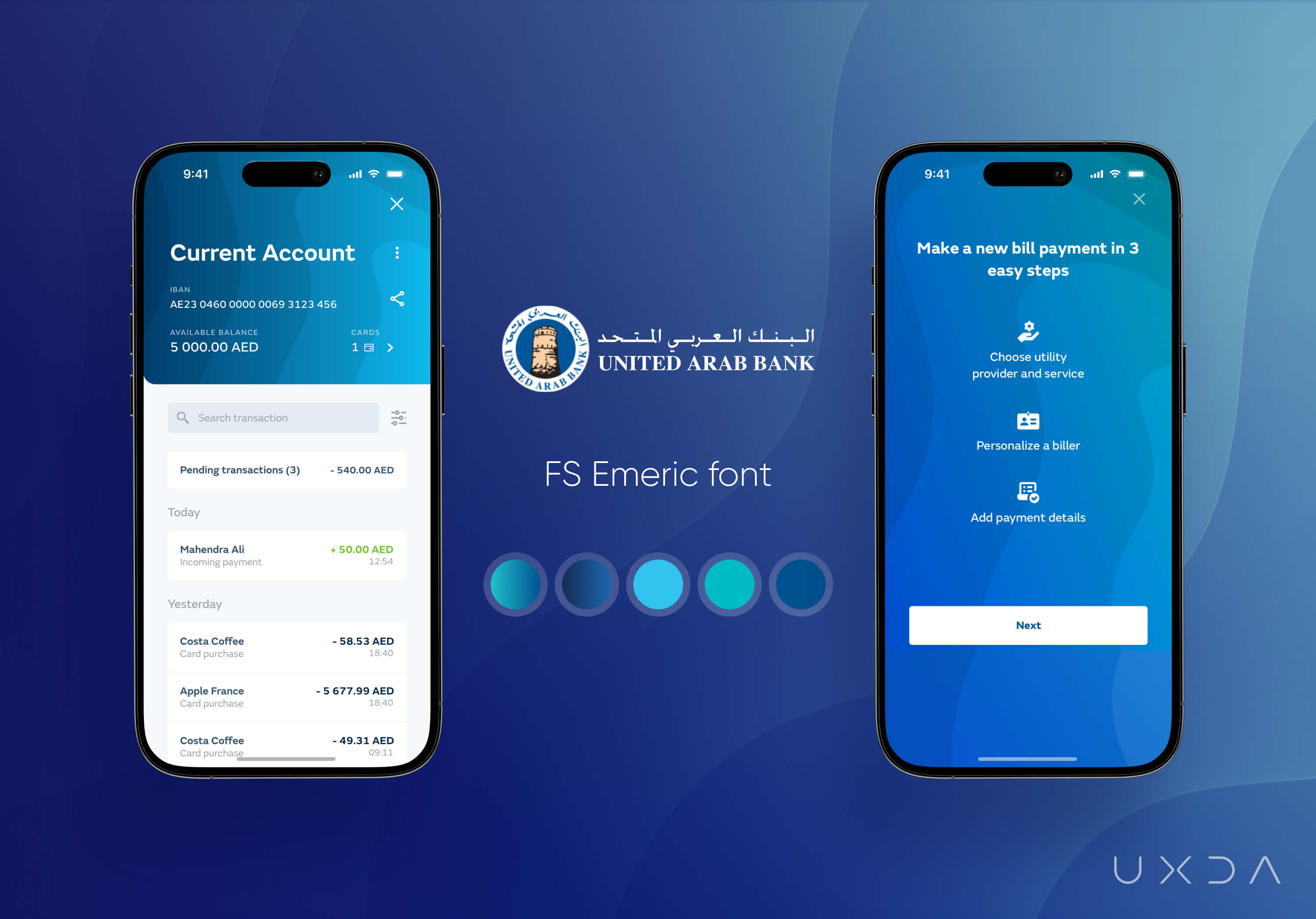
To ensure the created app complied with the existing brand guidelines, the design was based on the brand colors. Additional shades were added to the gradient to diversify the color palette without overloading it. The intention was to offer a breath of fresh air that would attract users.
So, instead of a template banking design, together with the UAB team, we have implemented an individual wave pattern that creates a sense of balance and calm, conveying the authenticity of the brand. White cards bring contrast and highlight the key data. At the same time, white space saves users from information overload.
UXDA Deliverables
- Stakeholder's’ interview
- Product audit
- User research and scenario prioritization
- Information architecture
- User flow maps
- Wireframes
- UI design
- Product motion design
- Design library
Takeaway: User Perspective Brings in Fresh Ideas
Before the redesign, members of the UAB team wondered why users would get stuck on certain tasks and contact support despite the written prompts in the app. The answer was how users perceive information. Although this is a simple reason, it is not so intuitive.
UAB team members were used to the app's current layout, and, for them, everything seemed understandable and logical. It took a set of fresh eyes and UX research to detect the challenging areas that needed improvement.
Together, we were able to achieve a customer-centered design for the most important user flows in the app and make improvements in line with the established bank brand and digital strategy.
These adjustments helped the bank enhance the customer experience and digitize financial behavior patterns. With the help of UX, the UAB team was able to reinvent traditional bank services and bring a breath of fresh air into its digital ecosystem.
“Our needs were heard and delivered. UXDA provided recommendations to the different user experiences that other UX design agencies never recommended. Out of the box thinking. Great experience!”
Discover our clients' next-gen financial products & UX transformations in UXDA's latest showreel.
If you want to create next-gen financial products to receive an exceptional competitive advantage in the digital age, contact us! With the power of financial UX design, we can help you turn your business into a beloved financial brand with a strong emotional connection with your clients, resulting in success, demand, and long-term customer loyalty.
- E-mail us at info@theuxda.com
- Chat with us in Whatsapp
- Send a direct message to UXDA's CEO Alex Kreger on Linkedin


