What is a banking app design?
In the modern world, even non-banking customers have smartphones, which is why mobile devices have become the key channel for financial services. We can define a banking app design as a process for creating architecture, functional requirements and graphical interfaces for mobile banking applications. Finance app design differs from other mobile application design due to its complexity and impact on the customer’s life. Any mistake caused by misunderstandings in a financial app can lead to disastrous consequences for the user.
A beautiful app design is the result of the highest competence and experience of financial UI designers and UX architects who empathize with users’ feelings, needs and pain points. The best banking app is a simple one, but simple doesn't mean primitive. Banking innovation and cutting-edge experience design allows for the transformation of any banking product into an easy mobile banking app. Banking of the future will disrupt the industry and create smart banking apps using artificial intelligence in banking.
The customer experience depends on interactions with the banking app UI (user interface). If your finance app design is frustrating, boring and outdated, the customer could switch to a competitor’s solution. This transforms the question of"How to create a banking app?" into "How to design a banking app?" A great development team and insane marketing budget will not succeed if the banking app architecture and user interface do not address users’ needs.
Therefore, a nice UI banking app that is based on recent finance app design trends is not enough. A modern financial services app design should start with financial UX architecture. You need to take into account user psychology and behavior, business goals, technical requirements, competitors, customer needs and expectations and the overall industry context. Mobile UX design should be the number-one priority in developing the best banking app.
Check out UXDA articles and insights about the best banking app design processes and tips.
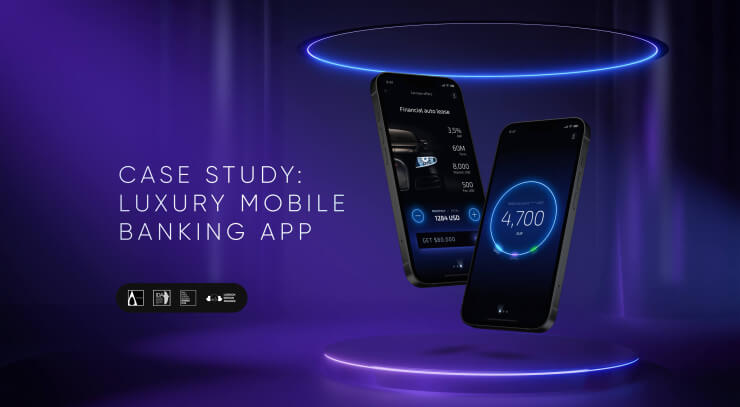
Case Study: Luxury Mobile Banking App UI Design for Emotions
The case study of multi-awarded Light Bank guides how to design the simple and beautiful luxury banking mobile app, at the same time keeping the full-scale banking functionality.
Bank of Jordan UX Case Study: Middle East Banking Redesign of Mobile UX
It took one year for the Bank of Jordan’s mobile banking app to go from a 2.8 to 4.7 star rating on Google Play. How? By teaming up with UXDA to create a comprehensive UX transformation.
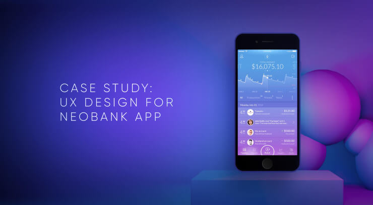
Fintech App Design: 10 Latest Mobile Banking Trends
Is it possible to unite dozens of traditional banking features in a single Neobank app? The answer is “yes” if you combine cutting-edge technological innovations and banking user experience.
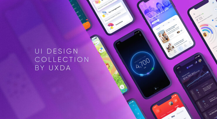
Finance Mobile App UI Design Collection by UXDA
There's no doubt - UX design is the key to success in the digital age. We have created a collection of our latest and most refreshing designs to prove - banking can be beautiful, easy-to-use and yet maintain the full functionality.
A Collection of 20 the Most Interesting Banking Design Ideas
There are so many beautiful visualizations of banking interfaces on Dribble and Pinterest. Unfortunately, if you look closer, quite often they are meaningless from the user experience perspective. Many of them are just beautiful animations that ...
What Do the Financial Experts Say About UXDA's Work?
You will be surprised to hear what our customers reveal about UXDA work process in independent Clutch research. I am happy to announce that UXDA’s NPS (Net Promoter Score) has reached 76 points — the same level as Apple, Amazon, and Netflix.
- 1
- 2


